


Author: Land8: Landscape Architects Network


“El Coso” Garden and Business Incubator: A Landscape of Opportunities
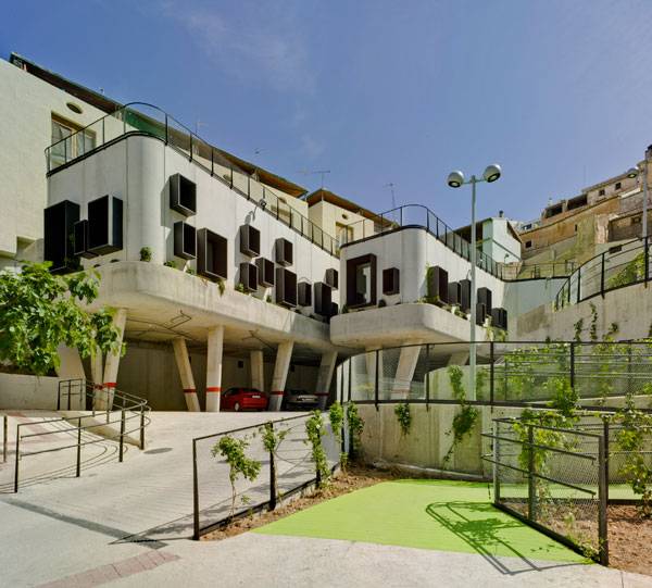
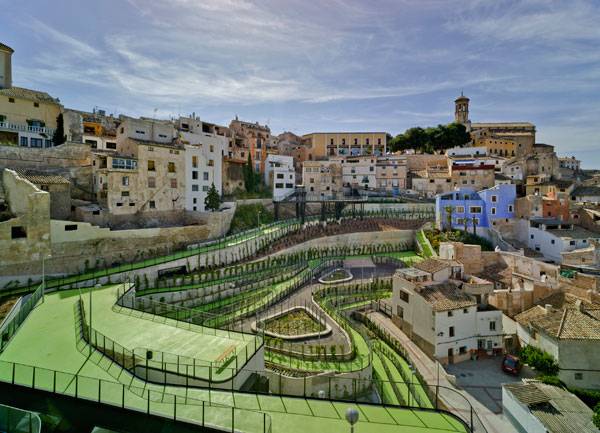
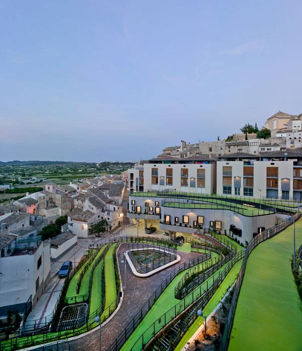
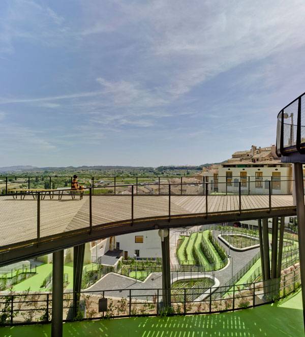
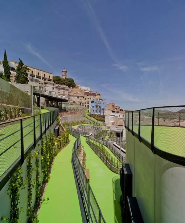
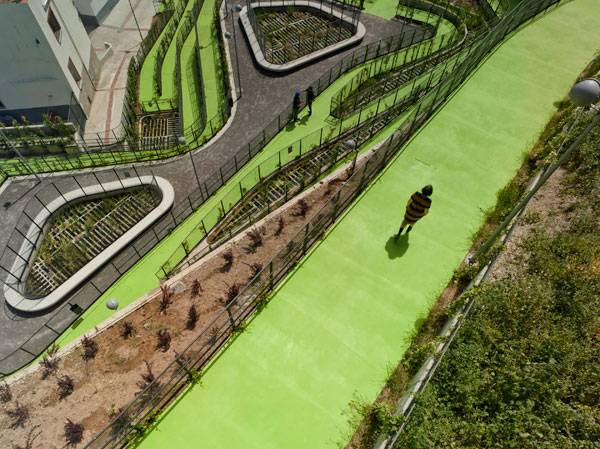
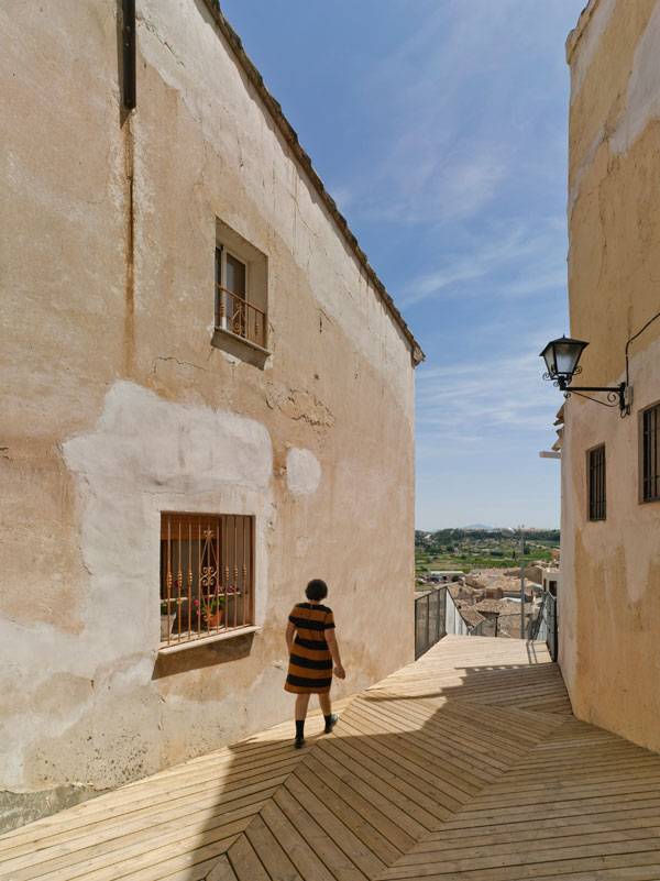
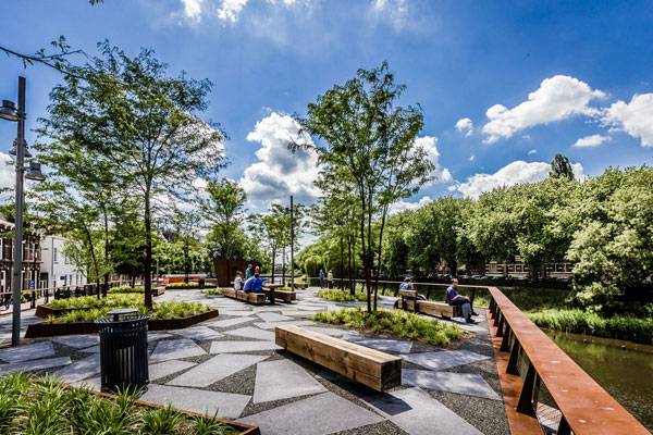
Article by Domenico Pistone – “El Coso” garden and business incubator, by Cómo Crear Historias, in Cehegín, Murcia, Spain. It all started in the ’50s, when a heavy snowfall in Cehegín, a Spanish municipality in the autonomous community of Murcia, brought down part of “El Coso”, a part of the high district of the city. Serious harm was done to the community; the event created a barren space within the city and the various height differences did not favor the repopulation of the area. A great void that became a landfill, crossed only with difficulty by the citizens who created trails in their wake. A void which left a city with no water and no paths or walkways for citizens. It is from here that the mysterious history of the garden that produces water begins.
“El Coso” Garden and Business Incubator. Photo Credit: David Frutos
“El Coso” Garden and Business Incubator
For this project, the group of architects thoroughly analyzed the discontent of the citizens, marked paths that were born spontaneously, and started a process of participatory planning and work camps involving the entire city. The garden is a landscape of integration, returning to community members their right to walk through the neighbourhood and acting to connect different sites of the city that were remote. It is also an important example of how a city can create a garden with limited resources.
“El Coso” Garden and Business Incubator. Photo Credit: David Frutos
A Project with Many Voices; Participatory Planning
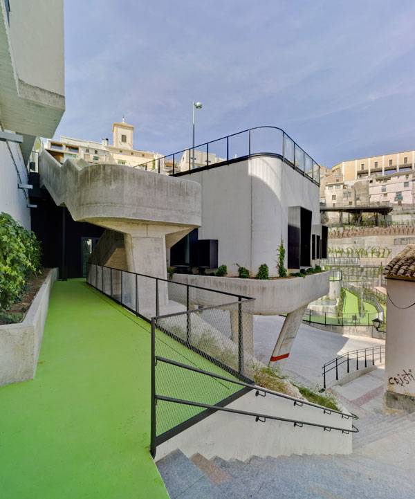
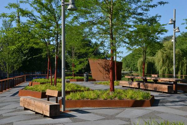
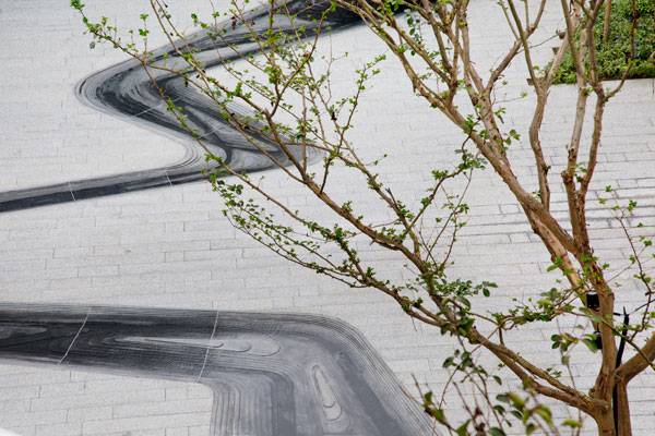
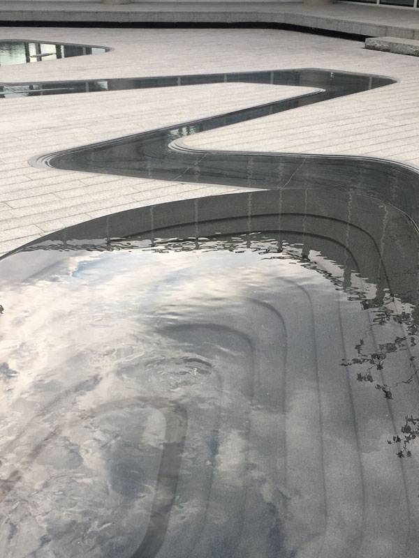
During the design phase, the architectsset themselves a number of questions and objectives, but the primary goal was the linkage and the path within the project. They found 9 possible results under different route conditions; at the same level, through stairs, inclined or with varying dimensions, or organically with the fall.
“El Coso” Garden and Business Incubator. Photo Credit: David Frutos
“El Coso” Garden and Business Incubator. Photo Credit: David Frutos
“El Coso” Garden and Business Incubator. Photo Credit: David Frutos
The Vegetation; Cure and Ornament
In order to achieve a result of such a high level, as has been done by the designers, one must undertake an almost obsessive study of the vegetation that would make healing and changing the landscape of El Coso possible. Many plant species are found here that perform the most varied functions such as Typha latifolia, (broadleaf cattail), a macrophita that purifies the water, and which assumes a brown colour in summer and green in the other seasons, or Hedera Hibernica, (Irish ivy), covering retaining walls and colouring them red in autumn and winter (this measure helps the walls accumulate less heat and cools the atmosphere in summer) or the violets’ scent or Freesia x hybrida that flourishes its perfume into the air and cheers the walks of citizens.
“El Coso” Garden and Business Incubator. Photo Credit: David Frutos
“El Coso” Garden and Business Incubator. Photo Credit: David Frutos
Innovation and Technology Help History
The main structure within the garden houses a business incubator that aims to enhance local excellence by supporting youth policies. Part of the interior of the building overlooks magnificent tanks for wine, partly discovered after the collapse, from the seventeenth century, weaving together culture, architecture, and business. The ceiling of the structure that contains the business incubator is designed to become a viewpoint over the river, the garden, the ponds, and the whole landscape.
“El Coso” Garden and Business Incubator. Photo Credit: David Frutos
“El Coso” Garden and Business Incubator. Photo Credit: David Frutos
Water as a Metaphor for Life
Never has the name of a project been so spot-on because the “mysterious history of the garden that creates water A.K.A. El Coso” is a project that has something special; it is not limited to the construction sphere, but also involves anyone who walks into its spaces. It is a magical project because it is able, thanks to the water, to give life to a dull, dark place, and it has managed to make a site of bad memories a place of regeneration and happiness. This is the mysterious history of the garden that produces water; a better place, a fantastic project, don’t you think?
Full Project Credits For “El Coso” garden and business incubator:
Project Name: “El Coso” garden and business incubator. Project Title: “The mysterious story of the garden that makes water” Project Location: Cehegín, Murcia, Spain (2003-2015) Architects and technical construction management: Mónica García Fernández and Javier Rubio Montero (cómo crear historias) Quantity surveyor: Patricia León de la Cruz Contractor: Jose Diaz Garcia S.A. Structural engineering: Dolores Romám Mechanical engineering: AGM ingenieros, José Alberto García Fernández Safety and health coordinator: Antonio Martínez Sánchez Owner/ developer: Municipality of the city of Cehegín Photographs: David Frutos Total area: 4.436 m2 Budget (Materials and execution works): 3.111.262 € Project start date: 2003 Construction period: 2011-2015 Recommended Reading:
- Becoming an Urban Planner: A Guide to Careers in Planning and Urban Design by Michael Bayer
- Sustainable Urbanism: Urban Design With Nature by Douglas Fa

Sandibe Okavango Safari Lodge : Luxurious African Sustainable Resort
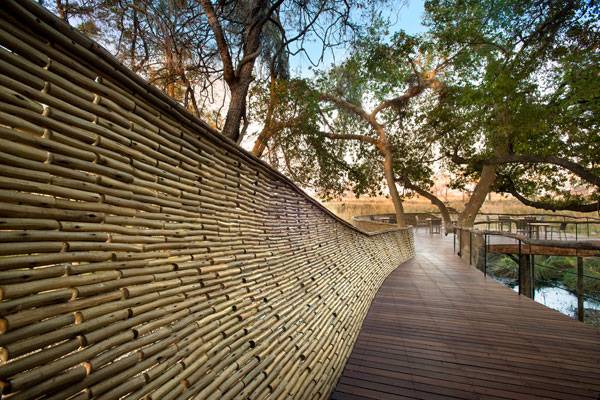
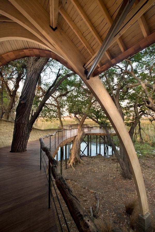
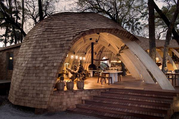
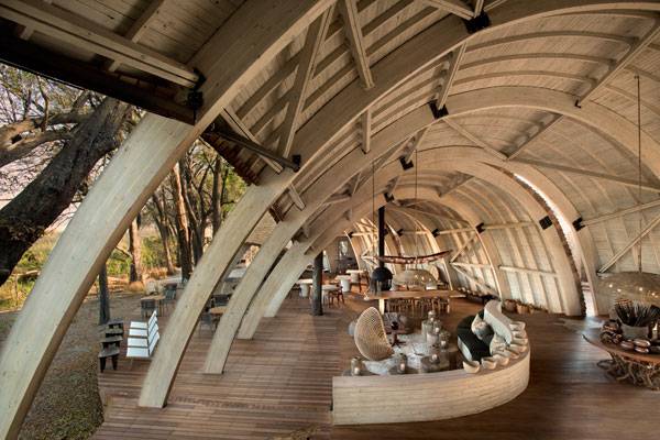
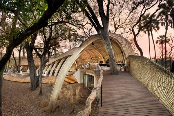
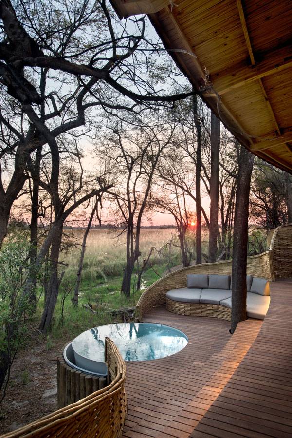
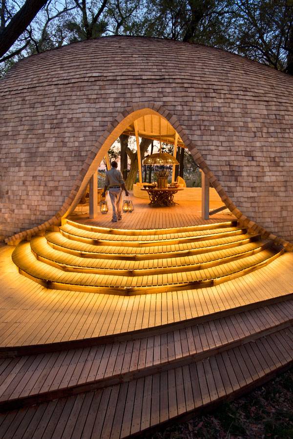
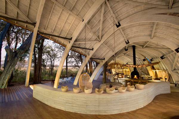
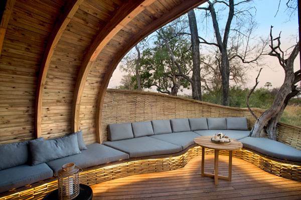
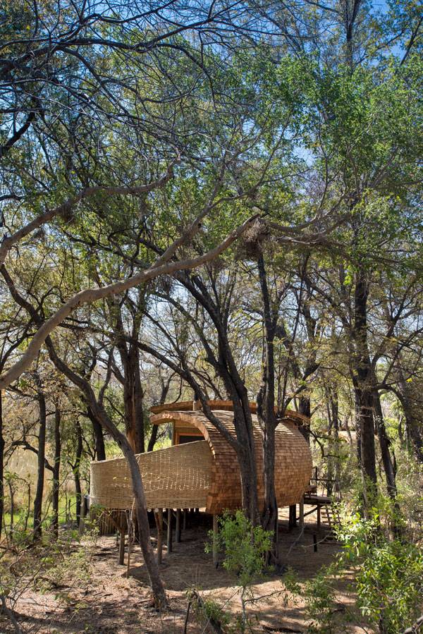
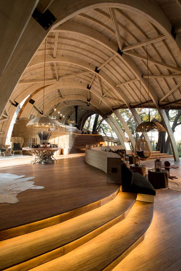
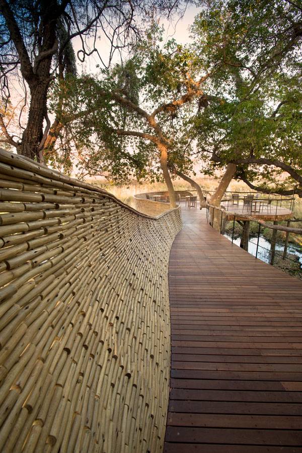
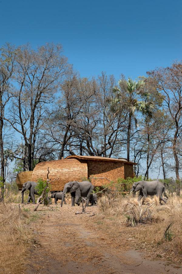
Article by Sara Fausti – Sandibe Okavango Safari Lodge by Nicholas Plewman Architects in Association with Michaelis Boyd Associates (MBA), in Okavango Delta, Botswana, Africa. A look at the formidable project of Sandibe Okavango Safari Lodge by Nicholas Plewman Architects in association with Michaelis Boyd Associates (MBA). Can you imagine a luxury resort in an African landscape, surrounded by elephants, lions and giraffes, but with a minimal energy impact?
Sandibe Okavango Safari Lodge Photo credit: Dook
Sandibe Okavango Safari Lodge
The project is a perfect integration between aesthetics and function in a harmonious fusion between architecture and nature; a building which respects the environment through technological solutions without compromising high-quality comforts and deep perception of the space. Okavango River Valley is one of the most fertile areas of Africa and was conscripted as a UNESCO World Heritage Site in 2014.
Sandibe Okavango Safari Lodge Photo credit: Dook
Sandibe Okavango Safari Lodge Photo credit: Dook
Sandibe Okavango Safari Lodge Photo credit: Dook
Sandibe Okavango Safari Lodge Photo credit: Dook
Sandibe Okavango Safari Lodge Photo credit: Dook
Sandibe Okavango Safari Lodge Photo credit: Dook
Sandibe Okavango Safari Lodge Photo credit: Dook
Sandibe Okavango Safari Lodge Photo credit: Dook
Sandibe Okavango Safari Lodge Photo credit: Dook
Sandibe Okavango Safari Lodge Photo credit: Dook
Sandibe Okavango Safari Lodge Photo credit: Dook
Sandibe Okavango Safari Lodge Photo credit: Dook
Sandibe Okavango Safari Lodge Photo credit: Dook
Sandibe Okavango Safari Lodge Photo credit: Dook
Full Project Credits For Sandibe Okavango Safari Lodge:
Project: Sandibe Okavango Safari Lodge Architects: Nicholas Plewman Architects in Association with Michaelis Boyd Associates (MBA) Location: Okavango Delta, Botswana, Africa Date of construction: 2014 Size: 11,500-square-foot Awards: winners in the Hotels & Resorts category at the A+Awards 2016 Clients: &Beyond Recommended Reading:
- Becoming an Urban Planner: A Guide to Careers in Planning and Urban Design by Michael Bayer
- Sustainable Urbanism: Urban Design With Nature by Douglas Fa
Latest News Landscape Architecture March Edition
20-Mar-2017 – Latest News Landscape Architecture March by Brett Lezon | Edition No. 4 out of 4 In this week’s Latest News in Landscape Architecture we highlight the winners announced to redesign St Jose’s Park. We will also look into how BIG’s looping station design in Paris turns bridge into public space. And have you seen the bold proposal for the new bike bridge connecting Miami to Key Biscayne? Additionally, we showcase a book, Landscrapers, which is said to be “an introductory historical survey on the many and creative ways humans have fought for and against the earth beneath our feet, merging man-made forms with the contours of the land”. And don’t forget to check out the YouTube tutorial of the week, you’ll end up “wowing” your teacher or your boss with your new skills in making Landscape Architecture diagrams.
Latest News Landscape Architecture March Edition 03
10 of the Best Stories in This Week’s Latest News Landscape Architecture:
- Landscape Architecture Diagrams in Photoshop [YouTube Tutorial of the Week]
- Winners announced to redesign St Jose’s Park
- BIG’s looping station design in Paris turns bridge into public space
- Landscrapers: Building with the land [Book Review of the Week]
- Bold proposal for new bike bridge connecting Miami to Key Biscayne
- Smart Cities and Urban Transport
- How do you protect people from terrorism through urban design?
- Circular runway allows planes to take off and land in all directions
- Ukraine’s leafy green ‘Tunnel of Love’ is a passageway for trains and lovers
- New York City’s “floating food forest” returns next month
(Click the headline for the full story)
- Landscape Architecture Diagrams in Photoshop [YouTube Tutorial of the Week]
This 10 minute tutorial teaches you how to draw informative and beautiful landscape architecture diagrams in Photoshop. The tutorial is informative, easy to follow and will you’re your future landscape architecture diagrams another dimension. Enjoy! WATCH >>> Landscape Architecture Diagrams in Photoshop
- Winners announced to redesign St Jose`s Park: Archpaper
A design team made up of San Francisco–based CMG Landscape Architecture, Future Cities Lab, Page & Turnbull Architects, and ARUP engineers has been awarded a contract to rehabilitate San Jose, California’s historic St. James Park. The City of San Jose held a national competition to redesign the neglected park back in 2016 with the aim of reintegrating and modernizing the city’s largest, most urban recreation space. The competition’s top four entries included competing submissions lead by New York City–based !Melk, Berkeley, California–based Meyer + Silberberg, and Philadelphia-based WRT. In a press release touting the winning commission, Nataly Gattegno and Jason Kelly Johnson of Future Cities lab said, “We designed the pavilion to be an open and illuminated space seamlessly integrated with the park. We want to encourage neighbors to stroll through the colonnades and interact with the pavilion day and night,” adding, “When there is a scheduled event, the pavilion will transform into a high-tech performance venue with superb acoustics and lighting.”
Danish firm Bjarke Ingels Group and French Studio Silvio D’ascia Architecture unveiled new rendering of their competition-winning designs for a loop-shaped metro station in Paris. “The Gare du Pont de Bondy continues the Parisian tradition of utilizing bridges as social spaces and cultural landmarks. Located at the encounter between the communities of Bondy, Bobigny and Noisy-le-Sec, the station is conceived as both bridge and tunnel wrapped around a giant atrium, connecting the riverbank to the train landing,” said BIG. “The deepest train tunnels will now open directly to the Parisian sky, and all three surrounding neighborhoods will be united in a single inclusive loop—a new architectural hybrid of urban infrastructure and social space.” The stations and lines of the Grand Paris Express and expected to open before 2030.
- Landscrapers: Building with the Land, Aaron Betsky, Thames & Hudson [Book Review of the Week]
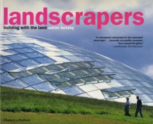
Landscrapers: Building with the Land. Get it HERE!
- Bold proposal for new bike bridge connecting Miami to Key Biscayne on display at Coral Gables Museum: archpaper
A new exhibit at the Coral Gables Museum is now on view, providing a deeper look into “Plan Z for Miami,” a proposal to create a snaking elevated platform that would provide pedestrians and cyclists with safer passage from Miami to nearby Virginia Key and Key Biscayne. The existing Rickenbacker Causeway has seen four fatal cycling accidents since 2006, spurring many cyclists to push for better bike lanes and barriers to protect them from the high-speed traffic on the bridge. Architect, urban planner, and lifelong cyclist Bernard Zyscovich saw an opportunity to promote cycling as a more viable means of transportation in Miami and launched Plan Z for Miami. The exhibit, titled Plan Z for Miami: From Infrastructure to Open Space, will be on view through May 14, 2017, at the Coral Gables Museum. For more information about the exhibit, visit the Museum’s website here. WATCH >>> Repurposing Rickenbacker Causeway to Rickenbacker Park – Plan Z for Miami
More Top Stories in the News This Week
- Smart Cities and Urban Transport: Topos Magazine
- How do you protect people from terrorism through urban design?: The New European
- Circular runway allows planes to take off and land in all directions: designboom
- Ukraine’s leafy green ‘Tunnel of Love’ is a passageway for trains and lovers: Inhabitat
- New York City’s “floating food forest” returns next month: Inhabitat
– For all of the latest news in Landscape Architecture continue to follow us on Facebook and Twitter. Do you have news to share? Send to office@landarchs.com News report by Irene Crowo Nielsen Return to Homepage

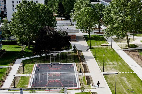
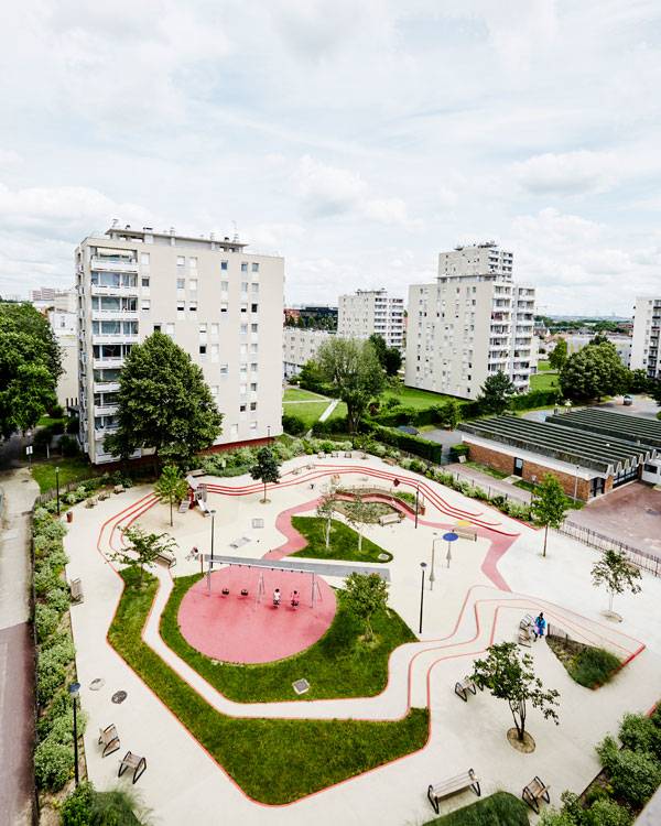
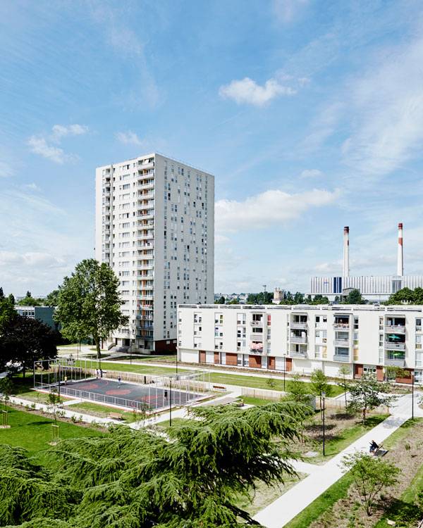
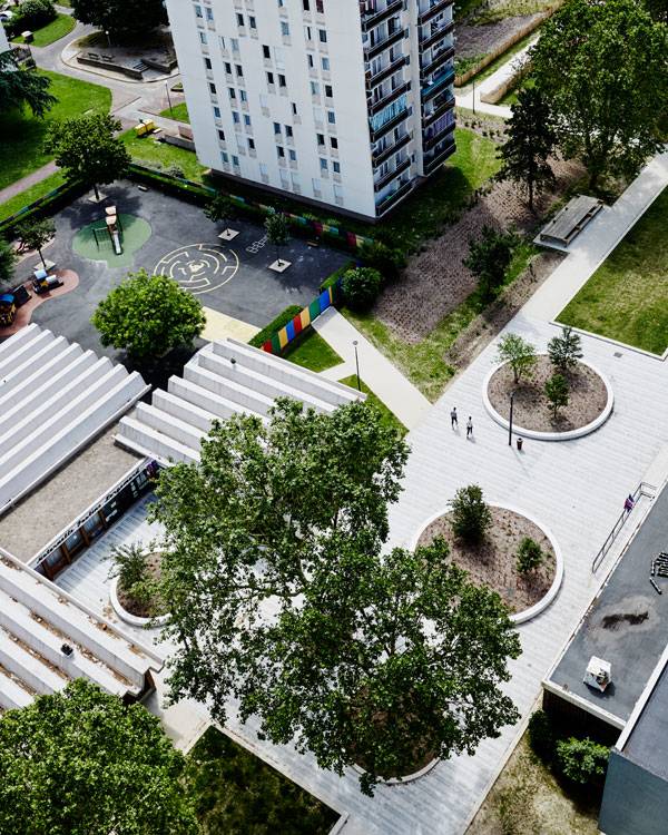
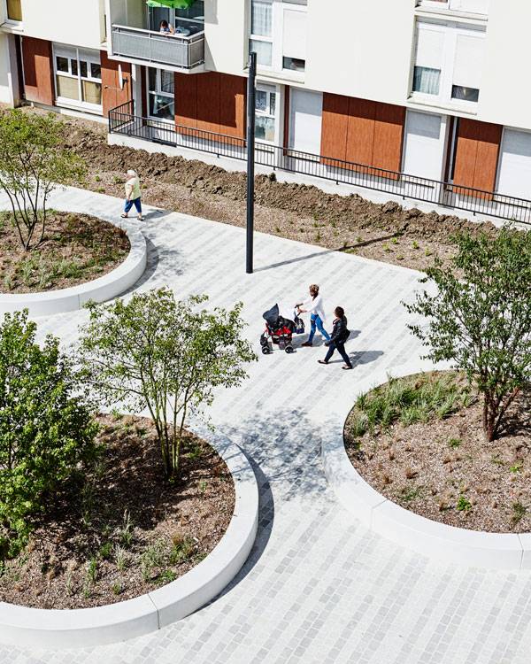
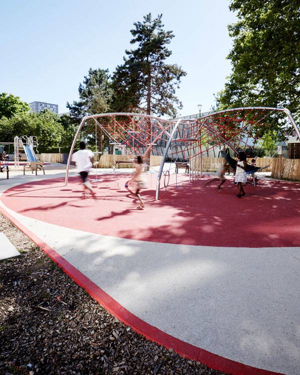
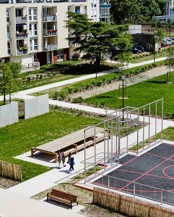
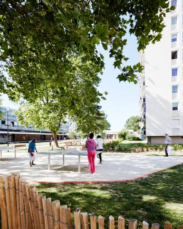
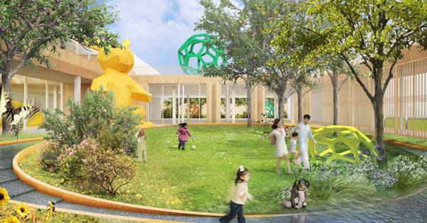
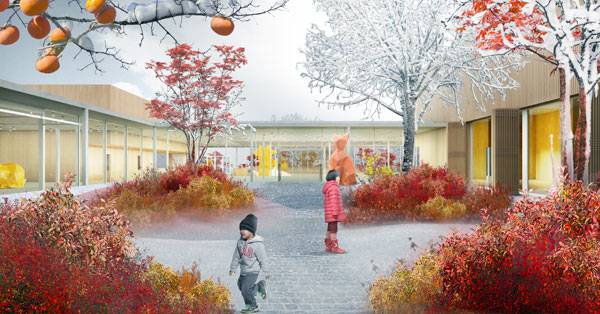
The Grand Ensemble Park | A Symphony of Early Urban Planning Principles
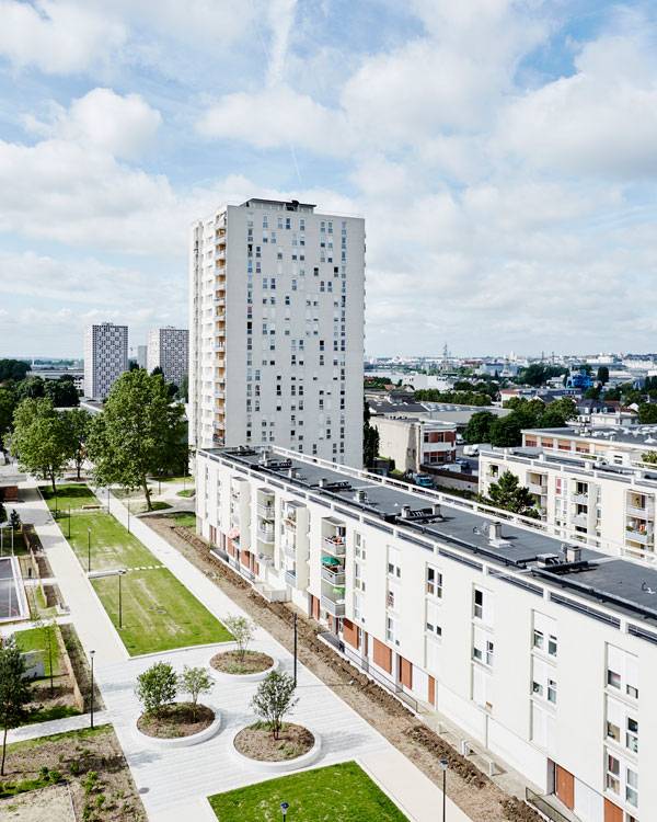
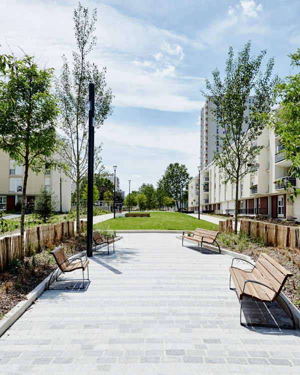
Article by Frank Bourque – The Grand Ensemble Park, by Espace Libre, in Alfortville, France Landscape architecture is a vital reality in all parts of the world. The best proof of that is that numerous projects are popping up in every country which unify the vision of a perfectly organized green space. One very impressive project that has been recently made official is the Grand Ensemble Park, a residential-area-and-park-brought-into-one concept in Alfortville, a small town in France.
The Grand Ensemble Park
How it Mimics the Cornerstones of Urban Planning (Set in 1943)
A great way to present the benefits of landscape architecture, its environmentally-friendly impact and the neat design principles that this direction in architecture presents is to introduce you to the Grand Ensemble Park, a new neighborhood area in Alfortville, France, which was planned on the basis of the design principles found in the Athens Charter.
The Grand Ensemble Park. Photo credit: Julien Falsimagne
The Grand Ensemble Park. Photo credit: Julien Falsimagne
From Private Living Spaces To Public Playground Areas
Landscape design is a thing that cannot be done overnight. In the Grand Ensemble Park, it actually took 2 full years of planning (from 2013 to 2015), whereas the execution of this project took one full year (from 2015 to 2016). However, the results definitely justify the years spent in planning, and give all residents of the Grand Ensemble Park and Alfortville a new hotspot in their city that can be enjoyed by people of all ages. The Grand Ensemble Park is basically a mixture of both private and public living spaces and playgrounds. Because of that mixture, it resembles a community that everyone can access and enjoy themselves in.
The Grand Ensemble Park. Photo credit: Julien Falsimagne
The Grand Ensemble Park. Photo credit: Julien Falsimagne
The Grand Ensemble Park. Photo credit: Julien Falsimagne
The Grand Ensemble Park. Photo credit: Julien Falsimagne
A Neighborhood with a Public- and Environmentally-Friendly Character
From a design perspective, all of the principles of urban planning and modern landscape architecture are kept in the Grand Ensemble Park in Alfortville. From the lines to the shapes and the materials used, Espace Libre made sure to focus on nothing but quality and give the community a twist of modernist architecture that still backs up some of the initial urban planning principles from the Athens Charter document. That can be best seen in the force lines of the design, as well as the shapes and materials that all reflect the image of the Swiss urban planning heritage but also deliver a modern architecture look to Grand Ensemble Park.
The Grand Ensemble Park. Photo credit: Julien Falsimagne
The Grand Ensemble Park. Photo credit: Julien Falsimagne
The Grand Ensemble Park. Photo credit: Julien Falsimagne
A Final Word
The opportunity to live, play or just enjoy being in the park is what each and every family member wants in the 21st century and something that is quite limited by the ultra-developed, too-crowded and constantly busy city locations. In the end, we can say that the Grand Ensemble Park definitely creates a natural symphony in the heart of Alfortville and perfectly mimics all aspects of urban planning and landscape architecture, creating a safe and livable neighborhood. Which aspects of this project stand out for you? Let us know in the comment section.
The Grand Ensemble Park. Photo credit: Julien Falsimagne
Full Project Credits For The Grand Ensemble Park:
Project: “The Grand Ensemble Park” Designer: Espace Libre Size: approx. 4.5 acres (1.8 ha) Location: Alfortville, France Date of Construction: 2015 to 2016 Chef of the public planning bureau: Karim Amokrane Budget for the project: 2 million Euros Recommended Reading:
- Becoming an Urban Planner: A Guide to Careers in Planning and Urban Design by Michael Bayer
- Sustainable Urbanism: Urban Design With Nature by Douglas Fa


National Museum Complex | A Vital Link Between Culture and Nature
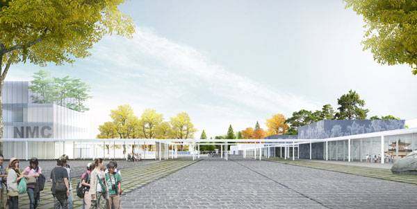
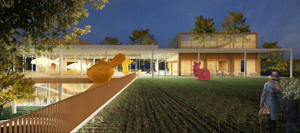
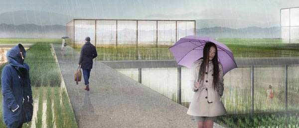
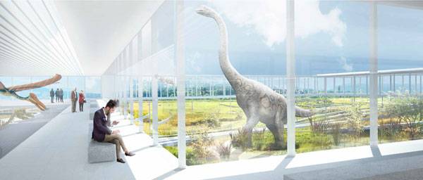
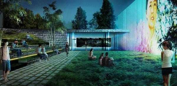
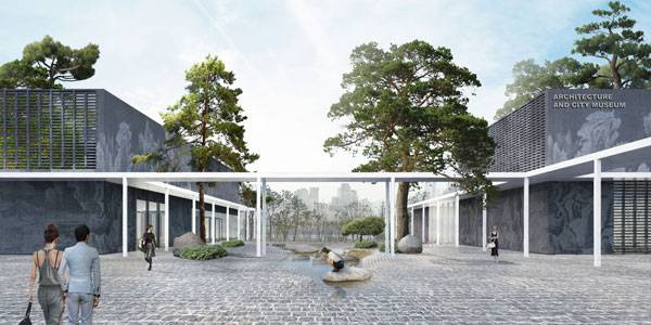
Article by Agmarie Calderón Alonso – National Museum Complex Master Plan of the New Administrative City by Office OU, in Sejong, South Korea. The National Museum Complex master plan is a design competition for a cultural center in Sejong, South Korea, which is also known as Administrative City. The first phase will utilize 75,000 square meters that will include diverse museums, such as Architecture, National History, Design, Digital Heritage, Archives and a National Children’s Museum. The site draws on its surrounding landscapes (groves, wetlands, forests, and rice paddies). All of these areas will be interconnected through a central square to create an outdoor space. Trying to connect structure and landscape can be creatively difficult, but in the right arrangement, it will amaze any spectator. That is what Office OU has done with the Sejong Museum Gardens. The gardens are recognized as a vital link between culture and nature, and the designers hope that this project can give the people of Sejong and South Korea a place to nurture this relationship.
National Museum Complex Image credit: Office OU
National Museum Complex
With the basic logic of Korea’s Joeseon Dynasty palace architecture, Nicolas Koff (Office OU principal) says, “The palaces are simple and cohesive complexes united in their architectural language and yet differentiated by their response to the natural landscape.” It’s clear that tradition and culture are very important keys in the design and development for this museum complex.
National Museum Complex Image credit: Office OU
National Museum Complex Image credit: Office OU
Plants in the Design
The museums are influenced by their adjacent landscapes, guiding the design of the courtyards. Some of the landscape areas include a grove featuring grass (Zoysia tenuifolia) and bamboo (Semiarundinaria ‘Korea’); wetland edges with perennial herbaceous plants (Typha latifolia) and perennial herb (Aster scaber); forests featuring Japanese red pine (Pinus densiflora siebold & zucc.) and Korean fir (Abies koreana); and the rice paddies, with Asian rice (Oryza sativa). This design will contribute to a new phase in learning about and cultivating how landscape and structure can work together. The architects are emphasizing nature vs. building; green areas are important and they can coexist with the museums.
National Museum Complex Image credit: Office OU
National Museum Complex Image credit: Office OU
Landscape as Educational Places
It is also important to recognize that while the museums serve an educational purpose, so do the landscapes surrounding them. The landscape is not just a pretty site. One of the competition’s jury called it “The interpretation of nature as an architectural element”. Office OU is creating and developing a new concept in interacting with nature — the realization that landscape can be the main focus and the museums can play a secondary purpose. The design integrates each element as if the spatial orientation of each space is what creates a collective visualization of greatness in design. In designing with nature in mind, the landscape is the central guide throughout these museums.
National Museum Complex Image credit: Office OU
National Museum Complex Image credit: Office OU
Each Museum has a Different Ecosystem
Nature is at its best within the constructed site, building a new learning experience within the spaces. Not only do visitors have the opportunity to reconnect with nature, they can also understand what the museums bring to the city. South Korea’s plan is to create the National Museum Complex as a platform for a cultural network, giving the Administrative City a harmonious vision between inhabitants and nature. It is a unique experience for South Korea and the world to have a development of this magnitude.
National Museum Complex Image credit: Office OU

National Museum Complex Image credit: Office OU
National Museum Complex Image credit: Office OU
Full Project Credits For National Museum Complex:
Project: National Museum Complex Master Plan of the New Administrative City Architect: Office OU Location: Sejong, South Korea Status: Competition Winning Entry Year: 2016 Size: 190,000 square meters – Thank you for reading another article on Landscape Architect Network – For updates on landscape architecture jobs, new competitions, internships, and discounts sign up to our VIP club HERE!


Denmark’s Got Talent: 10 “Democratic” Landscape Architecture Projects in Denmark
Article by Andrea Robezzati – Following on in our world series we have selected 10 awesome projects that perfectly represent landscape architecture in Denmark today. Have you ever been in Denmark? Are you planning to travel in this country? If not, let’s check for flights and come to meet one of the most democratic cultures of the world! It is widely recognized that Denmark is one of the most liveable countries, especially in its capital city of Copenhagen. Where is the relationship between this fact and landscape architecture? Well, apparently not just a political debate, here in Denmark it will be strongly revealed to you as a social way of life! Once, the politician Winston Churchill said: “First we shape the cities and then the cities shape us”. Denmark is one of the best examples where these words apply, where the landscape design shapes the hearts and souls of people. Let’s go through the list together to discover how this is possible, thanks to these 10 powerful landscape projects!
Landscape Architecture Projects in Denmark
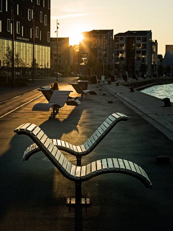
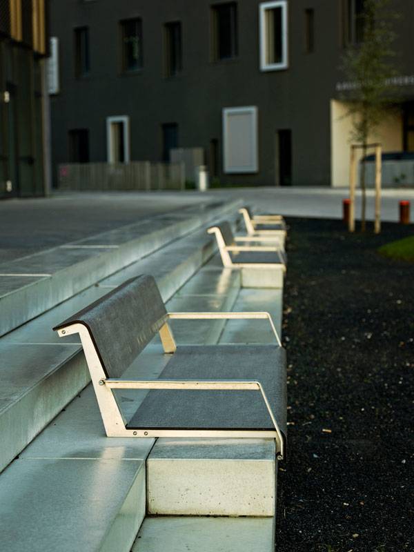
10. Aalborg Waterfront, C.F.Møller, Aalborg, 2013-2015
Situated in the northern portion of the country, Aalborg is one of the most highly populated cities in Denmark. In the last decades, the city has concentrated on building a “cozy cosmopolitan atmosphere”, especially along its waterfront which, in two different phases, has been transformed into a cultural quartier with new university buildings, student housing, and a striking concrete music hall. The project started in 2004 with the first phase and was completed one year ago with the second and last stage.
Aalborg Waterfront Phase II. Photo credit: Joergen True
Aalborg Waterfront Phase II. Photo credit: Joergen True
9. The Pulse Park, CEBRA Architects, Kildebjerg Ry, 2012
Kildebjerg Ry is a very popular residential area for families mainly because of the beautiful surrounding countryside that lends itself to a wide variety of outdoor activities. Since the community wants to expand this integrated system of leisure and sports, the Danish studio CEBRA was asked to design three activating and innovative activity zones for different purposes that form an integral part of the landscape. The Play Zone is designed for both playing and working out. People of all ages can go to this group of geometrical trees right next to the local gym to either climb, swing, or train with weights. The Pulse Zone is a literal bulge on the existing paths as it prompts horizontal movement.
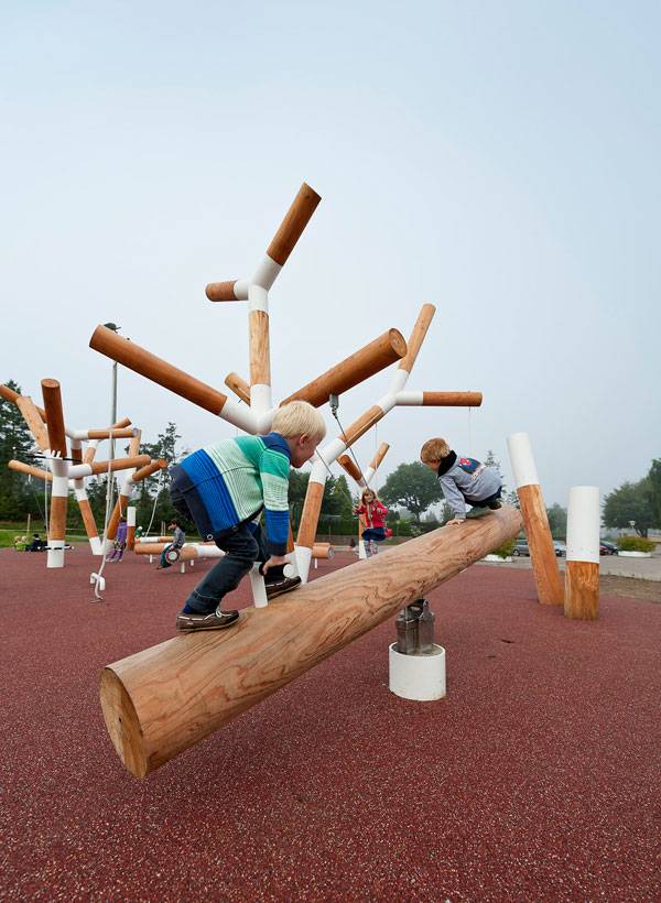
The Pulse Park, by Cebra, Kildebjerg Ry, Denmark. Photo credit: Mikkel Frost
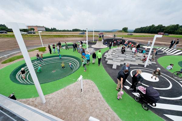
Pulse Zone. Photo credit: Mikkel Frost
8. Novo Nordisk Nature Park, SLA Architects, Bagsværd, 2014
If it is true that some of the best ideas in the world were generated during a walk through nature, Novo Nordisk Park should be the perfect space for the company’s employees, and for you, too! In 2010 a leading pharmaceutical company, Novo Nordisk, required a green space that would be just as innovative as the company itself. The talented studio SLA designed this space, taking inspiration from nature, with a sensational result and interpretation of a phenomenon known from the Danish woodlands: the dead-ice landscape.
Novo Nordisk Nature Park. Photo courtesy of SLA Architects
Novo Nordisk Nature Park. Photo courtesy of SLA Architects
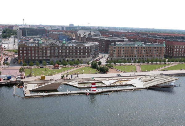
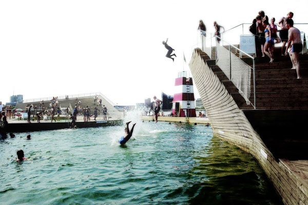
7. Vinterbad Brygge, BIG Bjarke Ingels Group, Copenhagen, 2002
Is it not strange, if on winter days, during your biking tour around the Copenhagen canals, with a strong wind in your face and frozen bike lanes under your wheels, you see people along the water’s edge, wearing only costumes and jumping into the frozen water? Maybe you think that they are trying for some sort of world’s record, but in fact this is a deep and very common ritual in Nordic countries, especially in Finland where it originated. The “North Bath” is the expression of a very special sensibility with the water and is an activity that has social, medical, and cultural aspects well-founded in Scandinavians’ perception of life.
Vinterbad Brygge. Photo credit: BIG – Bjarke Ingels Group
Vinterbad Brygge. Photo credit: BIG – Bjarke Ingels Group
6. Butterfly Bridge, Dietmar Feichtinger Architects, Copenhagen, 2015
In the last few years, Denmark has invested a lot to build new infrastructure for bikes, like bike lanes and bridges, underlining its purpose to be one of the most sustainable countries in the world. One of the most exciting projects is the Butterfly Bridge in Copenhagen.
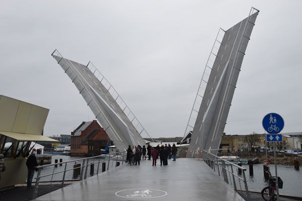
The Butterfly Bridge. Photo credit: Barbara Feichtinger-Felber
Butterfly Bridge takes its name from its form when two of three dynamic crossings are elevated for passing sailboats. When both doors are open at the same time, they form a butterfly, a beautiful figure which is spectacular for its size.

Green Roof Design Inspiration | 4 Awesome Projects
Article by Joanna Laska – We take a look at four terrific landscape architecture projects for green roof design inspiration. Green roof design is probably one of the best inventions of horticulture and landscaping, that’s a fact. Not only do they have hundreds of environmental advantages but also, they can look awesome too! Green roofs – though they weren’t called that back then –existed thousands of years ago. Even if you’re no expert on this, you have probably heard of the “hanging gardens of Babylon”. And yes, they were truly amazing, and people knew – even back then – it was good. Right now the gardens in the sky are making their way back to the top of the list of “most wanted” for their great design and eco-friendly features. Green roofs probably are one of the few ways to truly improve the quality of people’s lives, especially those living in highly urbanised areas. A few of the great benefits of gardens on the roofs are that they provide great protection against noise and air pollution, they act as pollutant binders, and of course they provide extra green space, when that is lacking on the ground plane. Generally speaking, green roofs are the improvement for the micro- and macroclimate we live in. When good planting, design and sustainability are incorporated, green roofs are a true game-changer. In this article, we’re going to look at the 4 best green roof designs which definitely can be a powerful inspiration for all of us.
Green Roof Design Inspiration
1. The Rooftop Park At Saint John’s Bulwark
Designed by OSLO Ontwerp Stedelijke en Landschappelijke Omgeving, this rooftop park in s-Hertogenbosch (Den Bosch) in the Netherlands is probably one of the most surprising green roof designs yet. What’s so special about this design? Well, probably the fact that its modern design has been seamlessly assimilated into the historical site of a former fortification and a main entrance to the city. What makes the building even more amazing is the fact that it is located literally in the river bank. Right now the building is home to a museum.
The Rooftop Park at Saint John’s Bulwark. Photo credit : Niels van Empel
The Rooftop Park at Saint John’s Bulwark. Photo credit : Rosanne Schrijver
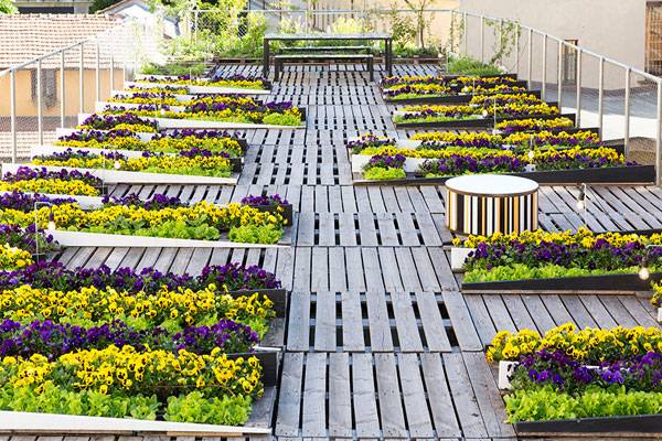
2. Orto Fra I Cortili – Garden Among The Courtyards
This wooden-pallet-based roof garden in Brera, Milan, designed by Piuarch, is definitely something you have never seen before. This project makes the difference when it comes to budgeting of the projects, as the base of this design is… wooden pallets. Believe or not, Piuarch really was able to shine a new light onto this material. This cleverly designed rooftop garden, surrounded by other taller buildings, creates a comfy space, which people in Brera really needed. The modular system of pallets hosts four types of plants, which really are eye candy. Repetitive straight lines of the wooden pallets, colourful varieties of salad, and yellow and purple pansies are the core of this design. This rooftop garden is the proof that you don’t need much to create something extremely beautiful.
Orto fra i cortili. Image courtesy of Piuarch
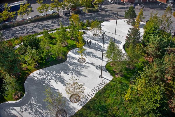
3. Dock Street Roof Terrace
Now, this one it truly breathtaking. Located in DUMBO neighbourhood in Brooklyn, New York, and perfectly designed by James Corner Field Operations this rooftop is more than likely a place where everybody and anybody can feel comfortable.
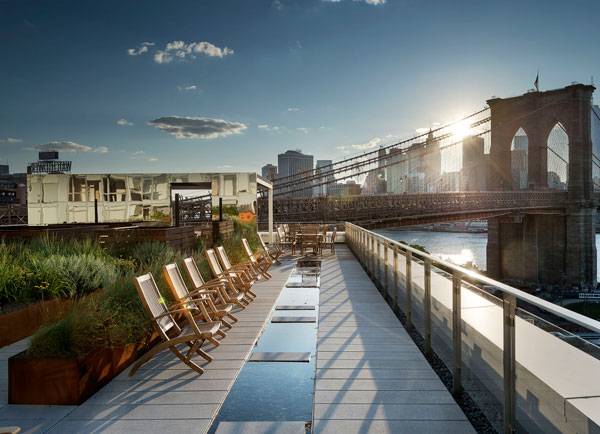
Dock Street Roof Terrace, by James Corner Field Operations
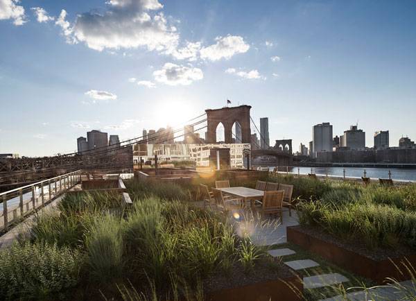
Dock Street Roof Terrace, by James Corner Field Operations
4. Comturney- Keller Roof Garden
Last but definitely not least on the list of our 4 best inspirations is the Comturney-Keller roof garden located on Mainau Island in Germany. Designed by ZinCo and Thomas Steinamann, this innovative construction is another historically-based project on our list. Comturney-Keller was once a medieval fortress, but now it serves as a one-storey restaurant. The amount and excellent use of planting combined with innovative construction technology means that this project offers thousands of possibilities. What’s amazing about this rooftop garden park is the fact that its construction is so strong that it not only allows users to walk on it, but also it lets in small vehicles such as road sweepers.
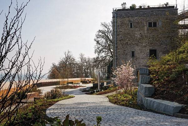
Comturey-Keller green roof. Image courtesy of ZinCo


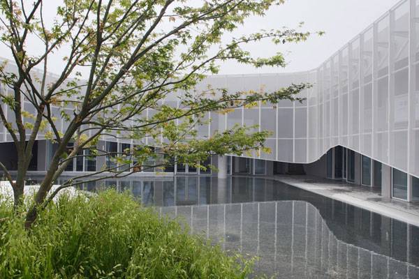
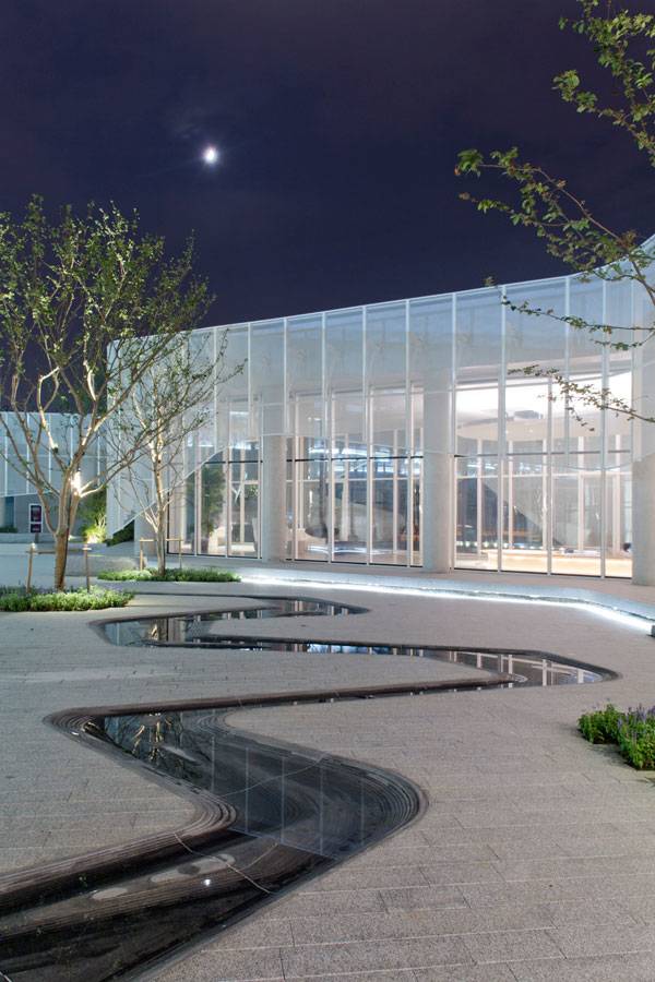
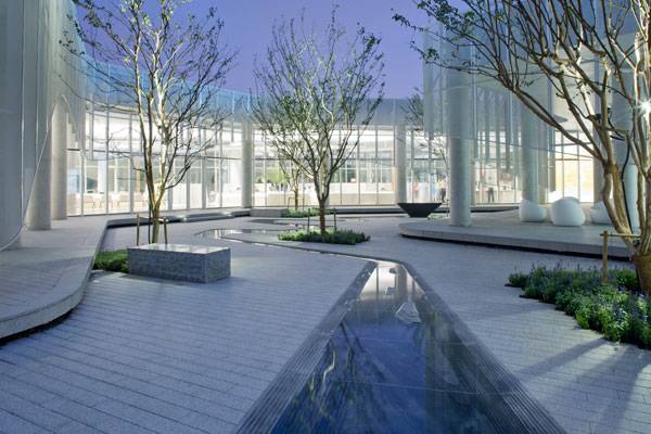
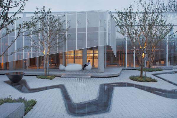
Yueyuan Courtyard | How Classical Chinese Design Adapts to the Modern Age
Article by Alexis Alvey – Yueyuan Courtyard, designed by Z+T Studio, in Mudu, Suzhou, China Yueyuan Courtyard, designed by Z +T Studio, is a small courtyard within a new development at Mudu Village in Suzhou. Suzhou is a historic city in eastern China that sits between the Yangtze River to the north and Taihu Lake to the south. It is known for its exemplary collection of classical Chinese gardens. These gardens date from the 11th to the 19th centuries; nine of them are listed on the UNESCO World Heritage List. The classical Suzhou Gardens are meticulously designed and reflect the central importance of natural beauty in traditional Chinese culture. These private gardens were originally inspired by royal hunting gardens and are limited to the physical space within a private residence.
Yueyuan Courtyard. Photo Credit: Jialin Zheng
Yueyuan Courtyard
In Yueyuan Courtyard, Z+T Studio successfully blends traditional Chinese aesthetics with a modern functional approach, utilizing water as the central design element. Like the classical Suzhou Gardens, Yueyuan Courtyard artfully simulates nature within an urban living environment and creates a microcosm of the natural world by integrating water, architecture, stone, and vegetation.
The Promenade
Before entering the interior space of Yueyuan Courtyard, one is presented with a wide, plaza-like promenade that leads patrons to the Sales Center of Mudu Village. The promenade provides a larger-scale introduction to what one will experience within the courtyard.
Yueyuan Courtyard. Photo Credit: Jialin Zheng
Yueyuan Courtyard. Photo Credit: Jialin Zheng
The Courtyard
Once inside the center, one can see the courtyard through large glass panels. The courtyard is designed to be viewed from all angles of the surrounding structures, which also include the clubhouse, restaurant, and commercial area. Being able to look out the glass and see the courtyard’s water features would surely have a calming effect on individuals inside the structures.
Yueyuan Courtyard. Photo Credit: Jialin Zheng
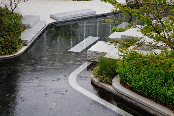
The Lake Garden
The courtyard was conceptually divided into a Lake Garden and a Creek Garden. A large reflecting pool dominates the Lake Garden, where both greenscape and building are reflected in the lake. One portion of the pool has terraced plantings, reminiscent of how one would find plants in nature growing along a riverbank. Square block stepping stones enable visitors to have contact with the reflecting pool. The Lake Garden alludes to Taihu Lake, a large freshwater lake that borders Suzhou on the southwestern side, which at one time was an important source of Taihu stone, a porous limestone commonly used in classical Chinese gardens as a viewing or scholars’ stone.
Yueyuan Courtyard. Photo Credit: Jialin Zheng
The Creek Garden
The other portion of the courtyard is the Creek Garden, which has a serpentine water feature running through it. The “creek” begins at a raised large stone basin, where a tranquil and meditative atmosphere is fostered as the sound of water drips into the dark granite creek and eventually flows into the reflecting pool.
Yueyuan Courtyard. Photo Credit: Jialin Zheng
Yueyuan Courtyard. Photo Credit: Jialin Zheng
Yueyuan Courtyard. Photo Credit: Jialin Zheng
Materials and Plant Palettes
The monochromatic materials palette ranges from white to dark gray, providing a sophisticated and decidedly contemporary feel. It also helps integrate the courtyard with the white-and-glass surrounding structure and allows the eye to discern other differences, such as texture. The plant palette complements the materials palette and is also understated. It also focuses on texture, as evidenced by the twisted naked branches of the trees in wintertime and the coarse-textured groundcovers. Small purple upright blooms from what appears to be perennial sage (Salvia spp.) bring in a bit of understated color throughout the summer months.
Yueyuan Courtyard. Photo Credit: Jialin Zheng
Yueyuan Courtyard. Photo Credit: Jialin Zheng
Full Project Credits For Yueyuan Courtyard:
Project: Yueyuan Courtyard Location: Mudu, Suzhou, China Size: 980 square meters Year Completed: 2016 Client: Suhang Real Estate Inc. Lead Designers: Z+T Studio — Dong Zhang & Ziying Tang Landscape Designers: Qiang Du, Yanjie Fan, Peixun Lin, Jialin Zheng, Hongchao Liu Architects: BIAD-BOA Recommended Reading:
- Becoming an Urban Planner: A Guide to Careers in Planning and Urban Design by Michael Bayer
- Sustainable Urbanism: Urban Design With Nature by Douglas Farrs
- eBooks by Landscape Architects Network

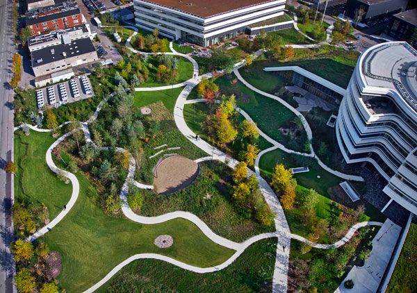
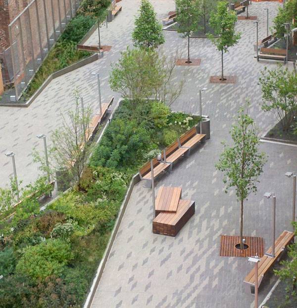
Company Profile: James Corner Field Operations
Landscape Architects Network Features a company profile of James Corner Field Operations. James Corner Field Operations is a leading-edge landscape architecture and urban design firm based in New York City that describes themselves on their website as ‘committed to the innovative design of public spaces’. One of the company’s most famous projects is the High Line in New York, which was designed in cooperation with architects Diller, Scofidio + Renfro and planting designer Piet Oudolf, and which has become a major tourist and residents’ attraction since its opening in June 2009 (Section 1 was opened in 2009; section 2 followed in June 2011, and the 3rd and northernmost section was finalised in September of 2014). The High Line is a 1.5-mile-long public park built on unused elevated rail tracks; it has become so successful that it now pulls in over six million visitors every year.
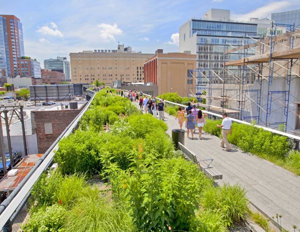
The Highline is a great example of a planting scheme increasing biodiversity in an urban area; credit: shutterstock.com
James Corner Field Operations
The company was founded by the Briton James Corner, who studied landscape architecture in Manchester and Pennsylvania in the 1980s. He has always combined his professional practice with intense teaching and writing, and a focus on post-industrial landscapes. James Corner was chair of the Department of Landscape Architecture and Urbanism at the University of Pennsylvania School of Design from 2000-2012, and is currently a professor emeritus in the department. James Corner’s work has been recognised – among many others – with the National Design Award in 2010, the Architecture Award from the American Academy of Arts and Letters in 2004, and the D&AD Black Pencil Award for the High Line in 2010.

Philadelphia Navy Yards – Central Green. Credit: © Halkin Mason Photography
One of the Capability Browns of Today
Corner’s work is renowned for innovative and bold contemporary design, with a special interest in designing a vibrant and dynamic public realm in cities. His designs bring back the open spaces of the natural wild into public realms – with a rough, natural, and ecologically-sound approach. “There is always a danger that landscape architecture can actually kill a place, through the deployment of clichéd design moves. The design of the High Line was very much inspired by what we first encountered there – the wildness.”; Corner. In an article published in the UK’s ‚‘The Telegraph’ in April 2016, James Corner has been compared to Lancelot ‚‘Capability’ Brown, one of the great English 18th-century landscape architects. The Brownian mindset was to enhance or alter the identity of large areas of land, rather than just decorate what is already there. In James Corner’s 21st-century projects, this would translate into renovating and regenerating existing infrastructure such as ex-docklands, derelict buildings, neglected riverfronts and decayed city centres. Integrating water into the design is also one of James Corner’s specialisms, similar to Brown’s.
Dock Street Roof Terrace, by James Corner Field Operations
Cross-disciplinary Approach
Field Operations is at the forefront of the Landscape Urbanism movement, an interdisciplinary approach that combines a wide range of disciplines including landscape architecture, urban design, landscape ecology, and engineering. Corner argues that it is an approach that focuses on process rather than a style. James Corner Field Operations also likes bringing in experts from various fields, such as artists and photographers. This cross-disciplinary approach led to one of his most celebrated books, ‘Taking Measures Across the American Landscape’, in which he and aerial photographer Alex MacLean explore the American landscape from a design perspective. His team comprises over 50 professionals.
Dock Street Roof Terrace, by James Corner Field Operations
© James Corner Field Operations
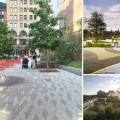
- South Park Plaza at the Queen Elizabeth Olympic Park, London
- Shelby’s Farm Park, Memphis, Tennessee
- Tongva Park, Santa Monica
- Navy Pier, Chicago
- Public Square, Cleveland
- Race Street Pier, Philadelphia
- Salisbury Gardens, Hong Kong
- Presidio New Parklands, San Francisco
- False Creek, Vancouver
Here is a short list of awards Field Operations has won (the full list can be found on fieldopertions.com):
- ASLA NY Award, The Underline Miami, Honor Award, 2016
- APA National Planning Achievement Award: Tongva Park and Ken Genser Square, 2015
- ASLA NY Award, High Line at the Rail Yards, Honor Award, 2015
- Los Angeles Architectural Award, Landscape Architecture: Public Open Space category, Tongva Park and Ken Genser Square, 2014
- National Design Award, 2010
- D&AD Black Pencil Award, High Line, 2010
- Time Magazine “Ten Most Influential Designers,” 2007
- American Academy of Arts and Letters, Award in Architecture, 2004
- Daimler-Chrysler Design Award for Innovation in Design, 2000
Want to learn more about James Corner Field Operations?
Have you been inspired by Field Operations’ innovative designs? Check out their website at http://www.fieldoperations.net/ for more information. It also features James Corner’s various publications, including a book about the High Line. Direct Information for James Corner Field Operations: Company Name: James Corner Field Operations Founder & CEO: James Corner Senior Principals: Lisa Tziona Switkin, Richard Kennedy Year of Foundation: 1998 Address (main office): 475 10th avenue, 9th fl, New York, NY 10018 Global offices: San Francisco, London, Shenzhen Website: http://www.fieldoperations.net/ E-mail Contact: info[at]fieldoperations.net Social Networks: Instagram, Twitter, LinkedIn
Related Articles Featuring James Corner Field Operations:
- Roof Terrace Offers Some Of The Most Breathtaking Views Of Manhattan
- The Navy Yard Central Green Shows us How to Achieve Healthier, Happier and More Industrious Workers
- How Frank Gehry’s Controversial Building Impacted the Landscape
If you would like to get your landscape architecture office profiled on Landscape Architects Network, contact us at office@landarchs.com Profile composed by Andrea Kreuer

Defining the Modern Era Of Green Homes
In this article, we discuss the concept of green homes and how they are infiltrating the modern era. Various campaigns to use environmentally friendly items have led to creative innovations in landscaping and home design. There is now a sense of distinction to homes that are reducing their carbon footprint without losing their aesthetic appeal. Solar panels, rainwater collecting system, environmentally friendly landscaping are few of the features that are defining the modern era green home design. Not only are they appealing, but pretty cost effective as well. Envelope
Modern Era Of Green Homes
The building envelope is one of the initial features. The idea is that all regions of the home should be insulated in some manner. This is applicable on porches, roofs, windows among other areas. Enveloping provides covered porches, roof overhangs, spray foam insulation and cross ventilation. The National Renewable Energy Labs (NREL) in U.S. reveals that such basic measures can cause more than 30% reduction in energy usage.
The ‘green’ case of Texas
Minimalist home designs equipped with green innovation are becoming a norm in many states, especially Texas. One stimulus for this has been the deregulation of energy providers which has led people to choose the right company for them. The deregulation of the energy industry has given birth to a competitive market with respect to rates and eco-friendly solutions. Homeowners can now refer to comparison websites to make a decision between providers. For homeowners in places like Corpus Christi, the power to choose their provider means they can save on energy rates and also help to save the planet by choosing providers that use more efficient ways of producing power. This trend is spreading to other states as well.
Rainwater Harvesting System
While a rainwater harvesting system can’t be regarded as an innovation, it’s now a common sight in green homes. Modern systems need minimal maintenance and allow residents to make use of nature’s supply of water. An extension of this idea is the aerobic septic system which is basically a treatment setup for the home. Wastewater from the home is sent to the septic system and can be used for the sprinkler system in the yard or related usage. In this way, your average water consumption can be reduced by half every year. A rainwater garden is also an eco-friendly option that provides special plants with the water they need to grow. They, in turn, provide benefits to the soil as well as birds and insects.
Indoor Air Maintenance
After the enveloping has been done, maintaining the air quality inside the home is a necessity. Homeowners going green are now using an Energy Recovery Ventilator system that’s able to manage the task without a hassle. The benefits are two tiers. You can change the air in your home about 2 to 3 times a day. Secondly, the risk of molds, dust and allergens sustaining in your house is reduced.
Home Design
Keeping the general green home trend in Texas as standard, certain features can be defined. Using these standard options, homeowners can convert their homes into green housing facility which provides aesthetic appeal without burdening the environment. Many such homes can found towards the lakeside of Lake Buchanan in Texas.
Grid Tied Solar
As mentioned earlier, states with deregulated energy markets are offering their residents the choice to choose from different energy providers. So, the grid tied solar is the electricity being generated by the home using solar that’s controlled by the local utility company. Such systems are becoming a norm because if more electricity is produced than needed, it can either be saved or sold back to the energy provider. Based upon the facilities that different homes are using, it is possible to classify them into following: 1. 1. Energy efficient homes 2. 2. Net zero energy homes 3. 3. Positive energy homes 4. 4. Point source homes Out of these, the point source homes are of great interest because they have the maximum amount of self-sustenance and produce surplus power. The National Association of Home Builders, as well as initiatives like the Green Building Program, are verifying homes that have some sort of sustainable component. Using these models, it’s possible to modify your home into something of value along with increasing its aesthetic appeal. Recommended Reading:
- Becoming an Urban Planner: A Guide to Careers in Planning and Urban Design by Michael Bayer
- Sustainable Urbanism: Urban Design With Nature by Douglas Farrs
Article by Brooklyn Williams Featured image for Green Homes article: By Jeff Kubina from the milky way galaxy – Solar Decathlon 2007, CC BY-SA 2.0
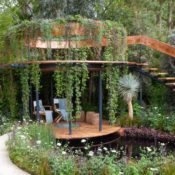

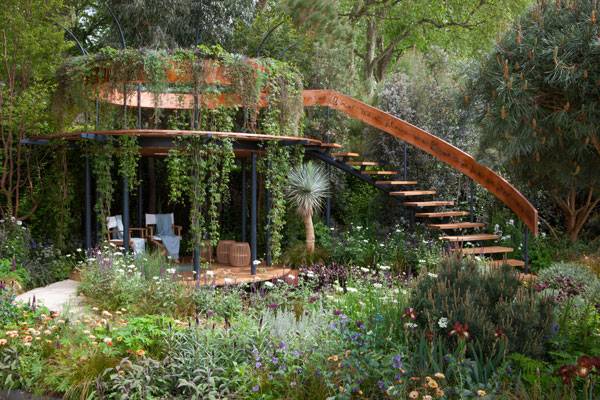
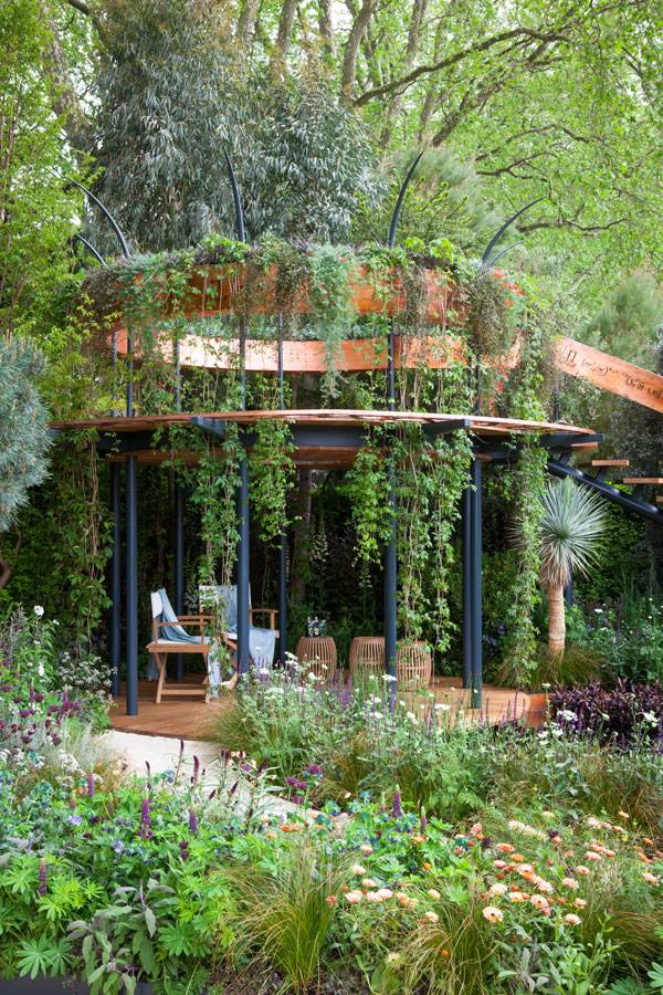
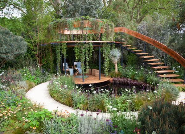
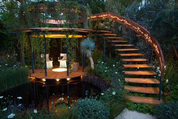
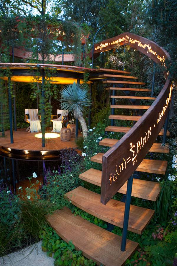
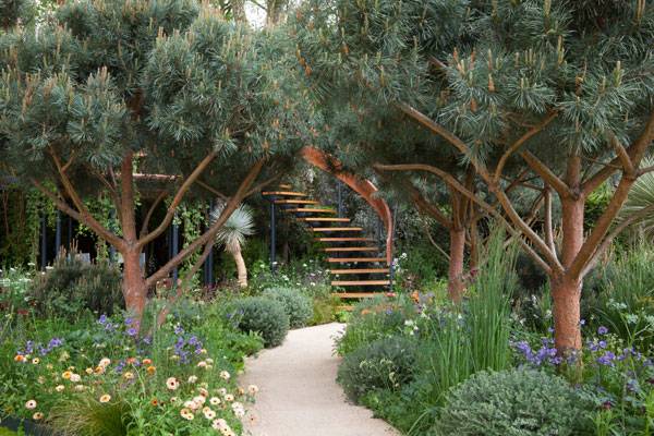
Mathematics Garden | Design Shows us The Beauty of Numbers
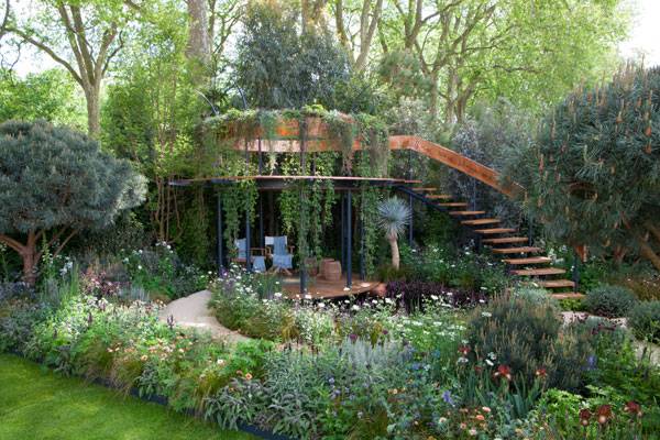
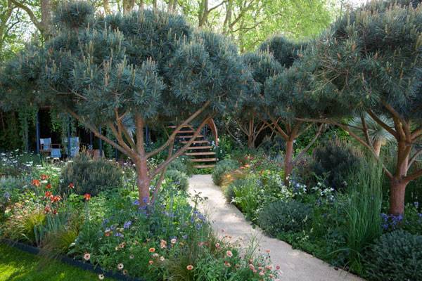
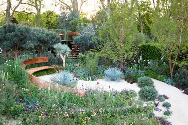
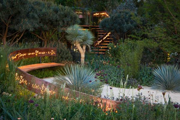
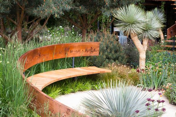
Article by Maria Giovanna Drago – The Winton Beauty of Mathematics Garden, by Nick Bailey, Chelsea, London, UK. The Winton Beauty of Mathematics Garden was a project by horticulturist Nick Bailey that was exhibited at the Chelsea Flower Show in 2016. It had a great success among the audience and judges for developing a side of nature that not everyone knows and that is certainly unexpected. There’s still so much talk about its main purpose: to show that nature is based on numbers. Not everyone knows that there are mathematical rules behind the number of petals on a flower or the arrangement of leaves on a plant. Bailey showed this dualism in a refined way, including signs and numbers easily recognizable, even by children.
The Winton Beauty of Mathematics Garden, Photo courtesy of Nick Bailey
The Chelsea Flower Show
The Chelsea Flower Show has been held each year since 1912 on the 11 acres of land of the Royal Hospital Chelsea in Chelsea, London. It’s also known as the Great Spring Show, and it hosts an exposition of landscape gardens for five days. It attracts about 150,000 visitors from all over the world and is considered one of the most beautiful garden shows in the entire world. It is so popular that tickets must be purchased in advance because of limited capacity. The exhibition has become the ideal place to discover new gardening trends. Here, new plants are promoted and old ones can be admired in all their beauty.
The Winton Beauty of Mathematics Garden, Photo courtesy of Nick Bailey
The Mathematics Garden
The Winton Beauty of Mathematics Garden, which was awarded one of eight silver gilt, was rectangular in shape and organized around a path that enveloped the symbol of infinity. It enclosed a first circle of greenery; a second circle was open, as the path split into two endings. One ending reached the short side of the rectangle and the other the adjacent long side. Visitors could access the garden from both ends. The garden rose from a base made of fine white earth, which was most visible in the corner between the two entrances where vegetation was sparse. As you ventured into the garden, the vegetation began to thicken and the white disappeared completely. Also, the routes stood out in their whiteness, as did the first circular space that you encountered as you entered.
The Winton Beauty of Mathematics Garden, Photo courtesy of Nick Bailey
The Winton Beauty of Mathematics Garden, Photo courtesy of Nick Bailey
The Winton Beauty of Mathematics Garden, Photo courtesy of Nick Bailey
Why Mathematics?
Who among us does not get along with math? I suppose many of us feel that way. That is why the garden was such a huge success — it let people discover that math is beautiful in unexpected ways. “I’m terrible at maths,” Bailey admitted. Who would have ever imagined that natural beauty is based on mathematical rules? No one knows why, but plants grow and develop following precise mathematical laws. For example, the seeds of the sunflower head are arranged to form spirals according to the sequence 1, 1, 2, 3, 5, 8, 13 — which is known as the “Fibonacci numbers”.
The Winton Beauty of Mathematics Garden, Photo courtesy of Nick Bailey
The Winton Beauty of Mathematics Garden, Photo courtesy of Nick Bailey
The Winton Beauty of Mathematics Garden, Photo courtesy of Nick Bailey
The Winton Beauty of Mathematics Garden, Photo courtesy of Nick Bailey
The Designer
Bailey is head gardener at the Chelsea Physic Garden, the oldest botanical garden of England, which covers four acres and contains about 5,000 plants. He is also a freelance garden writer and has 20 years of horticulturalist experience. He had visited the Chelsea Flower Show for the last 20 years, and finally had the opportunity to design a garden rather than just admiring them as a visitor. The Gardenlink service helped him realize the Mathematics Garden project, which took 14 months to complete. The multiple award-winning garden service has a team of 15 planter specialists, including three master gardeners from Japan.
The Winton Beauty of Mathematics Garden, Photo courtesy of Nick Bailey
The Winton Beauty of Mathematics Garden, Photo courtesy of Nick Bailey
Full Project Credits For The Winton Beauty of Mathematics Garden:
Project Title: The Winton Beauty of Mathematics Garden Landscape Architecture: Nick Bailey Location: Chelsea, London, UK Client: The Chelsea Flower Show Scope: Gardening exhibition Completion: 2016 Recommended Reading:
- Becoming an Urban Planner: A Guide to Careers in Planning and Urban Design by Michael Bayer
- Sustainable Urbanism: Urban Design With Nature by Douglas Farrs
- eBooks by Landscape Architects Network


Grove Grand Bay | Is This a Perfect Blend of Nature and Urbanism?
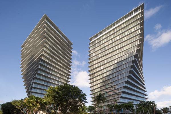
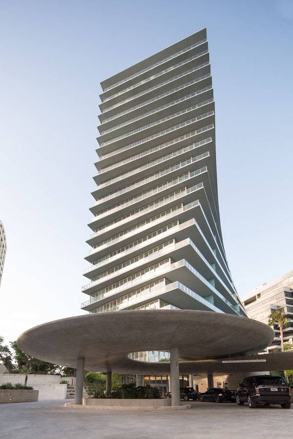
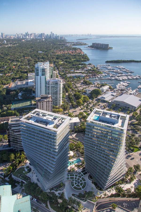
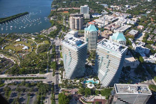
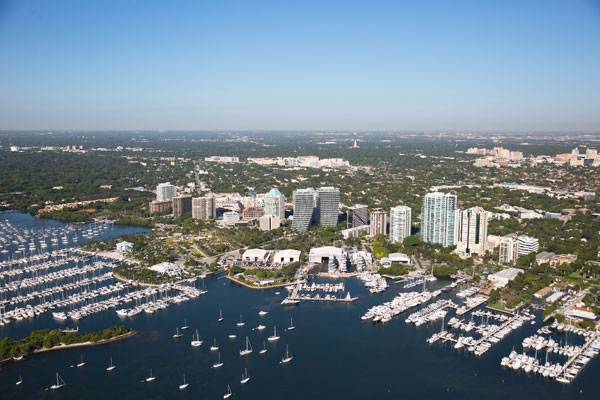
Article by Niriti Porwal – A Review of Grove Grand Bay, by Raymond Jungles Inc., Coconut Grove, Miami, Florida. The Grove at Grand Bay is a distinctive and luxurious residential project, featuring two twisting towers with a 360-degree view of Biscayne Bay. It is also the first LEED Gold-certified building in Dade County. This blending of sustainability and luxury brings a unique balance and paves the way for an ecologically sensitive approach to design. The low-density project of 98 units in two 20-story glass towers combines the remarkable architecture of the twisting towers with a contextually rich landscape. Raymond Jungles’ landscape design wraps around the towers in an unusual way. The design inspiration was drawn from the surroundings of Coconut Grove, which has a rich cultural history, a sense of community, a lush tropical landscape, and an unparalleled view of Biscayne Bay.
Grove Grand Bay. Photo credit: Robin Hill
Grove Grand Bay
The design process for the three-acre landscape took form through three major considerations
1. The Ingles-Jungles Duo
First, the landscape was designed in a way that complements the architecture and turns the project into a unified piece of art by architect Big-Bjarke Ingles Group and landscape architect Raymond Jungles Inc. The landscape layout represents a strong, curvilinear design language that seamlessly separates the hardscape from the soft landscape. Design components such as the seating, pathways, and terraces were planned on either side of the curve to give a view of the planting alongside. The design also provides an opportunity for spontaneous human interaction. The spaces were designed keeping people of all age groups in consideration. Within the flowing forms, programmatic elements have been introduced, including shade gardens, secluded areas, water gardens, and communal gardens to please people with varied interests.
Grove Grand Bay. Photo credit: Robin Hill
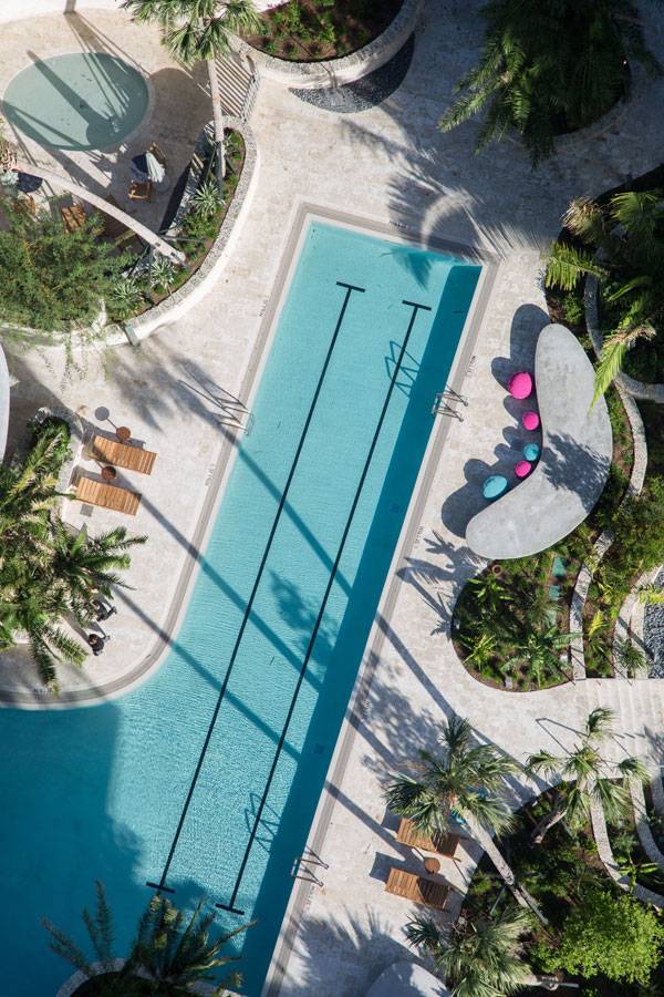
2. Re-Groving the Groves
The second consideration was to make Grove Grand Bay look indigenous. Tropical plants common to Coconut Grove were chosen for the site. The palette features about 470 trees and 15,400 native plantings, including aquatic vegetation for the water garden. The involvement of Jungles as a landscape architect from the very beginning helped in saving many of the old original trees on the site. The trees were moved during the construction period, then replanted once the work was complete. Sustainability was also kept in mind in choosing materials for the hardscape. To reduce the carbon footprint and prevent long-distance transportation, local stone inherent to the area was chosen for feature walls and water bodies. The hardscape element along the planting palette was wisely planned to create tropically rich visual corridors for pedestrians and provide opportunity for design interaction.
Grove Grand Bay. Photo credit: Robin Hill
Grove Grand Bay. Photo credit: Robin Hill
3. The People’s Place
The third important consideration in designing Grove Grand Bay was the definitive comfort of its residents and guests. While being loyal to the site’s context, Jungles made sure residents would have the most luxurious experience when traveling through the landscape. A butterfly ribbon-shaped canopy — called a porte-cochere – was installed at the entrance to welcome visitors and serve as a covered walkway. The canopy connects the two towers. Greenery on the roof of the porte-cochere is intended to spill over the sides as it matures, giving a feeling of a green frame.
Grove Grand Bay. Photo credit: Robin Hill
Grove Grand Bay. Photo credit: Robin Hill
A Practical Dream
Bjarke Ingels says, “What architects should do is to make the world a little bit more like our dreams, in a very practical way.” And when one experiences this unique blend of urbanism and nature as a part of everyday life, it certainly makes the experience of living at the site one of extraordinary quality. Raymond Jungles has provided the most tangible outcome of his goals for its design. What do you think? How can we derive goals for our site and stand by them?
Grove Grand Bay. Photo credit: Robin Hill
Full Project Credits For the Grove Grand Bay:
Project: Grove Grand Bay Client: Terra Group Design: Big-Bjarke Ingles Group Landscape Architect: Raymond Jungles Inc. Associate Architect: Nichols Brosch Wrust Wolfe &Associates Inc. Collaborators: Mónica Muñóz González, Adriana Herrada León Year of Completion: 2016 Consultants: HNGS Engineers, De Simmone Consulting Engineers, ESRAWE Photos: Robin Hill Location: Miami, Florida, USA Recommended Reading:
- Becoming an Urban Planner: A Guide to Careers in Planning and Urban Design by Michael Bayer
- Sustainable Urbanism: Urban Design With Nature by Douglas Farrs
- eBooks by Landscape Architects Network