Author: Land8: Landscape Architects Network
Top 10 Squares to Watch Out For
s we’ve all seen recently, public space is a fragile thing. Attempts can be made to destroy it, but as people realize what they take for granted is about to disappear, they react. People reclaim a space. Landscape architects should understand the value of public space and what it can give to a city, its people and future generations. Public spaces, squares and plazas have the power to initiate a city and its community into a renaissance. Here are “10 Squares to Watch Out For” projects that aim to do just that in the next few years. 10. Southern Concourse, Kings Cross Station, London, UK by Stanton Williams
A stone’s throw from Granary Square by Townshend landscape architects and part of the beautiful latticing of the new concourse by John McAslan and Partners, the Southern Concourse is the final piece in the puzzle of a complete overhaul of the Kings Cross area of London. Work is due to be finished this autumn.
9. Jaarbeursplein, Utrecht, by OKRA
One of the touted clever elements in the Jaarbeursplein is the relationship between open, square space and the built form – supposedly allowing for a pedestrian orientated experience.
8. City Gardens, Aberdeen, Scotland
A team headed by Diller Scofido + Renfro (in conjunction with Keppie Design and OLIN) won the competition and the support of Aberdonians to build the Granite Web. Then disaster struck. Rejected as not being financially viable, funds are instead being concentrated on developing pedestrian connectivity throughout the city. It will be interesting to see what happens here, and whether the project will be regarded as a missed opportunity or a red herring in the rejuvenation of Union Terrace Gardens and Aberdeen itself.
7. Public Square, Cleveland, Ohio, US by James Corner Field Operations
An updated proposal for Cleveland’s notoriously banal square has been released by Field Operations. The plan aims to weave the four small squares into one large square-park with grassy hills and trees a-plenty. If this project gets off the ground the green infrastructure will run past the park’s perimeters truly reinvigorating downtown Cleveland.
6. Green Square Town Centre, Sydney, Australia by Stewart Hollenstein and Colin Stewart Architects
The exciting images of this proposal convey liveliness and vivacity – but most importantly, the space has been thought about functionally, in terms of how it would be used as a festival space but also during everyday peak hours. The plaza has submerged functional spaces to create more room in an area which as plenty of high-density residential towers.
5. National Mall and Union Square, Gustafson Guthrie Nichol and Davis Brody Bond This is a monumental landscape with incredible resonance. If the project successfully maintains its connection to the individual and retains the history of the site, it will be an awe-inspiring experience for the visitor. 4. Casablanca Sustainable Market Square, Morocco, by TomDavid Architecten The mushroom-like canopy structures will collect rainwater, which filters into a system that flushes toilets around the square and cleans the floor of the market, whilst offering shade for the sellers. The elevated plaza provides infrastructure for both the legal and illegal markets both of which, say the practice, are vital to Morocco’s economy. 3. Rethink Athens, Athens, Greece by OKRA This project intertwines a green and blue strategy for the capital of Athens, as well reducing vehicular traffic to instigate change throughout the whole city. Considering the problems that have rocked Greece’s economy, will the design rise to the challenge and help the world rethink Athens? 2. Cadillac Square, Detroit by PPS
Well, actually just Detroit. The city made the headlines this month as it filed for bankruptcy. Yet, all eyes should be on Detroit as the potential there is huge. Project for Public Spaces has worked with Detroit for many years and the most recent project is Cadillac Square. One can only hope it continues to go ahead as the city struggles.
1. South Plaza, Queen Elizabeth Olympic Park, London, UK by James Corner Field Operations
Let us not forget that some of the major design considerations for an Olympic park are when they enter ‘legacy mode’. Alongside this, the fact that the designer for the new South Plaza is James Corner of High Line fame, means that the space will be one of the most eagerly anticipated projects of the coming years. Mix this with Corner’s dreams of a carousel, tree lined boulevards, picnic areas and climbing walls and you have the number one public plaza to watch.
Still, as with the good, so often comes the bad. Only the time will tell if these projects are actually successful – though all seem to be promising. A public space can indeed rejuvenate a community, but a public space can also be hollow and void if it does not engage with its purpose. Next in the series are ten projects that are, shall we say, a bit lacklustre – next up will be The Top Ten Square Fails.
Article by Sonia Jackett.
Top 10 Imaginative Squares
So far, LAN has presented the Top 10 squares of the world in a more traditional sense and the Top 10 modern squares in the form of urban plazas. In many ways, these are the most famous of their typology. Here, as we continue LAN’s Top 10 squares series, we give you a few that challenge the notion of what a public square can be.
City squares are places for people: They are places to sit and reflect, to move through, to be entertained in; and they are places for people to ingratiate themselves into their environment. These spaces should inspire and invigorate people. Here are 10 squares that do just that.
10 Parade Ground, University of the Arts, London by Planet Earth
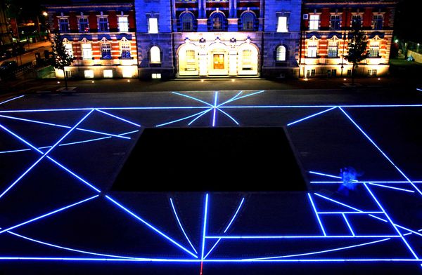
This square was transformed into a gallery without walls in 2008. Planet Earth was respectful of the need for the design to be quite low key, so as not to detract from future exhibitions in the parade ground, yet the geometric grid of steel lines and lights is a subtle artistry during the day and creatively playful at night. See our full review of the Parade Ground.
9. Plaza Euskadi, Bilbao, Spain by Balmori Associates
The organic forms of this plaza are somewhat reminiscent of a river, offering a soothing place to walk and relax in the middle of a busy junction. The three “pockets” are also peculiar in shape, and recycled rubber in bright colors is used in the seating, again creating a fun, thriving experience. See it here.
8. Iidabashi Plano, Tokyo, Japan by EARTHSCAPE
While it is a relatively small intervention, the “Time Tree” between residences at Fujimi Chiyoda-ku is large in impact. Through engraved words and images on the surface around the camphor tree, the project portrays the important history of the area through three timelines: the history of the area, the history of Tokyo, and the history of man’s relationship with the local nature. 7. The Peninsula at Burswood, Perth, Australia by HASSELLThe main plaza for the development here is part of an integral chain of five spaces that connect Perth’s Swan River to the center of the community. The unique form — from lighting to benches — and the vibrantly colored in-situ surfaces make the central plaza an absolute joy to live around.
The geometric forms of this square represent a strong element of unity and identity within the project. Throughout the layout, spatial tensions are defined and new ones created, resulting in a wonderful interlocking of green, blue, and hard landscape.
5. Urban Spaces in Torre Pacheco, Spain by Martín Lejarraga Architecture
Similar to the Superkilen project in Copenhagen, architect Martín Lejarraga has reinterpreted the notion of a public square and park. By using a U-shaped library, the existing topography has been transformed in order to make way for a series of innovative spaces, from flora gardens to an outdoor reading room. See it here.
4. Marsupial Bridge and Urban Plaza, Milwaukee, Wisconsin, USA by La Dallman
This little gem is included here because it challenges us all to think about what a “public square” can be. La Dallman converted an unsafe area into a civic space for festivals and celebration. As part of that, they created an urban plaza underneath a bridge, which is simple and refined. The lighting underneath the benches transforms the site into a beacon for the local neighborhood. See it here.
3. GENK C-m!ne, Genk, Belgium by HOSPER
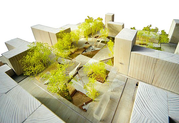
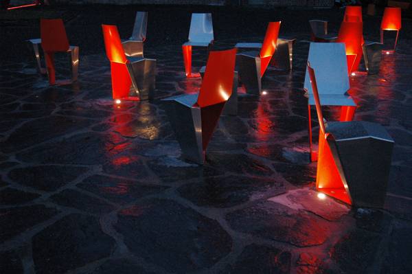
It even comes with a rather imaginative name! Situated on a former coal-mining site, the black-slated surface refers to the “black gold” history of the mines while the two old mine shafts are illuminated at night, creating an awe-inspiring spectacle. Removable seating is coated a provoking fire-engine red. The whole picture screams excitement and imagination. 2. Grand Canal Square, Dublin, Ireland by Martha Schwartz Partners Schwartz has re-imagined this area along the lines of a red carpet – and all the glitter and glamor that goes with it. With lighting provided by Woodhouse and the pier jutting out into the water, the project exudes energy and dynamism. Visitors are connected to the urban installation as some of the columns illuminate according to pedestrian activity, which is registered via radar sensing. See our full review of the Grand Canal Dock. 1. Emblematic Monument, Puebla, Mexico by Enrique Norten and TEN ArquitectosThe undulating form of this square makes it a vivid experience and one that surely sparks the imagination. The timber forms create an experience of hills, from which timber benches and trees grow. A café, playroom, and gallery are all beneath the square. The team sought to challenge the idea of a monument, instead thinking that a monument should be used by the city and its people as a public place. From atop the monument/square, views of the city below can be seen, creating a dialogue among inhabitant, user, form, landscape, and city. See it here.
So which squares inspire your imagination? Did you like them all, or could they have been better – maybe even more colorful, less colorful, different shapes or levels, or perhaps they could have used more trees? Which leads us on to the next installment … LAN’s Top 10 Green Squares!
Article written by Sonia Jackett.
Lighting Solutions – World’s tiniest recessed LED luminaire – 1PUCK LP by MINIMIS
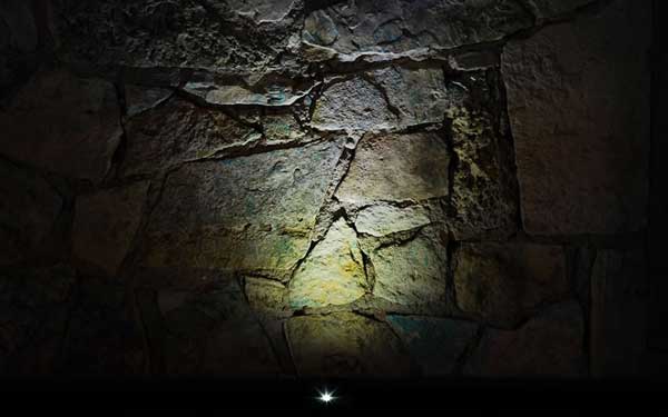
Austin-based MINIMIS amazed us with their outdoor lighting – which they claim to be ‘the world’s smallest’. 1PUCK LP is a tiny-aperture recessed LED indoor/outdoor luminaire for installation in to walls, floors, decks, soffits, and ceilings of wood or any drillable material. Fixture diameter is the size of an American half-dollar. Powered by standard, readily-available 12 volt DC (constant voltage), 1PUCK LP consumes only 1 watt, yet has a powerful 12-14-foot beam throw. The fixture is made of marine-grade aluminium, suitable for installation anywhere including beachside or yachting projects.
We can see from the minimalist, functional design – not too modern or too traditional – that 1PUCK LP would dramatically reduce the fixture selection process with clients. For a more indepth description about 1PUCK LP click here1PUCK LP was designed to run on low-cost 12-volt DC constant voltage power. No confusing LED drivers required. They can even operate on electronic waste, such as discarded cellphone chargers and old laptop power bricks.Discover more at MINIMIS www.MINIM.IS and www.TinyLED.net
Product reviewed by Scott Renwick
e-architect Guided Architecture Walking Tours – All Around The World
e-architect have been doing guided architecture walking tours since 2000, in cities such as Edinburgh, London and Copenhagen.
They have architectural tour guides in most major cities across the world. The latest addition is Palermo (their 55th city) and next up is the central American country of Guatemala, bringing a more offbeat option for more adventurous travellers. The most popular tours are London, Barcelona and Istanbul. Although the typical tours are architectural e-architect have provided tours for many groups of landscape architects over the years. They have quite a few landscape architect guides on their books and most cities have more than one guide to try to accommodate different languages, for example in London there are guides who can speak Spanish, Portuguese, French and German.
Tours can focus on traditional or contemporary landscape architecture, for example our Barcelona tours can examine the historic public spaces of the Barri Gothic or the newer public realm from the Barcelona Olympics period. e-architect can work on a tour itinerary and programme to suit your needs. Tours are typically by foot but sometimes by bicycle, bus or metro. e-architect is run by Adrian Welch and Isabelle Lomholt who both trained as architects. e-architect : architecture tours Composed by LAN admin.Sketchy Saturday Top 10 – No. 003
LAN returns with a new edition in the Top Ten Sketches series. Every time we seek to select the most imaginative and crafty work by our readers. So check out our new edition! 10. by Simon Bussiere
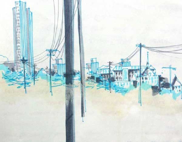
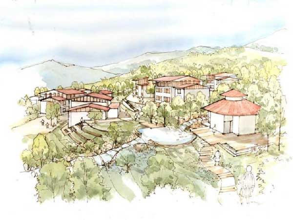
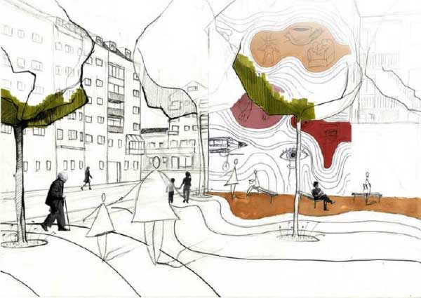
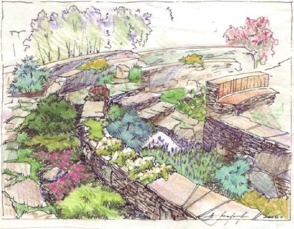
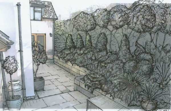
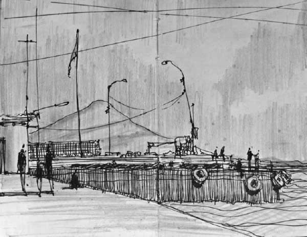
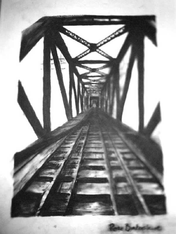
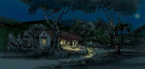
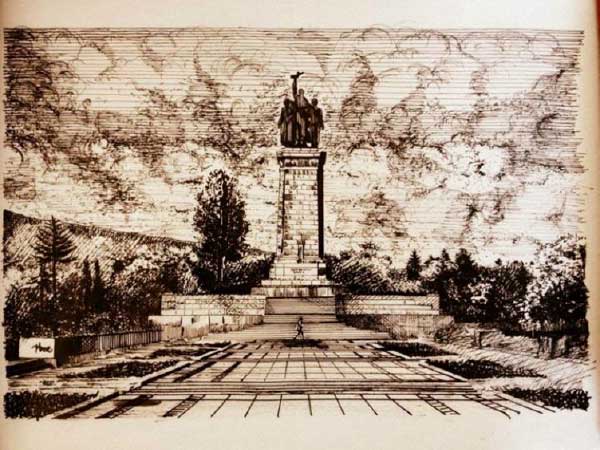
This is a view from the train station in Albany, NY. A 10 minute sketch, it started with a nice grease spot from a pepperoni that fell off a slice of pizza I was consuming! The sketchbook page was tilted slightly and the meat slid a few centimetres across the page, starting the light brown streak in the centre of the sketch. I ate the pepperoni and proceeded with my cyan Le Pen to outline the city horizon, then used a light grey, dark grey, and cyan Tombo marker to add some tonal value. 9. by Mahafuj Ali The sketch was an impression of a proposed school hostel in Bhutan. It was designed in a way which should not overpower nature, but blend in with its surroundings. 8. by Martin Vysoký This sketch is the output from an experimental course I participated in. Design is truly conceptual. It’s a way to create identity for local people who inhabit that area (in this case a courtyard) through participation in public art before anything is built and finalized. The sketches were later implemented into the final design. 7. by Morozova Lada I wanted to design a very special zone for relaxing. It looks like ancient amphitheatre ruins. Oak sits on stone benches, surrounded by pine-trees, junipers and flowers giving a romantic feel. By day one could sun bathe and children could draw scenic sketches. In the evening built-in lights are switched on and you could chat with friends, drink good wine, and eat grilled food. The owners say that it is their favorite place! 6. by Dan Willis This sketch was part of design work for a house and its gardens in rural Cheshire, England. For this particular area the owners wanted a Mediterranean style planted border with hints of native English species; the hard landscaping features reclaimed materials and natural stone. The drawing was created using a range of inks to add color and varying line weights. 5. by Simon Bussiere View of kids diving into Lago de Colchiboca from the docks at the volcanic island of Ometepe, Nicaragua. 4. by Rose Brokenshire Rose Brokenshire is a recent graduate of the Bachelor of Landscape Architecture, Guelph University. She is from Toronto, Ontario, Canada. This charcoal drawing is of an old train track, which was a visual component for her final thesis design to describe the under-use and neglect of the site. 3. Mahafuj Ali This sketch is an imagination of a small jungle circuit surrounding a guest house in the foothills of the Himalayas. I have never spent a night in such a place, but I dream of spending a night in solitude, with fireflies, and a full moon. I wanted to frame that dream. 2. by Yoan Zemyarski This Soviet Army Monument in Sofia is located in the central part of the city on an area of 2,000 square meters. By the end of 1989, the Soviet Army Monument is one of the most emblematic places of the city, where all kinds of celebrations occur. In recent years the monument has become a favorite place for skateboarders. On 17 June 2011 the monument became world news after one of the reliefs dedicated to World War II was painted with graffiti. Soviet soldiers were “dressed” like Superman, Captain America, the clown Ronald – a symbol of McDonald’s and Santa Claus. Underneath is written: “In keeping with the times.” From the book Forget Your Past. Monumental Monuments of Communism by Nikola Mihov. 1. by Mael Matthews This is a sketch of the Yorkshire woodland drawn using biro, marker pen, and collage techniques. The lines are made to “bleed” by spraying them with hairspray. I am a landscape architect and artist working in Yorkshire, UK. So there we have it! Another successful edition of our Top Ten Sketches. We are always looking forward to brilliant submissions from our readers and are joyful that the art of drawing and sketching has not disappeared in our day and age. Article written by Oana Anghelache Enjoy what you’ve read! Support us and pick up one of our awesome T-shirts and hoodies today, Click the link5 Steps To Stay Sharp Over The Summer Break
As landscape architecture students, the rapture upon completing a university year is something we all look forward to, and come crunch-time, can often be the shimmering light and the end of a very dark tunnel. The holiday period between each university years is a great time to kick back and relax; after all, you deserve it. But during this stage of quietude, it is also essential to continue the learning process to ensure a cognitive mindset come the new academic year. With all that spare time on your hands, here are five valuable steps to help you stay sharp over the break. 1. Read a book or three (landscape architecture related)
Reading has a myriad of positive effects, but during the semester it can often be hard to capture the edification books provide due to the laborious nature of your study load. That’s not to say you shouldn’t read while at university, but the end of year break presents a valuable period to broaden your knowledge of the discipline. Aim to read at least three books, on different subjects related to landscape architecture. These books can be contemporary, such as The Fundamentals of Landscape Architecture and Visual Communications For Landscape Architecture, or classic landscape literature by authors such as Ian McHarg. Anything that will give you the upper edge next semester. 2. Get outdoors / travel Following the confinement you frequently subject yourself to during those late nights in front of your desk, you will often emerge from the depths looking rather “Gollum-esque”. The holiday period grants you the opportunity to actually get out and experience the landscape! If you are financially able to travel abroad, then go and cultivate some worldliness and behold great landscape architecture around the globe. If not, it’s no reason to fret. Nature is everywhere, and can be easily enjoyed through bushwalks, hikes, and road trips. Even your local park will do! Getting outdoors clears and refreshes the mind, and most importantly gives you the chance to make connections between your learning and the real-world environment. 3. Boost your repertoire No matter what stage of your degree you are in, there will always be room for improvement in certain aspects of your skill set. This could be anything from free hand sketching, technical drawing, software programs, or even developing your conceptual and critical thinking. Strengthening these traits will deliver the confidence needed to tackle any project thrown at you, and will present you in an appealing light to potential employers. There are magnitudes of free tutorials online that can be taken advantage of. It’s important to note that these shouldn’t be viewed as gruelling tasks; after all, you are on holidays! Just set aside some time each week to knuckle down and boost your design repertoire. It will pay dividends in the long run. 4. Work experience With legions of landscape architecture students all competing for job placements upon completing university, simply being a graduate doesn’t cut it anymore. Experience really makes the difference, and the earlier the exposure to the office the better. Doing so will expose you to the rigor of the working environment, giving you the upper hand when entering the real-world workforce. This can be an internship or work experience, either paid or voluntary (usually the case). But don’t sell yourself short. If you possess a certain skill set (achieved from step 3!) display them in style through a creative portfolio or resume. 5. Embrace other creative disciplines Throughout the semester landscape architecture is well and truly your focus, but the holiday break allows you more time to explore other areas of design. This could be visual arts, fashion design, or architectural and interior design which interest you. These avenues should serve as inspiration and insight into all things creative, giving you the opportunity to broaden your mind and view design from another perspective, molding you into a well rounded designer. Holidays are to be savored, so these five steps are designed to be both straightforward and enjoyable. Implementing them throughout your break will provide the opportunity to better yourself as a landscape architecture student, letting you hit the ground running come class time. Article written by Paul McAtomney Featured image: Helder Almeida / shutterstock.comTop 10 Things to do with Your Summer Break!
It’s finally July, the sun is shining and school’s out for summer. For those Über-geeks, keen beans, and even those who just want to keep their hand in — here are 10 things you can do to keep yourself in good stead for the next year ahead at college or university (or just life in general!). 10. Wake Up Early Ok ok, within reason — it is your holiday after all. But do you really want to waste it in bed? Think about those few hours when the sun rises, all is quiet, before anyone else in the world is awake – a serene and brilliant thinking time. Besides it’s been widely suggested that early risers are more productive, creative, and successful. 9. Volunteer
If you haven’t managed to wangle yourself an internship this summer, why not volunteer? There are so many different companies, charities, and local government bodies that would be grateful for a bit of help in the current economic climate. There is bound to be something to suit your interests. Not only will it look good on the CV, but also it will leave you feeling rewarded and satisfied. 8. Read Read, read, and read some more. Read for a project or dissertation coming up, but also read to broaden your horizons. Browse the best magazines, browse LAN, and browse not just landscape architecture publications but others too! This is the perfect time to keep abreast of developments in politics, economics, and the wider society that are both influential to Landscape Architecture and, that in turn, may be influenced by our discipline. Check out our book reviews here 7. Sketch Enough time is spent on computer graphics during term time. With endless weeks and gorgeous summer weather present, take a sketchbook, some pencils, pens, watercolors, pastels, whatever you will, and draw whatever you see! Try quick 1-minute sketches to build up your confidence until you eventually spend longer and longer on them. And remember — practice makes perfect. Why not try out for Sketchy Saturday? Get your sketches into us and be in with a chance to get featured in our top 10 article– e-mail us at office@landarchs.com 6. Hug a tree Ever hugged a tree? If yes, then you’ll know how great it is. If not, then do it! There is scientific evidence, which indicates hugging a tree (ok, just being in open green space in general, but why not go all out?) improves health and well-being. 5. Be inspired! Make time to take a trip. Not necessarily to the Amazon or the depths of India, but to an art gallery, famous place, or just the open countryside. Hop on a random train or bus, cycle out beyond the city. See beauty in something and be inspired. See ugliness in something and be inspired to change it. Get off the computer and out into the world! 4. Take a look at your CV/Portfolio Why not makeover — or indeed start — your portfolio or relook at your CV? Redo some renderings for your portfolio while you have the time. Polish up your credentials. There are plenty of websites out there offering free help. Browse Pinterest or Issuu.com for ideas. 3. Learn a new skill There’s plenty to pick from; learn a new language, dabble in a new computer program/software, take up sewing, try your hand at woodcutting, or master the art of hula hooping. You never know where it could lead you or what interesting concepts you may arrive at from linking different artistic disciplines. Think along the lines of fashion and architecture like Zaha Hadid’s NOVA shoe or music and art a la Wassily Kandinsky’s ‘music paintings’, often numbered and titled “Composition”. 2. Start a blog In the modern world, it’s all about self-promotion. Whether we like it or not self-promotion is all about social media. Keeping a blog helps in this respect but it’s also a wonderful way to keep inspired, keep motivated, and keep a record of your journey and growth as a person and designer. So whether it’s written, visual, or a bit of both, make your mark on the world and web by starting a blog today. 1. Appreciate it. Appreciate it. It’s your summer break, the clue is in the title but don’t waste these glorious weeks. Use them to your full advantage and importantly, remember, once you start ‘a real job’ you’ll rarely have weeks on end to focus on any of the above. So, which will you be doing this summer? Just one or quite a few? Let us know on twitter @latweets4U or via our Facebook page. Article by Sonia Jackett Featured image:Tyler Olson / shutterstock.comMac vs PC-Which One do You Choose?
Now more than ever, landscape architects and designers are heavily dependent on computers for both rendering and technical drawings. As a designer, owning a computer or laptop is basically a necessity. When faced with the task of purchasing one, the number of choices can range from overwhelming to downright confusing. First and foremost is deciding which way you swing – are you to be an “Apple Fan” or a “Windows Loyalist”? We aim to help you out with this feature article on Mac vs PC Myths & Misconceptions Both stereotypes are rather comical and, to a large degree, untrue – I own a MacBook Pro, but I’m not exactly the Vespa-riding art school dropout that common clichés would have you believe. My roommate owns a PC laptop, but this doesn’t somehow make him dull and nerdy. The two computers can seem a world apart, with each side of impassioned partisans righteously defending their weapon of choice, so what are the differences? Price is always at the top of the list, with Macs seeming to be much more expensive than their counterparts. You could walk into a computer store today and walk out with two brand-new PCs for the price of one Mac. Yet in reality, there isn’t much price difference between comparable Macs and PCs. To build a PC that would match the standard that Mac Pro offers – similar software, hardware, etc. — the price difference would be minimal, and by minimal, I mean $6, as shown here. The Pros & Cons That being said, PCs can be customized with as many or as few options as you want, allowing you to adjust the features to meet your exact budget. Compare this with Macs, which are basically non-negotiable with no picking and choosing of features. Another difference is that a PC’s hardware is designed to be upgraded and tweaked to perform repairs or modifications. Macs generally aren’t made to be modified; however, things such as RAM can be added if deemed necessary. Apple’s product lines boast more expensive and better-quality parts, meaning Macs will generally outperform lower-end PCs. This is no reason to be conned by the “genius” at the Mac store – despite common rumor, they aren’t faster, just more efficient. PCs have the one up on Macs in terms of choice and variety, with Apple currently only offering five different lines of computers — which happens to fall neatly in line with Apple’s “less is more” marketing approach. On the other hand, PCs offer a wide variety of shapes and sizes, with up to 11 big-name brands wearing the Windows badge. Buyers often see this copious selection as a benefit, giving them a much greater chance of finding a computer to suit there exact needs. A deciding factor when choosing a side could well be the difference between the level of customer satisfaction Mac and PC owners claim to have. This is where Apple really shines – after purchasing any Apple product, you have free face-to-face access at any of their stores with their genius bar technicians. This relationship is much more personal than ringing company after company before even identifying the problem with your computer. Design is most likely the biggest differentiator between the two brands. The obsession Steve Jobs and Jonathan Ive had with reaching perfection resulted in Macs obtaining their sleek, clean aesthetic, thus producing a brand addiction as opposed to one-off purchases of products. I, for one, find Apple’s designs to be much more aesthetically pleasing, possessing an almost alluring appearance. Bottom Line The Mac vs. PC debate has been raging for more than a quarter of a century, and will continue to do so into the foreseeable future. Apple fans will continue to tout the Mac’s ease of use and elegance, and Windows loyalists will continue to see the enemy as overpriced with too little in the way of choice. As designers, the ability to run industry-standard software such as Photoshop, Illustrator, and AutoCAD effectively and smoothly ultimately depends on what you’re running under your hood, not what brand of computer you possess. It is your personal needs, tastes, and budget that will establish how much hardware and software you can equip, thus determining what side you are willing to take in the ongoing fray. Article written by Paul McAtomney Featured image: shutterstock.com
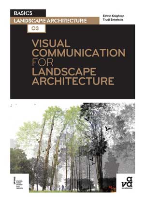
Visual Communications For Landscape Architecture (Basics Landscape Architecture) – Book Review
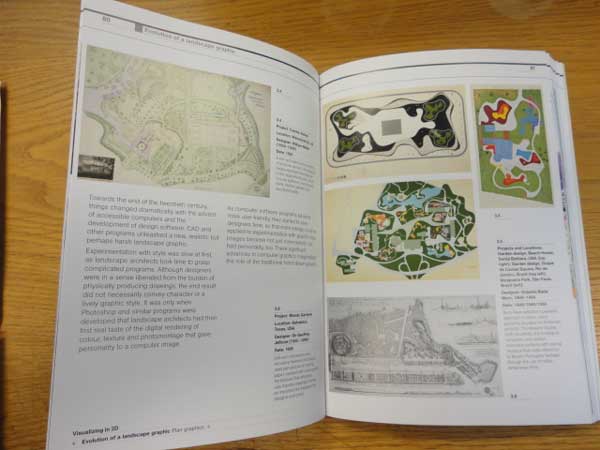
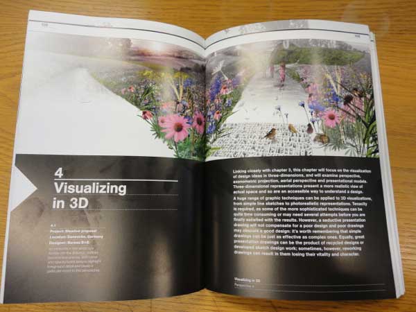
Throughout my studies I was taught that there is nothing more important than a landscape architects medium of visual communication. As landscape architects we need our visual communication nearly as much as we need food or a place to rest our heads. The authors of Visual Communication For Landscape Architecture understand this and are clearly lecturers applying their trade. The pocket-sized book, starts with explaining the basics of sketching and the importance of taking good site photographs- something I learned the hard way. Its great for a book to explain the benefits of sketching. When I started in college I wasn’t fond of hand drawing, but slowly came round to the idea.
What can we learn from this book? From the opening chapters its clear that the book is based around analytically reading the landscape. It applies what you have learned on site to better inform design and better visual presentation. It focusses strongly on holistic design- something I’m sure that would please Ian McHarg. Click here and get the book! For its size, the book is graphically presented in a clear manner and its pictures throughout inspire and provide a solid base for any student or practitioner wanting to improve their skills. It’s a great example of a book that could really help students understand scale and the basics of landscape architecture as a whole. It’s an easy to read, go-to book with lots of illustrations for its 195 pages. It gives great examples of real-life projects and what process they used to created their masterplans, from conception to completion. Its text is also full of easy to use words that would improve your technical language and any novice readers out there should have no fear in picking this book up and reading it from start to finish in a couple of days. However, if I was pushed to make a negative remark, the book is lacking short tutorials or a ‘how to’ guide for re-creating the graphic techniques shown. In my opinion, this would be its only real short fall. So is there an audience? From the outset it is clear that this is a, book targeted towards students and graduates. However saying that, I left the book on my desk for the last couple of weeks and it wasn’t long before my older colleagues picked it up- and loved it! Its now been lent to three or four partners in my practice. These are hard-nosed landscape architects and architects, they loved its clarity and easy to read nature. Simplicity really is the books golden thread. Click here and get the book! It’s a must for anyone looking to get into landscape architecture or even designers looking to broaden their palette. I really would recommend this book for an office coffee table. Why buy it? I feel “Visual Communication For Landscape Architecture” pulls no punches, delivers what the title encapsulates and for its price is a real steal. I wish I had picked this book up in college. It is a book that inspires new ideas and great methods to convey sketches to masterplans really clearly. It would be a real bonus for it to be passed around any university studio from student to student- it’s a definite keeper. Concluding thoughts I’ll be honest; this book has real ‘sex appeal’ in landscape terms; is easy on the eye, simple to read and oozes simplicity. I really enjoyed Visual Communications for Landscape Architecture from start to finish.Its appealing illustrations and graphics constantly had me saying “I want to do that!” or “I could do that!”. The book is fantastic for anyone who needs to sharpen up on skills or is just learning and wants inspiration. Visual Communication for Landscape Architecture (Basics Landscape Architecture)The Fundamentals of Landscape Architecture, by Tim Waterman | Book Review
One of the hardest things to do in landscape architecture is to explain what we do. What makes the book “The Fundamentals of Landscape Architecture” stand out as exceptional is that it is a clear and concise record of not only what landscape architecture is, but WHY it is so important. This book is obviously written by an educator — someone who not only intimately knows and understands landscape architecture, but who is also well versed in communicating to a diverse audience in plain English.
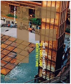
The Fundamentals of Landscape Architecture by Tim Waterman, Click the image and purchase the book today!
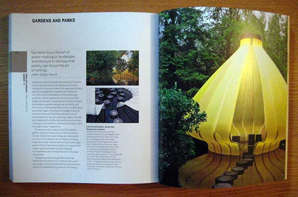
Gardens and Parks chapter (credit: AVA Publishing, The Fundamentals of Landscape Architecture by Tim Waterman, 2009)
Sketchy Saturday Top 10 – No. 002
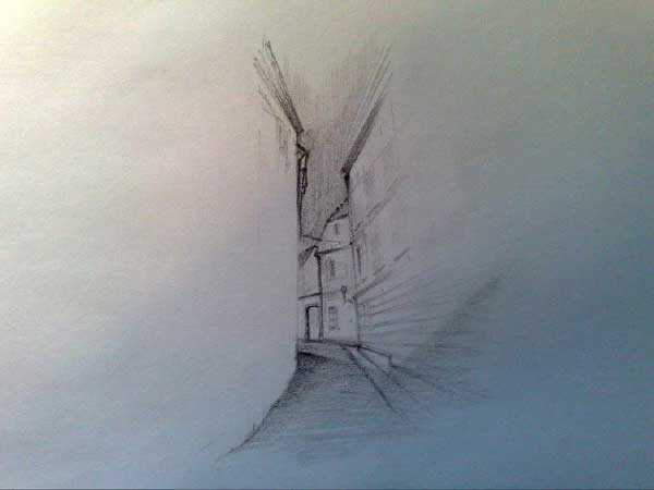
This Top Ten showcases the most beautiful, intriguing, and inventive sketches by some of our talented Landscape Architects Network readers. So we return with another batch of creative and beautiful works by our beloved and devoted readers. Sketches are getting better and better, and selecting the top ten is becoming a heavy task. We still base our criteria on beauty, technique, imagination, and well executed drawings. So without further a due, here’s the Top Ten! 10. by Andrej Žinić “This is a narrow and small street in an old part of Zagreb. One of many sketches made for a 1st year sketchbook capturing details of architecture and landscapes surrounding us, mainly using slightly softer pencils.”
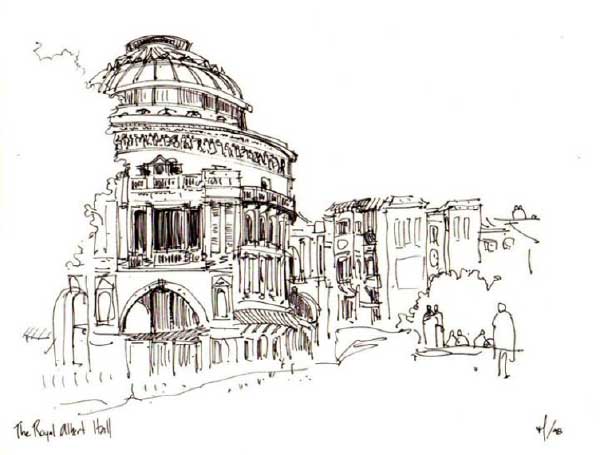
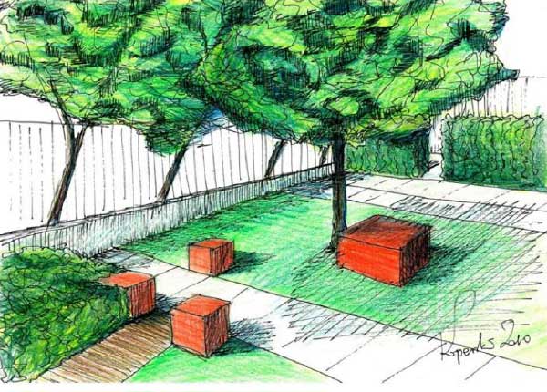
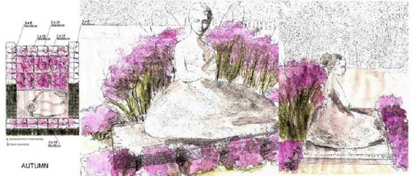
9. by Marcus Stevenson “I imagined solitude, peace, simplicity, serenity in the beauty of nature and a connection to God. This is often lost in our fast-paced society. This is a peaceful day in the 1700’s depicting an older pastor/shepherd going for a walk through the meadow to taking a break from his studies and pick some flowers to bring home to his wife. I express my art in garden design and sketch what I can, although I don’t consider myself developed. Subject matter and a story are more important to me than technique. My father is a pastor, thus the spiritual influence here. I often sketched in class in college, because it seemed to help me focus better.” 8. by Miguel Lievano, Australia “This sketch of London’s Royal Albert Hall was completed in Spring 1998. As can be imagined, the weather was not ideal. I sketched the drawing fast, trying to capture both the beauty of the building and mood of the neighbourhood.” 7. by Marek Wieronski “In my studies, each student had a sketchbook. This sketch is one page from mine, which accompanied me to different places, sometimes even on the bus or tram, because I never knew when I might see something that I would like to capture. This sketch is my attempt to understand the landscape and capture the most important elements, mixing black dots and dashes of varying pitch and length.” 6. by Maciej Koperski, Warsaw “The image shows a patio in one of the theatres in Warsaw. The space was designed especially for actors and employees, the red boxes playing the role of movable seats which allow the space flexibility. The patio was divided intogeometrical and rectangular spaces filled with plants pruned into geometrical forms.” 5. by Magdalena Subocz, Poland “My inspiration was a sculpture of a dancer in Warsaw’s sculpture park. I designed a composition of plants around the sculpture. The project is simple and the plants that I chose give it a more dynamic character. The composition of plants refers to dance and the emotion it envokes. I tried to a show variety of emotion by seasonal colours, especially green in Spring and purple in Autumn.” 4. by Cathy Vivies “My design based on ‘The Giant’s Causeway’ an artificial mineral garden, which mimics rugged land and stimulates the imagination in order to alter our perception of the space. We can see a pathway around a pond that flows thanks to the circulation of fresh running water. Moss and flowers will be planted between the stones and grow up from the narrow cracks.”
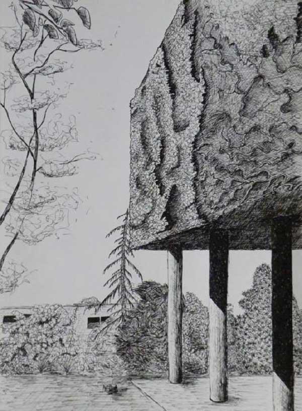
Design concept based on ‘The Giant’s Causeway’ uses moss and flowers to grow up the cracks in the rugged terrain by Cathy Vivies
Drawing Time Now
“Inventing” groundbreaking concepts in a domain as technical and complex as landscape architecture is a very hard task. Try to imagine creating a workshop where people from various artistic domains could engage in brainstorming on proposed technical concepts in landscape sketches! Who exactly has managed to come up with this new idea worth your attention? Noël van Dooren, landscape architect from the Netherlands, in a design experiment that was part of his Ph.D. research, called “Drawing Time”. Background What exactly does “Drawing Time” mean? Time in landscape is not often shown in drawings, although a lot of landscapes grow and change from the stage in which they are designed. Van Dooren organized the design experiment “Drawing Time Now!” at the Academy of Architecture Amsterdam. The intent of this workshop was to “invent” a proper way to draw time within the present context and with the available means. Inspiration was taken from landscape architect Lawrence Halprin’s concept of scores, representing who is doing what and at what moment in a landscape architecture project.
Why is this innovative? “Drawing Time” could be very useful to landscape architects and students, and even to the innovation of the very domain and profession itself. Traditionally, drawings have been mostly concentrated on the spatial composition. With this new concept, landscape architects would be able to understand the principles of the evolution of a landscape better and use that knowledge in designing. Van Doreen requested the 24 participating students to come up with at least one representation on the time aspects. “In making their design, they had to do a drawing that represents time, or more specifically, a score, as I wanted to test out this concept. In this case, the design was not a goal in itself but the vehicle to be able to make time drawings,” says Van Doreen.
‘Drawing’ by Els van Looy (Be), Esther Brun Nl) and Zuzana Jancovicova (Se). The product is a book with a series of drawings depicting the possible development in time in a metaphorical way.
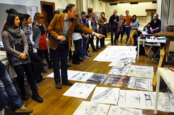
Exercise on Saturday afternoon with artist Frank van den Broeck: drawing intuitively first impressions.


