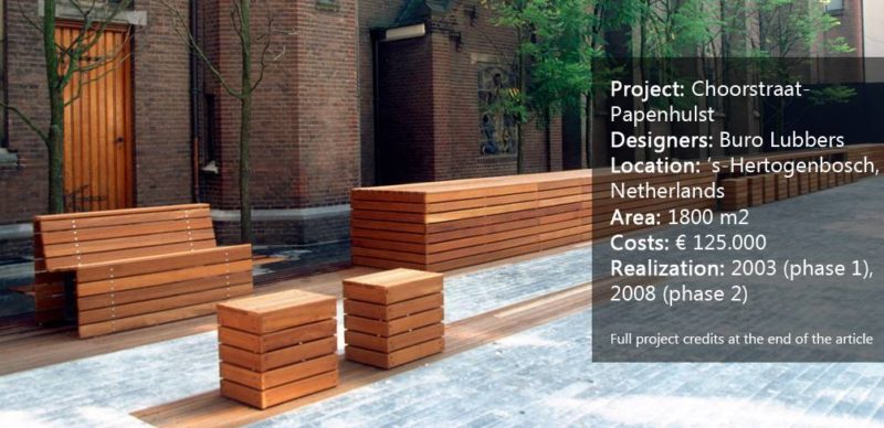
Choorstraat-Papenhulst, by Buro Lubbers, s’Hertogenbosch, Netherlands. There is always something intriguing about a project that exudes simplicity. You know, the ones that look effortlessly put together, like models on a catwalk. Nestled within the historic setting of a neo-gothic chapel, the project Choorstraat-Papenhulst was sparked by the transformation of a historic center within the immediate vicinity of the courtyard into a luxurious apartment building. Buro Lubbers has designed a space that is part of a sequence of squares around Sint-Jans Cathedral, giving the area a little boost to mark the change in residencies. The initial design as implemented is supposed to be a transformation of a private courtyard into a semi-public square. But unlike a bustling city square, the serenity of the space is palpable. Although the overall design lacks greenery, there is no sense of it being a cold and hardened place. Just as you can find solitude, comfort, and warmth inside a church, the space has a private character that allows you to find your bearings. With the addition of a good design, it is able to foster a mesmerizing presence with a welcoming and peaceful atmosphere.
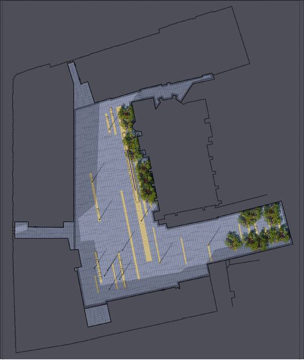
Masterplan of Choorstraat-Papenhulst. Image courtesy of Buro Lubbers
Choorstraat-Papenhulst
The whole of the space is paved in random strokes of Irish bluestone that is darkly rich with fossils. The linear pattern of this paving is reflected in a scattering of parallel wooden strips on which seating and tables are placed, made also out of wood.It is the gothic character of the Irish bluestone that makes this space so relatable to the historic building facades, yet the warmth brought about by the wood reflects the wooden chapel doors and makes the area seamlessly modern.
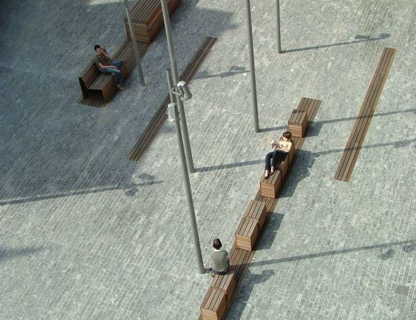
Choorstraat-Papenhulst. Image courtesy of Buro Lubbers
- Stirring Emotions at the Netherlands Army Museum and Netherlands Air Force Museum
- A Roof Garden That’s so Good, You Might Want to Work There!
- How Zoetermeer Vivaldi Care Home is Merging with Nature
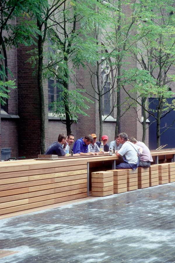
Masterplan of Choorstraat-Papenhulst. Image courtesy of Buro Lubbers
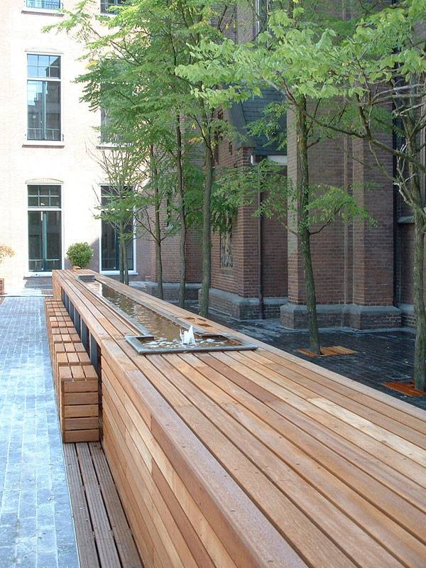
Choorstraat-Papenhulst. Image courtesy of Buro Lubbers
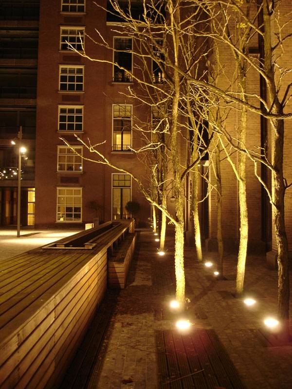
Choorstraat-Papenhulst. Image courtesy of Buro Lubbers
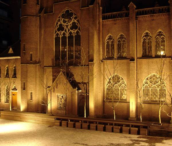
Choorstraat-Papenhulst. Image courtesy of Buro Lubbers
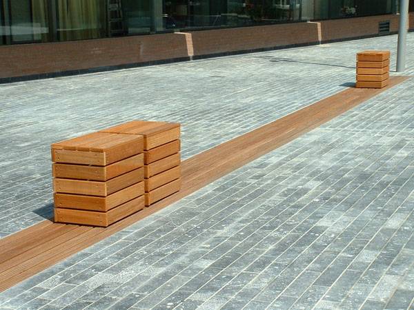
Choorstraat-Papenhulst. Image courtesy of Buro Lubbers
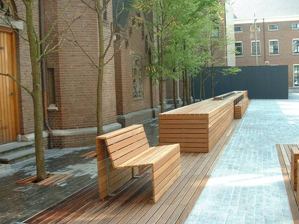
Choorstraat-Papenhulst. Image courtesy of Buro Lubbers
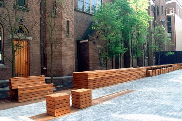
Choorstraat-Papenhulst. Image courtesy of Buro Lubbers
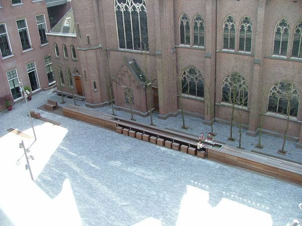
Choorstraat-Papenhulst. Image courtesy of Buro Lubbers
Full Project Credits for Choorstraat-Papenhulst
Project: Choorstraat-Papenhulst, A courtyard for Leonardo da Vinci’s last supper Landscape Architecture: Buro Lubbers Location: ‘s-Hertogenbosch, Netherlands Area: 1800 m2 Costs: € 125.000 Realization: 2003 (phase 1), 2008 (phase 2) Photos and text: Buro Lubbers Award: Winner Dutch Design Awards 2004 (category: design public space) Show on Google Maps
Recommended Reading:
- Landscape Architecture: An Introduction by Robert Holden
- Landscape Architecture, Fifth Edition: A Manual of Environmental Planning and Design by Barry Starke
Article by Win Phyo
Published in Blog


