In this second tutorial about enhancing basic SketchUp views I want to show how, with minimal effort, you can take a flat, uninspiring, initial 2d export from SketchUp and create a drawing with depth that does more than just sell an idea but also tells a story. I, again, used a 21″ Cintiq for painting in Photoshop, Photoshop, and SketchUp. An Intuos tablet will also work for painting.
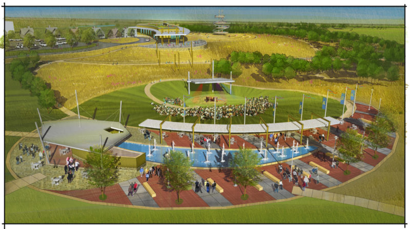
Starting Point. This simple export from SketchUp was my starting point. The terrain is stepped and I have applied just basic color and texture to aid in my painting. If I am working directly from SketchUp I always make sure to turn off the edges before I export the view. I brought this view into Photoshop by placing it onto an 11 x 17 at 300 dpi and began painting.
Saturation. Initially, I duplicated this first layer and locked that layer so I can always reference back to where I started. Then on the duplicated layer I bumped up the saturation just a bit.
 Initial Painting and Smoothing. Generally, my first step is to grab a simple round brush, set the opacity to 60%, and start smoothing out the stepped terrain by applying paint strokes in the direction of the slope. I always keep in mind the angle of the sun so I know where to lighten or darken a value. In this drawing the green areas represent a more manicured turf surface and the beige tones represent the less manicured prairie. For the pavement I make very confident strokes both perpendicular and parallel to the surface to just imply pattern. I am working with a similar hue already on the pavement surface in the model and just adding darker and lighter overlapping values. Don’t be afraid to add more color into the surface such as blues and greens as these opposite hues, applied lightly, create more depth.
I will usually finish the pavement by adding a couple of vertical strokes to suggest reflections. For the canopy and shelter I created some value change by using the Burn tool. You don’t want to get to carried away with this tool but it is a quick way to subtly darken a surface. For the canopy I applied the burn tool just to the edges and then added a few warm strokes of yellow to reflect sunlight. On the shelter I applied the burn tool just to the lower portion of the building to darken it. Generally, buildings, during daytime, will be brighter as they rise up and darker where they meet the ground.

Prairie Texture. To imply a rougher prairie texture in the sketch I initially grabbed a #16 square brush. I then went into my brush settings and clicked on Brush Tip Shape. Within Brush Tip Shape I have the ability to narrow the width of the brush along with tilting it at any angle I would like. I kept the brush vertical but narrowed it to a thin line. Next, I set the brush to Scatter and played with the Scatter settings a bit to get the results I was looking for. Then I started to paint into the prairie areas varying my light and dark values based on where sunlight was coming from. I kept the opacity near 100% and just slowly worked my way through the rolling terrain until I felt I had the affect I was looking for. I then cleaned up the edges of the prairie just using the Eraser tool and applied a little Dodge and Burn to either lighten or darken the prairie edge based on where sunlight was hitting.
The Water Fountains and Pool. To further enhance the water I just applied a few vertical strokes of lighter and darker blue along with a few subtle varied hues of different colors. I concentrated the darker values toward the ends of the pool and lighter toward the center. The fountains were quickly painted in place using a Drippy Water brush. Be sure to paint some reflections of the fountains into the pool.

Painting in Background Trees, Wild Flowers, and Windows. In this step, I painted in the background trees using a square brush set at an angle keeping in mind the direction of the sun. I also implied some wild flowers by using a small round brush set to Scatter and, finally, the windows of the Main Lodge were enhanced by adding some blue reflecting the sky and green reflecting the ground.
 Foreground Trees. Foreground trees have a little more detail than background trees so I have a little different approach. You can use trees from entourage services or downloaded files but I like to keep my money in my pocket so I just paint them in. By painting them in I keep the overall feel of the drawing loose and conceptual. If you decide to use a photographic source just remember to simplify it using filters. To paint foreground trees I use a round brush with Shape Dynamics and Wet Edges turned on. I initially paint a shape using a low opacity darker green and then slowly build lighter values on top of that using a wisp type brushstroke that mimics the shape of leaves. Again, I am always keeping in mind the direction of the sun. In the case of this sketch I painted one foreground tree and duplicated it adding details and leaves to the copied trees to vary them.
 Tree Trunks and other Line Work. Using a small round brush I drew in the tree trunks and outlined a few objects and paths to help define the drawing. I generally put all my line work on one layer and apply a Gaussian Blur filter to it at about 2 pixels and then reduce the opacity of the layer to about 80%. These extra steps should make the line work feel more like a loose pen or pencil.
 Entourage. I generally use people from random photos I find online or pictures I have taken myself. Downtown art fairs, farmer’s markets, and sporting events are all great places to take photos and build an entourage file. I really try to always vary my entourage and never want to see the same people or cars in each sketch I do. Above I used a random shot I found online, cut the people out by first tracing them with the Lasso tool, then Select- Inverse, and then Delete. I then simplified them using filters, scaled them down using Transform, and placed them in the scene.

Applying Shadows. The next step is to apply shadows on the ground plane and other surfaces. I use a round brush set to Wet Edges with the hardness set right in the middle. I initially lay the shadows down at 100% opacity and then reduce the opacity of the layer afterwards. Don’t worry about your shadows being perfect…just take note of where the sun angle is coming from and make sure they are all heading in the same general direction. Also make sure you shadow the entourage you have added. Consistently I see so much care taken to make sure a building or landscape structure is correctly shaded and shadowed but all the people and cars are floating in space. Finally, add a little blue or violet to your shadows so they have depth and don’t read as flat black holes in your drawings.
 Texture Overlay and Layer Mask. As I described in the first tutorial, I always finish my drawings by applying a texture over everything in a top layer set to Overlay. I group a Layer Mask with this texture and using the Brush tool and black paint I paint out the majority of the texture revealing the layers below. No matter how much black paint I apply to the layer mask there will always be a hint of that overlaid texture throughout the drawing. This texture makes the drawing cohesive and blends all the elements. Think of it like the consistent grain of watercolor paper that shows through the many washes or the pebbled surface of Strathmore paper that creates a textured rhythm in a graphite drawing.
 Vignetting. Again, I described this finishing touch on my last tutorial. It is simply a final top layer that I fill with a 50% opacity bluish black paint. I then, using a large soft eraser, erase out the focal points of the drawing allowing them to shine through. Generally, when we view a drawing we will notice the lightest brightest areas first. Vignetting takes advantage of this notion and helps direct our eyes immediately to the most important parts of the drawing.
I hope you found part 2 helpful and are starting to see with just a little effort you can transform a simple exported SketchUp view into something that tells a story or evokes an emotion. Every drawing is a bit of a journey and who knows what you might see along the way but with a little effort you should at least have a great story to tell at the end. As the artist Paul Klee once wrote “A drawing is simply a line going for a walk.”
Keep drawing!!
Published in Blog