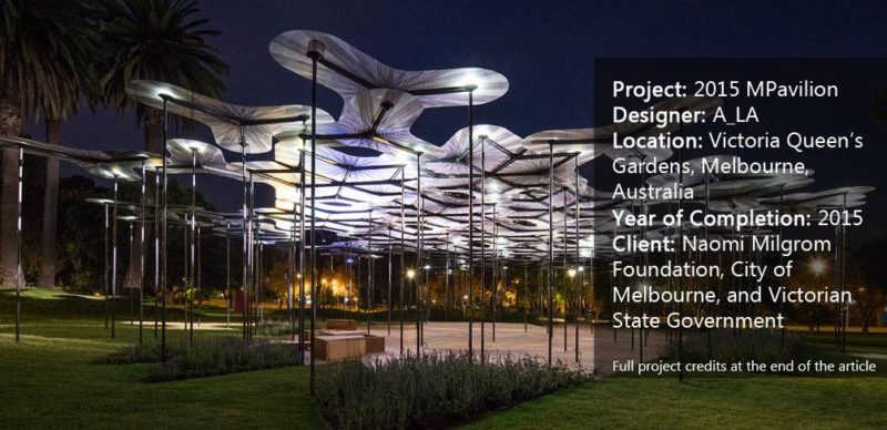
Article by Elisa García Nieto 2015 MPavilion, by A_LA, in Victoria Queen’s Gardens, Melbourne, Australia. If there is a function we should expect from public space, it is its contribution to reinforcing social cohesion, providing specific places where citizens can meet and share their diverse experiences. Cultural programs amplify this, and as such are an important factor in designing the urban landscape. In this article, we talk about how to rethink cultural spaces by taking a look at 2015 MPavilion, a recent edition to Melbourne. The idea is quite practical: Each year, commissioners knock at the door of an outstanding team, challenging it to design a temporary pavilion. In 2015, it was the A_LA team’s turn to provide a place for community and cultural industry. RIBA award-winning architect Amanda Levete designed an organic structure strongly inspired by nature. Levete’s 2015 MPavilion canopy uses innovative materials to grow a micro-forest of light and translucent colors that houses free cultural programs and encourages spontaneous appropriation.
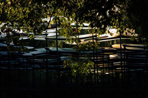
2015 MPavilion. Photo credit: John Betts.
Is There an Inside Under This Canopy?
Thanks to exhibitions such as the annual one organized by The Serpentine Gallery , the British root of MPavilion, we have mountains of creative reflections on the idea of boundaries to temporarily enclose a space. This is the first point that 2015 MPavilion questions — and one of those making it truly interesting for us as landscape architects. What Levete proposed was to generate the perception of place by the combination of a roof high enough above our heads and vertical elements occupying the space more than drawing a lineal perimeter around the space.
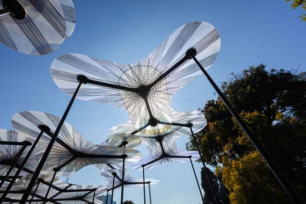
2015 MPavilion. Photo credit: John Gollings
How Fixed Models Produce Flexible Results
A singular model composes the pattern of this tree-like canopy, which gains meaning and a sense of whole structure through repetition. That is not an unknown design strategy, and it provides its own advantageous features. Starting with the beginning, let’s look at each piece individually: A species of plant consisting of three translucent petals with rounded contours is supported by three metallic columns instead of a central stalk. How do they join each other to form the canopy? They overlap their petals without touching others, thanks to a subtle difference in height among pieces. Petals of different units share the same column, offering multiple combinations that sometimes create figures able to cover larger spans.
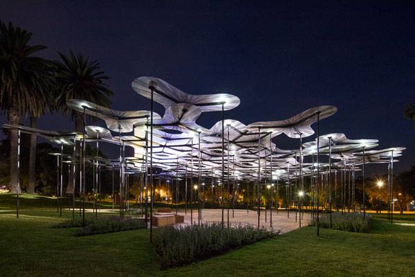
2015 MPavilion. Photo credit: John Gollings
The Cookie Cutter Factor
As you can see, this modular system allows the designers to control a wide range of factors in a flexible and consistent way. Maybe the most evident one is the contour of the whole structure, which is defined by the addition of pieces in any direction and without hierarchy. It means that the canopy could be adapted to uncountable contour conditions and take any size — like cookie dough shaped by cutters.
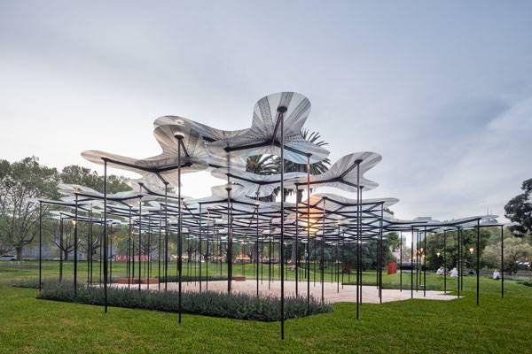
- 2015 MPavilion. Photo credit: John Gollings
What is more, designers could control the eventual growth of the structure, its density, and uses if they distribute columns creating an irregular pattern that provides cleared areas. Going further, the system would allow designers to control levels of opacity by changing materials to adapt the petals to different climates, or just to provide more marked or colorful effects.
The Best Kept Secret of 2015 MPavilion
The well-developed design of the canopy owes its success to the choice of materials. Levete had a clear idea of how the pavilion should capture “this ethereal kind of dreamy,” but it would have been hardly impossible to get it if she had not looked at other disciplines. This out-of-the-box thinking resulted in an innovative use of materials and technologies from the aerospace industry. In fact, the spectacular translucent petals are made of fiberglass, which allows them to be just a few millimeters thick, but between three and five meters wide. In addition, the carbon fiber structure supporting the canopy provides an unexpected feature: Wind can softly move the pavilion, as if it really were flexible stalks in nature.
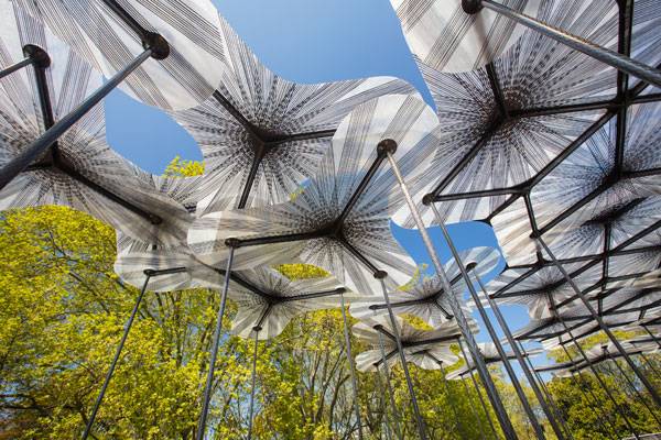
2015 MPavilion. Photo credit: John Gollings
How the Canopy Responds to the Environment
Interaction between the structure and natural elements is a main aspect that designers developed through openness. Openness refers to when the building of the canopy welcome and filter sunlight into a homogenous, clear light we can appreciate, when there are no enclosures, but a permeable assembly system for views and air to pass through. The canopy even allows wind to move it and amplifies its sound, making us conscious of the phenomenon. There is also a way for the structure to stay in the space: The pieces tend to decrease their concentration as they approach the limit, forming cutouts gradually. And at sunset, the petals give back light to the environment due to an integrated LED system that gracefully illuminates the scene.
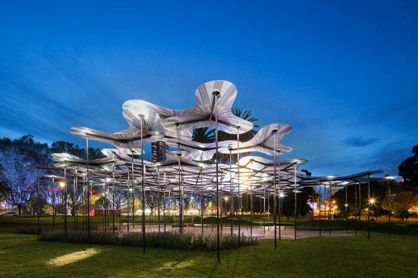
2015 MPavilion. Photo credit: John Gollings
Full Project Credits For The 2015 MPavilion
Project Name: 2015 MPavilion Designer: A_LA Engineering: Arup Manufacturer: mouldCAM Construction: Kane Constructions Location: Victoria Queen’s Gardens, Melbourne, Australia Year of Completion: 2015 Client: Naomi Milgrom Foundation, City of Melbourne, and Victorian State Government Learn more about A_LA: Website: www.mpavilion.org Facebook: www.facebook.com/mpavilion Instagram: www.instagram.com/explore/locations Recommended Reading:
- Becoming an Urban Planner: A Guide to Careers in Planning and Urban Design by Michael Bayer
- Sustainable Urbanism: Urban Design With Nature by Douglas Farrs
Article by Elisa García Nieto Return to Homepage
Published in Blog


