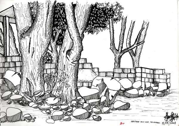
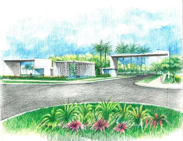
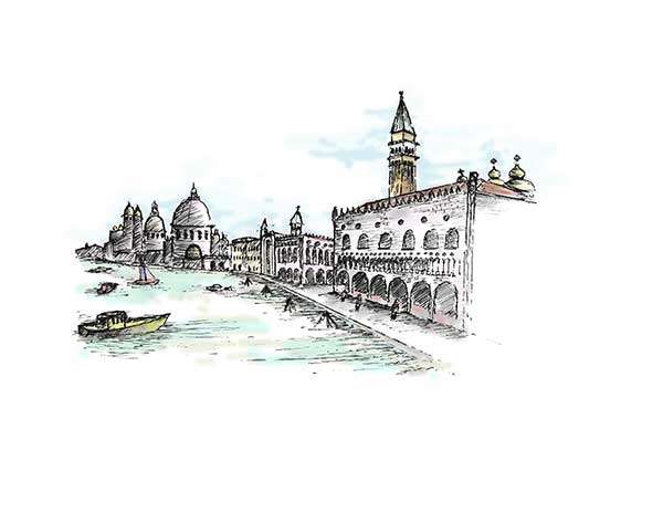
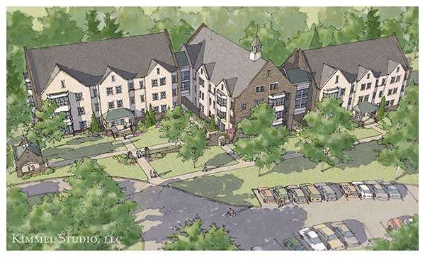
This week, we’ve got a new batch of sketchy, fresh out of the oven. I say that because they are deliciously detailed and drawn! We at LAN are constantly bedazzled by the talent of our readers and their amazing sketches! We think you’ll love our 14th edition of Sketchy Saturday. Check them out below! No. 10 by Ahmad Benbela Muzakal, Landscape Architect, Malaysia
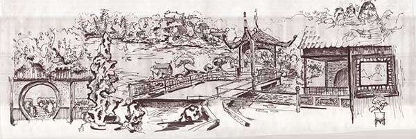
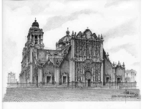
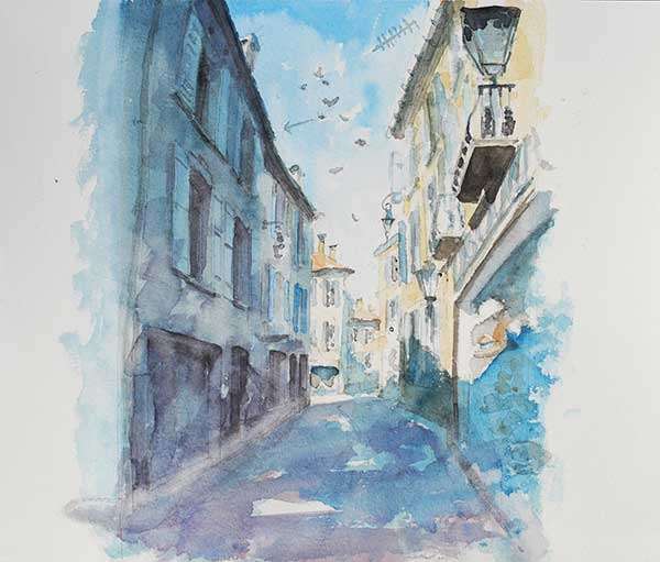
‘This sketch was actually done during my school field trip to one of the lush green resorts, in Ulu Yam, Selangor, Malaysia when I was in 2nd year of the BA Landscape Architecture program. To be honest, I am not very good at sketching, but for this one, I was really inspired by our senior lecturer’s hand sketch which was very tidy and detailed, and this is among the first attempts of mine to sketch like him. I used a black ink pen with varied tip sizes from 0.1mm to 0.6mm.. I chose this area to sketch because I love to see a mix of soft and hard landscape in scenes.’ No. 9 by Gabriel Legaspi, Architect from the Universidad de Buenos Aires, Argentina ‘It was a design or rather a study sketch which I made with color pencils on sketch paper. The project itself is called Mocoli and is located in Guayaquil Ecuador. The design is quite minimalistic, with boxy, geometric buildings with a white crisp render. The surrounding green landscape compliments the buildings well.’ No. 8 by Justyna Sulisz, 3rd year student at The University of Agriculture in Kraków, Poland ‘My sketch is made in pencil, size B2, for one of the classes we did. It shows a peaceful stone bridge and water scene in a secluded place. I drew this sketch just to create a picture, I was probably inspired by a landscape I’ve once seen, so it probably exists somewhere.’ No. 7 by Landon Bell, undergraduate landscape architecture student at Texas Tech University ‘The location of the sketch is near the San Marcos Piazza in Venice, Italy. The experience of the environment is what made this sketch unique for me. As I was sketching on a bench next to the harbor, I was greeted by a local Italian lady who was accompanied by her dog. After a short exchange of greetings, she sat down on the bench and began painting a scene across the harbor. Since then, every time I pick up my sketch book and pen I cannot help but remember the Italian painter, her dog, and the harbor! The media used was a sketch pad and Faber Castell Pens. I also rendered it in Photoshop.’ No. 6 by Devin Kimmel, ASLA, Assoc. AIA ‘This drawing is for the concept design of a new residential dormitory building and surrounding gardens. The dormitory is part of an existing seminary school. The design is a simplified version of collegiate Gothic. This is in keeping with the older buildings of the campus. The building layout allows for garden spaces on multiple sides that can be used in different ways. There will also be a new garden pavilion for multiple functions. The base drawing was drawn with pen and a color wash was added using a Wacom tablet.’ No. 5 by Sébastien Jobin, landscape architect student and Valentine Maeder, interior design student in Geneva, Switzerland ‘I’ve done this sketch to explain the concept of our project for a student contest in my school. I’ve participated in a workshop with Valentine to design a temporary project for this summer in Geneva. We’ve been selected to realize this project this summer. It’s a hand drawing with black ink and color pencils.The characters are from my Photoshop library. We are planning to use painted pallets in blue and white to make the structure. It will be completed with annual plants to provide a tropical effect.’ No. 4 by Léa Zeitoun, second year student in Landscape Architecture at the American University of Beirut (AUB) ‘The drawing represents part of an old church square located in a village north of Lebanon. It is also part of my site of intervention for my design course. I chose to illustrate this particular space because of its archaic beauty. Time perfectly shaped itself within the smallest details of this landscape.’ No. 3 by Blake Andera, Landscape Architecture Student, Iowa State University, United States ‘This drawing was made as a series of scenes emphasizing the important aspects of Chinese landscape design. Inspiration includes Chinese ink drawings, borrowed landscape, sculptures and details. The medium used was ink pen and gloss finish paper.’ No. 2 by Jesus Palafox Garcia, Architect, Mexico ‘This drawing is the Cathedral of the City of Mexico seen from the Sagrario. Monumental architecture is an exciting domain; I worked for many years in monument restoration. When the time allows me, I draw them. They are generally of realistic style. The technique used is pencil on paper.’ No. 1 by Peter McQuillan ‘This sketch represents a street in Albi, Southern France. Beside the landscape itself, Albi also has a great streetscape through its centre – famous for its brick cathedral and the birth place of Toulous Lautrec. The style of this sketchy is quite impressionist, but rendered in a plain but detailed way to emphasize the beauty of the landscape. The medium used was water colour on plain paper.’ Getting to the end of this article, you can probably see why it was so hard this week to pick the top 10 sketches: they are all so good! For more talent-pumped drawings check our official album. And don’t forget to check back next time! Article written by Oana Anghelache. Published in BlogLogin
Lost Password
Register
If this is your first time on the new site, please click "Forgot your password?". Follow the steps to reset your password. It may be the same as your old one.


