


Author: Land8: Landscape Architects Network


Mind Blowing Snow Art – A New Way to Think of Snow
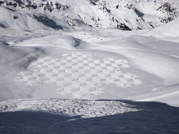
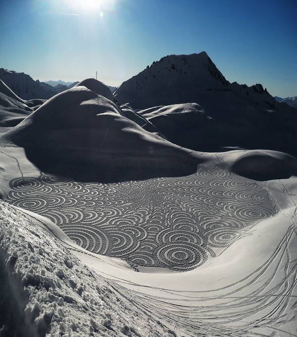
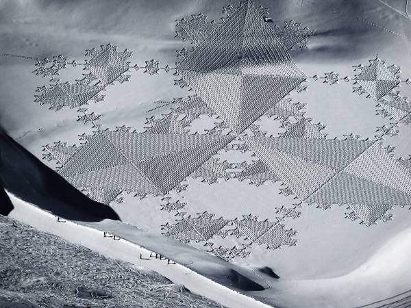
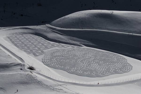
A review of Simon Beck’s unique art of geometry on snow. Land art often is associated with sandy or stony coasts or deep green hills and hollows. Simon Beck, however, is the founder of a very different and special kind of land art: snow art. His drawings in the snow go far beyond our snow-angel childhood memories. He produces geometrical art works that cover areas the size of multiple soccer fields. They are reminiscent of crop circles or huge, beautiful mandalas in the endless, white landscape of winter.
Credit: Simon Beck’s Snow Art
Snow Art Designs Mirror Mathematical Equations
Beck’s design process starts with a sketch on paper, which he then creates in nature on a much larger scale — one to four hectares per work. His designs are influenced by the world of complex mathematical forms, geometry, and sometimes crop circles. Each of his stunning drawings in the snow takes at least 10 hours to accomplish and requires that he walk between 20 and 30 kilometers. Walking such a distance in fresh, deep snow is unbelievably hard work; hence, his creations are both artistic and athletic masterpieces.
Credit: Simon Beck’s Snow Art

Credit: Simon Beck’s Snow Art
- Awesome Displays of Temporary Land Art
- 10 Amazing Landscapes You Won’t Believe Are NOT Photoshopped
- Lace Art Used to Transform and Beautify Neglected Urban Spaces
Credit: Simon Beck’s Snow Art
Credit: Simon Beck’s Snow Art
Creating a Snow Art Masterpiece
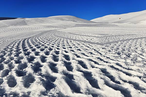
To get those beautiful geometric drawings onto the snow, Beck starts by measuring. To create straight lines, he uses the compass; but curves are made by his own judgment. Both require lots of practice. After this framework is completed, Beck uses a simple pace count method to measure distance and create points along the frame. By joining these points, he adds secondary lines before finally filling in the shaded areas.
Credit: Simon Beck’s Snow Art

Click on the image and pick up your copy!


10 Amazing Landscapes You Won’t Believe Are NOT Photoshopped
Amazing landscapes to inspire your mind. In the words of Frank Lloyd Wright – “Study nature, love nature, stay close to nature. It will never fail you.” The natural world is full of fantastic wonders. Since the dawn of time Man has drawn inspiration from the natural environment. Here we share with you some of the world’s most amazing natural landscapes that you won’t believe aren’t photoshopped to inspire you in your work and studies as landscape architects. Take a couple of minutes now to check out these beautiful landscapes. Go on. You deserve it.
10 Amazing Landscapes
1. Lower Antelope Canyon

Upper Antelope Canyon. Credit: John Fowler from Placitas, NM, USA. CC 2.0

The Eye of the Sahara. Credit: Public Domain Credit(s): NASA/GSFC/MITI/ERSDAC/JAROS, and U.S./Japan ASTER Science Team.

Zhangye Danxia National Geological Park. Credit: By Eric Pheterson – CC 2.0

The Marble Caves of Chile. Credit: By Raulurzua, CC 3.0

Pamukkale, Denizli, Turkey. Credit: By Miquitos, CC 2.0

Giant’s Causeway, County Antrim, Northern Ireland. Credit: BotMultichillT, Public Domain

Grand Prismatic Spring, Yellowstone National Park. Credit: CC0 Public Domain, source

El Saldar de Unyuni Salt Flats. CC-BY-3.0, source

Dead acacia trees (Acacia erioloba) in Dead Vlei, near Sossusvlei, Namibia. Credit: By Desertman, CC 3.0
- Landscape Photography: From Snapshots to Great Shots by Rob Sheppard
- Digital Landscape Photography: In the Footsteps of Ansel Adams by Michael Frye
- National Geographic Stunning Photographs by Annie Griffiths
Article by Ashley Penn Return to Homepage


Container Gardening for Green Aesthetics: The Essential Guide
Sponsored article from www.iotagarden.com.au Garden Pots and Planters for Design Build and Landscape Professionals. Container gardening is a great tool for landscape designers. It helps to add that natural style to your outdoor or indoor space. Green aesthetics is the keyword here. Imagine a busy city street where concrete and pavement is the all-encompassing material. It may look dull and is probably an eyesore by itself. There is no hint of plant life or foliage. Container gardening brings green aesthetics to these kind of environments.
The Benefits of Container Gardening
Let’s look at some of the benefits of container gardening:
- Adding foliage to concrete and hard paving. In places where planting is impossible under normal circumstances, container gardening makes it possible.

Photo credit: Nicholas Jones
- Indoor planting. Planting indoors adds a special appeal to interiors and this is usually only possible with container gardening.
- Easily move plants. Container gardening allows the gardener or the landscape architect to easily move the plants as needed. Redesigning is made much simpler. Depending on the size of your container, the plants can even be moved indoors when the cooler months come.
- Containers can be functional in a design. Plant pots and planters are not just pleasing to the eye. Depending on the container shape, they can be used for functional design. Tall pots can be used to highlight doorways and entrances. Trough shaped pots can be used to guide pedestrians. When used properly, plant containers can also become the focal point of a design.
- Soft Landscaping at a Designer Outlet Mall. IOTA planters were commissioned at a Designer Outlet Mall in Banbridge, Ireland. The mall was full of hard lines and hard concrete paving; and a variety of granite taper and granite trough planters helped bring about a certain kind of sophistication adding a soft touch to the existing design. The end result is an urban oasis.
For more information, see here.

Photo credit: Nicholas Jones
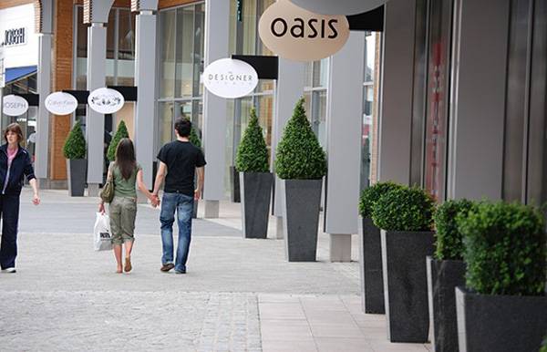
Photo credit: Nicholas Jones

Photo credit: Nicholas Jones

Photo credit: Nicholas Jones

Photo credit: Nicholas Jones
- A Totally New Space Saving Way of Growing Crops
- Guerrilla Gardening – Breaking ALL The Rules!
- How to Provide Easy Access to Urban Agriculture in Overpopulated Cities
That’s when IOTA’s large planters came in. The planters are strong enough to withstand the vigorous root growth of the magnificent poolside palm trees. The end result is a stunning poolside view with the palm tree standing proudly encased in an elegant fiberglass container. For more information, see here.

Photo credit: Nicholas Jones

Photo credit: Nicholas Jones

Photo credit: Nicholas Jones

Is the Ancient Art of the Zen Garden Dead, or Can it be Reinvented?
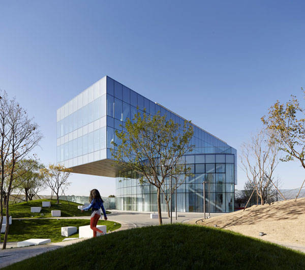
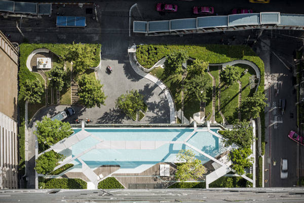
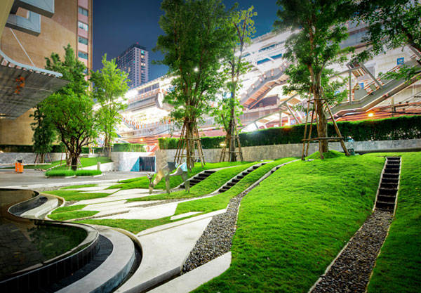
Vanke-Shoukai Retail and Leisure Centre, By SPARK and BAM Landscape, Daxing in Beijing, China Vanke-Shoukai is a new leisure and business center that combines a shopping mall, offices, and apartments. The center is a project of the SPARK office, in collaboration with the BAM landscape office. This is a new urban development center in the city of Daxing in Beijing. Its main priority is functional diversity, but with prime concern for business, given its proximity and connection to the new airport south of Daxing. It was necessary to create a park welcoming these activities within the same space.

Photo Credit: Vanke Daxing Retail and Leisure Centre, by SPARK and BAN Landscape, Beijing, China
Photo Credit: Vanke Daxing Retail and Leisure Centre, by SPARK and BAN Landscape, Beijing, China
Photo Credit: Vanke Daxing Retail and Leisure Centre, by SPARK and BAN Landscape, Beijing, China
- Where Zen Garden Design Meets Enchanted Woodland: TROP’s Forest and Pool at Pyne
- The Dark Art of Conceptual Design in Privately Funded Public Space
- Top Ten Names in Landscape Architecture
Photo Credit: Vanke Daxing Retail and Leisure Centre, by SPARK and BAN Landscape, Beijing, China
Reinterpreting the Ancient Art of the Zen Garden
In Zen Gardens of the past, stone carpets were used as winding roads that connected the different parts of a garden and the house, so that people did not have to dirty their feet. These roads were winding, to make the longest walk possible. So we had the habit of accentuating the curves in the most natural way and without opposing the flow of water. This contemporary Zen Garden’s black and white floor is a beautiful example of this tradition while being designed in a modern way.
Photo Credit: Vanke Daxing Retail and Leisure Centre, by SPARK and BAN Landscape, Beijing, China
Photo Credit: Vanke Daxing Retail and Leisure Centre, by SPARK and BAN Landscape, Beijing, China
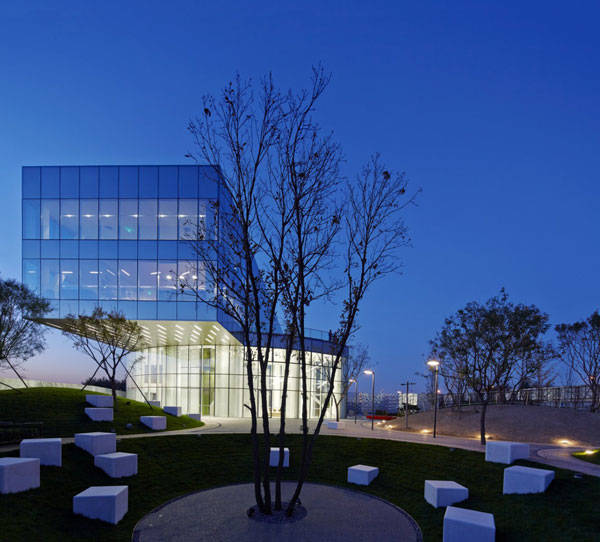
Photo Credit: Vanke Daxing Retail and Leisure Centre, by SPARK and BAN Landscape, Beijing, China
 So, the garden plays its role as an intermediary space between the internal and the external, the visible and the invisible. As the founder of philosophical Taoism, Lao Tzu says, it is the harmony of the median-void. This site will serve as an example for new developments in the area. Moreover, the two teams that worked on the project — SPARK and BAM — are already working on new developments, such as the Jiugong Vanke Plaza Project.
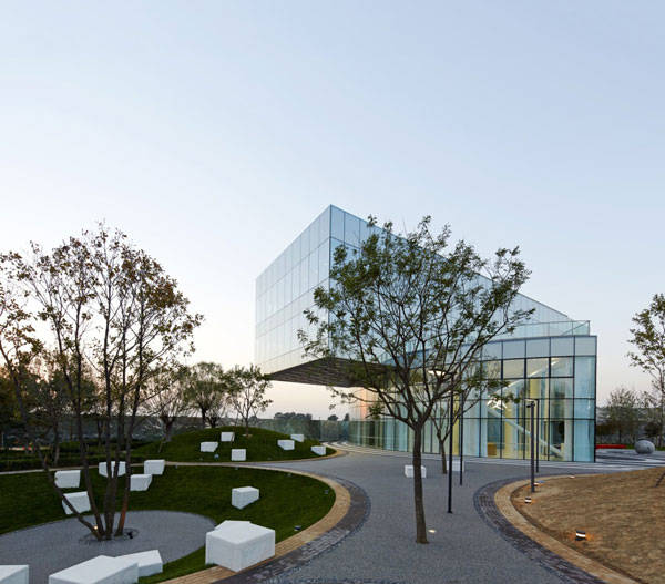
Photo Credit: Vanke Daxing Retail and Leisure Centre, by SPARK and BAN Landscape, Beijing, China
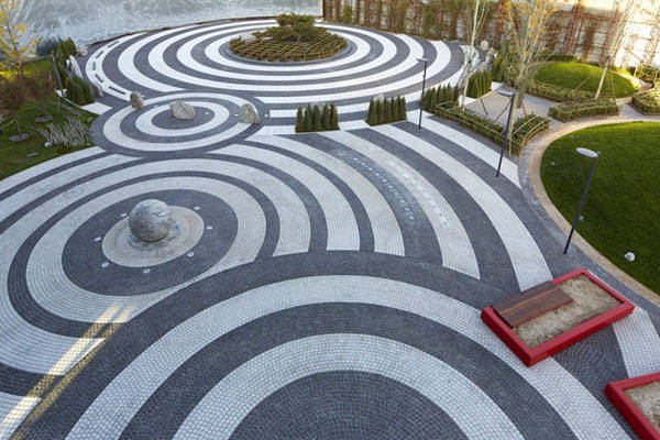
Photo Credit: Vanke Daxing Retail and Leisure Centre, by SPARK and BAN Landscape, Beijing, China
- The Garden Source: Inspirational Design Ideas for Gardens and Landscapes by Andrea Jones
- Private Paradise: Contemporary American Gardens by Charlotte M. Frieze
Article by Alexandra Wilmet. Return to Homepage


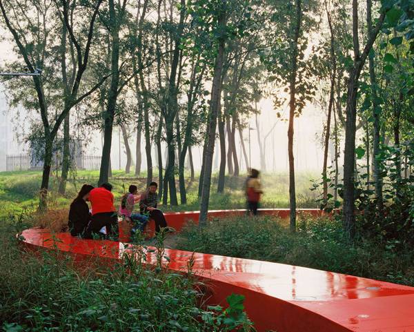
Fantastic River Park Unveils the Value of the Natural Landscape
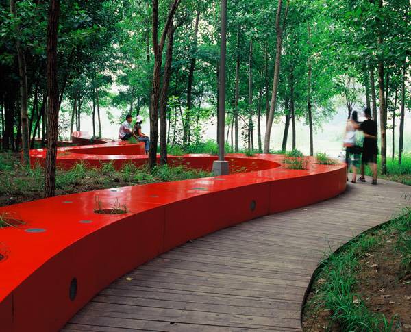
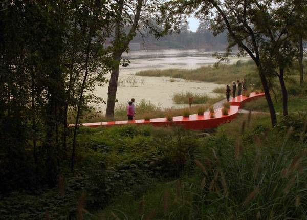
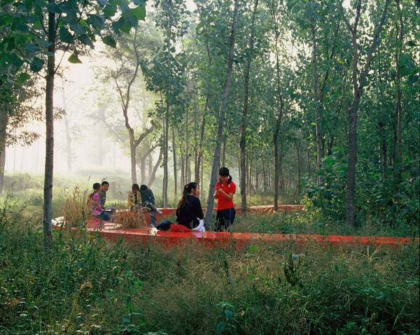
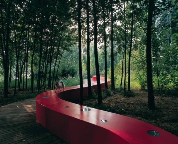
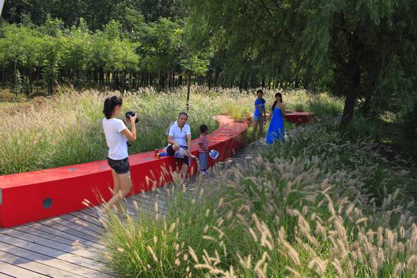
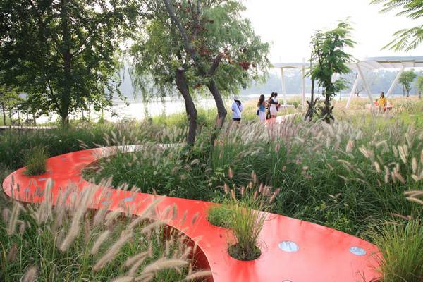
The Red Ribbon Park, Qinhuangdao City, Hebei Province, China, designed by Turenscape At the beginning of the 21st century, the eastern area of Qinhuangdao city, along the Tanghe River, was engulfed by an intensive urban expansion, being quickly surrounded by new developments. Despite its difficult access and unhealthy conditions, the river area was one of the few options for outdoor leisure for residents of nearby communities. The place was an important green area, since it maintained the vegetation supporting wildlife habitats, but there wasn’t any effective structure for the people who came to swim or fish. The landscape featured native plants and animals sharing the space with a garbage dump, challenging the professionals to create a solution to meet residents’ needs while revitalizing the long-neglected riverbanks on the outskirts of the city.
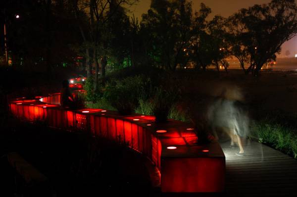
The Red Ribbon Park. Credit: Turenscape
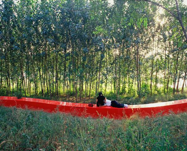
An Ecological Solution Preserving the Natural Landscape and Culture
A proposal in a contrary direction prevailed, developed by a firm whose own name emphasizes its philosophy of uniting humans and the land: Turenscape – a mix of two Chinese words, Tu (land) and Ren (people), with the English word scape — aims to create harmony between land and people.
The Red Ribbon Park. Credit: Turenscape
- Top Ten Names in Landscape Architecture
- 10 Incredible Projects For Students To Know About And Why!
- The World Without Landscape Architects!
The Red Ribbon Park. Credit: Turenscape
The Red Ribbon Park. Credit: Turenscape
The Red Ribbon Park. Credit: Turenscape
The Red Ribbon Park. Credit: Turenscape
The Red Ribbon Park. Credit: Turenscape
The Red Ribbon Park. Credit: Turenscape
The Red Ribbon Park. Credit: Turenscape
- Urban Design by Alex Krieger
- Digital Drawing for Landscape Architecture by Bradley Cantrell
Article by Tania Gianone Return to Homepage


How to Show Topography in your Plan Drawing in AutoCAD
A useful AutoCAD tutorial to help you with topography lines in AutoCAD. Computer aided design (CAD) software doesn’t come up with great concepts, as pointed out well by Barry Lupton. However in pretty much every project you reach a point where you want to digitalise sketches. Amongst others AutoCAD is probably the most used CAD program in landscape architecture and many other professions. As it is an extremely extensive program, only a few use it to it’s full potential. Even though you create drawings with it, it’s nothing like a box of pencils from which you pick the color you want just by looking at the box. You need to find your way. And it doesn’t stop there. AutoCAD can be customized and extended in virtually endless ways. So some pointers may come in handy! Lisa Tierney showed us 10 basic AutoCAD hacks, a useful overview for the absolute beginner. This article is the first of hopefully many about AutoCAD functionalities that, even when you are a pro, you may never have realized were possible. This first post from UrbanLISP is about topography in plan drawings.
Topography in your Plan Drawing in AutoCAD
Sections are very useful to show topography and slopes. Plan drawings still are the most important images you will produce during a project. Of course the topography should be shown in that plan drawing. In many countries it’s common to draw slope lines. It’s a pattern of lines that go from the top of the slope to the bottom. Every second line ends one half of that distance. Drawing such a pattern in AutoCAD on straight lines is not too much work. When the slopes in your plan are curvy the challenge is a bit bigger. The UrbanLISP ‘Slopelines’ command helps you to place such a pattern in an instant. Related Articles:
- Top 10 Hints & Tips For SketchUp
- 10 AutoCAD Hacks for Beginners!
- 3D Modeling Software for Landscape Architects
You only have to select two linear entities. Polylines, lines, arcs and splines are examples of linear entities. You have to select one for the top and one for the bottom and the pattern will be drawn in between. You can tweak the settings of the command to get an optimal result depending on the curves you use and the units your drawing is set to.
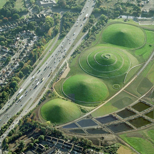
Where topography lines would come in handy. Photo credit: Northala Fields by Peter Fink and Igor Marko
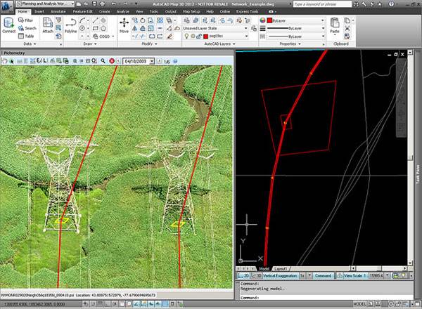
Image featured in our article “Computer Aided Software for Landscape Architects: The Essential Guide”. Image credit: @gletham GIS, Social, Mobile Tech Images; CC2.0
- Digital Drawing for Landscape Architecture by Bradley Cantrell
- Detail in Contemporary Landscape Architecture by Virginia McLeod
Article and video tutorial by Rob Koningen You can see more of Rob’s work at UrbanLISP Return to Homepage


How Did Tel Aviv Port Become the Best Design in Europe? Find Out
The New Tel Aviv Port, by Mayslits Kassif Architects, Tel Aviv, Israel. Reading the title of this article, you might already be wondering how Tel Aviv happened to get known for an urban redevelopment project? My reaction was similar, as was that of the 1,000-person audience at the issuing of the most prestigious award in Europe for landscape architecture — the Rosa Barbara European Landscape Prize in 2010. People were telling the architects of the port transformation: “We didn’t know that there are things like that in Tel Aviv.”
Tel Aviv Port
The project won out of more than 420 entrants, being selected both by the official jury and the audience. It was the first time Israel has been awarded a prize for landscape architecture, putting it on the global scene for remarkable projects.

Tel aviv port. Photo credit: Guy Cohen Photography

Tel aviv port. Photo credit: Guy Cohen Photography
The Opening of Tel Aviv Port
The port first opened in 1936, but was used at its full operational capacity for only three years. Attempts over the years to revive the port were unsuccessful, and although it was functioning partially until 1965, it had been lying abandoned and disintegrating ever since. In 2002, the port management saw its potential and ran a competition for the revival of the port areas and their transformation into a vital public space.

Tel aviv port. Photo credit: Guy Cohen Photography

Tel aviv port. Photo credit: Guy Cohen Photography

Tel Aviv Port. Photo credit: Mario Troiani
Tel Aviv Port Inspired by Sand Dunes
The architects’ desire to create an inviting public space became the base of the project. They came up with a design inspired by the sand dunes on which the former port was built, creating a vast open space covered by an undulating wooden deck reminiscent of those dunes.

Tel Aviv Port. Photo credit: Mario Troiani

Tel Aviv Port. Photo credit: Mario Troiani

Tel Aviv Port. Photo credit: Mario Troiani.
Tel Aviv Port, the Place to be
The reopening of the port started attracting the public even before the landscape works were completed. The wooden deck’s fulfilled its purpose of inviting diverse uses by various groups of people, making the port the place to be in Tel Aviv.

The quirky rock features at Tel aviv port. Photo credit: Guy Cohen Photography
- Kiryat Sefer Park, Tel Aviv, Israel by Ram Eisenberg
- Burj Khalifa Tower Park: The Oasis-Like Paradise
- Sculptor Creates Major Public Square

Yoga at Tel Aviv Port. Photo credit: Mario Troiani

Tel aviv port. Photo credit: Guy Cohen Photography

Tel aviv port. Photo credit: Guy Cohen Photography

Yoga at Tel Aviv Port. Photo credit: Mario Troiani

Tel aviv port. Photo credit: Guy Cohen Photography

Tel aviv port. Photo credit: Guy Cohen Photography


Where Zen Garden Design Meets Enchanted Woodland: TROP’s Forest and Pool at Pyne
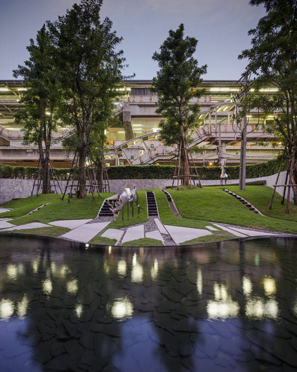
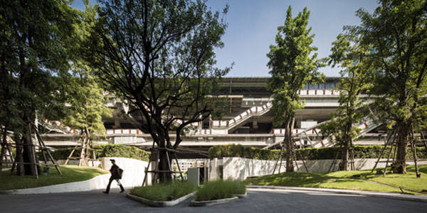
The Forest and Pool at Pyne, by TROP Terrains + Open Space, Bangkok, Thailand Some projects are simply impossible to forget, blurring the lines between art and design and mixing old with new. Unique in their design and conception, they create a lasting impression. The Forest and Pool at Pyne in Bangkok was commissioned in 2010 as part of a high-end condominium building by Thai real-estate developer Sansiri. The selected designer, TROP Terrains + Open Space, is an award-winning firm that previously received global attention for its design of The Garden of Hilton Pattaya and is among our Top Ten Names in Landscape Architecture.
The Forest and Pool at Pyne, TROP Terrains + Open Space
The Forest and Pool at Pyne, TROP Terrains + Open Space
The Forest and Pool at Pyne, TROP Terrains + Open Space
The Forest and Pool at Pyne, TROP Terrains + Open Space
The Forest and Pool at Pyne, TROP Terrains + Open Space
The Forest and Pool at Pyne, TROP Terrains + Open Space
- Top Ten Names in Landscape Architecture
- 10 Incredible Projects For Students To Know About And Why!
- The World Without Landscape Architects!
The Forest and Pool at Pyne, TROP Terrains + Open Space
The Forest and Pool at Pyne, TROP Terrains + Open Space
The Forest and Pool at Pyne, TROP Terrains + Open Space
A Refreshingly Unique Approach of Zen Garden Design Meeting Enchanting Forest Refuge
TROP continues to set an example to landscape architecture firms — cities don’t have to be boring. In a busy, urban environment, residents need an escape, but TROP’s forest and pool goes beyond this. It offers refuge in a city severely lacking in green space, while also creating a unique space that mixes art and design and effectively reflects the sense of luxury that is key to the identity of Pyne.
The Forest and Pool at Pyne, TROP Terrains + Open Space
- The Garden Source: Inspirational Design Ideas for Gardens and Landscapes by Andrea Jones
- Private Paradise: Contemporary American Gardens by Charlotte M. Frieze
Article by Michelle Biggs Return to Homepage


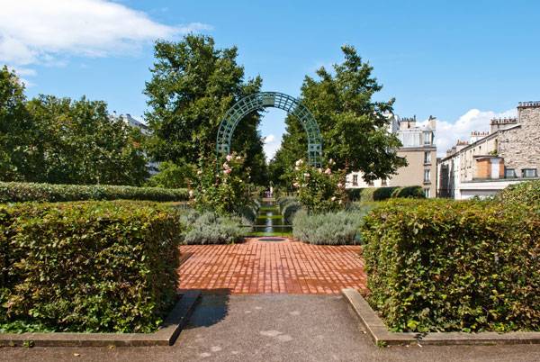
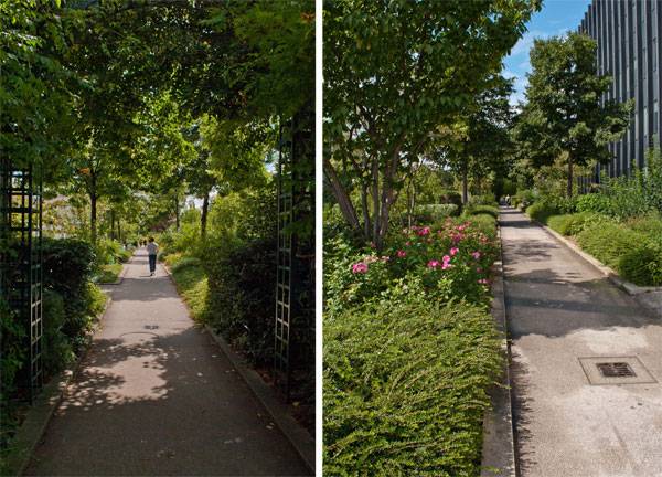
The Urban Revitalisation That Inspired New York City’s High Line Park
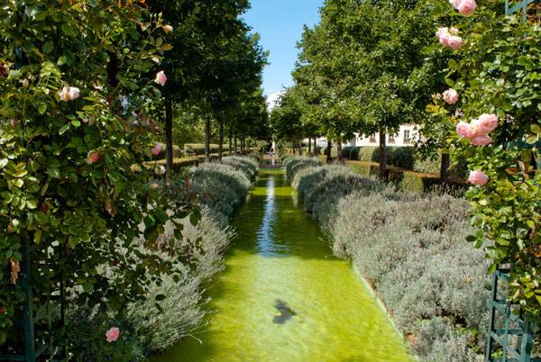
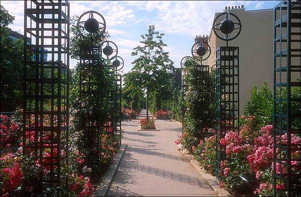
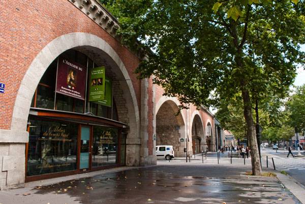
Promenade Plantee, Jacques Vergely and Philippe Mathieu, Paris, France. Can you commute to your city and enjoy the experience like a tourist would? This isn’t the case in every city, but Parisiennes can get a glimpse of what visitors might see – and not just because of the fabulous monuments Paris obviously has to offer. In East Paris, in the XXI arrondissement, an abandoned, old-fashioned brick viaduct is the starting point for an inspired requalification that has created a significant change for the city, its citizens, tourists, and for landscape architecture at large. The Promenade Plantée, also known as Coulée Vert, is the inspiration for New York City’s famous High Line Park.
Promenade Plantee. Photo credit: Yuliya Georgieva
A view of the Promenade Plantée in Paris, looking west towards the Opera Bastille. Photographer: Anthony Atkielski (Agateller), CC 3.0
An Urban Revitalisation
The linear park follows the railway path: The first segment is elevated upon the Viaduct des Arts and the second is under the street grade, comprising the Promenade Verte. It crosses 20 city blocks, slices through two buildings, opens into new gardens, creates access to the city with green stairs and bridges, and restores and revitalizes an area that was one of the poorest in the city because of the decaying railway and the related hidden danger inside.
Promenade Plantee. Photo credit: Yuliya Georgieva

“Creative Commons Promenade Plantée”. Source Promenade plantée in Paris, by La Citta Vita, licensed under CC 2.0
- The Flying Parks- From The Highline in New York to The Promenade Plantée in Paris!
- 10 Incredible Projects For Students To Know About And Why!
- The World Without Landscape Architects!
Promenade Plantee. Photo credit: Yuliya Georgieva
Promenade Plantee. Photo credit: Yuliya Georgieva
- High Line: The Inside Story of New York City’s Park in the Sky by Joshua David
- Joel Sternfeld: Walking the High Line by Joel Sternfeld
Article by Valentina Ferrari Return to Homepage


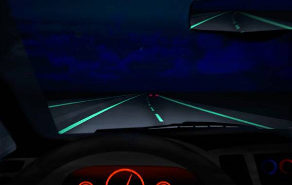
The Secrets Behind the Smart Highway
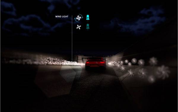
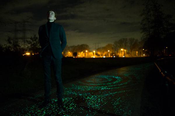
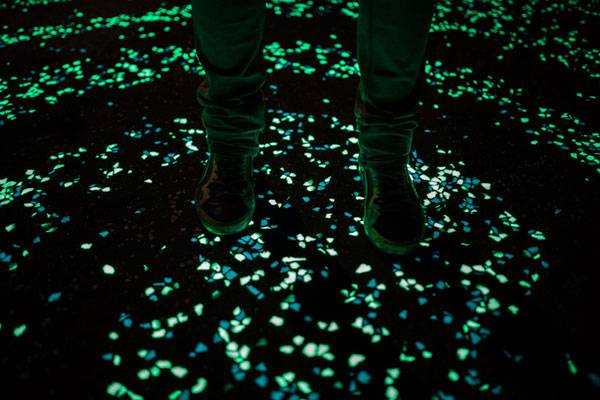
Smart Highway by Studio Roosegaarde. Energy efficiency and sustainability are some words that we use in almost every sector of our life now-a-days. Our planet has become vulnerable and her residents are already started to take care of her. We are conscious, yes, but are we smart enough? This is the very question the concept of “Smart Highway” brings before us. Smart highway is an innovative concept that targets the time yet to come. It is a result of the “brain” of Daan Roosegaarde, the designer and the “hands” of Heijmans, the builder and developer. We need collaboration between different fields to find the solutions of problems and difficulties of the contemporary world. Smart highway is a groundbreaking example for this kind of inter-expertise collaboration and effort.
Smart-highway – Credit: ‘Daan Roosegaarde’ and Heijmans.
The Smart Highway to Success
Ever thought of a highway with literally no road lights, to be safe? Or road lights that only lit when you are passing? What about an interactive highway that will talk to you about the weather condition? Or a one that will charge your vehicle while driving? – maybe you haven’t, but good news is, those “smart” people already have. So, want to take a quick drive on the “Smart highway” where art and technology goes hand to hand? Let’s go! The concept of smart highway The idea of a more intelligent way of transportation is not new. But the effort was primarily focused on vehicle development. The designer Daan Roosegaarde says, “When we look at highways, why is so much money and time and energy spent on cars? But the actual roads themselves are still stuck in the middle ages.” Sounds like that little word “why” gave birth to the innovative and the most beautiful concept of the future highways.
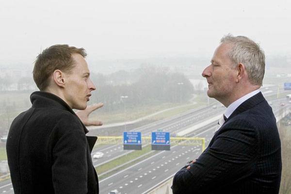
Daan Roosegaarde and director of Heijmans. Credit: ‘Daan Roosegaarde’ and Heijmans.
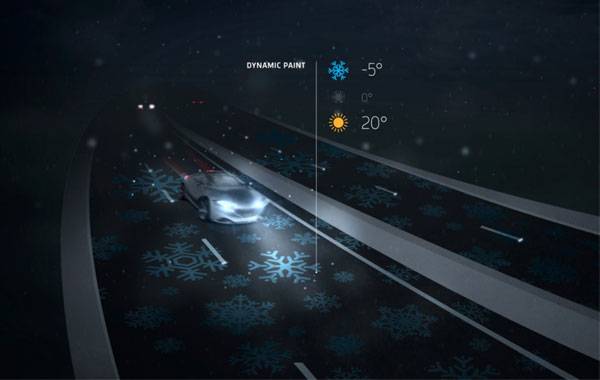
Dynamic paint – Credit: ‘Daan Roosegaarde’ and Heijmans.
- Fabulous Bicycle Path Inspired by Van Gogh’s “Starry Night”
- Pavegen: Using the Pavement to Generate Energy
- Incredible Glow in the Dark Pathways
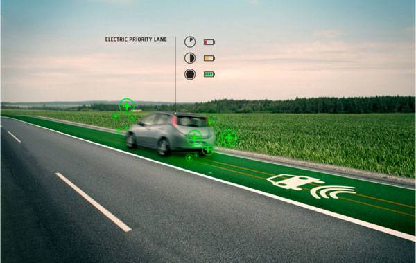
Priority lane – Credit: ‘Daan Roosegaarde’ and Heijmans.
Credit: ‘Daan Roosegaarde’ and Heijmans.
- Urban Planning For Dummies by Jordan Yin
- Becoming an Urban Planner: A Guide to Careers in Planning and Urban Design by Michael Bayer
Article by Auditi Bridget Biswas Return to Homepage


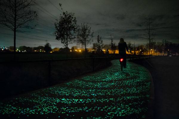
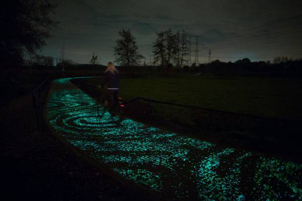
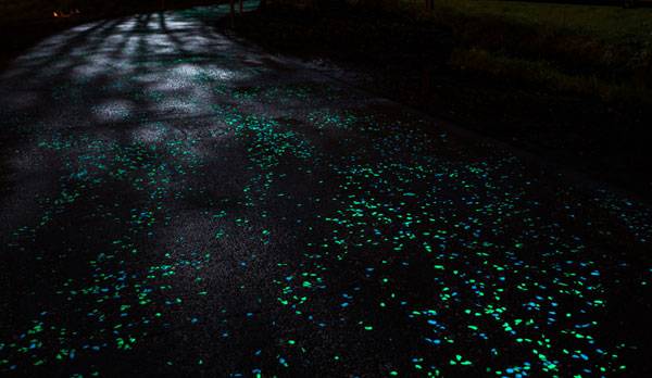
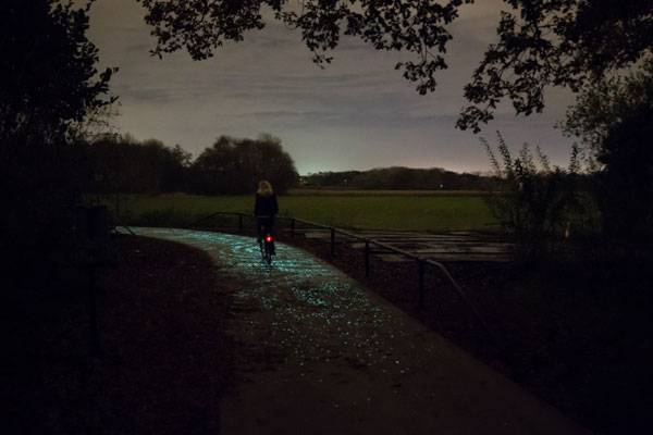
Fabulous Bicycle Path Inspired by Van Gogh’s “Starry Night”
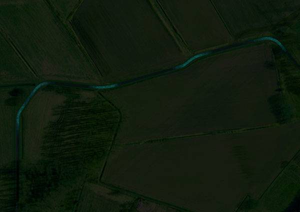
Starry Bicycle Path, Studio Roosegaarde, Eindhoven, the Netherlands. The city of Eindhoven, in the south of the Netherlands, is the hometown of Vincent Van Gogh, one of the most well known Dutch painters. The opening of a solar bicycle path inspired by Van Gogh’s most recognizable painting, “Starry Night,” this November marked the beginning of an international year celebrating his work and legacy, with activities spanning three countries: the Netherlands, Belgium, and France. Daan Roosegaarde, a Dutch designer who explores the relation among people, technology, and space and the author of the Lotus Dome project, has created this magnificent, glowing cycle path. This one-kilometer path is Roosegaarde’s second achievement in the Smart Highway project, through which he aims to build energy-smart, interactive, and memorable highways.
Credit: ‘Daan Roosegaarde’ and Heijmans
Glow in the Dark Bicycle Path
Van Gogh year 2015 “125 years of inspiration” marks the 125th anniversary of the death of Van Gogh (1853-1890). To pay tribute to Van Gogh’s legacy, Roosegaarde wanted to create something incredibly poetic, a place that people will experience in a special way. The cycle path is located in Eindhoven, where Van Gogh was born and raised. He often used Eindhoven as a backdrop for his paintings.
Credit: ‘Daan Roosegaarde’ and Heijmans
Credit: ‘Daan Roosegaarde’ and Heijmans
Credit: ‘Daan Roosegaarde’ and Heijmans
Credit: ‘Daan Roosegaarde’ and Heijmans

Credit: ‘Daan Roosegaarde’ and Heijmans
- World’s tiniest recessed LED luminaire – 1PUCK LP by MINIMIS
- Pavegen: Using the Pavement to Generate Energy
- Incredible Glow in the Dark Pathways
Credit: ‘Daan Roosegaarde’ and Heijmans
Credit: ‘Daan Roosegaarde’ and Heijmans
- Urban Planning For Dummies by Jordan Yin
- Becoming an Urban Planner: A Guide to Careers in Planning and Urban Design by Michael Bayer
Article by Diana Ispas Return to Homepage

Unbelievable Conceptual Pool Design That Plays With Your Mind
The Pool, By Nippaysage, Emile Gamelin Plaza, Montreal, Canada Illusion and whimsy combine to create a cool, blue oasis in Montreal’s Emilie Gamelin Plaza in the center of the city. Architect Nippaysage has used paint and geometric designs to give a rectangular slab of hardscape the optical shimmering feel of a real swimming pool. Draw closer, and you will see that the pool is a place to play: Hopscotch grids, chessboards and giant tangram puzzle pieces invite users to take a break from their busy urban lives.

Photo Credit: The Pool, Emilie Gamelin Plaza, Montreal, by Nippaysage

Photo Credit: The Pool, Emilie Gamelin Plaza, Montreal, by Nippaysage by Frédérique Ménard-Aubin

Photo Credit: The Pool, Emilie Gamelin Plaza, Montreal, by Nippaysage by Frédérique Ménard-Aubin
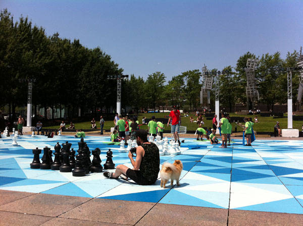
Photo Credit: The Pool, Emilie Gamelin Plaza, Montreal, by Nippaysage
The Dry Pool Design that Recreates the Fun of Being at the Pool
These installations within the pool design provide everyday fun, but also attract interest during festivals and special events held in the plaza, including the summer park program organized by Le partenariat du Quartier des Spectacles, the project’s client. The primary concept of the pool design was to create the illusion of an actual swimming pool, which has been achieved by varying the tints of blue to trick the human retina into seeing the shimmers it would expect to see in a real pool. The cerulean colors were chosen not only for the purpose of depicting a pool, but also because the color blue is often conceptually associated with depth and stability, symbolizing trust, loyalty, wisdom, confidence, intelligence, faith, truth, and communication. The last of which is the most important, because the pool design is intended to bring people together in a place where they can interact and have fun.

Photo Credit: The Pool, Emilie Gamelin Plaza, Montreal, by Nippaysage by Frédérique Ménard-Aubin
- Rooftop Infinity Pool with Awesome Views
- Sky Pool Takes World Class Design to the Next Level
- Swimming Pool Design with the Wow Factor
Would you like to play chess with the Kings and the Queens or play tangram with squares and triangles? Here in Emilie Gamelin, you can do both. The pool welcomes you with its playful furniture and the sense that you are surrounded by cool, blue water on a hot summer day.
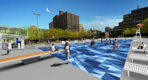
Photo Credit: The Pool, Emilie Gamelin Plaza, Montreal, by Nippaysage
- Urban Design by Alex Krieger
- Digital Drawing for Landscape Architecture by Bradley Cantrell
Article by Sha Sulaiman Return to Homepage