


Landscape Architecture for Landscape Architects › Forums › GENERAL DISCUSSION › Bad font decisions, yes I’m talking to you Papyrus users!
- This topic has 1 reply, 29 voices, and was last updated 14 years, 3 months ago by
 Andrew Garulay, RLA.
-
AuthorPosts
-
June 13, 2011 at 11:42 pm #162180
Anonymous
InactiveI have to admit, you have a lot of chutzpah going toe to toe with veterans that were making a living off of this profession when you were still in diapers. You’re talking to people who don’t need to refer to Dirr because they’ve observed plants over enough seasons in different places that they really know what plants will do in different parts of various regions. I was pretty brash in my day, but I didn’t have the nerve to lecture scarred up, grizzled old landscape warriors on design principles. In fact I still watch what I say to my senior landscape architects and designers. It’s no fun having egg on your face.
June 13, 2011 at 11:45 pm #162179InactiveAlex – “…choosing the wrong font is similar to choosing the wrong plant.” I think it’s more like choosing the wrong color green to render your lawn or drawing the shadows in the wrong direction on a drawing. These are the things clients and bosses might notice, but really don’t give a rat’s a$$ about. Choosing the wrong plant can waste a client’s money, create dangerous and/or unpleasant conditions, and even work against your design intent.
I’m sure you were taught enough design graphics in your program to last you a life time. There’s not enough time to teach everything a student should know about landscape architecture in 4 or 5 years. What part of the curriculum would you suggest they sacrifice to go more in-depth into font sciences?
If a font doesn’t look or feel right, don’t use it. Done and done. Stop with the chin stroking and design.
June 13, 2011 at 11:50 pm #162178 Lily-Love TopparParticipant
Jason, you are the MAN! I thought of doing something like this after work, but I am glad you did. I wish people could open their eyes and see that Papyrus and Comic Sans are very unique. They sure deliver!!!
June 13, 2011 at 11:55 pm #162177 ALEX PParticipant
Unique? How is something that every “natural” food vendor and landscape design company uses unique. I could see if it was some custom font, then yes it is unique.. but lets not get ahead of ourselves.
June 14, 2011 at 12:03 am #162176Lily-Love TopparParticipant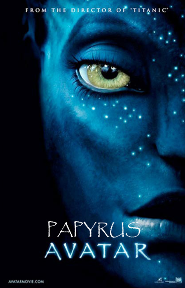
How glorious the font that sits on this page
Take that smirk expression off your face
Papyrus rules!!!
June 14, 2011 at 12:11 am #162175 Heather SmithParticipant
haha…I mean…this is serious business!
June 14, 2011 at 12:16 am #162174Heather SmithParticipantThank you for your concern.
I didn’t say I don’t LIKE graphic design I said I don’t believe all design is graphic design.
Like someone mentioned on here previously a good designer doesn’t even need a computer to get their ideas across. I believe it was Olmsted’s son that sketched out the lay-out for the University of Idaho’s grounds on a napkin. Nope, it probably wasn’t framed as art…I just think it is very easy to be distracted by tools. If you don’t like those fonts don’t use them. Problem solved.
If you think the type of font you choose is going to save the world be prepared to be disappointed.
Also, wanted to add that my graphics professor Stephen Drown absolutely could hand render a beautiful design with some colored pencils and scratch paper. We were taught that we needed the ability to produce work, “quick and dirty” because time is money. A client probably doesn’t want to pay you $100 an hour to mull over the finer points of font. Your job is to design landscapes…not fliers. Of course you want your information to be legible. That goes without saying. But if you are stressing over font you are probably not moving through your work as quickly as you should be. Pick a font. Use it.
June 14, 2011 at 12:22 am #162173ALEX PParticipantI just graduated, and i am not about to snub the very institution that gave me a degree (cum laude i must add) but there is a few places to add it. I mean even just one graphic design class is more than needed.
To your other comment, I am not here to go toe to toe with someone. I was using Dirr as an example that i figured everyone would get. I am, as im sure you can tell, more than a little passionate about the issues at hand. Im not one of those LA’s who wants to save the world via saving a prairie, but instead via good graphic communication. It really irks me how lax some of the people are on this feed about graphics. Why do something you know is bad? It would be different if we were arguing about a font that actually looked mildly good. I am just one of those people that is not going to back down to someone just because they have been doing it for 23 years, to me thats even more of a reason to start an uprise. I mean I could really start a whole other forum about Mac vs. PC but that is something that mac will aways win. I wanted to get this issue off my chest. I have spent the past 5 years of seeing my classmates with a good project ruin it by an awful font choice (not to mentions bad tracking, colour, kerning, to which i’m not even going to start mentioning, there are people in my class who don’t know the difference between cmyk and rgb). Yes it is like choosing the wrong colour to render a lawn. You are not going to chose hot pink to do a lawn (unless your are rem koolhass) but will that change how a project is perceived.. yes.. even on a more normal colour such as french grey 70% and cool grey 30%. Those are just shades of black, but yet completely different. similarly helvetica and papyrus are just fonts, yet completely different. Give me a reason not to care about graphic communication, in an age when most people are addicted to the visual aspect of life. Even when saving a prairie aesthetics matter!
June 14, 2011 at 12:23 am #162172ALEX PParticipantJust because james cameron does it does not mean landscape architects should use it. I liked titanic, but im not building a boat, or drawing Rose.
June 14, 2011 at 12:24 am #162171Lily-Love TopparParticipantLandscape Architects should do this if it fits their design intent. In most cases, it does.
June 14, 2011 at 12:27 am #162170Heather SmithParticipantSeriously…Lily is right. I would LOVE to use a pirate font if I was designing a pirate themed park and it worked. Why not?
June 14, 2011 at 12:34 am #162169ALEX PParticipantI only use one font! I dont stress out about it, i dont waste $100 an hour, I’m not sure about what you learned at Idaho, but how can you not say all design is not graphic design. i believe the book for landscape architect to use when making construction docs is called the “graphic standards for landscape architects..” i could be wrong miss smith, but either way how is the contractor supposed to build your landscape if its illegible, or the “graphics” dont read. Im dont get how good ole freddy got brought up in all this? By distracted by tools do you mean technology, adobe creative suite.. i dont think anyone has died from photoshop, although i could be wrong, i mean i have seen some “to die for graphics” come out of illustrator. I dont hand render. So i dont waste time stressing over what prisma marker to render a plan, or when the next mike lin lecture is going to be. okay so maybe the poster is actually your plan.. hmm… makes sense to me. im sorry, but i really dont understand anything you are talking about.
June 14, 2011 at 12:35 am #162168InactiveIf it can be read clearly and you’re having fun, I say go for it.
June 14, 2011 at 12:36 am #162167ALEX PParticipanteven pirates of the Caribbean did not use this font.. thats how bad it is
June 14, 2011 at 12:52 am #162166Heather SmithParticipantbut how can you not say all design is not graphic design.
Because it isn’t.
-
AuthorPosts

- You must be logged in to reply to this topic.