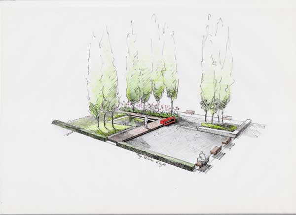
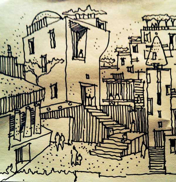
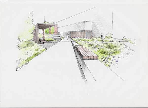
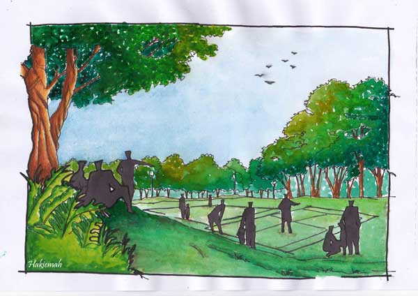
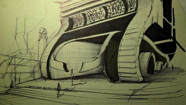
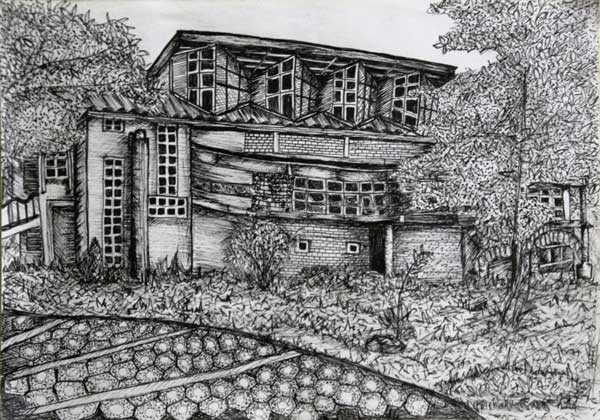
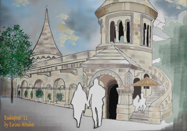
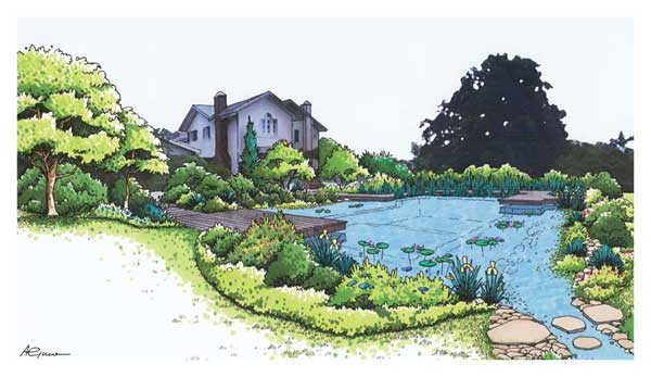
This Saturday we’ve reached our tenth edition of our beloved Sketchy Saturday! I hope you’ve had as much fun as we had admiring and learning from all the artistic, technical and detailed sketches from our readers. As this is a special edition, a mini anniversary so to say, we tried to pick the best of the best, looking out for essentials like style, mediums and perspectives. Enjoy this week’s Top 10! No. 10 by Wiktor Kłyk, landscape architect
‘This is a sketch for an outdoor garden. The concept was based on symmetry and geometrical shapes, in respects to the outdoor furniture as well as the trees and plants that accompany them. The perspective of the sketch is semi-aerial, so that we can see how the atmosphere in the garden will be. It features a small pond, benches and rows of trees and flowers set geometrically to the whole concept. The sketch was done in pen and colour.’ No. 9 by Anton Comrie, director at PrLArch ‘This sketch is called ‘Urban Utopia’ and I made it with a felt tip pen on a 100mmx100mm white post-it note. When exploring ideas in design, it is often a matter of putting pen to paper and starting to draw. With this as an example, it does not matter what the drawings are at first. They are, in a way, just like stretching exercises before a workout. Personally, I find this way of exploration liberating and fun while offering different angles of approach to a design. As landscape architects, drawing assists greatly in making us better designers rather than makers of good drawings.’ No. 8 by Van Cam Hoang ‘Landmark is a construction company which is specialised in council kit form. This is the viewing platform product of Landmark. The hand sketch perspective helps us to imagine how the platform looks e and how much people could enjoy it. The perspective gives us the view of the surrounding landscape as well as shares the enjoyment of the viewers. ‘ No. 7 by Wiktor Kłyk, landscape architect ‘Gardens are essential in urban areas. This one fits great among the surrounding buildings and it also holds true to their geometry in its design. Its style is quite minimalistic, with simple plants and a few covered and semi-covered leisure spots. Wood is quite prevalent as a material, but overall, the garden can be a nice spot for meditation or a coffee break. I drew it in pen and colour.’ No. 6 by Kiemah Hakiemah ‘This sketch shows a recreational park and activities that bring people together within this gathering area. Here we tried to fulfil the parks requirement as an area for connection with open spaces or an area set aside for recreation, which includes the delightful aesthetic result of enhancing the space.’ No. 5 by Hamidreza Massahi, designer from Iran The style of this sketch is quite futuristic with a gloomy note, but it shows how great design comes by just by putting down your ideas on paper. Sketching spontaneously and doing designs that come just out of your head on the spot, can made for the best sketchy work and later to great real-life designs. ‘This sketch was made on A4 paper and I did it in about 20 min. I tried to capture the best view of my idea and to show the scale of the building. I drew a bus and some buildings in the background on the left and some human figures. I did this sketch with just a pen and marker, without a model or erasing, just from my imagination.’ No. 4 by Attila Tóth, Slovak University of Agriculture, Nitra ‘This picture was sketched on a sunny summer’s day at a pond in Hungary called Római tó with the aim to capture the calm and idyllic atmosphere of the water scenery. The unruffled surface of the pond and the pleasant tiny fishing cottages are framed by tree and shrub compositions. The reed and the small pier impart depth to the sketch and draw you into the composition.’ A basic pencil sketch in itself, this is the most definite and pleasant way to capture a detailed view of a special perspective. No. 3 by Jehanna Abdulkarim, LA student from University of the Philippines Diliman ‘I made this sketch when I was a 1st year LA student and we were asked to do some sketches for our class. This is a sketch of UP Diliman College of Architecture Building 1I was drawn towards its unique architectural design among other buildings in the campus. The medium used was pen and ink.’ No. 2 by Eirini Mouka, landscape architect ‘This is a drawing from a place I visited in Budapest in 2011, during my participation in Erasmus IP, at the University of West Hungary. I used pencils and pens for drawing, and Photoshop for painting.’ No. 1 by Alexandre Guillet, Landscape architect at J.N. Jardins naturels SA., Switzerland ‘This represents a natural swimming pool project in the area of Geneva, Switzerland. The perspective was elaborated by J.N. Jardins naturels Chavornay SA and illustrates the integration in the garden using hand sketching (the house plants) and Photoshop (the water and background).’ I hope you enjoyed our tenth edition of Sketchy Saturday. We love that you guys are such avid drawers and send us your best work. However, if you want to improve on your LA designs, why not check out our book review of Drawing for Landscape Architecture by Edward Hutchison. Also, browse through Sketchy Saturday No.009 to other amazing sketches! Sketchy No. 011 is soon to come! But until next time, don’t forget to send your work along with a short description of the sketch to get a better chance of having your work selected for our weekly Sketchy! See you next Saturday! Article written by Oana Anghelache. Published in BlogLogin
Lost Password
Register
If this is your first time on the new site, please click "Forgot your password?". Follow the steps to reset your password. It may be the same as your old one.


