


Author: Land8: Landscape Architects Network

Offenbacher Hafen Turns from Polluted Industrial Port to Ecological Riverfront
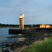
Offenbacher Hafen, Atelier Dreiseitl, Frankfurt, Germany. For the past two decades, sustainability and creating ecological cities have become the buzz words dominating discussions on nature in the city. But these countless discussions and debates on the matter are often accompanied by a shadow of skepticism in regard to their actual implementation. Landscape architects are among the main key players — although not the only ones — who have taken on the responsibility of showing how these concepts can be applied to real-life projects. So what are the factors that can contribute to shaping an ecological city through a landscape architecture project? The award-winning design of Offenbach Harbor (Offenbacher Hafen) shows a genuine example of how it can be done.

Offenbacher Hafen. Image credit: Atelier Dreiseitl.
Offenbacher Hafen
The Legacy of Industrial Revitalization in Germany One of the challenges standing in the way of creating ecological spaces is represented by the many factories and industrial landscapes made obsolete in the decline of heavy industry. Examples from the Ruhr and other regions of industrial Germany prove that this country stands as a pioneer in industrial revitalization. Offenbach Harbor, located on the Main River in Frankfurt, Germany, is a former industrial port that had been utilized since the 1950s for the storage and transportation of petroleum, sand, scrap metal, and gravel. The plan to transform this area into a new commercial and residential zone has initiated a €800-million project that would change the face of the port and give it a new identity.

Offenbacher Hafen. Image credit: Atelier Dreiseitl.
- How The Chicago City Hall Green Roof is Greening the Concrete Jungle
- Potsdamer Platz in Berlin Becomes a Sustainable Ecofriendly Urban Square
- How Bishan Park Became “The Central Park” of Singapore
Zollhallen Plaza. Image credit: Atelier Dreiseitl

Offenbacher Hafen. Image credit: Atelier Dreiseitl.

Offenbacher Hafen. Image credit: Atelier Dreiseitl.

Offenbacher Hafen. Image credit: Atelier Dreiseitl.

Offenbacher Hafen. Image credit: Atelier Dreiseitl.

Offenbacher Hafen. Image credit: Atelier Dreiseitl.

Offenbacher Hafen. Image credit: Atelier Dreiseitl.
Full Project Credits for Offenbacher Hafen
Project Title: Offenbacher Hafen (Offenbach Harbor) Landscape Architect: Atelier Dreiseitl Client: Mainviertel Offenbach GmbH & Co. KG Location: Frankfurt, Germany Expected Year of Completion: 2020 Area: 290,000 m2 Budget: 800 million euros Award: DGNB Gold Sustainable City District
Recommended Reading:
- Landscape Architecture: An Introduction by Robert Holden
- Landscape Architecture, Fifth Edition: A Manual of Environmental Planning and Design by Barry Starke
Article by Dalia Zein


Levinson Plaza Creates a Green Refuge in the City
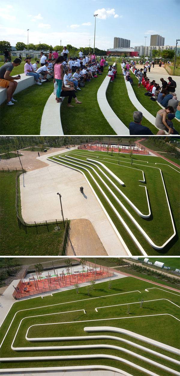
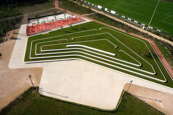
Levinson Plaza, Mission Park, Boston, Massachusetts, USA, by Mikyoung Kim Design. A city plaza is more or less like an urban jungle where people can unwind and get in touch with their inner naturalist. Maybe they do not even know that they secretly admire nature in this mechanized world. But a plaza in the midst of busy roads and lanes has always attracted people of all ages and has helped people to unveil that secret. Located on what had once been a raised plaza that was largely exposed to the traffic and train congestion of nearby Huntington Avenue in Boston, Levinson Plaza in Mission Park was redesigned to shelter it from the nuisances of the busy thoroughfare and to satisfy the need for a children’s play area, a community gathering space, recreational spaces, and other multi-programmatic activities for nearby residents. Mikyoung Kim Design designed the new urban plaza, creating an urban park and a green refuge in the city.

Levinson Plaza by Mikyoung Kim Design.
Levinson Plaza
Easily accessible to all, the design team planned the plaza as an urban grove to accommodate a complex program. The plaza consists of lawns, canopy trees and different types of textured plant species, contemplative seating areas for different groups of people, and flexible open space to serve as venues for large gatherings during festivals such as the Chinese New Year, Russian Unity Day, and other cultural and civic events. The seating areas are designed thoughtfully and creatively. There are different sorts of seating arrangements. One is the bench type just beside the textured, flowering plants shaded by canopy trees. This type of seating is for people to admire nature and to enjoy their time in solitude. Another sort is the ones that can serve groups of people playing games such as Tai Chi and chess.

Levinson Plaza by Mikyoung Kim Design.

Levinson Plaza by Mikyoung Kim Design.
- Crown Sky Garden Inspires Healing
- The ChonGae Canal Turns an Auto-Centric Zone into a Pedestrian Haven
- 7 Female Landscape Architects That You Need to Know About

Levinson Plaza by Mikyoung Kim Design.
Levinson Plaza by Mikyoung Kim Design.

Levinson Plaza by Mikyoung Kim Design.

Levinson Plaza by Mikyoung Kim Design.

Levinson Plaza by Mikyoung Kim Design.
Full Project Credits for Levinson Plaza
Landscape Architecture: Mikyoung Kim Project: Mission Park Plaza, Location: Boston, Massachusetts, USA Completion: 2008, Area: 2800 m2, Design budget: $82,000, Construction budget: $1.2 million. Client: Roxbury Tenants of Harvard Photography credit: Lisa Garrity, Charles Mayer Landscape Contractor: Paragon Landscape Construction Show on Google Maps
Recommended Reading:
- Landscape Architecture: An Introduction by Robert Holden
- Landscape Architecture, Fifth Edition: A Manual of Environmental Planning and Design by Barry Starke
Article by Farah Afza

Turn Useless Objects into Gold: Give Your AutoCAD Drawing a Makeover
Turn Useless Objects into Gold from our resident AutoCAD expert UrbanLISP to make your work in AutoCAD more efficient. After the conceptual phase during which you make a lot of sketches, it’s time to get real. A good drawing of the existing situation of the site is essential for making a proper plan drawing. Although AutoCAD is the industry standard for these drawings, when working on projects across the world, it becomes clear that there is no standard on how information is organized. So you will have to work with the information you get. Take trees for instance. The way they are represented is quite essential to your drawing. But if you only receive points for the tree locations, you are far off from a nice plan drawing. It’s easy to place a block on a point. Just make sure you snap to the node of the point. If you work on a site of a few square kilometers, however, it becomes a different story. You might have a few thousand points on which to place a tree. As mentioned in the article ’10 must do’s to become a professional autocad user’, drawings are essentially graphical representations of databases. Perhaps the term big data rings a bell? The databases are packed with useful information. If you know how to access those databases, you can turn useless objects into gold. See these AutoCAD tutorials:
- 4 AutoCAD Commands to Draw Paving Patterns on Curving Paths
- How to Show Topography in your Plan Drawing in AutoCAD
- How to Place Large Quantities of Trees in a Master Plan Instantly with AutoCAD
Point to Block The bare minimum you can find as specification for a tree location is a point. Of course, there is a lot more information you might want to have for a tree. If you are missing the location, it’s impossible to place a tree. With the ‘Point to Block’ command, it’s easy to turn all the points in your drawing into blocks. Line to Block A point is a one-dimensional object; essentially, just a location. A line is two-dimensional and gives us more information. With the ‘Line to Block’ command, we can use that information. A line has two points: a start point and an end point. Those points give us valuable information. We can use either one of those points to place a block. But when you know these points, you also know the midpoint. So that’s three points we can potentially use to place a block. But let’s take it one step further. When you have two points, you also have a distance. That’s information, as well. So when we place a block on a line, we have three options for the placement and the option to scale it; we just relate it to the distance. Circle to Block Lines aren’t the only linear entities we can use. Circles also contain information that allows us to place a block. If you only have arcs in your drawing, don’t worry. Arcs are essentially circles that aren’t closed. So if you want to have circles instead, you can use ‘Arc to Circle’ and all your arcs will turn into circles in no time. A circle is essentially defined by two values — the center point and the radius. With ‘Circle to Block’, we can place a block on the center point and relate the scale to the radius. Block on Text Sometimes site drawings show the location of the tree as text. The content of the text is often related to the species. With the ‘Block on Text’ command, it’s possible to select text entities and place a block on them. By selecting the text entity with the proper content, you can place different blocks on different contents and place species-specific blocks on the text. WATCH: Our YouTube Video for this Tutorial
These are a few very basic metamorphosis tools from the UrbanLISP app store to turn your CAD file into a representable drawing. Information can be provided in many different ways and in different formats. Even an Excel file with a tree inventory can be very useful and can be imported to a drawing. We live in an age of big data. If you know how to access and use that data, you can turn something that seems useless into gold.
Recommended Reading:
- Digital Drawing for Landscape Architecture by Bradley Cantrell
- Detail in Contemporary Landscape Architecture by Virginia McLeod
Article by Rob Koningen
You can see more of Rob’s work at UrbanLISP

Ground Breaking Project Brings Affordable Housing Scheme to all in Cambodia
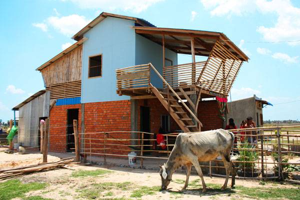
Building Trust international, Atelier COLE and Habitat for Humanity Cambodia announce details of a creative affordable housing scheme encouraging and promoting client involvement in design and future expansion of their home. Building Trust international and Atelier COLE have unveiled their latest collaboration with Habitat for Humanity Cambodia with a creative housing scheme. Framework House is an innovative low-cost housing project providing opportunities for NGOs and Government groups to encourage client involvement in the layout and material selection of their home.
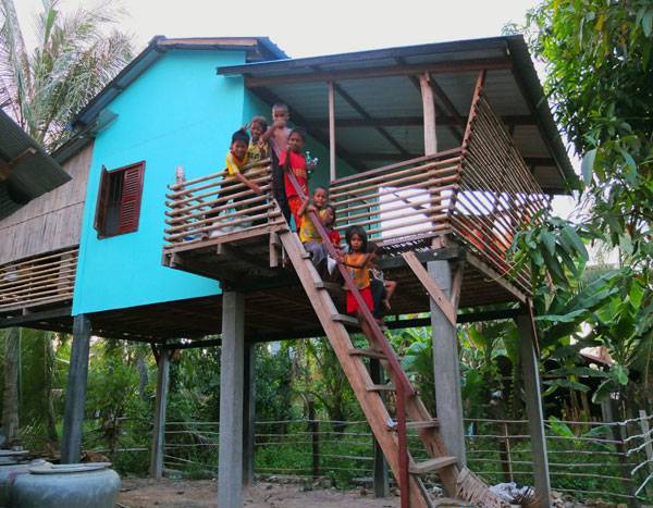
Family sit outside their new Framework House. Photo courtesy of Building Trust International
Quality Housing Design
Framework House incorporates lessons on sustainable building techniques, healthy home principles and provides options for structured expansion and investment over time. The design allows for infill wall and floor materials that are site specific, reducing the overall cost and carbon footprint. These infill areas allow for expansion and extension of the property over time by residents, once skills have been shared through construction. Each Framework House costs just $2500 With funding through SELAVIP, Building Trust were able to construct 9 pilots of the new flood resistant adaptable homes for families affected by HIV/AIDS on the outskirts of Phnom Penh, Cambodia. Each Framework House costs just $2500 for the initial weather resistant home. It is the result of over a year of research and engagement with local community groups and charitable organisations.
Family sit outside their new Framework House. Photo courtesy of Building Trust International
- Building Trust International-PLAYscapes Competition
- Building Trust International Interview
- Reflecting on the Past While Looking Forward to the Future with Wildlife Conservation
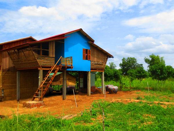
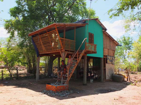
Framework House designed by Atelier COLE in partnership with BTi. Photo courtesy of Building Trust International
Framework House adapted by home family with walls filled in on ground floor
Bamboo and wood are used to create the balcony. Photo courtesy of Building Trust International
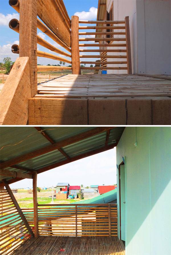
Top: Framework House adapted by home family with walls filled in on ground floor Bamboo and wood are used to create the balcony. Below: Split bamboo is used to create floor and balcony Children enjoy their new home. Photos courtesy of Building Trust International


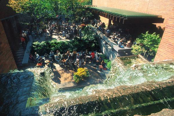
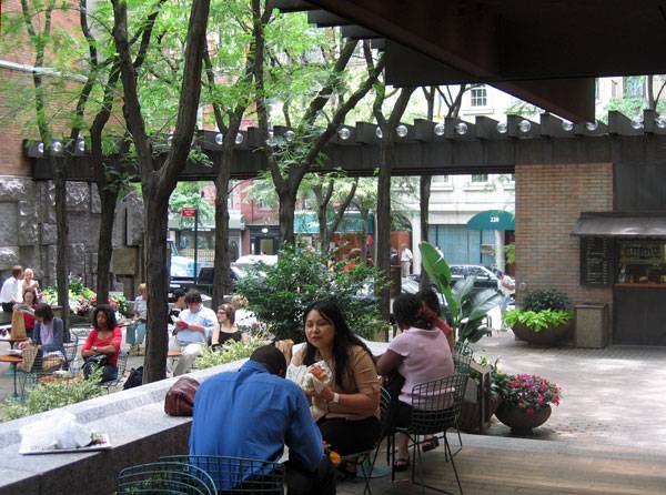
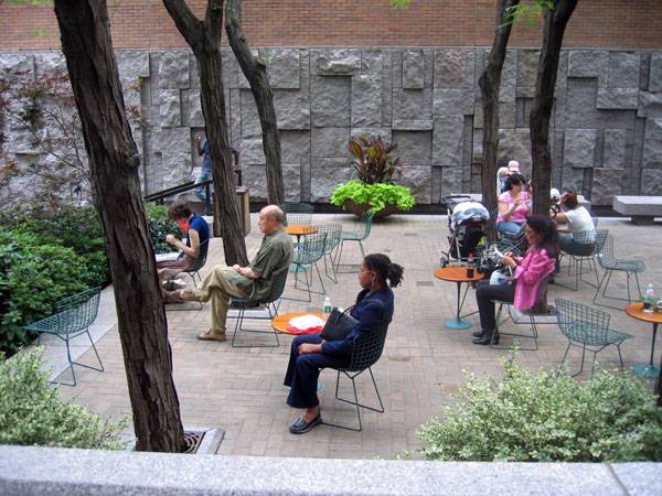
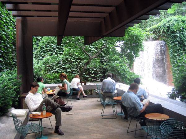
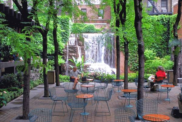
How to Bring Out the Best of a Small Site – Greenacre Park
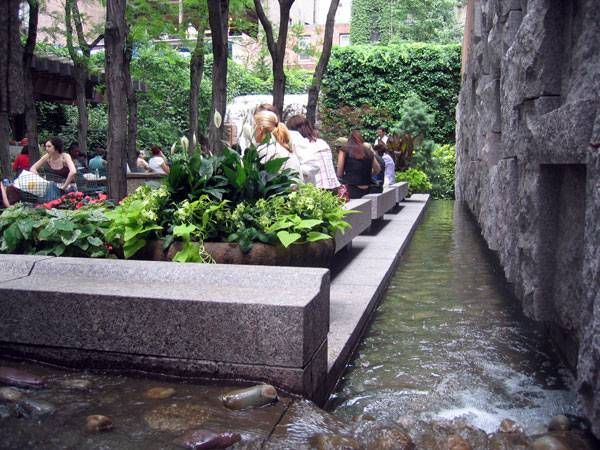
Greenacre Park, by Sasaki Associates, Inc., New York City. “Cities are as good as their public spaces”, urban planner Gerhard Curdes once said. Public spaces are the response to multiple needs and wishes and are at the heart of every city. But not all public spaces are alike: The good ones improve the quality of public life; the not-so-good ones lower that quality. Among the many options are pocket parks in inner-city areas — urban open spaces on a very small scale that meet a variety of needs. They are a perfect solution for people taking a break during the workday, serving professionals, tourists, shoppers, and the neighboring population.
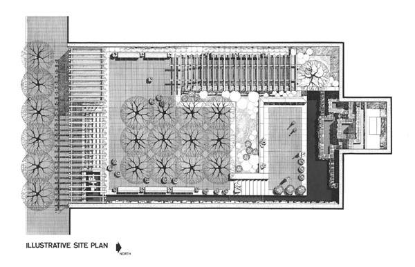
Masterplan of Greenacre Park. Image courtesy of Sasaki Associates, Inc.
Greenacre Park
New York City embraced the idea of pocket parks in late 1964, when The Park Association of New York City organized to support the formation of public green spaces from small, unused lots in the city. In 1975, Hideo Sasaki, founder of Sasaki Design, created the plans for one such space, Greenacre Park. Sasaki is an internationally renowned landscape architect admired for his multidisciplinary approach to design. Through the modernist style of this park, he offers New Yorkers an intimate experience in the middle of the city.
Greenacre Park. Image courtesy of Sasaki Associates, Inc.
- Pocket Parks: Why size doesn’t matter
- Channel Center Park and Iron Street Park Bring Life into Boston
- How Departments of Parks and Recreation Are Making the World a Better Place
Greenacre Park. Image courtesy of Sasaki Associates, Inc.
Greenacre Park. Image courtesy of Sasaki Associates, Inc.
Greenacre Park. Image courtesy of Sasaki Associates, Inc.
Greenacre Park. Image courtesy of Sasaki Associates, Inc.
Greenacre Park. Image courtesy of Sasaki Associates, Inc.
Full Project Credits for Greenacre Park
Project: Greenacre Park Location: New York City, NY. Designers: Sasaki Associates, Inc. Completion: 1975 Size: 6,000 square feet Cost: $1.6 million Show on Google Maps
Recommended Reading:
- Landscape Architecture: An Introduction by Robert Holden
- Landscape Architecture, Fifth Edition: A Manual of Environmental Planning and Design by Barry Starke
Article by Ruth Coman


Geometry Brings Out the Best in Landscape Architecture at the Earthly Pond Service Center
Earthly Pond Service Center of International Horticultural Exposition 2014, by HHD-FUN, in Qingdao, Shandong, China. Every once in awhile, we are reminded how much of our world relies on shapes and the way they relate to one another. The Earthly Pond Service Center was created by the talented team of architects and landscape designers at HHD-FUN, demonstrating how powerful an influence geometry actually has over the field of landscape architecture. This project is located in Qingdao (China) and it was completed between 2011 and 2014, covering a site area of 23,000 square meters and a floor area of 6,539 square meters. It represents a perfect obedience to the field of geometry, and the final result is no less than spectacular, demonstrating that each and every functional space is pure mathematics.

Earthly Pond Service Center of International Horticultural Exposition 2014, by HHD-FUN. Photo credit: DuoCai Photograph
Earthly Pond Service Center
Natural Gradients Used for the Benefit of the Aesthetic Experience In designing the Earthly Pond Service Center, the creative minds at HHD-FUN decided to make good use of the natural gradients. At the same time, it was highly important to maintain a strong connection with nature, given the inspiration for the project. Thus, it was decided that the courtyard of the Earthly Pond Service Center would connect with the surrounding lake wetlands, providing the perfect blend between landscape architecture and nature, in its most beautiful form. [contextly_sidebar id=”vgfAcOF7ryakWyjELILoMjRvpFycXVjA”] Working to Compliment the Natural Gradient of the Site The shapes chosen for the making of this project provide fluidity, especially since all the landscape heights have been decided in accordance with the natural grade levels. Those who come to the Earthly Pond Service Center have the opportunity to enjoy the results of some amazingly creative people, with the different heights providing immense possibilities for accessibility and guaranteeing a unique viewing experience. Providing a Space of Peace and Quiet When seeing the different elevations, one can easily understand how the natural gradients were used for the benefit of the aesthetic experience. The main spaces have been chosen to be lower than street level, providing a place of peace and quiet. Apart from that, visitors are brought quite close to the water landscape, being able to enjoy its beauty and take in all that it has to offer.

Earthly Pond Service Center of International Horticultural Exposition 2014, by HHD-FUN. Photo credit: Zhenfei Wang

Earthly Pond Service Center of International Horticultural Exposition 2014, by HHD-FUN. Photo credit: Zhenfei Wang

Earthly Pond Service Center of International Horticultural Exposition 2014, by HHD-FUN. Photo credit: DuoCai Photograph

Earthly Pond Service Center of International Horticultural Exposition 2014, by HHD-FUN. Photo credit: Zhenfei Wang

Earthly Pond Service Center of International Horticultural Exposition 2014, by HHD-FUN. Photo credit: Zhenfei Wang
Full Project Credits for Earthly Pond Service Center
Landscape Architecture: HHD_FUN: Project Name: Earthly Pond Service Center of International Horticultural Exposition 2014 Qingdao, Shandong Location: QingDao China Completion Date: 2011-2014 Architecture: HHD_FUN LDI: BDG Qingdao beiyang architectural design co., LTD Site area: 23000 m2 Floor area: 6539 m2 Photographer: Zhenfei Wang; DuoCai Photograph ( Aerial views) Show on Google Maps
Recommended Reading:
- Landscape Architecture: An Introduction by Robert Holden
- Landscape Architecture, Fifth Edition: A Manual of Environmental Planning and Design by Barry Starke
Article by Alexandra Antipa


One Central Park Brings Nature Back to Sydney
One Central Park, by ASPECT | OCULUS, in Sydney, Australia. One Central Park is an urban infill redevelopment in Sydney, Australia. Two mixed-use towers composed of residential, commercial, and retail units stand on the former Carlton and United Brewery site. The walls were designed by French artist and botanist Patrick Blanc. The award-winning planting design was done by ASPECT | OCULUS and uses 250 species of native Australian plants. The plants were carefully selected using scientific modeling techniques. To the north lies Sydney’s skyline and spectacular harbor; to the south many of the city’s sprawling suburbs. The towers, bordered by Broadway and Abercrombie streets in Chippendale, stand between Sydney’s central business district and its sprawling suburbs. Due to their unique façades, the buildings also metaphorically stand at the intersection of architecture and landscape architecture.

One Central Park, by ASPECT | OCULUS. Photo credit: Simon Wood
One Central Park
Each residence and wall incorporates a green façade that, with a total area of 1,200 square meters, is said to be the largest en-mass vertical garden in the world. The development also boasts a Skygarden, internal planting, podium gardens, and a sunken courtyard. [contextly_sidebar id=”XqgqjKWXhcUqoCFUF8cyyonPlM7ZwPo6″] Integrating Plants and Water with Built Form ASPECT Studios promotes the practice of “living architecture”, which integrates plants and water with built form. For this project, this is achieved through the use of green roofs, facades, and walls. Living architecture is increasingly being recognized in Australia as a means of responding to climate change and dealing with the scarcity of water and energy. The “heat island effect”, in which the overall temperature of an area is increased through heat storage by buildings and road surfaces, has been identified as a growing problem in Sydney. Integrating living vegetation with buildings alleviates this problem. Other key benefits of living architecture include improvement in thermal performance of buildings, regulation of stormwater impacts, water recycling, and increased urban biodiversity.

One Central Park, by ASPECT | OCULUS. Photo credit: Simon Wood

One Central Park, by ASPECT | OCULUS. Photo credit: Simon Wood

One Central Park, by ASPECT | OCULUS. Photo credit: Simon Wood

One Central Park, by ASPECT | OCULUS. Photo credit: Simon Wood

One Central Park, by ASPECT | OCULUS. Photo credit: Simon Wood

One Central Park, by ASPECT | OCULUS. Photo credit: Simon Wood

One Central Park, by ASPECT | OCULUS. Photo credit: Simon Wood

One Central Park, by ASPECT | OCULUS. Photo credit: Simon Wood
Full Project Credits for One Central Park
Project Title: One Central Park Location: Chippendale, Sydney, NSW, Australia Year: 2013 Client: Frasers Property Australia and Sekisui House Australia Area Size: 5960sqm Budget: $1.8 million Photo Credit: Simon Wood Team: ASPECT | OCULUS (Landscape architects for the design, development and documentation of The Green Facade and courtyards) Patrick Blanc (Botanist and designer of The Green Wall component) Ateliers Jean Nouvel (Principal Architects for the building) PTW Architects (Architects for the building) JAAA +Turf Design Studio (Landscape architects for the site master plan) Junglefy (Installation of the Vertical Gardens) Watpac Construction (Builders) Awards: 2014 WAN Landscape Award – Finalist (ASPECT|OCULUS) 2014 AILA NSW Awards – Design (ASPECT|OCULUS) 2014 CTBUH Best Tall Building Award – Best Tall Building Worldwide (Awarded to Ateliers Jean Nouvel) 2014 International Green Infrastructure Award (Awarded to Frasers Property Australia and Sekisui House Australia) 2014 Leading European Architects Forum (LEAF) Awards – Sustainability Award, Overall Award (Awarded to PTW Architects + Atelier Jean Nouvel) 2014 Sydney Design Awards – Landscape Design Winner (ASPECT|OCULUS/ Frasers Property) 2014 NSW Architecture Awards – Residential Architecture, Multiple Housing (Team) 2014 CTBUH Best Tall Building Award for the Asia & Australasia Region (Team) Show on Google Maps
Recommended Reading:
- Landscape Architecture: An Introduction by Robert Holden
- Landscape Architecture, Fifth Edition: A Manual of Environmental Planning and Design by Barry Starke
Article by Gerard de Silva

Millenary Park Builds on the Past and Embraces the Future
Millenary Park by Ujirany / New Directions Landscape Architects, in Budapest, Hungary. The story of the rehabilitation of a former industrial site is not a new one. It usually involves demolition or re-use of existing structures and may require environmental remediation or restoration. The potential of these “brownfield” sites provides exciting opportunities for landscape architects, as they can design the landscape to transform spaces into habitable public assets. Former industrial sites also hold within them the memory of past technology and its place within the urban context. For this article, we shall tell this story through the powerful creation of Millenary Park in Budapest.

Millenary Park. Photo courtesy of Orsolya from Ujirany / New Directions’
Millenary Park
Millenary Park is located in a dense residential area in Budapest on the site of the former Ganz Works factory. The factory was home to one of the most innovative engineering firms of the 19th century, making it an important part of Hungary’s history. [contextly_sidebar id=”ZXv3wgpbtP8j7oXMuV0SvC2fusJlivrz”] It was originally located on the outskirts of the city, amongst vineyards and forests, but as the city grew, it became surrounded by a residential suburb and thus needed to be moved. This presented the opportunity to use the site as a public asset. It was decided to coincide its development with the Hungarian millennium in 2001, marking 1,000 years since the first Christian king, St. Steven, was crowned. The Industrial Site Dilemma As with most industrial sites, the first phase of development involved deciding which elements would be demolished and which would be kept. By retaining and re-using 30 percent of the existing factory buildings, a sense of memory and cultural history was maintained. This approach also allowed for unique experiences to be created through the contrast of historical elements and materials with contemporary form and function.

Millenary Park. Photo courtesy of Orsolya from Ujirany / New Directions’

Millenary Park. Photo courtesy of Orsolya from Ujirany / New Directions’

Millenary Park. Photo courtesy of Orsolya from Ujirany / New Directions’

Millenary Park. Photo courtesy of Orsolya from Ujirany / New Directions’

Millenary Park. Photo courtesy of Orsolya from Ujirany / New Directions’

Millenary Park. Photo courtesy of Orsolya from Ujirany / New Directions’

Millenary Park. Photo courtesy of Orsolya from Ujirany / New Directions’

Millenary Park. Photo courtesy of Orsolya from Ujirany / New Directions’
Full Project Credits for Millenary Park
Project: Millenary Park Location: Budapest, Hungary Architects: CÉH Ltd. Design year: 2000 Year of construction: 2001 Area: 34 800 m2 Office: Újirány Group – Új Irány Kkt. Authors: Árpád Kovács, Gábor Lendvai, Johanna Muszbek, Péter Pozsár, Dominika Tihanyi, Krisztina Wallner Building contractor/executor: Harkai és Társa Kft. Award: Europa Nostra, 2002 Show on Google Maps
Recommended Reading:
- Landscape Architecture: An Introduction by Robert Holden
- Landscape Architecture, Fifth Edition: A Manual of Environmental Planning and Design by Barry Starke
Article by Rose Buchanan


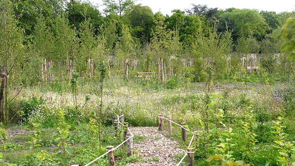
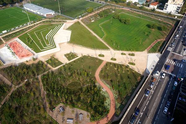
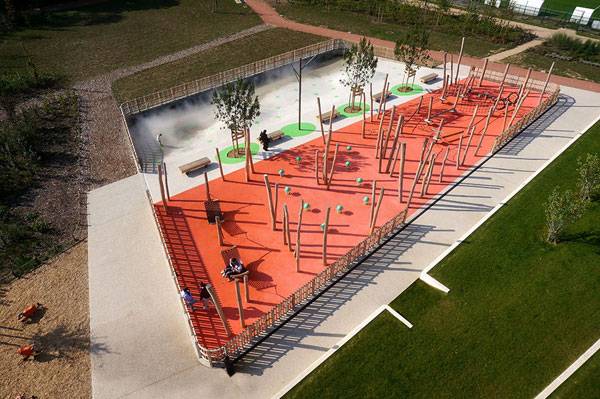
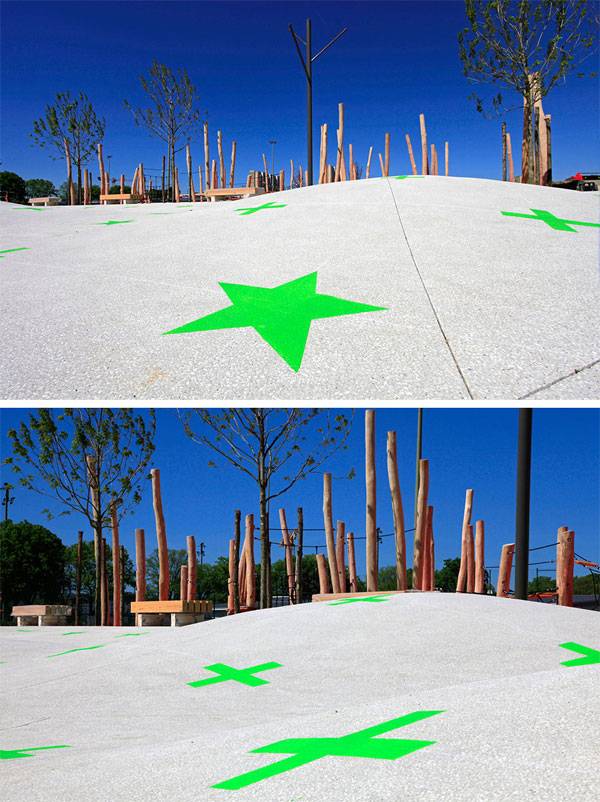
How Clos Layat Park is Bringing Biodiversity Back to the City
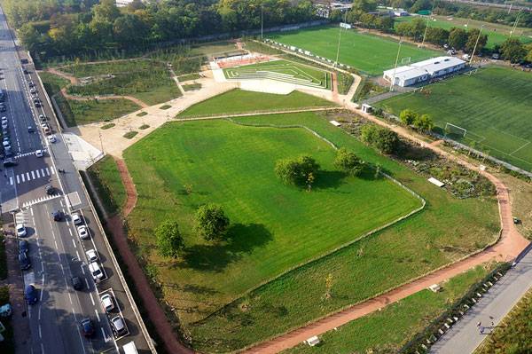
Clos Layat Park by Base Landscape Architecture + Arcadis + Les Eclaireurs in City of Lyon, France. There are often empty abandoned spaces in our neighborhoods that are not so often destined to becoming public spaces or parks but rather often taken over by real estate developers. The new park of Clos Layat was one of those forgotten places before the city administration decided to provide the three bordering neighborhoods of 7th, 8th districts and Vénissieux with the open space their communities were lacking. The strategic decision to “put nature in the heart of the neighborhood” as the deputy representative of the city administration Alain Giordano puts it, was taken by the city leaders despite the real estate pressure in the area and is of great importance for the public space structure of Lyon. The park adds its 3 hectares to the surrounding sports terrains which make altogether 10 hectares that complete Lyon’s green belt.
Clos Layat Park. Image courtesy of Base Landscape Architecture
Clos Layat Park
The landscape architects at BASE were in charge of the transformation of what was a vast terrain without purpose into a vital neighborhood park. Their approach to the structural design of the parks elements was based on the existing surroundings of the future park and the needs of the surrounding neighborhoods that were lacking public spaces. [contextly_sidebar id=”SrWb9YVKkiZJDEqvNwdjwd9ZhoDCGdXK”] Once part of the historical Saint Jean de Dieu Hospital, the park is now bordering its forest on the south. The team decided to establish a landscape continuity of that forest into the park creating a variety of a densely planted urban forest on the south of the park followed by a wide meadow dedicated to inviting and discovering biodiversity on the north. Their aim was not only to introduce biodiversity but also a mixture of experiences and activities in harmony with it. Entering the Clos Layat from its main entrance one doesn’t perceive right away the diverse activities and surprises the park has to offer.
Clos Layat Park. Image courtesy of Base Landscape Architecture
Clos Layat Park. Image courtesy of Base Landscape Architecture
Clos Layat Park. Image courtesy of Base Landscape Architecture
Clos Layat Park. Image courtesy of Base Landscape Architecture
Clos Layat Park. Image courtesy of Base Landscape Architecture
Clos Layat Park. Image courtesy of Base Landscape Architecture
Clos Layat Park. Image courtesy of Base Landscape Architecture
Clos Layat Park. Image courtesy of Base Landscape Architecture
Clos Layat Park. Image courtesy of Base Landscape Architecture
Full Project Credits for Clos Layat Park
Project: Clos Layat Park Landscape Architecture: BASE Contractor: City of Lyon Team: BASE landscape designer mandatory + Arcadis (Bet vrd) + Les Eclaireurs (lighting concept) Location: Lyon, France Budget: €2.8 M Area: 3 hectares Completed: 2014 Show on Google Maps
Recommended Reading:
- Landscape Architecture: An Introduction by Robert Holden
- Landscape Architecture, Fifth Edition: A Manual of Environmental Planning and Design by Barry Starke
Article by Yuliya Georgieva

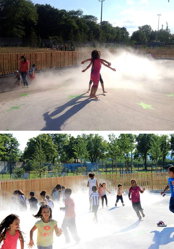
Waterplein Benthemplein Reveals the Secret of Versatile Water Squares
Waterplein Benthemplein, by De Urbanisten, in Rotterdam, Netherlands. Rotterdam is a city that literally swims in abundance – the abundance of water. Unlike many other cities worldwide where scarcity of water is a huge problem, densely populated Rotterdam is regularly confronted with great quantities of water causing floods in many parts of the town. For years, experts were unable to come up with sustainable solutions. However, the planning bureau De Urbanisten finally put an innovative Watersquare-concept into practice; Waterplein Benthemplein was born but is this really a place that makes a virtue out of too much water? How does a so-called Water square work? WATCH: Animated video of the Watersquare Benthemplein, by studio analoog
Waterplein Benthemplein
Waterplein Benthemplein is a square that functions as an attractive meeting place for city residents. The square features three concrete basins of different depth which are used for different leisure activities in dry weather. However, during heavy rainfalls those basins are temporarily submerged in order to relieve Rotterdam’s sewage system. The water of the surrounding surfaces and rooftops are collected in the basins forming three small lakes in the middle of the square. [contextly_sidebar id=”mlUepoIKimBO8c7Pg64przuybo9Ptz2G”] At the time the city’s canal system has enough capacity to allow the run off to the nearest open water again; the stored water slowly disappears, to make room for the various users once more. Additionally this Watersquare – concept also improves the quality of open water in urban environments as it prevents unpurified water from running directly into the River Maas. Can flood control be visually appealing too? The three concrete basins of Benthemplein are painted in various shades of blue in a pattern vaguely resembling the isobars on weather maps. Open stainless-steel zigzag gutters and slim light strips are integrated into the ground of the square. They transport the water, as well as function as skater bars.

Waterplein Benthemplein. Photo courtesy of De Urbanisten

Waterplein Benthemplein. Photo courtesy of De Urbanisten

Waterplein Benthemplein. Photo courtesy of De Urbanisten

Waterplein Benthemplein. Photo courtesy of De Urbanisten

Waterplein Benthemplein. Photo courtesy of De Urbanisten

Waterplein Benthemplein. Photo courtesy of De Urbanisten

Waterplein Benthemplein. Photo courtesy of De Urbanisten

Waterplein Benthemplein. Photo courtesy of De Urbanisten

Waterplein Benthemplein. Photo courtesy of De Urbanisten
Full Project Credits for Waterplein Benthemplein
Project: Waterplein Benthemplein – The Watersquare of Rotterdam Location: Rotterdam (north of centre), the Netherlands Client: Rotterdam Climate Initiative, City of Rotterdam supported by the Waterboard Schieland & Krimpenerwaard Authors: DE URBANISTEN Project Architect: Florian Boer Designers: Roberto Schumacher, Jens Jorritsma, Eduardo Marín, Tim Peeters, Dirk van Peijpe Collaborators: City of Rotterdam: Engineering Bureau Project Management: City of Rotterdam: Project Management Bureau Construction Management: City of Rotterdam: Engineering Bureau Producing Firms: Wallaard, coordinating construction firm Wallaard, concrete works of the basins Wallaard, underground water management infrastructure ACO, construction stainless steel gutters and ledlights Topcourts, coloring of the basins Anouk Vogel, artwork/baptistery Municipal nursery, planting and additional trees Date of Project: Design: 2011-2012 Date of Construction: 2012- 2013 (finished on December 4th, 2013) Budget: 4 million euros including Larger underground infrastructures (pipes and water pumps) engineering, tendering and communication budgets Surface area: total: 9.500 m2 (including street and parking) effective square: 5.500 m2 offering 1.800 m3 temporal water storage Photographers: All illustrations by DE URBANISTEN. Photos by Jeroen Musch, Ossip van Duivenbode, pallesh+azarfane and De Urbanisten Show on Google Maps
Recommended Reading:
- Landscape Architecture: An Introduction by Robert Holden
- Landscape Architecture, Fifth Edition: A Manual of Environmental Planning and Design by Barry Starke
Article by Sophie Thiel

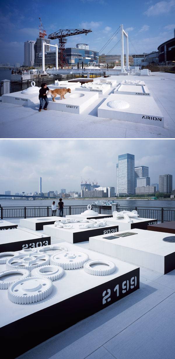
LaLaport Toyosu Envisions Entire Landscape as an Ocean
LaLaport Toyosu, by Earthscape, Tokyo, Japan. Upon first arrival at LaLaport Toyosu in Tokyo, Japan, visitors are invited to embark on an oceanic adventure through a park and public plaza designed by the landscape architects at Earthscape. The former dock and port site now hosts spaces for a variety of uses. Completed in 2006, the vision of the project was to consider the entire landscape as an ocean. The goal of the project was to allow site history and context to influence aspects of design while providing public space for both passive and active use. In LaLaport Toyosu, the ground plane literally undulates, emulating the waves and motion of water. The changing topography of the site allows for a variety of uses. Some hills form visually enclosed spaces with built-in seating, while others serve as slides or ramps for children to explore. The changing ground plane in the park draws visitors in and creates a feeling of adventure and an element of surprise as they explore the park.

LaLaport Toyosu. Photo courtesy of Earthscape

LaLaport Toyosu. Photo courtesy of Earthscape
LaLaport Toyosu
Scattered throughout the site, the café, radio station, and museum are like coral nodes floating on the surface of the water. Other islands that break through the surface are benches and seating elements. White benches are designed to model very organic forms, such as a clump of coral. Trees, surrounded by benches and ample seating, poke through the ground plane like sticks in shallow water. All of these elements in the landscape create clusters and nodes that emulate landforms and islands. [contextly_sidebar id=”SHoVgWFCcrZxWiWc1FBH9d2xAFUSo80Q”] Day to day, hour to hour, the site is continually evolving and changing. Water landscapes are ever changing; just as the tides rise and fall, waves change with weather and wind patterns, and water temperature vary based on the season, the landscape of LaLaport Toyosu is also ever changing. The park takes on a different feel day and night, when it is active on weekends and during the work week and continually changes, much like the waterscape. Visitors are invited to freely voyage throughout the entire site, like a drop of water in the ocean. Specific circulation pathways are not defined in all areas, allowing for people to spread out and explore the entire site. Some areas see higher traffic volume and seem to have a flow to them, like the crashing waves while other spaces allow for visitors to stroll and float through the site at their leisure.

LaLaport Toyosu. Photo courtesy of Earthscape

LaLaport Toyosu. Photo courtesy of Earthscape
LaLaport Toyosu. Photo courtesy of Earthscape

LaLaport Toyosu. Photo courtesy of Earthscape

LaLaport Toyosu. Photo courtesy of Earthscape. Photo courtesy of Earthscape

LaLaport Toyosu. Photo courtesy of Earthscape
Full Project Credits for LaLaport Toyosu
Project Name: Urban dock LaLaport Toyosu Landscape Architecture: EARTHSCAPE Completion: 2006 Location: 2-4-9 Toyosu Koto-ku Tokyo, Japan Developer: Mitsui Fudosan Group Ltd./Ishikawajima-Harima Heavy Participants in planning: Architect – LAGUARDA.LOW ARCHITECTS, Construction – Taisei Corp. Photo Credits: Koji Okumura/Forward Stroke, Shigeki Asanuma Show on Google Maps
Recommended Reading:
- Landscape Architecture: An Introduction by Robert Holden
- Landscape Architecture, Fifth Edition: A Manual of Environmental Planning and Design by Barry Starke
Article by Rachel Kruse