A few weeks ago I posted a blog asking for critiques on some 3D models components I had made. I posted it on IGN, WordPress, and Land8Lounge. The response was fairly low, and I tried posting it as a discussion thread on Land8Lounge as well. This got some helpful comments, but it also possibly inspired a thread that brought up the issue of rendering VS. design in Landscape Architecture. This question came up a few weeks ago at a networking event for NYC landscape architects, and I talked to a few different people about it. It made me wonder: Why is it that designers often have a negative reaction to “high end” renderings?
If I said I had never seen a rendering and assumed that the graphic quality was hiding something I would be lying. I think this often comes from past experience, either in firms as CAD monkeys, or in school. We, I think, have all had a presentation where we worked our ass off to the last minute perfecting a design, leaving little time to get perfect graphics, so we go out with what we can, trusting our peers and other trained professionals to see through the pencils lines to the heart of the design beneath, only to be disappointed. We have also all had the time when we have seen the person slap together a half-assed design, but with pretty pictures, and when we are counting on our bosses and teachers to see it, they instead get “blinded” by the crisp lines, hypnotized by the texture work, and in a trance from the shadow quality. I think it’s this shared experience that leads so many of us to distrust pretty drawings: we all know just how easy it is to lie with graphics. Whether it is drawing a plan that doesn’t show steps because they client didn’t want them – even though it’s not physically possible, screwing with perspective sizes, or hiding views that you don’t want noticed. We know the tricks all too well; in part because we use them to some extent ourselves.
We choose a rendering style based on what we want to show and not show: Computer graphics traditionally show a Utopian version of everything – where it all looks fresh from vacuum -packaging, but it makes the space look more contemporary to clients; Hand graphics hide views by simply not drawing the far background, but show more flow and life in the space. We choose views that may not show the space in the best ways, but show a feature we want to emphasize over others. It’s a limit of non-physical models – you have a finite window onto the world, you are going to be careful about what you choose to show to show off what you want to be seen. The problem is, we need a way to easily communicate to clients, and in forms other than physical models, and clients who have not been trained as designers get the best feel for a space through perspective drawings.
-Utopia?
So the issue becomes not graphics VS design, because it never really was outside of designers’ heads. The issue is how can we make graphics that communicate effectively, and manage to not fire off alarm bells in designer’s and client’s brains.
Personally, I choose to concentrate on computer graphics over hand graphics not due to a lack of skill (believe me, if I put the time into drawing that I have put into rendering I’d be pretty good with a pencil), but because in my mind, it is the most honest form of representation. If I model everything the way it is – which I can with no extra effort – I know exactly what I will see from a given view. I can put a camera inside your eyes when you are sitting on a bench, and if you would actually see a sliver of that utility box, it’s going to be in the rendering. The problem is, it would still set off alarm bells, all because of an effect that is becoming well-known in the media worlds of movies and video games.
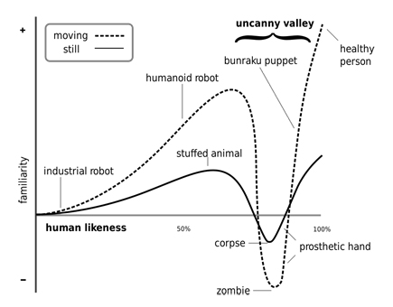
The “Uncanny Valley” is an issue that became most well-known a few years ago when the movie “The Polar Express” came out.
It’s the theory that as things become more realistic, they become more familiar, but only to a certain point. Once things become TOO realistic, small things that are wrong make us cringe and react negatively. In “The Polar Express” the thing that set people off was the eyes. For all the realism the characters had, from mannerisms created by directly copying from actors in Motion Capture suits, to careful texture work, the fact that the eyes didn’t glisten correctly gave them a dead look, and made some people instantly see, instead of a heartwarming children’s story, a movie about a train filled with zombies… (note to self – Make a movie about a train full of zombies. “Brains on the Orient Express”?)
In the ensuing years movies, and video games, have dealt with this issue in one of two ways. Some have gone the route of making themselves, while beautiful, purposefully unrealistic. This brings thoughts of movies such as “Up”, and games such as “Little Big Planet 2”. Neither of these tries to be realistic – the characters look like cartoons, but with realistic flesh-tones (or woven sack-tones in the case of Little Big Planet), elements.
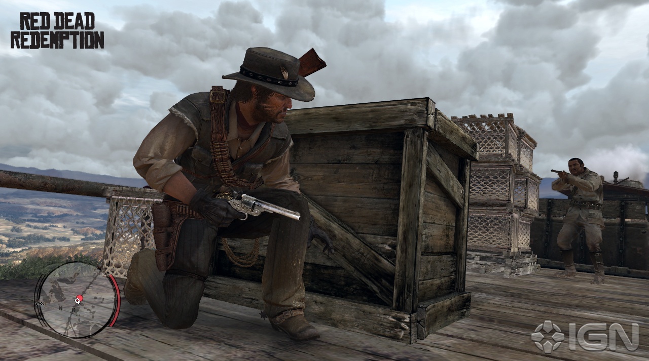
The other method is to continue to push the boundaries of realism. Movies like Avatar skirt this method by having realistic aliens that we have no internal reference for as digital characters. Where true realism is pushed the hardest today is in gaming. Games like Uncharted 2, Heavy Rain, and Read Dead Redemption push realism in gaming past where it has been before. As some of the best looking games widely available, they all have one thing in common.
Grime.
None of these games are set in pristine areas. They all are set in places that have been lived in, that have wear and tear, grease and grime, chips and gashes. I think this is one of the essential things to making a convincing 3D rendering, and one that doesn’t make you think you are being tricked by graphics. The splinters out of the wood crate, the dirt on the boots, the powder burns on the pistol, all give it a realistic feel.
If that detail is paired with a render engine that has more than 1/30th of a second to output, it would give amazing results.
And those are the kind of results that I think we, as designers/graphic artists have to work for. Gone are the days of the pristine landscape with rows of identical, perfectly pruned trees. If we want buy-in from clients, and from other designers, we need to show all the blemishes on the face of our designs. Whether it’s the ugly light industrial building that is visible through the trees, or the mottled color in the bricks, these are some of the things that A) will affect the spirit of place and B) that will create a sense of life in our renderings.
Are hand graphics still valid? Of COURSE they are. Neither hand graphics nor computer graphics is inherently “better”. They are just different. The grime and dirt of the world in computer graphics is no different then adding a little of every color to a tree in a Mike Lin style render.
It adds a little depth, and a spark of randomness that is what makes the world what it is.
Uncanny Vally image from http://ntlkdesign.co.uk/blog/
Little Big Planet 2 image from littlebigplanet.com
Mik Lin image from Beloose.com
All other images from IGN.com
Published in Blog









nca
Great write-up.
I think I would only argue that if you’re at the point in the design process where you’re 3d rendering a utility box, you’ve probably made a critical error or oversight much earlier in the design process.
I think hand drawing is better recieved with clients generally because they know what to expect-they know theyre getting ‘design drawings’ not the finished product. With 3d rendering you might need to spend more time adding the ‘grime’ or atmosphere than you would focusing on communicating the big ideas.
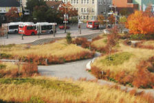
As much as I like the mike lin sketch, it is just as misleading as the stark 3d rendering at the top. There is some kind of shrub planted in turf, the perspective is skewed to make things appear more dramatic than they actually may be, and the world appears to end when you hit the sidewalk on the right, what else is back there? Maybe this is your point.
Jenny Hill
I love the graphics in grimy computer games (most recently ‘New Vegas’) but I think that they typically convey a landscape I wouldn’t choose to live in.
In part this is a personal question about aesthetics. But if you imagine making the decision using public money, or even just making a decision on behalf of stakeholders not present, would you dare opt for a design that showed where the litter would gather with the prevailing wind? and which areas of turf would become worn through?
How far would you propose to take the realism?
However, with regard to 3D digital models presenting more alternative views for consideration, I’d have to agree that they do present the opportunity to show requested views and animated walkthroughs are nice. I created a simple walkthrough of an underground tunnel and viewing platform using Sketchup a couple of years ago at Uni, only to find that there was no desire to view it. The sketches, sections and plans all didn’t really show the whole picture, so I ended up building the scale model. Nice though, I enjoy building ‘real’ models.
Frank Varro
Nick:
All I’m saying is that if your design requires a utility box (or say, a utility box for the streetlights, that you cannot move, and can only try to screen), you should still have it in model in accurate scale. And in theory, with most items, you can have premade components to tweak to fit, and materials “pre-grimed” so that it does not take any longer to get the realistic results then the Utopian ones. But yeah, your third paragraph is a good summation of my basic point. Sketches are limited, so is 3D, just in different ways. And the 3D can be overcome with, IMO, less work than the sketch limitations.
Jenny,
Finding the balance in the grime is also key. I wouldn’t want the post apocolyptic version of the design, or the garbage filled one. I would say what I would shoot for is an what it will look like an hour before an event 5 years after opening. Its been used a bit, things have some caked in grime, but there has been a quick once over to pick up trash, straighten benches, etc. Finding that balance is something I am still working on, and not an easy feat to pull off – 5% to much dirt and a stop sign looks tan instead of red with dust, 5% to little and its clean as a whistle. Physical models definitely also have their place, and are an art unto themselves. I prefer the 1st person nature of a fly-through, but I also play FPSs, so that’s a viewpoint I am much more used to than some.
Brandon Reed, CVO, ASLA / Rooftop and Urban Designer / Landscape Architect
i think you should check out http://www.drawingshortcuts.com
Jim Leggitt is the best i’ve seen at addressing the age old question of hand vs computer rendered graphics…
Why not combine them like he has in what he calls tradigital rendering where you combine sketchup model and render right over the top of the model to give you more of a hand rendered feel to it…
This is merely one technique he teaches but your time would be well spent to check out his website and/or book…It might help you answer your questions and clarify these questions…
My personal opinion is that it shouldn’t be a question of hand vs. computer but how you can combine the best of both worlds and use both of them to your advantage…
I can say from personal experience that all of my clients respond so much better to a quality sketch or rendering than they do to a computer rendered image….But, let me also, clarify this point by stating that the hand rendering usually has a much greater impact in the beginning or conceptual phases of a project….from those sketches, once we have received owner approval, then we model everything up in Sketchup and show them walkthroughs so they can better understand and comprehend their designs…
One last thought is that it should never be a question between design vs render…you can’t really compare the two because they are two different things…a design can be rendered but a rendering cannot be designed…I think that you have to find a way to do the best possible design that you can for a client and find a way to convey the design through a nice rendering…
There is no denying the fact that many people in school got away with, possibly not as great of designs, if they had great rendering skills…but good professors can see through the beautiful renderings and understand the design concept…I don’t think you should ever sacrifice the design for a better rendered finish product…good design is good design and, if used correctly, good rendering will only enhance and help communicate the design…The optimal setup would be do an amazing design and combine it with an amazing rendering or renderings to help the client visualize and understand it better…
Those are my thoughts so far…