San Francisco-based designer Joanna Borek-Clement has envisioned these neuron cell-inspired, Sky-Terra skyscrapers to cope with the growing need for green urban space in Tokyo. The towers rise up to 1,600 ft above the street level and expand out until they reach the flat top plaza layer. These plazas offer many options and configurations, from public parks, greenbelts, playing fields, jogging paths, amphitheaters, pools, and bath houses.
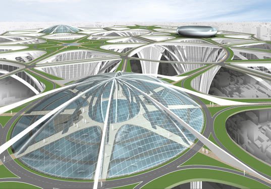
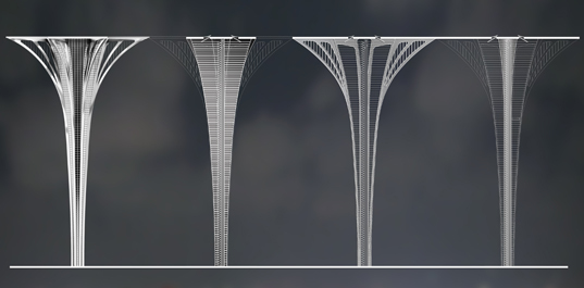
I have to admit that I was drawn to the concept of building a sustainable cloud city. But what about the pedestrian experience? Where is the connection to the street and the natural environment? And how can one get a sense of place? This idea is repeating a historical mistake. Take Le Corbusier for example.
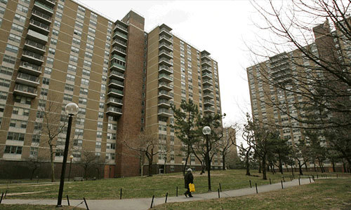
“The desire to increase the amount of green space led first to the Garden City movement and then the Radiant City type designs of Le Corbusier and others. These movements advocated for “tower in a park” designs during the “urban renewal” era of city planning. These developments, commonly found in housing projects but also found in high-end residential and commercial developments, destroyed the street grid and strangled street life, leading to spookily desolate urban environments.” DMIBLOG
Via The Book of Jabe The City of Tomorrow, Radiant City
Via Skyscraper World Perspective, Radiant City
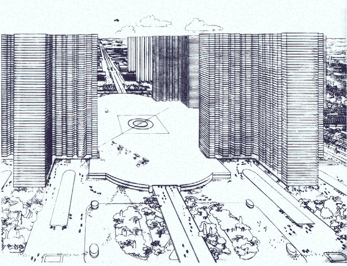
Via Tesugen Color Perspective, Radiant City – Where are the people?
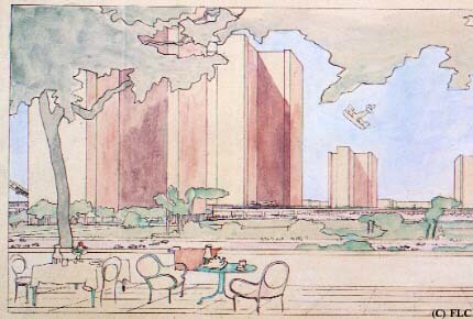
Via DMIBLOG Tower in the Park



nca
Seems like if these were concepts for mixed use towers it would win some type of award, with or without the aforementioned criteria.
Erik R. Smith
Am I the only one who sees the resemblance?
Itonk
what about the wind factor at 1600 ft above?
Todd McCurdy, FASLA, CLARB
I completely agree with your assessment, Andrew! You can’t forget the pedestrian or the project is doomed to failure no matter how many architectural magazines it gets published in!
Mirjana Jovanović
If the goal was to increase green surface in the city, I don’t see how this is a solution to it: to much concrete and steel to gain small areas of green…it does not appear to be sustainable. And, there is a problem of wind, like Itonk said.. This is just a interesting idea that looks god on a paper.
Jared Horsford
Although I’m behind the curve, I recently just finished reading Jacob’s The Death and Life of Great American Cities… From all the observations I’ve made about cities I’ve visited, her observations seem pretty on-point. How is it that, almost a half-century later, we still see proposed solutions, like these, that completely ignore the failures of the development of most cities since WWII and continue to reiterate them in new, shinier manifestations. Are the allied design professionals, at large, that out-of-touch with the reality of what makes cities tick? Or are we so infatuated with innovation at the expense of function that we will continue to perpetuate ideas that doom our cities to the continuation of sprawl and decay…. just an observation.
Andrew Spiering
I appreciate everyone’s feedback – especially the Jetson’s image! I instantly thought of that when I first read about this project. I was also thinking Star Wars and Tower of Babel…
I think these buildings cause a WOW factor that gets the press excited. And to be honest I am not sure that the general public has studied history through the same lens as we have, so they continue to be attracted to these Towers of Babel.
MANNISI ALBAN - SEIWOOO - ZZAC
Anyway
Thanks Andrew to share this kind of projects which seems never get the intention of Landscape Architects…
Yes we like your nice Photoshop Masterplan but hopefully LA is more than Engineers Footprint rendering….
sizzelman
What in gods green earth! Designers are really getting carried away with this whole computer manipulation and integration into there work. Seriously I think all designers (college drop outs) should be tarred and feathered and given a life time ban of Photoshop.