


Author: Land8: Landscape Architects Network

The Mind-blowing Design of Porsche Pavilion
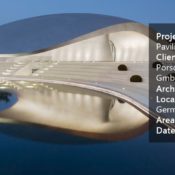
Porsche Pavilion, HENN Architects in Wolfsburg, Germany. “In the beginning I looked around but couldn’t find the car I dreamt of, so I decided to build it myself,” this is how Ferry Porsche’s well-known quotation welcomes and engages visitors to the spectacular world of Porsche – right at the entrance of Porsche Pavilion. Perhaps in this particular sentence Ferry has injected the whole-hearted philosophy of the brand Porsche. “It realizes dreams. Builds legacies. Shakes up established norms and sublimely violates conventions,” as the world’s most successful brand in sports car racing reveals on their official website, “To this day, nothing can replicate the feeling of driving a Porsche. No other combination of sound, feel, sight and soul connects in quite the same way. Nothing else is simultaneously as recognizable yet breathtakingly novel“.

Porsche Pavillion. Copyright Photogapher: HG Esch

Qoute at the entrance to Porsche Pavillion. Copyright Photogapher: HG Esch
Porsche Pavilion
On 12 June, 2012 Autostadt in Wolfsburg celebrated the opening of a new fabulous construction – Porsche Pavilion. Its distinctive silhouette provides a one of a kind, striking, exquisite presence, which can’t be missed within the lagoon landscape of Autostadt. The organically shaped structure, designed by HENN Architects, can be defined as a dynamic, yet static sculpture with elegantly curved and softly glimmering roof platform, covering an exhibition and presentation area of 400 m2.

Siteplan. Copyright Photogapher: HG Esch

3d Visualisations of Porsche Pavillion. Images courtesy of HENN Architects

Porsche Pavillion. Copyright Photogapher: HG Esch
- Understanding the Basic Principles of Organic Design
- Sculptor Creates Major Public Square!
- Stunning Plant Pavilion Created in China

Porsche Pavillion. Copyright Photogapher: HG Esch

Porsche Pavillion. Copyright Photogapher: HG Esch

Porsche Pavillion. Copyright Photogapher: HG Esch

Porsche Pavillion. Copyright Photogapher: HG Esch
Embracing the Fascination of Porsche The design concept of the exhibition and presentation zone, created by MERZ architekten and Jangled Nerves, embraces the evolution, the engineering and the fascination of Porsche and represents them in a memorable, but forward-looking way.

Porsche Pavillion. Copyright Photogapher: HG Esch

Porsche Pavillion. Copyright Photogapher: HG Esch

Porsche Pavillion. Copyright Photogapher: HG Esch
Full Project Credits:
Project name: Porsche Pavilion Client: Dr. Ing. H.c. F. Porsche Ag / Autostadt Gmbh Architects And Lead Consultant: Henn Principal: Prof. Dr. Gunter Henn Programming: Andreas Fuchs, Martin Rath Design: Martin Henn, Klaus Ransmayr, Paul Langley Planning: Georg Pichler, Hans Funk Florian Goscheff, Katrin Lind, Birgit Schönbrodt, Yves Six, Wolfram Schneider, Sebastian Schuttwolf, Maximilian Thumfart Quantity Surveying: Paul Lawrence, Lars Becker, Wolfgang Malisius Construction Management: Wolfgang Wrba, Siegfried Kruse, Hendrik Noack, Karl Rosebrock Structural Engineers: Schlaich Bergermann Und Partner Prof. Dr. Mike Schlaich, Achim Bleicher, Thomas Schoknecht, Sebastian Linden Technical Building Services: Zwp Ingenieur-ag Lighting: Kardorff Ingenieure Lichtplanung Gmbh Infrastructure Design: Niermann Consult Landscape Design: Wes Landschaftsarchitekten, Prof. Hinnerk Wehberg Michael Kaschke , Maxie Strauch Coordination/costing: Claus Rödding Project Team: Thomas Bohr, Frank Fischer, Rainer König, Axel Koch, Yushu Liu, Walter Maas, Barbara Tieke Tendering, Construction Management: Klaus Werner Rose Frank Bolle, Werner Hüsing, Thorsten Heitmann, Robert Holldorf Exhibition Design, Scenography And Media Design: Hg Merz Architekten Museumsgestalter And Jangled Nerves Principals: Prof. Hg Merz, Ingo Zirngibl Project Management: Markus Betz, Jochen Zink Team: Johannes Brommer, Alexander Franzem, Heiko Geiger, Stefanie Heinecke, Bjørn Kantereit, Fabiola Maldonado, Marcel Michalski, Marc Schleiss, Jörg Stierle, Christian Stindl, Sylvia Stoll, Patrick Wais Acoustic Space Design: Klangerfinder Design Period: March 2011 To February 2012 Construction Period: August 2011 To May 2012 Gross Floor Area: 1,400 M Net Floor Area: 1,045 M Roofed, Paved Outdoor Area: 290 M Exhibition Area: 400 M Monocoque: 2,550 M Weight: 425 T Material: Stainless Steel Plate 10-30 Mm Envelope Contractor: Centraalstaal B.v., Groningen Copyright Photogapher: HG Esch Awards: Automotive Brand Award 2012 in the category “Best of Best – Architecture” by the German Design Co.
Recommended Reading:
- Landscape Architecture: An Introduction by Robert Holden
- Landscape Architecture, Fifth Edition: A Manual of Environmental Planning and Design by Barry Starke
Article written by Velislava Valcheva


The Forest Man of India Shows Us the Power of One
The storry of Jadav Payeng, the Forest Man who dedicates his life to growing and nurturing an entire forest by himself. Majuli or Majoli is a large river island in the Brahmaputra River, in the Indian state of Assam. It is the largest river island in India. Majuli had a total area of 1,250 square kilometers (483sq mi), but having lost significantly to erosion it has an area of only 421.65 square kilometers (163 sq. mi) in 2001. Here is where our story starts, in 1979 a young man called Jadav Payeng, decided to work with the Social Forestry Division of Golachat District that launched a scheme of tree plantations on 200 hectares at Aruna sapori. After 5 years, this project was completed, but Jadav decided to stay and keep up the maintenance of the place, adding more trees and making this place into a forest.
The Forest Man
This man has created a land for different species of plants and also a secure habitat for animals. For example, there have been Bengal tigers, Indian rhinoceros, elephants and several varieties of birds. Also there are several thousand trees including Arjuna (Terminalia arjuna), Pride-of-India (Lagerstroemia speciosa), Royal poinciana (Delonix regia), Red siris (Albizia procera), Kachlora (Archidendron bigeminum), and Indian bombax (Bombax ceiba). WATCH: Forest Man Trailer
300 hectares of an Area Covered by Bamboo His efforts have come a long way, protecting animals that could be killed by poachers. By creating this forest he has rebuilt an area that would be only sand and dirt, no animals could survive in it. The Awards Keep on Coming for Jadav By accomplishing this sanctuary of pure nature, Jadav has received several honors. First he was honored at a public function arranged by the School of Environmental Sciences, Jawaharla Nehru University on April 22, 2012, with the title “Forest Man of Assam”. In October of 2013, he was honored at Indian Institute of Forest Management and this year he was honored with the Padma Shri, the 4th highest civilian award in India.

One of Jadav Payeng’s awards. Image credit: Printscreen, source
With this said, now I’m going too elaborated a little more on 3 of the different species that have been planted on the forest. 1. Lagerstroemia speciosa: Commonly known as Pride of India or Queen’s Crape Myrtle, it can reach 40 to 60 feet in height and a spread of 30 to 40 feet. The attractive bark is smooth, mottled and peeling. In India, the wood is used for railroad ties and construction. It will grow in full sun on a wide range of well-drained soils but it is not salt-tolerant.

Inflorescence of Giant Crape-myrtle (Lagerstroemia speciosa) at Manado, North Sulawesi. Photo credit: Author: Ariefrahman. Licensed under CC-SA 3.0
2. Delonix regia:

Delonix regia, South Miami, FL, USA. Photo credit: Author: Scott.Zona. Licensed under CC-SA 2.0
Commonly known as Royal Poinciana, it is broader than tall, growing about 40 feet high and 60 feet wide. It will provide fullest flowering and best when planted in full sun locations. Tolerant of a wide variety of soils and conditions, and needs to be well-drained until established, then only during the severest drought. 3. Terminalia arjuna: Commonly known as Arjuna, this tree is about 20-25m tall, usually has a buttressed trunk and forms a wide canopy at the crown from which its branches drop downwards. It is found growing on river banks or near dry river beds in West Bengal and South and Central India. It ss one of the species whose leaves are fed on by the Antheraea paphia moth, which produces the tussah silk. You May Also Like These Other Articles:
- Out of This World Bamboo at Arashiyama Bamboo Forest
- Is Detroit turning into an Urban Forest?
- Bridal Veil Creates a Curtain of Water Through the Forest
An example of Terminalia arjuna in Sir Seewoosagur Ramgoolam Botanical Garden. Photo credit: Author: Liné1. Licensed under GNU Free Documentation License
The Man and Now the Movie By dedicating most of his life to this forest, Jadav has cultivated interest in the world, and in 2013 William McMaster debuted his film called “Forest Man”, which won best documentary at The American Pavillion: Emerging Filmmaker Showcase at Cannes. In this film, we can see what Jadav has accomplished throughout the years, this massive forest with his own momentum, willingly and deliberately.

The Happiest Man in the World. Photo credit: Printscreen, source
This man knows the importance of the land and what it can give us, the certainty of hard labor can pay off. Payeng’s motto was – sleep less, eat healthy, drink Apong (the favored drink of the Misings, prepared from 101 leaves that are found in the forest), but work hard. It is not too late to take a note from this culture, this village, this island, this human and apply a little of the knowledge that he is spreading into our world. A Mission Spanning 36 Years and Beyond Giving protection to the animals and saving the island from erosion, that has been the mission for over 36 years for this man. This is the future, it is a simple and well-grounded idea, but still we fail to stop deforestation and the taking away of the habitats for wild animals. It is not hard, it is so simple that society cannot comprehend. I hope they will after knowing Jadav Payeng the “Forest Man” of Majuli. Get informed, watch the video that led me to writing this article, by viewing clicking on this link. People will understand more about what it is to love the land.
Article by Agmarie Calderón Alonso


10 Must do’s to Become a Professional AutoCAD User
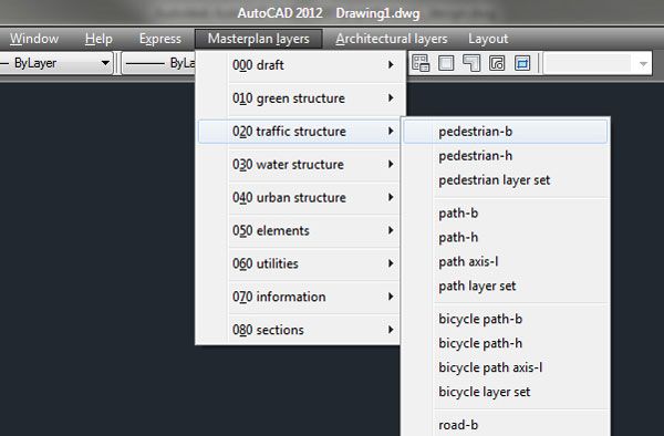
10 top tips from our resident AutoCAD expert UrbanLISP to make your work in AutoCAD more efficient. When drawing by hand, we use a box of pencils, crayons, a ruler, and maybe a compass. Whatever we use, it’s all on our desk, in sight and ready to grab. AutoCAD is stuffed with functionalities hidden in menus, on palettes, and behind shortkeys. In order to get the most out of AutoCAD, we list the 10 must do’s to become a professional AutoCAD user: 1. Layers, layers, layers Without a doubt, one of the most important aspects in a drawing is the use of layers. An empty drawing by default only has one layer, named “0” in AutoCAD. Don’t use this layer unless you know what you are doing; it behaves in a particular way. It’s hard to create too many layers, but to prevent getting lost, it’s wise to think of a layer structure first. Add numbers for main categories as a prefix of the layer names so they are grouped together in the layer menu by default. As suffix, it’s good to add a code related to the type of object it’s used for; -b for layers that are boundaries, -h for layers with hatches, -t for layers with only text. You’ll get layers like 012-grass-b and 012-grass-h.
Layer pulldown menu
Blocks on toolpalette

Hatch patterns_add path
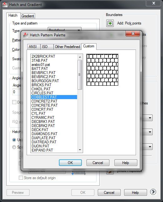
Hatch patterns_custom

Design Center

Ribbon

Acadpgp
- 4 AutoCAD Commands to Draw Paving Patterns on Curving Paths
- How to Show Topography in your Plan Drawing in AutoCAD
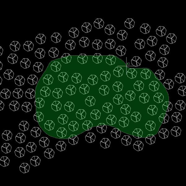
- How to Place Large Quantities of Trees in a Master Plan Instantly with AutoCAD
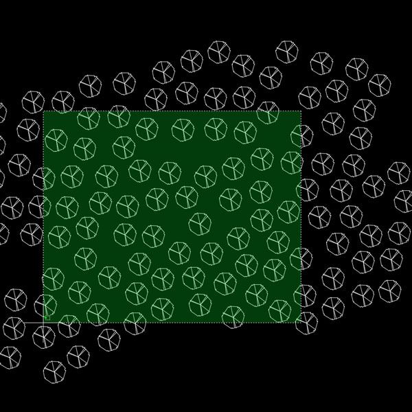
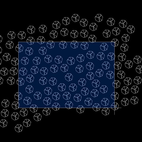
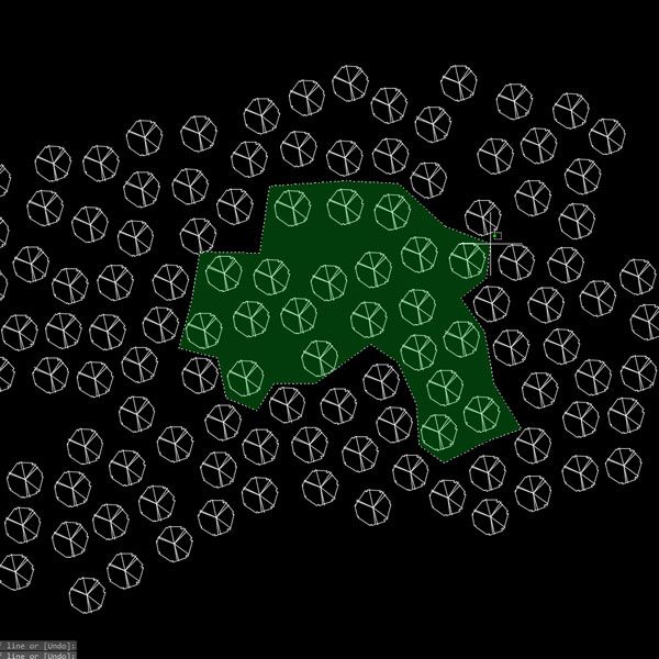
9. Snap and select like a pro There are two main purposes for the mouse in AutoCAD: defining positions and selecting objects. If you want to draw accurately, snapping to the right point is extremely important. It sounds obvious, but it deserves some attention. The more objects in your drawing, the more snapping points you’ll have. If there are a few snapping points close to each other, the chance of snapping to the wrong point increases:

Snap perpendicular

Snap intersection

Snap endpoint
Selection crossing
Selection_window
Selection_crossing polygon
Selection_dragging
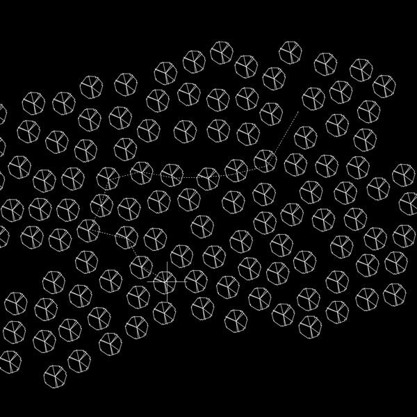
Selection_fence
Recommended Reading:
- Digital Drawing for Landscape Architecture by Bradley Cantrell
- Detail in Contemporary Landscape Architecture by Virginia McLeod
Article by Rob Koningen
You can see more of Rob’s work at UrbanLISP


How the New St. Petersburg Zoo Could Change the Stereotype of Captivity Zoos
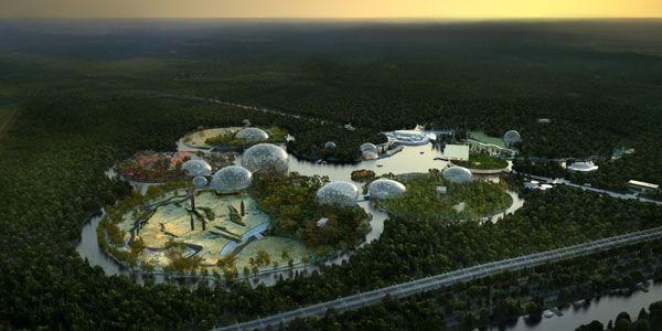
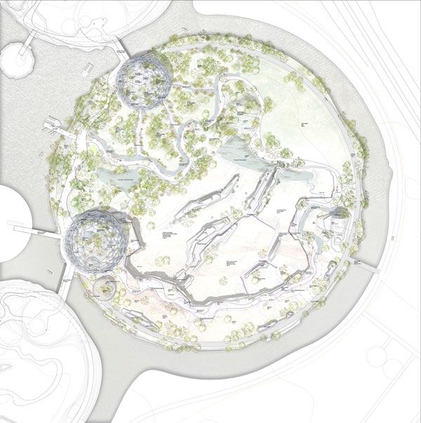
The New St. Petersburg Zoo by TN Plus & Beckmann N’Thépé Architects in St. Petersburg, Russia. Located in the heart of Alexander Park in St. Petersburg, Russia, the Leningrad Zoo was founded on Aug. 1, 1865. According to the Saint Petersburg Commune, the Leningrad Zoo is the oldest zoo in Russia and the second-largest zoo, after the Moscow Zoo. Currently, the zoo holds approximately 600 species of mammals, birds, fish, and invertebrates from various parts of the world, according to the Leningrad Zoo, and, like most others zoos around the globe, suffers from lack of space. In 2010, the city decided to relocate the zoo and organized an international competition for the new Primorskiy Zoological Park. The winning project was designed by a team formed by Bruno Tanant and Jean Christophe Nani of the landscape design firm TN PLUS, with Aldric Beckmann and Françoise N’Thépé of the architecture firm Beckmann N’Thépé. These architects created a fascinating project concept based on the primitive continent of Pangea.
St Petersburg zoo competition phase general overview . Image credit: Artefactory
St. Petersburg Zoo
Pangea was the supercontinent that existed more than a million years ago. The concept embraced by TN Plus & Beckmann N’Thépé consists of reuniting the Pangea. Using water on the site, the team created six circular islands: South East Asia, Africa, Australia, South America, North America, and Eurasia, representing the pieces of the Pangea. The idea was to introduce, on each of these islands, ecological samples and native animals of each continent.
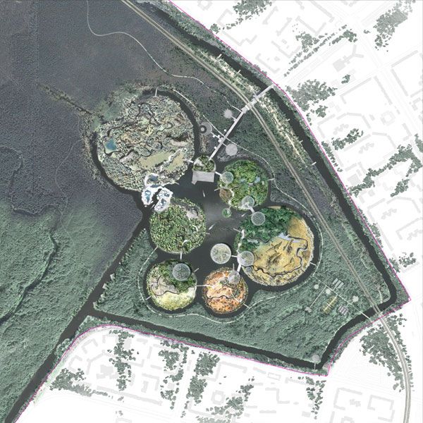
St Petersburg zoo competition phase general masterplan. Image credit: TNplus
St Petersburg zoo competition phase masterplan of Africa. Image credit: TNplus
Related Articles:
- How Beirut’s Zeytouneh Square is Reuniting a Divided Urban Community
- Bill and Melinda Gates at the Forefront of Sustainable Design
- Diana Memorial Fountain: “Reaching Out, Letting In.”
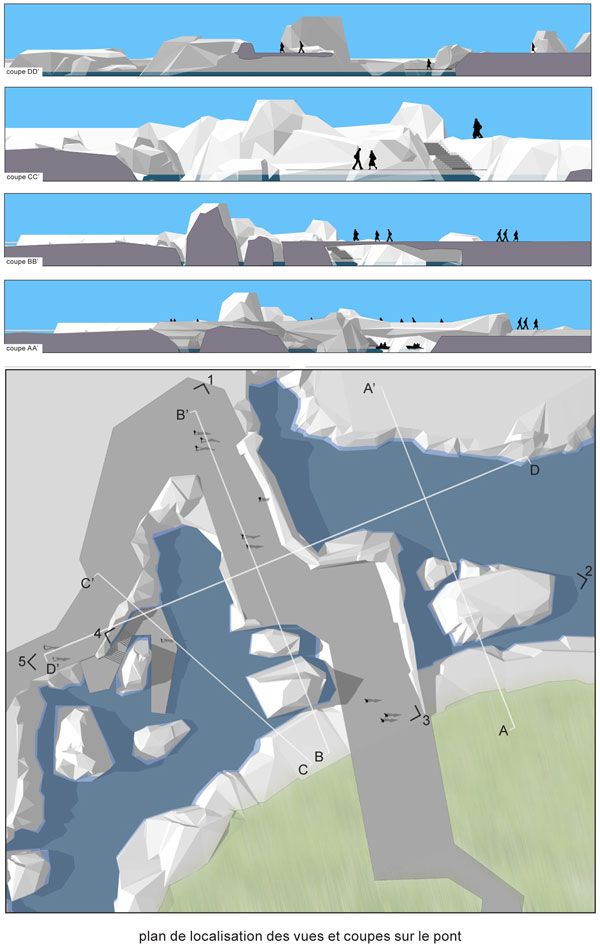
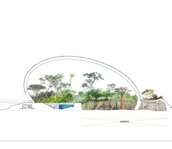
St Petersburg zoo detailed design phase sections and 3D on North pole. Image crediy: TNplus
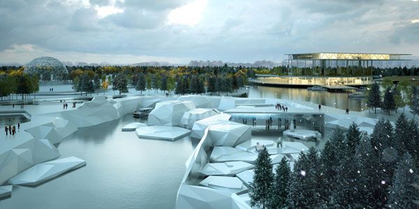
St. Petersburg Zoo competition phase North Pole veiw. Credit: Artefactory
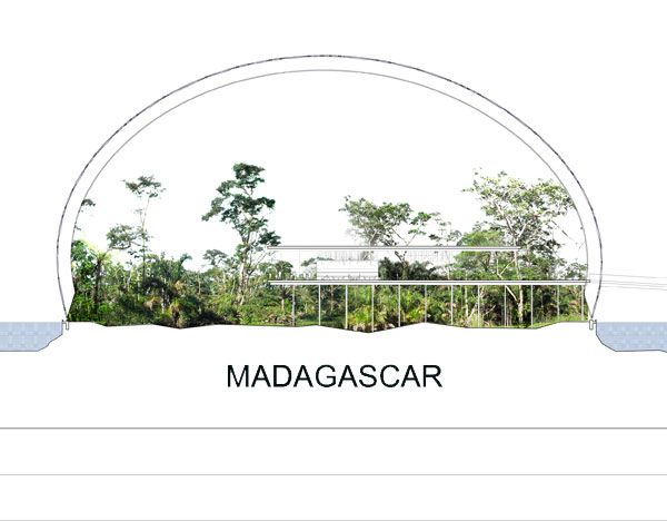
Madagascar simulation in Russia. Image originally from TNplus. Modified by SDR to suit publication.
One of the proposed structures at St. Petersburg Zoo. Image originally from TNplus. Modified by SDR to suit publication.
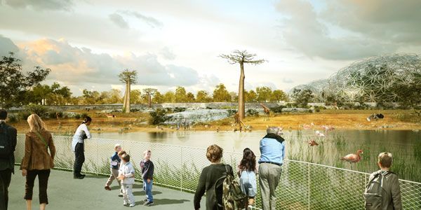
Zoo Saint Petersburg. View of African savana. Credit: TNplus
Full Project Credits:
Project: New Zoo of St. Petersburg Designers: TN Plus & Beckmann N’Thépé Architects Zoologist: Eric Plouzeau, Biozones Consulting Zoo Expert: Monika Fiby Botanical: Albert A. Tourette Location: St. Petersburg, Russia Total Area: According to TN Plus: 140ha According to Beckmann N’Thépé Architects: Site Large: 300ha Emprise Zoo: 96ha Client: Ville de St. Petersburg/Intarsia Budget: 287 M € HT Area in Context: The site is in the northern suburbs of the city not far from the Bay of Finland, in the frontier between a new residential district in plain development with high rise buildings and a natural reserve.
Recommended Reading:
- Landscape Architecture: An Introduction by Robert Holden
- Landscape Architecture, Fifth Edition: A Manual of Environmental Planning and Design by Barry Starke
Article written by Sarah Suassuna


A Bus Stop You Will Never Miss
Bus Stop by mmmm… in Baltimore, S. East Avenue in Highlandtown, USA. Awhile ago, I watched an artistic installation made by the collaborative mmmm… for a bus stop in the city of Baltimore. It is undoubtedly outstanding because of its minimal and clean style, high functionality, identification, and as a positive feature in an otherwise anonymous place, but I found myself wondering, why is it beautiful? What is beauty? Is the Latin phrase “de gustibus non disputandum est” true? Is there no accounting for taste? Is beauty really only in the eye of the beholder? The question is, why do we like something? Why do we surround ourselves with nice things, live in a nice place, buy nice stuff?

Bus Stop. Photo credit: mmmm…
Bus Stop by mmmm…
But let’s start from the beginning: The city of Baltimore opened a collaboration with citizens associations and the group TRANSIT- Creative Placemaking with Europe in Baltimore in order to include European artists in the urban renewal of the city. Through this collaboration, the city was able to identify the principal needs of the community and, through a contest, examine different solutions. The winner was mmmm…’s perfect bus stop – or as the studio calls it, the obvious bus stop.

Bus Stop. Photo credit: mmmm…

Bus Stop. Photo credit: mmmm…
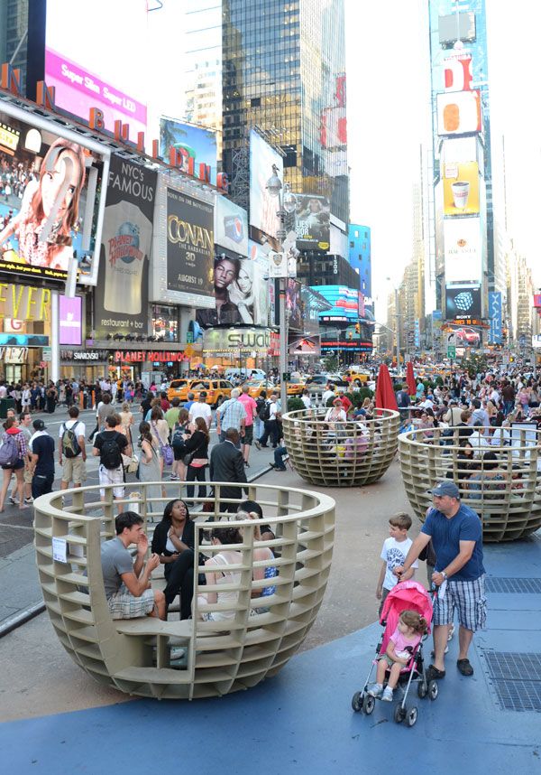
“meeting Bowls” At Times Square. Photo credit: mmmm…

Bus Stop. Photo credit: mmmm…

Bus Stop. Photo credit: mmmm…
- 10 Top Examples of Land Art From Around the World
- Urban Artwork Transforms Everyday City Space into a Lively Plaza
- Shanghai Red Carpet Park Lets People Reflect on Their Everyday Lives

Bus Stop. Photo credit: mmmm…

Bus Stop. Photo credit: mmmm…

Bus Stop. Photo credit: mmmm…
Full Project Credits:
Project: Bus Stop Location: Baltimore, S. East Avenue in Highlandtown, USA Designer: mmmm… Date of Construction: 2014 Size: 14 feet x 7 feet Show on Google Maps
Recommended Reading:
- Landscape Architecture: An Introduction by Robert Holden
- Landscape Architecture, Fifth Edition: A Manual of Environmental Planning and Design by Barry Starke
Article written by Valentina Ferrari


Giles Rayner and His Mind Bending Water Sculptures
We take a look at the water sculptures of artist Giles Rayner. For Giles Rayner, it all started at the age of 16 when he fell in love with the sculpting of ceramics. Years later, he felt an attraction for metalwork. Since then, he has built up an incredibly varied portfolio of water sculptures. He has the ability to create sculptures that not only work in terms of scale and design, but are also timeless. Because of this, his work can be placed almost anywhere, from a country yard to a modern garden to a public space. His works intrigue; they have a simple aesthetic beauty but radiate energy in combination with the water. As Rayner puts it, the water not only has an aesthetic purpose, it is “the element that embodies designs with real life, binding order and chaos and achieving — sometimes the dramatic, sometimes the peaceful”.

Castle hill water sculpture topiary. Photo credit: Clive Nichols
Giles Rayner
If we take a closer look at his creations, we have the feeling that he sometimes defeats the impossible, putting real energy into each design. Take his Falling Leaves water sculpture, for example. The 12-foot-tall sculpture contains five triangular “leaves” of reinforced copper. The water runs from the upper leaf, joining each torrent as it tumbles through the other leaves into the water basin. To correspond to the size of each leaf, more water is introduced at each intersection. All this without ever seeing one tube.

Falling Leaves water sculpture. Photo credit: Gile Rayner

Whirlpool copper bowl sculpture Photo credit: Giles Rayner

Serpent (West) One of a pair of 9ft water sculptures installed at Corsock House. Marine grade stainless steel. Photo credit: Giles Rayner

Lasso water feature stainles steel. Photo credit: Giles Rayner

Implosion stainless steel water feature. Photo credit: GilesRayner

Fusion water feature jets. Photo credit: Giles Rayner

Coral water sculpture 2002 original. Photo credit: Giles Rayner

Blade 30ft Water sculpture. Photo credits: Giles Rayner
- Amazing Kinetic Sculptures That Could Hypnotize You
- The Pine Cones of Floyd Elzinga That Challenges your Perceptions
- Mark Nixon’s Chimecco Chime Bridge

Fountain Twiggy Water sculpture night. Photo credit: Giles Rayner

Coriolis water sculpture sunset. Photo credit: Giles Rayner

Twister water sculpture Norfolk. Photo credit: Giles Rayner

Globe water sculpture tectonic Chelsea Flower show. Photo credit: Giles Rayner

Copper Nebula IV rotating water sculpture. Photo credit: Giles Rayner

Charybdis water sculpture large whirlpool vortex. Photo credit: Giles Rayner
Recommended Reading:
- Flume & Vortex: The Art of Two Fountaineers: The Extraordinary Lives and Works of Giles & Ranulf Rayner by Jenny Pery
- Land and Environmental Art by Jeffrey Kastner
Article by Sander Van de Putte Return to Homepage


How “A Toddlers Playground” Inspires Learning
A Toddlers Playground, by Espace Libre, in Alfortville, France. When children play in the open air, they experience life to the fullest, all of their senses being stimulated in the most amazing ways. “A Toddlers Playground” is the kind of project that you understand from the start, being designed and realized for children. Thanks to the talented team of architects from Espace Libre, the town of Alfortville, France, now has an incredible playground, a perfect environment in which toddlers can develop their broad and fine motor skills. The project was completed in 2014, covering an area of 2,500 square meters and having a budget of 400,000 euro. What resulted was a playground filled with color and elements of creativity.

A Toddlers Playground. Image courtesy of Espace Libre
A Toddlers Playground
One cannot design a space intended for children without taking into consideration what children actually need. In going through with the project, the team of architects from Espace Libre has gone beyond that scope, performing extensive research on children and how they perceive space. It was this thorough research process that allowed the French architects to create a space that suits the concept of early childhood development to perfection.

A Toddlers Playground. Photo courtesy of Espace Libre

A Toddlers Playground. Photo courtesy of Espace Libre

A Toddlers Playground. Photo courtesy of Espace Libre

A Toddlers Playground. Photo courtesy of Espace Libre

A Toddlers Playground. Photo courtesy of Espace Libre

A Toddlers Playground. Photo courtesy of Espace Libre

A Toddlers Playground. Photo courtesy of Espace Libre

A Toddlers Playground. Photo courtesy of Espace Libre

A Toddlers Playground. Photo courtesy of Espace Libre

A Toddlers Playground. Photo courtesy of Espace Libre

A Toddlers Playground. Photo courtesy of Espace Libre

A Toddlers Playground. Photo courtesy of Espace Libre
Full Project Credits:
Landscape Architecture: Espace Libre Location: Alfortville Design Year: 2013 Year of Construction: 2014 Area: 2500 m² Budget: 400 000 euros
Recommended Reading:
- Landscape Architecture: An Introduction by Robert Holden
- Landscape Architecture, Fifth Edition: A Manual of Environmental Planning and Design by Barry Starke
Article written by Alexandra Antipa

Thessaloniki New Waterfront Creates Spectacular Scenes
Thessaloniki New Waterfront Landscape Design by Nikiforidis-Cuomo Architects in Thessaloniki, Greece. Thessaloniki is the second-largest city in Greece, with more than a million inhabitants. Developed along the coast of Thermaikos Gulf, the city’s proximity to the sea has defined its character to a great degree. The “in-between” of sea and city became the object of an architectural competition held by the Municipality of Thessaloniki in 2000. The architectural firm Nikiforidis-Cuomo Architects won the top prize. The project was completed in 2014 and has already become well known and enjoyed by the citizens of Thessaloniki, as well as by city visitors.

Aerial view of the site. Photo courtesy of Prodromos Nikiforidis
Thessaloniki New Waterfront
The three kilometers-long promenade starts from the White Tower of Thessaloniki, an emblematic city landmark, and reaches up to the New City Concert Hall. The intervention unfolds in two parallel zones along the water. Each line differentiates in terms of function, scale, and character.

Thessaloniki New Waterfront. Photo courtesy of Nikiforidis-Cuomo Architects

Photo courtesy of Nikiforidis-Cuomo Architects

The garden of sound. Photo credit: Prodromos Nikiforidis

The garden of music. Photo credit: Prodromos Nikiforidis

Thessaloniki New Waterfront. Photo courtesy of Nikiforidis-Cuomo Architects

The garden of water. Phot credit: G. Gerolympos

Thessaloniki New Waterfront. Photo courtesy of Nikiforidis-Cuomo Architects
Thessaloniki New Waterfront. Photo courtesy of Nikiforidis-Cuomo Architects

Thessaloniki New Waterfront. Photo courtesy of Nikiforidis-Cuomo Architects

Thessaloniki New Waterfront. Photo courtesy of Nikiforidis-Cuomo Architects

Thessaloniki New Waterfront. Photo courtesy of Nikiforidis-Cuomo Architects

Thessaloniki New Waterfront. Photo courtesy of Nikiforidis-Cuomo Architects
Related Articles:
- How Beirut’s Zeytouneh Square is Reuniting a Divided Urban Community
- Bill and Melinda Gates at the Forefront of Sustainable Design
- Diana Memorial Fountain: “Reaching Out, Letting In.”
Greek, urban landscape has recently become an object for contemplation and intervention for architects and landscape professionals. A number of architectural competitions regarding parks and public squares have been held. The New Waterfront of Thessaloniki Landscape Design has also been a competition object, as previously mentioned.

Thessaloniki New Waterfront. Photo credit: Theo Karanikas

Thessaloniki New Waterfront. Photo courtesy of Nikiforidis-Cuomo Architects
Full Project Credits:
Project Name: Thessaloniki New Waterfront Landscape Design Designers: Nikiforidis-Cuomo Architects Location: Thessaloniki, Greece Area: 238.800 m² Date of Completion: 2014 Construction Duration: 2006-2014 Budget: €43.200.000 Contractor: Sidirodromika Erga S.A. Client: Municipality of Thessaloniki
Recommended Reading:
- Landscape Architecture: An Introduction by Robert Holden
- Landscape Architecture, Fifth Edition: A Manual of Environmental Planning and Design by Barry Starke
Article written by Eleni Tsirintani


Hand Drawing versus Computer Rendering. Which is Best for Landscape Architecture?
To be a successful landscape architect, one has to possess multiple qualities. The way to success is always pursued by three basic factors – the ideas we have, the persistence to realize them, and the way we present (or sell) them. Those three things go hand in hand. It’s not enough just to have good ideas. Almost every person has good ideas. But the difference between the good professional and the average one, is that the good landscape architect has the full package. He has ideas, knows how to present them, and is persistent. In this article, we will focus on the third part of the design process – how we illustrate our design concepts and why is the way we do it so crucial? If a designer generates original ideas but doesn’t display them in an attractive way, he will be wasting efforts, time, and money. If another designer doesn’t have marvelous ideas, just decent ones but is able to create a mind-blowing illustration of them, which one, you think, will gain more? After clarifying the significance of designers’ presentation skills, let’s discuss the two most popular graphic techniques for Landscape architects.
Hand Drawing versus Computer Rendering
Hand Drawing Although the majority of designers nowadays prefer computer rendering, hand drawing is still very much alive and kicking. It remains the most fluent and unhindered way to transmit what is in designer’s imagination to the physical world.

By Pete Bonette. From imagination to paper.

By Pablo Saiz del Rio. Featuring in our Sketchy Saturday Top 10

By Gustavo Garrido

Computer rendering. Photo credit: shutterstock.com
- Digital Drawing for Landscape Architecture, second edition | Book Review
- Top 10 YouTube Tutorials for Technical Drawing
- Freehand Drawing & Discovery by James Richards | Book Review
Cons: Like hand drawing, computer rendering has its shortcoming too. 1. Licensed versions require resources The greatest disadvantage of computer programs is that licensed versions have their price. Although there are free demo versions, they often process slowly and lack a part of the tools and libraries, which licensed programs have. 2. Misleading clients Subconsciously or not, designers tend to carry away with the effects they use in visualizations. Too much exaggeration could result in misunderstandings with clients, who expect that the realization will look just like the scene you showed.

Is this misleading. Image: Delta District Water Management by SLA
Recommended Reading:
- Drawing and Designing with Confidence: A Step-by-Step Guide by Mike W. Lin
- Landscape Perspective Drawing by Nicholas T. Dines
Article by Velislava Valcheva


Designing With Succulents | Book Review
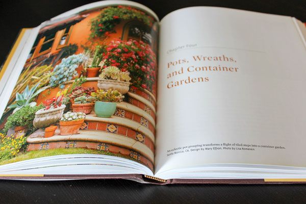
A book review on Designing With Succulents by Debra Lee Baldwin. Having a landscape with succulents might be easier than it seems. Succulents offer plentiful colors, textures and shapes that provide stunning project possibilities for any landscape designer and gardeners. Moreover, succulents are very resistant to drought due to their water storage in their leaves, stems, and/or roots. Due to this fact, many landscape designers have been using theses species to create a xeriscape, reducing the need for supplemental water from irrigation. Debra Lee Baldwin, who is completely in love with succulents, share with us in her book “Designing With Succulents” some of hers and other people experiences of working with succulents over the years. Following her tips, advice and thorough explanations about how to work with these magnificent plants, you will be able to create and maintain your own succulent garden.
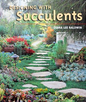
Front cover of Designing with Succulents. Photo credit: Sarah Suassuna
Designing With Succulents
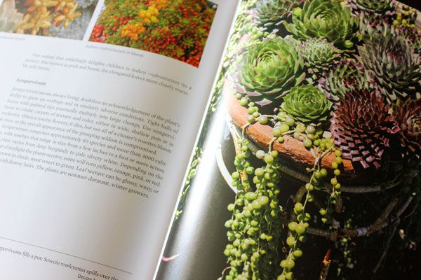
The book is divided in two parts, “Design and Cultivation” and Plant Palette, with a total of ten clear and well-organized chapters, resulting in a comprehensive and didactic guide. In each chapter the author focus in a different subject and, together, prepare the readers not only to design a succulent garden, but also to maintain it. The Part One, which consists from Chapter One to Six, is about Succulents’ Design and Cultivation. If you are new in the garden field, you will find, in this part, the information needed to start. In the course of the Chapter One, the author makes a great description of some initial characteristics that are important to consider such as insolation analysis, soil evaluation, water and irrigation design, preparation of the garden and how to maintain it. This chapter touches on all the planning stages that the readers should respect when designing a garden with succulents. Other more general explanations made by the author, for those who are beginning to understand a garden, are about basic concepts of Garden Design such as Scale and Proportion, and Repetition and Contrast. In this chapter, you can also find some beautiful pictures of front yards, slopes, and terraces.
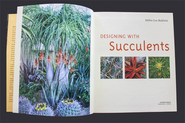
Inside the book, Designing with Succulents. Photo credit: Sarah Suassuna

Inside the book, Designing with Succulents. Photo credit: Sarah Suassuna
Inside the book, Designing with Succulents. Photo credit: Sarah Suassuna
Inside the book, Designing with Succulents. Photo credit: Sarah Suassuna
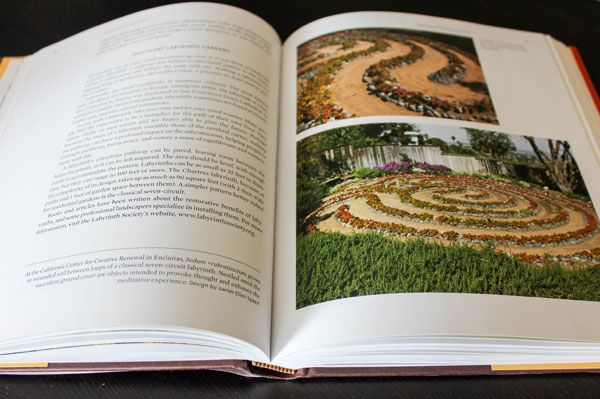
Inside the book, Designing with Succulents. Photo credit: Sarah Suassuna
Pick up your copy of Designing With Succulents today!
Article by Sarah Suassuna Return to Homepage


How Yi Zhong De Sheng Secondary School Mixes Play With Learning
Yi Zhong De Sheng Secondary School, Foshan, China, by Gravity Green. Is it possible to create an educational environment that integrates play and learning? Most people have been brought up in a traditional educational structure based on determination of rules, obedience, homogenization, collective thinking, and memorization of tedious knowledge. This is often accompanied by dull environments and rigid schedules. China’s state education system is often considered to be both rigorous and traditional, based on the philosophy of one-sidedly passing on knowledge from generation to generation. In reality, the quality of education China’s students receive varies greatly. Parents often invest a lot, depending on where they live and how ambitious their choice of school, making decent education a privilege.

Landscape masterplan of Yi Zhong De Sheng Secondary Image credit: Gravity Green.
Yi Zhong De Sheng Secondary School
But what is decent? We are beginning to witness advances in education, with innovative proposals related to integrative learning processes being implemented as an interesting option for a more effective and inspirational approach to education. Foshan, a city located in the province of Guangdong in China, is the location of the Yi Zhong De Sheng Secondary School, a 2009 campus enhancement project designed by Gravity Green Limited and Frank Yu and Claude Wong of Gravity Green Partnership architects. Gravity Green is a young studio with a clear vision of design called “Smart and Great”, which pursues comprehensive, sustainable, and responsive design solutions to highlight the uniqueness of each project.

Science Courtyard at Yi Zhong De Sheng Secondary School. Photo credit: Gravity Green.

Cubism courtyard at Yi Zhong De Sheng Secondary School. Photo credit: Gravity Green.
- How to Grow a School Garden – Book Review
- Dyslexia in Design – Is Dyslexia a Problem or an Advantage to a Designer?
- 10 Great Places to Study Landscape Architecture in Europe
The 10th anniversary of the school was an excuse to enhance the old-style open space and change the appearance of the school as a whole. The building has a built area of 12,500 square meters and is home to 2,800 students. The complex comprises a display of blocks with open spaces in between, which suggested an opportunity to transform these voids into dynamic and stimulating learning spaces to rejuvenate the complex as a whole.

Students enjoying themselves in a outdoor sketching session. Photo credit: Gravity Green.

Wind frm at Yi Zhong De Sheng Secondary School. Photo credit: Gravity Green.

Garden of Geography with cubes in different sizes representing the populations. Photo credit: Gravity Green.

Cubes of nation imprinted with basic geographic information such as coordinates, areas, and time zones. Photo credit: Gravity Green.

Garden of Geography overview. Photo credit: Gravity Green.

Yi Zhong De Sheng Secondary School. Photo credit: Gravity Green.
- Landscape Architecture: An Introduction by Robert Holden
- Landscape Architecture, Fifth Edition: A Manual of Environmental Planning and Design by Barry Starke
Article written by Claudia Canales Return to Homepage


How Presqu’île Rollet Park Recaptured The Seine Banks
Presqu’île Rollet Park, by Atelier Jacqueline Osty & associés, Petit-Quévilly and Rouen, Seine-Maritime, France. As the industry of coal storage begun to lose importance in the past years previous port sites turned into wastelands, but they did not lose their importance or dynamism. Cities became denser so that these sites along rivers and ports became focal points for development and investment. As part of the project, Seine Ouest-Rive Gauche and being in direct relationship with two major elements – the Seine river and the eco-district – Presqu’île Rollet Park designed by Atelier Jacqueline Osty & associés draws the tableau of restoration of nature in the city. Furthermore beyond the park’s function, it shows the reconciliation of the city of Rouen and of the Flaubert district with the river. The design of this park places value on the identity by retaining former materials and elements of the site.

Masterplan of Presqu’île Rollet Park. Image credit: Atelier Jacqueline Osty & associés
Presqu’île Rollet Park
How to recapture a river bank? The banks of the river Seine located in the neighborhood of the Flaubert eco-district developed on the site of a former port and industrial wasteland. Thus, the river banks struggled with soil contamination. Because of this, and the desire for nature, different steps had to be found to overcome the present difficulties of creating biodiversity and restoring the river banks.

Presqu’île Rollet Park. Photo credit: Atelier Jacqueline Osty & associés

Presqu’île Rollet Park. Photo credit: Atelier Jacqueline Osty & associés

Presqu’île Rollet Park. Photo credit: Atelier Jacqueline Osty & associés

Presqu’île Rollet Park. Photo credit: Atelier Jacqueline Osty & associés

Presqu’île Rollet Park. Photo credit: Atelier Jacqueline Osty & associés

Presqu’île Rollet Park. Photo credit: Atelier Jacqueline Osty & associés

Presqu’île Rollet Park. Photo credit: Atelier Jacqueline Osty & associés
Related Articles:
- 10 Practices Showing That “Sustainability” is More Than Just a Buzzword!
- 5 Landscape Architecture Buzz Terms, Explained!
- Exceptional Ecological Park Reconnects Children With Nature

Presqu’île Rollet Park. Photo credit: Atelier Jacqueline Osty & associés

Presqu’île Rollet Park. Photo credit: Atelier Jacqueline Osty & associés

Presqu’île Rollet Park. Photo credit: Atelier Jacqueline Osty & associés

Presqu’île Rollet Park. Photo credit: Atelier Jacqueline Osty & associés
Recommended Reading:
- Urban Design by Alex Krieger
- The Urban Design Handbook: Techniques and Working Methods (Second Edition) by Urban Design Associates
Article by Ruth Coman Return to Homepage