


Author: Lisa Town
Laura Wilson – Two Spirals
I had the great pleasure of meeting and working with Laura Wilson in 2008 while I was living in Germany. She has a distinct sense of calm about her that instantly puts you at ease as if you’ve known her forever and I believe that her art is a direct extension of her warm personality and intimate connection with the natural elements. Laura was born and raised in Raleigh, North Carolina and has a BA in Fine Art from Furman University as well as graduated from the School of Sculpture at Emerson College in England. Her artwork focuses on temporary and permanent site specific public installations incoporating the history of the place and future intentions in the forms. Laura works with materials found locally within a 50 mi radius and in collaboration with the local community. She has exhibited and had installations in the US, England, Italy, and Norway. She currently resides in Mannheim, Germany and Chapel Hill, North Carolina.
Laura recently sent me some photos of a sculptural weaving of two spirals she worked on for eight weeks during the spring of 2007 in Forest Row, England within the center of Emerson College’s campus. In her own words, she describes the process and thoughts behind the piece…

“The sculpture could be experienced by viewing it from the periphery or by walking through the spirals – coming in, pausing, going out – like a breath or a heartbeat.”
“The materials I worked with were local and natural, mostly wood and branches for weaving, collected within a 10 mi radius from the site. The spirals had a slightly raised center space with a sand path to walk through. A third of my time was spent in dialogue with college and local community members about the sculpture, listening to and incorporating their thoughts and meanings as I worked on it.”

“Having lived at Emerson College for three years, I wanted to create this sculpture to represent this unique location and as a result of asking whether a public artistic process could contribute to and encourage discussion about certain social questions such as:”
“How can one care for and create an inner quiet space in a community and also be open and inviting, allowing activity and even chaos? How can different people, cultures, courses, architecture and landscape come together during major administrative changes?”

“My intention was to make an all encompassing gesture originating from the center of campus and extending to the periphery of the Emerson landscape and beyond to create a sense of a connection and wholeness. Because of the dark and heavy tarmac in the center of an otherwise beautiful and lush campus, I also wanted to lighten and lift the space in order to visually let it breathe and expand.”

“From the beginning with only the sand drawing of the spiral, community members would walk the form. After I placed the trees in the center, many students started walking the path, winding in and out of the trees, not knowing I would be weaving them soon.”


“Once I began working on the sculpture, a friend told me that this arrangement of spirals is a sacred symbol for the Maori people called koru, which represents unfolding new life, renewal, growth, hope for the future, strength and peace, coincidently all qualities I hoped bring to this space. It is also the shape of the universe, weather patterns, the flow of movement through the heart, the yin/yang symbol, and vortices.”

“This public sculpture was a temporary installation intended to only be on exhibition for the eight weeks I worked on it. However the community felt strongly that it should stay longer and it was on display for four months. The spirals were used in many community gatherings, workshops, and festivities. I observed both children and adults spending time alone in the center of the spirals. Prior to the installation, the space was used simply as a path from point A to point B, but during this time, people stopped and noticed the space, the sculpture and each other.”


images via Laura Wilson
Lisa Town, Inspiration Wall
Wave Hello to the Simcoe Deck
image via pmccabin600
As the second Wave Deck on the Toronto Harbourfront, the Simcoe Slip has officially opened for public enjoyment! I’m absolutely in love with West 8‘s super sexy form designed to emulate the natural form of waves that make up this amazing deck.
The last time I wote about this, it was still under construction. Of course, the first thing I thought when looking at the construction photos was that there’s no way it would be near as cool once they start sticking all those darn safety features on. But I was pleasantly surprised to see that the rails totally work and in fact, actually add to lovely curving form.

However, eventhough there are rails in the area of the steepest portion of the curves, the railing then dives behind the backless seating benches to allow people sit such that they can face inward towards the deck or outward towards the water for a direct engagement. Amazing! I saw several examples of waterfronts in Europe that had details like this one that I drooled over…knowing full well that we’d never get to build something like that here the US. Instead we would have benches set back and with rails between the people and the water.

images via pmccabin600
With the steep slopes of the curves, it would seem an obvious question as to whether people could actually walk up and down the deck safely. One flickr member took a picture of the detail and points out that the “seemingly impossible slope at the newly opened Simcoe Street wave deck [is] easy to walk up and surprisingly safe to walk down due to the tilted hardwood boards. The whole effect is gorgeous and unexpected.”

image via restorationcomedy
Adriaan Geuze, landscape architect and urban designer from West 8, said that the wave deck has no specific program. West 8 wanted the deck to inspire and enourage people to step off their normal path and engage themselves with the waterfront. But I bet that no matter how they thought people would use it, they didn’t expect kids to treat it like a slide! It’s always amazing to see how the public ends up using new spaces and what kind of unexpected events begin to form.

image via restorationcomedy

image via pmccabn600


images via somewhere in toronto
Lisa Town, Inspiration Wall
May Photoshop Tutorial: Hue/Saturation for Major Color Changes
In celebration of May being my birthday month, this tutorial is going to use candles! We all know and use those typical little multi-colored twisty candles but I was only able to find one. Here is the original candle and it’s the blue one. It’s all cropped out and ready to be colored up. So….how do I get different colors?
The best way to make these color changes is to use the Hue/Saturation dialogue box. You can open this dialogue by going to Image > Adjustments > Hue/Saturation. This will open up the following dialogue:
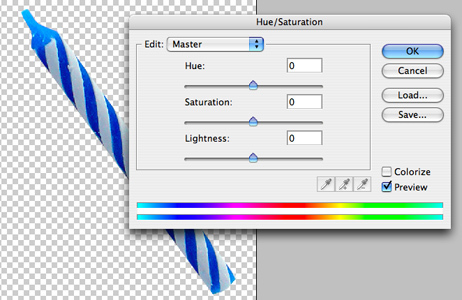
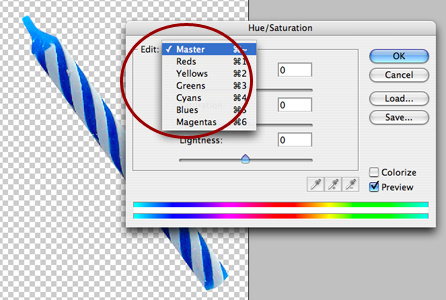
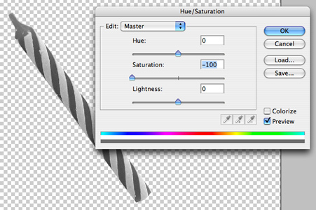
Notice the drop down at the top of the dialogue next to the word “Edit:”. The default is “Master” which means that whatever you do with the sliders, it will apply to the entire image. You may or may not want to make changes to the entire image but I usually like to isolate my colors. If you click on that drop down, you’ll see the following options:
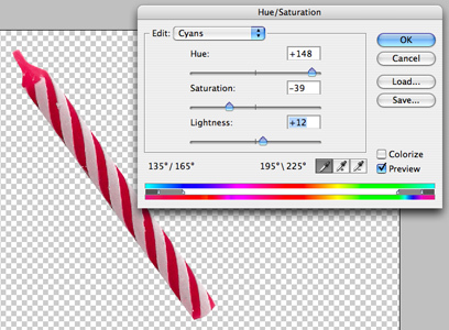
Since with this image, I really just want to change the blue and the cyan, I chose each each of those and adjusted the sliders until I got the color that I wanted for a reddish candle. This is what the candle looks like as red:
Works pretty well doesn’t it? But you’re probably wondering why I used all of the sliders instead of just one. Now I’m going to break down the three different sliders in the dialogue box. The top slider is the one that can seem the most confusing. If you start dragging it around, it’s obvious that it changes the color…but how?
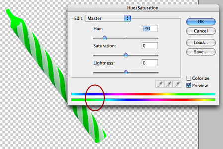
First, leaving the “Edit” drop down as the default of “Master” (changes the whole image), I want you to focus your attention to the two bars of color at the bottom.
– The top bar shows the colors in the original, un-manipulated image.
– The lower bar shows the colors that the image will be changed to.
Notice the red circle on the bars. Remember how the candle was blue? Well now it is green by moving the top slider, the Hue slider, because this slider affects the Hue or the Color. The reason it has turned green is shown in the bars. In the upper bar, where the area is blue, that same area is green in the lower bar which means….everything in the image that is blue, will not be green. Try opening up any image and playing around with the sliders, noting the relationship between the two bars and how it affects the image.
Now for the other two sliders. The middle slider is the Saturation slider which basically means how much or how little color do you want to stuff into that image. This is how it works:
To the left = less color (duller)
To the right = more color (brighter)
NOTE:, if you push the slider all the way to the left, the image will have no color at all. This is a great way to make an image grayscale while keeping it in the RGB mode. You always want to try to keep an image in RGB mode. So from now on, instead of changing the mode to grayscale, all you have to do is Desaturate the image by taking all the color out through pushing the slider all the way to the left. (Or, go to Image > Adjustments > Desaturate for a shortcut)
This is how it looks:
And then for the lower bar, the Lightness bar, this affects the lightness and darkness of the image.
To the left = black
To the right = white
And when this is applied to just certain colors, it can help to dark or lighten. But be careful with it as it treats the color with blanket lightness or darkness, ignoring highlights and lowlights. Personally I don’t like to use it too much, only to add small adjustments, but instead prefer to use Levels or Curves to make major tonal adjustments.
So getting back to the red candle, with the information you now know about how the Hue/Saturation adjustments work, let’s examine what I’ve done here. Looking at the sliders:
– The Hue slider in conjunction with the color bars show that the cyan is reflected as a magenta/red color.
– The Saturation slider has been pushed to the left, or in the negative, because the candle started out pretty saturated or bright and I wanted to dull it down a bit to make it look more real.
– And then the candle was a bit dark so I pushed the Lightness slider a bit to the right, or in the positive, to lighten it up a bit.

Now, all that’s left is to make a bunch of different colored candles. Just duplicate the original candle as many times and necessary and then manipulate the Hue/Saturation according to what colors you want.

Stay tuned for the June tutorial where I’ll show you how to light the candles!
April Photoshop Tutorial: Advanced Blending, Part 2
In last month’s tutorial on Advanced Blending we took a look at the Blend If section in the Layer Style dialogue box. We discussed the difference between the two sliders in that section. These are:
This Layer: Controls the current or active layer and how it blends with what is below it and,
Underlying Layer: Controls the layer below the active layer and how it blends with the active layer
In the previous tutorial we focused on the top section labeled “This Layer:” This month, as Part 2 of the series on Advanced Blending, we will now look at the lower section labeled “Underlying Layer” and see how this can be used.
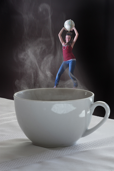
I’m going to start with two images. One is of a steaming coffee cup and another of a girl dancing on a desk at work. Something I often like to play around with when I’m exploring new techniques in Photoshop is to grab two or more seemingly unrelated photos and try to create a believable scene. Dealing with scenes that go beyond reality and explore more of the hyper realism helps to make it more fun and seem less like work. And not only that but trying to make something impossible look believable can often times be difficult and will further challenge your skills as a photoshop artist.
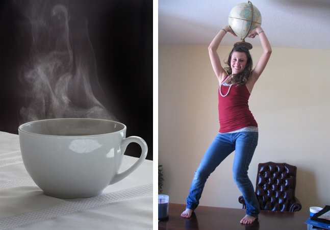
Sure I could’ve decided to have some kids frolicking in a misty fountain but that sounds a bit too much like something I would do at work and we want to keep this interesting. I’m going to do something a little more fun and have this girl dancing on the rim of the coffee cup while she is enveloped in steam.
First I crop out the girl and drop her into the coffee cup image.
Next, I take a look at the steam and position the girl on the rim where it looks like the steam could be wrapping around her body in a believable way. And then I open up the Layer Style Dialogue box by either double clicking on the layer where I’ve placed the girl or by going to the drop down menus and choosing Layer > Layer Style > Blending.
In last month’s tutorial, I already showed you the difference between the Blend If and the Blend Modes as well as how the sliders behave. If you haven’t read through the tutorial, I suggest that you do so at this time. So now I’m going to perform the same actions, but instead of using the “This Layer:” part of the Blend If, I’m going to use “Underlying Layer:”.
The reason here is because I want the active layer (the girl) to show or hide certain parts of the layer dependent upon the underlying layer (the coffee cup). Note, this will control not just the one underlying but ALL layers beneath the current one, not just the one directly beneath the active one, so be aware of this.
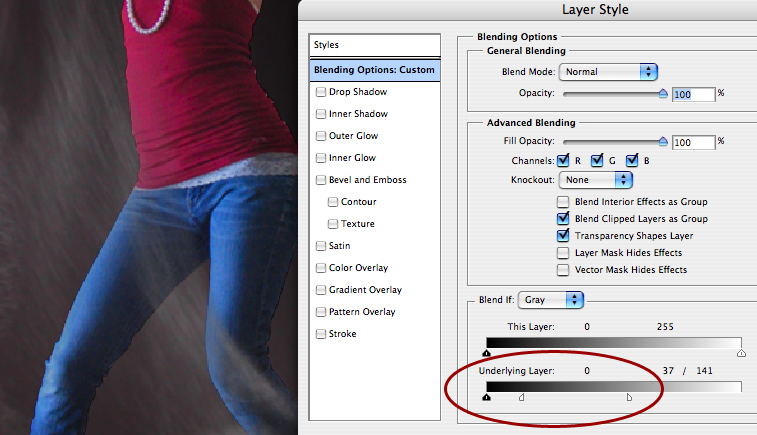
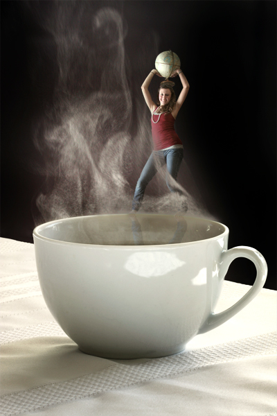
I’ve pushed the sliders around and adjusted them according to what I’d like to see. The image above shows the numbers in the dialogue box that I found to work for this image in allowing the steam to curve around her legs but still be translucent enough to still look like steam. And here’s what the numbers mean:
-Everything brighter that 141 on the underlying layer (coffee cup) will be hidden in the active layer (girl)
-Everything darker than 37 on the underlying layer (coffee cup) will be visible in the active layer (girl)
-Everything in between 37 and 141 in the underlying layer (coffee cup) is smoothly blended/faded in the active layer (girl)
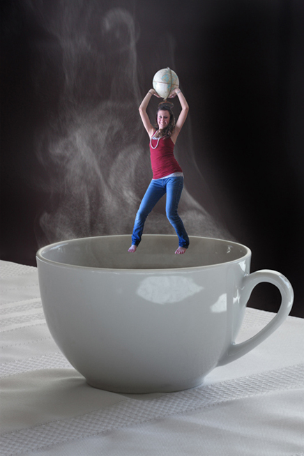
The above image obviously doesn’t look terribly believable so just another minute of touch ups to make it all fit together with some realistic highlights, shadows and reflections and making the two images have a similar color and then, voila, here’s what a final image might look like.
I know you aren’t going to be drawing up any people dancing through coffee steam anytime soon but just imagine that you could use this for nearly any kind of atmospheric thing you want something to sort of poke through may that be kids in a fountain, birds/planes in the sky, a sculpture or bridge poking through the haze, or people walking in the Seattle rain…whatever! Chances are, if it’s atmospheric and seems impossible to crop or blend, you can make it work using Blend If!
March Photoshop Tutorial: Advanced Blending, Part 1
Whoa, where did the month go? Well we can’t let the month get away without another Photoshop tutorial!
In this tutorlal we’ll go behind blanket blend modes and look at a more advanced level of blending with a highly useful yet mostly overlooked and misunderstood feature hidden away in the Layer Style palette. This feature allows you to hide or show elements automatically without the need of a brush or mask.
This is a great technique when dealing with things that are impossible to crop and even the Blend Modes won’t work right because you may not want the entire object to blend, only specific areas. What if you want to create an image montage of a kid running through a misty fountain? Or birds flying through clouds? Or a fireworks celebration off the water from your newly designed waterfront promenade at night?
It can be done!
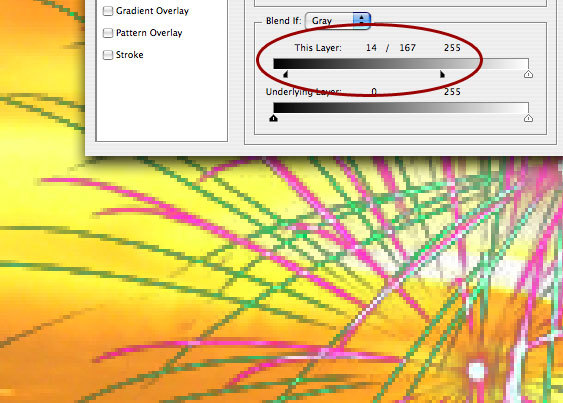
First, double click on a layer to open the Layer Style dialogue box or chose from menu drop down menu Layer > Layer Style > Blending Options. Chances are your eyes immediately look to the left of the box where all the options like Drop Shadow exist right? But what about all the crazy information in the middle and what on earth are all those sliders for at the bottom? Well that area that says Blend If: is exactly the area we are going to focus on in this tutorial. See the area circled in red below:
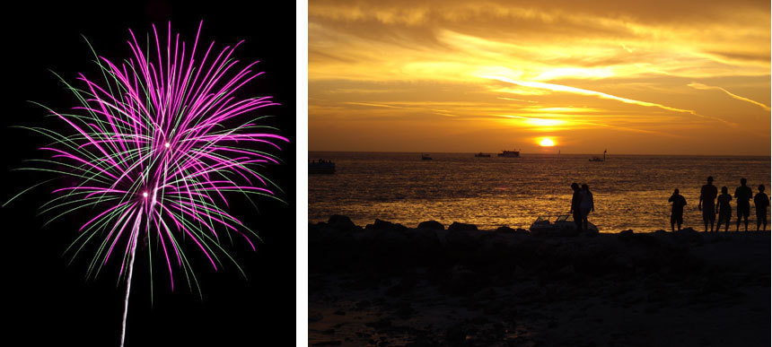
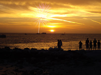
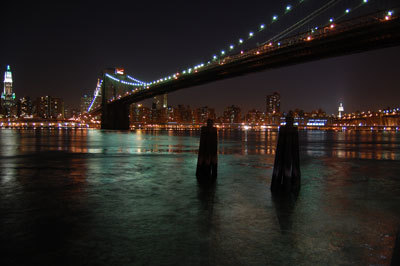
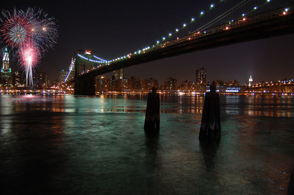
I grabbed in image of fireworks which I will blend into a lighter colored sunset photo just so you can see how this works. See below the original photographs of the fireworks and the background.
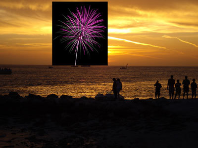
If I put the fireworks photo on the sunset background then you can see the black background won’t let the sunset show through.
But then if i use a Blend Mode it will change the way the entire fireworks image will react with the background. If I use the Screen mode, it will get rid of the black effectively, but it also changes the color of the fireworks and they look too light on the lighter background and the are almost unnoticable.
So how do I leave the colors of the fireworks themselves alone and just blend the black of the current layer with the underlying sunset layer and that’s all?
Let’s take a closer look at the Layer Style palette and that magical Blend If section.
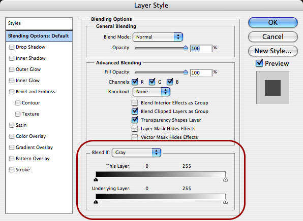
There are two sliders
This Layer: Controls the current or active layer and how it blends with what is below it and;
Underlying Layer: Controls the layer below the active layer and how it blends with the active layer
These sliders are on a scale from 0 to 255. In the RGB scale that means 0 is black and 255 is white.
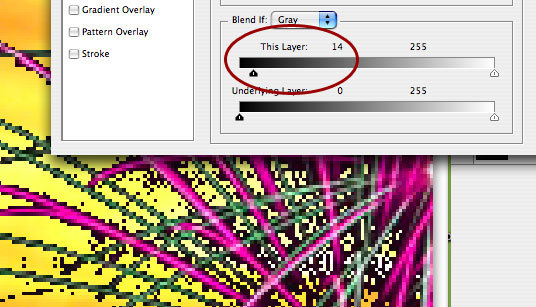
The sliders are currently all the way at either end, meaning there is no blending going on. In order to start the blending, the sliders need to move. So I’ve zoomed in on an area of the fireworks and pulled the black triangle slider on the left over to the right where it is now at 14, it was at 0. What this means is, anything from darker (lower in number) than 14 will be hidden.
If you look at what it did to the image, you will see that a bunch of pixels have now gone away.
Amazing right? Well, not really because it looks horrible and jagged from all the pixels and it still has a black fringe. So that means I should keep pulling the slider over till all the black is gone right? Let’s try it:
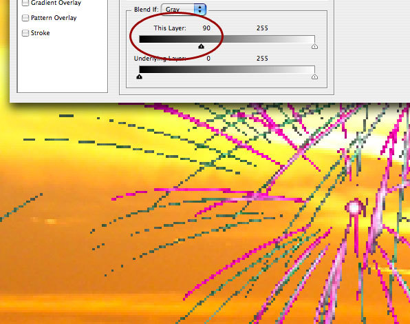
That didn’t really work either because now some of the actual fireworks are missing and it’s still jagged and doesn’t look nicely blended. We need a more realistic effect…and an even closer look at these sliders. Do you see what looks like a little white line in the center of the black triangle slider? It’s not actually a line but a joint because what seems like two sliders is actually one joined together. We need to break them apart for some fine tuned blending.
So with the black triangle at 14, hold down the alt key (control on mac) and click and drag the slider to the right and you’ll break it apart. Take it all the way down till you like what you’re seeing. What this means is:
– everything darker than 14 is hidden
– everything lighter than 167 is left alone
– everything from 14 to 167 is blended/faded perfectly smooth
Check it out:
The sunset photo doesn’t really fit with the fireworks so I have to show another photo that is more fitting. I just wanted to use a light background image so you could really see how the Blend If works and why it’s useful.
Check out the better matched montage below….original photo and then the one with the fireworks added using the Blend If strategy for a perfectly seamless image.
In the next tutorial, we will explore more examples of how this can be used and delve even further into the power of Blending.
Interactive Bus Shelters
As landscape architects we are consistently trying to involve the user in their environment and to create spaces that inspire, engage and even educate people of all ages. We do this through a variety of design strategies, often employing different and cutting edge techniques that turn a simple landscape into an dynamic and interactive world.
Now advertisers are beginning to follow our lead when they take their campaigns to the street. In particular, bus shelters are a great place to not only grab hold of a captive audience but many people waiting for their next bus are looking for something to take their mind off the wait. These days marketing campaigns take advantage of all the senses, not just sight, to engage their audience in something exciting, turning the once simple shelters into a multimedia stage.
Check out this video of Cadbury’s new bus shelter campaign for their Creme Eggs in London. This campaign turns bus shelters into fully interactive video games that challenges users to splat as many creme eggs as they can. People not only love it, but they love challenging others for a better score or themselves each time they go to catch a bus to see their score get better each day. Brilliant!
A previous campaign by Solo Mobil in Canada wanted to promote their walkie talkie feature and decided to put two way radios in bus shelters in Vancouver, Calgary, Toronto and Montreal. Anytime someone would push the button to talk to someone, they would be connected to another bus shelter in a completely different city. How wild would it be to be sitting there, waiting for your bus and then someone from across the country starts talking to you from the shelter?
Another campaign in Rotterdam used weight sensitive technology to rig up the seats to measure riders weights as they sat down and translate that number to a screen on the inside of the shelter. This is an interesting concept to use a sensor to detect a persons presence but I would thinking putting someone’s weight on a screen for everyone to see would make many people pretty upset. This particular campaign actually had this very thought in mind and wanted people to feel that they needed to hit the gym. Once the weight appears, it draws the eyes to the board where a very simple logo appeared for Fitness First. Nuff said. This might fly in The Netherlands but definitely wouldn’t be tolerated in the United States!
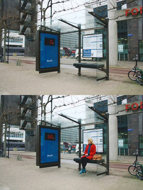
image via: directdaily
This one from Science world in British Columbia created an rather gross and yet funny interactive ad, check out the video:
These creative Sharpie ads in many US cities give users a blank cast in order to entice them to explore their inner graffiti artist and leave their mark with a digital marker.
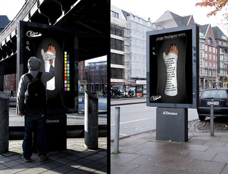
image via: The Cool Hunter
In Chicago, known as the Windy City, ten shelters were made warm and toasty with heated air along with ads that read “Cold, provided by winter. Warmth, provided by Stove Top.” They wanted to remind them of the cozy feeling and warm thoughts of eating a nice piping hot cup of instant Stove Top stuffing.
And last but not least, here’s the latest ad innovation to enhance the very well known “Got Milk?” campaign. They take advantage of scentvertising by piping in the smell of chocolate chip cookies to bus shelters with the thought that where there’s fresh chocolate chip cookies, there’s a big glass of cold milk. If nothing else, it’s a welcome breath of fresh air compared to the smell too often associated with public transportation stops.
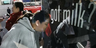
image via: Cutting Through the Clutter
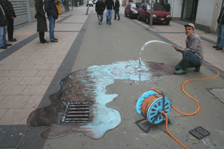
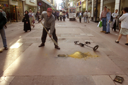
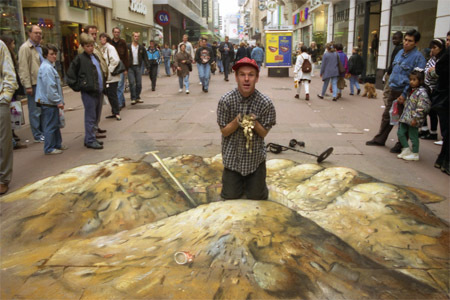
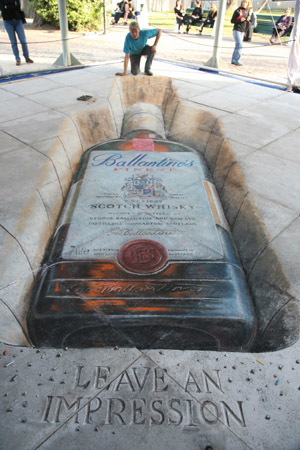
Sidewalk Illusions
Summer is a wonderful time full of non-stop events and one of my favorites are different ways of producing art whether it’s through meticulously sculpting a sand castle to look like one of the built wonders of the world, placing flowers in designs to look like intricately woven carpets or drawing an original work of art in chalk on the sidewalk. The latter can even go so far as to truly look like it could be on the sidewalk. Julian Beever is one such artist and he has been creating sidewalk masterpieces all over the world for over ten years.
I especially love this coke bottle. Look at the amazing reflections on the bottle and the shadows on the pavement. I seriously thought there was a real giant bottle there when I saw it for the first time.
He likes to get really interactive with his art as well…
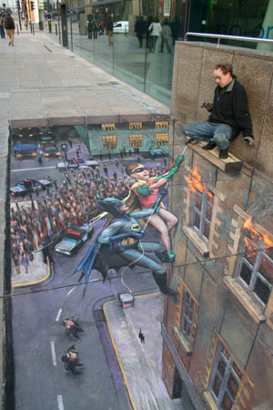
Or create a series in which he becomes part of the art….
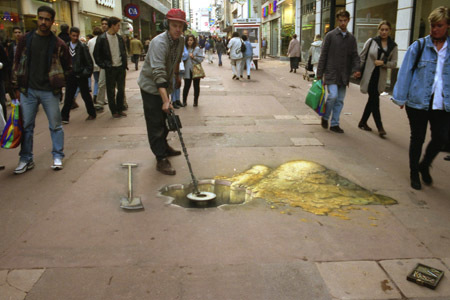
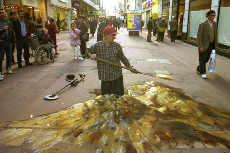
The special trick with his sidewalk art is to draw them in just the right way to make them actually appear to be three dimensional. These means that when viewed from the wrong angle, they look all stretched and distorted but when viewed from the correct angle, they look amazing. For example, see this series of wrong angle followed by correct angle…
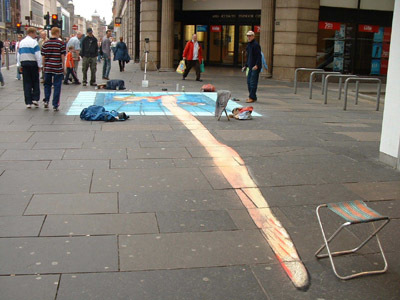
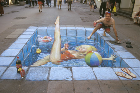
But no matter where he draws or what his subject matter is, within the community that he brings together in the process, he will always leave a lasting impression.
The Sustainable Model for the World?
Could one block in Texas become just that?
That’s the question asked by the City of Dallas and Urban Re:Vision in their latest design competition. Titled Re:Vision Dallas, the competition “is a revolutionary initiative to create the prototype for an innovative, sustainable urban community. At the heart of the process is a series of contests generating visionary ideas for what can and should be in the design about urban space.”
They aren’t just asking for designers to take what we know and put it all together into one block but rather to challenge what we know and understand about creating a community that can sustain itself and the entire way in which a community should function. The idea is to go beyond today and truly look into the future and create a visionary concept which could possibly even change our entire thinking of what a sustainable community really is and could be. “It’s a chance to change how we live and connect, how we interact and collaborate – how we live in a space throughout out life and the lifecycle of the space.”
This could be a really interesting concept to follow as the competition unfolds.
Capturing the worlds cities on foot
I proudly love walking around cities. If I can get there on foot, I will. I have thought for some time that it would be a fabulous side gig to just spend a huge chunk of time walking around a city and documenting the trip through pictures and blogging.
image of a busker in Leeds via Lydia Heard
As it turns out, someone is doing this! Her name is Lydia Heard and her blog called Citywalker is my new favorite blog. As an urban designer she has walked and studied many cities but currently resides in Seattle where she walks and documents the most. The best part is that she looks at city’s like I do, and like most of us do as designers. She discusses the details that we would find relevant and interesting in the public realm, green infrastructure, public transportion, architecture, and so much more…. She also has a jaw dropping 1826 pages of photos on flickr!
image of bench outside Peckam Library in London via Lydia Heard
On a bit of a side note, I find it really fascinating how differently people can see the same place. After traveling all around Europe with my husband, each of us with our own camera, I found that I had stumbled across an interesting little experiment that I didn’t even realize I was conducting. After looking through the photos I realized it was like looking through the eyes of person as they were seeing the world unfold around them…and how unbelievably different we saw what was in front of us. He might have snapped a photo of a great view from a lookout in Barcelona while my photo at the exact same time was of the stone construction of the wall keeping us from tumbling over the side. Or when we were in Rome and from a hill above the city, looking out towards Vatican City, my husband took a photo of the moon beginning to show just next to St. Peters Basilica while I was looking at the plaza below us that was setting up for the following days market. It’s definitely a good thing we both have a camera so there’s someone to balance out my photos of sidewalks and paving patterns when it comes to putting together photo albums for the family!
Think Inside the Box
The green bike box that is! National Geographic contained an article last month called “A Bicycle Bump” which featured Portland, Oregon for it’s “171 miles of bike lanes, ten freshly painted green boxes (picture from the article above) that put cyclists safely ahead of vehicles, even some signals just for bikes.” And this isn’t the first time the yellow-bordered magazine has featured Portland. In the August 2008 issue, it named Portland the number one city in the top five bike-friendly cities in the nation.
It’s of no surprise that biking is on the rise. With gas prices soaring, more and more people are parking the car and choosing to pedal to work. How do they measure this? According to National Geographic, it’s by the additional bikes being places on the racks of buses. In the lead is Houston with a whopping 235% increase.
With more and more bike friendly streets being built and programs like bike-sharing, it’s hard for anyone not to have the incentive to keep the car at home. I thought the bike sharing program in Paris was great. It seemed like nearly every corner I turned I was faced with the scene in the image below, which I took near the Viaduc de Artes.
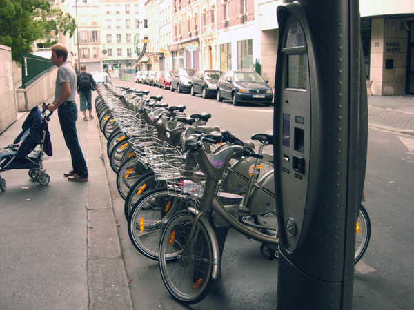
How wonderful would it be to show up in any city and be able to just grab a bike and go. Sure you can rent bikes for a time, but then they always have to be returned to the same place. Have a network of kiosks where you can pick up and drop off as you please purely on an as-needed basis is definitely something that would have more people grabbing a bike.
And then another issue, one that always kind of bothers me, is bikes on light rail trains. First of all, there is hardly any space on the cars for bikes and then during busy, commuter times the cars are so stuffed that bikers have little chance of getting on and people on the train just glare at the biker who had the nerve to bring their dirty bike on a crowded train. But a recent post by Brice Maryman in Seattle discusses a model for the city’s new light rail and it sounds like a much better option. With a consistently placed gallery car dedicated to bikes it should make both bikers and non-bikers happy.
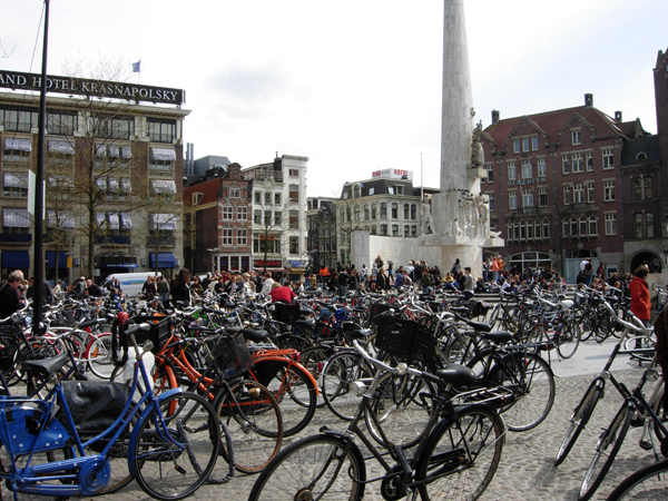
And then, before you know it, everyone will be biking, there will be a whole network of bike trails within cities with their traffic signals and we’ll have trouble keeping up with the demand for bike parking and our plazas will end up looking like this one I encountered in Amsterdam 😉
Celebrate Skateboarding!
I recently walked past a parking lot that should’ve been empty but instead was full of kids having set up makeshift skateboard ramps. There must have been about 10 kids there. But the most interesting part is that there is a small area to skate just a block away from the parking lot and a brand new state-of-the-art skate park just a 5 minute drive away. And yet here are more kids out in parking lots. The demand for areas where kids can skate is continuously amazing me.
This brought back to my mind the old never-ending discussion topic of skaters amongst landscape professionals. Do you deter them, instlaling all sorts of different metal shapes into your seat walls or do you let ’em ride? I definitely fall into the latter group to the point where I don’t just want to let them ride, I want to encourage them to ride!
As designers we always trying to come up with ways to activate a space, throwing in all kinds of multi-functional things that can be used by all ages, in several different ways and all different times of day and year. Things like skate parks and dog areas are fabulous ways of getting more eyes on the space and more round the clock social activity to encourage safety. And why not make areas where people can sit and/or skate?
In a ongoing discussion in the forum on the topic of skateboard deterrents, I posted some images of a favorite little plaza of mine in the German town of Neu Ulm. This is a very small plaza with a lot going on and is bordered by two busy streets, retail and a library. This space is the joy of the town. And what do they have on their seat walls? Skate rails! See the photos below of the plaza and the seat wall.
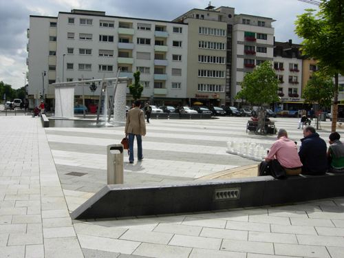
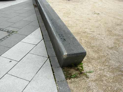
These multi-functional spaces allow skaters to ride as they please but also gives people plenty of places to sit. In some areas, there are wooden benches on top of the wall to note where there are places only for sitting, but for the most part it’s all about sharing. And by putting the rail on there, it helps to protect the edges of the seatwall. Everyone is happy.
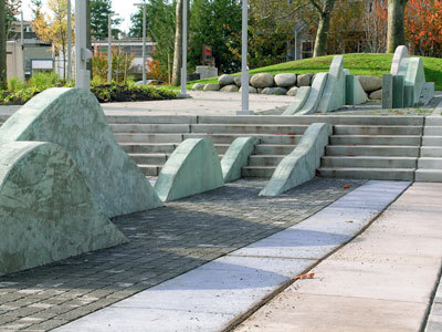
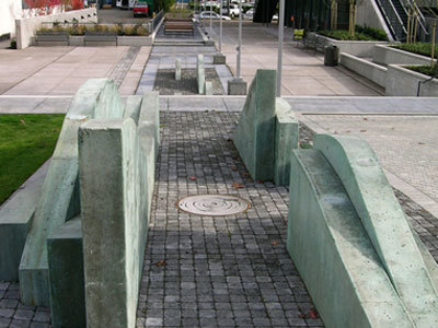
So actually encouraging skaters to skate walls is great but my all time favorite is the idea of skateable art. Artist Perri Lynch has already created some pieces that show just how fabulous this concept is. I personally think a lot of skate parks already look like art, so it’s certainly an easy concept to grasp.
For example, here are some images from Lynch’s website that show off the successful Lake City Civic Core project in Seattle, Washington. The project has been deemed the most skateable public art. And it looks darn cool too.
So let’s not deter skating, let’s embrace it and encourage it. Because hey, it’s cool to watch, a great way to further activate a space and any way we can continue to encourage kids to get out in the fresh air to do something physical is a good thing.
- 1
- 2