Are renderings all they are cracked up to be or do they just cover the cracks? We explore renderings and the different mediums used to help us draw our conclusion. The field of landscape architecture uses a diverse mix of tools to create, design, and communicate ideas. We solve problems through design and make spaces better for the people who inhabit them. The design and construction of a project is made possible through the help of computer software and hand drawing or drafting. Photoshop perspectives, plans and sections, 3-D models, and hand drawings all help communicate a design to the public, the client, or the contractor. However, this does bring up an interesting issue: Are renderings true to the design and its construction? We make pretty pictures, but are some of them doing more harm than good?
Types of Renderings
We need renderings in landscape architecture to communicate design ideas to our clients, our peers, and contractors. Renderings are often used to sell a project in a way that idealizes the landscape to create a “perfect” image. It is not always an idealization, but a visualization. The artistic leeway we use in renderings is necessary, because no one can completely predict what a landscape will look like after installation. That means renderings have the potential to create some unrealistic expectations.
More Top Articles on LAN
- 10 of the Most Common Mistakes People Make in Planting Design and How to Avoid Them
- Interested But Not Confident? – Know How to be Good at Hand Drawings
- Top 10 YouTube Tutorials for Technical Drawing
Let’s explore the different types of renderings and their uses
Photoshop Perspective
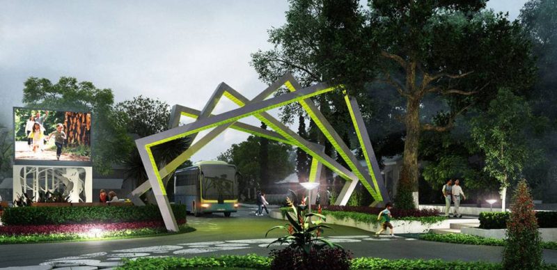
A well-done perspective can give the viewer a feeling of the experience he may have in the landscape represented. This is the image people will gravitate toward when looking at final boards, because it is the most enticing and seductive. As a result, people often put a lot of effort into Photoshop perspectives to sell a design, win a competition, or communicate an idea. You get a feeling for the experience of the landscape when you see people doing things in the perspective or when vegetation and lighting are used to create a distinct atmosphere. These techniques help to convince the viewer that this landscape will work and show him that people will want to use it. WATCH: Here is a great example of a perspective and how far you can go to alter an image:
Perspective Rendering for Landscape Architecture: Photoshop Workflow
Plans and Sections
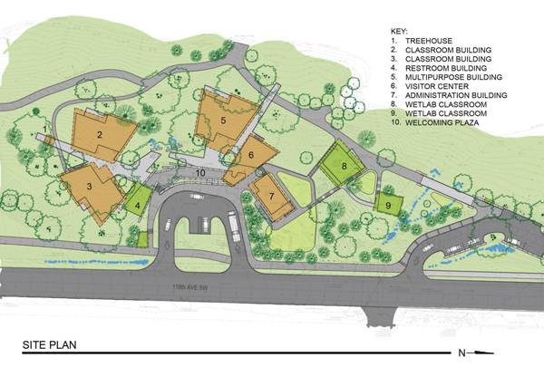
Plans and sections are versatile drawings that can be used to communicate to the client and the contractor. We can all picture an AutoCAD planting plan, section detail, or rendered section because they are so widely taught and used. On the plus side, these renderings can be drawn to scale, which proves to be essential during construction. They are a more concrete way to say what is going to be built, because plan view is not the easiest thing to render. Therefore, trees are often stylized to represent canopy cover and not what the final planting will truly look like. We need these renderings to get things built.
3-D Models
Modern computer software is so advanced that we can now create a project in virtual reality. The potential to experience the landscape through a video or screenshots or to “walk” through it on the computer is really exciting to clients and designers. It’s also fun! Programs such as SketchUp, Rhino, and 3ds Max can idealize landscape characteristics to create an environment that may not look anything like the real world. However, it does give you a visual of what the landscape might roughly look like.
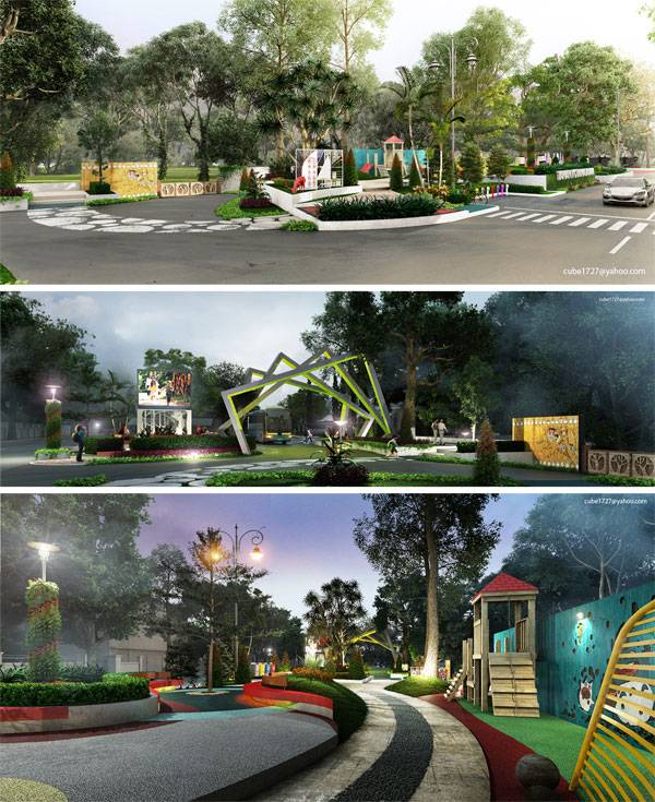
3D Rendering Images of Public Small Space at Mataram City, Lombok Island Indonesia. Image credits: Khatibul Umam bin Ahmad Fauzi, 3D Visualizer
Realtime Landscape Architect rendering
Hand Drawn
The most rustic of the bunch, hand drawings evoke a physical sense of the landscape. The hand of the designer is easily seen and used to show the possibilities. Hand drawing forces an understanding of the spatial characteristics of a space. You need to know how to hand draw to be good at computer software. Computers don’t think – we do — and we need to be designing while drawing. And hand drawing is the best place to start. Drawing in front of a client is the most engaging thing you can do to spark a conversation and come up with a better solution. WATCH:Hand-drawing a plan
Fast Sketch – Landscape Design
WATCH: Sketch in the field to build up your knowledge of how other sites work
Linescapes: Drawing Landscape Architecture – Introduction video
Controversy
I think we can all agree that renderings are not perfect. There is no way to know what a landscape will really look like. This has forced us to make assumptions and predictions, with a broad understanding of natural processes and environmental relationships. It’s not a bad thing, just a fact of the profession. We just need to understand that things will change, and a resilient design will adapt to potential change in a positive way. Renderings are not what the final product will look like. Designs change in response to climate, construction implementation, budget concerns, and the growth patterns of plants. They are used to show an idea of the potential of the site, not what it will become. This is often enough to get a client interested in pursuing a project. The perfect image is not what will be built, but it does increase the understanding of what it can be.
More Top Articles on LAN
- 10 of the Most Common Mistakes People Make in Planting Design and How to Avoid Them
- Interested But Not Confident? – Know How to be Good at Hand Drawings
- Top 10 YouTube Tutorials for Technical Drawing
Most of the time, renderings show landscapes that work, which is not always the case. We tend to put a lot of happy people in our drawings, but we never know how people will react or if they will even use the space. Our eyes naturally register a photograph as the true representation of an existing condition. When we manipulate photographs into what we want our design to look like, it tricks our minds into believing something is real. This is highly persuasive, but the reality of it needs to be understood.
So, what should we do?
There is no perfect answer to the applicability of renderings in landscape architecture. Every firm and person will do it differently, creating a diverse and exciting mix of possibilities in the field. However, the one lesson that should be taken away is that drawings should be used to explore relationships and study ideas. If you are not designing when you are rendering, something is wrong. Have knowledge beyond the rendering to understand the spatial and natural relationships of the landscape. Layering information based upon experience will make you more credible and successful in the field. Create a feedback loop, in which you go out and see what you know works and bring that knowledge back to the office to layer into the drawing. WATCH: An architect’s design process (we should be thinking in a similar way at the start of each project):
How To Think Like An Architect: The Design Process
Real-world design needs to respond to people, scale, and context. Always be cognizant of the experience of a site while designing, and use your broad knowledge base to create relationships that have the potential to really work. Have an open mind, and create thorough drawings that explore and study creative alternatives. How do you use landscape architecture renderings in your daily practice, and how should we use them in a way that is true to both the client and the designer?
Recommended Reading
- Landscape Architecture: An Introduction by Robert Holden
- Landscape Architecture, Fifth Edition: A Manual of Environmental Planning and Design by Barry Starke
Article by Nick Shannon Return to Homepage
Published in Blog






Pingback: Drawing Software Perspective – Viral craft