


Author: Erik Schofield

Eye-opening Images Predict a Dark Future For Nature
Museum of Nature, by Ilkka Halso, set in the distant future on Earth. A rollercoaster track loops over an idyllic riverscape, creating a clear reflection in the water as it dances off into the distance like a great serpent; a single tree lies in the middle of a paved square encircled by benches in an enclosed room with light piercing through a single hole, as though the tree was the main attraction; a cinematic room faces not a large digital screen but a pristine waterfall scenery, untouched, bright and idyllic in comparison to the dark auditorium. Through the combination of landscape photography and computerized 3D models, the photographic series of Museum of Nature only suggests idyllic scenery at the first glance. Through careful observation do we realise that the nature we know and can see today is depicted in the future as being torn from its environment- isolated, cultivated and preserved like animals close to extinction- a precious relic. Welcome to the strange world of Finnish artist Ilkka Halso where his photographic series will challenge how we imagine nature to be like in the distant future.

Museum I, 2003. Image credit: © Ilkka Halso
A Word From The Artist
“The project is based on pessimistic vision of what is happening on earth. I am looking into future and I am not very happy about it. I am considering these pictures more as visual pamphlets than aesthetic images.” – Ilkka Halso For many of us, the relationship we have with nature is ambivalent. It is present in our everyday life, even in vast quantities in some countries and it seems our access to nature is boundless. Perhaps we don’t imagine enough of what our natural environment will be like in the future. Halso, however, has visualized a future we do not want to see coming into fruition.

Theatre I, 2003. Image credit: © Ilkka Halso
What is the future of nature?
This is a daunting question. During this day and age, there are global discussions around the world on climate crisis- a threat to our natural environment. The answer depends on how much we value nature’s benefits- its values which are multiple from the provision of food, water, creating safe places for living, including provision of materials such as timber and many of our medicines. Let’s not forget how they provide opportunities for breath-taking recreation, cultural inspiration and spiritual fulfillment. The availability of nature is largely free and accessible. It is only when something becomes scarce that we begin to appreciate its value. The photographs depict the future society learning how to value and evidently pay for abusing the benefits of nature. Recomended Reading:
- Art and Photography by David Campany
- Art and Photography by Aaron Scharf

Kitka-river, 2004 (triptych). Image credit: © Ilkka Halso
A Frightening Population Increase
According to the UN (United Nations), the population at present, 7.2 billion, is predicted to increase to 9.6 billion by 2050. How do we, then, balance out the act of providing the needs of nature and people? Will we be able to feed, provide energy and clean water for people at a time of storms and rising sea levels? Can we meet those needs for the growing population whilst we protect the richness of nature that we all depend on? The answers, it seems, will be multiple and complicated. Halso’s work is one answer to those questions as well as a brief glance into a less greener future.

Roller-coaster, 2004. Image credit: © Ilkka Halso
Don’t Miss Halso’s Other Works
The internationally renowned artist has been dealing with the healing and restoration of nature in his work for the past decade. His photographic inventions are a reaction to our unstable planet. His previous series “Restoration” dealt with the idea of giving nature a treatment, like a patient receiving medical care, trees are arranged inside transparent scaffolding structures. Now the “Museum of Nature” collection shifts and nature is no longer being rescued but protected from threats of man’s actions in visualized shelters and massive buildings that allow the ecosystems to be “stored as they are found today.”
Can photography depict the future without cinematographic effects?
As I observed Halso’s photographic imageries, I could not help recall unfamiliar feelings of shock and eerie realization (of a possible bleak life on Earth) I experienced from a movie I recently watched- Mad Max: Fury Road. Whilst this heated, action-packed film has nothing to do with Halso’s idyllic work of art, it depicts a tale of a post-apocalyptic world of dry desert land where nature, the “Green Place”, is absolutely absent.

Theatre II, 2008. Image credit: © Ilkka Halso

Museum II, 2005 (triptych). Image credit: © Ilkka Halso
A Different Take on Photography
Halso’s photographic series shows a different take on photography that films have always done in the past and that is to depict a time in the future. Photography is about the here and the now, the taken image fits into the historical timeline of the subjects in the photograph- one which we can comprehend. Yet photographic work like this challenges the viewer. This playing with time and the contrast between the fictional film, the reality and the documentary photograph makes the urban landscape recognizable but also strange.

Forest of Sponsors, 2004 (triptych). Image credit: © Ilkka Halso
- Drawing and Designing with Confidence: A Step-by-Step Guide by Mike W. Lin
- Landscape Perspective Drawing by Nicholas T. Dines
Article by Win Phyo Return to Homepage

A Dramatic Peninsula Setting Makes Way for a Reflective Park in Sweden
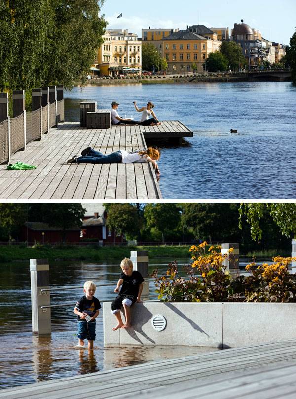
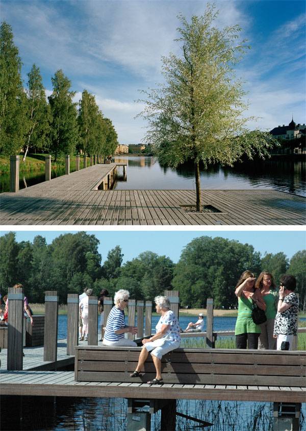
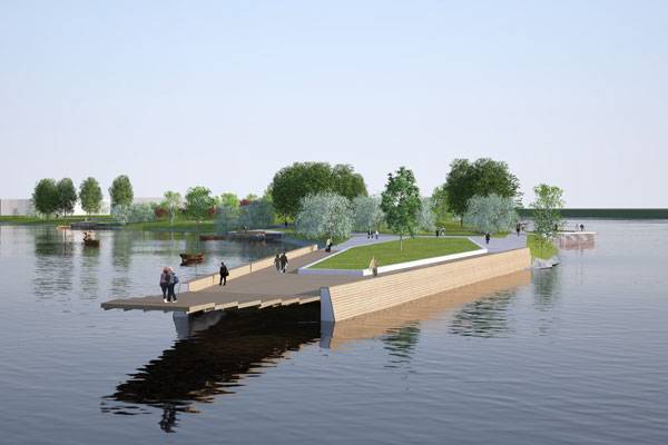
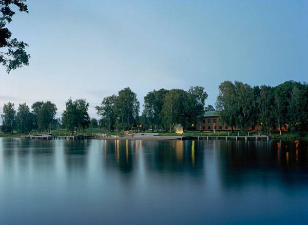
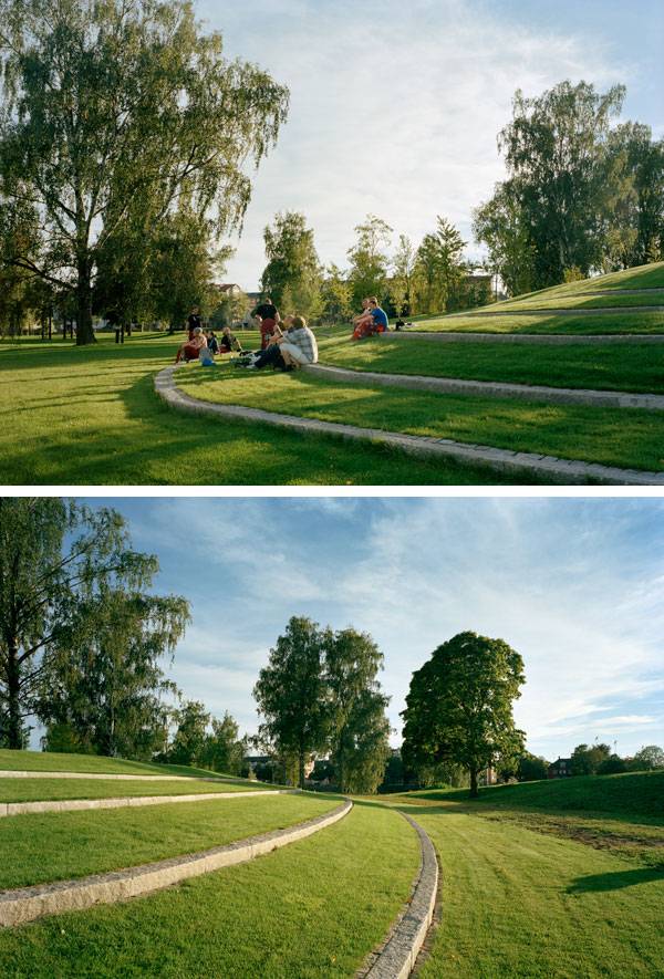
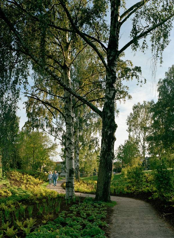
Sandgrund Park, by Thorbjörn Andersson, in Karlstad, Sweden. “Water is the driving force of all nature.” Never has this statement by Leonardo Da Vinci (1452-1519) rung truer for us than in recognizing the sheer impact Thorbjörn Andersson Landscape Architects have made on one dramatic landscape in a place that is suspended between land and water. Sandgrund Park in Karlstad, Sweden, is situated on a sandy peninsula that flows into the Klar River. The driving force behind the different aspects of the park is one’s physical closeness to water — and ultimately to its meditatively calm to raging aspects. The park exemplifies a project that takes full advantage of the abundance of opportunities created by the location and creatively plays on the magical attraction we have with one of the strongest and most irrepressible forces of nature.
Sandgrund Park. Image courtesy of Thorbjörn Andersson
Sandgrund Park
The peninsula has always been a dramatic place, but one with a lost sense of purpose. Prior to the construction of the park, there was no sense of arrival. Taking advantage of the site starts with the story of the Klar River: The river has its source in the Scandinavian Mountain ranges on the border of Sweden and Norway and ends in Lake Vanern, the largest lake in Sweden. While upstream, it enters the Karlstad region and splits into two main parts and eight smaller parts. At the point where it separates, the 300-meter-long peninsula where the park now stands is formed. The powerful physique of the peninsula is further dramatized from the air, resembling a bird’s pointed beak.

Sandgrund Park. Image courtesy of Thorbjörn Andersson
Sandgrund Park. Images courtesy of Thorbjörn Andersson
Sandgrund Park. Photo credit: Kasper Dudzik
Working With The Nature, to Create an Exceptional Space and Experience
Conceptually, the park and the river represent the dramatic yet calming endpoint to the possibilities of travel that exist within the city and from the train station. The designers were able to work with the river, the sand, the abundant space of the peninsula, and the close proximity to the city’s center to use the presented resources wisely, amplifying the existing qualities for the future park.
Sandgrund Park. Photo courtesy of Thorbjörn Andersson
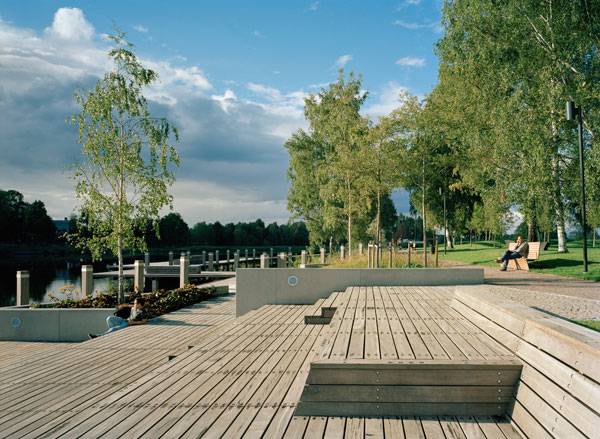
Just Because You Can’t Swim in it, Doesn’t Mean You Can’t Enjoy it
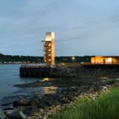
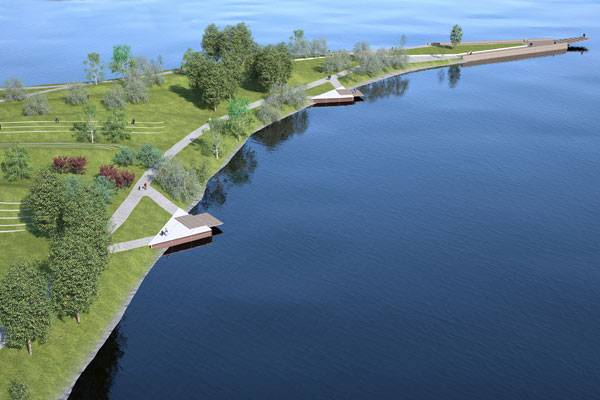
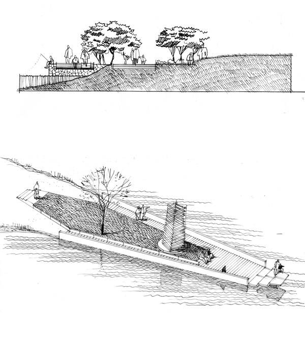
With the currents being too strong and the water being too cold, the resulting design is not made for physical contact with water, such as swimming. Therefore, the landscape architects wanted to create a place that can be seen and enjoyed in all seasons. The element of water is highlighted by comfortable wooden walkway surfaces. A boardwalk system extends along the western shore, facing the sunset with plenty of space for social opportunities. Four triangular viewpoints in the form of jetties protrude over the river for a pause.
Main Features of The Park
The scenic dramatic tip of the peninsula’s profile was given a sharper profile by adding a 40-meter-long viewing platform with a springboard-like viewing feature at the tip that really maximizes on the pause-and-reflect opportunity this location provides. Other features of the park include a sandy beach and a reedbed walk on the western shore, activity space near the peninsula’s tip, and an event location close to the base of the peninsula.
Sandgrund Park. Image courtesy of Thorbjörn Andersson
Sandgrund Park. Photo courtesy of Thorbjörn Andersson
Sandgrund Park. Photos courtesy of Thorbjörn Andersson
Sandgrund Park. Photo courtesy of Thorbjörn Andersson
See More Projects by Thorbjörn Andersson:
- Dania Park, Landscape Architecture’s Love Story With Water
- How Winter Bay Culture Park Merged History and Revitalization
- Sjövikstorget Square: Traditional Techniques in Modern Landscape Architecture
Sandgrund Park. Photo courtesy of Thorbjörn Andersson
Full Project Credits for Sandgrund Park
Project: Sandgrund Park Location: Karlstad, Sweden Designer: Thorbjörn Andersson with Sweco Architects Design Team: Johan Krikström, Emma Pettersson, Andreas Johansson Program Team: Margaretha Diedrichs, PeGe Hillinge Construction: Lennart Knutsson, VBB structures Illumination: Ljusgestaltning AB Area: 40,000 sqm Time of Completion: 2009 Investment: 2, 9 million Euro Client: City of Karlstad Recommended Reading
- Landscape Architecture: An Introduction by Robert Holden
- Landscape Architecture, Fifth Edition: A Manual of Environmental Planning and Design by Barry Starke
Article by Win Phyo

How the Van Campenvaart Playground is Breaking Boundries
Van Campenvaart, by Carve, The Hague, Netherlands. We live in a world filled with diversity. As adults, the more we test out unfamiliar places, the more we are exposed to all the differences that make up our world. This is also true for children. Play is a big part of children’s lives: In every child, there is a natural explorer willing to investigate new territories, which (let’s face it) exist practically everywhere. When a child plays, he gets to test out the capacities of his body as he explores the material world around him. This is also where children begin to navigate around the complexities of social interactions. For children with disabilities, their chance to play can often be limited by physical barriers and social exclusions. As sad as this sounds, we also live in a world that is also forever changing for the better. Campenvaart Playground gives hope for future generations to become more tolerant of these differences.
Van Campenvaart. Image courtesy of Carve
Van Campenvaart
Carve’s genius designers had one goal in mind: When they received the brief to design a playground with “integrated play facilities,” their mission was to blur the lines to the point where “integration” did not exist, simply because differences were not a part of the design vocabulary. In order to truly appreciate the revolutionary statement this playground is making, we must stroll down memory lane to see the progression that has been made in the history of playgrounds.
No More “KFC” (Don’t Worry, We are not Talking about Kentucky Fried Chicken)
Do you remember where you used to play when you were a child? This could have depended on where you were living at the time. For example, I remember when I was around eight years old, I would play on swings and slides in a little fenced “playground” within a big park. For me, this became my definition of a play space. Through the preconceived notions of creating safety for children, identical approaches were carried out in many cities in what can be described as “KFC” style: Kit, Fence, and Carpet (a term invented by landscape architect and academic Helen Woolley at the University of Sheffield for unimaginative and standardized playgrounds). Recommended Reading
- Landscape Architecture: An Introduction by Robert Holden
- Landscape Architecture, Fifth Edition: A Manual of Environmental Planning and Design by Barry Starke

Van Campenvaart. Image courtesy of Carve
Dropping KFC Like a Bad Habit
In contrast to this, a friend of mine from Zambia recalls her childhood being spent in the great outdoors, climbing trees, picking the fruits of the trees, and getting happily muddy. Thankfully, the “KFC” approach has changed significantly over the past years to evolve into something along the lines of what my friend experienced during her childhood years. The idea of “Natural Play” — the integration of play areas within natural landscapes such as woodlands — is now seen as a beneficial approach that immensely aids the learning capacities of children, their understanding of nature, and hence the world around them. See These Other Playground Related Articles:
- Zorlu Center, The Playground Where Imagination Comes to Play
- How “A Toddlers Playground” Inspires Learning
- Creative Outdoor Gym in a Modern Community Park
In Carve’s Vision, “Playing Together” Doesn’t Mean Playing Next to Each Other
Playgrounds such as Campenvaart are challenging the notion of social inclusion in play spaces. The secret ingredient that one needs to design a playground for children both with and without disabilities is to eliminate the idea that you are catering to a specific group of children. As differences were set aside, Carve was able to see the opportunities that come with considering the capacities of children with and without disabilities, not their limitations. The natural explorer within every child makes her want to explore the possibilities and extend her boundaries. Therefore, the playground does not show any obvious sign that possible visual, auditory, physical, or mental limitations have been taken into account. Yet it provides increasing challenges for all children. The playground becomes their oyster, free from any limitations to challenge themselves as they wish.

Van Campenvaart. Image courtesy of Carve
- Zorlu Center, The Playground Where Imagination Comes to Play
- How “A Toddlers Playground” Inspires Learning
- Creative Outdoor Gym in a Modern Community Park
So from this project, how can we begin to define inclusive play? Well, we do not need to define our perceptions of accessibility in play by making special adaptations for special needs. We can begin by creating designs that cater to a broad spectrum of children’s needs, to their innate role as explorers, right from the beginning to really demonstrate the true definition of inclusion.

Van Campenvaart. Image courtesy of Carve
Crossing the Barriers That Are Created Through Varying Degrees of Ability
Campenvaart playground shows that accommodating children with disabilities does not need to have additional costs for specific play items to “help” special needs children in particular ways. Designing for inclusive play can benefit all children, as they get to concentrate on their own particular abilities. Interactions between children with varied abilities help them develop a true understanding of the world, appreciate differences, recognize the underlying similarities between people, and be capable of tolerating and accepting diversity.

Van Campenvaart. Image courtesy of Carve
Full Project Credits for The Osum River in Van Campenvaart
Project Name: Van Campenvaart Location: The Hague, Netherlands Client: Municipality of The Hague Designer: Carve Area: 280m2 Construction: 2010 Awards: Child and Family Friendly Initiatives Prize 2011 Show on Google Maps Recommended Reading
- Landscape Architecture: An Introduction by Robert Holden
- Landscape Architecture, Fifth Edition: A Manual of Environmental Planning and Design by Barry Starke
Article by Win Phyo

Super Garden Explores the Senses to Accelerate the Learning of Kindergarten Children
Shrewsbury International School “Play Field” for Kindergarten Children, by Shma Designs, in Bangkok, Thailand. Shrewsbury “Play Field” is a shining example of a sensory-stimulating environment for kindergarten children. Going beyond the typical all-in-one play equipment — which suggests limitations for the growth of a child — Shma has created an all-encompassing play area where young children are able to experiment, explore, observe, and manipulate their surroundings. So, just how exactly is this executed? Multi-sensory play makes up a big part of the design. Stop and think about what you are doing right now or what you were doing a minute ago. Can you identify the senses you used that allowed you to gain an understanding or perform a function? Through this short contemplation, you will realize how your senses are key to survival. Inside this Article:
- Geometric Galore
- Color Coordination
- Vegetation Variety
- A Play Garden Full of Contradiction
- Thinking Through Exploring
- Full Project Credits for Shrewsbury International School “Play Field”
- WATCH: Jinsop Lee: Design for all 5 senses
- Recommended Reading

Shrewsbury “Play Field”. Photo courtesy of Shma
Shrewsbury “Play Field”
Sensory play allows children to focus on one particular sense or use all senses in different play opportunities. Such sensory stimulations — to be able to see, hear, touch, smell, and taste — are key to existence in our world as much as food and water. Some of the many benefits of a stimulating environment include the ability to learn better, aid motor and cognitive development, and improve language and social interaction skills. Shma has used the following elements in efforts to encourage children’s brain development.

POavement pattern at Shrewsbury International School “Play Field”. Photo courtesy of Shma
Geometric Galore
One of the most noticeable things about this design is the contrast between the linear ground patterns against the circular seating and play areas. The combination produces a striking sight sure to grab the attention of any five-year-old child. The circular elements, known as “Playing Pods,” provide varied experiences. “Swirl Pod” is a maze-like structure that mimics the experience of moving through a snail shell; “Island Pod” is like being surrounded by a water plant; “Herb Pod” stimulates the sense of smell with Thai herbs; “Sand Pod” provides the all-time favorite sand play (particularly strong for stimulating the sense of touch); and lastly, “Classroom Pod” has a roof for class gatherings.
More Top Articles on LAN
- 10 of the Most Common Mistakes People Make in Planting Design and How to Avoid Them
- Interested But Not Confident? – Know How to be Good at Hand Drawings
- Top 10 YouTube Tutorials for Technical Drawing

Shrewsbury International School “Play Field”. Photo courtesy of Shma
Color Coordination
The striped ground pattern is characterized by different tones of green rubber flooring to imitate the feeling of a lawn. The colors are gentle for the children’s eyes and create a more pleasant setting. Among the linear pattern runs a meandering bicycle track that travels in and around the pods for fun bike classes. The final color pallet consists of earthy tones; here Shma managed a delicate balance between geometry and color. Both of these elements widen a young child’s vision — a sense that helps them gather the most information of the world.
Recommended Reading
- Landscape Architecture: An Introduction by Robert Holden
- Landscape Architecture, Fifth Edition: A Manual of Environmental Planning and Design by Barry Starke

Sand pod at Shrewsbury International School “Play Field”. Photo courtesy of Shma
Vegetation Variety
When it comes to multi-sensory stimulation, do not underestimate the power of planting. For example, plants such as lavender (Lavendula angustifolia) produce a strong pleasant scent; Allium spp. have large spherical shapes that can make any child feel like they are on another planet; Bamboo (Bambusa spp.) can produce whistling sounds in the wind; textural plants such as Lamb’s ears (Stachys byzantine) have a velvety soft feel (a favorite for growing with children); and any edible planting such as fruit trees are great to cultivate to educate the children.

Swirl pod Shrewsbury International School “Play Field”. Photo courtesy of Shma
A Play Garden Full of Contradiction
Keep thinking about what the “Play Field” would look like from a five-year-old’s point of view. At a first glance, the play area looks like a forest, with “glades” and swathes of green created from either the planting or the rubber flooring. There is a challenging aspect for the children, because there is always an element of contradiction.

Seat pod at Shrewsbury International School “Play Field”. Photo courtesy of Shma
More Top Articles on LAN
- 10 of the Most Common Mistakes People Make in Planting Design and How to Avoid Them
- Interested But Not Confident? – Know How to be Good at Hand Drawings
- Top 10 YouTube Tutorials for Technical Drawing
These contradictory elements are there to challenge the children to use their senses as a way of exploring and getting familiar with the space. They are not on their own. With an army of kindergarten children playing together in the play garden, they can interact with one another and share their discoveries.

Room pod at Shrewsbury International School “Play Field”. Photo courtesy of Shma
Thinking Through Exploring
Children learn to think and relate to the world around them through the exploration of their surroundings: touching wood, rubber, metal, or concrete surfaces; changing body positions and movement patterns; and so on. They have fun and “‘fun’ is a child’s word for sensory integration.” We, as adults, can relate to this, because our senses are our gateways to the world that surrounds us.

Shrewsbury International School “Play Field”. Photo courtesy of Shma
WATCH: Jinsop Lee: Design for all 5 senses
We have picked out the key elements that this project contributes to the multi-sensory play experience. Do you think Shma has the right balance or could there be more elements introduced to heighten the children’s senses?
Full Project Credits for Shrewsbury “Play Field”
Project: Shrewsbury “Play Field” Landscape Architecture: Shma Designs Client: Shrewsbury International School Location: Bangkok, Thailand Site Area: 900 sq.m. Design: 2007 Construction: 2007 Show on Google Maps
Recommended Reading
- Landscape Architecture: An Introduction by Robert Holden
- Landscape Architecture, Fifth Edition: A Manual of Environmental Planning and Design by Barry Starke
Article by Win Phyo

How “Peak Experience” is Inspired by The San Fransisco Hills
Peak Experience, by Atlas Lab, Market Street, San Francisco. What does a main street in your city or town look like? A streetscape is typically a stretched linear entity that encourages circulation and has common elements such as street lighting; lanes paved in an orderly fashion for cars, bicycles and pedestrians; landscape planting; and some street furniture. One finds great diversity in a streetscape, and every street has a separate identity. However, we don’t always find streets that encourage us to partake in any activity besides fast-paced walking. As part of the Market Street Prototyping Festival, the unique streetscape prototype installation of the Peak Experience is driven by a desire to integrate play into traditional street models and provide opportunities for connection with others.

Peak Experience. Photo credit: Atlas Lab, tenBrink Garza
Peak Experience
For the people of San Francisco, Market Street has always been a passageway, not a destination. The city itself is built on rolling waves of hills. Besides the Golden Gate Bridge and the stunning views across San Francisco’s bay, the city is famous for the hilly topography of its peninsula, making it distinctive among American cities. The city’s iconic terrain has curated and framed its diverse neighborhoods. Market Street has been a different story. Built on a rare flat land, the area lacks the iconic views of San Francisco’s landscape. Although the main thoroughfare provides links to the vibrant surrounding neighborhoods, it lacks the character other spaces in the city provide and does not support a platform for community engagement.

Peak Experience. Photo credit: Atlas Lab, tenBrink Garza
- 10 Top Examples of Land Art From Around the World
- Urban Artwork Transforms Everyday City Space into a Lively Plaza
- Shanghai Red Carpet Park Lets People Reflect on Their Everyday Lives

Peak Experience. Image credit: Atlas Lab

Peak Experience. Image credit: Atlas Lab

Peak Experience. Photo credit: Atlas Lab, tenBrink Garza

Peak Experience. Photo credit: Atlas Lab, tenBrink Garza

Peak Experience. Photo credit: Atlas Lab, tenBrink Garza

Peak Experience. Photo credit: Atlas Lab, tenBrink Garza
Full Project Credits for Peak Experience
Project: PEAK EXPERIENCE – Deploying San Francisco’s iconic terrain as an agent for interactive discovery, play, and community engagement Project Type: Juried Competition – Temporary Installation Competition Name: Market Street Prototyping Festival Designers: Atlas Lab Location: Market Street, San Francisco Area: Around 20m2 Client: The public engaging in the 2015 San Francisco Market Street Prototyping Festival Year: 2015 Team Information: Andrew tenBrink and Kimberly Garza (ATLAS Lab)
Recommended Reading:
- Landscape Architecture: An Introduction by Robert Holden
- Landscape Architecture, Fifth Edition: A Manual of Environmental Planning and Design by Barry Starke
Article by Win Phyo

How Choorstraat-Papenhulst Reminds us of Da Vinci’s Last Supper
Choorstraat-Papenhulst, by Buro Lubbers, s’Hertogenbosch, Netherlands. There is always something intriguing about a project that exudes simplicity. You know, the ones that look effortlessly put together, like models on a catwalk. Nestled within the historic setting of a neo-gothic chapel, the project Choorstraat-Papenhulst was sparked by the transformation of a historic center within the immediate vicinity of the courtyard into a luxurious apartment building. Buro Lubbers has designed a space that is part of a sequence of squares around Sint-Jans Cathedral, giving the area a little boost to mark the change in residencies. The initial design as implemented is supposed to be a transformation of a private courtyard into a semi-public square. But unlike a bustling city square, the serenity of the space is palpable. Although the overall design lacks greenery, there is no sense of it being a cold and hardened place. Just as you can find solitude, comfort, and warmth inside a church, the space has a private character that allows you to find your bearings. With the addition of a good design, it is able to foster a mesmerizing presence with a welcoming and peaceful atmosphere.

Masterplan of Choorstraat-Papenhulst. Image courtesy of Buro Lubbers
Choorstraat-Papenhulst
The whole of the space is paved in random strokes of Irish bluestone that is darkly rich with fossils. The linear pattern of this paving is reflected in a scattering of parallel wooden strips on which seating and tables are placed, made also out of wood.It is the gothic character of the Irish bluestone that makes this space so relatable to the historic building facades, yet the warmth brought about by the wood reflects the wooden chapel doors and makes the area seamlessly modern.

Choorstraat-Papenhulst. Image courtesy of Buro Lubbers
- Stirring Emotions at the Netherlands Army Museum and Netherlands Air Force Museum
- A Roof Garden That’s so Good, You Might Want to Work There!
- How Zoetermeer Vivaldi Care Home is Merging with Nature

Masterplan of Choorstraat-Papenhulst. Image courtesy of Buro Lubbers

Choorstraat-Papenhulst. Image courtesy of Buro Lubbers

Choorstraat-Papenhulst. Image courtesy of Buro Lubbers

Choorstraat-Papenhulst. Image courtesy of Buro Lubbers

Choorstraat-Papenhulst. Image courtesy of Buro Lubbers

Choorstraat-Papenhulst. Image courtesy of Buro Lubbers

Choorstraat-Papenhulst. Image courtesy of Buro Lubbers

Choorstraat-Papenhulst. Image courtesy of Buro Lubbers
Full Project Credits for Choorstraat-Papenhulst
Project: Choorstraat-Papenhulst, A courtyard for Leonardo da Vinci’s last supper Landscape Architecture: Buro Lubbers Location: ‘s-Hertogenbosch, Netherlands Area: 1800 m2 Costs: € 125.000 Realization: 2003 (phase 1), 2008 (phase 2) Photos and text: Buro Lubbers Award: Winner Dutch Design Awards 2004 (category: design public space) Show on Google Maps
Recommended Reading:
- Landscape Architecture: An Introduction by Robert Holden
- Landscape Architecture, Fifth Edition: A Manual of Environmental Planning and Design by Barry Starke
Article by Win Phyo

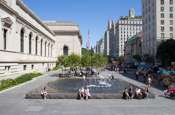
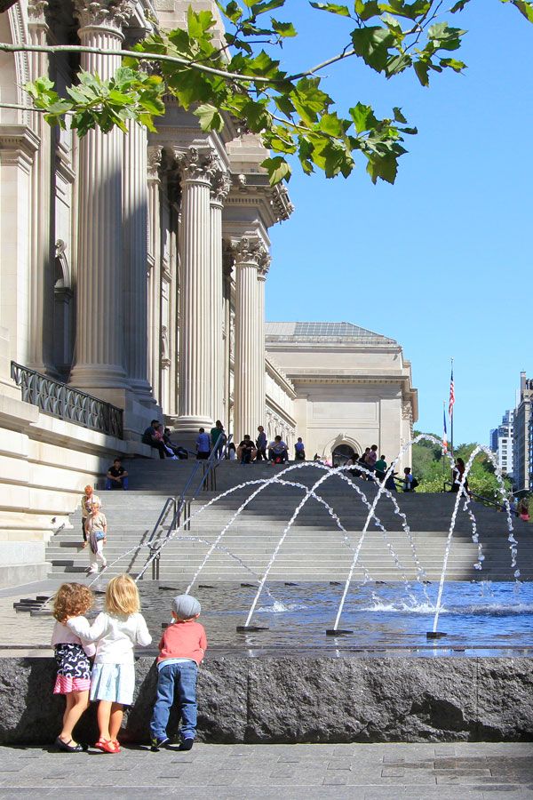
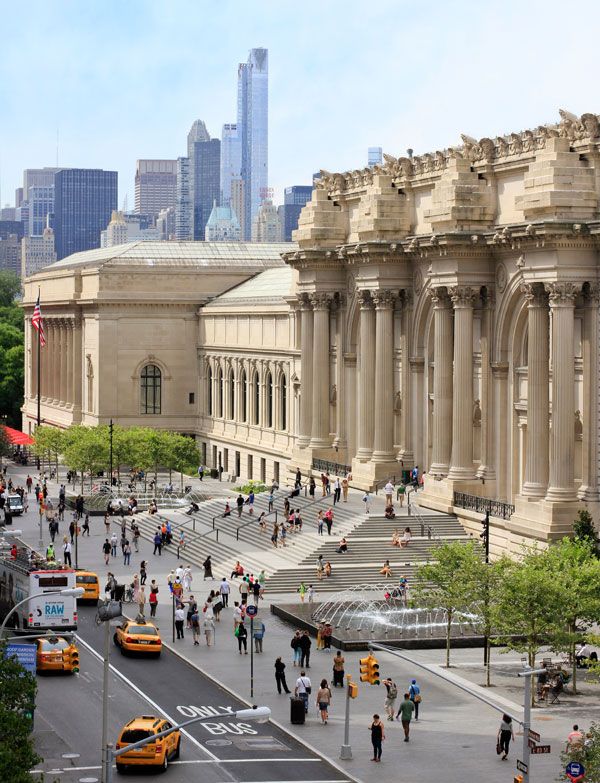
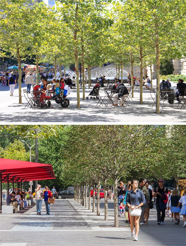
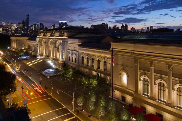
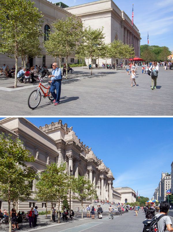
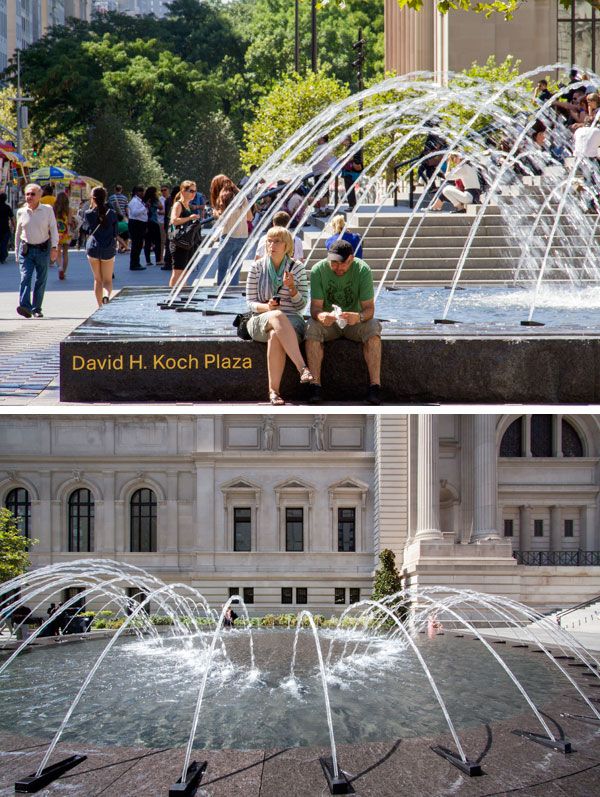
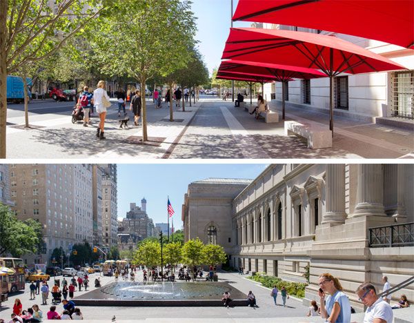
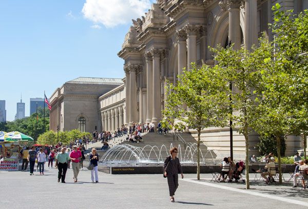
David H. Koch Plaza Creates an Urban Ballet of Creativity
David H. Koch Plaza at the Metropolitan Museum of Art, by OLIN in New York City, New York, USA. Before I share the intricacies of the project with you, I would like to first share this quote by Jane Jacobs, as cited by Dennis McGlade, partner at OLIN, when commenting on his thoughts about the project: “The ballet of the good city sidewalk never repeats itself from place to place, and in any one place it is always replete with new improvisations.” This is a project that revolves around transformation and this quote is a gentle reminder that tells us of the inconsistent patterns between people and spaces. Why is it so relevant to this project? Well, the project is grandly sitting in Manhattan, New York- one of the most famous, busiest metropolitan cities of the world, in front of one of the largest and prestigious art institutions of the world- the Metropolitan Museum of Art. David H. Koch, who is among America’s richest and frankly not so popular men, funded the project with a $65 million dollar donation.
David H. Koch Plaza
It would be an understatement to say designing for a colourful community of New Yorkers and tourists alike would spark a challenging task of accommodating the fusion of movement and change, a “dance” as Jacobs calls it that glaringly exists. This is the result of what was supposed to be repair work for the long-standing space and its old fountains that turned into a total redesign of the public spaces spanning four blocks long. It has brought about many controversial opinions but keeping this quote in mind, let us see why the space works.
David H. Koch Plaza at the Metropolitan Museum of Art © OLIN / Sahar Coston-Hardy
David H. Koch Plaza at the Metropolitan Museum of Art © OLIN / Sahar Coston-Hardy
David H. Koch Plaza at the Metropolitan Museum of Art © OLIN / Sahar Coston-Hardy
David H. Koch Plaza at the Metropolitan Museum of Art © OLIN / Sahar Coston-Hardy
David H. Koch Plaza at the Metropolitan Museum of Art © OLIN / Sahar Coston-Hardy
David H. Koch Plaza at the Metropolitan Museum of Art © OLIN / Sahar Coston-Hardy
David H. Koch Plaza at the Metropolitan Museum of Art © OLIN / Sahar Coston-Hardy
David H. Koch Plaza at the Metropolitan Museum of Art © OLIN / Sahar Coston-Hardy
David H. Koch Plaza at the Metropolitan Museum of Art © OLIN / Sahar Coston-Hardy
Recommended Reading:
- Landscape Architecture: An Introduction by Robert Holden
- Landscape Architecture, Fifth Edition: A Manual of Environmental Planning and Design by Barry Starke
Article by Win Phyo

How Bishan Park Became “The Central Park” of Singapore
Bishan Park- Kallang River Restoration Poject by Atelier Dreiseitl, in Singapore. Bishan Park, with more than 3 million visitors annually, has a local significance in Singapore similar to that of Central Park in New York City. At the heart of the park is a dynamic natural ecosystem of an important river that flows at a length of 3.2km through the park that once fell victim to the country’s rigid flood control infrastructure system of the sixties. For Singapore, engineering of the past left a legacy of concrete along with physical barriers that divided local communities, created a lack of biodiversity and deprived the citizens of a recreational space with fresh water. The new life brought about by the project brings residents of Singapore closer to water and encourage the busy city go-getters to slow down and enjoy nature.

Bishan Park. Photo courtesy of Atelier Dreiseitl

Bishan Park. Photo courtesy of Atelier Dreiseitl.
Bishan Park
Kallang River is the longest river in Singapore that carries water from one reservoir at the center of the island to another on the coast. During the 1960s and the 1970s, as part of a flood control project, it was forced into a straight concrete drainage channel that flowed through Bishan Park. This cut off neighbourhoods from each other and from the park creating more isolation.

Bishan Park. Photo courtesy of Atelier Dreiseitl

Bishan Park. Photo courtesy of Atelier Dreiseitl

Bishan Park. Photo courtesy of Atelier Dreiseitl.

Bishan Park. Photo courtesy of Atelier Dreiseitl

Bishan Park. Photo courtesy of Atelier Dreiseitl

Bishan Park. Photo courtesy of Atelier Dreiseitl.

Bishan Park. Photo courtesy of Atelier Dreiseitl.

Bishan Park. Photo courtesy of Atelier Dreiseitl
- How The Chicago City Hall Green Roof is Greening the Concrete Jungle
- Potsdamer Platz in Berlin Becomes a Sustainable Ecofriendly Urban Square

Bishan Park. Photo courtesy of Atelier Dreiseitl

Bishan Park. Photo courtesy of Atelier Dreiseitl

Bishan Park. Photo courtesy of Atelier Dreiseitl.
Bishan Park, A $60 million Success Story
The park offers a vibrant example of what is possible in the midst of a dense city for the people, the wildlife and for the benefit of the environment. Much to everyone’s delight, the three year- $60 million Bishan Park intervention was environmentally and socially relevant and became a huge success.

Bishan Park. Photo courtesy of Atelier Dreiseitl. Photo courtesy of Atelier Dreiseitl
Full Project Credits:
Landscape Architecture: Atelier Dreiseitl Partners in Charge: Herbert Dreiseitl, Gerhard Hauber Project Management and Lead Design: Tobias Baur, Rudolf Mager, Leonard Ng, Hendrik Porst Project Engineers: Andreas Bockmühl, Stefan Brückmann Project Team: Jeff Boggess, Angelika Büchele, Jason Chia, Edith, Gustavo Glaeser, Tobias Klinger, Martin Koller, Birgit Kühlbrandt, Wi Ming, Herbert Montevirgen, Vera Sieber, Angela Soler, Chanida Suebpanich, Sebastian Walker, Melissa Yip, Ingo Zoefelt, Christoph Hald, Nengshi Zheng Bioengineering: Peter Geitz und Partner JV Partner: CH2MHILL Project owners: PUB, Singapore’s national water agency and the National Parks Board Image credits: Dreiseitl, PUB, Wang Area: Central catchment 140 km² 62 ha / 155 acres Client: Public Utilities Board & National Parks Board Design: 2007 – 2010 Construction: 2009-2012 Cost: 76 million SGD / 45 million € / US$ 60 million Awards: WAF 2012, Excellence on the Waterfront Honor Award 2012, President’s Design Award Singapore 2012
Recommended Reading:
- Urban Design by Alex Krieger
- The Urban Design Handbook: Techniques and Working Methods (Second Edition) by Urban Design Associates
Article by Win Phyo

How the Extraordinary Qunli Stormwater Park got Listed as a National Wetland Park
Qunli Stormwater Park, by Turenscape, in Haerbin City, Heilongjiang Province, China. These days, with cities growing, life taking on a faster pace, and resources strained by the demands of the developing human race, it can be difficult to determine the importance and ability of natural ecosystems to fit into the urban context. Nature takes its time to grow and develop, and seems to be nowhere as demanding as people. When it comes to dealing with water, urban environments can lack resilience. In China’s Haerbin City, 30 hectares of wetland was on the brink of extinction. With a little bit of help, Turenscape was able to turn a bleak situation into a green oasis filled with the abundance of nature and life, while addressing the problem of stormwater management and providing aid in the city’s development.

Qunli Stormwater Park. Photo credit: Turenscape
Qunli Stormwater Park
The City’s Context Qunli New Town, east of Haerbin City in the north of China, is a fairly new urban district that has been developing since 2006, with more than 32 million squares to be developed within the next 13 to 15 years. Once finished, the place will be a concrete jungle, with more than a third of a million people living there. A small percentage of the developable land – 16.4 percent — is dedicated as permeable green space. But the area’s rainfall statistics do not reflect this decision. From June until August, rainfall is intense, accounting for 60 percent to 70 percent of the annual rainfall. Flooding and waterlogs are regular occurrences in the area. A small percentage of the developable land – 16.4 percent — is dedicated as permeable green space. But the area’s rainfall statistics do not reflect this decision. From June until August, rainfall is intense, accounting for 60 percent to 70 percent of the annual rainfall. Flooding and waterlogs are regular occurrences in the area.

Qunli Stormwater Park. Photo credit: Turenscape

Qunli Stormwater Park. Photo credit: Turenscape

Qunli Stormwater Park. Photo credit: Turenscape
- The Stunning Yanweizhou Park Recaptures Lost Ecology
- Shipyard Site Transforms into Stunning Ecological Park
- Turenscape Design Outstanding River Park
2. Cut-and-Fill Landform Strategy The infamous cut-and-fill landform strategy is an understated method that transforms the site’s wetland perimeter into a series of ponds and mounds that surround the former wetland. This outer ring then becomes a stormwater filtrating and cleansing buffer zone for the wetland core — a welcoming transition and an interesting connection between nature and city.

Qunli Stormwater Park. Photo credit: Turenscape

Qunli Stormwater Park. Photo credit: Turenscape

Qunli Stormwater Park. Photo credit: Turenscape

Qunli Stormwater Park. Photo credit: Turenscape

Qunli Stormwater Park. Photo credit: Turenscape
Qunli Stormwater Park
The role of landscape architecture is growing in the current climate to aid nature and its systems in integrating and adapting to our urban environments, helping our cities flourish and become more resilient. This site is now listed as a national wetland park. The multiple ecosystems service, collect, cleanse, and store stormwater, infiltrate into an aquifer, protect and recover native habitats, and inevitably will help with flood prevention. And the city’s residents? Well, they will benefit from an environment filled with recreational and aesthetic experiences. Here, we find a growing area where in the future, nature and city will be in better harmony than they were at the beginning of the story. Recommended Reading:
- Urban Design by Alex Krieger
- Digital Drawing for Landscape Architecture by Bradley Cantrell
Article by Win Phyo Return to Homepage
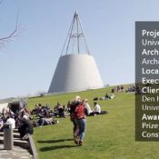

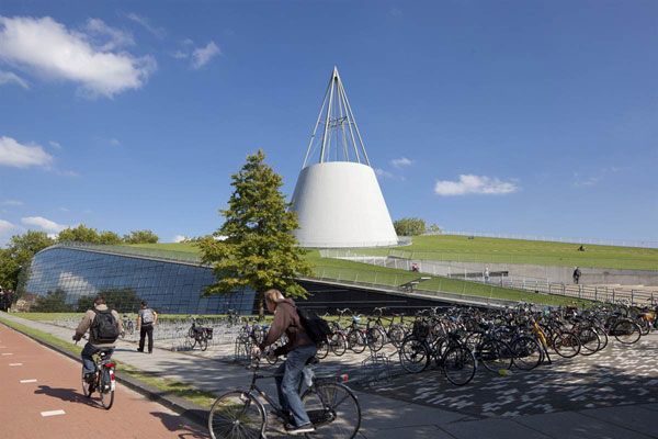
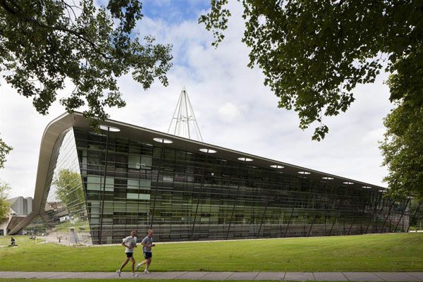
The Building That Wants to be a Landscape at Delft University of Technology
Delft University of Technology, by Mecanoo Architecten, in Delft, Netherlands. Known as TU Delft, Delft University of Technology is the largest and oldest technical university in Holland. The university needed to update its campus atmosphere, so what better way to do this than by coming up with a design for one of the buildings that makes up the heart of a campus: the library. We can all call up the image of a library with endless rows of books in cases reaching the ceiling. But modern libraries combine books with computers and a sense of community. Inspired by such radical change, the design for the outside atmosphere of the TU Delft library brings the university into the new century, giving rise to an iconic library set within a fascinating site design. WATCH: Library Delft University of Technology (2013)
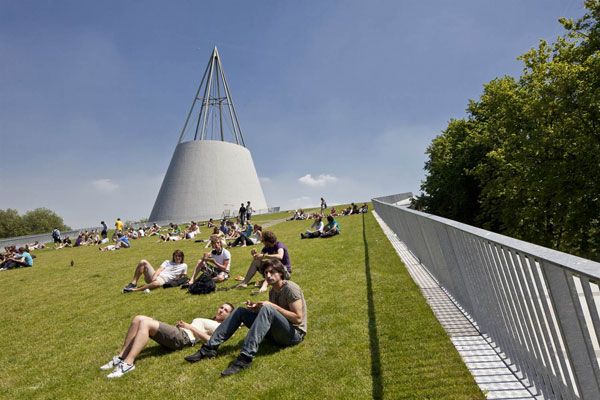
Delft University of Technology
Is it a building or a landscape? It is a building that doesn’t want to be a building – it wants to be a landscape. Mecanoo Architecten designed the library on a sloped plane, extending the grass from the ground to the very edge of the building roof, allowing intensive interaction with all facades of the building. What’s more, you can literally walk over the building! The steel structure resembles a large pin that secures the roof to the ground on one side, like a sheet of paper being pinned to a noticeboard.
Green roof at Delft University. Photo credit: Mecanoo Architecten
- WARNING: Why You’re Losing Money By Not Using a Green Roof
- A Roof Garden That’s so Good, You Might Want to Work There!
- Why Should You Have a Grass Roof?
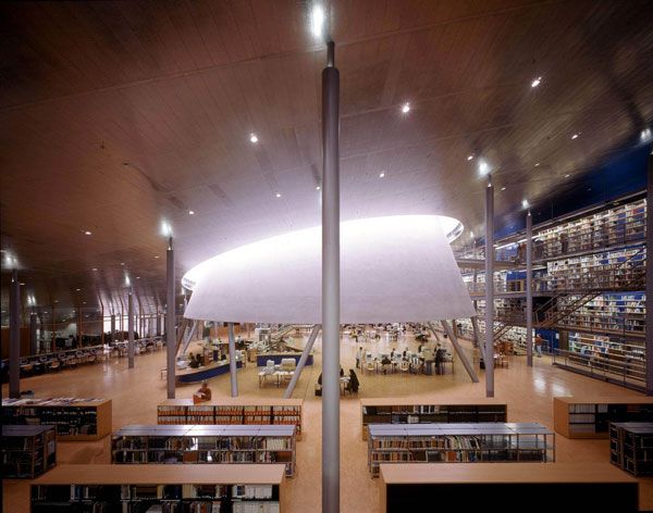
As an underground library where books are stored like a good wine, the building has done well at maximizing its volume by building across the landscape. A large volume of 15,000 square meters of underground book archives, reading rooms, study spaces, and bookshops all stand under one roof.
Green roof at Delft University. Photo credit: Mecanoo Architecten

Inside Delft University library. Photo credit: Mecanoo Architecten
Inside Delft University library. Photo credit: Mecanoo Architecten
Sustainability at Delft University of Technology
The density of the mass of the planted roof has significant insulating properties so that the interior of the building is less susceptible to changes in temperature. In addition, the mass provides excellent soundproofing, and gradual evaporation of rainwater held by the vegetation provides natural cooling in the summer.
Green roof at Delft University. Photo credit: Mecanoo Architecten
- The Green Roof Manual: A Professional Guide to Design, Installation, and Maintenance by Linda McIntyre
- Green Roof Construction and Maintenance (GreenSource Books) (McGraw-Hill’s Greensource) by Kelly Luckett
Article by Win Phyo Return to Homepage

Channel Center Park and Iron Street Park Bring Life into Boston
Channel Center Park and Iron Street Park, by Halvorson Design Partnership, Boston, Massachusetts. Relatively small it may be, but Boston as a city is still growing and building new neighborhoods such as Channel Center. The city’s seaport district, commonly known as the Innovation District, has been transforming in the recent years to make the area more vibrant with new businesses and residential areas. With a mixture of new office buildings and over 200 residential units, Channel Center is one of the mixed-use projects that are the first to develop its multiple parcels. Amongst the initial implementations, a pocket park named Iron Street Park and a large neighborhood park, Channel Center Park have begun to grace Boston with their innovative and community-spirited designs.

Iron Street Park. Photo credit: Ed Wonsek
Channel Center Park and Iron Street Park
Set in the historic 100-Acre District of South Boston, adjacent to the Fort Point Channel, these open spaces are a core to serve the growing Fort Point Channel neighborhood. The vibrant Channel Center will include a community of offices, residences, retail spaces, live/work art studios, an art gallery and even a performance theatre- becoming a fusion of many architectural styles and details.Halvorson Design Partnership of Boston has had to collaborate with numerous architects and engineers involved with the project to really make these spaces integrate well with the diverse surrounding, whilst making a special statement of their own. Halvorson Design Partnership of Boston has had to collaborate with numerous architects and engineers involved with the project to really make these spaces integrate well with the diverse surrounding, whilst making a special statement of their own.

Iron Street Park. Photo credit: Ed Wonsek

Iron Street Park. Photo credit: Ed Wonsek

Iron Street Park. Photo credit: Ed Wonsek

Iron Street Park. Photo credit: Ed Wonsek
- Historical Landscape Gets Modern Day Makeover
- 15 Great Examples of Historical Landscape Architecture
- Giant Sized Pergola Creates Ecological Haven
The concrete plinths are also highlighted with quotations of the area’s history. What’s more, the most interesting incorporation of the area’s history is how some of the seating is also made from original beams from the historic buildings, nicely bringing together the artistic and construction design. Channel Center Park This park is bigger and seeing as it is situated at the forefront of the business and residential environment, the firm has done a good job of creating a welcoming character and a beautiful green backdrop. There are many seating areas and open spaces, as well as a playground.

Channel Center Park. Photo credit: Ed Wonsek

Channel Center Park. Photo credit: Ed Wonsek

Channel Center Park. Photo credit: Ed Wonsek

Channel Center Park. Photo credit: Ed Wonsek

Channel Center Park. Photo credit: Ed Wonsek
Channel Center Park and Iron Street Park, development for Boston’s Future
These two parks are already demonstrating how beneficial they will become to the future growth of this neighborhood. Not only in appearance but also in functionality, the landscape treatments that have been done to improve this area, along with these open spaces, have really managed to create streetscape improvements consisting of new sidewalks, street trees and lighting. As Boston’s growing seaport district celebrates the past and looks forward to the future, it can clearly be seen that these two parks have played a major role in paving the way. Recommended Reading:
- Site Engineering for Landscape Architects by Steven Strom
- The Artful Garden: Creative Inspiration for Landscape Design by James van Sweden
Article by Win Phyo Return to Homepage

The Hidden Meaning Behind The Elastic Perspective
The Elastic Perspective, by Next Architects, Carnisselande, Netherlands. A project rich in meaning, form, and experience, the Elastic Perspective by Next Architects is rather a rare finding in the Carnisselande, Rotterdam suburbs of the Netherlands. The giant circular staircase marks the end of a tram stop and takes visitors up to a height that provides a continuous view of the surroundings, including the skyline of Rotterdam. Rotterdam is the second-largest city in the Netherlands, and Carnisselande looks out to its mother town. It is this attraction/repulsion relationship between the two diverse places that stimulated Next Architects’ inspiration for the staircase design.

The Elastic Perspective. Photo credit Sander Meisner
The Elastic Perspective
The Mobius ring inspires the form of the design. The Mobius ring — or the Mobius strip, as Next Architects describes it — is a surface with only one side, whereby a traveler on such a shape can climb endlessly and never end up wandering over the edge. The final design picks up on this alluring illusion of travelling above and below a single surface. There underlies a meaning of continuity. Although the tram stop represents an end of the journey back and forth the Carnisselande and Rotterdam, the three-dimensional staircase suggests an endless route.

The Elastic Perspective. Photo credit Sander Meisner

The Elastic Perspective. Photo credit Sander Meisner

The Elastic Perspective. Photo credit Sander Meisner

The Elastic Perspective. Photo credit Sander Meisner

The Elastic Perspective. Photo credit Sander Meisner

The Elastic Perspective. Photo credit Sander Meisner

The Elastic Perspective. Photo credit Sander Meisner
- Site Engineering for Landscape Architects by Steven Strom
- The Artful Garden: Creative Inspiration for Landscape Design by James van Sweden
Article by Win Phyo Return to Homepage