


Author: Land8: Landscape Architects Network

The Chinese Garden | Book Review
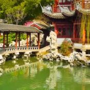
The Chinese Garden by Bianca Maria Rinaldi The modern landscaped garden certainly has some well established roots. The English, Japanese, French, and, not lastly, Chinese were pioneers in organizing all the elements of a garden to create an inspiring and unique space most often regarded as a piece of art. As we wish to explore every aspect of modern landscape architecture and its every implementation, we search the past to inspire the future. To do that, we have chosen Bianca Maria Rinaldi’s book “The Chinese Garden” as a great reference for gardeners and landscape architects alike. Overview
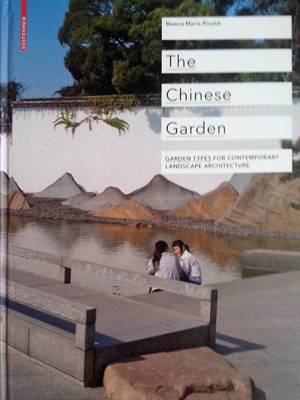
Book Cover; photo credit: Oana Anghelache
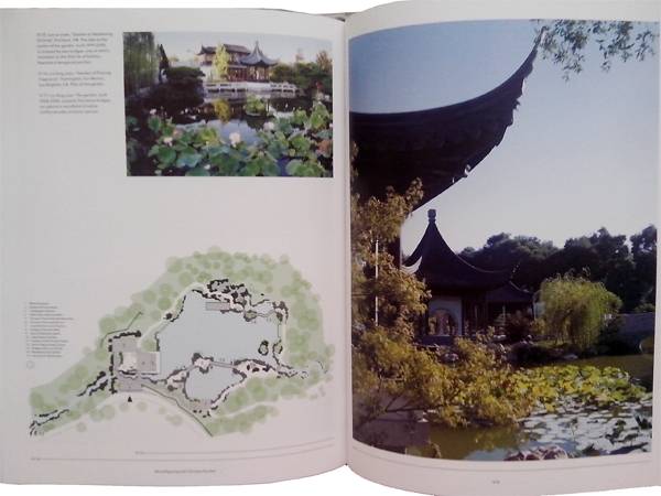
Inside the book; photo credit: Oana Anghelache


10 Incredible Projects For Students To Know About And Why!
Anyone who is, or has been, a landscape architecture student knows the value of exploring past and present projects for both design ideas and inspiration. Anyone who is, or has been, a landscape architecture student also knows that free time is hard to come by. Rarely do you get the opportunity to take time out to scour the Internet for such designs. So, I am here to help. The following 10 projects for students are examples of incredible landscape architecture that every student needs to know about, representing more than simply the aesthetic and pushing the boundaries of what landscape architecture is and what it can be! 1. Landschaftspark Duisburg Nord Why? Duisburg Nord is considered an icon in the reclamation and reuse of a post-industrial landscapes. The designers built respectfully atop the existing site and procured new layers of meaning through enhancing found structures and integrating landscape, park, and garden design. The repurposing of this industrial site kick-started a change in how people think about existing spaces within the public realm. Landschaftspark Duisburg Nord also features in our Top 10 Reused Industrial Landscapes 2. Paley Park
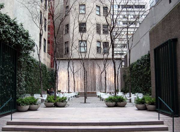
“Creative Commons Paley Park on a cloudy, chilly late winter afternoon”. By Jim.henderson licensed under CC

The world Famous Highline project; photo credit: Stuart Monk, shutterstock.com
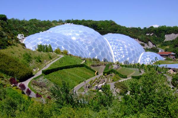
“Creative Commons The iconic bio-domes of the Eden Project, Cornwall, England”. Source Flickr as The Biomes, by Jon licensed under CC 2.0

9/11 Memorial site design with Peter Walker; credit: Scott Renwick
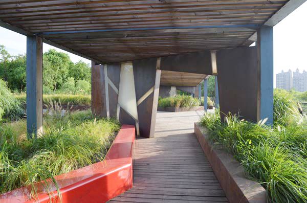
Structure and planting at Houtan Park; photo credit: Lisa Sabella
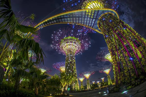
Gardens by the bay; credit: Photo collection from Robert Such, Darren Chin, Craig Sheppard
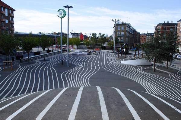
“Creative Commons Superkilen, Copenhagen, Denmark”. Source FA13_Superkilen_Emily_Lavieri-Scull, by Emily licensed under CC 2.0


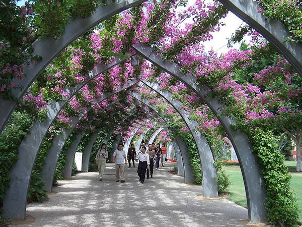
10 Great Projects Showing why Australia are Leaders in Landscape Architecture
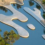
Australia is a nation renowned for many things. Its vast array of killer creatures, alluring beaches, self-deprecating humour, backyard barbeques and inordinate beer consumption to name a few. Aussies are proud of their country and unique culture. I know this, being one myself. What I also know is that our nation has some of the best landscape architects in the world. Here are 10 examples showing why Australia is the leader in landscape architecture. 10. Bonython Park Playspace – WAX Design This premier playspace and community hub is located along a naturalistic river setting within the Adelaide Parklands. Through community involvement and collaborative design, carefully considered user focused solutions provide opportunities for children of all abilities to develop physical and social skills. The park features exhilarating flying foxes, climbing equipment, a hamster wheel, a water play area and a wheelchair accessible merry-go-round. 9. Southport Broadwater Parklands – AECOM Prior to redevelopment this urban parkland was a 1000 space car park. The sites proximity to the coastline, local river systems, and event hubs necessitated a creative approach to design and environmental initiatives. A 2700m2 urban wetland filter cleanses stormwater runoff before entering the ocean, while 300 metres of solar paneling generate most of the sites electricity needs. The parklands now serve as an iconic gateway for the city of Gold Coast and provide an active green waterfront. 8. Rio Tinto Naturescape, Kings Park & Botanic Gardens – Plan (E) This imaginative approach to a bushland setting within an urban environment utilises a natural creek system as a playspace for children, reconnecting them with nature. Water elements, wood sculptures, pathways, boardwalks and bridges all reinforce this sense of place within the bush, while also providing an educational experience and journey for adults and carers. 7. Victorian Desalination Plant Project Green Roof – Aspect Studios Aspect Studios project synthesises industry and landscape, visually blending the desalination plant’s architectural form into the coastline. This piece of green infrastructure not only mitigates any unwanted visual impacts, but also stores and cleans rainwater. Surrounded by 225 hectares of ecological reserve, this is land art on a grand scale. 6. Ballast Point Park – McGregor Coxall
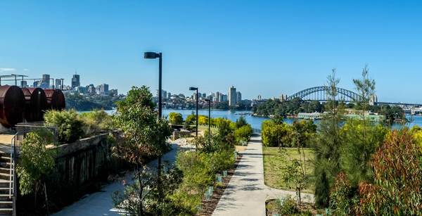
“Creative Commons Ballast Point Park with symbolised Tank 101” by Hpeterswald is licensed under CC BY 3.0
“Creative Commons Brisbane Suuth Bank” by eGuide Travel is licensed under CC BY 2.0

“Creative Commons Red illuminated facade of building at Darling Quarter, Sydney” by Gallura Travel is licensed under CC BY 3.0
“Creative Commons Looking south south east from the Chinese Tulip Tree plantings across the Central Valley at the Event Pavilion, National Arboretum, ACT, Australia”. Source BurHor Open Space Management company for The National Arboretum Canberra by Mark Burgessis licensed under CC BY 2.5
Australian Garden; photo credit: John Gollings
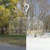

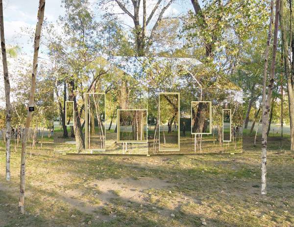
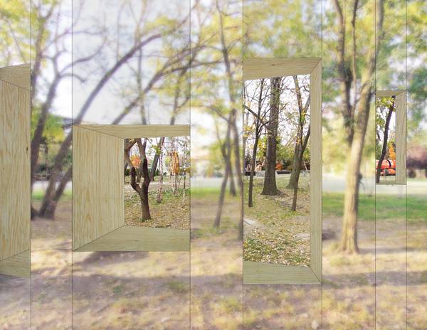
Invisible Barn Brings us Back to Nature
STPMJ Create World’s First Invisible Barn! Do you remember Parc de la Villette in Paris? The park was designed by the French architect Bernard Tschumi, who built it from 1984 to 1987. It hosts museums, concert halls, live performance stages, theaters, and children playgrounds. It’s one of the largest concentrations of cultural venues in Paris, including Europe’s largest science museum. But it is most famous for its 35 architectural follies. They are placed on a grid, forming a distinct organization within the park and acting as points of reference that help visitors navigate. What is a folly? In architecture, a folly is a building constructed mainly for decoration, but suggesting another purpose, or a structure so extravagant that it goes beyond the normal range of garden ornament. Follies are found worldwide and have been used since the 18th century. Mainly used in English and French gardens, follies often took the form of Roman temples, ruined gothic abbeys, or Egyptian pyramids. In Parc de la Villette, the iconic follies act as architectural representations of deconstruction. But what would a contemporary folly look like? The Architectural League’s Folly Competition is a contest that asks architects and designers to create a 21st century folly to be installed in the Socrates Sculpture Park in New York. The call is to explore the contemporary interpretation of the architectural folly. The designers should explore the boundary between sculpture and architecture, and the overlapping concepts and techniques between the two fields.
The Invisible Barn. Credit: STPMJ
A close up of The Invisible Barn. Credit: STPMJ
The Invisible Barn in Winter. Credit: STPMJ
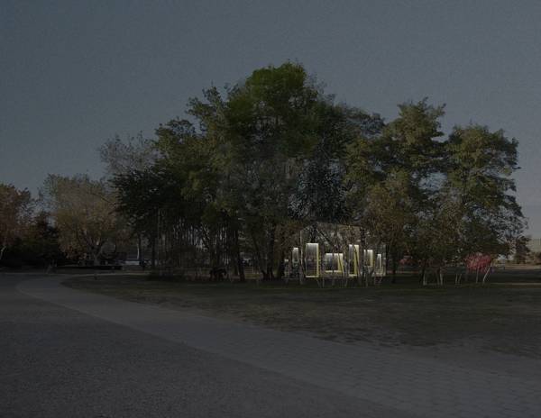
The Invisible Barn at night. Credit: STPMJ
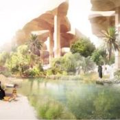

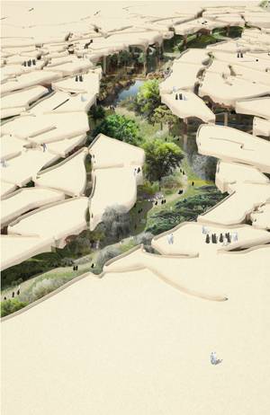
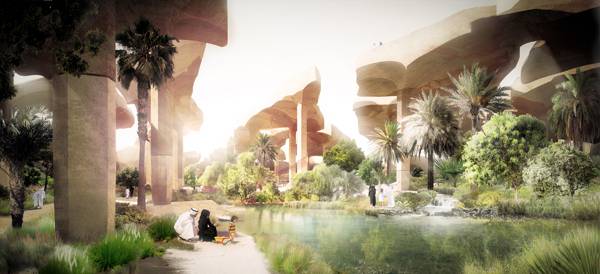
Al Fayah Park: An Oasis in The Middle of The Desert
Al Fayah Park turns heads as Heatherwick Studios plan to create a state of the art lush park in the desert! Landscape design is getting stronger as the days are passing by. Each architect and urban planner is now aware that there is a need for landscape design when we are talking about any land use and the improvement of the city. But, what is stronger is the misconception of sustainability and landscape design. If we analyze the actual status of our cities and the green areas that are within them, we will discover that the reason why landscape design, architecture and urbanism are falling in their purpose is because they follow “old models” of design. In most of the cases, the parks are designed with a goal of creating an English garden. In other situations, client, gardener and architect decide to use big platforms of grass, based on the idea that using grass is more sustainable than proposing other options. These are only two examples of common mistakes architects and clients made in the name of sustainability.
Canopies at Al Fayah Park; credit: Heatherwick Studio

Shade structures at Al Fayeh Park; credit: Heatherwick Studio
Al-Fayah-Park; credit: Heatherwick Studio


Sketchy Saturday | 017
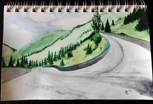
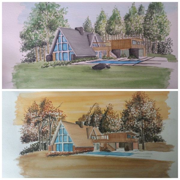
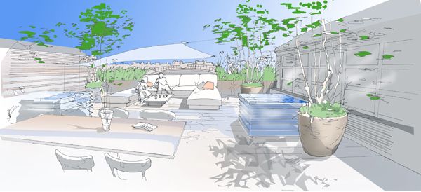
Week in week out we bring you 10 incredible displays of sketchy talents, showing you that this ancient skill is alive and thriving in a digital age of computers and fancy software packages. The sketches this week are raw and electric with some terrific use of colors and techniques, each one with it’s own unique character, acting as a visual extension of the artists signature. Thank you for making Sketchy Saturday what it is! Here are this week’s Top 10: 10. Sketch by Andrey Chernykh landscape designer from Toronto
Andrey Chenykhlandscape , Toronto
“The sketch was done as part of my documentation of my journey to Almaty, Kazakhstan in summer 2013. I was hiking through the mountains and while approaching a turn in the road I witnessed that incredible view, and sketched it in pencil on the spot, then coloured it later on. The medium is watercolour on paper, done in a realistic style”.
9. Alan Ramiro Manning, 4th year Architecture student at Woodbury University, Burbank, Ca.
Alan Ramiro Manning, Burbank, Ca.
Kristen Kuzdub, Canada
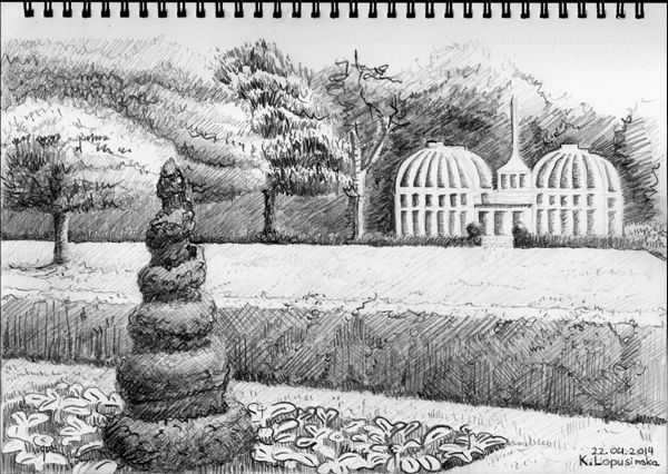
Karolina Lopusinska, Birmingham, UK
 “I made this sketch when I was studying my first year of architecture. There isn’t a particular location because it was drawn based on a book of painting techniques. The sketch was done in watercolor and paper. The first sketch shows the predominance of cold colors such as blue and green while the second one shows the use of warm colors such as red, yellow and orange. The trees are the product of mix several colors including a touch of black for enhance the shade and make it more realistic”. 5. Albert C. Del Rosario, Reg, License Architect – (UAP), Philippines
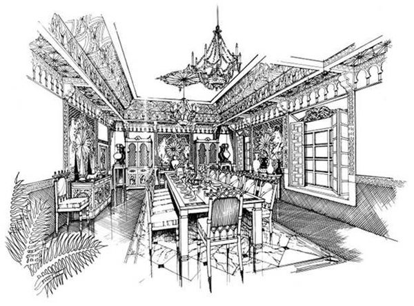
Albert C. Del Rosario, Philippines
Huy Nguyen, USA
Karolina Ciok
Peter McQuillan
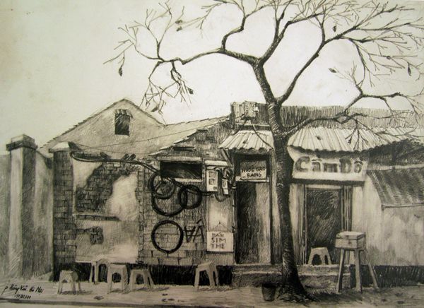
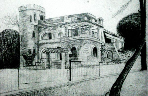 There’s something eerie and beautiful about this picture that I just loved, with obvious focus on the building itself, the artist somehow met the challenge of creating intrigue around the edges, to such an extent that you want the artist to sketch more, so we can find out what secrets lie beyond the scene of what is presented. – We hope you enjoy Sketchy Saturday as much as we do, it really is one of the highlights of our daily publications on LAN. What makes this feature so unique is that we create it together, long may it continue! Check out the Sketchy Saturday official Facebook album and see literally hundreds of incredible sketches! If you want to take part send your entries into us at office@landarchs.com Recommended reading: Sketching from the Imagination: An Insight into Creative Drawing by 3DTotal Article written by Scott D. Renwick

Top 10 Public Squares of the World
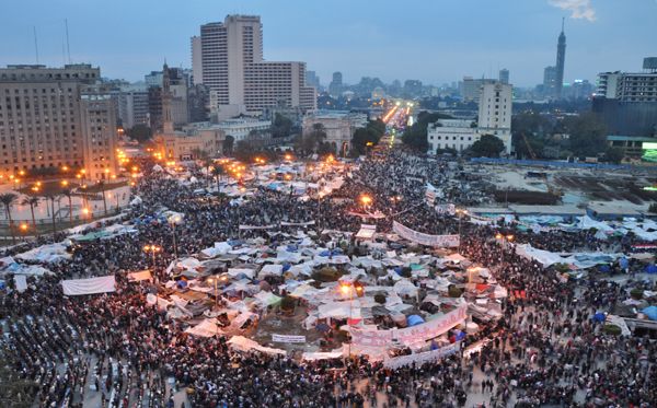
The recent protests in Taksim Square, Istanbul, and those in Tahrir Square, Cairo, have once again highlighted the power of public space as a tool of protest. The use of public space has always been employed as a way to reflect the economic and socio-political mood. Yet, public space is a fragile thing. The London Occupy Movement highlighted that our public space may not be as public as we think, when protesters were prevented from entering Paternoster Square by a high court injunction taken out by the owners. Public space is important because it is supposed to be just that. Public. For you and me, and the person sitting next to you. It represents our rights, and in all the above cases the right to political protest. The architectural emblem of a society in all its guises — economics, politics, protest, food, fun, and enjoyment and at the same time, the arena for all these constructs is, the public square. In what will culminate as Landscape Architects Network’s Top 100 public squares, we kick off with a general Top 10 Public Squares of the World… 10. Tahrir Square, Cairo, Egypt
“Creative Commons Tahrir_Square” by Jonathan Rashad is licensed under CC BY 2.0

“Creative Commons Times square at night 2013 New York City, Manhattan” by Chensiyuan is licensed under CC BY 2.0
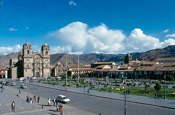
“Creative Commons Cuzco Plaza de Armas ” is licensed under BY-SA 3.0

“Creative Commons Kraków – Sukiennice ” by zobacz zasady is licensed under BY- 01CC
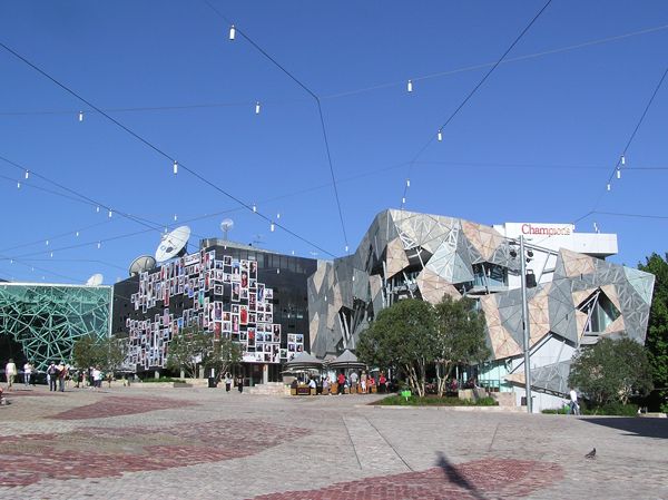
“Creative Commons Federation Square, Melbourne” by Donaldytong is licensed under CC BY 3.0
Photo by DAVID ILIFF. License: CC-BY-SA 3.0
Photo by DAVID ILIFF. License: CC-BY-SA 3.0
- Sugar Beach: The Design That Makes Your Teeth Hurt
- Stunning Residential Development Brings The Beach to The Residents
- The Garden of Hilton Pattaya by TROP: terrains + open space
3. Red Square (Krasnaya ploshchad), Moscow, Russia

“Creative Commons Red square, Russia” by Raul P is licensed under CC BY 3.0
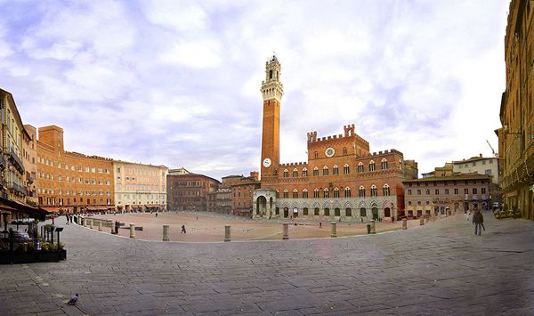
“Creative Commons Piazza del Campo, Siena, Italia” by Ricardo André Frantz is licensed under CC BY 3.0
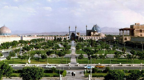
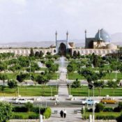
“Creative Commons Naghsh-i Jahan Square, Isfahan, Iran ” by Arad Mojtahedi is licensed under CC BY 3.0
- The New Structuralism: Design, Engineering and Architectural Technologies by Rivka Oxman
- The Art of Construction: Projects and Principles for Beginning Engineers & Architects (Ziggurat Book) by Mario Salvadori
Article by Sonia Jackett Return to Homepage Featured image: “Creative Commons Times square at night 2013 New York City , Manhattan” by Chensiyuan is licensed under CC BY 2.0

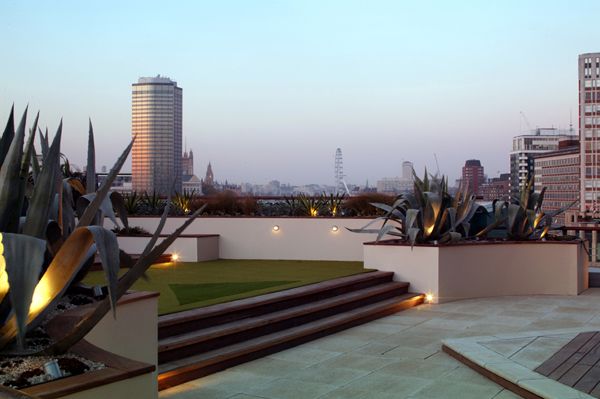
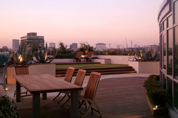
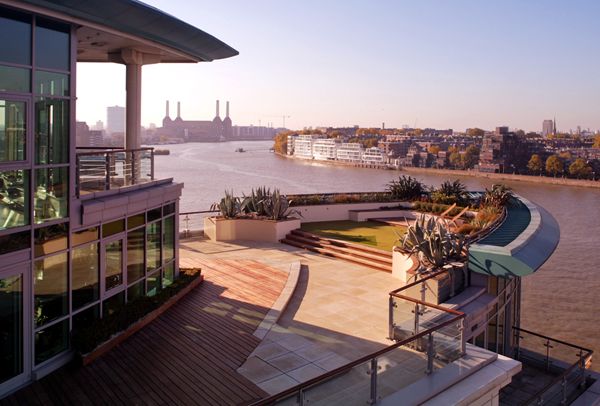
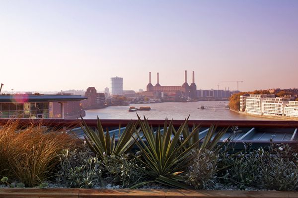
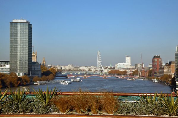
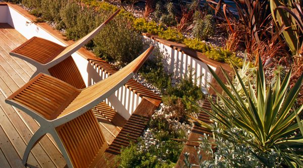
Floating Roof Garden on the River Thames
Designer Amir Schlezinger creates a luxurious floating roof garden. This 2500-square-foot northwest facing private roof terrace is situated on the 7th floor of Bridge House – the first of 5 towers at St George Wharf – the flagship development of St George PLC. The client, a recruitment consultant, asked me to rework what was a barren landscape of concrete slabs and withered plants to create a low maintenance Mediterranean entertainment space – the highlight of what is otherwise a rather small apartment. This was to be arguably the largest landscaped terrace on the Thames. The Site
Concept plan; credit: Amir Schlezinger
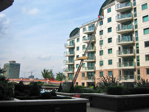
Crane to the rescue! Photo credit: Amir Schlezinger
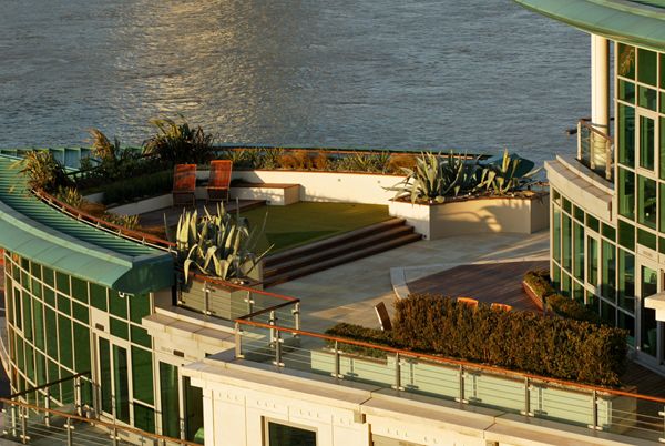
An overall view of the roof garden; photo credit: Timothy Soar
Entertainment space; photo credit: Timothy Soar
Seating on the roof garden; photo credit: Timothy Soar
An inviting space with a great view; photo credit: Timothy Soar
Planting on the roof garden; photo credit: Timothy Soar
Low planting was an essential factor in planting design; photo credit: Timothy Soar
Furniture selection and planting; photo credit: Timothy Soar

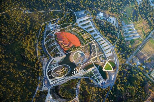
The Australian Garden That Everyone’s Talking About!
Australian Garden at The Royal Botanic Gardens, Cranbourne, by TCL Landscape Architecture Urban Design. The Australian Garden at The Royal Botanic Gardens at Cranbourne has been awarded the prestigious title of World Architecture Festival Best Landscape Project 2013. It also features as No. 2 in Landscape Architects Network’s Top 10 World Class Landscape Architecture Projects of 2013, by Paul McAtomney. In this review, we take a closer look at one of Australia’s most remarkable landscape architecture projects in recent history. Royal Botanic Gardens The Royal Botanic Gardens at Cranbourne are a division of the Royal Botanic Gardens, Melbourne. The Cranbourne gardens are situated approximately 45 kilometers from the center of Melbourne and are dedicated to showcasing the astounding diversity of Australian native flora. In fact, they are the world’s first botanical gardens dedicated exclusively to Australian native flora.
Australian Garden; credit: John Gollings
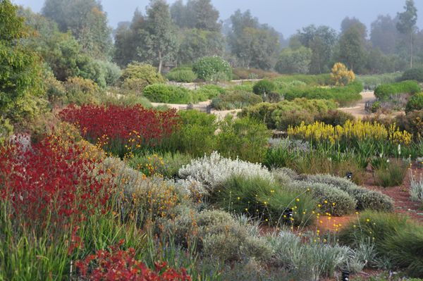
Planting at the Australian gardens; credit: Paul Thompson
River walk; Photo credit: Ben Wrigley
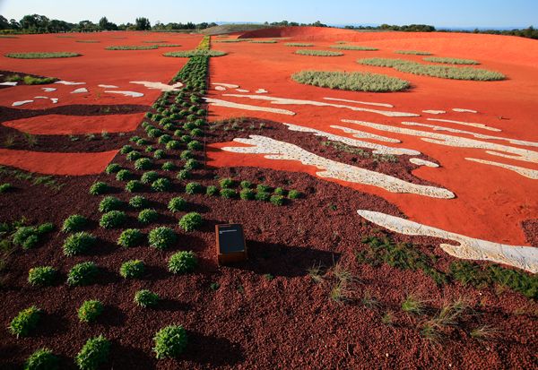
Rad sand garden; photo credit: Peter Hyatt
Australian garden; photo credit: John Gollings


Natural Swimming Pools Designed With Nature
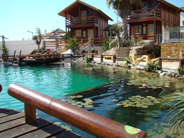
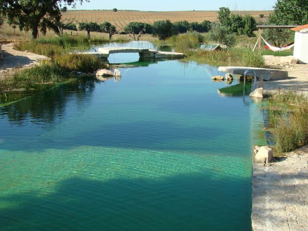
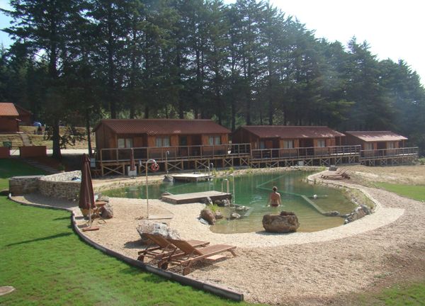
Claudia Schwarzer from Bio Piscinas gives us a detailed account of her own experience of designing and creating natural swimming pools. In the 20 years I have worked as a landscape architect in Portugal, my firm has designed more than 170 swimming ponds, 40 for tourist use. So I know the challenges of placing water features into the Mediterranean landscape. For me and for our clients, it is important to design the swimming ponds to be as natural as possible, so that they look like they have always been there. I am used to working with living things, like gardens and parks. But for me, a swimming pond goes far beyond the sum of its parts. It is biologically alive, offering more than just a place to swim. Swimming in a pond allows us to get close to nature in an extraordinary way — diving with frogs, smelling the sweet perfume of the water lily. It’s enchanting and inviting for everyone, even those who are not yet nature lovers.
Natural swimming pool full of life; credit: Bio Piscinas
The natural approach; credit: Bio Piscinas
Merging the natural world with the designed approach; credit: Bio Piscinas
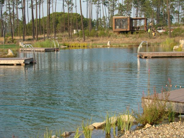
Large scale natural pond; credit: Bio Piscinas
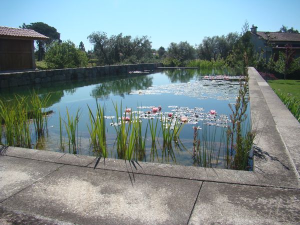
Natural swimming pool with a formal edge; credit: Bio Piscinas

A swimming pond that looks like it has always been there; credit: Bio Piscinas

Natural swimming pool design; credit: Bio Piscinas


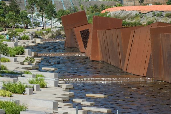
Sculptor Creates Major Public Square!
Habima Square: Tel Aviv’s Cultural Plaza as a Work of Art
Tel Aviv’s Habima Square, which connects Chen and Rothschild boulevards, hosts a number of cultural venues, including Habima Theatre, Mann Auditorium, and Helena Rubinstein Pavillion for Contemporary Art. Also known as Orchestra Plaza, the square’s importance to the city is undeniable. However, its design generated a few controversies when a sculptor, rather than a landscape architect, was put in charge of the project. The situation raises questions such as: Should the space be considered a work of art rather than a public space? Will it function as such? Are landscape architects the only professionals capable of designing outdoor spaces? These are not easy questions to answer.

Sunken garden view. Photography credit: Eran Karu
The Plaza
In the late 1920s, while designing Tel Aviv’s master plan, Patrick Geddes proposed the idea of establishing a cultural center. The area he chose was instead used as a plant nursery from the 1930s to the 1950s. It then was used as an agricultural farm, a soccer field, and a parking lot before it finally was turned into a modern “Acropolis” in 2010 — as envisioned by Geddes many decades before.

Seated steps line the sunken garden. Photography credits: Eran Karu

People interacting with the space. Photography credit: Heike Kaiser
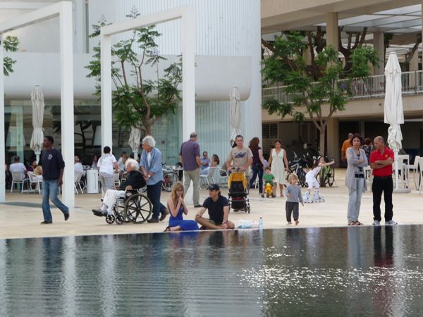
Open body of water at the reflection pool. Photography credit: Heike Kaiser


9 Unmissable Youtube Videos for Landscape Architects (Part 1)
Short Youtube videos have to be one of modern day life’s little perks, information at your fingertips, instant gratification and if you’re lucky you may just discover something! However if we’re being totally honest, how often are we watching these short flashes of entertainment out of procrastination as opposed to learning something? We’ve complied a list of Youtube’s finest videos that will keep the landscape architect inside you entertained without the guilt of procrastination! 1. Tiger Stone Road Paving Machine You can’t help but look at this video and be in awe of the sheer awesomeness of it’s engineering prowess, how many countless hours would it save, how much back breaking labor could be avoided and how much faster would they get quality roads built? One thing everybody points out about this video is the machines inability to go around tight bends and corners, but I don’t think we can really hold that against it, given how much work it could do. This video was viewed over 2,000,000 times 2. I Want to be a Landscape Architect The ultimate reference video for anybody who wants to learn more about landscape architecture. This epic video effectively takes the broadness of landscape architecture and somehow ties it up into a perfect and exciting video. The producers Room60 certainly did the profession proud! This video was viewed over 130,000 times 3. Tree Transplanting with ArborCo Melbourne Never before has moving a tree been so EPIC! With the carefully selected music and pop up windows in the video this is a must watch. The only thing this video is missing is an action hero and some explosions. You can check out this professional Australian based Arborists at www.arborco.com.au This video was viewed over 640,000 times
4. The Dubai Fountain – Time to Say Goodbye
We all love a water feature, and we all love landscape lighting as it always manages to enhance the landscape and create a whole new experience. Watch what happens when you take an incredible water feature and cross it with one of world’s most loved and powerful songs, the results are sensational. The only thing better than this video would be to go to Dubai and see it for real! This video was viewed over 720,000 times. 5. 100 Year Old Compton Oak Move Successful in League City It’s certainly no secret that trees do not want to be moved. When you decide to move any tree, you always have to account for risk and the older the tree the bigger the risk; which makes moving a 100 year old Oak tree all the more impressive. This video was viewed over 220,000 times. 6. The History of Man – The Ugly Version It’s hard to tell if this video is incredibly sad or incredibly entertaining. Easily one of the best environmental animations I ever seen. With its friendly, non-abrasive way of telling the truth, this is the video everybody needs to see! Animation created in Flash and After Effects looking at mans relationship with the natural world. Music: In the Hall of the Mountain King by Edvard Grieg. This video has been viewed over 8,700,000 times 7. Beautiful Minds: Stephen Wiltshire Hand drawing skills are an integral part of landscape architecture, always have been, always will be, but what this artist did would put even the most talented landscape architect to shame, the extent of his ability will leave your mind blown. This video was viewed over 3,460,000 times. 8. Thomas Heatherwick’s ‘Spun’ installation in Southbank Centre Square Finally somebody decided that the landscape could be fun for adults, yes that’s right apparently we don’t have to give up playing once we enter into adult hood, there is hope and landscape architects are bringing it. This video was viewed over 34,000 times. 9. Hypnotizing Wind Machine WARNING! This may be the last video you ever watch. The powerful hypnotic effects and mesmerizing music will take you to your happy place. This is the most shared video we have ever had on our Facebook page! What I love about this piece of art is the organic feel of it, it’s not just a sculpture, it’s alive, it’s moving so organically it’s like looking at some exotic jellyfish on the national geographic. Check out the artist’s website: Anthony Howe Thanks for checking out our 9 Unmissable Youtube Videos for Landscape Architects, proving that you can learn something relevant and procrastinate at the same time. We know there’s more, if you know of a Youtube video that landscape architects would benefit from and which is also entertaining, please leave a comment or email us your suggestion to office@landarchs.com See also: Top 10 Documentaries for Landscape Architects 9 Unmissable Youtube Videos for Landscape Architects (Part 2) Article written by Scott D. Renwick Feature image: Youtube printscreen