


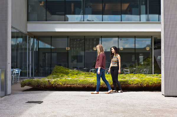
Author: Erik Schofield


Top 10 Websites for Online Portfolios
Article by Win Phyo – Total reading time 5 minutes We take a look at 10 of the best platforms for online portfolios Dear students…we know this might be perhaps one of the most important times of the year for you. Whether you are at the beginning or the end of your student life, you will most likely be trying to get hired for a summer placement, your first job or maybe even on your way to saying bye-bye to University and starting your professional life. It can be an exciting and daunting experience. The job-hunting market can be competitive and you have to know how to put forward your best assets for a potential employer to notice you. Whilst you are busy finishing up your final projects, we aim to help you out with this as much as possible. Your portfolio plays a huge part in this process and by sifting through the World Wide Web, today we bring you the best websites to showcase your work and pave the way for an exciting professional life.
Websites for Online Portfolios
10. Wix Wix has been around since 2006 and has become quite well known over the years. You may recognise this website builder from its SuperBowl advertisement campaign early this year. It provides a simple platform to create a quick and basic website with no coding needed, has tons of templates and is flexible so that you can add personal touches. The unique things about Wix is that they have an App Market and is also one of the few that lets you animate texts and other elements. The downside to Wix is that it does have an ad-free pricing plan and you have to be decisive about your template. If you wanted to change it down the line, you can lose all your content! However, this is a great platform if you want to build a no-fuss, quick and easy portfolio. WATCH >>> Creating a Wix Portfolio: Getting Started
9. Weebly Over the years, Weebly has improved massively and it is a truly simple site for those of us who are not tech-savvy but still want stylish and modern online space to display our work, maybe share some thoughts in a blog-style format or link to other websites. If you want your own domain name, it is free for the first year but the pricing for the consecutive years is manageable. Weebly sites also give flexibility for viewing with other devices such as on your mobile and tablet. They also have an app that allows you to edit your site on these devices too! WATCH >>> How to Build a Weebly Portfolio Website in 5 minutes or less – Website Builders Critic
8. Carbonmade Carbonmade is a unique resource that was born out of a need- one guy wanting an easy and affordable place to put his work online. He decided to make it for himself and due to popular demand became a resource for every designer, artist, makers and mothers out there! The pricing plans starts from $6 a month. Just take a look at their handpicked examples and you will see the kinds of stunning online platforms you can create. WATCH >>> Tutorial: How to make a Carbonmade Portfolio
7. Dribbble Dribbble is like Facebook, Twitter and Instagram combined into one for designers. This is perhaps great for posting “work-on-the-go”, which can then be linked to a bigger platform. The Pro version only costs a mighty $20 a year, which will hardly break your bank account. It is perfect for getting people excited about the work you are doing and testing new ideas, which would be a good to showcase to potential employers as your online sketchbook! 6. Squarespace Squarespace is great if you want to take an active role in crafting the look and feel of your portfolio website. It is minimalistic and favor imagery much more than text, which is exactly what we want so we don’t make people bored! The great thing about Squarespace is the 24/7 online support that you will need if you ever want to venture into trying to build an online website and have those times when you want to pull your hair out. Their pricing plans range from $5 per month to $70 so you are not short of choices. WATCH >>> How to Build a Squarespace Portfolio Website in 5 minutes or less – Website Builders Critic
3. Dropr Dropr is a UK-based start-up- self-proclaimed as “the easy creative network”. Again, this is a free platform that is aimed at the creatives to share their work and stay inspired. The process of uploading your projects seems very straightforward, perhaps even more so than the others, using the process of drag and drop. You can also invite others to edit your project, compile all the projects into a single embedded project, which can be shared elsewhere! 5. Behance Adobe’s Behance is an effective way to showcase your work for free, as well as have this social networking platform. There is also an option to add your previous Work Experience alongside your work. The ProSite offers more options and layout freedom, starting from $9.99 per month, which also includes access to Photoshop and Lightroom. Behance is definitely getting popular amongst many employers and creatives so don’t hesitate to check this one out! WATCH >>> Helpful Tips to create a more successful Behance portfolio
4. Issuu You may all have heard and used Issuu before. It has definitely been a popular choice amongst students and professionals alike- acting as the platform to publish your PDFs and turning them into flipbooks. They also have a great embedded feature that allows you to post your online books elsewhere. If you want an advertisement free plan, it starts at $29.99, which is a little pricey but the free version will allow unlimited publishing. WATCH >>> Landscape Architecture Portfolio
2. Coroflot Coroflot is different from the others as it is also more of a social network platform. It is perfect for those of you who want to upload your work not just until you get a job but consistently stay inspired, connected and updated. You can connect with other creatives, like their work and also get feedback on your work! You may not get much creative control on the layout of the page but it is still stylish enough to compete with the others. The best part is that it is free- you get free unlimited file uploads! WATCH >>> Coroflot Tutorial
1. Cargo Collective The unique thing about Cargo Collective is that it is targeted specifically for artists; to get an account you need to apply or be referred. It is probably one of the most user-friendly, straightforward and simple websites. The free version allows you to post 12 projects and the upgrade is $5.50 per month. The layout varies but images are the central pieces of the site, which is effective for showcasing your work. WATCH >>> Cargo Collective: A stunning web publisher for eye-popping content
So, it all depends on what you are looking for. For example, do you want a platform that allows you to share your work easily and consistently? Do you want to spend time building up the portfolio layout yourself, which may be updated every year hence you only need a simple online platform that allows you to upload what you already have? Are you interested in web design and are interested in how to engage employers on the site? Are you looking to stay inspired constantly and network with other creative? The list goes on… With the way the Internet is evolving these days, we suggest to keep updating your portfolio so your online presence is ever more powerful. The great thing about some of the selections in our Top 10 like Coroflot, Dribbble and Dropr is that they allow you to constantly stay inspired and connected, which is a great way to pave the way of your professional career because who knows where your next inspiration might come from? We suggest that you try out a few for yourself and see which one works best for you. Niala Salhi has also written about essential tips to create knockout portfolio, which would make a great follow-up read to your portfolio development process. These days it is almost essential to have an online presence so use platforms like LinkedIn, Facebook and Pinterest so you can spread the word about yourself and your work. If you need some advice on the progress of your online portfolio or website selection, our mentors at the Landscape Architects Network Students Group can give a helping hand. Go to comments Recommended Reading:
- Drawing for the Absolute Beginner: A Clear & Easy Guide to Successful Drawing (Art for the Absolute Beginner) by Mark Willenbrink
- You Can Draw in 30 Days: The Fun, Easy Way to Learn to Draw in One Month or Less by Mark Kistler
Article by Win Phyo

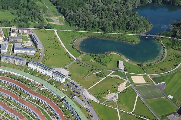
10 Projects That Put Sustainability at the Forefront of Landscape Architecture
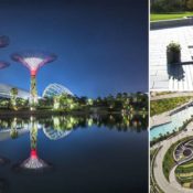
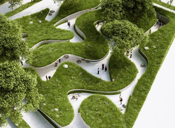
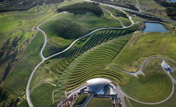
Article by Win Phyo Here’s a list of 10 projects that put sustainability at the forefront of Landscape Architecture. “Sustainability” — boy, have we heard this word a lot over the past 10 years! But it is more than just a buzzword. In fact, the issues surrounding sustainability have provided more opportunities for landscape architects to lead the way toward finding holistic solutions that architects and engineers might not necessarily be able to provide. Basically speaking, landscape architects have the ability to see the bigger picture and understand the complex relationships among our cities, the people, and the natural environment. To demonstrate this, Tania Gianone has given us 10 practices that show how “sustainability” has made the world a better place — and almost all of these practices have a landscape architect playing a major role. Let us take a look at the 10 most inspiring, functional, and successful landscape designs that have really sought to make our environment more sustainable.
Sustainability at the Forefront of Landscape Architecture
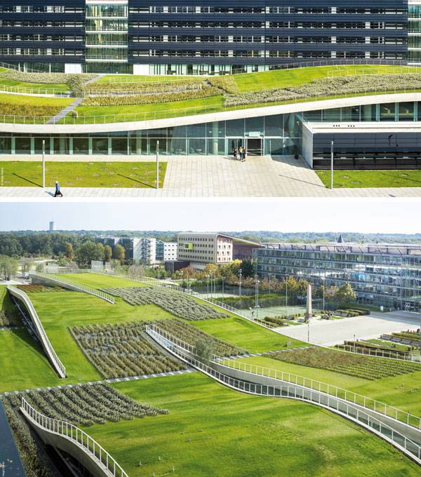
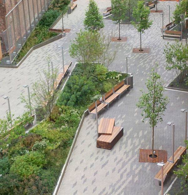
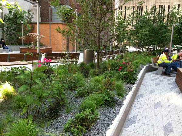
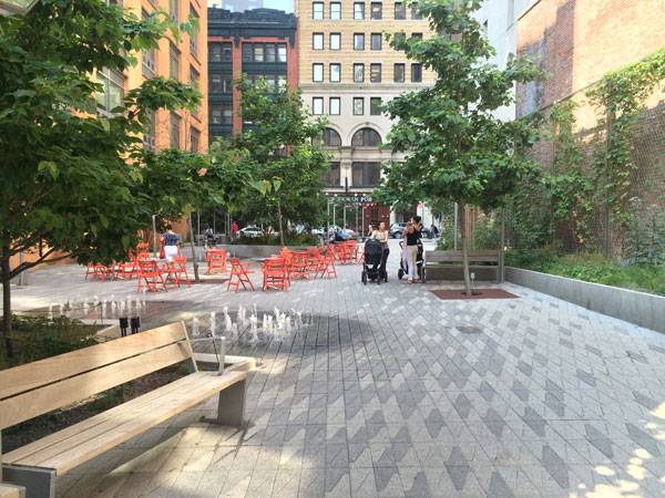
10. Atlantic Wharf Park, by Halvorson Design Partnership Atlantic Wharf Park answers the prayers to revive a historical, lively district in Boston, Massachussetts, with clean and functional design solutions. One key aspect of this design was the preservation of the historical buildings relating to America’s colonial times. Forty-two percent of the existing historic structures were re-used, through refurbishment and integration with the modern elements. Another great feature of this design was increasing the green spaces within the area through the addition of extensive green roofs. In fact, the water efficiency of the Atlantic Wharf Park building is also combined with the reduction in irrigation costs through rainwater reuse and the planting of native vegetation. Interestingly, this green roof in particular uses pre-planted modules that also allow for easy access and repair.
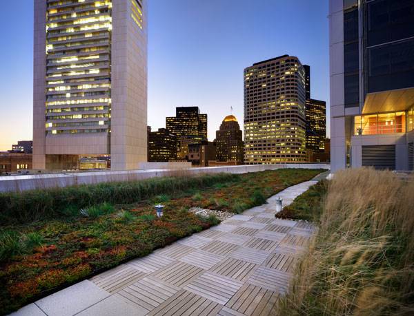
Atlantic Wharf Park. Photo credit: Ed Wonsek
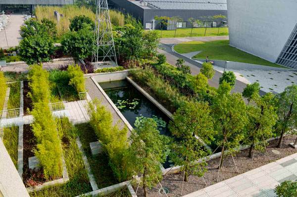
Vanke Research Center. Photo credit: Hai Zhang

Royal Neighbour. Image courtesy of ADEPT
Where the rivers runs. Image courtesy of Penda
Espace Bienvenüe: Paris Est. Scientific and Technical Pole. Photo credit: Sergio Grazia
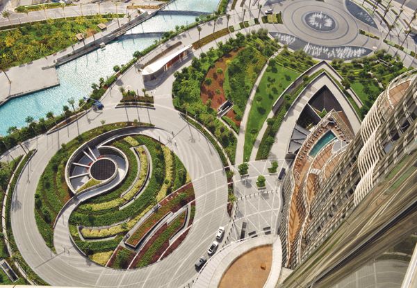
Burj Khalifa Tower Park; credit: Tom Fox and SWA Group.
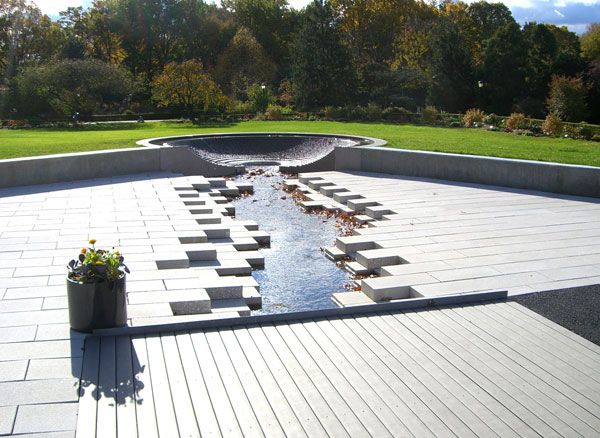
Queens Botanical Garden Photo courtest of Atelier Dreiseitl
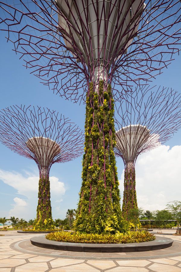
Supertree at Gardens by the Bay. Image courtesy of Grant Associates
The sculptured landforms of the Central Clearing form part of the visitor arrival sequence. Photo credit: John Gollings
Solar City. Photo credit: Pertlwieser
- Becoming an Urban Planner: A Guide to Careers in Planning and Urban Design by Michael Bayer
- Sustainable Urbanism: Urban Design With Nature by Douglas Farrs
Article by Win Phyo

10 of the Best YouTube Tutorials for Drawing Perspectives by Hand
Article by Win Phyo We take a closer look at 10 of the best YouTube tutorials for drawing perspectives by hand Lately at Landscape Architects Network, we have been sharing our finest articles on hand drawing. It is obvious why we have been doing so, isn’t it? We want you to become the best possible designers you can be and become confident in the art of hand drawing. If you are reading this article, hopefully by now you believe that you don’t suck at drawing , know a little thing or two about improving your hand-drawing skills and may even, wait for it, have become a confident artist over the last couple of months! For you folks out there, landscape architecture requires a hefty amount of different technical drawing skills and one of them is drawing in three dimensions. This is a great drawing tool to really bring your design to life and it all comes down to being able to draw in different perspectives. Being the good messenger, we have compiled the best tutorials from our artistic teachers on YouTube.
Drawing Perspectives by Hand
10. How to Understand the Different Components of a Perspective Drawing WATCH >>> Linear Perspective Drawing Lesson 2/6 – Vanishing Points, Horizon Line, Cone of Vision
Did you know that a perspective drawing is a drawing made from the point of view of an observer? Well, to kick things off, in this video, the components of a perspective drawing are broken down, such as “vanishing points”, “cone of vision” and “horizon line”. This is mainly an explanation video with many examples to help you understand the key parts. If you find this useful, you should know that this video is a part of a perspective drawing series that you can explore in more depth. 9. How to tell the Difference Between Many Types of Perspective Drawings WATCH >>> How to Draw in Perspective
This is an incredibly useful video, which describes the different types of perspective drawings. There are the ones we have already heard of such as one- to four-point perspective and aerial perspective. However, there are other uncommon terms that may surprise you such as photo-perspective, perceptive perspective, parallel perspective and reverse perspective. For example, a photo perspective is drawn to look like you are looking into a distorted photo lens. Check out the video to find examples of the rest! 8. How to Draw a Room WATCH >>> Drawing a Room in One-Point Perspective
We can all practice the simplest form of three-dimensional drawing in any room that we are in, right at this moment! Your bedroom, living room, kitchen – these are all great practicing locations and this tutorial will give you good guidance on how to begin, using a one-point perspective. The features in this sample drawing only include a window and a bed, but that leaves you more room to explore with your own furniture! 7. How to Draw an Interior Setting; Public Transport WATCH >>> How to Draw Interior Spaces: 1-Point Perspective
This is a one-point perspective-drawing tutorial that illustrates the interior of a train. The artist talks through the video in a basic way and it mostly involves drawing multiple straight lines, making it easy to follow. This is a great tutorial for those of us who want to practice our sketching skills on the go. 6. How to Draw a City from Above WATCH >>> How to Draw a City in Three-Point Perspective
This video teaches us how we can create a three-point perspective drawing of a cityscape. Again, the sample drawing involves many straight lines so this would be great to practice for those of you living in a big city or visiting one. However, do you think this style of drawing can be used to illustrate our landscape design ideas? 5. How to Illustrate Your own Design WATCH >>>Bridge in the park perspective drawing #2 [narrated] | my own projects. See it here. This is truly inspiring; the artist uses their own design of a bridge in a park to illustrate in the three-dimensional sketch. One useful thing that he suggests is doing rough sketches before choosing the best one to draw in a larger format. You can also learn how to use different pencils to give tonal effects and to strengthen the look of the drawing. 4. How to Draw a Crowd of People WATCH >>> How to Draw People in Perspective
People occupy many spaces and chances are, you will find more than one person to draw in your sketch. Here is a great tutorial on how you can draw detailed and charming characters. The artist begins by drawing simple ovals and shapes before moving on to adding features and clothing, finally finishing off with shadows and pathways. 3. How to Draw Using Many Perspectives in one Sketch WATCH >>> How to draw perspective / perspective and landscapes / #1
More complex drawings require us to combine our knowledge of different three-dimensional drawing techniques to create a dramatic effect. This is an in-depth tutorial on drawing a landscape using one-point, two-point and three-point perspective of different features within the landscape. The tutorial is fascinating and useful for anyone who wants to take his or her skills to the next level. 2. How to Draw More Complicated Features WATCH >>> Drawing tutorial – Perspective | Kurs rysunku – Perspektywa [S02E06 ENG/PL]
This artist’s lesson was also featured in our Top 10 YouTube Tutorials for Drawing Trees and he is back again with another great tutorial on drawing a landscape in perspective. This is a great video to follow and practice your tree-drawing skills also. He uses the minimum essentials of simple geometrical shapes, tones and texture to make this three-dimensional drawing look elegant. 1. How to use the Rule of “Halves and Doubles” to Draw a Naturalistic Landscape WATCH >>> How to draw & paint landscapes in perspective
This artist has a unique approach to perspectives that can be implemented over and over again, particularly when it comes to drawing a natural landscape, like he does in this video, of mountains and waterfalls. It is only a short video but he pretty much sums up the main components of creating a three-dimensional perspective drawing and the end result will blow your mind! Whilst there may be tons of materials out there for you to practice with, it is definitely worthwhile to take a look at the videos above as a starting point. Perspective drawings can be the foundations for the designer to explain their ideas across clearly to a client at a meeting and they can certainly be the foundations for a slick computer render. We hope you enjoy practicing and don’t forget to show off your skills through our Sketchy Saturday Series. The latest series has some awe-inspiring perspective drawings submitted by our readers. Will one of the next groups of chosen drawings be from you? Go to comments Recommended Reading:
- Drawing for the Absolute Beginner: A Clear & Easy Guide to Successful Drawing (Art for the Absolute Beginner) by Mark Willenbrink
- You Can Draw in 30 Days: The Fun, Easy Way to Learn to Draw in One Month or Less by Mark Kistler
Article by Win Phyo


Top 10 YouTube Tutorials for Drawing Trees
Article by Win Phyo. We take a look at 10 tutorials for drawing trees that will bring life to your sketches and help you communicate your design schemes with more confidence. Trees are awesome! Feel free to disagree with me but who doesn’t love trees? They provide us with shade during the summer months, make us feel peaceful in a park, provides homes for birds and as a landscape architecture student, they are one of the key things I can use to create functional and beautiful designs. They are also the most frequent features we will end up drawing throughout our academic and professional lives. Therefore, whether you are a beginner or a pro, here are 10 YouTube tutorials that can help you capture the most simplistic to the most intricate details of our majestic arboreal friends. I realize that as artists and designers, we all have different styles of expression; hence the videos explore various drawing mediums. What is your style?
Tutorials for Drawing Trees
10. Brush Pen Drawing Tutorial WATCH >>> How to Draw a Tree With Brush Pens – An Oak Tree – How to Draw Trees
In this tutorial, the artist draws an elegant oak tree using very simple circular scribbles, which intensify in mass to create a sense of 3D (three dimensional) space. He continues by drawing a bare tree trunk with impressive mark-making skills. The finished piece will show you how simple it actually is to make a beautiful drawing. 9. Chalk Pastels Drawing Tutorial WATCH >>> How to draw a tree at distance with pastels
If you like the bright and colorful, this tutorial is for you. A friend of mine loves drawing in chalk pastels so much so that it has almost become her “thing”. Every time she whips out the colorful soft colored chalks to present her design, I am in awe of how effective they can be. This tutorial is a perfect representation of this feeling. The artist starts of with a chunky block of green and just applies layers over different colors to create a simple and colorful tree drawing. 8. Marker Pen Drawing Tutorial WATCH >>> Mike Lin: How to draw a tree with markers
I will assume, at least from my personal experience, that most students own the kind of marker pens used in this tutorial. They are great for rough coloring and can cover a huge area in short amount of time. This tutorial is my personal favorite and I feel it will be useful for us all. Mike Lin shows us a great tip to blend the different marker pens and even adds a bit of pencil and watercolor pencil to the mix. The great thing about this is that the final product can be as general or as detailed as you want. 7. Colored Pencils Drawing Tutorial WATCH >>> Rendering trees using colored pencil
Gone are the days where we used to color our apple trees within the line (mostly) in our coloring book with the colored pencils. If you want to go from block coloring to what I would like to call “dot” coloring, where each color is dispersed throughout the drawing, watch this video. The artist gives a step-by-step guide to render a group of trees by using light to dark colors, starting from a simple outline. 6. Pencil Drawing Tutorial WATCH >>> Drawing tutorial – Tree: simple way | Kurs rysunku – Drzewo: prosty sposób [S02E01 ENG/PL]
Drawing trees with just a pencil can be the most difficult task. However, when you can master the toning techniques, it is a great, lightweight tool to take with you on your travels. This artist uses an abstract technique that breaks the form of the tree down into ovals, which allows you to separate the light and dark areas- what a drawing genius! If other techniques have failed for you, this one may give you hope again! 5. Pen Drawing Tutorial WATCH >>> Linescapes: How to draw a tree II – groups of trees
Trees don’t usually come as individuals. They are most often clustered in a group. This three-minute tutorial shows how to draw groups of trees within a rural-type landscape. The sketcher gives a great tip of representing tree clusters in the distance as a single, two-dimensional volume. Take a look at the short clip to see what else he does! 4. Watercolor Drawing Tutorial This tutorial is a great way to familiarize yourself with different tree forms and represent them as a very simple three-dimensional shape within seconds. I wouldn’t hesitate to try out this technique, as it is so quick to do. Once you have mastered this, you can try out a more advanced tutorial, such as this from the same watercolor artist. WATCH >>> How to Paint Tree Studies in Watercolor – Basic Shapes
3. Aquamarkers Drawing Tutorial WATCH >>> Painting a tree with Aquamarkers – tutorial
I have never come across Aquamarkers, but being a watercolor fan, watching this tutorial, and seeing how versatile the medium was, I would definitely like to give them a try. Coming in third place in this article, it is incredible how a few lines made with these Aquamarkers can be blended with a watercolor brush to give a smooth painting finish. It is easily achievable and in my opinion, should become must-have equipment for landscape architecture students! 2. Pastel Drawing Tutorial WATCH >>> Moody Views trees in pastel
Earlier on, I showed you a tutorial to create a brightly colored drawing using chalk pastels. This one is using pastels in a different rendering technique – more subtle and dream-like. Again, the end drawing looks phenomenal yet I am in awe of how easily anyone can re-create this effect! 1. Pen and Ink Drawing Tutorial WATCH >>> How to Draw Trees | Pen & Ink Drawing Tutorials
This is the most comprehensive, all-around tutorial with tips on strokes, form, and showing light and shadow. If you do not have time to watch all ten videos, I highly recommend this one. Not only is it great for beginners, but instructor Alphonso Dunn truly gives the opportunity to explore different ways of drawing the trees. His approach is unique and can be easily applied when drawing on-site, as well as at your drawing board. – There you have it! After reviewing the above tutorials, you may have noticed that I described many as “simple”; I admit that the mediums may have been different but the level of difficulty did not seem to be so high. You can say that the artists have made it look so easy but I think we can all achieve it and eventually develop our own styles. They all started with scribbles and strokes but ended up with elegant tree drawings. The fundamental thing is the studying of forms and understanding of where the sunlight hits the trees, which of course come from careful observation. Moreover, never give up and don’t forget the power of practice. Why not have a go yourselves and submit it to our Sketchy Saturday series? We would love to see what you come up with! Have you got any tips for drawing trees? Let us know in the comments section below! Go to comments Recommended Reading:
- SketchUp for Site Design: A Guide to Modeling Site Plans, Terrain, and Architecture by Daniel Tal
- Rendering in SketchUp: From Modeling to Presentation for Architecture, Landscape Architecture and Interior Design by Daniel Tal
Article by Win Phyo Feature Image: Printscreen from featured YouTube Tutorial | Source

8 Incredible Pools With the WOW Factor
Article by Win Phyo These incredible pools have changed how people think and interact when it comes to people and water. Fancy a dip? The first swimming pool existed 5000 years ago in a Pakistani settlement. The great bath was the earliest public water facility made out of bricks. The history of pools then moved to the ancient Greeks and Romans. As individual wealth increased, so did the standard of living and luxuries like pools were considered to be the ultimate amenity. The Romans definitely knew how to make a splash – in AD 305, they built an incredible pool; over 900,000 square feet in size, which was heated by giant fires in the basement below the pool. Over time, swimming pools evolved and became more mainstream as people began to see that part of the American Dream was to perform a breaststroke in your very own backyard! Now, pools can be found in almost every country; so much so that it is hard to spot the difference between one country and another! Today, however, we will honour the long history in many different cultures and dive into a tour around the world to the most spectacular swimming pools that are worth taking a dip in. Enough with our witty puns – let’s take the plunge, shall we?
1. The Pool at Pyne by TROP Terrain+Openspace
How do you design a sky pool within a concrete jungle that makes a statement? The first in our list is a pool in Bangkok that is situated above a high-end condominium building, designed by a renowned landscape architectural design studio – TROP Terrain+Openspace.
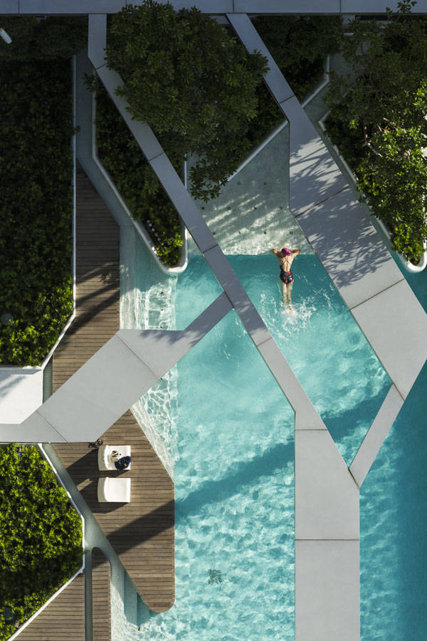
The Forest and Pool at Pyne, TROP Terrains + Open Space
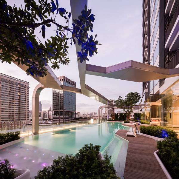
Pool at Pyne, TROP Terrains + Open Space
2. The Jellyfish House by Wiel Arets Architects
Within a sophisticated beach house in southern Spain lays a swimming pool that exceeds others in construction and design techniques. Without the pool, the Jellyfish House’s character is lost. Why? Because the visual connection of the exposed cantilevered pool glass pool between the interior and exterior parts of the house grants a fluid space, full of iridescent turquoise movements that reflect throughout the entire house. This pool personalizes the house and is a unique experience for both the swimmer and the house dweller.
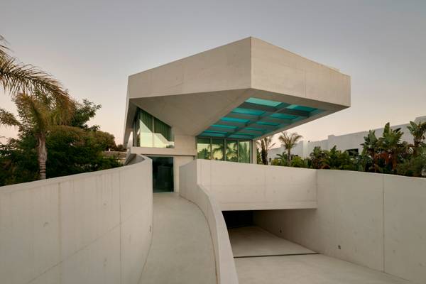
Extending out 9 meters. Photo credit: Jan Bitter
3. + Pool by Play Lab
What if the Hudson River became swimmable? What if we told you it could be a possibility? The guys at PlayLab have worked with other designers and engineers, such as Arup, to make it a possible for you to swim in the City that never sleeps. The plus-shaped pool has layers of filtration system to naturally improve the water condition and the innovative shape creates an open space and four-in-one pool which allows for competitive swimming, playing and lounging! This is a one-of-a-kind unique invention that ought to be implemented and you can help make it a reality by visiting this page but for now, why not check out the link to see what could be waiting for you the next time you visit New York City?
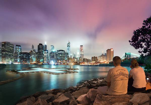
How the +Pool may look at night. Credit: PlayLab
4. Mirage Residence Pool by KIOS Associated Architects
This pool doesn’t just make up the rooftop of the Mirage residence, it is the roof of the Mirage residence! The design of the house disappears quietly into the landscape just as the pool disappears out onto the horizon. The concept and construction of the pool deals with the illusion of seamless infinity and serenity.
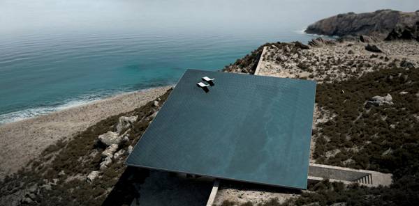
An overview of the infinity pool. Credit: Kois Associated Architects
5. Swimming Pool Design by Cipriano Custom Swimming Pools & Landscaping
A wealthy amateur violin player and collector-homeowner in New York deserves nothing less than a pool which resembles an exact scale replica of a Stradivarius violin from the 1700s with all of the intricate, beautiful details. The pool consists of fibre optic lighting elements which bring its violin features to life, complemented by plantings, two koi fishponds, and a spa and river flow jet system. The design in itself is an art piece with great construction details, once again used to maximize the aesthetic and experiential qualities of the pool.
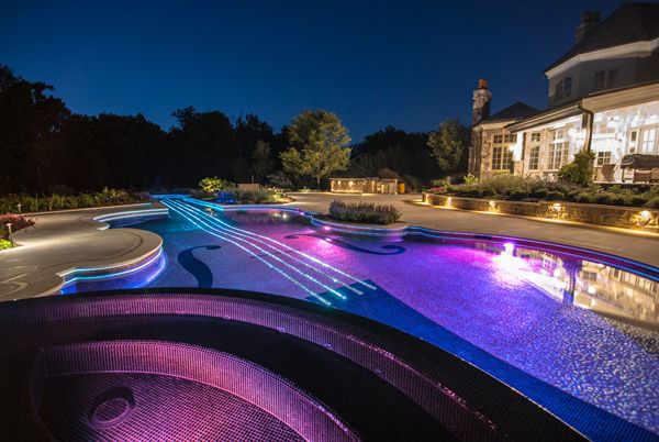
Violin Swimming Pool; image courtesy of www.njcustomswimmingpools.com
6. Vinterbad Brygge Winter Baths by BIG
Winter swimming is a popular thing in Northern Europe and the Harbour Baths in island Brygge in Copenhagen are a successful landmark and facility that allows both summer and winter swimming for water-loving city dwellers. The pool has long wooden promenades that resemble the decks of a passenger ship, and a diving tower which looks like the tip of the ship itself. This infamous unique oasis, since its opening, has given the Copenhagen Harbour a new green image.
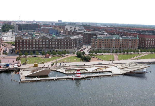
Vinterbad Brygge. Photo credit: BIG – Bjarke Ingels Group
7. Bassil Mountain Escape by Vladimir Djurovic Landscape Architecture
To infinity and beyond! Bassil Mountain Escape is a vacation house in Lebanon that was built to get away, far away, from our busy stressful lives and encounter a peaceful environment that helps us relax. This is one of the main purposes of a water element in landscape architectural design and our interaction with water is a huge help. The clever design of the pool is made up by the illusion of the infinity by extending the design out of the site’s boundary with a cantilevered water mirror and floating stepping-stones, which lead users out to the bar below.
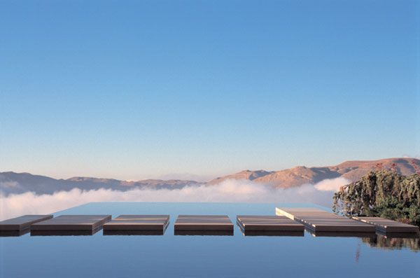
Bassil Mountain Escape. Photo courtesy of VLADIMIR DJUROVIC LANDSCAPE ARCHITECTURE
8. Laurel Way by Whipple Russell Architects
This special residence in Beverley Hills uses the water’s edge as an organic perimeter to break the connection between the outside environment and the house. The three-storey building has a majestic water feature on its lowest level – a small water channel, which becomes a spectacular pool and Jacuzzi through a quick change in the width of the waterway, that creates a barrier whilst maintaining spatial continuity. The water element, fittingly, absorbs into the terrace style design with certain elegance that defies the commonplace.
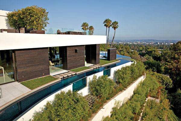
Laurel Way. Image courtesy of Whipple Russel Architects
- Becoming an Urban Planner: A Guide to Careers in Planning and Urban Design by Michael Bayer
- Sustainable Urbanism: Urban Design With Nature by Douglas Farrs
Article by Win Phyo

Do you Dare to Venture on the Valley of the Giants Tree Top Walk?
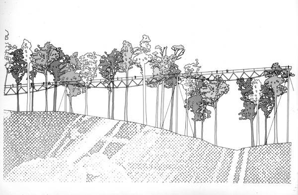
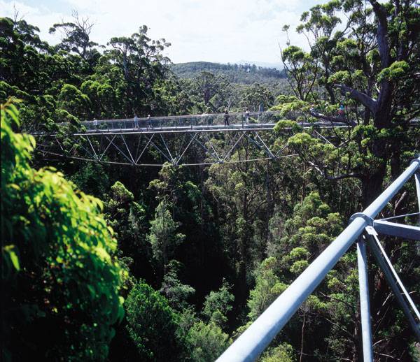
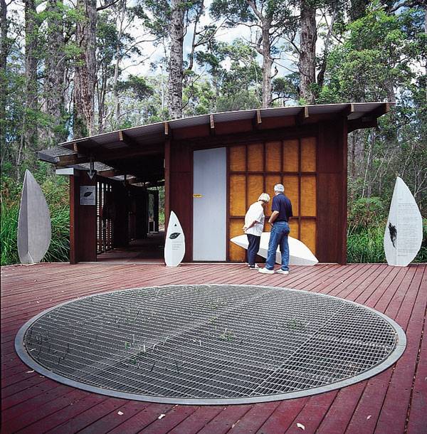
Article by Win Phyo Valley of the Giants Tree Top Walk, by Donaldson and Warn, in Denmark and Walpole, Southern Ocean Coast of Western Australia. Do you know about the long-lost era of Gondwana? There is a unique piece of the Earth on the South Ocean Coast of Western Australia that provides a window to the past. To access this land, one must embark on a 600-meter-long Tree Top Walk, designed by Donaldson and Warn, which ventures among a grove of more than 400-year-old giants. One hundred and eighty million years ago, present-day South America, Africa, Arabia, Madagascar, India, Antarctica, and Australia comprised a supercontinent. Imagine this time of the Jurassic period, when the land was covered in lush rainforest and dinosaurs still roamed the Earth. The land in this part of Australia is a piece of this past, being home to one of the oldest groves of Eucalyptus trees — the tingle tree forest — where planting origins trace back as far as 65 million years ago.
Valley of the Giants Tree Top Walk. Image courtesy of Donaldson and Warn
Valley of the Giants Tree Top Walk
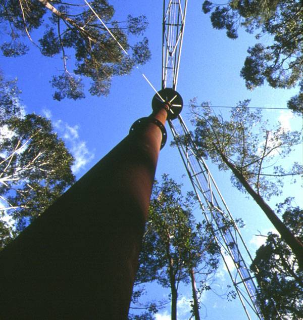
Using no helicopters or cranes, construction to create the Tree Top Walk began in 1995 as a way to protect the forest. Visitors can enjoy the interpretive experience of fantasy, science, and awe by walking 40 meters high among trees that range in height from 40 meters to 80 meters in what we now call the Valley of the Giants. The simple design was the solution to a complicated context and matrix of challenges that were environmental, political, aesthetic, historical, and cultural in scope. How do you enhance a tourist destination that is home to some of the planet’s oldest trees while taking into account the above challenges?
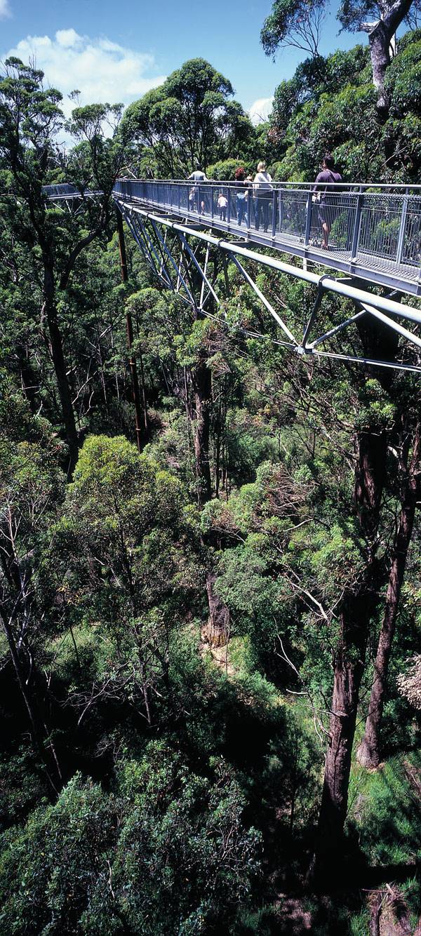
Valley of the Giants Tree Top Walk. Photo courtesy of Donaldson and Warn

Valley of the Giants Tree Top Walk. Photo courtesy of Donaldson and Warn
Valley of the Giants Tree Top Walk. Photo courtesy of Donaldson and Warn

Valley of the Giants Tree Top Walk. Photo courtesy of Donaldson and Warn
Valley of the Giants Tree Top Walk. Photo courtesy of Donaldson and Warn
Valley of the Giants Tree Top Walk. Photo courtesy of Donaldson and Warn
Full Project Credits For The Valley of the Giants Tree Top Walk:
Project Name: Valley of the Giants Tree Top Walk Location: Denmark and Walpole, Southern Ocean Coast of Western Australia Designer: Donaldson and Warn Structural Engineers: Ove Arup Client: Department of Environment and Conservation, Western Australia Length of the Walk: 600 meters Height of the Walkway from the Forest Floor: 9 meters to 40 meters Construction Period: 1995- 1996 Cost: $1.8 million Learn more about Donaldson and Warn: Website: www.donaldsonandwarn.com.au Recommended Reading:
- Becoming an Urban Planner: A Guide to Careers in Planning and Urban Design by Michael Bayer
- Sustainable Urbanism: Urban Design With Nature by Douglas Farrs
Article by Win Phyo Return to Homepage

5 Odd Things You Should Know Before Taking a Dip in King’s Cross Pond
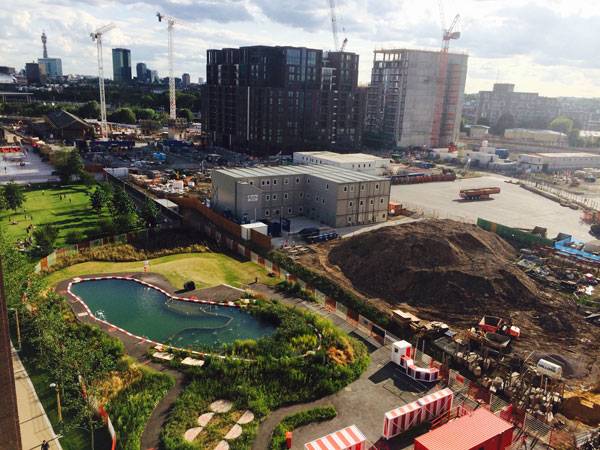
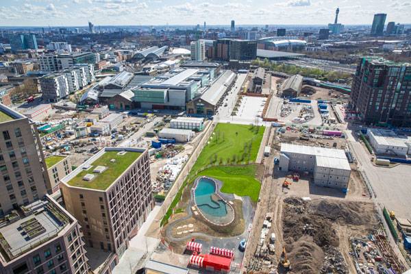
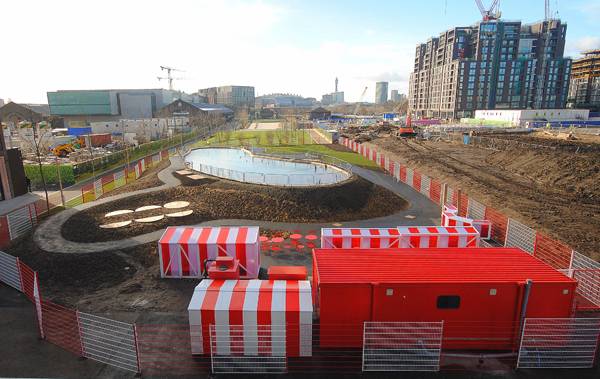
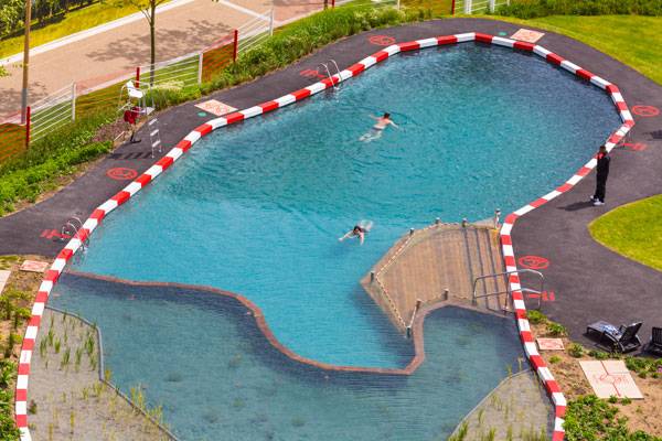
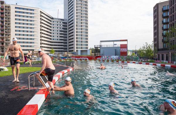
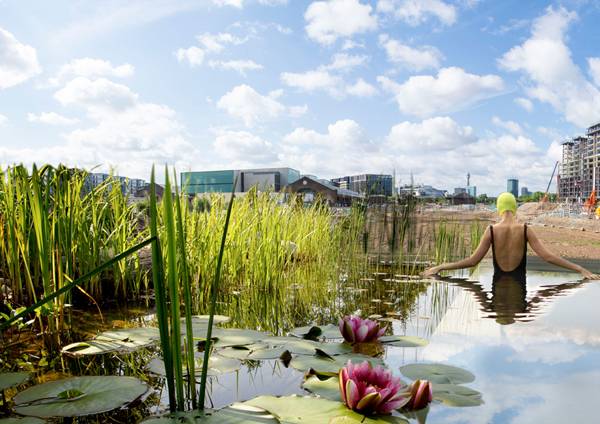
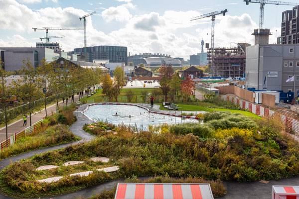
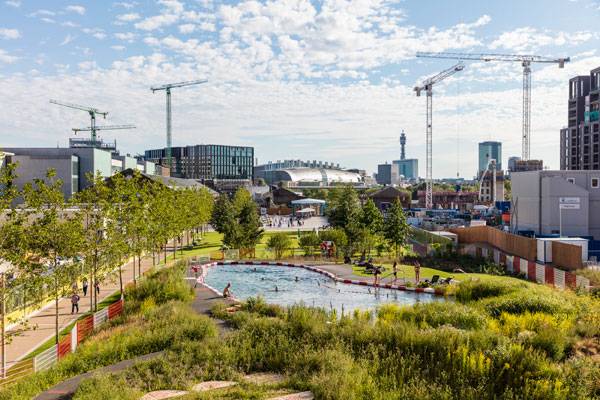
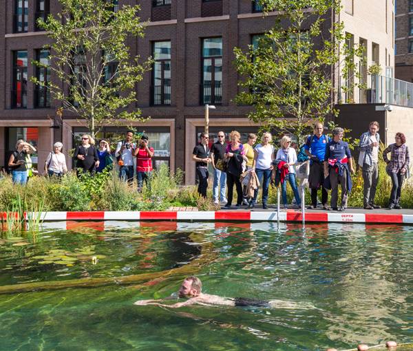
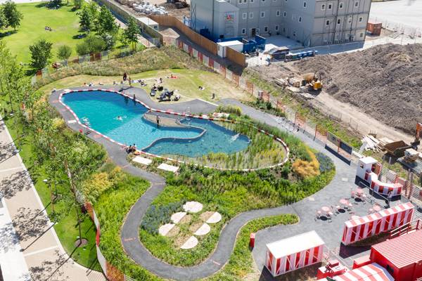
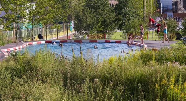
Article by Win Phyo King’s Cross Pond Club, by Ooze Architects, in London, UK. Welcome to King’s Cross Pond Club – a natural swimming pool born from the collaboration between Netherlands-based Ooze Architects and Slovenian artist Marjetica Potrc. This alliance has resulted in a unique practical swimming facility that is also a beautiful landscape feature. It is situated in the heart of King’s Cross regeneration area and as you might have guessed already, it is not your typical swimming pool. Now, there are many other peculiar things associated with this pool that break down habits of stereotyping and will possibly make you reconsider the notions of what constitutes an artistic design project.
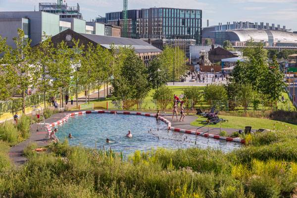
The King’s Cross Pond Club. Photo credit: John Sturrock
The King’s Cross Pond Club
1. It is in the Middle of a Construction Site The area north of King’s Cross station has been redeveloped, since 2007, into a vibrant new city quarter. As a way to celebrate the industrial heritage of this area and its future, as well as to ease the inconvenient disruptions, a number of contemporary art projects have been popping up throughout the venture’s duration of nine years. King’s Cross Pond Club is the final installation of the programme.
The King’s Cross Pond Club. Photo courtesy of Ooze Architects
The King’s Cross Pond Club. Photo credit: John Sturrock
The King’s Cross Pond Club. Photo credit: Jacqueline Andrews
The King’s Cross Pond Club. Photo credit: John Sturrock
The King’s Cross Pond Club. Photo credit: John Sturrock
The King’s Cross Pond Club. Photo courtesy of Ooze Architects
The King’s Cross Pond Club. Photo courtesy of Ooze Architects
The King’s Cross Pond Club. Photo courtesy of Ooze Architects
The King’s Cross Pond Club. Photo credit: John Sturrock
The King’s Cross Pond Club. Photo credit: John Sturrock
The King’s Cross Pond Club. Photo courtesy of Ooze Architects
Full Project Credits For The Natural Bathing Pond by Ooze Architects
Project: ‘of Soil And Water’: The King’s Cross Pond Club Project Description: Natural Bathing Pond And Its Landscape Location: King’s Cross, London, UK Area: 2200m2, 400 M² – Pool Client: King’s Cross Central Limited Partnership Curator: Stephanie Delcroix & Michael Pinsky Designer: Ooze Architects and Artist Marjetica Potrc Natural Pool Consultant: BIOTOP Austria Project date: May 2015 until the end of 2016 Authors: Ooze (Eva Pfannes & Sylvain Hartenberg) And Marjetica Potrč Curator: Stéphanie Delcroix & Michael Pinsky Project Manager: Ian Freshwater – Argent Llp -UK Qs: Gardiner & Theobald – UK Water Engineering: Biotop & Planungsbüro Wasserwerkstatt – Austria Structural Engineering: Arup – UK Utilities Engineering: Hoare Lea And Peter Brett Associates – UK Specific Pioneer Landscape: Rita Breker-kremer & Stefanie Strauß – D Participatory Workshops: Global Generation – UK & Landscape Maintenance Monitoring: Central Saint Martins – Students Of Spatial Practices Department – UK Operation: Fusion Main Contractor: Carillion – UK Technical Drawings: Bd Landscape – UK Natural Pool System: Biotop – Austria Pool Contractor: Kingcombe Aquacare – UK Hard & Part Soft Landscape: Willerby – UK Groundworks: Galldris – UK Other Water Systems: Cameron Lonsdale – UK Outbuilds: Setworks & Houston Cox – UK The Authors Would Like To Thank: All Clear Access, Townsend Landscape Architects, Ald, RLSS Anna Strongman/Argent, Ken Trew/Argent, Steve Alderson/Argent , Rosie Cade/Argent , Nick Foster/Argent, Amanda Buckley, Rebecca Bennett/Argent, Hannah Alderton/Argent, Megan Youell/Argent, Alan D Sowden/Carillion, Steven Windless/Carillion, Graeme K Tucker/Carillion, Brad Henderson/Carillion, Des Smith/Willerby, Jane Riddiford/Global Generation, Paul Richens/Global Generation, Ciara Wilkinson/Global Generation, Robert Townshend, Tim O’hare, Christine Fent & Gilma Wendt, François Cassin. Learn more about Ooze Architects: Website: www.ooze.eu.com Recommended Reading:
- Becoming an Urban Planner: A Guide to Careers in Planning and Urban Design by Michael Bayer
- Sustainable Urbanism: Urban Design With Nature by Douglas Farrs
Article by Win Phyo Return to Homepage


The Magic Green Carpet That Will Bring Out The Art Critic In You
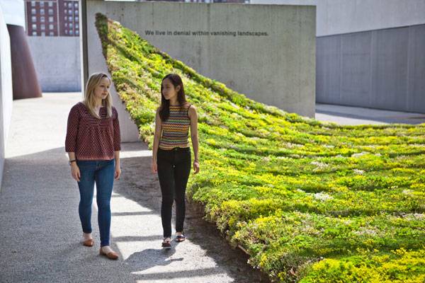
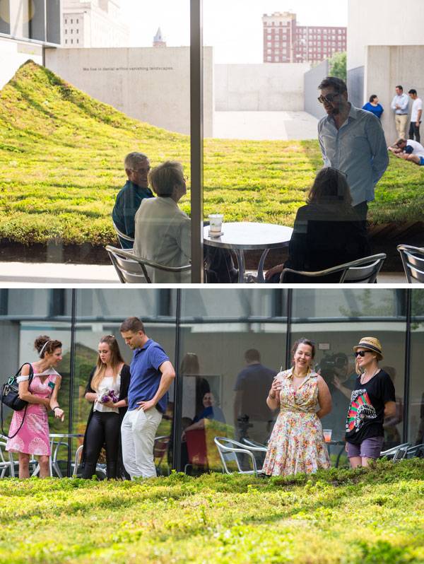
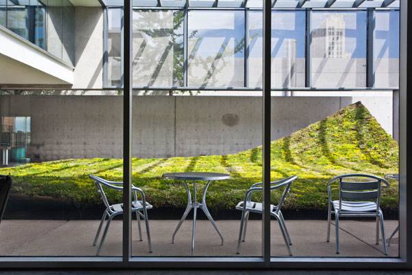
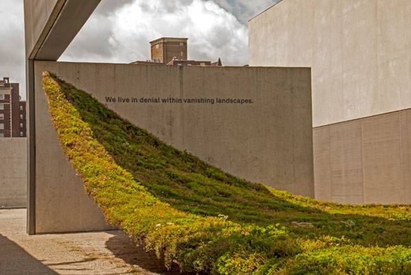
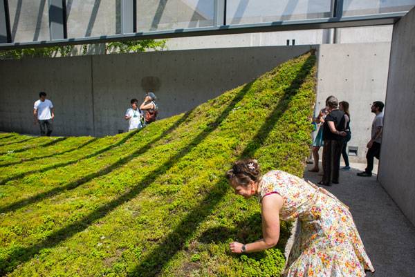
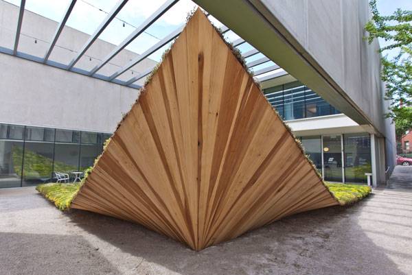
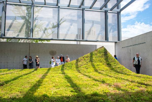
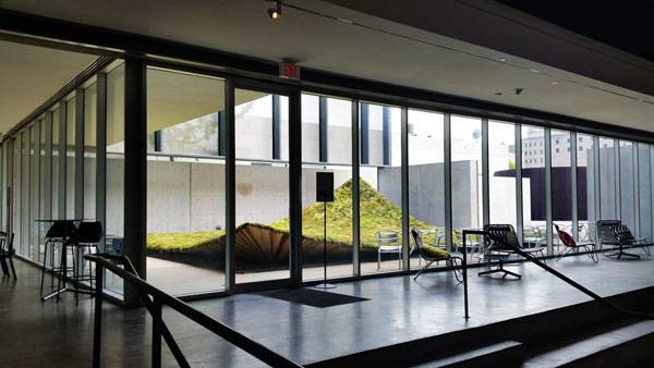
Article by Win Phyo Green Varnish, by Nomad Studio, in St. Louis, USA It is not unusual for art and landscape design to cross paths. Many artworks convey a powerful message in an abstract manner that can create a conflict of opinion, a source of discussion or a new perception. Landscape design can be used as a tool, or as a canvas, to deliver a message of some kind that can, in many ways, enhance the design. So, how would an example of art and landscape design translate in reality? Green Varnish by Nomad Studio is a site-specific green space, which is part an art installation and part social interpretation that has breathed new life into the 200m2 courtyard in Contemporary Art Museum (CAM), St. Louis. In fact, it is alive. Like turning a new page in a book, the living green carpet installation is curled up and hovering in the air- ready to take action. Nomad Studio is known for creating radical and innovative proposals that foster a dialogue between the user and the environment. This is no different.
Green Varnish. Photo credits: David Johnson
Green Varnish
The Outer Appearance
As you walk through the gallery space of CAM or have your coffee in the café, you will come across Green Varnish from the inside. Beyond the floor-to-ceiling windows and amongst the greys and whites of the concrete and gravel surfaces, it dominates the space and looks expansive.
Green Varnish. Photo credits: Jarred Gastreich
Green Varnish. Photo credits: David Johnson
Green Varnish. Courtesy of Nomad Studio and Contemporary Art Museum of
Saint Louis
Green Varnish. Photo credits: Jarred Gastreich

Green Varnish. Photo credits: Alex Elmestad
Green Varnish. Photo credits: David Johnson
Beneath The Coat of Varnish- The Meaning Behind The Project
The project title, Green Varnish, gives us the clue to the underlying meaning of this project. To put varnish on a surface is to apply a glossy coat. In the same way, the installation covers the lifeless monotone courtyard with a green carpet.

Green Varnish. Photo credits: David Johnson
Green Varnish. Photo credits: Jarred Gastreich
Green Varnish. Courtesy of Nomad Studio and Contemporary Art Museum of Saint Louis
The Second Part of The Dialogue
Green Varnish was de-constructed in September of this year but the conversation continues. As a part of a two-year commissioned project, Nomad Studio will install a second piece of the story- an installation named Green Air, in summer 2016. Green Air will occupy the same 200m2 courtyard, but will be the opposite of a floating green carpet. Instead, it will be a hanging garden made out of the same wood from Green Varnish with hanging air plants like Tillandsia, creating a different spatial experience altogether. This purposeful inversion is to make a statement that, what was hidden will become exposed. Could this mean Green Air proposes a more optimistic future or the point of no return? WATCH: Nomad Studio: Green Varnish
Green Varnish is a minimalistic artistic piece that, from the outer appearance, does not seem like it had such a deep layer of meaning. However, instinctively, one can see that it made a strong statement. Art, as always, is strongly subjective and we can be certain that all of you will have had different reactions to the piece itself or the deeper meanings. As an installation, do you like the way it was made? Do you agree with the statement Nomad Studio is making? Or is it another drama that is added to the art world? As always, let us know your thoughts in the comments below! Go to comments
Green Varnish. Photo credits: David Johnson
Full Project Credits For Green Varnish
Project Name: Green Varnish Landscape Architect: Nomad Studio Location: Washington Avenue, St Louis, USA Area: 1150 ft2 Project Year: June-September 2015 Consultants: Iria Perez and Assoc., LIA Engineering Assembly Team: Collab – Portico, Green Roof Blocks Get Social with OSLO Urban Design and Landscape Environment: Website: www.thenomadstudio.net Twitter: www.twitter.com/thenomadstudio LinkedIN: www.linkedin.com/in/laura-santin-0aa56226 Instagram: www.instagram.com/thenomadstudio Recommended Reading:
- Becoming an Urban Planner: A Guide to Careers in Planning and Urban Design by Michael Bayer
- Sustainable Urbanism: Urban Design With Nature by Douglas Farrs
Article by Win Phyo Return to Homepage

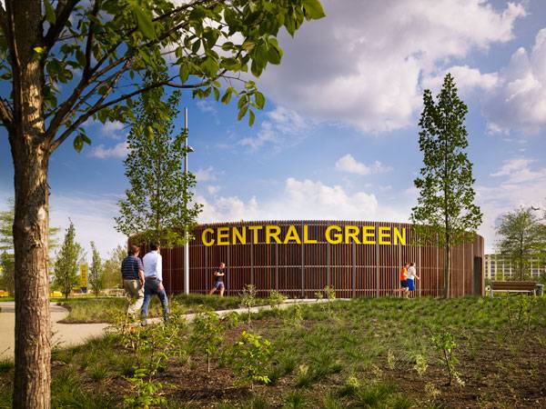
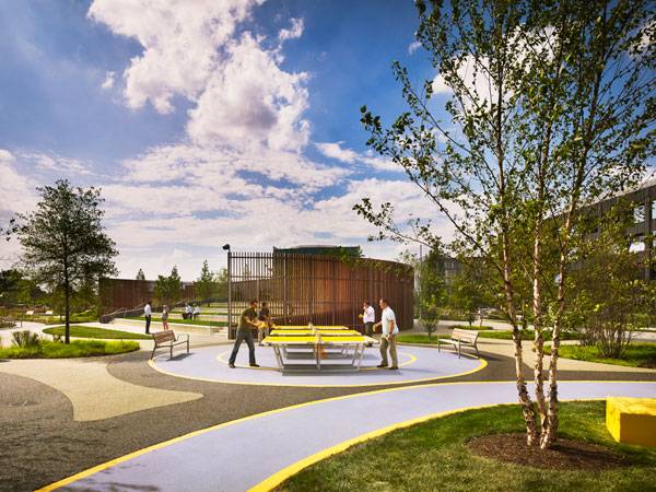
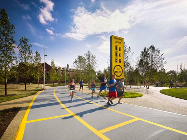
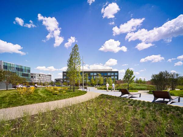
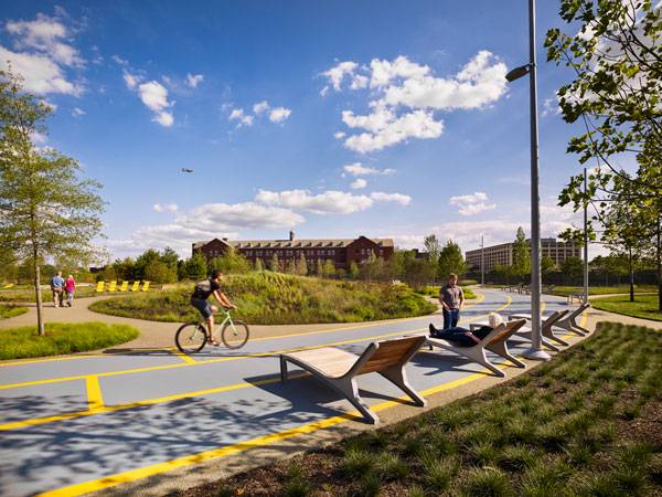
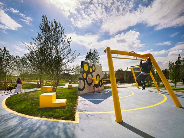
The Navy Yard Central Green Shows us How to Achieve Healthier, Happier and More Industrious Workers
Navy Yard Central Green, by James Corner Field Operations, Philadelphia Navy Yard, Philadelphia, PA, USA. Towards the end of June, the Navy Yard in Philadelphia unveiled its sixth park addition to its expanding office campus. James Corner Field Operations has debuted a strong addition to Philly’s expanding simple but effective public spaces. If you didn’t know already, the 1200-acre Navy Yard is a dynamic urban development promoting business growth and smart energy innovation. The vision for the campus is concerned with creating environmentally friendly workplaces, industrial development, public spaces, residential development, and remarkable architecture.

Philadelphia Navy Yards – Central Green. Credit: © Halkin Mason Photography
Navy Yard Central Green
What was once a closed military facility is now becoming the region’s most progressive and vibrant business locations and Central Green Park is the perfect amenity to match. The 4.5-acre park will also be complemented by 1200 Intrepid, a $35million office building, which is the first building in Philadelphia to be designed by starchitects Bjarke Ingels Group (BIG). The Master Plan of Navy Yard focuses on having a mixed-use campus based around historic preservation, sustainability, and smart growth. In this article, we will take a look at why the ideas and features embedded in Central Green are a notable example for creating successful businesses.

Philadelphia Navy Yards – Central Green. Credit: © Halkin Mason Photography
Historical Preservation
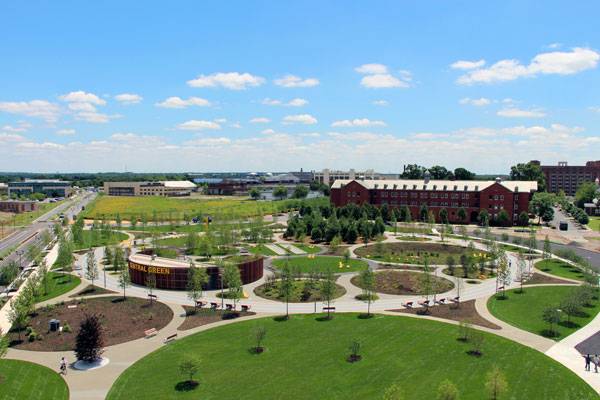
At the first glance, all you can see is a series of circular shapes of green. Where does the simple shape arrangement come from? The overall spatial design is related to the site’s historical landscape condition. In fact, hundreds of years ago, the area was a marshland with pockets of planting and water. The circular segments are therefore celebrating the original designs of Mother Nature!

Philadelphia Navy Yards – Central Green. Credit: © Halkin Mason Photography
Work-Play Environment
Realistically speaking, many of us spend a huge chunk of our time in a workplace. Most of our interactions take place here too. The success of a workplace depends on healthy, happy, productive, and innovative employees. So what can the 11,000 and growing workforce of Navy Yard do in order to achieve this? They would need spaces for relaxation and escape, for exercise and recreation and Central Green provides this.

Philadelphia Navy Yards – Central Green. Credit: © Halkin Mason Photography
Variety is the Spice of Life
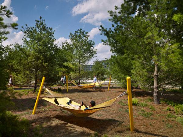
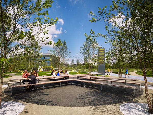
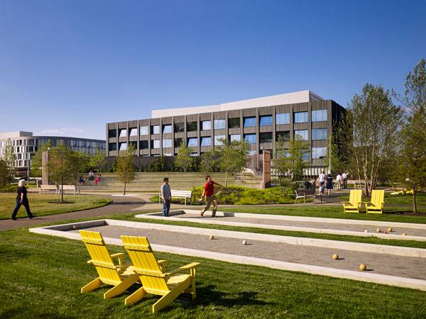
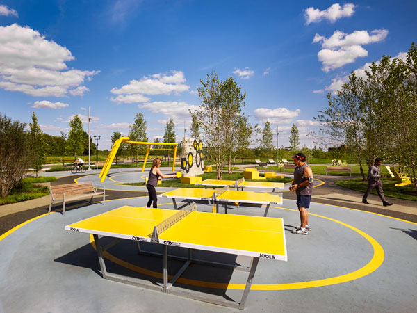
This is how James Corner Field Operations aims to achieve the best quality workforce. It seems this lucky workforce has choices. The circular park division is seen to have separate outdoor rooms that each holds a purpose and in total creates a multi-purpose space. The zones are an outdoor expression of many creatives of today and allow the space for creative expression. The uses include a fitness station, an amphitheatre/”sun lawn”, a hammock grove, bocce courts, ping-pong tables, a communal table, and a “bio-basin” for stormwater.
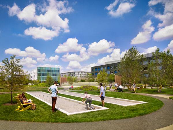
Bocce Courts at Philadelphia Navy Yards – Central Green. Credit: © Halkin Mason Photography
The Inclusion of the Amphitheatre
The only building in the park is an outdoor amphitheatre. Permeable paths of greys and warm tones offset the circular spaces. A 2-mile long, 6-meter wide “social track” contains most of the main spaces, completed with wood and metal lounge chairs and benches.
Philadelphia Navy Yards – Central Green. Credit: © Halkin Mason Photography
Philadelphia Navy Yards – Central Green. Credit: © Halkin Mason Photography
Achieving the Right Social Balance
Areas for active recreational play vs. areas that create opportunities for quiet gatherings are nicely balanced. For example, the site’s language is enhanced by the use of a long X-shaped table for picnics and meetings. Nearby, a cluster of yellow hammocks are threaded between a grove of conifers that allow for a restful refuge. Lawns also offer breathing room.
Philadelphia Navy Yards – Central Green. Credit: © Halkin Mason Photography
Conference tables at Philadelphia Navy Yards – Central Green. Credit: © Halkin Mason Photography
The Bold Use of Yellow
Another recognizable feature is the use of yellow, which pops out with an energizing effect. Every opportunity is grabbed to use this cheerful yellow: from the clusters of Adirondack chairs on the lawns to the ping-pong tables, moveable bistro tables and fitness zone equipment.
Ecologically Sound
All of the above would seem a little bit superficial if the park did not demonstrate an environmentally conscious thoughtfulness. Luckily, this is not the case. Sustainability was one of the key driving forces being the Master Plan of Navy Yard. Within the park, in total, there are 304 trees, 10,025 shrubs, 42 types of groundcover and 13,600 bulbs. Areas of pervious surfaces allow for the facilitation of water filtration and the expansive-looking spaces subtly change from wildflower-covered mounds to the dips of the stormwater retention pond. The overarching objective of the whole Master Plan also includes looking into the production and storage of green energy.
Philadelphia Navy Yards – Central Green. Credit: © Halkin Mason Photography
Philadelphia Navy Yards – Central Green. Credit: © James Corner Field Operations
Philadelphia Navy Yards – Central Green. Credit: © Halkin Mason Photography
Planning for the Future
These good design practices are fundamental to build Navy Yard as a place for innovation, entrepreneurship and environmentalism. The vision that has been set for the whole area has been one similar to Garden Cities; to build a sense of a cohesive mixed-used village integrating jobs and residents.
Philadelphia Navy Yards – Central Green. Credit: © Halkin Mason Photography
Philadelphia Navy Yards – Central Green. Credit: © Halkin Mason Photography
Philadelphia Navy Yards – Central Green. Credit: © James Corner Field Operations

Philadelphia Navy Yards – Central Green. Credit: © Halkin Mason Photography”
Philadelphia Navy Yards – Central Green. Credit: © Courtesy of Philadelphia Industrial Development Corporation
Full Project Credits For Navy Yard Central Green
Project: Navy Yard Central Green Location: Philadelphia Navy Yard, Philadelphia, PA, USA Design Team: James Corner Field Operations (Landscape Architects), Environetics (Architectural and Structural Engineer), Larry Weaner Design Associates (Horticulture), Pennoni (Civil and Utilities Engineer), Tim Craul (Soils Engineering) Design Director: James Corner, RLA, Founding Partner Project Manager: Sarah Weidner Astheimer, Senior Associate Project Designer: Matt Grunbaum, Associate, Kimberly Cooper, Associate, Sanjukta Sen Size: 5 acres Role: Public realm design Budget: $7.4 million Completion: Summer 2015 (June) Client: Liberty Property Trust Website: www.fieldoperations.net Twitter: www.twitter.com/fieldoperations Instagram: www.instagram.com/fieldoperations Recommended Reading:
- Becoming an Urban Planner: A Guide to Careers in Planning and Urban Design by Michael Bayer
- Sustainable Urbanism: Urban Design With Nature by Douglas Farrs
Article by Win Phyo Return to Homepage


Mediterranean Terrace Provides Inspired Living in Italy
Mediterranean Terrace, by Studio S.O.A.P, in Alassio, Italy. “The traveler returning from Italy, with his eyes and imagination full of ineffable Italian garden-magic, knows vaguely that the enchantment exists.” – Edith Wharton Italian gardens, full of fantasy and sensory delight, have never failed to inspire artists and designers throughout the centuries. Travelers who have ever visited Italy share the feeling described by Edith Wharton, and upon viewing the Mediterranean Terrace by Simone Ottonello, we are transported back and forth between the 15th and 21st centuries, realizing that it is not just to foreign designers that Italian Renaissance gardens provide inspiration.
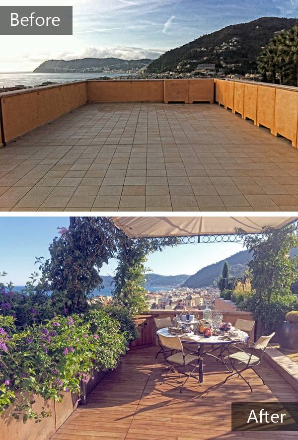
Before and after sequence. Photo credits: Simone Ottonello
Set in Northern Italy
Set just a few miles from the French border in the town of Alassio, on the western coast of Liguria in Northern Italy, what was once a basic, flat surface has been unrecognizably transformed into a terraced garden with immaculate views onto the Mediterranean Sea. Italian Renaissance gardens are inspired by classical ideals of order and beauty, allowing users to savor the sights, sounds, and smells of the garden and to contemplate the garden and the landscape beyond. The Mediterranean Terrace appeals to these ideals, yet remains true to our time through the introduction of modern elements and functions.

Photo credit: Simone Ottonello
Understanding The Italian Style
The classical Italian style of the garden terrace can be deduced from the symmetry and geometry. The geometric design in the old Italian gardens often features walls with a central fountain. The boundary in the Mediterranean Terrace arises from elegant metal fencing and low walls, but geometry arises from the building façade in which the outside living area corresponds to the inside living area, and the outside dining area corresponds to the inside dining area.
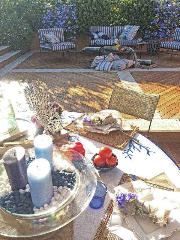
Photo credit: Simone Ottonello
- Floating Roof Garden on the River Thames
- Luxurious Small Urban Garden Getaway
- Cantilever Pool with the WOW Factor!
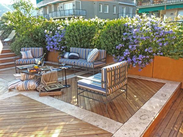
Photo credit: Simone Ottonello
A Fascination With Water
Old Italian Renaissance gardens also show a fascination with water — the mechanics of the supply of water, the beauty it adds to a garden, and the fun to be had in drenching unsuspecting visitors. Although there are no such fountains to be found in this terrace garden, we find a swimming pool on the top terrace, complete with sun beds — fittingly created for the relaxation of 21st century Italians.
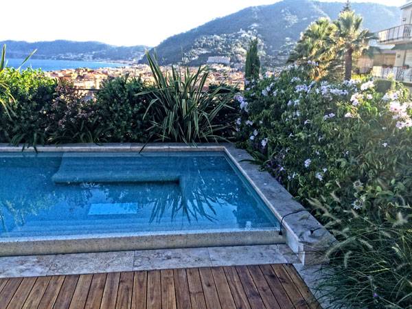
Photo credit: Simone Ottonello
Planting on The Mediterranean Terrace
In the Mediterranean Terrace, plantings are never too far away. The chosen planting species are evergreen and fragrant in all months of the year. The top terrace with the swimming pool features plantings that intimately border the edge. The shrubs appear to be at the same level as the pavement. This is because the steel vases that hold them are under the deck and concealed in a clever manner. Recommended Reading:
- Sun-Drenched Gardens: The Mediterranean Style by Jan Smithen
- Designing and Creating a Mediterranean Garden by Freda Cox
The plants are meticulously chosen for specific purposes, like actors having specific roles in a play. Tall plants are used to provide privacy from the other buildings. In areas where one can appreciate the panorama, shorter plants have been arranged. Take a look at the shaded shelter on the terrace dedicated for dining, which features plantings that hug the edge of the corners to elegantly frame the views. Reference to old Italian gardens is also made through the plant selection: There are Cypresses as columns, Phormium as fountains, and boxwoods as spheres.

Photo credit: Simone Ottonello
A Magical Transformation
The garden has been transformed from a blank, single terrace overlooking the vast panoramic view to one with three levels, each specifically dedicated for a function: dining, outdoor living area, and swimming pool with sun beds. At first glance, the Mediterranean Terrace looks like a modern terrace set amongst the surrounding seascape and townscape. It looks simple, yet enchanting. Why is that so? It is not because the Italian weather reveals bluer skies and richer vegetation. Recommended Reading:
- Sun-Drenched Gardens: The Mediterranean Style by Jan Smithen
- Designing and Creating a Mediterranean Garden by Freda Cox
IN FACT, WE DON’T SEE A VAST VARIETY OF VEGETATION, and the symmetrical, geometric effect produces repetition, which could be described as dull and monotonous. However, the enchantment comes from the impressions the designer has left upon the terrace garden, with a thoughtful and concise manner in the carefully chosen and crafted details. The delicately crafted works of Italian gardens are what make them magical. The Mediterranean Terrace allows for simple contemplation and viewing, and it also allows for a closer study of details that are in harmony and in balance with one another.
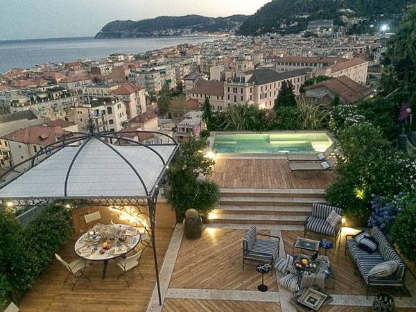
Photo credit: Simone Ottonello
Full Project Credits For The Mediterranean Terrace, by Studio S.O.A.P
Location: Alassio, Itlay Designer: Studio S.O.A.P, Simone Ottonello Landscape Architect Consultant: Arch. Carlo Berio and Ing. Bruno Martini Lighting: E2000 Decking: TeakWoodSA Swimming Pool: Silver Piscine Gardening: Michelini Garden Services Size: Around 140m2 Website: www.soapstudio.com Recommended Reading:
- Sun-Drenched Gardens: The Mediterranean Style by Jan Smithen
- Designing and Creating a Mediterranean Garden by Freda Cox
Article by Win Phyo Return to Homepage

How Frank Gehry’s Controversial Building Impacted the Landscape
Beekman Plazas, by James Corner Field Operations and Piet Oudolf, in Manhattan, New York City. Striking architecture can have an impact on the design of the landscape that surrounds it. The controversial Frank Gehry, who is changing the language of architecture as we speak, designed Forest City Ratner Residential Tower. At its base are the Beekman Street Plazas, designed by James Corner Field Operations in collaboration with Piet Oudolf. The building footprint was reduced by about 30 percent to allow for urban plazas to be created on the western and eastern sides of the building. From above, the dramatic steel folds of the residential tower create an inspired addition to the Lower Manhattan skyline. Below, the public space reflects the dynamism and movement to create an inviting space for all. An oasis of trees and fountains within this space complements the 76-story, stainless steel and brick sensation above. However, both plazas have had to deal with neighboring buildings, and how this has been achieved is also a little “High Line-esque”.
© James Corner Field Operations
Beekman Plazas
The plazas have a total area equaling about 21,000 square feet. Field Operations, the creative force behind Manhattan’s High Line, collaborated with the Dutch horticulturist Piet Oudolf, who also collaborated with Gehry on Chicago’s Millenium Park. Through such a strong collaboration, the level of excellence has been raised. The plazas are accessible by all, and the intensity of their use is emphasised by the mixed-use development of Gehry’s building, which includes the first-ever public school built on private land in New York City, doctor’s offices, and neighborhood-orientated, ground-floor retail spaces. Related Articles:
- The Urban Revitalisation That Inspired New York City’s High Line Park
- Riverside Park South Celebrates New York’s Industrial Past
- The Meeting Bowls: A New Hub of Social Activity Along Times Square
WATCH: Frank Gehry’s Beekman Tower
– THE PLAZAS ARE LOCATED on the north side of the Financial District, near many notable sites, including the 9/11 Memorial Museum, City Hall, the City Hall park, and the adjacent New York Downtown Hospital. The West Plaza is the primary plaza, located outside the entrance of the residential complex. It features fixed and moveable outdoor furniture, as well as trees, planters, and water features. William Street Plaza separates the building from New York Downtown Hospital and provides access to underground car parking. Although it has similar features to West Plaza, its function is more similar to a pathway than a plaza, as seen by the existence of bollards for underground parking access.
© James Corner Field Operations
Creating a Sense of Movement
The details of the hardscape and softscape give the sensation of speed and movement, replicating the rhythm of the busy New Yorkers in downtown Manhattan. Benches and long planters filled with ornamental grasses and perennials are placed at different angles. The pavers also interlock at an angle, creating a sense of urgency and flow as one moves through the space. A large number of trees soften the diagonal edges and are bound to keep the area well shaded as they mature over time
Similarities to the Highline
Those who have been to the High Line will feel a familiarity from Beekman Plazas. The similarities include benches made from stock lumber and the manner in which the two different grays are used for pavers and interspersed like the High Line’s planks. In Beekman Plazas, the dark gray pavers also seem to coincide with points of access, creating a connection between the building and the spaces. THE PLAZA DESIGN also has to work with two edge conditions created by existing buildings: the neighboring buildings on the west and the porte-cochere for the tower on the east. Trellises with vines create screening and provide a lush, green backdrop. The drop-off zone along the West Plaza is separated from the plaza itself through a series of planters placed along the columns, although this is kept at a minimalistic style. The eastern plaza — William Street Plaza — is also simple, and bollards are used to mark the entrance of the underground parking garage. The same paving pattern is used for the walking paths and driving lane, producing an informal separation.

© James Corner Field Operations
© James Corner Field Operations
A Place to Dwell, a Place to Pass By
The great thing about the plazas is that the spaces are not restricted to the residents living in the swanky apartments. This means that those who pass by and linger in these spaces will vary from schoolchildren and parents to building residents, from shopkeepers and office workers to construction crews. This creates a real community atmosphere, making the site even more vibrant.
Dealing With Economic Crisis
The project also had to deal with the economic crisis of 2008-2009. Many similar projects were put on hold during this period, but the decision to move forward with a vision, to create a building unlike any other in New York City, determined its success. With such strong collaborations, this project is an example of architecture and landscape combining to complete a vision. It is one that certainly could have been incomplete without the support of the two plazas that bring life to the skyscraper. Would you agree that the striking architectural form of the building has truly animated the space beneath, in the Beekman Plazas?
© James Corner Field Operations
Full Project Credits For Beekman Plazas
Project: Beekman Plazas West Plaza Site Area: 11,500 square feet Williams Plaza Site Area: 9,786 square feet Location: Lower Manhattan, New York City Project Completion: 2012 Budget: $2.7 million Client: Forest City Ratner Companies Project Team: Project Lead, Landscape Architecture, Urban Design: James Corner Field Operations Design Director: James Corner, Rla, Founding Partner Project Manager: Karen Tamir, Senior Associate Project Designer: Rebecca Kainer Planting Design: Piet Oudolf Additional Credits: Philip Habib & Associates WSP Cantor Seinuk JB & B Consulting Engineers Website:www.fieldoperations.net Recommended Reading:
- Urban Design by Alex Krieger
- The Urban Design Handbook: Techniques and Working Methods (Second Edition) by Urban Design Associates
Article by Win Phyo Return to Homepage

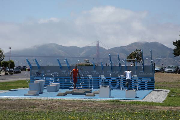
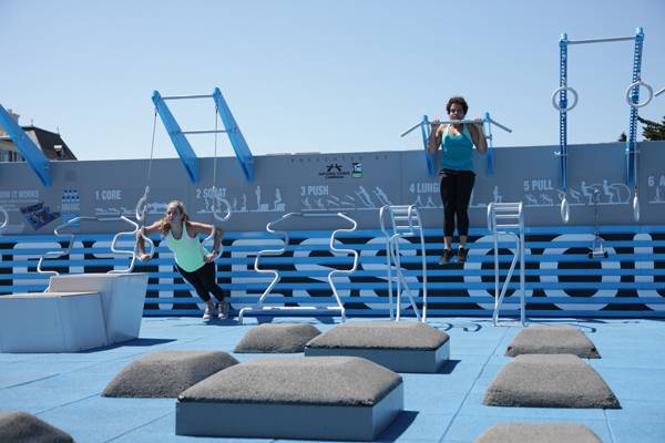
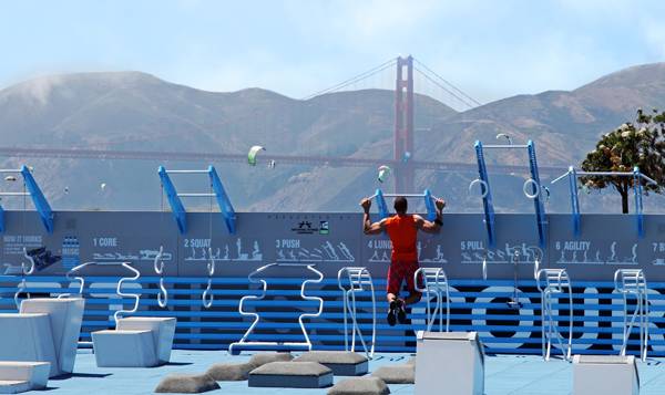
Your Gym Has Moved Outside — and the Monthly Membership Fee is $0
National Fitness Campaign Fitness Court, by NewDealDesign, in Marina Green, San Francisco. Do you have a gym membership? If so, how often are you able to motivate yourself to arrive at the doorsteps of your gym for a hardcore workout session? Here comes the big question: Have you actually achieved your fitness goal? Gyms have become so standardized these days that they have become more of a marketing tool for consumerism. With so many of us having the odd rarely used gym membership, being too busy, and feeling more guilty than fit, we have actually become blind to other solutions. But there are ways to get exercise and a better sense of well-being without dealing with pricey membership fees, travel costs, and mind-boggling use of gym equipment.
Credit: NewDealDesign LLC and the National Fitness Campaign
National Fitness Campaign Fitness Court
Let us introduce to you the Fitness Court. Like many other “courts”, such as basketball courts, it is an outside workout space dedicated for use by the community. The first of its kind is the National Fitness Campaign (NFC) court designed by NewDealDesign, which aims to tackle the personal, social, and physical barriers to working out in a gym.
The Vision
NFC is a social enterprise founded in 1979 by Mitch Menaged. By converting public spaces into outdoor circuit-training systems, a.k.a. Fitness Courts, the campaign is able to provide free and accessible workout spaces to the public. Communities can request the Fitness Courts to arrive in their area for free, and locals do not need to buy a membership. How? It follows Menaged’s idea of allowing businesses to advertise in the space. In turn, these businesses end up supporting community fitness — and gaining publicity in the process.
Credit: NewDealDesign LLC and the National Fitness Campaign
- How to Design a Landscape for Extreme Workouts: Part 1 Calisthenics
- How to Design a Landscape for Extreme Workouts: Part 2 Free Running
- How to Design a Landscape for Extreme Workouts: Part 3 Bouldering
Now, re-launching the campaign with this model in the 21st century, the new and improved NFC court has arrived in San Francisco, with the idea of opening 20 new courts across the United States in 2015 and 200 by 2017. Could this be a simply intelligent way of tackling obesity?
Credit: NewDealDesign LLC and the National Fitness Campaign
Re-thinking the Gym Experience
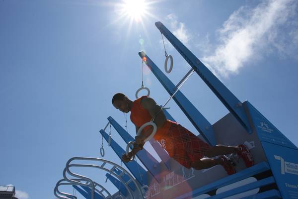
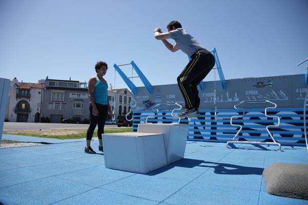
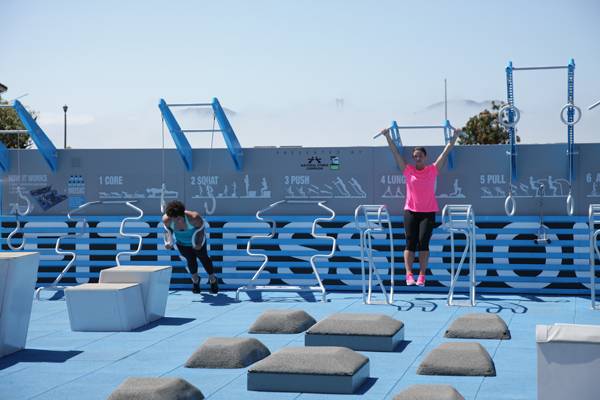
Concerns with such a vision lie in finding waterproof materials that are easy to transport and assemble. More importantly, how do you design a Fitness Court that mimics the gym experience, yet does it just a little bit better, offering equipment designed for a full body workout at all fitness levels? The innovative NewDealDesign has created a circuit-training-based court split into seven main movement areas, each of which targets different muscles. With 30 pieces of equipment, the design flows from one area to the next, allowing individuals or groups to use the court simultaneously. Moreover, the “perfect layout” is restricted to a single court, so the final design takes ownership of the space and is also able to maximize efficiency.
Credit: NewDealDesign LLC and the National Fitness Campaign
Credit: NewDealDesign LLC and the National Fitness Campaign
7 Movements in 7 Minutes
While gyms offer weight-training equipment, the NFC Court ditched the weights in favor of body-weight-resistance, high-intensity training. This opens up a workout routine to a more freestyle approach. The equipment is designed to work with various postures and grips. The structure’s single wall is used for many of the hardest exercises. Personal trainers involved in creating the prototype have created a seven-minute podcast as a guide to using the space. The seven movements correspond to the seven sections of their perfect layout: core, squat, push, lunge, pull, agility, and bend. According to Menaged, research shows that even seven minutes a day of working out can improve your health in the long run.
Credit: NewDealDesign LLC and the National Fitness Campaign
Credit: NewDealDesign LLC and the National Fitness Campaign
Credit: NewDealDesign LLC and the National Fitness Campaign
A New Style of Community Fitness
Whether you are a couch potato or a fitness maniac, the NFC Fitness Court model provides effective solutions to your excuses for skipping the gym. The seven movements in seven minutes approach is seemingly a tiny chunk out of our 24-hour day. And it can bring us together with our neighbors, encouraging our whole community to get and stay fit. Good health is not something we can buy, but efforts to achieve and maintain it can save us a great deal of trouble in the future.
Credit: NewDealDesign LLC and the National Fitness Campaign

Credit: NewDealDesign LLC and the National Fitness Campaign
WATCH: Fitness Court Promo
Full Project Credits For The National Fitness Campaign Fitness Court
Project: National Fitness Campaign Fitness Court Launch Date of Campaign: 1979-present Dimension of the Court: 32 feet by 35 feet Designers: NewDealDesign Location: Marina Green, San Francisco Recommended Reading:
- Urban Design by Alex Krieger
- The Urban Design Handbook: Techniques and Working Methods (Second Edition) by Urban Design Associates
Article by Win Phyo Return to Homepage