


Author: Land8: Landscape Architects Network


The Award-winning Queen Elizabeth Olympic Park in London: Top 5 Features Showcasing the Future of Sustainable Design
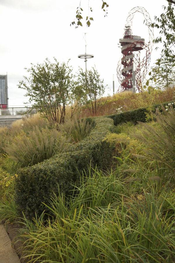
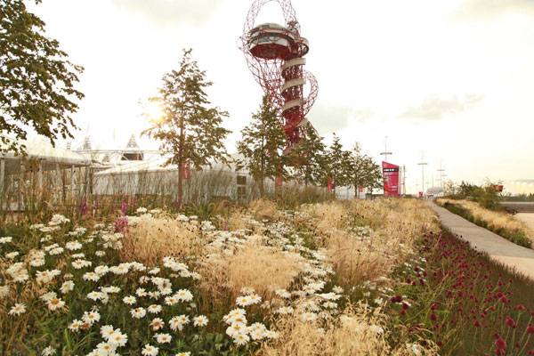
Article by Andrea Kreuer Queen Elizabeth Olympic Park, by LDA Design et al., in London, United Kingdom Since its heyday in 2012, when the Olympic Park first opened to the public to host the Olympic and Paralympic Games, the park has undergone a further transformation, developing into a forerunner of naturalistic planting and sustainable landscape design. To achieve this, the Park’s management have commissioned best-in-class landscape and planting designers – Professors Nigel Dunnet and James Hitchmough from the University of Sheffield, Sarah Price from Sarah Price Landscapes, and world-renowned Dutch planting designer Piet Oudolf; all working alongside the main landscape architects; LDA Design and Hargreaves Associates.
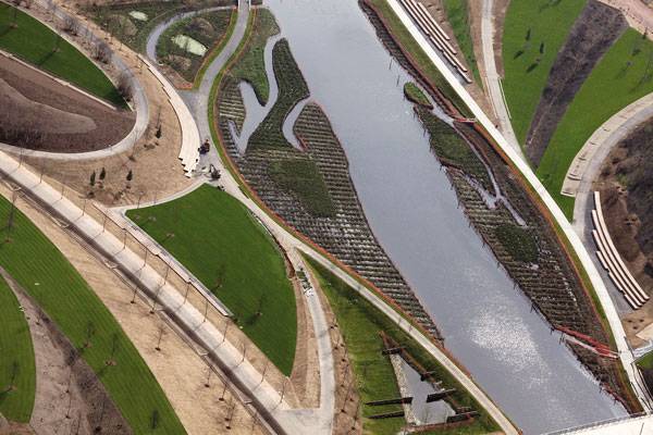
Image courtesy of the Queen Elizabeth Olympic Park London Legacy Corporation
Queen Elizabeth Olympic Park
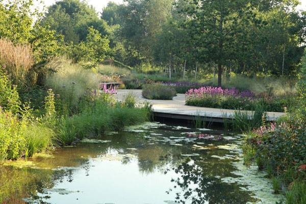
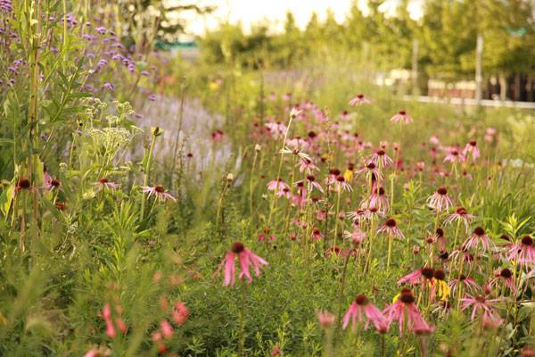
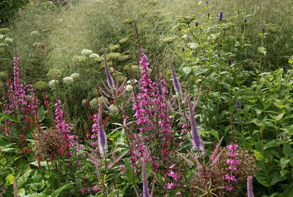
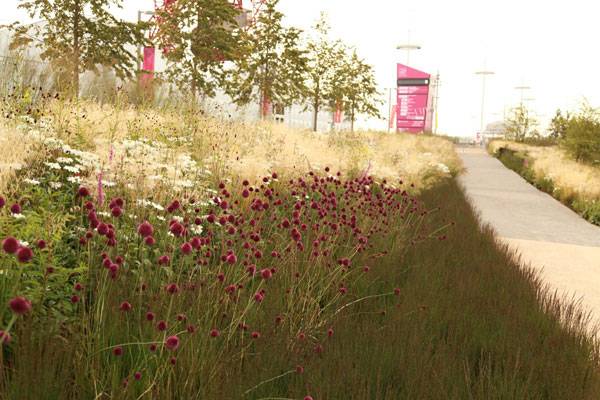
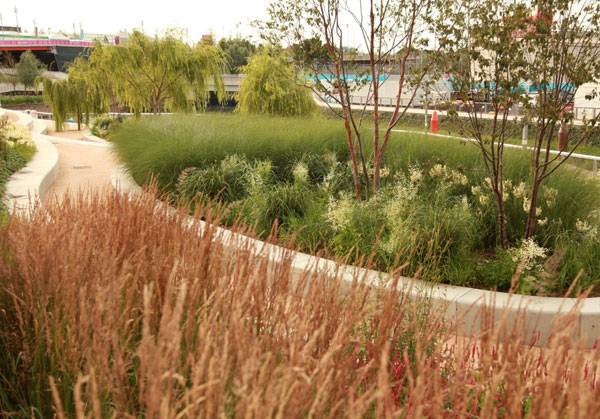
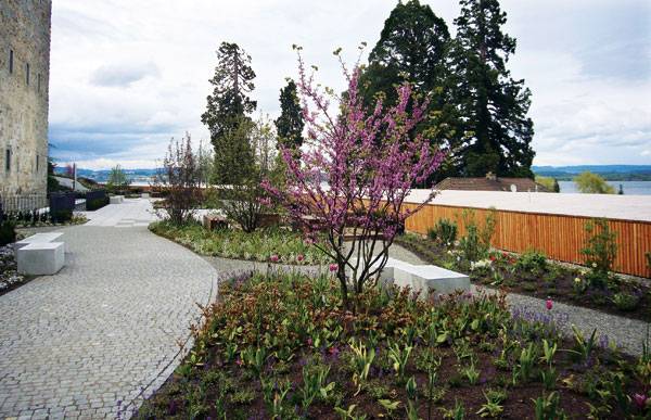
Here is a list of the top 5 features of the Olympic Park that also represent the biggest trends in sustainable planting design: 1. Native Wildflower Meadows Throughout the Park The vast fields of wildflower meadows that have been sown pre- and post- Games have been designed by Professors Nigel Dunnett and James Hitchmough of the department of landscape at the University of Sheffield, together with up-and-coming London designer, Sarah Price.
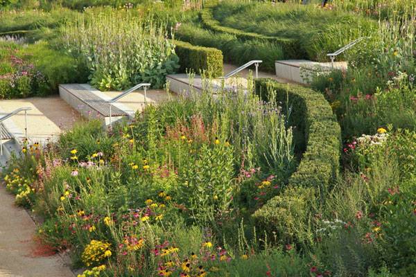
Queen Elizabeth Olympic Park London. Photo credit: Sarah Price
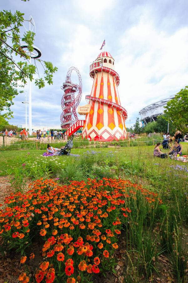
Image courtesy of the Queen Elizabeth Olympic Park London Legacy Corporation
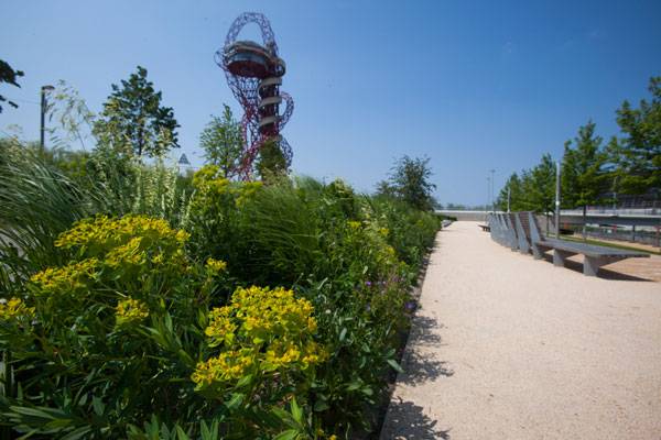
Image courtesy of the Queen Elizabeth Olympic Park London Legacy Corporation

Queen Elizabeth Olympic Park London. Photo credit: Sarah Price
Queen Elizabeth Olympic Park London. Photo credit: Sarah Price
Queen Elizabeth Olympic Park London. Photo credit: Sarah Price
Queen Elizabeth Olympic Park London. Photo credit: Sarah Price
Queen Elizabeth Olympic Park London. Photo credit: Sarah Price

Queen Elizabeth Olympic Park London. Photo credit: Sarah Price
Queen Elizabeth Olympic Park London. Photo credit: Sarah Price
Queen Elizabeth Olympic Park London. Photo credit: Sarah Price
Queen Elizabeth Olympic Park London. Photo credit: Sarah Price
Full Project Credits For Queen Elizabeth Olympic Park :
Project: Queen Elizabeth Olympic Park, Post Games Transformation Programme Landscape Architecture: LDA Design with Hargreaves Associates Partners & Planting Design: Sutton Vane Associates, University of Sheffield, Sarah Price, Piet Oudolf Location: Stratford, East London, United Kingdom Design: 2008 – 2014 Completion: 2014 and ongoing Area: 102 ha Cost: confidential Client: London Legacy Development Corporation Recommended Reading:
- Becoming an Urban Planner: A Guide to Careers in Planning and Urban Design by Michael Bayer
- Sustainable Urbanism: Urban Design With Nature by Douglas Farrs
Article by Andrea Kreuer

How This Artwork Provides a Holistic Sensory Experience
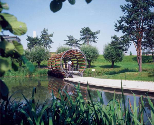
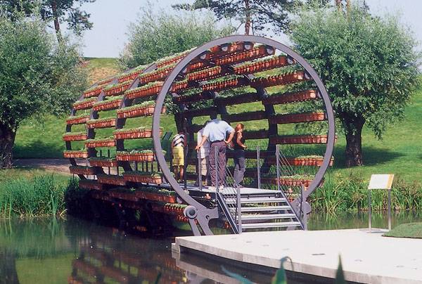
Article by Frank Bourque The holistic sensory experience of the Scent Tunnel, by Olafur Eliasson, in Autostadt Park, Austria There are many new and innovative art works that bring the best of the modern world. One of them is Olafur Eliason’s Scent Tunnel, a majestic experience and an artwork that happens every spring in Austria. As humans, we are born to see, breathe, enjoy and appreciate the beauty of life. When brought together, all of these senses can become a part of an eye-opening experience that feeds the soul and creates a pleasant emotion. Olafur Eliasson is a unique Austrian artist who sees art from another point of view. His unique masterpiece is named ‘The Scent Tunnel’ and refers to an art event happening each spring in the Autostadt Park in Austria. Contemporary and holistic, Olafur’s approach to art is tailored to each one of the human senses. The Scent Tunnel is a large construction that acts as a bridge across a little waterway between the Audi and Lamborghini Pavilions.
Scent Tunnel. © 2004 Olafur Eliasson
Holistic Sensory Experience
This art-in-motion leverages a cutting-edge technology and turns in a circular way, therefore overwhelming every art enthusiast with the constant motion, the picturesque flowers and most importantly, the unique and unforgettable scent that is the result of this rotation. That being said, ‘The Scent Tunnel’ is a form of art that triggers each of the senses and lets you dig deeper in the meaning of art, introducing its brand new form.
The Secret Message Behind The Scent Tunnel
The Scent Tunnel is not just a rotating tunnel full of flowers and elements of nature. Its main focus, as the name suggests, is to capture the nose of visitors and overwhelms them with fresh, unique and sensory smells. The entire model is built by Olafur Eliasson as a new form of art, which is more than just art. First and foremost, the tunnel is powered via a rotating technology giving the carefully picked plants a unique smell while they are moving and resulting with an eye opening experience for every visitor.
Scent Tunnel. © 2004 Olafur Eliasson

Scent Tunnel. © 2004 Olafur Eliasson

Scent Tunnel. © 2004 Olafur Eliasson
A Final Word on this Holistic Sensory Experience
Artists have always been trapped inside their creative mindset. Only a few of them have managed to ‘escape’ from it and show the world why their vision is worth it. Olafur Eliasson is definitely one of them an artist that has transformed his fascination of the sensory perceptions and blended it within a park. More importantly, with The Scent Tunnel,Olafur shows us how simultaneous and dependant on nature and technology artworks can be. By stepping out of your comfort zone just like Olafur did, you are welcomed to Austria to experience this mind-blowing art and balance your senses while enjoying the bridge of art and architecture.

Scent Tunnel. © 2004 Olafur Eliasson
Full Project Credits For the Scent Tunnel :
Project Name: Scent Tunnel Designer: Olafur Eliasson Location: Autostadt Park, Austria Date of Construction: 2004 Client: Autostadt GmbH Recommended Reading:
- Becoming an Urban Planner: A Guide to Careers in Planning and Urban Design by Michael Bayer
- Sustainable Urbanism: Urban Design With Nature by Douglas Farrs
Article by Frank Bourque


How to Change a City with a Competition Entry
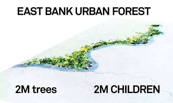
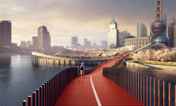
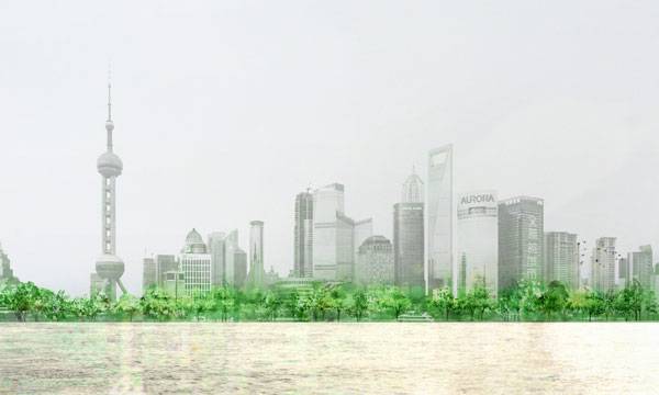
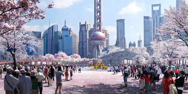
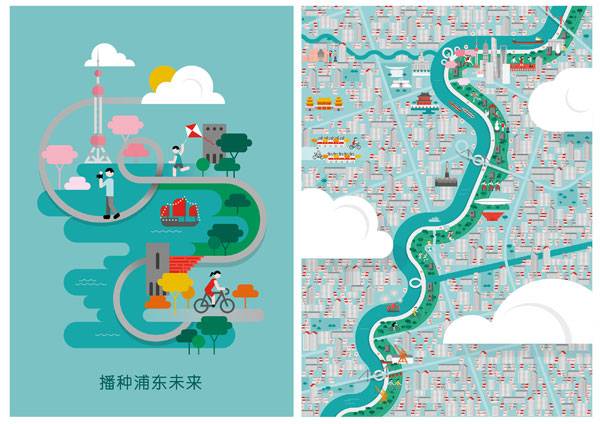
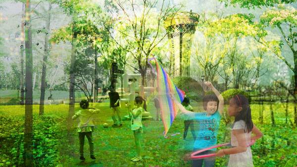
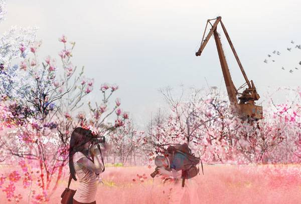
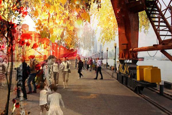
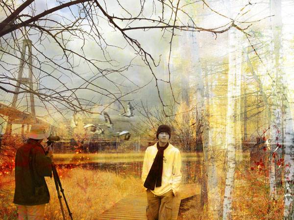
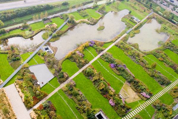
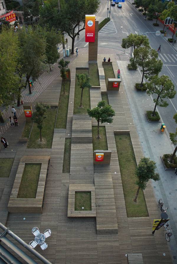
Article by Rose Buchanan Huangpu East Bank Urban Forest, design for the Shanghai Waterfront Design Competition, by HASSELL Studio in Shanghai, China Design competitions are often risky things for companies to take on. They involve a large amount of unpaid resources, tight deadlines, and design processes that forgo the useful stages of work input. One might argue then that competitions are simply not worth the time, effort, and money. This may be true, but within that tiresome work often emerges some of the most brilliant and groundbreaking ideas. Without the usual restraint of client demands and budget, designers have the freedom to think laterally, solving numerous small- and large-scale design problems. The world of landscape architect has particularly benefited from design competitions, and many of the greatest projects have been the result of this approach. WATCH >>> Huangpu East Bank Urban Forest
Huangpu East Bank Urban Forest
Recently, a competition was held to re-design 21 kilometers of the East Bund area next to the Huangpu River in Shanghai, China. The brief for this project was to unlock the potential of the riverfront land while providing Shanghai with a new city identity, symbolizing the creation of a contemporary world city.
Huangpu East Bank Urban Forest. Image credit: HASSELL
Huangpu East Bank Urban Forest. Image credit: HASSELL
Huangpu East Bank Urban Forest. Image credit: HASSELL – MIR
Huangpu East Bank Urban Forest. Image credit: HASSELL
Huangpu East Bank Urban Forest. Image credit: HASSELL – MIR
Huangpu East Bank Urban Forest. Image credit: HASSELL
Huangpu East Bank Urban Forest. Image credit: HASSELL
Huangpu East Bank Urban Forest. Image credit: HASSELL
Huangpu East Bank Urban Forest. Image credit: HASSELL
Huangpu East Bank Urban Forest. Image credit: HASSELL
Full Project Credits For Huangpu East Bank Urban Forest :
Project: Huangpu East Bank Urban Forest Location: Shanghai, China Client: East Bank Group Designer: HASSELL Collaborators: TTT Architects Scale: 21 km Year: 2016 Imagery: HASSELL, MIR, TTT Architects Recommended Reading:
- Becoming an Urban Planner: A Guide to Careers in Planning and Urban Design by Michael Bayer
- Sustainable Urbanism: Urban Design With Nature by Douglas Farrs
Article by Rose Buchanan

10 of the Best Urban Design Degree Programs from Around the World
Article by Maria Giovanna Drago We search and explore the best Urban Design degree programs from around the world. Urban design is always a hot-button topic. We often hear discussions about overpopulation, sustainability, urban connection, and social spaces. People want to know more about cities and designed urban spaces, and the number of students who aim to become urban designers continues to increase. To make it easier for young people embarking on their careers, we have looked into 10 of the most prestigious universities in the world to see what they have to offer in Urban Design Degree Programs. (A selection of pictures were chosen to highlight projects in the countries represented by these degree programs. For further information on any of them, just click the image).
The Best Urban Design Degree Programs
1. Tsinghua University, Beijing, China Are you interested in global development and computer technologies matched with Oriental design? THU’s two-year master’s degree program in urban and rural planning provides deep, practical experience in computer technologies, GIS, and other innovative systems. The THU campus is one of the most beautiful in the world, according to a 2010 Forbes interview of architects and designers. The area is the former site of the Qing Dynasty Royal Gardens, so it is characterized by a Chinese style of landscaping, with brooklets and traditional buildings, together with more modern, Western-American style elements.
Photo Credit: Vanke Daxing Retail and Leisure Centre, by SPARK and BAN Landscape, Beijing, China
One Island East. Image courtesy of Hargreaves Associates
The development of the village centre in Innichen, Italy. Photo courtesy of Alles Wird Gut
Waterplein Benthemplein. Photo courtesy of De Urbanisten
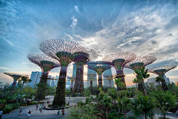
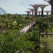
Gardens by the Bay by Grant Associates
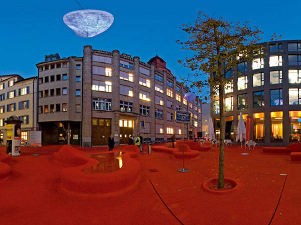
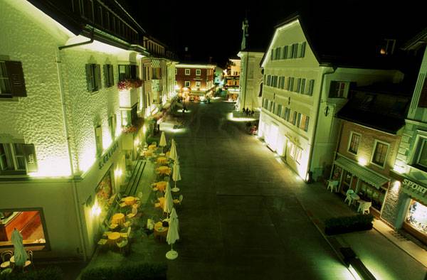
Photo Credit: Stadtlounge, St Gallen, Switzerland, by Carlos Martinez Architekten and Pipilotti Rist
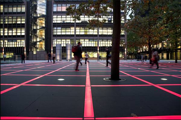
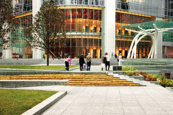
Finsbury Avenue Square. Photo by Lewis Foti
Philadelphia Navy Yards – Central Green. Credit: © James Corner Field Operations
University of California San Francisco Regional Medical Center. Photo Credit: Tom Fox
Aerial view of Shoemaker Green. Photo credit B. Doherty Photography
Urban Design Degree Programs
This list is just a brief introduction to the world of planning and design on the urban and territorial scale. Could you ever imagine all the factors an urban designer might have to deal with? Fast-growing cities, new technologies, periphery challenges — these are all points of view and aspects that every university will guide you to discover. Dare to face those challenges with intellect and creativity. Which Urban Design degree programs would you recommend ?
Recommended Reading:
- Becoming an Urban Planner: A Guide to Careers in Planning and Urban Design by Michael Bayer
- Sustainable Urbanism: Urban Design With Nature by Douglas Farrs
Article by Maria Giovanna Drago


How Did Flying Beetles Inspire the V&A Museum’s Courtyard?
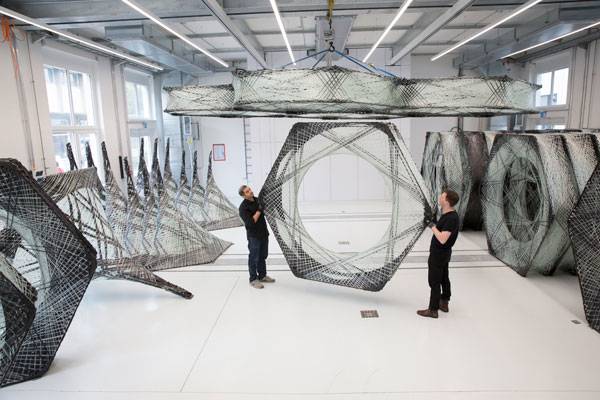
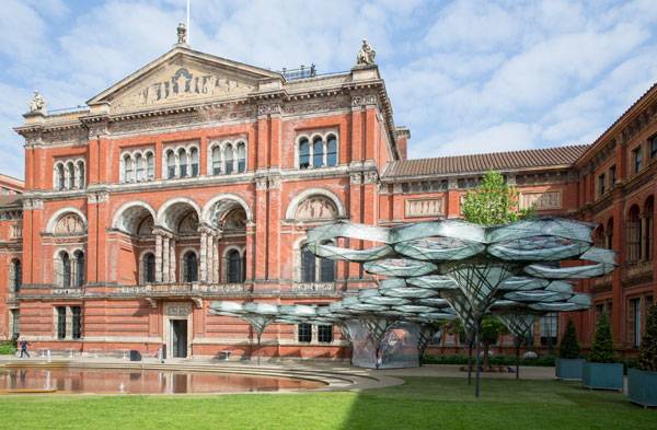
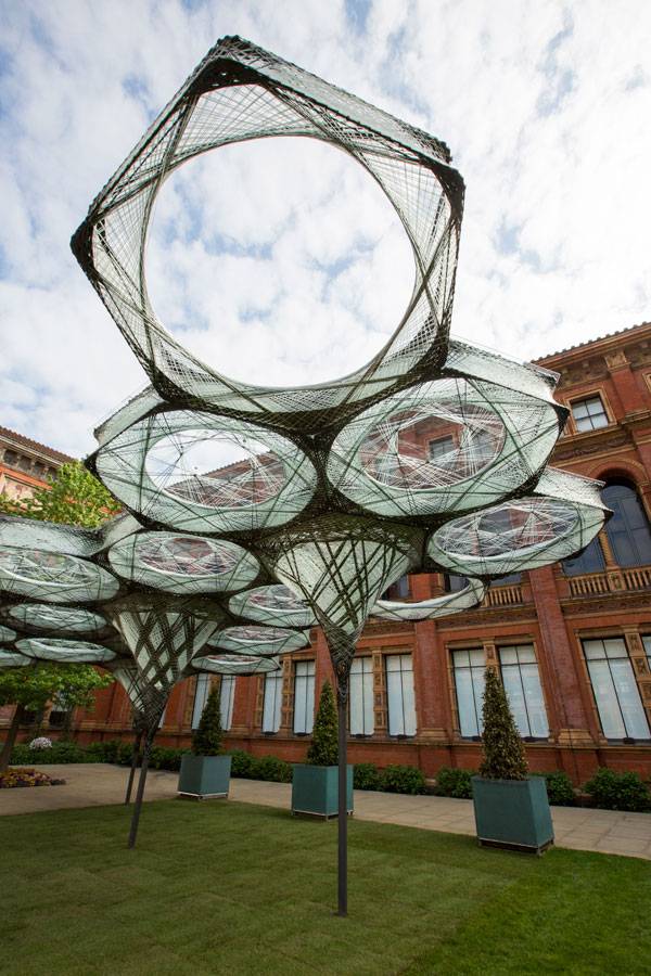
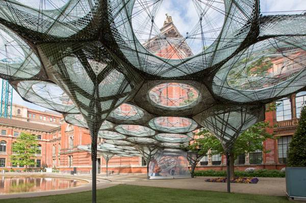
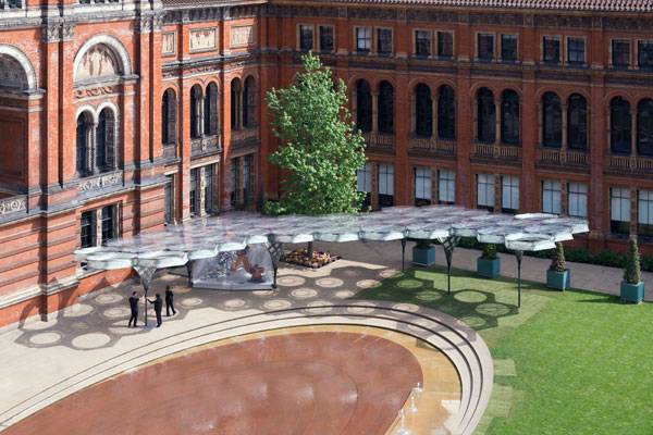
Article by Selen Öztürk Elytra Filament Pavilion, a collaborative project in Victoria and Albert Museum, John Madejski Garden, London, England, United Kingdom Elytra Filament Pavilion, a biomimetic installation by Achim Menges, Moritz Dörstelmann, Jan Knippers and Thomas Auer, in the Victoria and Albert Museum’s John Madejski Garden, London. Can nature contribute to architectural designs? As we look through Elytra Filament Pavilion’s design techniques, the answer is definitely: YES! The pavilion was designed by imitating the structure of the wings of flying beetles. But WHY? The practice of learning from nature is called biomimicry. In the Elytra Filament Pavilion, the construction of this biomimetic design is inspired by the fibrous structures of the fore-wing shells of flying beetles known as elytra. Also, this design is an example of how knowledge and innovation can be achieved on both technical and design levels. [read more=”Read more” less=”Read less”]
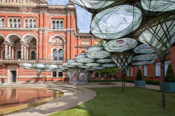
Elytra Filament Pavilion at the V&A Credit: Victoria and Albert Museum, London
Components that will make up Elytra Filament Pavilion (c) Victoria and Albert Museum, London
Elytra Filament Pavilion at the V&A. Credit: Victoria and Albert Museum, London
Elytra Filament Pavilion at the V&A. Credit: Victoria and Albert Museum, London
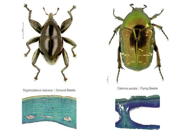
Comparison of internal elytron architecture in flying and flightless beetle. © Dr.Thomas van de Kamp, Prof. Dr. Hartmut Greven
Elytra Filament Pavilion at the V&A. Credit: Victoria and Albert Museum, London
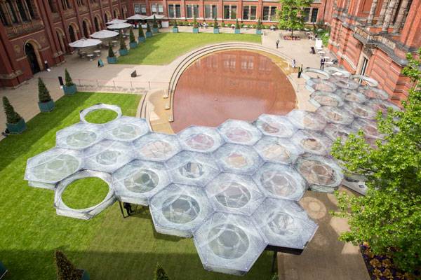
Elytra Filament Pavilion at the V&A
Credit: Victoria and Albert Museum, London
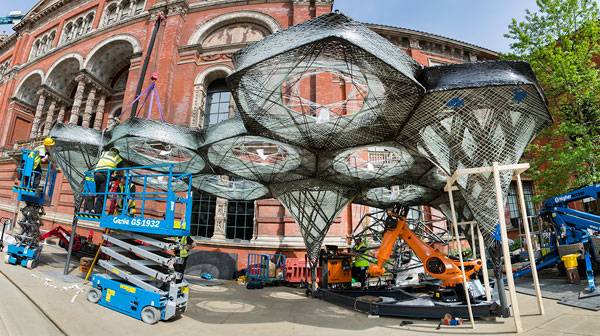
Elytra Filament Pavilion construction (c) Victoria and Albert Museum, London
Would you like to visit and be a part of this evolutionary process?
Elytra Filament Pavilion at the V&A. (c) NAARO
Full Project Credits For Elytra Filament Pavilion :
Project: Elytra Filament Pavilion Location: Victoria and Albert Museum, John Madejski Garden, London Created by: Achim Menges, Moritz Dörstelmann, Jan Knippers and Thomas Auer, in the Victoria and Albert Museum’s John Madejski Garden Construction Completion: 2016 Project Area: 200 square-meter Recommended Reading:
- Becoming an Urban Planner: A Guide to Careers in Planning and Urban Design by Michael Bayer
- Sustainable Urbanism: Urban Design With Nature by Douglas Farrs
Article by Selen Öztürk[/read]

Residential Complex Explores the Concept of Shared Open Space
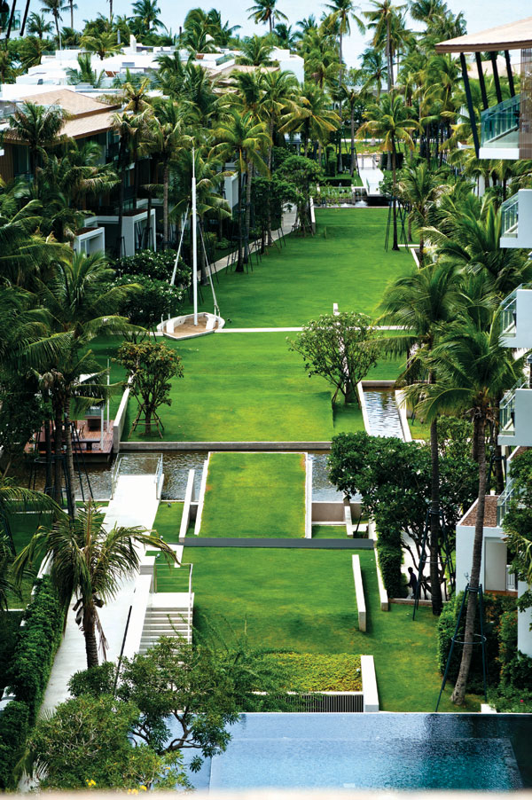
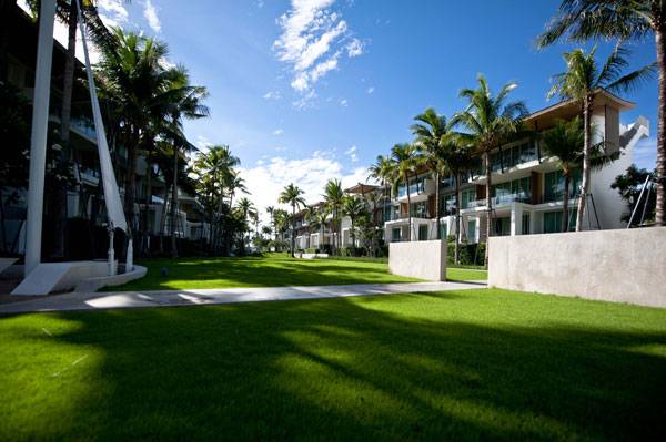
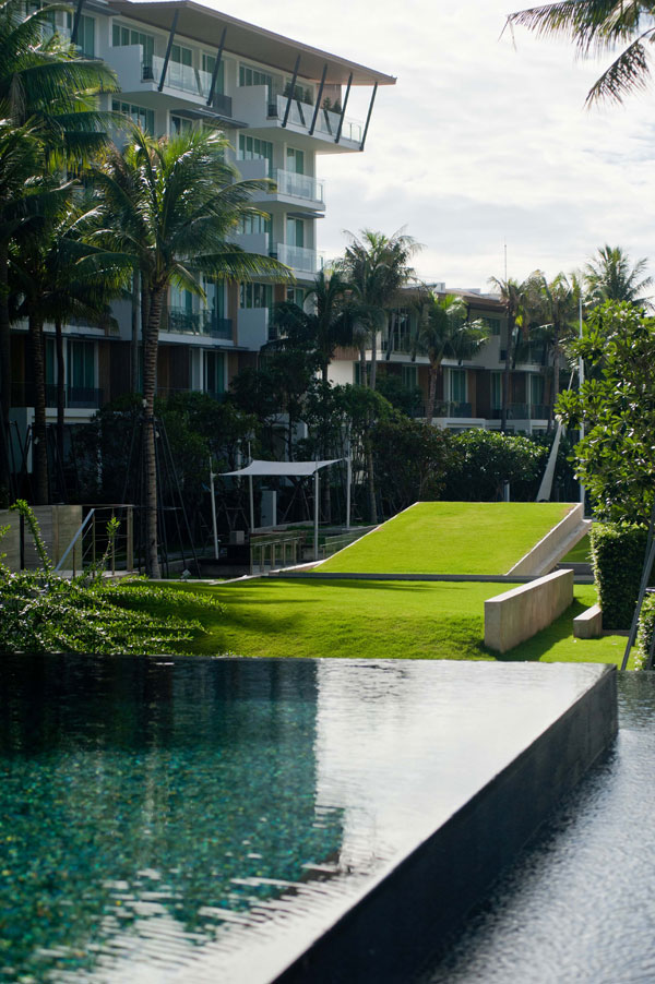
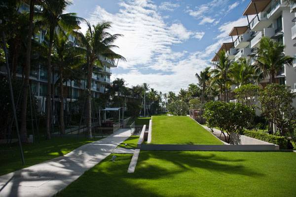
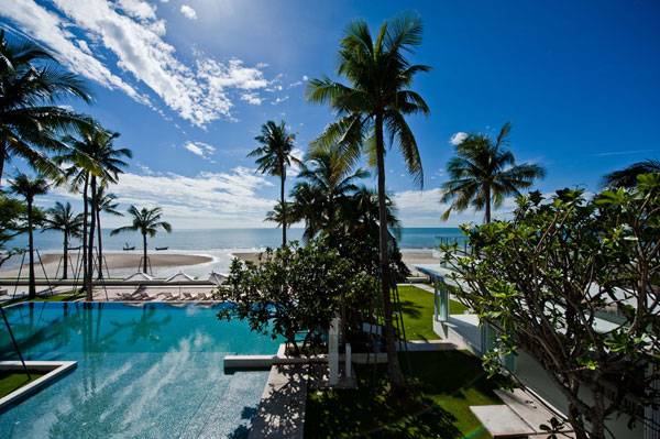
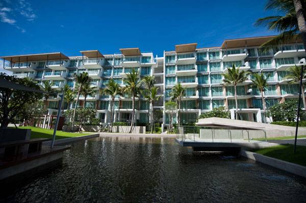
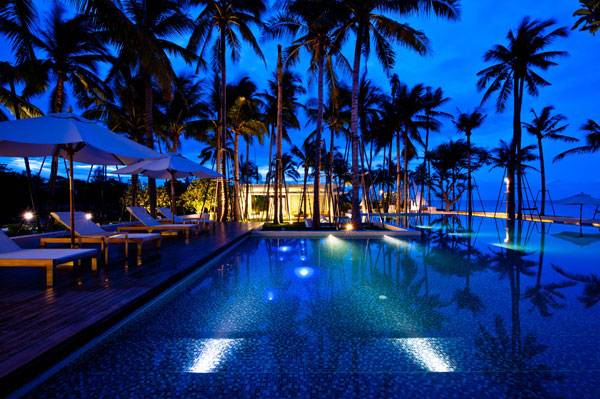
Article by Pooja Wahane A review of the shared open space under the project name of Ocas at Hua Hin, by Landscape Architects 49 Limited, in Hua Hin, Prachuap Khiri Khan, Thailand. Located in the beach resort town of Hua Hin, the Ocas condominium complex is spread over a sprawling 6.8 acres, revealing something previously unseen every time you look. Ocas has been worked into a unique space that maintains its own value. It has the highest percentage of common-use grounds per unit in all of Hua-Hin. Taking a stroll through this luxurious complex is like walking into a dream, with its infinity-edged swimming pool, lush green landscapes leading to the stunning beachfront, and absolute privacy. The Unique Concept of Private Vacation Villas Ocas is a three-story condominium complex comprised of tenant-owned, luxury vacation villas. Extended over a linear land shape, the complex is divided into two parts by mulit-leveled, landscaped green areas and a spectacular, infinity-edged pool that is the magnum opus of the design.
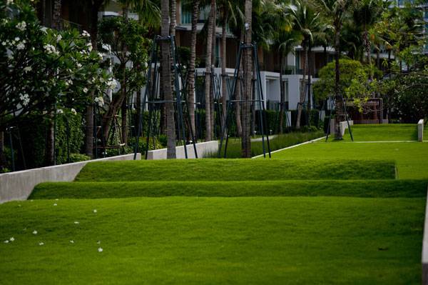
Ocas at Hua Hin. Photo credit: Krisada Boonchaleow
Ocas at Hua Hin. Photo credit: Krisada Boonchaleow
Ocas at Hua Hin. Photo credit: Krisada Boonchaleow
Ocas at Hua Hin. Photo credit: Krisada Boonchaleow
Ocas at Hua Hin. Photo credit: Krisada Boonchaleow
Ocas at Hua Hin. Photo credit: Krisada Boonchaleow
Ocas at Hua Hin. Photo credit: Krisada Boonchaleow

Ocas at Hua Hin. Photo credit: Krisada Boonchaleow
Ocas at Hua Hin. Photo credit: Krisada Boonchaleow

Ocas at Hua Hin. Photo credit: Krisada Boonchaleow
WATCH >>> Walk Through Animation @ OCAS HunHin
Full Project Credits For Ocas at Hua Hin :
Project Name: Ocas at Hua Hin Location: Hua Hin, Prachuap Khiri Khan, Thailand Site Area: 27,600 square meters Completion: 2012 Client & Developer: Land & Houses Public Company Limited Landscape Architect: Landscape Architects 49 Limited Design Director: Arrak Ouiyamaphan Landscape Architect: Suttida Tharanatham Architect: Plan Studio Co., Ltd. Photographer: L49, Krisada Boonchaleow Recommended Reading:
- Becoming an Urban Planner: A Guide to Careers in Planning and Urban Design by Michael Bayer
- Sustainable Urbanism: Urban Design With Nature by Douglas Farrs
Article by Pooja Wahane

How Darling Quarter is Unifying the City of Sydney
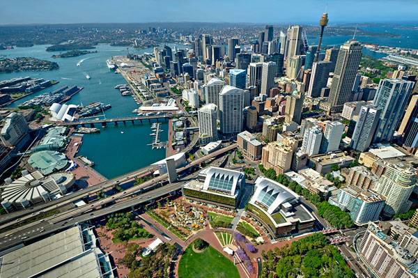
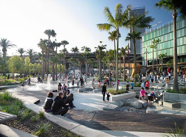
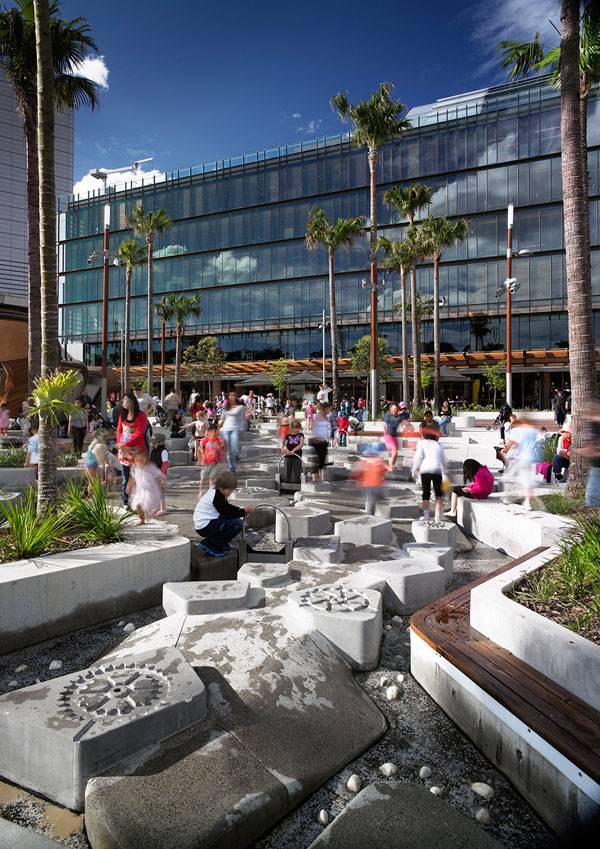
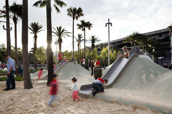
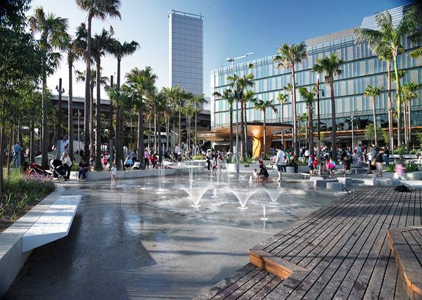
Article by Nour Adel Darling Quarter, Sydney, NSW, Australia, by ASPECT Studios, in Sydney, NSW, Australia ASPECT Studios has completed a transformation of the public domain of Darling Harbour South, one of Australia’s most visited destinations. This public domain project now known as Darling Quarter was commissioned by the Sydney Harbour Foreshore Authority (SHFA) and Lend Lease. It is a major 1.5 hectare place-making project for Sydney with a retail terrace, public park, two 6-star commercial buildings and an innovative children’s playground which acts as its centrepiece. At over 4000m2, the playground is the largest in the Sydney Central Business District and with its interactive water play facilities, this civic space has become a regional attraction for Sydney. “The time is not far off when companies will have to justify their worth to society, with greater emphasis placed on environmental and social impacts than straight economics.” –Dick Dusseldorp, Lend Lease Founder, 1997
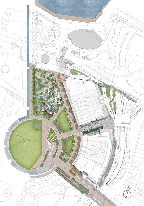
Darling Quarter Masterplan. Image courtesy of ASPECT Studios
Darling Quarter
ASPECT Studios’ Darling Quarter does not only create a huge public space and gigantic interactive playground, it plays a huge role in giving back to its community and demonstrates corporate social responsibility within an urban design scale, which is becoming highly necessary in the last few years, along with the goal of creating sustainable cities. Darling Quarter sets a new standard for achieving economic and social sustainability whilst becoming an easily accessible and simple-to-reach destination for people coming from any part of the city.
Darling Quarter. Photo credit: ASPECT Studios
Darling Quarter. Photo credit: Florian Groehn
Darling Quarter. Photo credit: Florian Groehn
Darling Quarter. Photo credit: Florian Groehn
Darling Quarter. Photo credit: Florian Groehn
Darling Quarter. Photo credit: Florian Groehn
Darling Quarter. Photo credit: Florian Groehn
Darling Quarter. Photo credit: Florian Groehn
Full Project Credits For Darling Quarter :
Project Name: Darling Quarter Project Location: Darling Harbour, Sydney, NSW, Australia Client: Lend Lease and Sydney Harbour Foreshore Authority Lead Consultant and Landscape Architect: ASPECT Studios Collaborators: FJMT, David Eager, Hyder, Waterforms International, Deuce Design, Speirs + Major, ARUP, SJB, Ramus Illumination, Lend Lease Design Photography: Florian Groehn, Hamish Ta-Me, John Marmaras Completion Date: 2011 Area size: 15,000 m² Awards: 2013 National Architecture Awards – National Commendation for Urban Design 2013 CCAA Public Domain Awards – Precincts Commendation 2013 Australian Institute of Architects’ NSW Architecture Awards – The City of Sydney Lord Mayor’s Prize, The Lloyd Rees Award for Outstanding Urban Design 2013 Property Council of Australia Innovation and Excellence Awards – People’s Choice, Development of the Year 2012 IFLA APR Award for Landscape Architecture – President’s Award – Landscape Design category 2012 Banksia Environmental Awards – BUILT ENVIRONMENT 2012 Kidsafe National Playspace Design Awards Category of Public Playspaces Over $1M 2012 ULI Global Awards for Excellence 2012 Urban Taskforce Awards Best Commercial Development 2012 The Chicago Athenaeum Museum of Architecture and Design International Architecture Award 2012 Australia Award for Urban Design – Delivered Outcome – large scale category 2012 Parks and Leisure Australia NSW Award of Excellence – Winner of Parks 2012 Asia Pacific Property Awards – Asia Pacific – Best Leisure Development 2012 Asia Pacific Property Awards – Australian Region (Winner Five Star) – Leisure Development 2012 Asia Pacific Property Awards – Australian Region (Winner Five Star) – Mixed Use Development 2011 CIBSE Commissioning Project of the Year 2011 AILA NSW Awards – Excellence Award for Design 2011 The National Association of Women in Construction (NAWIC) Design Award Recommended Reading:
- Becoming an Urban Planner: A Guide to Careers in Planning and Urban Design by Michael Bayer
- Sustainable Urbanism: Urban Design With Nature by Douglas Farrs
Article by Nour Adel


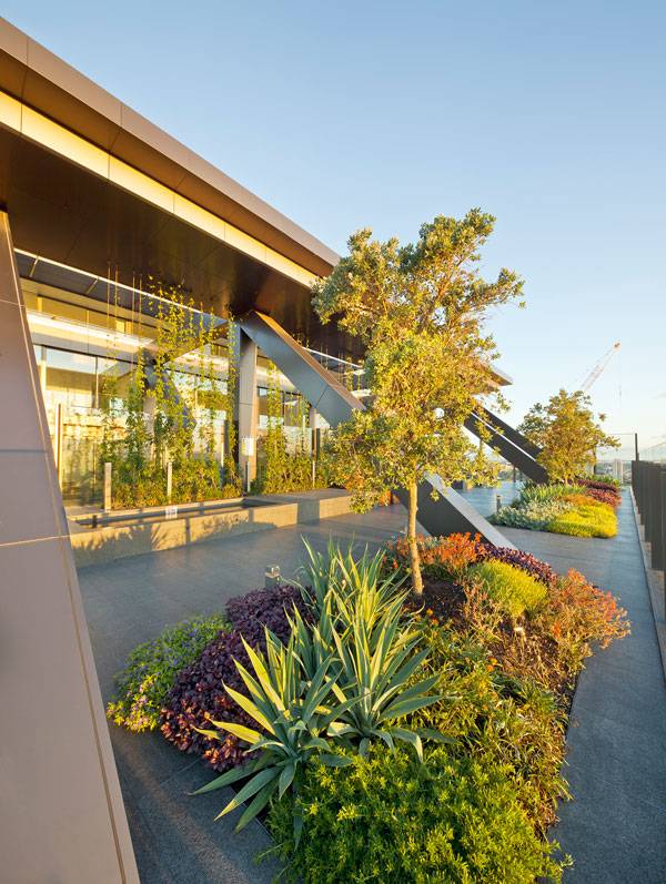
Green Roof Benefits – 20 Reasons to Have a Green Roof
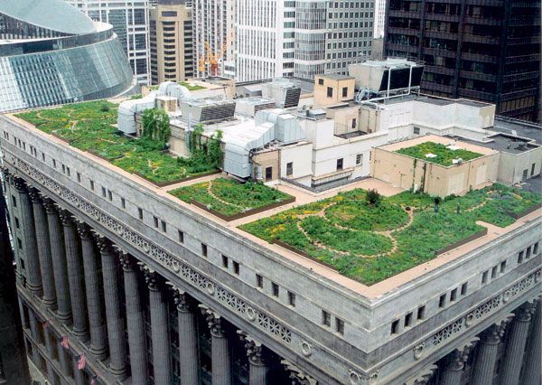
Article by Erisa Nesimi In this article we explore green roof benefits, looking at 20 reasons why you should have a green roof. If I am to define green roofs, I would like to describe them as: ‘tools to reinvent our cities’. Also known by the term “living roofs”, they stand for a counteraction to the fast urbanization of our cities. As a result of urbanization and technology, we are left with cities which are often non- enjoyable environments. Sometimes considered as a pile of concrete (concrete jungles), we have the duty to come up with ways to make our cities great again. Why green roofs? What are their benefits? I’m quite sure that a lot of you out there are very tired of hearing such a cliché phrase again and again; “we should have more green roofs”. Nevertheless, is this just a buzzword? Do green roofs help, and if yes, how? To download our eBook on Green Roof Construction join the Landscape Architects Network VIP Club by clicking HERE!
20 Green Roof Benefits
1. New Amenity Spaces Even if we do not consider the environmental benefits, green roofs will certainly re-create the lost connection we have with public space. Community gardens, recreational spaces, and places to meet and relax will improve the social life of people living nearby.

ASLA Green Roof. Image courtesy of Conservation Design Forum
Chicago Green Roof. Photo credit: Mark Farina
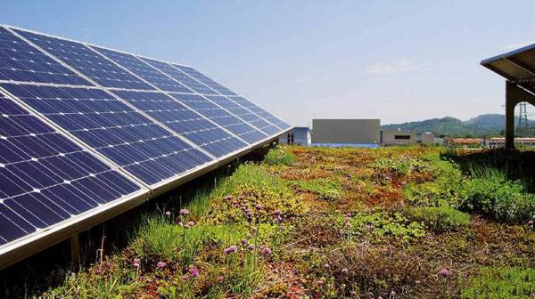
4. Improved Air Quality It is obvious that more green areas equals better air quality. The plants on green roofs can capture airborne pollutants as well as filter harmful gases. The temperature-moderating effects of green roofs can reduce demand on power plants, and potentially decrease the amount of CO2 being released into the air. 7. Improves Health and Well-being This is both in terms of physical and psychological health. Plants and green areas mitigate air and water pollution whilst in psychological aspects, they can serve as community hubs that increase social cohesion and public safety. WATCH >>> News Flash: Carlisle’s Roof Garden
8. Raising the Value of the Buildings A green roof can increase a building’s marketability. They are an easily identifiable symbol of the green movement and can act as an incentive to those interested in the benefits offered by green roofs. Having a green roof raises the price of the properties in the real estate market. 9. Noise Reduction Green roofs have excellent noise reduction properties. An extensive green roof can reduce sound from outside by 40 decibels, while an intensive one can reduce sound by 46-50 decibels (Peck et al. 1999).
Comturey-Keller green roof. Image courtesy of ZinCo
ARTICLE: A Roof Garden That’s so Good, You Might Want to Work There!. Credit: Van der Tol Hoveniers en terreininrichters bv.
12. Waste Diversion Green roofs can prolong the life of waterproofing membranes and even the service life of heating, ventilation, and HVAC systems. 14. Educational Whether built on educational facilities or regular buildings, they can provide a laboratory to teach students and visitors about biology, green roof technology, and green roof benefits in general. 15. Local Job Creation The growth of green roof market generates new job opportunities related to manufacturing, plant growth, design, installation, and maintenance.
One Central Park, by ASPECT | OCULUS. Photo credit: Simon Wood
Inside image from Green Roof Construction: The Essential Guide. Image credit: ZinCo
What green roof benefits can you think of that weren’t on our list?
To download our eBook on Green Roof Construction join the Landscape Architects Network VIP Club by clicking HERE! Article by Erisa Nesimi


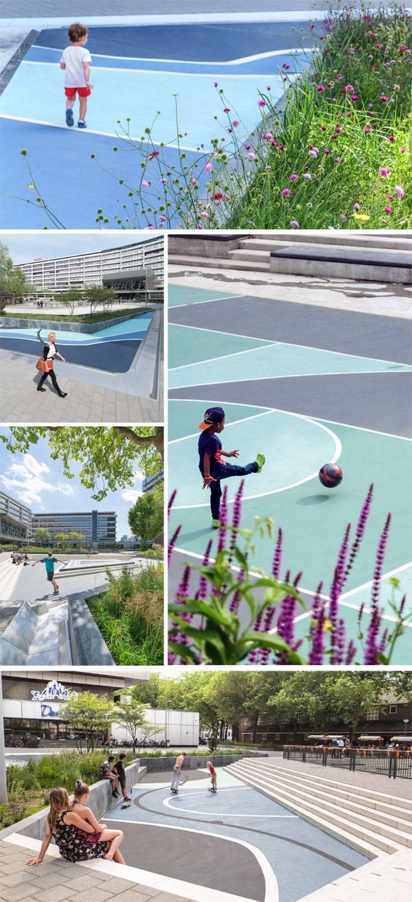
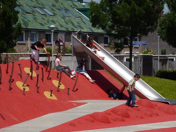
10 Projects that Show Us Amazing Ways to Design with Varying Levels
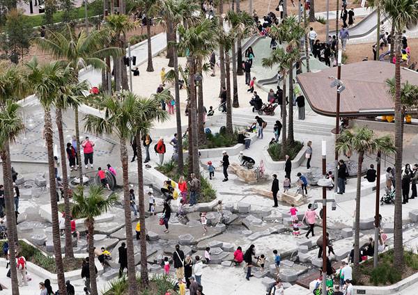
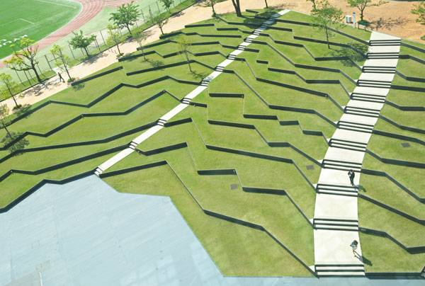
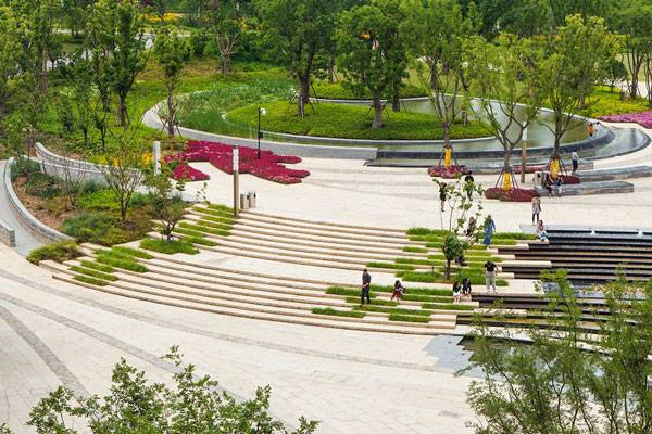
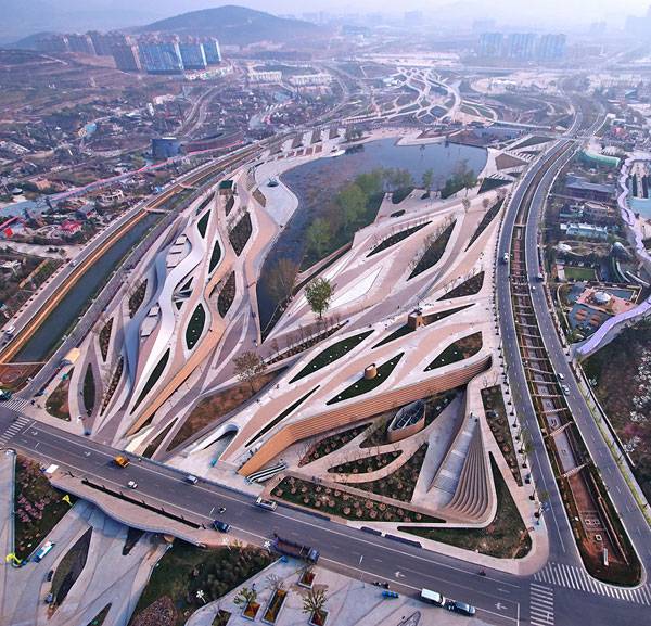
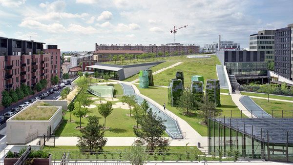
Article by Carlos Cortés Why is designing with varying levels a challenge for the user and the landscape architect? – 10 10 projects that show us how to design with varying levels. Playing with the varying levels of a landscape invites users to experience and discover what each point of the site has to offer. It promotes a more conscious visit of the place through its vistas, spots, and of course the overall big picture. Nonetheless, for designers and landscape architects, it’s a challenge to know when and how to play with levels. This is because every project is unique and responds to different conditions. Let’s take a look at 10 projects that show us amazing ways to design with varying levels. 10. Where the River Runs, by Penda, inside the 10th China International Garden Expo, Wuhan, Beijing, China Where the River Runs by Penda is a beautiful conceptual project with a lot of meaning. The designers evoked the path of a river to make people more conscious of the importance of clean water. This path has been created with wildflowers, grass, and lawns, but it also features different heights that fit incredible well into the landscape as soft hills and valleys. People can experience this landscape in various ways, including at the path level or on the grassland above the canyon. It is a very fun place to visit and relax while reflecting on our environment.
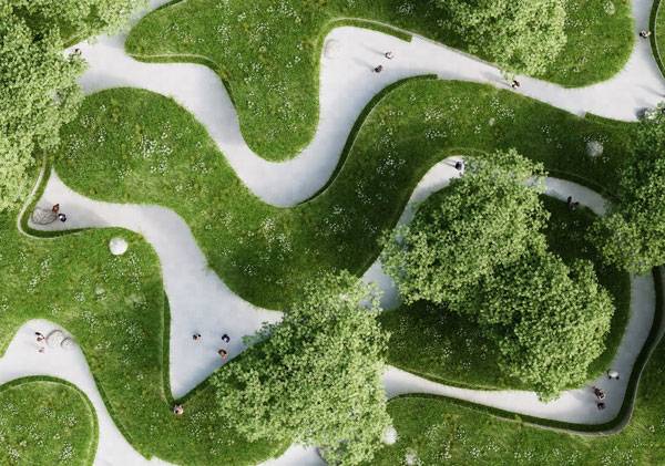
Where the rivers runs. Image courtesy of Penda
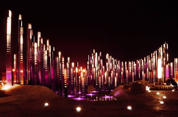
The Soundwave. Photo credit: Xia Zhi
Amphitheater at Kyushu Sangyo University. Image courtesy of DESIGN NETWORK +ASSOCIATES
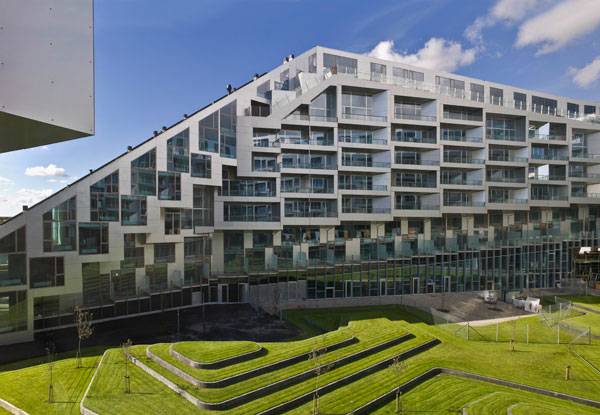
8 House. Photo credit: Jens Lindhe
This photo captures how the landscape design curves and moves up and down in coordination with the land and how it is layered, geometrically, in a pleasing manner for the user. Photo credit: Johnson Lin
Earthly Pond Service Center of International Horticultural Exposition 2014, by HHD-FUN. Photo credit: DuoCai Photograph
One Island East. Image courtesy of Hargreaves Associates
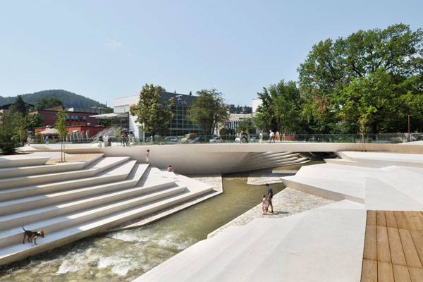
Velenje City Center Pedestrian Zone Promenada. Photo credit: Miran Kambič
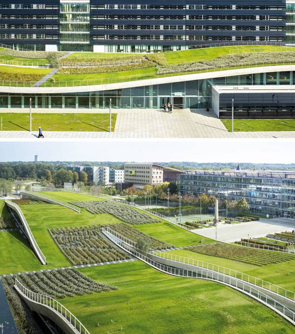
Espace Bienvenüe: Paris Est. Scientific and Technical Pole. Photo credit: Sergio Grazia
Vache Noire. ©agenceter- Yves Marchand & Romain Meffre photographers
Design with Varying Levels
Can we play with varying levels more often? From parks, neighborhoods, rivers, and plazas, we have seen how playing with different heights can be done on almost any project. It can be featured on the furniture, be the very own topography of the place, or even the roof like in Espace Bienvenüe. Landscape architects use this to add fun to their designs and economy for the projects. As a user, I love to experience different heights at a place. Do you know any other landscape architecture with varying levels? Let us know in the comments.
Recommended Reading:
- Becoming an Urban Planner: A Guide to Careers in Planning and Urban Design by Michael Bayer
- Sustainable Urbanism: Urban Design With Nature by Douglas Farrs
Article by Carlos Cortés

How to Transform a Historic Courtyard into a Useable Space for the 21st Century
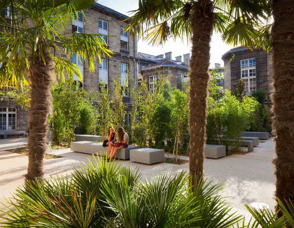
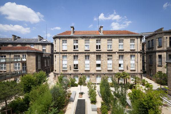
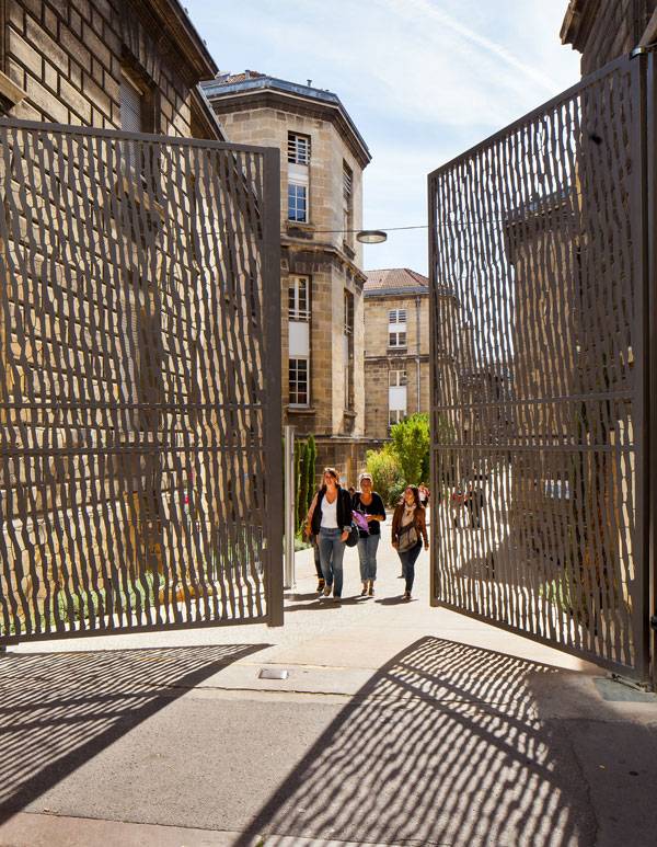
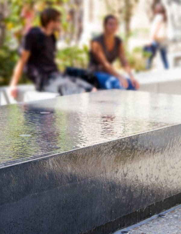
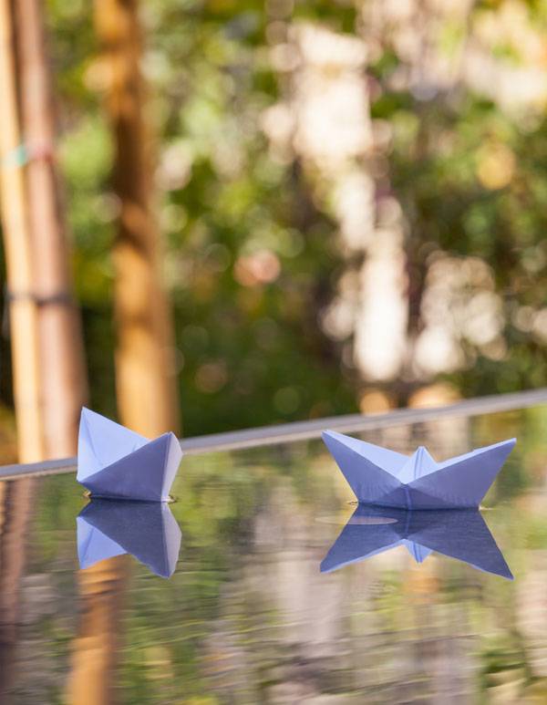
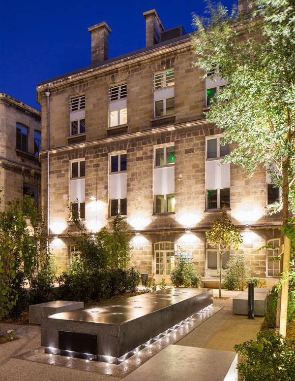
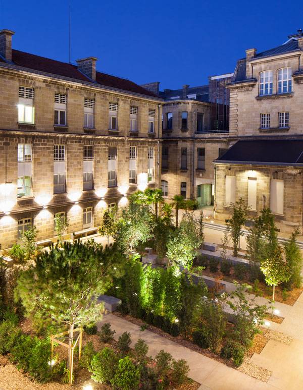
Article by Moreira Filho Leyteire Courtyard Project, “Opération Campus” at Victorie Campus of Bordeaux University, France, by Debarre Duplantiers Associés Architects, Landscape Architects and Urban Designers. An iron gate opens at Bordeaux University, inviting entrance, offering pieces of green and benches for sitting. Inside the campus, you may notice how important and special this place is: islands of heat – so commons nowadays – are relieved by the freshness of this courtyard. Leyteire Courtyard takes place at “Opération Campus” at Victorie Campus of Bordeaux University, France, in a big block among Leyteire, Broca, Candale and Gintrac streets, in front of Victorie’s Square. This picturesque plaza in the historical Bordeaux downtown deserves a design like Debarre Duplantiers Associés Architects, Landscape Architects and Urban Designers had amazingly worked out in the project called Leyteire Courtyard Project. In the past, this courtyard was used for the circulation of students and furthermore, used to be the place for deliveries of goods to the Campus. You would probably find there some rubbishes bins, boxes of food, delivery bicycles and cars mixed with students. However, the localization of this Campus is very strategic and of course, had to have another use, as Debarre Duplantiers Associés Architects well observed. Victorie Campus was founded in front of the Victorie’ Square, a very important plaza in Bordeaux.
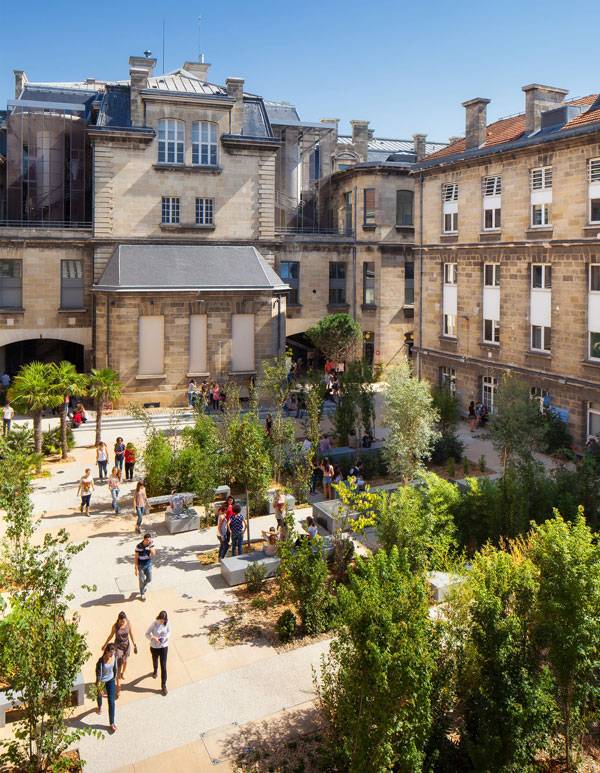
Leyteire Courtyard. Photo Credit: Arthur Péquin
Leyteire Courtyard Project
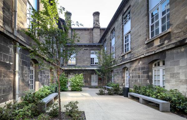
Why not Open this Place to the City? Universities always have social functions, right? So, why not open it to the citizens in general? This is what you may think when you design a landscape like that. Taking advantage of the location, social function, and history of the space, matching them with contemporary design is the objective that the project must reach. In fact, the project starts with this job of the circulation of people and deliveries through the maze of buildings formed from university buildings, an anthropological museum and an amphitheater. From this point, Debarre Duplantiers Associés Architects divided the courtyard into four kinds of environments, one for the circulation of people, one small one for the deliveries, another for the meeting of groups and at last, one for intimacy or an isolated ambiance.
Leyteire Courtyard. Photo Credit: Arthur Péquin
Leyteire Courtyard. Photo Credit: Yohan Zerdoun
Leyteire Courtyard. Photo Credit: Yohan Zerdoun
Leyteire Courtyard. Photo Credit: Arthur Péquin
Leyteire Courtyard. Photo Credit: Arthur Péquin
Leyteire Courtyard. Photo Credit: Arthur Péquin
Leyteire Courtyard. Photo Credit: Arthur Péquin
Leyteire Courtyard. Photo Credit: Arthur Péquin
Leyteire Courtyard. Photo Credit: Arthur Péquin
Full Project Credits For Leyteire Courtyard:
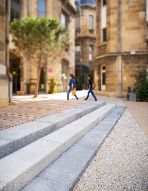
Project Name: Project: Leyteire Courtyard – “Opération Campus” Client: Bordeaux University Architects: Anouk Debarre landscape architect, Martin Duplantier architect, Yon Anton Olano light design Completion: 2012 Area: 1 900 sqm of concrete, 450 sqm of green area Construction Cost: 0,9 M€ – “Opération Campus” – Address: Rue Leyteire / Rue Broca, Victor Segalen University – Bordeaux Brief: exterior spaces Client: Bordeaux University Architects: Anouk Debarre landscape architect, Martin Duplantier architect, Yon Anton Olano light design Completion: 2012 Area: 1 900 sqm of concrete, 450 sqm of green area Vegetation: Judea trees, camellia, chamaerops Humilis, arbours, choisya ternata, cornus – kousa Construction: grounds in poured-in-place concrete. Pre-cast concrete furniture. Materials: grounds in coloured concrete, with either broomed or desactivated finish with a 3cm stone mix. Wooden stage and steps in limestone. Grey concrete furniture. Water table in dark grey polished concrete. Construction Cost: 0,9 M€ Recommended Reading:
- Becoming an Urban Planner: A Guide to Careers in Planning and Urban Design by Michael Bayer
- Sustainable Urbanism: Urban Design With Nature by Douglas Farrs
Article by Moreira Filho

Design Like You Care: 10 of the Best People-Oriented Designs
Article by Erisa Nesimi We explore 10 projects that were made successful by their focus on being people-oriented designs. Design is a discipline that, regardless of its subject, is closely related to people, because they are at the end of the chain. Designs that listen to the end users are being implemented in projects all over the world and have been very successful. I strongly think that they are the key to better living conditions and healthier lives. Therefore, I want to share with you some great examples of landscape designs that focus on people’s needs, raising awareness on social sustainability. As Jan Gehl, an important figure in urban design, has stated: “Only architecture that considers human scale and interactions is successful architecture.”
People-Oriented Designs
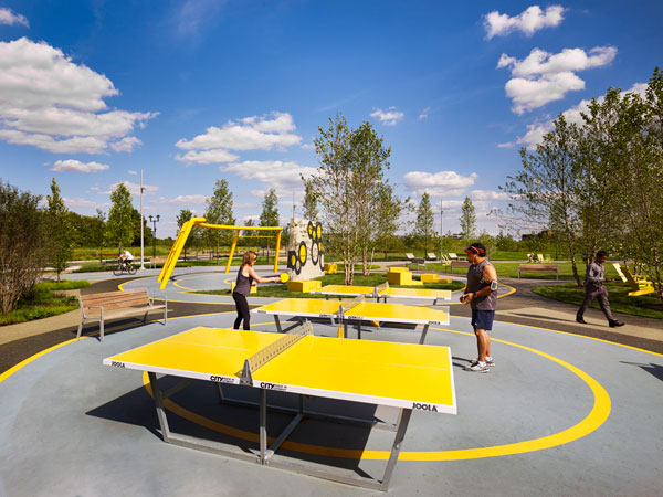
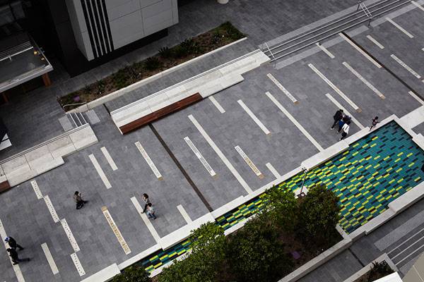
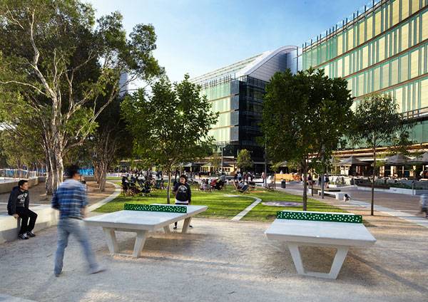
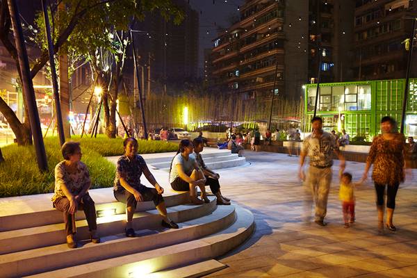
Here are 10 of the best examples of designs that empower people: 1. Design to Enhance Activity — A’beckett Urban Square Since the Situationist movements of the 1960s, which proclaimed the importance of design as a tool against the apathy that people are often thrown into, designing to support the opportunities of moments in life has come into focus. A’beckett Urban Square in RMIT, Melbourne, Australia, is a wonderful example of how a space — no matter how small in scale — can accommodate dynamical social interactions and be a design of experiences. The key is in the small features of urban furniture, such as various sport facilities, which generate a stronger relationship between users and the space.

A’beckett Urban Square. Above: Before image, courtesy of Peter Elliott Pty Ltd Architecture + Urban Design. Below: After image (Not at the same angle as above image) Photo credit: John Gollings
Kic Park. Photo credit: Shen Qiang
Van Campenvaart. Image courtesy of Carve
The upper terrace. Image courtesy of Colwell Shelor + West 8 + Weddle Gilmore
Vanke Chongqing Xijiu Plaza. Photo credit: ASPECT Studios
The Playgarden, by The Pattie Group of Novelty, in Stan Hywet Hall & Gardens, Ohio. Photo credit: Ann Norman

A landscape acting as an example in our article about designing crime our of landscape architecture. Plaza de la Luna by Brut Deluxe and Ben Busche Architects.
C-Mine-Genk. Photo credit: Pieter Kers.
Amphitheater at Kyushu Sangyo University. Image courtesy of DESIGN NETWORK +ASSOCIATES
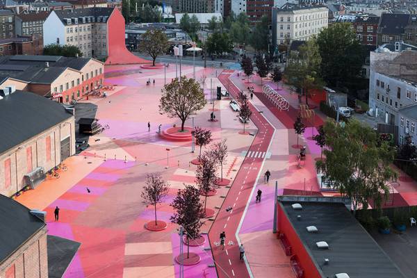
Pedestrian friendly street. “Creative Commons BIG – Bjarke Ingels Group – SUK – Superkilen Park, Copenhagen, Denmark”. Source Forgemind ArchiMedia, licensed under CC 2.0
Recommended Reading:
- Becoming an Urban Planner: A Guide to Careers in Planning and Urban Design by Michael Bayer
- Sustainable Urbanism: Urban Design With Nature by Douglas Farrs
Article by Erisa Nesimi


10 Awesome YouTube Tutorials to Master Hand Rendering
Article by Farah Afza Jurekh We explore 10 awesome YouTube tutorials to master hand drawing. Hand drawings are simply the visual translation of the thoughts of our creative minds. In architecture, hand drawing is one of the most powerful and essential tools. The sketches and drawings of architects should be able to speak, obviously metaphorically; it means that they should be able to communicate with our clients. It must be a medium to express and convey our thoughts and ideas. Now, if you are a beginner, I will suggest that you read this wonderful article; The Complete Beginners Guide to Improving Your Hand Drawing by my colleague Carlos Cortés. For those who have already read this helpful article, assuming that you are now a pro in hand drawing, you need to give your masterpiece life which means I am talking about rendering. Renderings add lives to sketches. It is true that digital renderings are comparatively easier and less time-consuming, but the impression that hand renderings can make surpasses everything. In this article we will explore 10 YouTube tutorials to improve your skills in hand renderings. 1. Rendering by Adding People and Trees WATCH >>> Drawing in progress: How I sketch people
Suppose you have drawn a building. The form, the spatial quality, and everything may be nice. But, you will still feel an emptiness, the absence of something in your sketch. Now, try adding a few trees, bushes, a few people or the surrounding environment and see the magic! These few things will surely accentuate the liveliness of your sketches. This is because when we see drawings, we automatically try to relate that to our real world. And in reality, a building does not stand alone on a white canvas. In reality, it is surrounded by nature and its users. Thus, by adding trees, people, and the related surrounding elements, you can easily bring life to your sketches. Rendering with Different Media Rendering can be done with different media. The best part is that we get to choose whatever media we like and are comfortable with. So, it is actually fun to do. The commonly used media are pencils, pens, markers, water colors, oil colors and so on. 2. Basics for Ink Pens and Markers WATCH >>> Ink Pen Comparison for Sketching, Drawing, and Copic Marker Rendering
Before starting to render with pens and markers, we need to know what different types of pens and markers are available. The line weight of each pen varies significantly and so does its use. Hence, this tutorial is important to pick up the right pens to meet your style. 3. Rendering With Ink WATCH >>> Architectural Sketching – Day 06
A common drafting pen does wonders. This tutorial is very helpful for those trying to improve your skills with pen. With a few simple line strokes, the rendering is done over here. The tonal variation gives depth, adding a 3d effect to a sketch. All you need to know is how to hold the pen in the correct position, how to make your strokes bold. Remember, the strokes are very important in drawings! Strokes can easily differentiate an amateur from a pro. The bolder the strokes are, the more vivid and communicative the drawing will be. 4. Ink Texturing WATCH >>> Ink texturing – Architecture Daily Sketches
Well, rendering can be done by adding textures to your sketches. This is basically performing the hatch command of AutoCAD by hand. Of course it will be time consuming, but you need to be patient because it’s worth trying! All you need to do is to know about different types of textures for different materials. This type of rendering will be very informative, giving clear details of materiality in your design. And this can be a great technique especially for interior designers. 5. Rendering with Watercolorand Markers WATCH >>> 2 story building – Architectural sketching and rendering If you want to render your sketches with watercolors or markers, this video can really be very helpful. Watercolor is fun to do and the artistic look it gives to sketches is simply mind-blowing. But, I must say, to do these water color washes like a pro, takes a lot of practice. With markers, shadows can easily be defined which brings depth to sketches. Adding shadows will also make sketches more realistic. Markers are easy to use. You can easily turn your sketch into a colorful masterpiece. 6. Rendering with Ink and Watercolor WATCH >>> Pen, Ink speed demo by Joe Cartwright
7. Landscape Coloring Techniques WATCH >>> ASMR Landscape Coloring Techniques
Another awesome tutorial showing coloring techniques with markers. It is important to emphasize o the strokes while working with markers. To learn about it watch landscape coloring techniques 8. Rendering with Caligraphy pen or Waterbrush WATCH >>> watercolor architectural presentation
This is another type of media. The technique is intriguing. Calligraphy brushes create awesome watercolor effects. A light water wash can bring dramatic changes to your sketch! 9. Pencil Rendering WATCH >>> Architecture rough sketch drawing
If you are in love with black and white, pencils can do magic. Just like pens, variations in tones with pencils are great techniques with which to render your drawings. The sketchy effect that pencil rendering produces gives a casual look to your work which is artistic and at the same time very appealing. The technique of holding the pencils plays an important role in mastering your skills. 10. Combo of different media WATCH >>> Expresión Arquitectónica – Arq. Eloy Vera Lahaye
Well, this tutorial is a great example of how the use of different media like color pencils, color markers, and pen, along with the additions of people, trees and other natural settings can transform a simple drawing into a vibrant one. Well, I hope, following the tutorials, you will get to learn the techniques of hand rendering and will soon be a pro. Do comment in our comment section. We will love to hear about how you have improved your rendering skills!
Recommended Reading:
- Becoming an Urban Planner: A Guide to Careers in Planning and Urban Design by Michael Bayer
- Sustainable Urbanism: Urban Design With Nature by Douglas Farrs
Article by Farah Afza Jurekh