


Author: Land8: Landscape Architects Network

McBurney Lane Brings Back The Good Times to Downtown Langley
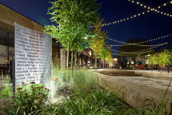
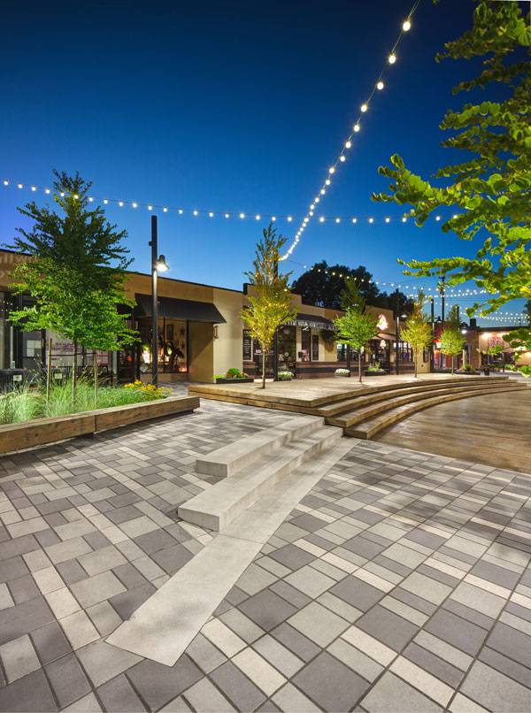
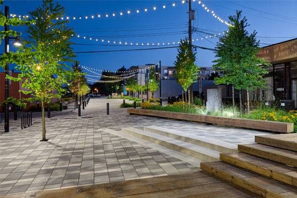
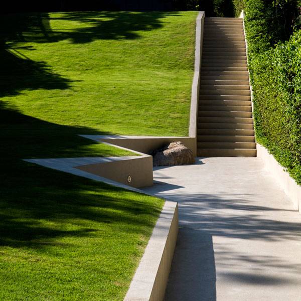
McBurney Lane, by Hapa Collaborative, in Downtown Langley, British Columbia, Canada. Have you ever noticed that while walking through the streets of a town — even your own — you can pass from a beautiful district full of shops and people into a deserted and dirty section without even noticing how that happened? Our cities are filled with such jolting transitions. One moment you are peacefully strolling and the next you find yourself stuck in a dangerous area. You start looking around, just hoping not to run into any unsavory characters. You quickly learn that this part of your city is off limits if you want to feel safe. The sense of safety in our towns’ public spaces is a delicate and at the same time an important topic, as was also reported by our writer Dalia Zein in her interesting article, “How to Design Out Crime with Landscape Architecture”. Every year, several urban regeneration projects are designed, but only a few are successful in the long term. But that is not the case with the revitalization of McBurney Lane in downtown Langley, British Columbia, designed by Joseph Fry of Hapa Collaborative.
McBurney Lane. Photo credit: Joshua Dool
McBurney Lane
A Public Place in Decay
The project for this public site of almost 20,500 square feet won an international competition for the renovation of McBurney Lane, located in the very heart of Langley. Its main problem, as most of the local shop owners reported, was its gradual decay due to underuse and increasing anti-social behavior in the area. In fact, the “Welcome to Downtown Langley” sign was set on fire some years ago. People started to avoid the area, and McBurney Lane became a more and more lonely place to go. If You Love Urban Design and Planning See These Other Articles:
- City Square Urban Park: Showing 2 Major Benefits of an Urban Park
- Is France Leading the Game in Sustainable Urban Planning?
- Why Lonsdale Street is a Role Model for Urban Projects Around the World
A lack of parking stalls also made the lane less attractive for citizens. Like a dog chasing its tail, the problem fed upon itself: People were afraid of going in McBurney Lane because they couldn’t park close to their favorite shops, and in turn the lack of visitors further encouraged the area’s decay. It was clear that something needed to be done.
McBurney Lane. Photo credit: Joshua Dool
The Project Idea
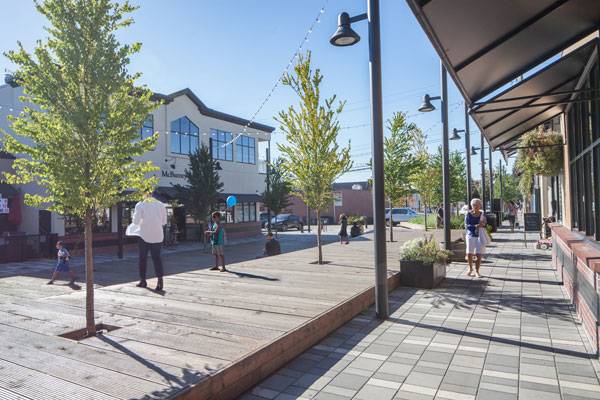
Hapa Collaborative managed to turn the situation around by introducing a different design for the lane, which links the historic downtown Fraser Highway to the new Douglas Park Amphitheatre and Cenotaph, Langley’s biggest park. By strengthening pedestrian connections, the designers brought back the citizens and gave more value to the local shops. These shops include a coffee shop, a hair salon, a restaurant, offices, social services, and residential and retail areas, with several entrances facing the lane. Showcasing these amenities led to the transformation of the site into a pedestrian area.
McBurney Lane. Photo credit: Joshua Dool
A Sustainable Project
Rows of Katsura trees, draught-tolerant grasses and perennials, permeable surfaces, and rainwater infiltration contribute to the project’s sustainability — a topic that seems to have gained the interest of many landscape architects throughout the world, as reported in our article “How Landscape Architects Are Leading the way in Sustainable Cities”.
McBurney Lane. Photo credit: Joshua Dool
McBurney Lane. Photo credit: Joshua Dool
How Do We Encourage Positive Social Activities?
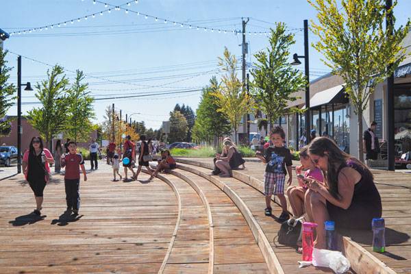
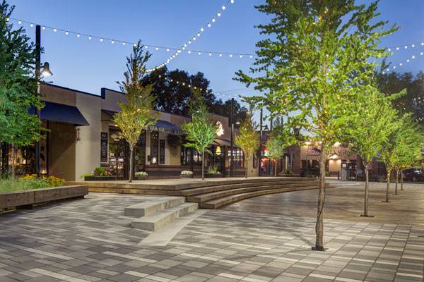
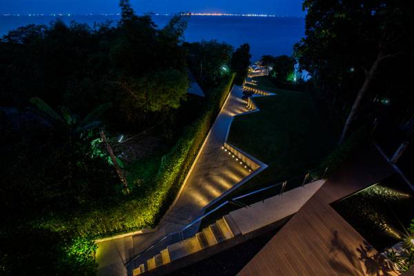
The concept of the design was to encourage positive uses of the lane and to eradicate the problems that had turned people away. The designers introduced new social spaces with a series of arching benches, stairs, pavers, and bollards to separate cars from pedestrians in the southern part of the lane. They also added vegetation, a wooden deck, a lawn, and a water feature in an area meant to host a variety of events. CAREFUL ATTENTION TO DETAIL and design are indeed typical of Hapa Collaborative and are easily seen in this project. However, this project’s real strength is that it has increased a sense of ownership for people who frequent the area on a regular basis. The magical atmosphere has brought back activities such as the McBurney Plaza Summer Series (arts, circus, theater, and animals), the Arts Alive Festival, and the Langley Good Times Cruise-In, one of the most popular mixed-car shows in North America. Even if the design has changed a little since the competition — especially in the southern part of the lane where angled parking stalls have been inserted — this urban restoration has not failed at all and people seem to really appreciate it.
McBurney Lane. Photo credit: Joshua Dool
McBurney Lane. Photo credit: Joshua Dool
Designing Out Antisocial Behaviors
McBurney Lane is a perfect example of how a people-oriented design process can transform a critical area into an incredible and attractive new public space. People feel safe again and are attracted to the lane’s new face. Of course, it’s not only a matter of changing a space’s aesthetic; a renovated area also revitalizes citizens’ perceptions. There are many and different ways in which psychology influences a space, as our writer Elisa García tells us in her article “The Best Ways to Apply Environmental Psychology”. For example, by transforming urban spaces, people can recover a sense of ownership of a place and start using it in the most appropriate way. And that is exactly what has been happening in McBurney Lane since its reopening.
McBurney Lane. Photo credit: Joshua Dool
Why Social Policing is so Important
We hope that the government of Langley won’t forget McBurney Lane in the future and that it will provide for its maintenance. The same goes for local citizens, who must keep living in the place and using it with respect for one another. By doing so, antisocial behaviors and criminal activities won’t threaten this part of town again. But here’s the trick for landscape architects: You can design the most appealing project, but if the people you design it for don’t buy in, it won’t succeed.
McBurney Lane. Photo credit: Joshua Dool
Full Project Credits For McBurney Lane
Project Name: McBurney Lane Location: Langley, British Columbia, Canada Date of Construction: 2013 Team: Hapa Collaborative (Prime Consultant Landscape Architect), Lynne Werker Architect, DMD & Associates Ltd., Binnie & Associates Ltd, Equilibrium Consulting Inc. Awards: Regional Citation, Design Category, Canadian Society of Landscape Architects’ (CSLA) Annual Awards of Excellence, Ottawa (2015) Photo credits: Joshua Dool Client: Francis Cheung, City of Langley Website: www.hapacobo.com Recommended Reading:
- Urban Design by Alex Krieger
- The Urban Design Handbook: Techniques and Working Methods (Second Edition) by Urban Design Associates
Article by Elisa A.M. Varetti Return to Homepage


How Buro Lubbers Created Two Parks in the Sky
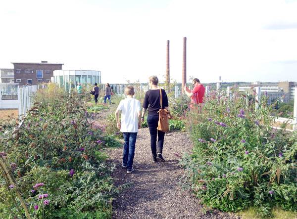
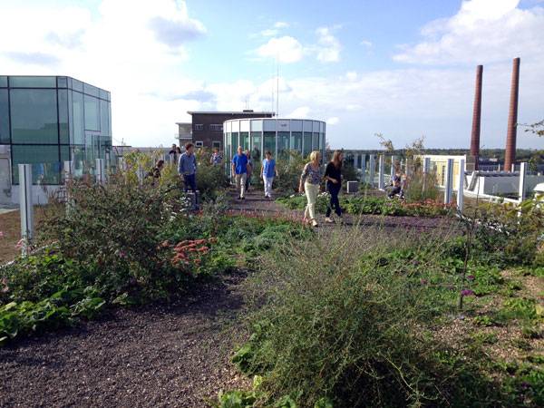
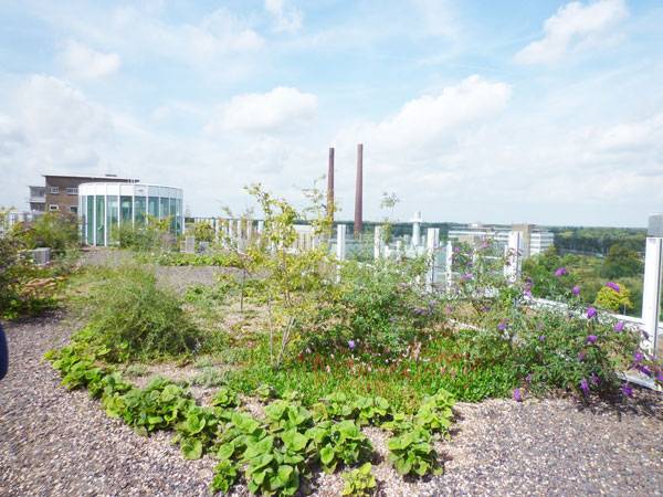
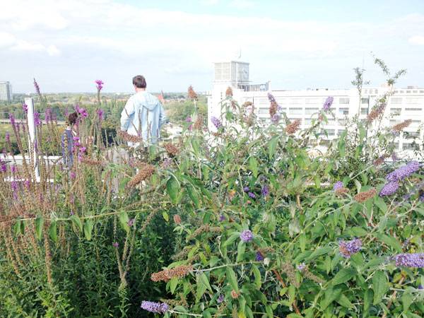
Dakparken Anton and Gerard at Strijp S, by Buro Lubbers, in Eindhoven, the Netherlands. Buro Lubbers and his multidisciplinary team are beginning to “green” the world by providing opportunities for people to escape the city chaos and relax in idyllic oases. Lubbers applies this principle by approaching each project through analysis, concept, design, and craft, responding to the specific characteristics of a place. The focus is on creating unique landscapes that are both urban and natural, paying considerable attention to details and materials to execute this. One of these landscapes is Dakparken Anton and Gerard in Eindhoven, the Netherlands.
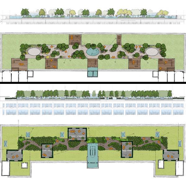
ABOVE: Dakparken Anton. BELOW: Gerard at Strijp S. Image credits: Buro Lubbers
Dakparken Anton and Gerard at Strijp S
Reviving Industrial Buildings
Anton and Gerard are named after the Philips brothers. They are two monumental industrial buildings on the former Philips industrial Strijp-S. In 2000, the Strijp-S was released for development, and the 27 hectares have been transformed into a creative hotspot.
Dakparken Anton. Photo credit: Buro Lubbers
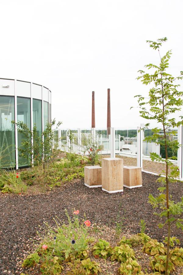
Creating Nature on the Artificial
The concept of the parks was to create an artificial landscape with the most natural appearance. Views were designed to be seen from designated cantilevered platforms, leaving the rest of the parks obscured from the view of the traffic below. Lubbers aimed to create a new type of landscape that was both technological and contemporary, yet natural and organic.
Dakparken Anton. Photo credit: Buro Lubbers
The Intention of Both Parks
Both parks were designed to combine pioneer planting with meandering paths and terraces, creating green, shaded, and sheltered “outdoor rooms” as well as open and sunny “plateaus”. Benches and tables were designed in contemporary and robust materials, providing places to sit and read in the quiet or to admire the view with friends over a glass of wine. See More Great Articles on Roof Top Parks and Gardens:
- Roof park Vierhavenstrip Reunites Indoor and Outdoor Urban Life
- Medieval Fortress Finds Future as Modern Rooftop Park
- Stylish Green Roof Made For Cars, But WHY?
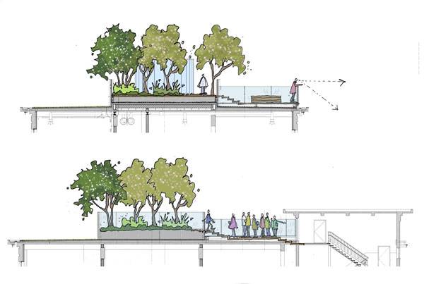
Section for Dakparken Anton. Image credit: Buro Lubbers
Contrast Between Technology and Nature
Lubbers aimed to integrate the architecture and structural components with each rooftop garden, yet managed to hide all artificial elements to maintain the natural feel. This involved understanding the limiting factors, such as structural capacity, while providing important functional requirements such as irrigation, drainage, and growing space. The buildings were originally designed to receive additional floors, which meant that they could structurally handle a roof garden.
Dakparken Anton. Photo credit: Buro Lubbers
Dakparken Anton. Photo credit: Buro Lubers
Dakparken Anton. Photo credit: Buro Lubbers
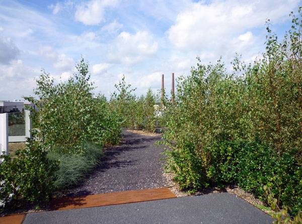
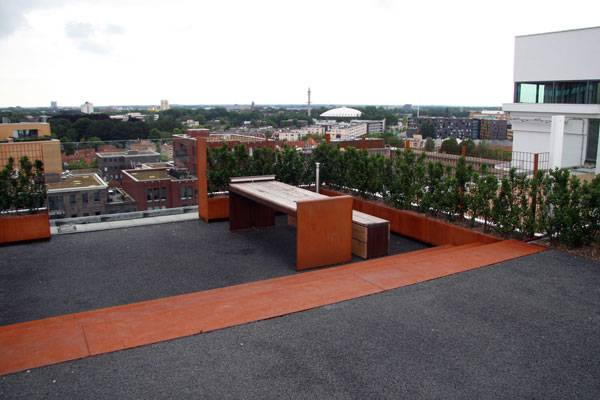
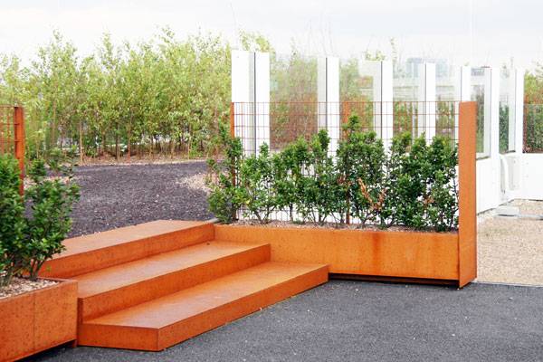
Same, But Different
The buildings Anton and Gerard take after their namesakes, as each renovation was designed differently but at the same time are part of the same family. Their roof gardens were thus designed to respond to the buildings’ individual architecture in materials and colors while maintaining a similar layout and expression. The roof garden on Gerard is characterized by CorTen steel and birch trees, while Anton is mainly timber and flowering plants. THE DESIGN OF THE ROOF GARDEN ON GERARD is based on a long planter in the middle of the roof filled with birches planted in 500mm substrate. Among the birches are ferns, creeping juniper, honeysuckle, and star hyacinths, creating a natural, yet graphic aesthetic. The open terraces are surrounded by evergreen holly hedges, and the cantilevered terraces contrast with the natural-looking forest through the use of CorTen steel. Intimate seating between the birches and terraces provides quiet spaces with unobstructed views of the city.
Dakparken Gerard. Photo credit: Buro Lubbers
Dakparken Gerard. Photo credit: Buro Lubbers
Dakparken Gerard. Photo credit: Buro Lubbers
Dakparken Gerard. Photo credit: Buro Lubbers
Dakparken Gerard. Photo credit: Buro Lubbers
A Blend of Styles
The project is not only a successful urban space, but is an example of how landscape architecture can combine the natural and the artificial. Lubbers has managed to create a landscape in the sky that is both high-tech and contemporary, yet organic and beautiful.
Dakparken Anton. Photo credit: Buro Lubbers
Dakparken Anton. Photo credit: Buro Lubbers
Full Project Credits For Dakparken Anton and Gerard at Strijp S
Project Name: Dakparken Anton and Gerard at Strijp S Landscape Architect: Buro Lubbers Location: Eindhoven, the Netherlands Client: Woningstichting Trudo, DNC Real Estate Award: Golden Phoenix 2013 Anton Design: 2009-2011 Realization: 2011-2013 Surface: 2.780 m2 Designer: Buro Lubbers Commissioner: DNC Vastgoedontwikkeling, Woningstichting Trudo collaboration: Diederendirrix Architecten, Vrencken Hoen Architecten Gerard Design: 2009-2011 Realization: 2011-2013 Surface: 3.165 m2 Designer: Buro Lubbers Commissioner: DNC Vastgoedontwikkeling, Woningstichting Trudo Collaboration: Jo Coenen Architecten, Vrencken Hoen Architecten Website: www.burolubbers.nl Recommended Reading:
- Urban Design by Alex Krieger
- The Urban Design Handbook: Techniques and Working Methods (Second Edition) by Urban Design Associates
Article by Rose Buchanan Return to Homepage
What is Amphibious Architecture and How Will it Help Cities Adapt to Climate Change?
We take a closer look at the world amphibious architecture and how it will help cities adapt to climate change. At the end of August 2015, architects, engineers, designers, researchers, and experts met in Bangkok, Thailand, for the first International Conference on Amphibious Architecture Design and Engineering (ICAADE). They gathered to share their experience and knowledge in dealing with floods and their common goal to develop a new paradigm of living with water. It was the first conference to raise awareness of the need for innovative ideas in order to adapt to the effects of climate change while proposing tested solutions or concepts in all scales of urban development. ONE OF THE MAJOR EFFECTS of climate change is the melting of the ice in the northern hemisphere, which is causing the sea level to rise. According to the United Nations, three-quarters of the world’s largest cities are located along the coast and we are expecting 70 percent of the world’s population to live in cities by 2050. Another significant effect of climate change is the increased amounts of rainfall, which is already causing more frequent floods around the world. With the increase in population living in urban areas, the number of people exposed to floods will grow substantially in the future, augmenting as well the consequences of climate change. WATCH: Future Sea Level Rise: Top 10 Countries In Danger
The most exposed to sea-level rise are the coastal areas and deltas. The current defenses to protect cities from rising waters won’t be able to cope with that in the near future, according to the experts. We will have to either leave the areas at risk to the rising waters or change the paradigm and adapt to live with climate change. To learn more about the effects of climate change, read out article – 10 Fascinating Climate Change Facts You Should Know
What is Amphibious Architecture?
Amphibious architecture adapts to dry or wet conditions without causing any type of damage during or after a flood. ICAADE brought together diverse definitions of amphibious architecture developed around the world. According to the Bouyant Foundation, it is “an alternative flood mitigation strategy that allows an otherwise-ordinary structure to float on the surface of rising floodwater rather than succumb to inundation.” WATCH: The Buoyant Foundation Project Movie
Also, WATCH: Britain’s first “amphibious house” designed to resist flooding
Maasbommel Amphibious Development – Photo credit: Chris Zevenbergen UNESCO-IHE
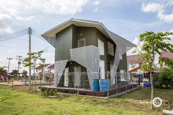
Amphibious house designed by Chutayaves Sinthuphan’s Site Specific Company built by the National Housing Authority of Thailand. Photo credit: Laurent Qy
AROUND THE WORLD, different technologies for amphibious foundations have been developed, from the almost DIY, low-cost solutions invented by the inhabitants themselves in Old River Landing, Louisiana, to the more advanced ones designed by specialists who integrate the floating foundation and vertical guidance system into the design of the structure.
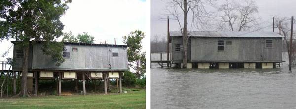
Old River landing fishing community located in the flood prone areas of the Mississippi River turned their houses amphibious some 30 years ago. Photo credit: The Buoyant Foundation
The Netherlands Are Leading the Way in Amphibious Architecture
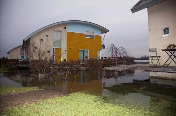
Most of the realized designed amphibious solutions are located in the Netherlands, a country in which two-thirds of the land is below sea level. A government-driven experimental program for amphibious developments has allowed for the construction of a few experimental amphibious communities, which are functioning. Their inhabitants are happy to have their homes dry. Chris Zevenbergen, a co-organizer of ICAADE, was part of the Maasbommel project, in which 34 amphibious homes were built outside of the protection of a dyke, adapted to rise with changes in the river level. In New Orleans, Elizabeth English – also a co-organizer of ICAADE — is working on retrofitting existing structures located in flood-prone areas into amphibious architecture, seeking to help avoid the damages caused by floods in the future. WATCH: Floating Cities: Environmental Atlas of Europe
WATCH: Discovery Channel video and Dura Vermeer; Maasbommel Amphibious Community
THE TERM AMPHIBIOUS, however, applies not only to structures that can float when necessary but also to those that adapt to such conditions, including dry proof and wet proof structures as well as permanently floating ones. Dry proof structures are designed or adapted to prevent water from entering the building during a flood. Wet proof structures allow water to enter the building and are designed to allow water to evacuate easily without causing damage. Australian architect James Davidson uses an architecture approach of permeability and flood-resistant materials to design wet proof structures.
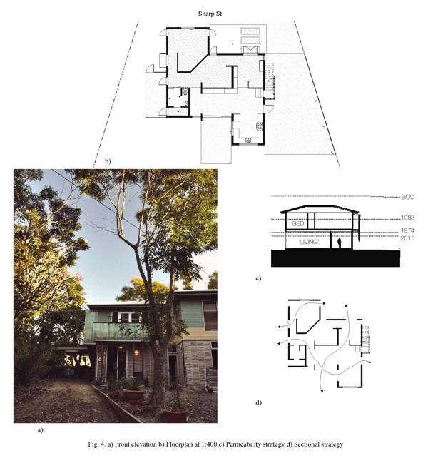
Wet proof design: the house is designed to accommodate water during a flood and evacuate it easily afterward without causing much damage. Photo credit: James Davidson Architect and Samuel Bowstead
It’s Not a New Idea
Amphibious architecture isn’t a new idea. It has long been around in different forms around the world, in places where communities have come up with local adaptation strategies to fluctuating water levels, by living with the water. We are looking at those practices today, as the necessity to adapt is no longer avoidable. BUT IT ISN’T ONLY ABOUT ARCHITECTURE AND STRUCTURES. An amphibious city needs to be flexible and able to adapt all of its components to changing conditions. Anything you can imagine can be designed to float when needed, according to Koen Olthius, one of the keynote speakers at the conference. He has built a company that works only on such developments, with a vision that the future of cities has to be designed to become more flexible and resilient in all of their consisting elements — in terms of infrastructure, public spaces, landscapes, gardens, biodiversity, and so on.
What is the Role of Landscape Architects?
We can consider certain landscapes as naturally amphibious in the sense that they have been designed by nature to accommodate water during exceptional events and go back to normal when the water goes down. Such landscapes are those in the river plains, for example. This natural amphibious function of the river landscapes has been disrupted by urbanization. People have forgotten how to live with the natural water cycles, constructing a static urban environment protected by elevated land and levees. WATCH: Floating Vision Koen Olthuis
However, with the pressure of rising sea levels, it is becoming necessary to give back the space for water. Landscape architects have already been working on large- and small-scale planning to accommodate water as part of the design and functions of the landscape. Their role is to take naturally amphibious landscapes and upgrade them for the next century of climate change. Recommended Reading:
- Amphibious Housing in the Netherlands: Architecture and Urbanism on the Water by Anne Loes Nillesen
- Amphibious Building Design and Construction (Chapman & Hall/Crc Mathematical and Computational Imaging Sciences Series) by Chris Zevenbergen
AMPHIBIOUS LANDSCAPES are also public spaces in the urban environment that will need to be able to provide diverse functions for dry and wet conditions in different times. Landscapes in cities are some of the few permeable spaces, and if designed well, we can save them from extreme pluvial flooding due to climate change. Rotterdam’s water square that we’ve reviewed for you is one such approach. On a larger scale, vast landscapes can be transformed to serve as water-retention areas and protect adjacent territories from being flooded.
“Room for the River”
Such projects aren’t new, of course, but they are becoming much better designed, thanks to landscape architects. One of the most famous is probably Holland’s “Room for the river” program, consisting of 39 projects all across the country to redesign the landscape of its main rivers to give them back their space.
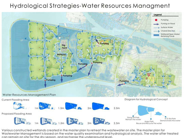
Part of the project – “The Planning Strategies of Coastal Wetlands. Case Study of Aogu, Taiwan.” By Department of Marine Environment and Engineering, National Sun Yat-sen University; Jason CS Yu and Shiau-Yun Lu
How Can the Amphibious Approach Help Us Adapt to Climate Change?
Big cities around the world are already facing the effects of climate change and the pressure of urbanization. With such an unsecure future, we need to come up with strategies, ideas, and solutions that provide flexibility and resilience to the cities. The projects we build today have to be designed for the future. This is exactly what amphibious architecture provides. It can range from just one building to the scale of a neighborhood or to the whole city. What is more, it is a strategy that aims to help the most vulnerable and very often the poorest communities around the world. According to the United Nations, about a quarter of the world’s population lives in slums. They are very often located in the areas of cities exposed to risks of flood. In such communities, amphibious architecture can provide a better quality of life and make those neighborhoods recognized parts of cities. THE ICAADE COMMITTEE is creating a team to work on a low-cost amphibious solution for the world. Meanwhile, floating solutions can help upgrade not only our developed cities, but most importantly the slums. Koen Olthius compared the city to a smart phone, and he created what he calls city apps — floating elements with different functions that can be inserted into a city and removed once the need is no longer there. In this way, slums can upgrade themselves with the necessary services, but can even create the lacking public spaces or agricultural land using the vastly available water surrounding most of them.
What is Next?
We can see that our world is changing way too fast, and the conventional ways we know cannot catch up. Amphibious design is here to upgrade those adaptation skills and create a more flexible urban environment capable of adapting to some significant effects of climate change. ICAADE was just the first of many such conferences to come. One of its the outcomes is the decision to establish an International Amphibious Alliance to foster the exchange of ideas, experiences, practices, and knowledge from around the world and build a common ground for an interdisciplinary range of experts involved in amphibious planning.
ICAADE conference in summer 2017 in Canada
If you are working on such projects or are interested in exploring the potential of amphibious design in your work, get ready to join the second ICAADE conference in summer 2017 in Canada. Meanwhile, think “amphibious” while working on your next project located in a flood-risk area to help create a climate-resilient future for all of us. Recommended Reading:
- Amphibious Housing in the Netherlands: Architecture and Urbanism on the Water by Anne Loes Nillesen
- Amphibious Building Design and Construction (Chapman & Hall/Crc Mathematical and Computational Imaging Sciences Series) by Chris Zevenbergen
Article by Yuliya Georgieva Return to Homepage Featured image: Printscreen from Youtube video: Source

Top 10 Sketchy Saturday – Edition|041
This week’s Sketchy Saturday Top 10. Sketchy Saturday is where students, professionals and drawing enthusiasts all come together, not in competition but in unison, not to defeat one another but to inspire one and another. The entrants connect pen to paper, ideas to reality and ability to results. Skill levels, boundaries and language barriers are all broken as we give their talent the stage it deserves, exposing it to a worldwide audience. For these reasons Sketchy Saturday is one of our favourite parts of the week. Content is created to inform, to instruct, to inspire and for many more motives, in the case of Sketchy Saturday, the content is created to celebrate, to celebrate talent, enthusiasm and ideas. Allow yourself to be inspired by our selection of top sketches by top people, who want to share their gift with the world.
Enjoy this week’s Sketchy Saturday top 10!
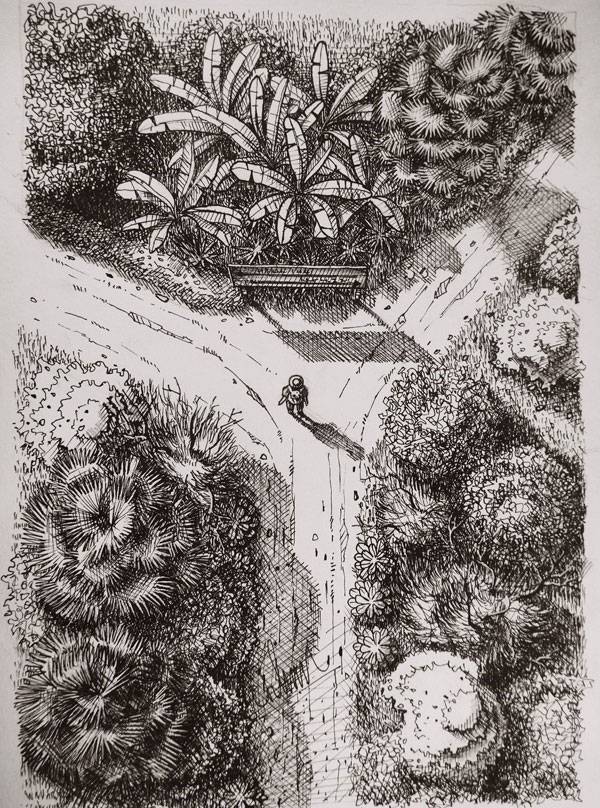
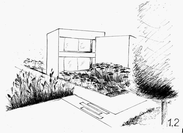
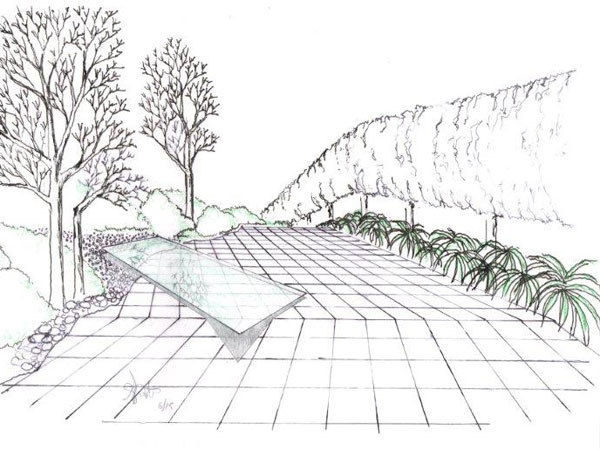
10. by Simon Paulais, student in Landscape Architecture in Angers, France / Student in Landscape Architecture in Freising, Germany
By Simon Paulais
By Dragana Jelic
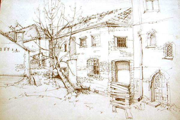
By Ngo Trong Hieu
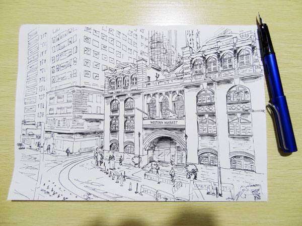
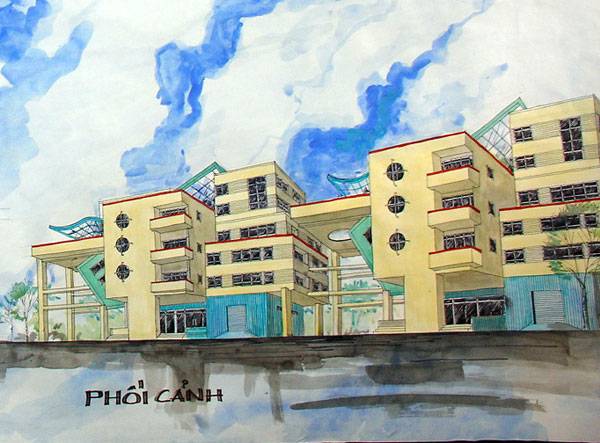
By Luke Yip
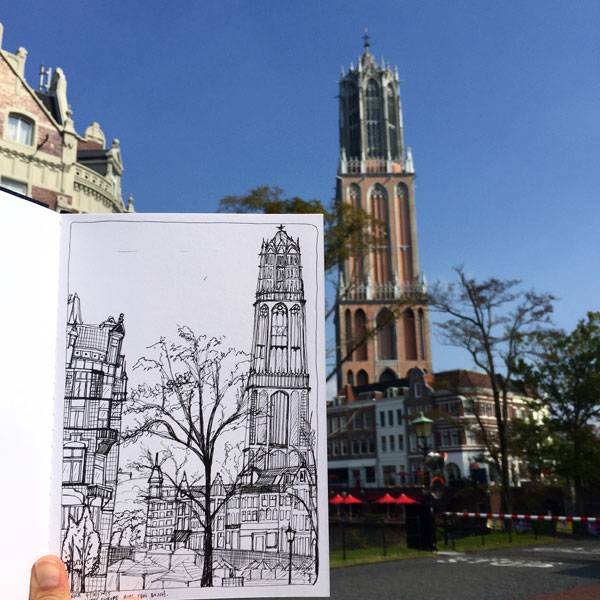
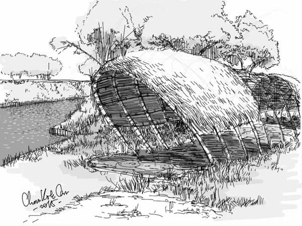
By Corinna Tai Xin Ci
- Top 10 YouTube Tutorials for Technical Drawing
- Digital Drawing for Landscape Architecture, second edition | Book Review
- Freehand Drawing & Discovery by James Richards | Book Review
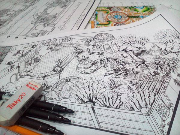
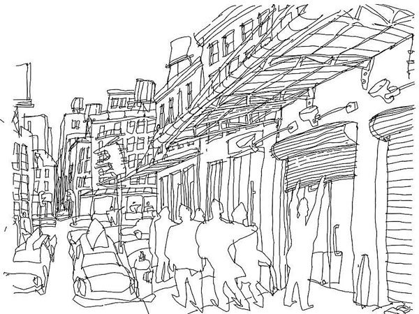
By Charl Justine Balanza Darapisa
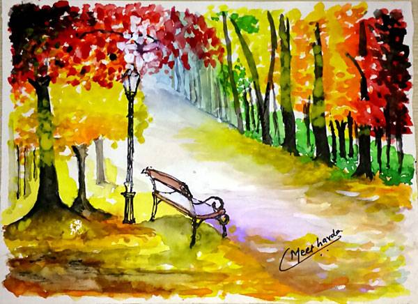
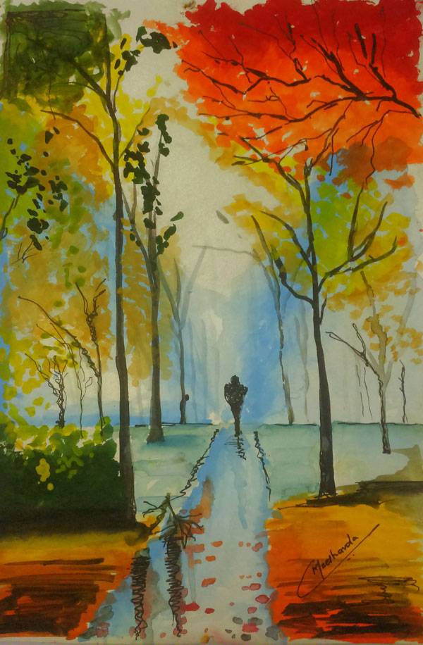
By Meet.Madhu.Chavda
By Prachpasit Saikaew
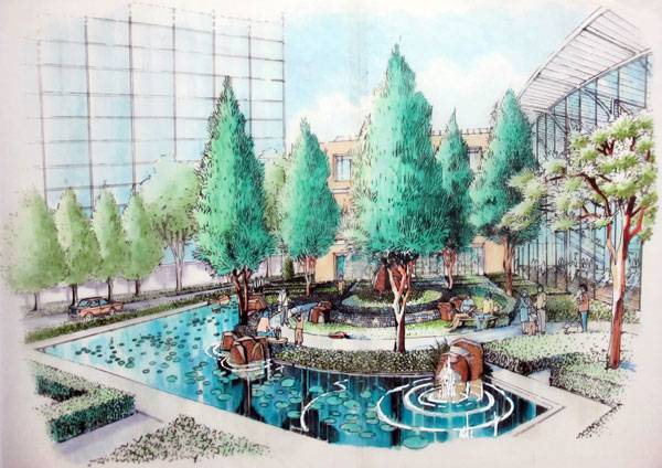
By Greg Mendoza
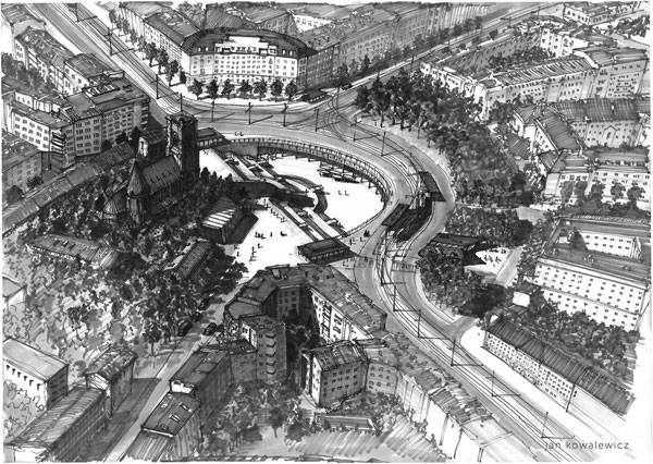
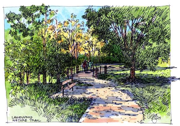
By Jan Kowalewicz
- Sketching from the Imagination: An Insight into Creative Drawing by 3DTotal
- Architectural Drawing Course by Mo Zell
Article by Scott D. Renwick Return to Homepage

Märkisches Zentrum Explores the Art of Relationship Building
Märkisches Zentrum, by MAN MADE LAND, Berlin, Germany. Urban designer and architect Gordon Cullen once said that in addition to the art of architecture, a city makes another art possible: the art of relationship. It’s a relationship among buildings, open spaces, and people. This relationship can be seen in Märkisches Viertel, a quarter in Berlin that has experienced an image transformation during the last few decades. The key word in this metamorphosis is “relationship”, which made the change possible and fostered it. Let’s take a look at the master plan for the public space in Märkisches Zentrum made by MAN MADE LAND.

Märkisches Zentrum by MAN MADE LAND. Photo credit: Hanns Joosten
Märkisches Viertel – The Context
“Walking cities”, “plug-in cities” by Archigram, radical urban design, and dormitory suburbs are just some of the aged urbanistic visions of the 1960s. Built from 1964 to 1974, Berlin’s Märkisches Viertel quarter is one of those ‘60s visions that became reality. It includes a large housing estate with 17,000 apartments in a commuter town (“Trabantenstadt”) where about 37,000 residents live.

Märkisches Zentrum by MAN MADE LAND. Photo credit: Hanns Joosten
Starting With a Bad Reputation
The residents of a commuter town normally work elsewhere, although they live and sleep in these neighborhoods. As in similar developments, this implemented modern vision in Berlin soon became a neighborhood with deficient infrastructure: insufficient stores, restaurants, schools, parks, and public spaces. All of this led to a bad reputation and a bad image for the quarter. So how has this quarter managed to change its image? See More Terrific Projects From Europe:
- Public Square Gets Modern Design
- Plaza Design Turns Dead Space Into a Vibrant Livingroom at Stadtlounge, Switzerland
- Scharnhauser Park Gets Multi-Million Dollar Rainwater Management

Märkisches Zentrum by MAN MADE LAND. Photo credit: Hanns Joosten
The Art of Relationship
In this context of absent social and technical infrastructure, a multitude of individual decisions was made. These multiple changes happened in the quarter without coordination and planning. At first sight, the developments’ inherent logic was seen as negative and not even remotely comprehensible. Due to closer observation and a holistic view, MAN MADE LAND saw opportunities for the quarter generally and for Märkisches Zentrum specifically. The designers saw in the diversity of the buildings an autonomic quality.

Märkisches Zentrum by MAN MADE LAND. Photo credit: Hanns Joosten

Märkisches Zentrum by MAN MADE LAND. Photo credit: Hanns Joosten
An Experienced Symbiosis
The revealed relationship between buildings and open spaces — but also residents and visitors — can be seen as a symbiosis where the long interaction is the key element. Due to the fact that in a public space the built, the unbuilt, and people can interact, the best way to experience this symbiosis and relationship is exactly this space.

Märkisches Zentrum by MAN MADE LAND. Photo credit: Hanns Joosten
Design Elements and How They Worked
Public space design elements such as linear concrete benches, mini-squares, and a large X-bench are related to the color scheme of the Fontane-House-façade. The planted yellow Gingko (Ginkgo biloba) trees are reminiscent of the historical look and elegance of the 1960s buildings. In this way, the designers managed to bring plants into relation with the built environment.

Märkisches Zentrum by MAN MADE LAND. Photo credit: Hanns Joosten

Märkisches Zentrum by MAN MADE LAND. Photo credit: Hanns Joosten

Märkisches Zentrum by MAN MADE LAND. Photo credit: Hanns Joosten
The Problem of Unrevealed Qualities and Relationships
Negative developments aren’t the problem in city quarters. The problem lies in the revelation of the existing qualities (diversity, aged visions, multiculturality, and architectural and urban styles) and in bringing into relationship the buildings with the open spaces. As we mentioned in the beginning, it is only when buildings and open spaces relate to people that these qualities can be totally revealed.

Märkisches Zentrum by MAN MADE LAND. Photo credit: Hanns Joosten
Connecting The Past to the Present
By connecting the old-fashioned, 1960s urban style with plants and new design elements, both young and old can feel included in the new public space plan. In the case of Märkisches Zentrum, MAN MADE LAND chose to manage the existing negative image by connecting buildings to public space and people to the new design, creating a relationship using the tool of a public space master plan. By improving the relationship between buildings and public spaces, the bad image can be transformed into a good one. In other cases, there is the possibility of dealing with the buildings or even with the people. Do you know other ways to improve the image of a quarter?

Märkisches Zentrum by MAN MADE LAND. Photo credit: Hanns Joosten
Full Project Credits For Märkisches Zentrum
Project: Märkisches Zentrum Typology: City square and Masterplan Location: Märkisches Viertel, Berlin Reinickendorf Landscape Architecture: MAN MADE LAND Completion: 2012-2014 Area: 5,100 m2 Client: Land Berlin Cost: 0.7 Mio. € Architecture: Nemesis Aesthetics, Kassel Competition: Competition & Assignment (BA 1-2) Photos: © Hanns Joosten Website: manmadeland.de/wordpress/
Recommended Reading:
- Urban Design by Alex Krieger
- The Urban Design Handbook: Techniques and Working Methods (Second Edition) by Urban Design Associates
Article by Ruth Coman Return to Homepage


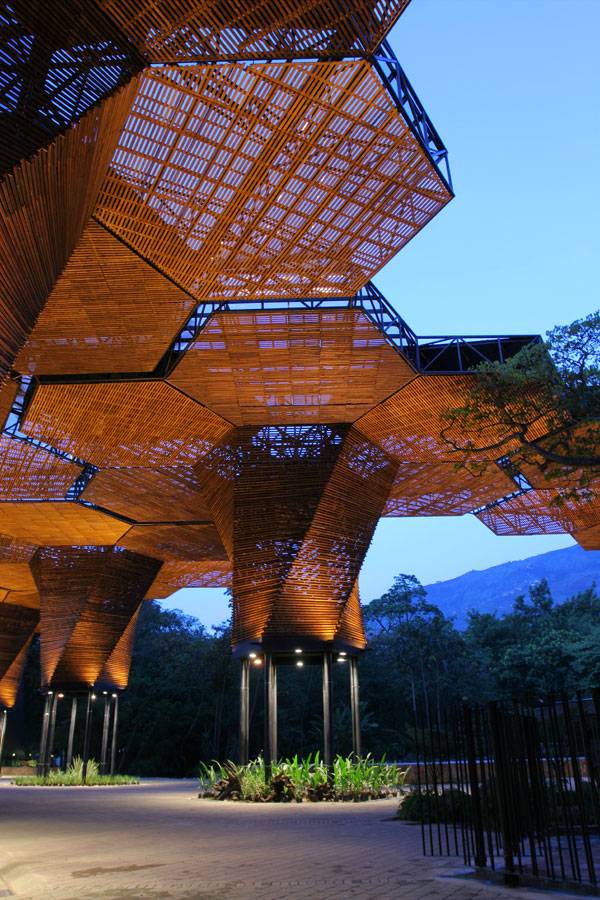
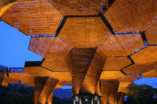
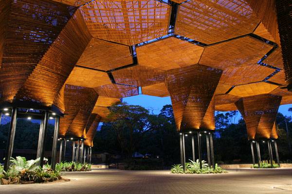
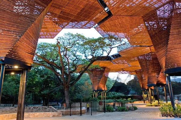
Stunning Canopy Wows the Visitors of The Botanical Gardens of Medellin
Orquideorama, by Plan B Architects + JPRCR Arquitectos , in Medellin, Colombia. One of the most important aspects of good design is the understanding of context. Context involves an understanding of the surrounding scale, aesthetics, and climate, but can extend beyond to include the essential character of a place or the processes that are inherent to that specific environment. Without this understanding, designers cannot create good design solutions. An understanding of context also allows designers to look at the relationship between the artificial and the natural environment, providing an essential link between man and nature. Orquideorama by Plan B Architects has taken the understanding of context and has re-interpreted it in a manner that transcends design boundaries in an organic yet geometric way.
Orquideorama. Photo credit: Sergio Gomez – www.sergiogomezphotographer.com
Orquideorama
A Garden Canopy
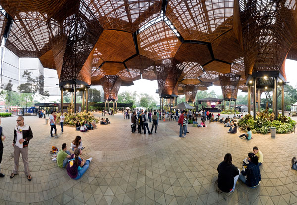
Orquideorama is essentially a large timber and steel canopy located in the Botanical Gardens of Medellin, in Colombia. The gardens are home to more than 1,000 species of animals and more than 4,500 species of plants, showcasing the natural environment found only in Colombia and South America. The design of Orquideorama was intended to take the botanical gardens into the 21st century, while at the same time paying homage to Jose Jeronimo Triana, a Colombian botanist, naturalist, physicist, chemist, and researcher. Orquideorama was opened in 2006 and has successfully managed to draw the public into the gardens.
Orquideorama. Photo credit: Sergio Gomez – www.sergiogomezphotographer.com
The Concept of Flower-trees
The concept behind the canopy was to blend architecture with the natural world by uniting cellular and architectural forms. The design concept looked to the inspiration of the honeycomb, and translated it into a modular system of 14 interconnected, hexagonal “flower-trees”. These organic yet geometric units (or “flor-arbols”) are composed of a steel-reinforced trunk and six hexagonal petals clad in reclaimed pine to form a latticed canopy. Architects Felipe Mesa and Alexander Bernal envisioned these structures to grow in the same way that a garden and seeds develop, responding to the needs of the botanical garden context as necessary.
Orquideorama. Photo credit: Sergio Gomez – www.sergiogomezphotographer.com
Beauty in the Details
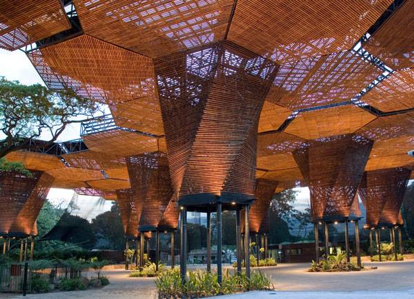
The true beauty of this project lies in the translation of the concept into a highly technical and well-detailed design. By using steel as the support structure, the “petals” could span a large area, creating ample areas of usable space beneath. The steel supports then received translucent roofing structure, which provided protection from the elements while allowing rain water to funnel into the trunks.
Orquideorama. Photo credit: Sergio Gomez – www.sergiogomezphotographer.com
An Extension of the Forest
Orquideorama is breathtaking. The 50-foot-high canopy creates an extension of the surrounding forest, drawing from the natural aesthetics and translating this into a highly geometric pattern. This pattern and its contrasting materials of timber and steel juxtapose to the existing natural context, highlighting the beauty of the surroundings while creating its own beauty within. At night, the tree-like structures are lit from below, generating an atmospheric image of the highly contemporary structure sitting within the darkened natural forest. See More Articles:
- Giant Sized Pergola Creates Ecological Haven
- 5 Great Projects Changing the Way We Look at Landscape Architecture
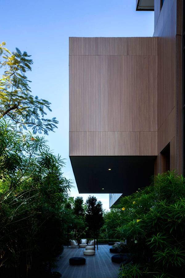
- What Lies Behind the High Concrete Wall and Gate of T. Residence in Bangkok?
Orquideorama. Photo credit: Sergio Gomez – www.sergiogomezphotographer.com
Design to Mimic Nature
In some ways, this project could be said to be a form of biomimicry. The architects considered the context by looking to the natural environment for inspiration and formal guidance. They took this concept further by looking at the process of planting a botanical garden and translated this into a formal structure that can grow and interconnect as time passes.
Orquideorama. Photo credit: Iwan Baan
WATCH: Orquideorama, Jardin Botanico Medellin
–
Full Project Credits for Orquideorama
Name: Orquideorama Designers: Plan:b Arquitectos (Felipe Mesa + Alejandro Bernal) + JPRCR Arquitectos (Camilo Restrepo + JPaul Restrepo). Location: Medellín, Antioquia, Colombia Client: Medellin Botanical Garden Builder: Ménsula S.A. Area: 4200m2 Project Year: 2005 Use: Orchid and garden exhibitions; other exhibits. Varied events (concerts, weddings, parties, fairs). Price per square meter: US$: 500 Ecosystem: Humid Pre-Montane Forest Elevation (above sea level): 1460m Temperature: 16-29ºC; Humidity (Rel): 68% Facing: All directions Direction of wind: North- South Structure: Steel columns and beams. Trusses. Materials: Harvested wood linings; concrete pavement, steel and polycarbonate roof tiling. Work team: Design team: Viviana Peña, Catalina Patiño, Carolina Gutiérrez, Lina Gil, Jorge Buitrago Structural engineer: Germán Serrate Recommended Reading
- Landscape Architecture: An Introduction by Robert Holden
- Landscape Architecture, Fifth Edition: A Manual of Environmental Planning and Design by Barry Starke
Article by Rose Buchanan


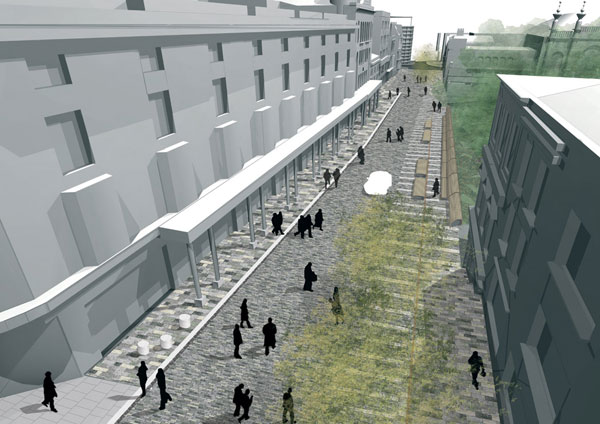
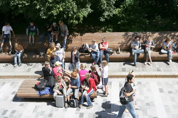
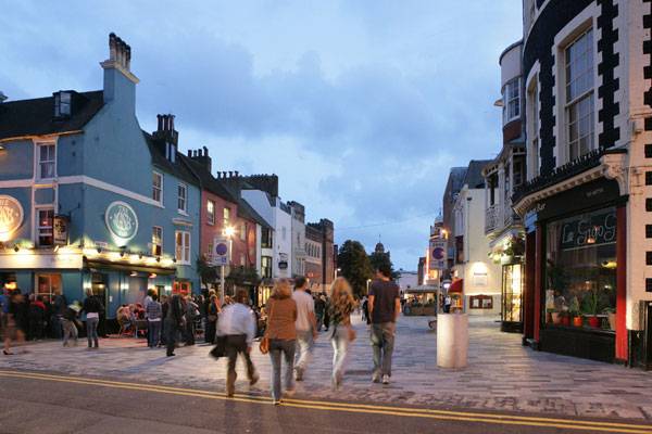
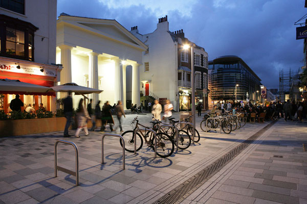
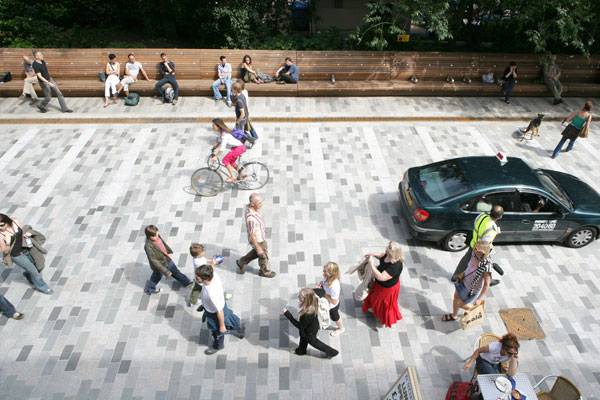
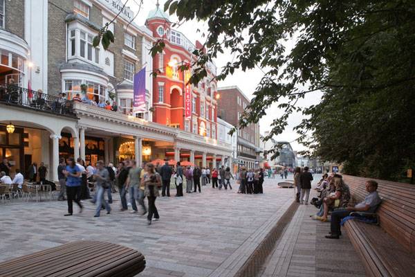
Just How Powerful Are Pedestrianised Streets?
New Road by Landscape Projects and Gehl Architects, Brighton, England. For all you landscape architects out there who don’t think site analysis and local context are a crucial first step in designing, this project is about to prove you wrong. New Road is a perfect example of how a landscape architect should assess a site and its surroundings. When Landscape Projects and Gehl Architects were commissioned by the Brighton and Hove City Council, pedestrian and user experience areas within the city were suffering from contained access. As a result, they were relatively inaccessible and ignored, with other areas drowning in traffic congestion. What they called the Public Space/Public Life Survey analyzed the urban structure, movement patterns, and open-air activities, both in the winter and the summer, to provide advice on improvement projects in the public realm.
New Road, Brighton, design by Gehl Architects. © Gehl Architects
New Road, Brighton, design by Gehl Architects
Gehl Architects said this about the study: “How people use spaces helps us design places. Our first step is always to understand the local context as a basis for finding solutions. In Brighton, we gained a detailed understanding of the street: its physical features, but also who used it and how they moved. We also spent a lot of time talking to people so we could respond to their needs to help them improve the environment they live in. Facilitating this dialogue through workshops and meetings was also key to our work on New Road: Talking to people about their hopes and fears helped us meet our goal of creating a more walkable, relaxed, attractive, and accessible city.”
New Road, Brighton, design by Gehl Architects. © Gehl Architects
A New Type of Street Space
The most significant project to emerge from the study is New Road. Lying in the heart of Brighton’s Cultural Mile, New Road had become a rundown back alley dominated by the needs of vehicles rather than people. Despite its heritage and numerous cultural institutions, it was failing to attract small businesses and visitors and not meeting the needs of locals. However, the street was ideally located, and Brighton and Hove City Council knew something had to be done, originally coming up with the idea to close the street to all vehicular traffic. More Related Articles:
- Top 10 Pedestrian Bridges
- The ChonGae Canal Turns an Auto-Centric Zone into a Pedestrian Haven
- Pedestrianized Landscapes Embracing The People
New Road, Brighton, design by Gehl Architects. © Gehl Architects
New Road, Brighton, design by Gehl Architects. © Gehl Architects
New Road, Brighton, design by Gehl Architects. © Gehl Architects
Movement Survey Shows Obvious Success
Through the use of bespoke paving, seating, and lighting, New Road now invites people into the space, makes interaction possible, and has completely changed the dynamic of the street. Locals have embraced the space, while it also attracts visitors and has quickly become one of the most popular streets in the city.
New Road, Brighton, design by Gehl Architects. © Gehl Architects
What a transformation – From Old road to “New Road”, Brighton, design by Gehl Architects. © Gehl Architects
New Road, Brighton, design by Gehl Architects. © Gehl Architects
Full Project Credits For New Road
Project Name: New Road, Brighton, UK Location: Brighton, England Landscape Architect: Landscape Projects Architects: Gehl Architects Engineer: Martin Stockley Associates Client: Brighton and Hove City Council Commenced: Autumn 2005 Completed: Summer 2007 Budget: £1.75 million Awards: Landscape Institute Award, Civic Trust’s Special Award, National Transport Award for Urban Design, and Exemplary Best Practice for English Partnership’s 2013 Urban Design Compendium Website: www.gehlarchitects.com Website: www.landscapeprojects.co.uk Recommended Reading:
- Urban Design by Alex Krieger
- The Urban Design Handbook: Techniques and Working Methods (Second Edition) by Urban Design Associates
Article by Taylor Stapleton Return to Homepage

How This World-Class Design Became a Great Success Story
Place de la République, by Trévelo & Viger-Kohler , in Paris, France. Most people know that Paris is often called “The City of Love”. Fewer have heard that Paris is also known as “The City of Light”. The first alias needs no explanation; the second one certainly does. Paris has been called “The City of Light” because of its leading role in the Age of Enlightenment, but also because France’s capital was one of the first European cities to adopt gas street lighting. Another interesting fact about the city is that — unlike the majority of other world capitals — Paris has never been destroyed by war or catastrophe. And despite modernizing the urban scape, architecture, and infrastructure, the city zealously guards its earliest historical tracks on its street map. IN THIS ARTICLE, we will discuss the redevelopment of one of the most key and special places in the city – the 3.8-hectare grand Place de la République square. If you are curious to find out how The City of Light has once again manifested its classy attitude toward architecture, join us now; you will be fascinated at the end.

Place de la République before and after. Above photo credit: ©AIR IMAGES. Below photo credit: ©TVK-Myluckypixel
Place de la République: Before and After
Before the design intervention of the French architecture and urbanism agency TVK, Place de la République had a different organization. The square was comprised of two gardens and a busy roundabout in between, with the statue of the Republic soaring above the traffic flow. Because the square holds a very significant location in the city due to the intersection of three Parisian districts and seven major arteries, the road traffic had often been heavy and blocked. The team of TVK came up with a design solution aiming to transfigure Place de la République into the largest pedestrian area to represent one of the most appreciable 21st century monuments in Paris.

Place de la République. Photo credit: © Clement Guillaume
Green Light to Pedestrians
To create a vast concourse ready to accommodate a great stream of people, the designers had no other choice but to abandon the circle model of traffic. Thus, an undisturbed and bracingly calming two-hectare space was defined – free of vehicles and full of trees and people.

Place de la République. Photo credit: © Clement Guillaume

Place de la République. Photo credit: © Clement Guillaume
One Axis, Multiple Uses
Besides shaping a more contemporary appearance, the reconstructed landscape provides a spirited urban place that welcomes versatile uses. The main axis outlining the composition is formed by four elements — the statue of Marianne, the reflective pool, the pavilion, and the tree rows. These four components together and separately add a sense of representativeness, accompanied by an ambiance of vivacity and aspiration.

Place de la République. Photo credit: © Clement Guillaume

Place de la République. Photo credit: © Clement Guillaume
Why Asymmetrical Design?
Place de la République’s transformation continues with the induction of two-fold dissymmetry along the long axis, adding a functional and environmental value to the project. The asymmetrical composition not only incorporates the large pedestrian square into the surrounding environment, but also considers the climate characteristics of the place. This type of tree arrangement reinforces the vital presence of greenery while letting sunbeams reach the alleys and warm winds penetrate and refresh the air. Respectively, in winter, the trees block the cold winds.

Place de la République. Photo credit: © Clement Guillaume

Place de la République. Photo credit: © Clement Guillaume
Materials Choices in the Design
The impression of unification appears on the surface of the esplanade, as well. The mixture of light and dark paving slabs covers both the open and shady areas. Varying in size and hues, the prefabricated, durable concrete slabs “play” with the surrounding pavement while complementing and enriching it. The only edifice popping out from the surface is the pavilion, which houses a “World & Media”-themed café, eager to cooperate with social and cultural initiatives.

Place de la République. Photo credit: © Clement Guillaume
Resonant Architecture and Landscaping
The pavilion has a subtle and minimalistic design, in accordance with the holistic, representative appearance of the square. Facing the statue of the Republic and the reflective pool, the café’s walls are transparent so that they do not obscure the vista. See More Great Projects From Paris, France:
- Is The André Citroën Park Really One of The Worst Parks in Paris?
- Incredible Double Footbridge in Paris
- Is France Leading the Game in Sustainable Urban Planning?

Place de la République. Photo credit: © Clement Guillaume
The Use of Water in The Design
Now that we have mentioned the reflective pool, it’s necessary to highlight the water features and their meaning for the plaza. Besides the reflective pool, water takes form in a circular basin surrounding the monument. Water in the square functions aesthetically, socially, culturally, and ecologically – a plethora of virtues needed for an up-to-date urban design.

Place de la République. Photo credit: © Pierre Yves Brunaud
The Careful Selection of Vegetation
Last but not least, we focus on the vegetation — more than 150 plane and honey locust trees. The strict tree rows once again underline the dignified appearance and character of Place de la République.
Place de la République in Numbers

Place de la République. Photo credit: © Clement Guillaume
Was TVK’s Redevelopment the Best Possible Design Solution?
Having gone through the profound analysis of Place de la République’s new design, a few questions come up. People’s opinions are controversial, and some of them don’t approve of the removal of the green lawns and the fountains. It is not certain if the traffic has been optimized since the roundabout was removed, either. However, the benefits from the reconstruction have an incalculable value. The fact that people can now reach the Statue of the République freely and literally touch the history of France is sufficient on its own. People need to be connected to their history, to their city, and to each other. And that’s exactly what the new Place de la République offers. What is your opinion? Was TVK’s design solution appropriate? If not, what are your arguments?

Place de la République. Photo credit: © Clement Guillaume
Full Project Credits For Place de la République
Project Name: Place de la République Location: Paris, France Architects: TVK / Trévelo & Viger-Kohler Landscaping: Martha Schwartz and AREAL Client: City of Paris, Highways Department (Direction de la Voierie et Déplacements) Area: 3.8 hectares + 162 square meters Technical Consultants: ATEC Traffic and Movement Consultants: CITEC Fountain Consultants: JML Consultants Lighting Design: AIK – Yann Kersale Environmental Consultants: Transsolar Dialogue and Consulting: Ville Ouverte Team Square: TVK, Areal, Martha Schwartz, Atec, JML, Citec, Transsolar, Ville Ouverte, AIK, Segic Team Pavilion: TVK, ARC, Atec, Transsolar, NP2F Project Year: 2011 Construction Date: 2013 Website: www.tvk.fr Recommended Reading:
- Urban Design by Alex Krieger
- The Urban Design Handbook: Techniques and Working Methods (Second Edition) by Urban Design Associates
Article by Velislava Valcheva Return to Homepage


From Concept to Construction in 90 Days: TROP’s Pause Court and Lawn Hill
Pause Court and The Lawn Hill Garden for Sales Gallery, by TROP Terrains + Open Spaces, Pattaya, Thailand. Pause Court and Lawn Hill were designed by TROP as part of the sales gallery for a new residential development in Thailand’s beach resort city of Pattaya. Pattaya is a popular tourist destination, especially for those looking for a low-budget, tropical getaway. However, the city has lost some of its prestige in recent years. A victim of unbridled and unregulated development and expansion, as well as its growing reputation as a hotbed for the sex and drug trades, has led to declining popularity among upper- and middle-class vacationers. But today, many developers are trying to turn this image around — rebuilding Pattaya into the vibrant, high-class destination it once was.
Pause Court and The Lawn Hill Garden for Sales Gallery
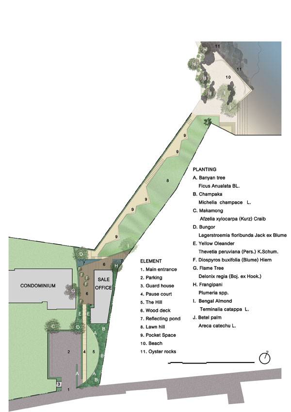
Masterplan of Pause Court and The Lawn Hill: Garden For Sales Gallery, Image courtesy of TROP Terrains + Open Spaces
Developers Aim to Bring Class Back to Pattaya
The high-end residential development Baan Plai Haad is located just steps from Pattaya’s waterfront. These luxury residences are some of the most expensive in the area, so the developer, Sansiri, hoped to impress clients with the incredible ocean views paired with high-end, contemporary design.
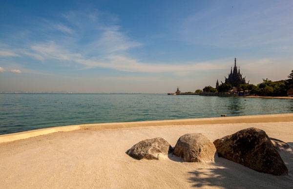
Photo credit: Pirak Anurakyawachon
Pause Court and The Lawn Hill: Garden For Sales Gallery. Photo credit: Pirak Anurakyawachon
Small Budget, Smaller Time Frame
In creating their design solution, TROP faced a number of serious challenges. In less than a month’s time, TROP was required to go from conceptual design to final construction documents. Then, another two months later, the project’s construction was completed. TROP’s design solution is elegant in its simplicity. Working with an extremely limited time frame and budget, a complex design was out of the question. The development is intended to act as a sort of seaside refuge, with a sense of peace and serenity within the residential area that contrasts that of the main city. See More Incredible Projects From TROP Terrains + Open Spaces:
- Where Zen Garden Design Meets Enchanted Woodland: TROP’s Forest and Pool at Pyne
- The Garden of Hilton Pattaya by TROP: terrains + open space
- “Walk of the Town”, the Walk Everyones Talking About
Pause Court and The Lawn Hill: Garden For Sales Gallery. Photo credit: Pirak Anurakyawachon
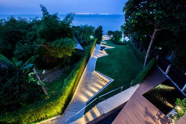
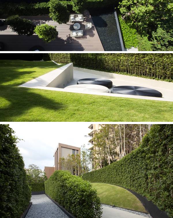
Pause Court: From City to Serenity
TROP’s landscape design for the sales gallery can be divided into two main planes: the lawn hill and the pause court. The pause court area serves as both a physical and visual buffer between the residences and the loud, urban seafront. With a seafront populated with shops, bars, and nightclubs that operate into the early hours of the morning, separation was important to maintaining the image of a private beach escape. Rows of hedges are used as visual screen and to create a sense of separation and privacy from the busy beachfront strip. These green hedge layers also work to provide a sense of entrance and transition into the space.
Pause Court and The Lawn Hill: Garden For Sales Gallery. Photo credit: Pirak Anurakyawachon
Lawn Hill: A Link to the Waterfront
The housing development is closely linked to the waterfront both visually and physically. The beach is public property and has remained mostly unchanged, although TROP was responsible for some rehabilitation efforts along the shoreline, which simply restored and enhanced the waterfront’s natural beauty.
Pause Court and The Lawn Hill: Garden For Sales Gallery. Photo credit: Pirak Anurakyawachon
Stunning Views Are Always a Major Selling Point
Lawn Hill acts as a transitional area between the beachfront and the development’s sales gallery, sloping down to and providing access to the sandy shore. Visually, the area is relatively simple and doesn’t distract the viewer from the stunning ocean views, which are ultimately the focal point — and selling point — of this particular project. By preserving and working with the existing slope rather than against it, TROP minimized costs while highlighting the natural beauty of the landscape. RESIDENTS PASS THROUGH THE LAWN HILL area in order to get to the beachfront. TROP saw this function as an opportunity to create an additional space for residents to enjoy. Small pockets with simple furnishings offer areas for users to stop, rest, and fully enjoy the space in its own right. Looking down from the residences, the focal point becomes the beachfront. However, when looking up from the beach, the lawn lays itself out along the slope for the viewer like a lush carpet of green. The feeling of the space is simple, but luxurious.
Pause Court and The Lawn Hill: Garden For Sales Gallery. Photo credit: Pirak Anurakyawachon
Pause Court and The Lawn Hill: Garden For Sales Gallery. Photo credit: Pirak Anurakyawachon
Pause Court and The Lawn Hill: Garden For Sales Gallery. Photo credit: Pirak Anurakyawachon
Is Less Really More?
Ultimately, TROP’s design solution is simple but beautiful, and considering the limits on time and budget, it an effective solution that met the wants and needs of the clients, while staying true to the luxurious feel of the residential development. Certainly, if given more time, TROP could have implemented a more complex but nonetheless stunning design. However, it is important to also remember the focus here: Pattaya’s amazing waterfront and beaches. Time and budget constraints exist in virtually every design project, but do these limitations help or hinder designers? In your opinion, what is the single biggest constraint for landscape architects and designers — time, budget, or something else entirely? Let us know your opinion in the comments below.
Pause Court and The Lawn Hill: Garden For Sales Gallery. Photo credit: Pirak Anurakyawachon
Full Project Credits For Pause Court and The Lawn Hill: Garden For Sales Gallery
Project Name: Pause Court and Lawn Hill: Garden for Sales Gallery @ Baan Plai Haad Location: Pattaya, Thailand Designers: TROP Terrains + Open Space Lead Designer: Pok Kobkongsanti Size: 2,400 Square Meters Date of Construction: 2012 Client: Sansiri PLC Photography Credit: Pirak Anurakyawachon Project Designer: Paisit Viratigul Project Team: Kampol Prakobsajjakul, Chatchawan Banjongsiri Architect: The Steven Leach Group Website: www.troplandscape.com Show on Google Maps Recommended Reading:
- Urban Design by Alex Krieger
- The Urban Design Handbook: Techniques and Working Methods (Second Edition) by Urban Design Associates
Article by Michelle Biggs Return to Homepage

Designing Your Own Private Garden
An overview of details and ideas to take into consideration when designing your own private garden. Adding a private garden to any home always brings a feeling of warmth and comfort to any home. There are a number of reasons why someone would want to transform their yard into a private garden. The two main reasons for most people are aesthetics and privacy. Homes with an untouched and open yard can leave an empty and cold feeling to the home. A beautiful garden goes a long way towards improving your mood. A garden adds another dimension to your house giving it not only character but another living area in your own abode. A garden can also be used to entertain guests as well as provide a personal sanctuary to recharge after a stressful day. In terms of privacy, a private garden can provide you some solitude from the outside world. A garden can be an extension of the homeowner’s personality. Adding a gazebo can add a certain flare to the garden and provides a nice accent to the home. A well-designed garden can not only be beautiful to look at but also provide some privacy from the prying of eyes of neighbours and the public. There are many things to consider before designing and building your own private garden. Here’s a related post – Steps to designing the perfect garden to give you some ideas.
Fencing
The easiest and quickest way of creating privacy for your garden is to install a fence. A fence helps to keep your neighbours from looking into your garden and yard. A fence will also provide a feeling of enclosure and safety which is good if you have children. A fence helps to keep kids in and strangers as well as animals such as cats and dogs out.
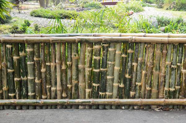
“Bamboo Fence – Agri-Horticultural Society of India – Alipore – Kolkata 2013-01-05 2371” by Biswarup Ganguly. Licensed under CC BY 3.0 via Wikimedia Commons –
- Award Winning Small Garden Design
- Stylish Terraced Garden Makes The Most Out of Small Space
- Luxurious Small Urban Garden Getaway
If adding a fence is too blunt or stark, you can grow a hedge to give your garden a softer feel. There are numerous shrub varieties that can be used as hedges. For example, Boxwood and Privet are popular shrub types used for hedges. For a more natural appearance, you can combine a variety of shrubs. To give the hedges some character and texture, feel free to mix and match different heights, shapes, sizes and colours. Bear in mind to regularly prune your shrubs for keep the shrubs looking presentable and beautiful. For longevity, shear your shrubs so that the bottom of the shrub is always wider than the top.
“Hedge alley” by allispossible.org.uk. Licensed under CC BY 2.0 via Flickr
Structural accents
Adding a structure like a lattice panel is an inexpensive way to create some extra privacy within the garden or hide an unwanted view. Add some vines to the lattice to give the garden a down to earth feel. Additionally, accent the lattice with a small garden bed for yet another option to beautify your garden. Consider adding a pergola or arbour, which is a shaded path or walkway to give your garden a more protected and intimate feel. The pergola can be used to protect and shade a deck or terrace help to connect two or more sections of your garden. A well-placed pergola will add some shade and class to any private garden.
Landscaping
Varying the landscape of your garden can dramatically add to the beauty and freshness of the garden. Adding a winding path or a stone walkway can gently add character to the garden without being too intrusive. You can also add various types of flowers to give the garden more colour and a more lively and robust atmosphere. Designing the garden plots in varying geometric shapes changes the nuance of the garden yet again.
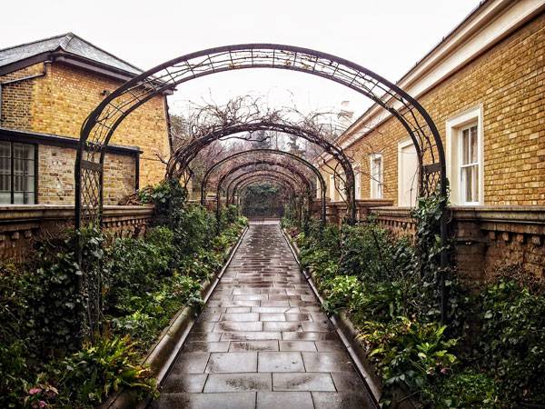
“Pergola walk, Garden of St John’s Lodge, Regent’s Park, London” by Garry Knight from London, England – Leaving a Secret Garden. Licensed under CC BY-SA 2.0 via Wikimedia Commons
Paying special attention to the presentation of the entrance can create a more inviting feel to the garden. Building an arch or adding vines and flowers can hint and prepare you for what’s to come. Carefully placed berms add texture and continuity to a garden by separating garden areas with varying hill and mound placements. Many factors come into play to making a private garden work successfully. Know what you want from your garden. Get inspired and start planning your private garden today. Recommended Reading:
- Urban Design by Alex Krieger
- The Urban Design Handbook: Techniques and Working Methods (Second Edition) by Urban Design Associates
Article published by SDR Return to Homepage Featured Image Credit: “Private garden 2 – Paris Opera Cadet Hotel” by Opera Cadet from PARIS, FRANCE – Private Garden (2). Licensed under CC BY-SA 2.0 via Wikimedia Commons

Sketchy Saturday |040
This week’s Sketchy Saturday top 10. Sketchy Saturday is back after a long break, way too long, and we have a big back log of sketches to get out. As we sort through them, however, the top ones are rising to the top for your viewing pleasure. This week’s selection offers a range of styles and abilities making it another difficult week for judging as it is, of course, challenging to compare vastly different styles and so we have to look at each sketch from an overall point of view and rate them based on how they stand alone and not necessarily when compared to one another. We hope you are inspired by our selection of top sketches by top people.
Enjoy this week’s Sketchy Saturday top 10!
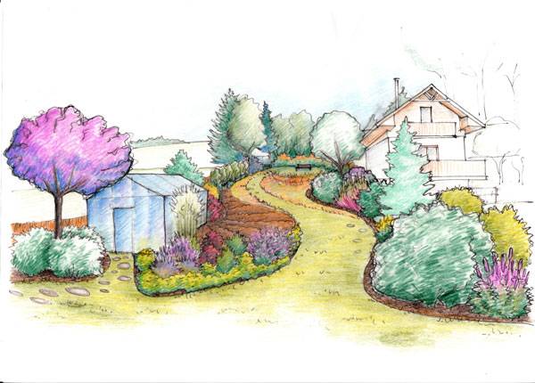
10. by Kristýna Haisová from the Czech Republic. Landscape Architecture student at the Czech University of Life Sciences in Prague. Works as a planner (designer of gardens, parks) for a small local studio.
By Kristýna Haisová
By Gerard Butterss
Klára Zuskinová
By Agnieszka
By Amaury Neto
By Egle Garramone
- Top 10 YouTube Tutorials for Technical Drawing
- Digital Drawing for Landscape Architecture, second edition | Book Review
- Freehand Drawing & Discovery by James Richards | Book Review
“This sketch was made during my study of landscape architecture. It’s a part of a courty yard in Kaunas(Lithuania). It was not renovated so you could see many details that show its history. I made it in 2 hours and I used only graphic pen on paper. Motivation: Free time. Style: Graphic sketch. Location: Country yard in Kaunas (Lithuania) Material used: Graphic pen on paper”. 4. by Nguyen Thi Ha, architect and living in Hanoi, Vietnam “This sketch is a student’ exercise about apartments. The materials in the building are reinforced concrete, brick, glass windows and steel truss”.
By Nguyen Thi Ha
By Chan Kok Cen
By Jarmo Suominen
By Meet.Madhu.Chavda
- Sketching from the Imagination: An Insight into Creative Drawing by 3DTotal
- Architectural Drawing Course by Mo Zell
Article by Scott D. Renwick Return to Homepage


Walls: Elements of Garden and Landscape Architecture | Book Review
A book review of the Walls: Elements of Garden and Landscape Architecture by Günter Mader and Elke Zimmerman. Everyone knows Pink Floyd’s hit song “Another Brick in the Wall”, and perhaps every person finds something true in the lyrics. Who wants to be just another brick in the wall? Don’t we all try to seek the different, the undiscovered, the unheard of and the untold? We chase singularity, individuality, and differentiation in our everyday lives. Artists and architects strive to make names for themselves, to develop their recognizable signatures, and, yes, to stand out among the other “bricks”.
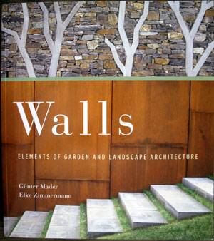
Front cover of Walls: Elements of Garden and Landscape Architecture. Photo credit: Velislava Valcheva
Walls: Elements of Garden and Landscape Architecture
The Engrossing World of Walls
“Stones always tell us long stories. They are natural formations that reflect the growth and decay that occurs over the course of time. Man senses something unique in stone that helps him express his thoughts. In this way, we find our connection to the tried and true and our unison with nature.” With this quote from world-famous architect Werner Blaser, the book immerses you in the fascination of walls right from the very first sentence.
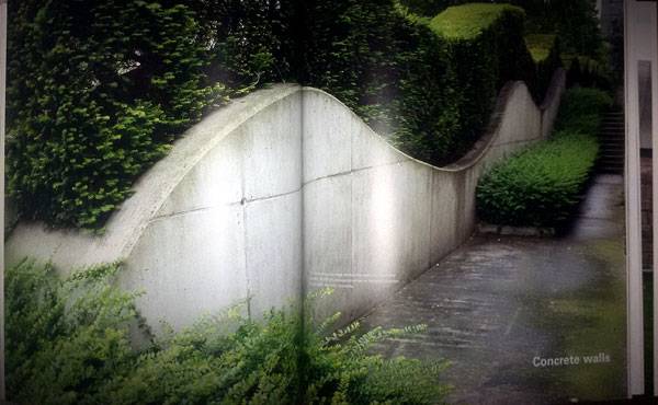
Inside Walls: Elements of Garden and Landscape Architecture. Photo credit: Velislava Valcheva
Inside Walls: Elements of Garden and Landscape Architecture. Photo credit: Velislava Valcheva
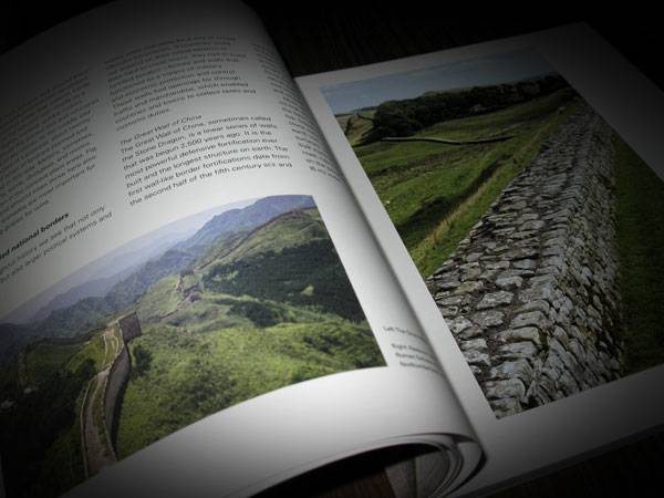
The Cultural and Building History of Walls
The first section of the book goes into the cultural history of wall construction. While illustrating examples of cultural heritage such as fortified national borders — including The Great Wall of China, the walls of the Roman Empire, and The Berlin Wall — the book studies how cultural and building history go hand in hand.
Inside Walls: Elements of Garden and Landscape Architecture. Photo credit: Velislava Valcheva
A Trip Back to 5,000 B.C.
The reader is taken back in time to 5,000 B.C. to investigate how town walls defined spaces with their own regulations and helped society live in peace. The history of walls traces out the development of waterside, garden, and terraced walls until it reaches the curious, bowl-like plant areas called arenados, which were used for earth cultivating in the first part of 20th century.
Inside Walls: Elements of Garden and Landscape Architecture. Photo credit: Velislava Valcheva
Inside Walls: Elements of Garden and Landscape Architecture. Photo credit: Velislava Valcheva
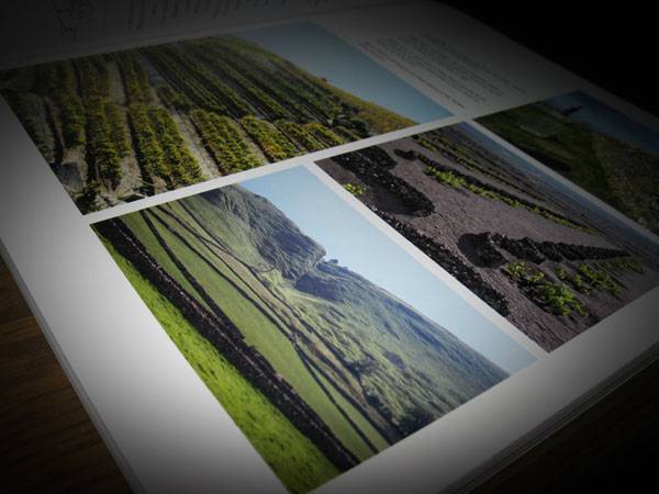
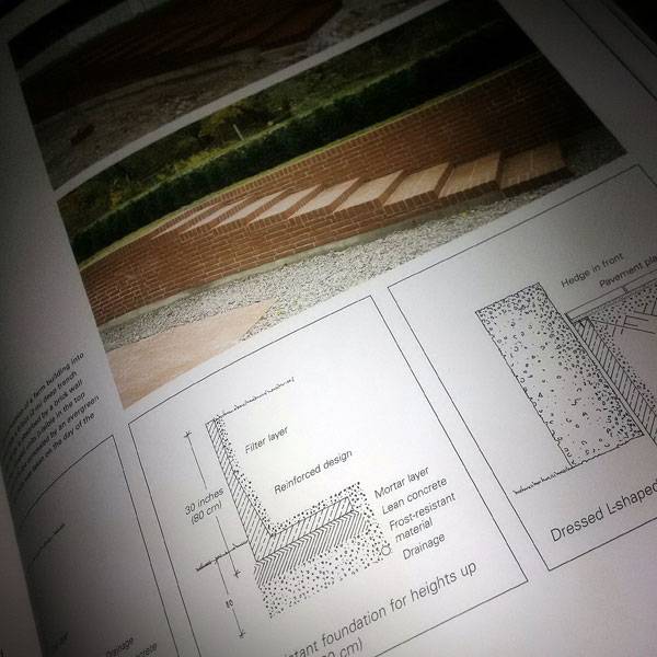
Design Fundamentals of Walls
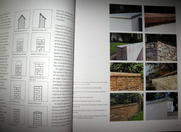
The next section of the book is devoted to the most considerable part of designing walls – the structural fundamentals. What are the differences between freestanding and retaining walls? What technical details should be taken into account for the foundation, the base, the masonry, and the coping of a wall? The easily comprehensible text, professional sketches, and images reveal the answers to all those questions. Furthermore, a special feature is dedicated to planning basics, from which a designer can learn the best way to design a wall – considering the proper dimensions, materials, and, of course, legal concerns.
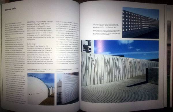
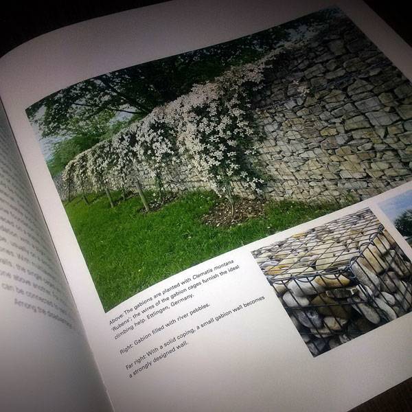
Wall Variety
Coming closer to the most tempting part of the book for designers – the one looking at the diverse types of walls – readers are gradually faced with the unbounded but steady design potential held by walls. Beginning with the favorite of garden and landscape designers — stone masonry walls — the authors disclose stone’s strengths and weaknesses while displaying mind-blowing, world-class projects of the highest craftsmanship. If you are eager to sneak a peek into the Edwardian epoch (1901-1910) and see how walls were designed at that time, this section of the book is for you. You can pick up the book here!
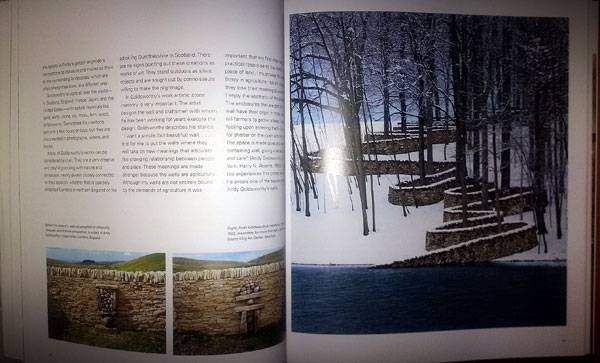
Inside Walls: Elements of Garden and Landscape Architecture. Photo credit: Velislava Valcheva
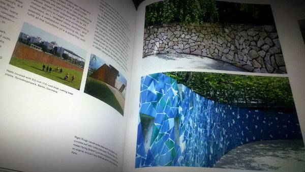
Inside Walls: Elements of Garden and Landscape Architecture. Photo credit: Velislava Valcheva
Inside Walls: Elements of Garden and Landscape Architecture. Photo credit: Velislava Valcheva
Why Should You Read This Book?
As the authors say: “This book presents numerous design possibilities for walls and open spaces. It is organized by type of construction, material, and method of execution. You will find examples from traditional dry walls typical in some regions and cultures to actual works of land art …” With its absorbing content, this book is suitable for inquisitive designers, students, and people seeking perfection and the vital connection between the time-honored and the new, into and beyond the world of walls.
Inside Walls: Elements of Garden and Landscape Architecture. Photo credit: Velislava Valcheva
- Landscape and Urban Design for Health and Well-Being
- Digital Drawing for Landscape Architecture
- 10 Books to Read in Your Fourth Year of Landscape Architecture
Pick up your copy of Walls: Elements of Garden and Landscape Architecture today!
Review by Velislava Valcheva Return to Homepage