Author: Ronlad Lee
Company Profile: Gustafson Porter
Landscape Architects Network feature a company profile for Gustafson Porter . Established in 1997 in London by Landscape Architect Kathryn Gustafson and Architect Neil Porter, the office soon became an award-winning company, known all over the world thanks to several of its realized projects located in different places around the globe. Its main strength is a combination of ingenious design, sensual shapes and the use of advanced computation tools with which it is capable of producing its characteristic and original projects.
Gustafson Porter
Spreading a Culture About Landscape
One of the key points of Gustafson Porter’s profile is its interest in creating a culture about landscape involving the role of specialists such as landscape architects. It often gives lectures about these topics and it is part of examiners’ committees during degree programmes or design juries. “We are part of a wider community of professionals who believe landscape is at the forefront of contemporary design and development,” they report on their website.
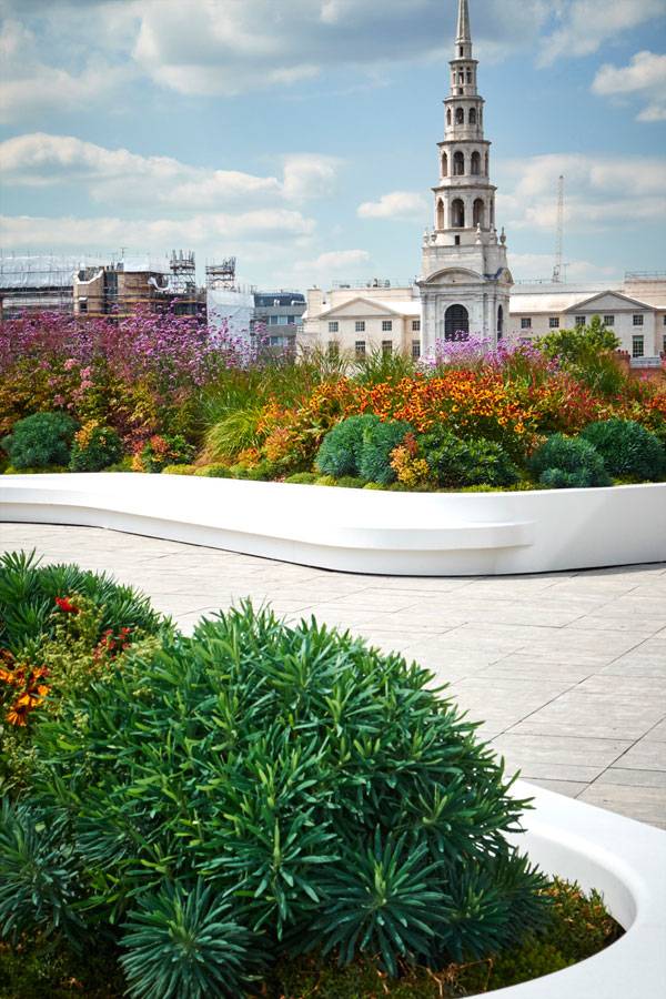
New Ludgate. Image credit: Fletcher Priest
Design Approach
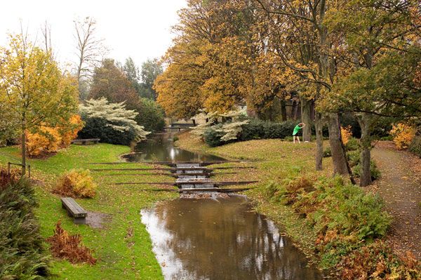
What makes this office different from other firms is its distinctive design approach based on different but equally important elements. Just consider, for instance, its huge intervention for the Westergasfabriek Park, of which you can read more in our article Westergasfabriek Park Goes from a Polluted Gas Factory to an Award-Winning Design, from Gerard De Silva; at a closer look, you will find out all of GP’s key elements; landform, water, planting, lighting, sustainability, ecology, inclusive design and safety.
The combination and the analysis of all these elements defines Gustafson Porter’s amazing projects while its people-oriented design brings them right to the peoples’ hearts, giving its interventions a long-lasting life through many different generations. “Our work is intellectually rigorous. We weave in layered stories; in the botanical selection of species or the way the colour of the paving demarcates the ancient line of the sea. We sculpt the land so it unfolds as the visitor walks through it. We design landscapes which change through the day, through the seasons, through different uses. We make landscapes to be experienced, owned and loved.”Working with Different Cultures
Being an award-winning firm with built projects located all over the world it means being capable of dealing with multicultural contexts and different cultural needs. And that’s exactly what Gustafson Porter’s team aims at doing for every single project. Research strategies and deep analysis of historical contexts, along with collaborations with a wide range of specialists, allow the firm to create spaces which meet the complex and changing demands of all users.
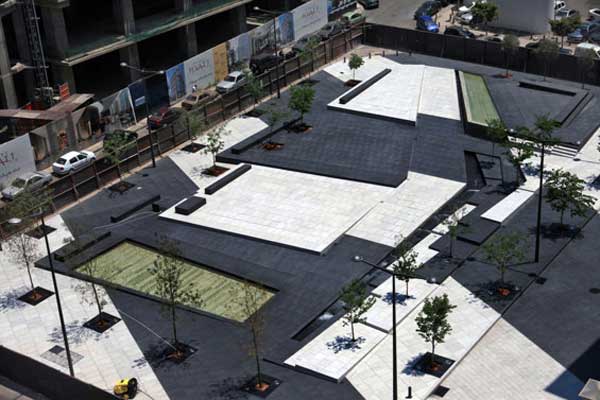
Zeytouneh Square, Beirut, Lebanon by Gustafson Porter
Creating a Project is a Combination of Different Elements
Unlike what common people could think, being able to create awesome landscape designs is not exclusively related to one’s design skills. Actually, inclusive community spaces such as GP’s combine a variety of fields from strategic economic planning to cultural programming, not to mention a community consultation process with the public and other stakeholders to receive feedback. A certain attention to sustainable techniques is also appreciated, to build appropriate solutions.
Being a Landscape Architect at Gustafson Porter
Working for such an important firm would be a great opportunity for every landscape architect willing to make a leap forward in his or her career. Gustafson Porter’s team is wide and varied and includes professionals from different sectors, capable of working together to create fabulous designs such as the Diana Memorial Fountain, of which you can read more in Diana Memorial Fountain: “Reaching Out, Letting In” by writer Win Phyo.
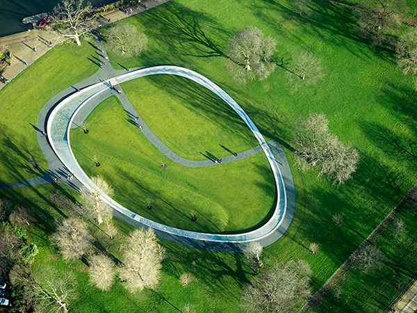
Aerial view of Diana Memorial Fountain. Photo credit: Jason Hawkes
A Constant Search for Knowledge
Knowing Gustafson Porter and understanding its main project designs is something that someone wanting to be a landscape architect shouldn’t fail to do. This interesting firm, with its almost 25 years of design experience, reveals in its landscape projects to be exceptionally passionate about design and both the natural and built environment. Its attention to the spreading of a culture about landscape through lecturing, education programmes, and consultancy surely is a start towards a different future for the next generation. “The development of our design work has continuously pushed the boundaries of what constitutes the field of landscape design and our work is known for its sensual and sculptural features. We believe that landscape architecture is an essential discipline for the creation of healthy environments in the 21st century.”
Direct Information for Gustafson Porter :
Office Name: Gustafson Porter Founders: Kathryn Gustafson, Neil Porter Year of foundation and location: 1997, London Address: 1 Cobham Mews – Agar Grove – St Pancras – London NW1 9SB Website: www.gustafson-porter.com E-mail contact: enquiries@gustafson-porter.com Social networks: Facebook, Twitter, LinkedIN
More Gustafson Porter’s projects:
- How Beirut’s Zeytouneh Square is Reuniting a Divided Urban Community
- Westergasfabriek Park Goes from a Polluted Gas Factory to an Award Winning Design
- Why New Ludgate Will Become Your Role Model For Landscape Design
- Diana Memorial Fountain: “Reaching Out, Letting In”
Related Articles Featuring Gustafson Porter:
- Top 10 Urban Design Firms in the World
- 6 Unusual Memorials Where Landscape is the Element of Memory
- Top 10 Names In Landscape Architecture Today
- The Netherlands Got Talent! – 10 Awesome Projects From The Netherlands
- Britain’s Got Talent: 10 Awesome Projects From the UK
- 7 Female Landscape Architects That You Need to Know About
If you would like to get your landscape architecture office profiled on Landscape Architects Network, contact us at office@landarchs.com Profile composed by Elisa A.M.Varetti
Top 10 Urban Design Firms in the World
Article by Elisa A.M.Varetti Discover our top-ten selection of urban design firms from around the world. Who knows maybe they’re hiring. Have you ever stopped to think about the meaning of urban design? Well, working with urban design is not as easy as one could think and is not just about towns. Incorporating several disciplines, such as landscape architecture, architecture, civil engeneering and urban planning, to say a few, it relates to people and their connection with spaces. The following is our top 10 selection of the best urban design firms from all over the world which better develop this subject, creating joyful and interesting designs.
Urban Design Firms
10- SANALarc , Turkey
Based in Istanbul, Turkey, this fourteen-year-old firm can be considered among the most interesting urban design names of the last few years. Its latest urban design, Sishane Park, was nominated for the Beirut 2015 Archmarathon, meaning that its mission in creating innovation for public spaces, thanks to a multidisciplinary team, is leading it to the right direction.
Read our article: The Dark Secrets Behind Sustainable Urban Design Revealed in Şışhane Park by Simon Vive9- Integrated Planning and Design Inc. , USA + China
iPD is not a common firm: being an incubator where creative individuals (and ideas) can grow is what makes it different from the others. Founded in 2009, it is based both in the USA (San Francisco) and China (Shanghai and Shenzhen) and owes its popularity to its citizen-oriented designs. “iPD values timeless and enduring environments that solve problems and connect to people. We strive to excel through technology, knowledge, construction techniques and an innovative methodology to keep pace with the ever-changing, complex landscape.”
Read our article: Lotus Lake Park Sets Precedent for Sustainable Urban Design in China by Michelle Biggs8- Landscape Projects , United Kingdom
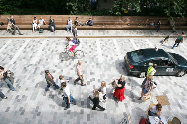
This urban design firm, based both in Manchester and London, United Kingdom, combines urban planning with landscape architecture, a strong design sense, and people-oriented principles. Its core business is to create spaces where people can entertain themselves and which are capable of improving our society. Its team focuses on social connection and this is the reason why their designs are so well-appreciated. “As a practice we have spent time examining what makes successful places. The best spaces are well connected and they fit well with the way people use them. They are comfortable. They have a beauty. We believe that as a practice, we understand how to design these successful places.”
Read our article: Just How Powerful Are Pedestrianised Streets? By Taylor Stapleton7- HASSELL , Australia + China + South East Asia + United Kingdom
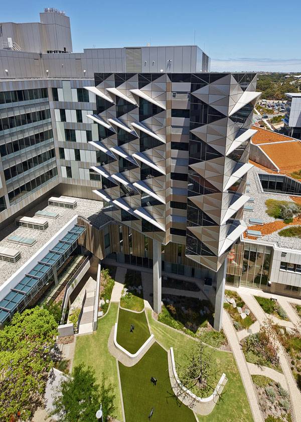
A multicultural team defines this urban design firm, based in different locations around the world. This peculiarity, combined with good design and a certain sense of empathy with clients, forms the machine capable of creating large-scale urban projects as well as small ones. “Our capability in urban design is supported by original research in knowledge, innovation and sustainability – all of which help us achieve our goal to deliver future cities that are robust, culturally rich and economically strong.”
Read our article: Fiona Stanley Hospital: A Landscape for Healing by Erin Tharp6- The Office of James Burnett , USA
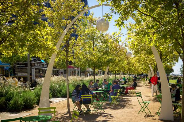
Founded in 1989 in Houston and today also based in Solana Beach and Boston, this firm’s urban projects combine landscape architecture with a deep analysis of forms and functions. Its huge team grants it a higly professional approach with both design process and clients. “OJB’s design process conceives original and inventive landscapes within the framework of context and function, mitigating site challenges with creative and innovative solutions.”
Read our article: Does The New Klyde Warren Park in Dallas, Bridge the Gap to a Greener City? by Tania Ramos Gianone5- SWA Group , USA + UAE + China
Sustainability and aesthetic principles is what characterize SWA’s designs. With offices in several towns in USA, China and the United Arab Emirates, this firm can count on a huge multidisciplinary team capable of developing large-scale urban designs as well as smaller ones with high quality standards. “Professionally focused and employee-owned, our foremost passion is to create exceptional places for our clients”. Read our article: Gubei Gold Street Brings Peace to the Busy City of Shanghai by Alexandra Antipa
4-OLIN , USA
We couldn’t forget this well-known firm based both in Philadelphia and Los Angeles. Its popularity as an urban and landscape architecture firm lies in its interventions entwisted with the natural world. Project scales do not worry its team, which always creates dynamic designs coming from deep analysis and rigorous research. “Sustainability is a central tenet of our holistic approach, uniting natural processes with technical innovation to produce contemporary and beautiful places.”
Read our article: The Street Bridge Park Everyone’s Talking About by Erin Tharp3-West8 , The Netherlands + USA + Belgium
Founded in 1989 with offices in Rotterdam, New York, and Brussels, West 8 couldn’t miss its place on the podium of our top 10 selections. This award-winning firm is composed of a multidisciplinary team working on important projects all over the world. Its designs focus on sustainability, global warming, and space identity.
Read our article: 280 Million Euros Invested into Urban Revitalisation Project by Julia Lucchese2-Gustafson Porter , United Kingdom
This very well-known firm, based in London since 1997, develops each of its designs with a highly talented multidisciplinary team. Advanced computation tools help in the development process but its attention to detail and ability to read a place’s historical, social and cultural background is the real value it adds to its designs. Not to mention its intriguing designs with soft shapes and water features.
Read our article: Westergasfabriek Park Goes from a Polluted Gas Factory to an Award Winning Design by Gerard de Silva1-Turenscape , China
This Chinese firm, established in 1997 and considered the most important in its nation, develops great and giant open spaces focused on nature, people, and ’spirit of the place’, or genius loci (as its name states). Its interventions, though oriented towards landscape architecture, definitely represent real, huge-scale urban regeneration managed only by its 600-person team which grants it highly professional designs and emotional results. “Armed with modern technology, Turen observes the phenomenon up in the sky and the patterns down on the earth; follow the natural and social processes so that man, nature and the spirits can be understood as one and designed as one.”
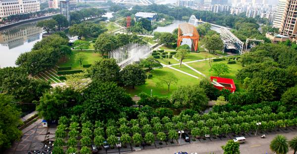
This industrial site represents 50 years of Socialist industrial history and was a witness to China’s Cultural Revolution. Credit: Turenscape
Recommended Reading:
- Becoming an Urban Planner: A Guide to Careers in Planning and Urban Design by Michael Bayer
- Sustainable Urbanism: Urban Design With Nature by Douglas Farrs
Article by Elisa A.M.Varetti
10 Projects That Make Excellent Use of Planting Design
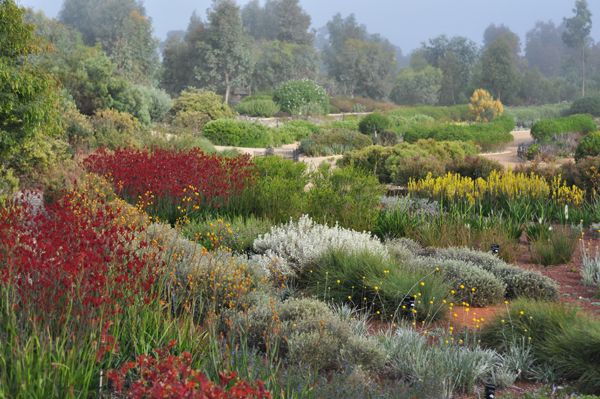
Article by Elisa A.M.Varetti Discover our selection of 10 landscape projects that make excellent use of planting design. Anyone who wants to create a powerful design knows that an outstanding planting scheme capable of highlighitng every possible element of the project is more than just required. In this article, you will find a selection of 10 landscape architecture projects that have made excellent use of planting design. Being an expert in this sector is not an easy task, but if you think you have the makings of a plantsman, keep reading.
Excellent Use of Planting Design
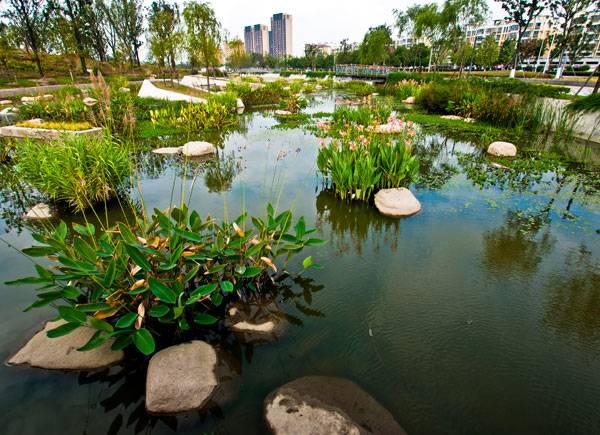
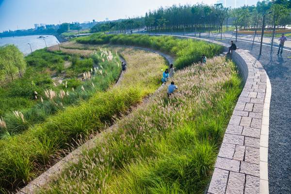
1. Zhongshan Shipyard, by Turenscape, Zhongshan, China Designed on the site of a former shipyard, this 27-acre park features an extraordinary variety of vegetation species following Kongjian Yu’s philosophy about landscape architecture. One could think that its main strength lies in its huge dimensions , which allow a planting design based on many different species. But that would be incorrect. Actually, what makes it so interesting — from a planting point of view — is its different consideration of low-value common species. By using native aquatic flora and combining different kind of grasses, Turenscape managed to create volumes of vegetation capable of creating emotions in those visiting the park. It’s not how rare and valuable the plants are, but how you use them that makes a place stunning.

This industrial site represents 50 years of Socialist industrial history and was a witness to China’s Cultural Revolution. Credit: Turenscape
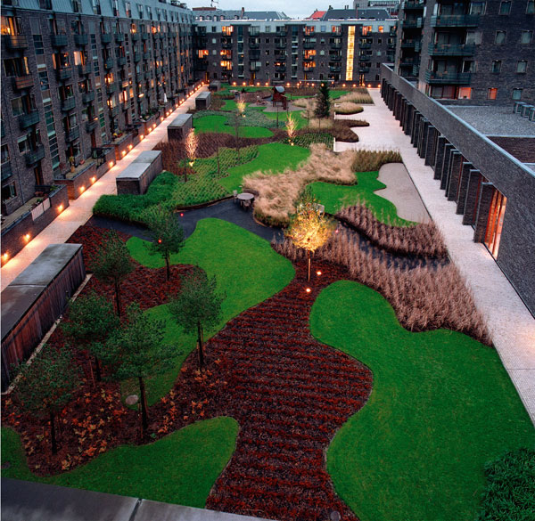
Charlotte Garden. Photo credit: Torben Petersen.
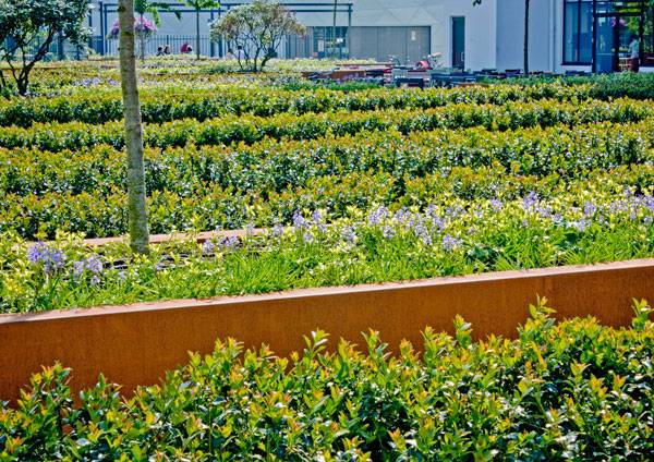
Mathildeplein. Photo courtesy of Buro Lubbers.
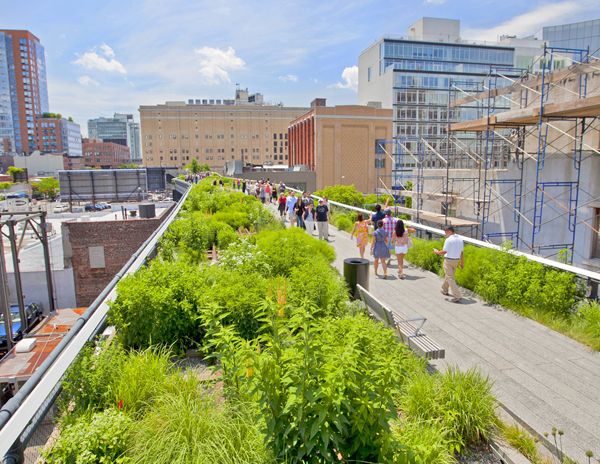
The Highline is a great example of a planting scheme increasing biodiversity in an urban area; credit: shutterstock.com
Recommended Reading:
- Becoming an Urban Planner: A Guide to Careers in Planning and Urban Design by Michael Bayer
- Sustainable Urbanism: Urban Design With Nature by Douglas Farrs
Article by Elisa A.M.Varetti
How to Design a Site and Preserve it’s Archaeological History
Article by Elisa A.M.Varetti Musealização da Área Arqueológica para a Pç Nova Do Castelo de S.Jorge, by Global Arquitectura Paisagista and JLGS Arquitectos, Lisbon, Portugal. Have you ever stopped to wonder about the historic evolution of your own town? Most people think landscape architects only deals with green materials, parks, and gardens, but they can do a lot more! For example, they can work with archaeological areas and bring out what people have forgotten; their history and their tradition. Making people aware of what they have lost is a tough job but it clearly defines an important role for landscape architecture showing how it can interact with other sectors. And that’s exactly what happened when landscape architect João Gomes da Silva of Global Arquitectura Piasagista worked with Architect João Luìs Carrilho da Graça of JLCG Architects to restore the archaeological site of the S. Jorge Castle in Lisbon.

Musealização da Área Arqueológica para a Pç Nova Do Castelo de S.Jorge. Photo credit: Duarte Belo

Musealização da Área Arqueológica para a Pç Nova Do Castelo de S.Jorge. Photo credit: Duarte Belo

Musealização da Área Arqueológica para a Pç Nova Do Castelo de S.Jorge. Photo credit: Fernando Guerra

Musealização da Área Arqueológica para a Pç Nova Do Castelo de S.Jorge. Photo credit: Duarte Belo

Musealização da Área Arqueológica para a Pç Nova Do Castelo de S.Jorge. Photo credit: Duarte Belo

Musealização da Área Arqueológica para a Pç Nova Do Castelo de S.Jorge. Photo credit: Fernando Guerra

Musealização da Área Arqueológica para a Pç Nova Do Castelo de S.Jorge. Photo credit: Duarte Belo

Musealização da Área Arqueológica para a Pç Nova Do Castelo de S.Jorge. Photo credit: Duarte Belo

Musealização da Área Arqueológica para a Pç Nova Do Castelo de S.Jorge. Photo credit: Duarte Belo

Musealização da Área Arqueológica para a Pç Nova Do Castelo de S.Jorge. Photo credit: Duarte Belo

Musealização da Área Arqueológica para a Pç Nova Do Castelo de S.Jorge. Photo credit: Duarte Belo
Full Project Credits For Musealização da Área Arqueológica para a Pç Nova Do Castelo de S.Jorge:
Project Name: Musealização da Área Arqueológica para a Pç Nova Do Castelo de S.Jorge Location: Lisbon, Portugal Date of Construction: 2008 project, 2009 – 2010 construction Team: Global Arquitectura Paisajista/João Gomes da Silva (landscape architecture), JLCG Arquitectos/ João Luís Carrilho da Graça (architecture) Project Team: Francisco Freire, Vasco Melo, Pedro Abreu, Monica Ravazzolo Security Installations: GIPIC/Alexandre Martins Foundations and Structures: Estudos Betar / José Pedro Venâncio and Paulo Mendonça Water Installations: Estudos Betar / Marta Azevedo and Jorge Pinheiro Electrical Installations: Ruben Sobral Graphic Design: Henrique Cayatte, Mónica Lameiro and Pedro Gonçalves Area: 3.500 m2 Cost: € 1 million Awards: Piranesi Prix de Rome in 2010 Client: Câmara Municipal de Lisboa (EGEAC) Photographs: Fernando Guerra, Duarte Belo Recommended Reading:
- Becoming an Urban Planner: A Guide to Careers in Planning and Urban Design by Michael Bayer
- Sustainable Urbanism: Urban Design With Nature by Douglas Farrs
Article by Elisa A.M.Varetti
10 of the Best Landscape Architecture Portfolios on YouTube
Article by Elisa A.M.Varetti Discover 10 excellent Landscape Architecture portfolios and grab some tips to make yours the best. Does making one change to your professional or student portfolio prompt you to want to change it completely? You simply can’t help it. You would like to transform it with new graphics, new text, new everything! You start thinking about it and suddenly realize you need inspiration and ideas — examples to follow, tips and suggestions to borrow to make your new portfolio REALLY amazing. Here are 10 excellent examples to help you make your portfolio the best one you have ever had.
Landscape Architecture Portfolios
1. Enhance your Academic Portfolio In this video, the author shows how a neat graphic, a few well-described projects, and a leit-motif repeating itself on every page can become the winning elements of your portfolio. Each project reveals images of the existing situation, a few drawings, analysis of the place, and various hand-drawn sketches. Plans, sections, and perspectives — with a clear, graphic style and bright colors combined with a rigorous font such as Architext — provide a professional image of this academic portfolio. WATCH >>> Landscape Architecture Portfolio
2. Adding a Full Index Gives your Portfolio a Professional Aura This is a complete and detailed portfolio showing different kind of projects. The index is well organized, helping people understand what they will find inside the portfolio. The image of a tree in the background accompanies us throughout the whole work, perfectly marking the beginning of each category or project. Adding hand drawings instead of just pc renders make the portfolio more personal. While approaching the end, we can experience the author’s increased skills in hand drawing. Making people understand your evolution as a professional is quite important, and the author clearly knows it. WATCH >>> T. Clark Stancil – Landscape Architecture Portfolio
3. Add your Hobbies Showing a very simple but effective graphic style, this portfolio leaves people to fully appreciate every element inside it. Its minimal descriptions allow people to focus on the designs, while the succession of different techniques clearly shows the author’s skills and evolution in both hand drawing and computer graphics. The portfolio ends with a mixed section in which the author shows glimpses of her abilities with other computer software apart from SketchUp. Instead of just writing them down, she preferred to feature them. Good choice! WATCH >>> landscape architecture portfolio
4. Tell a Story In this video, we can see a portfolio telling a story about the author’s passion for landscape architecture. By beginning with the explanation of the cover, he leads people directly inside the fairytale he’s going to tell. From the first pages, the author shows us the places where he has worked, designed a project, or has visited, making us understand his worldwide background. If you have lived or studied in different countries, featuring it in your portfolio could be of interest for your future chief. Here, each project represents a chapter of this story and is identified not only by pictures, but also by words. If you have communication skills, show them by adding keywords throughout your portfolio. It will help in making a good impression. WATCH >>> Landscape Architecture Portfolio
5. A Few Elements Can Create a Powerful Portfolio WATCH >>> Rikerrious Geter Landscape Architecture Portfolio
A few elements can make a portfolio an exceptional work if you know how to use them wisely. Acting as a main theme is the grid on the cover, with six columns, each one showing a detail of the six projects featured inside the portfolio. Each design begins with the same grid, in which the related column is switched on, anticipating what we will find in the following pages. From hand drawing to computer graphics, this portfolio features the author’s skill with concept designs, site plans, perspective views or renders, and a short description. The video ends with an extra section on the author’s computer skills. A real treat! 6. Add Various Information I chose this portfolio because it reflects the author’s personality right from the beginning. You don’t have to go too far to discover that ecology and the natural world are exactly what she likes the most! In fact, just behind the cover there is a short description about her main interests, not to mention her own portrait picture. Adding other information apart from your projects — such as your picture, some models, your work methods, and philosophy — can help people understand how your brain works during the design process and be the difference between you and another candidate. WATCH >>> Carley Rickles’ Landscape Architecture Design Portfolio (UGA-CE+D)
7. Consider it a Proper Book Another way in which you can create your portfolio is to consider it as a proper book, adding all the elements that books usually have: information on the author, index, page numbers, detailed texts supported by some pictures, and a few images describing the project. In this case, a neat graphic style and a few elements are the best way to feature a small number of projects. With just a white background, a sans serif font, and no other color apart from that in the images, this portfolio acquires a professional appearance even if it refers to academic works. WATCH >>> Patrick Strott Landscape Architecture Portfolio
8. Add the Project Period I chose this portfolio beacuse it has a good balance among colors, text length, and various graphic techniques. Even if there are many elements — such as gray and green text, colored images, and a black and green stripe at the bottom of each page — each one seems to get along well with the others, thanks to a precise composition of all the items. The result is a portfolio showing the author’s ability in graphics, hand drawing, and the design process. It is also pleasant to browse and easy to read. WATCH >>> Landscape Architecture Portfolio – James Kelly
9. Relate Each Project to Your Skills Portfolios must be short, otherwise people won’t look at them properly. So how can you insert everything inside them without being extremely boring? Well, this author’s portfolio found out a solution for all of us by just adding to each project the list of the techniques he used during the design process. Pretty useful, isn’t it? He also added his design philosophy, representing it in his portfolio’s cover and explaining it on the first page. WATCH >>> David Neuman – Landscape Architecture Portfolio
10. Make People Understand Your Passion My last choice is one of my favorites because of its fabulous graphics. It also covers a variety of different projects, from small to big, each time giving details and information not only about the project, but also about the design process and the techniques the designer used. His last sections — one about technical drawings and the other about his hobbies — help in defining this professional’s profile. WATCH >>> John Latham – landscape architecture portfolio
Landscape Architecture Portfolios
What you have just seen are 10 examples of excellent portfolios made with different techniques and covering different kinds of work. However, if you are still looking for other examples, why don’t you look around on the Internet by following our article on Top 10 Websites for Online Portfolios, by Win Phyo? By looking and studying others’ work, you can find ideas on how to improve your own portfolio. But don’t forget to have a look as well at our suggestions on some important must-do’s and don’ts, which you can find in our articles 5 Mistakes You Should Avoid When Designing Your Portfolio, by Dalia Zein, and 8 Essential Tips to Make a Knockout Landscape Portfolio, by Naila Salhi. Remember: Your portfolio is your business card! Go to comments Recommended Reading:
- Becoming an Urban Planner: A Guide to Careers in Planning and Urban Design by Michael Bayer
- Sustainable Urbanism: Urban Design With Nature by Douglas Farrs
Article by Elisa A.M.Varetti
This is Going to be the Most Powerful Monument for World Peace!
Article by Elisa A.M.Varetti 100 Miles 4 Peace, by Paul-Felix Montez; a global project in 100 locations around the world. Have you ever stopped to think how many memorial monuments there are? Every country has its own, related to some global or local tragic event that must be remembered or commemorated as our writer Nick Shannon shows us in his article Poppy Plaza: the landscape of memory and Kaila Johnson in hers article How Gordan Lederer Memorial Makes a Tragedy Beautiful. Memorial monuments remind people what happened and encourage them to hope that similar tragedies never happen again, like Alexandra Antipa shows us in her article How A Symbol of Tragedy Can Encourage People to Look into the Future. “But what if people were taught how many men and women stood up for global peace in the past?“ Unfortunately, we all know human history is going to repeat itself, we have learned that at school since we were children. But what if people were taught how many men and women stood up for global peace in the past? Couldn’t global peace knowledge and culture be the most powerful elements to really fight tragic events? And what would you say if I told you that artist Paul-Felix Montez is close to making it happen with his 100 Miles 4 Peace project?
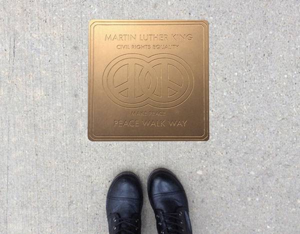
100 Miles 4 Peace, by Paul-Felix Montez

100 Miles 4 Peace, by Paul-Felix Montez
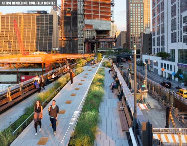
100 Miles 4 Peace, by Paul-Felix Montez
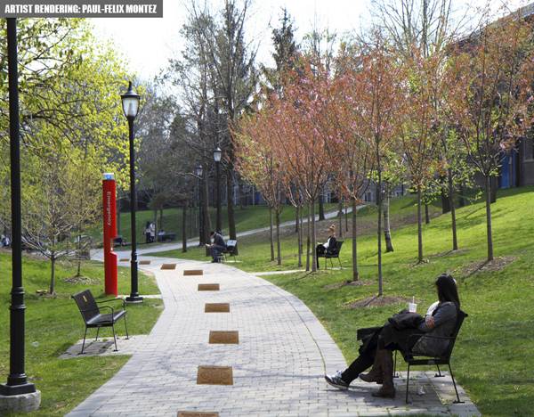
100 Miles 4 Peace, by Paul-Felix Montez
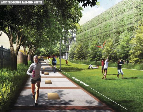
100 Miles 4 Peace, by Paul-Felix Montez
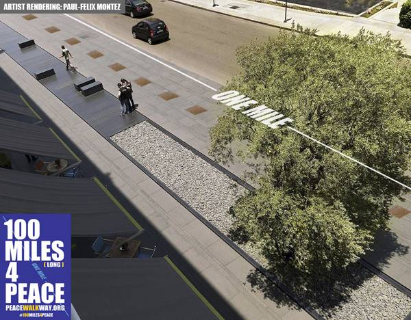
100 Miles 4 Peace, by Paul-Felix Montez
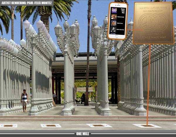
100 Miles 4 Peace, by Paul-Felix Montez
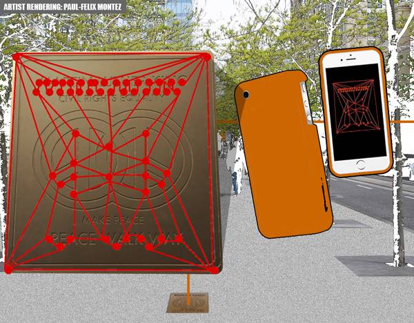
100 Miles 4 Peace, by Paul-Felix Montez
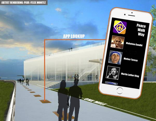
100 Miles 4 Peace, by Paul-Felix Montez
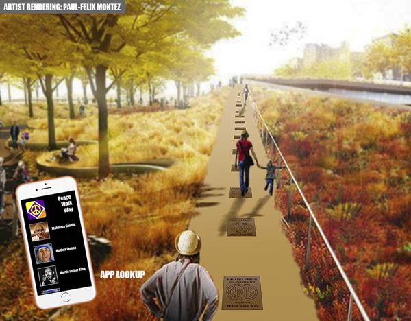
100 Miles 4 Peace, by Paul-Felix Montez
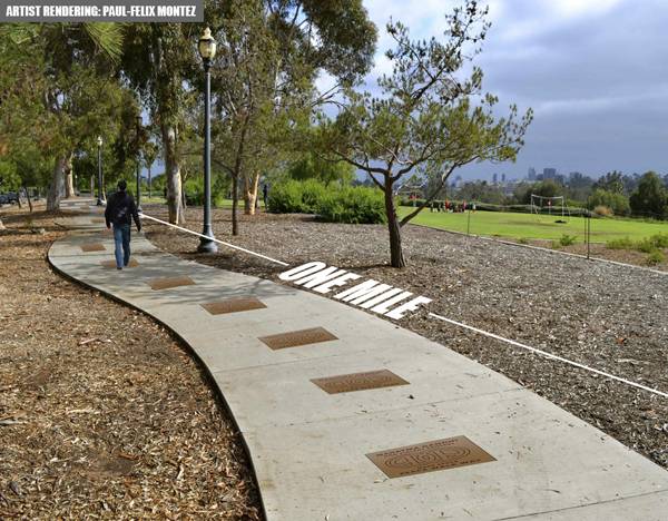
100 Miles 4 Peace, by Paul-Felix Montez
Full Project Credits For 100 Miles 4 Peace:
Project Name: 100 Miles 4 Peace/Peace Walkway Project Location: global; 100 locations around the world Team: Artist- Paul-Felix Montez, Gary Jackson Monumental Sculptures, Jason Rohan of Rohan Engineering Area: 1 mile Achievements: Ted Talks UCLA Speaker Finalist 2016 Facebook: 100 miles 4 peace Twitter: @makepeaceglobal Recommended Reading:
- Becoming an Urban Planner: A Guide to Careers in Planning and Urban Design by Michael Bayer
- Sustainable Urbanism: Urban Design With Nature by Douglas Farrs
Article by Elisa A.M.Varetti
10 Unmissable SketchUp Tutorials on Youtube
Article by by Elisa A.M.Varetti 10 SketchUp tutorials that will suddenly turn you into a SketchUp pro. Have you always wanted to know how to use SketchUp but never tried to because you thought it was too difficult? Have you always wanted to learn SketchUp’s deep secrets and become a master in this software? If your answers are yes, you need to read this article and discover 10 unmissable tutorials that will teach you, step by step, how to improve your knowledge and make you become a SketchUp Master. Be sure to pay attention to all of them and use them to develop you skills in your spare time as each one of them has something different to offer in terms of practical information. 1. Let’s Start WATCH >>> Just the Basics 1. Import Reference Image – SketchUp Tutorials For Landscape Architects of Digital Archland
You can’t start learning SketchUp without knowing one of its basic principles first. Whether you are a beginner or an advanced user, knowing how to place and scale reference images in your SketchUp models will help you save time while working, not to mention that by following this YouTube tutorial you’ll avoid any problems or wrong practices that would probably slow your work in the future. 2. Simplify Your Work When Using Components WATCH >>> Simplify Design with Components – SketchUp for Landscape Architects
Every time we start learning new software we always waste a lot of time using it in the wrong way. We manage to transform the simplest tasks into the most difficult ones. So that is why this YouTube tutorial is really valuable. In this video, which is for beginners and advanced users, the author teaches you how to deal with repeated elements (lights, benches, doors …). I think that everyone should know this one. It’ll make your life easier without having to modify the same object an infinite number of times. Just use components and you’ll be able to transform all of your identical objects at the same time. 3. The Site’s Topography is Essential for a Good Project WATCH >>> How to Import a Google Map into SketchUp
You may want to know that it is possible, and really useful, to import Google Maps into SketchUp. With a simple click you can then discover the topography of your site. Be careful; it’s not as accurate as a land survey, but at least it’s a start. This tutorial clearly teaches you the right steps that will lead you to choose your location, import it into SketchUp and reveal its topography. It can be very useful at times, especially when you are working on big properties in the hills and you still don’t have any land survey. Your life suddenly becomes much easier! 4. Create Your own Topography With the Sandbox Tool WATCH >>> SketchUp 8 – Sandbox Tools – Building Terrain from Contours
Ok, tutorial 3 was very useful but it just referred to real, existing topography. But what if you changed site’s topography while designing? Well, SketchUp gives you the possibility to create your own site topography, you just need to work with contours (that can either be imported from AutoCad or drawn in SketchUp from a map), follow some easy and simple steps, and voilà! 5. From AutoCad to SketchUp: Topography Lines Step by Step WATCH >>> Modeling Topography w/ DWG Contour Map and Sandbox Tools – SketchUp for Landscape Architects
This is another tutorial about creating your own topography lines from AutoCad for SketchUp models by using contour lines. It can be very useful for those who don’t know how to deal with contours in SketchUp. Don’t forget that landscape architecture works with land and territory and that you need to understand your site perfectly if you want to design correctly. Reproducing your site in the most accurate way will help you save time while drawing your project in SketchUp. See More SketchUp Related Articles:
- 10 SketchUp Hacks That Will Turn You Into a SketchUp Ninja
- How to Make Quick 3D Models From AutoCAD to SketchUp
- Top 10 Hints & Tips For SketchUp
6. What About Textures? Another thing that SketchUp offers you is the possibility to add textures to the objects inside your model. In this YouTube video the author shows every step you need to know, to deal with them for the first time. Textures can be of help of course, but if not treated correctly they can become terrible and waste all of your work. So please, pay attention and start practicing. WATCH >>> Textures in SketchUp
7. Get to Know How to Deal With Trees and Bushes WATCH >>> SketchUp trees and shrubs
I choose this video tutorial because it shows different kinds of 3D vegetation materials and it teaches how to deal with these kinds of elements in your model. But that is just the first step. Don’t forget that as landscape architects the vegetation material is everything, so you need to make it look as nice and as real as possible. This means that you also need to use some special effects to reach your goal. 8. Get to Match Images with Your 3d Model from a Perspectival Point of View WATCH >>> SketchUp: Photo Match & Compositing (Pt.1)
If you want your model to be as real as possible, you may want to add a little bit of the outside world into your 3D model. That is possible only if you add some details; for example, the context. The only thing you need to do is to insert a photograph into your model. And here comes the problem: how to match the perspective view of your image with the view of your SketchUp model? This is something that advanced users may want to know about or to improve: how to perfectly insert your model into photos while keeping the correct perspective. 9. Being Capable of Drawing Every Kind of Shape Makes You Powerful WATCH >>> Designing with the Follow Me Tool – The SketchUp for Landscape Architects
Landscape architecture and architecture need to be free from pc limits. While hand drawing gives you this freedom, software need to be deeply understood to let you to have the same flexibility. In this YouTube video the author shows you how to create curvilinear and complicated objects with one simple tool called the Follow Me Tool. 10. Difficult shaped can be created in a few steps WATCH >>> How To Create Domes, Spheres & Other Curved Shapes in SketchUp
This is another YouTube video for advanced and expert users who want to improve or learn; how to create the irregular objects that are often found in landscape architecture designs. Pc graphics are really useful and can help you save a lot of time but it cannot control your creativity nor your projects. Every software package has a tool that allows you to illustrate your unique design, you just need to find it and learn how to use it. – It ends here, this article about 10 SketchUp tutorials that will suddenly turn you into a SketchUp pro. These recommended videos aim to explain to both beginners and advanced users just 10 of the most important steps and tools offered by SketchUp. Keep practicing and watching other YouTube videos to learn how to improve your skills and create 3D models and renderings of the highest quality.
Recommended Reading: Rendering in SketchUp: From Modeling to Presentation for Architecture, Landscape Architecture and Interior Design. Get it HERE!
- SketchUp for Site Design: A Guide to Modeling Site Plans, Terrain, and Architecture by Daniel Tal
- Rendering in SketchUp: From Modeling to Presentation for Architecture, Landscape Architecture and Interior Design by Daniel Tal
Article by Elisa A.M.Varetti
The Best Way to Design a Traditional Mediterranean Garden
Article by Elisa A.M.Varetti Mediterranean Park Countryside, by Atelier Nelumbo Paysage, in the French Riviera. Working in landscape architecture doesn’t mean realizing only public spaces. On the contrary; landscape architects are often called to design private gardens, terraces, and parks, as you can read in Win Phyo’s article Mediterranean Terrace Provides Inspired Living in Italy and in The Best Way to Live in Sunny Spain from our writer, Yang Su. Beware – dealing with this side of the profession can be very tough sometimes and not every professional manages to do it in the right way. Some of them simply choose not to deal with it at all. Luckily that’s not the case with Atelier Nelumbo Paysage, who provides modern landscape solutions with a Mediterranean inspiration. One of his latest projects, the Mediterranean Park Countryside, can be considered a sort of guide for those willing to learn how to design a real Mediterranean garden on a large scale.
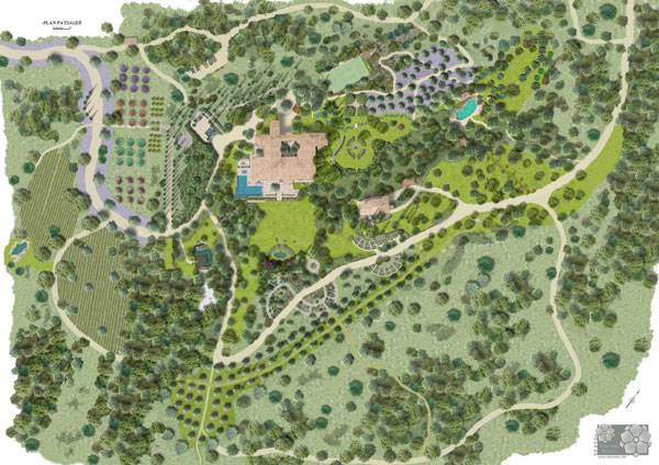
Masterplan of the Mediterranean Park Countryside, by Atelier Nelumbo Paysage
Mediterranean Park Countryside
Connecting With the Surrounding Environment The context of the site and the site itself are the main and most important elements to consider while dealing with a new landscape project. Creating a deep bond between the project and its site is one of the main aims of Landscape Architects, which allows them to insert the project in perfect harmony with the surrounding environment. Here, Atelier Nelumbo Paysage followed the shape of the site and took advantage of its slope to create different rooms in the open air. “We added a special touch to imagine an enchanted space where beauty and sensuality were enhanced while respecting the environment” say the designers.
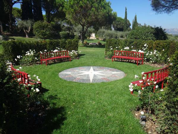
Mediterranean Park Countryside, by Atelier Nelumbo Paysage
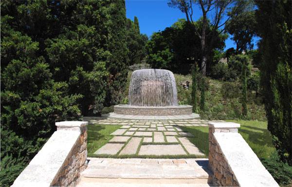
Mediterranean Park Countryside, by Atelier Nelumbo Paysage
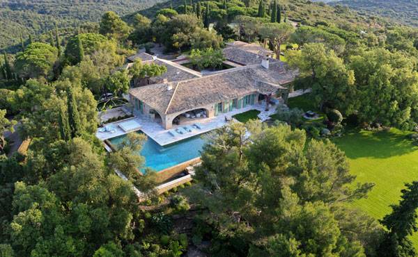
Mediterranean Park Countryside, by Atelier Nelumbo Paysage
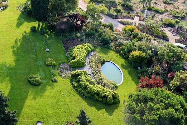
Mediterranean Park Countryside, by Atelier Nelumbo Paysage
Using Traditional Materials
Concerning the physical elements to be used in a contemporary Mediterranean garden, the designers referred to the traditional types of objects used in the Italian garden style. In fact, they used natural materials such as yellow stone for the stairs and some paved areas, porphyry to pave the courtyard, a variety of vegetative materials (trees, bushes and grass), and gravel in different part of the garden.
Choosing the Correct Plant List
Visiting a garden should be a supreme joy, so choosing a palette of plants that will exhibit its beauty through every season is very important. Apart from the lawn areas, which can be considered as the floors of the garden, a Mediterranean garden requires some plants belonging to that geographical area.
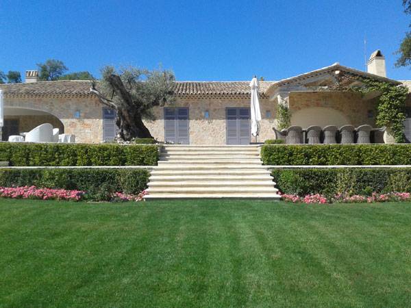
Mediterranean Park Countryside, by Atelier Nelumbo Paysage
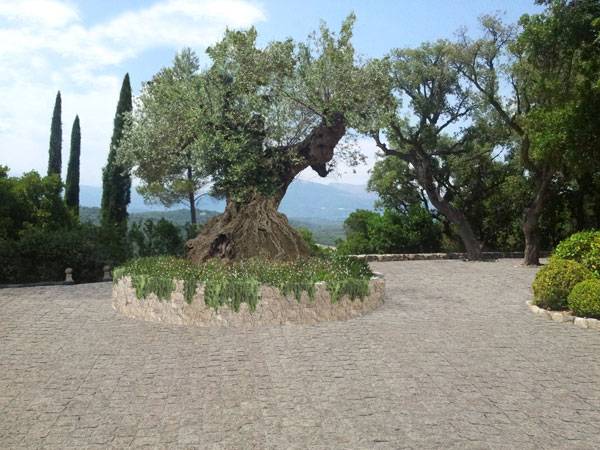
Mediterranean Park Countryside, by Atelier Nelumbo Paysage
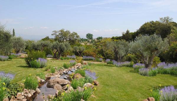
Mediterranean Park Countryside, by Atelier Nelumbo Paysage
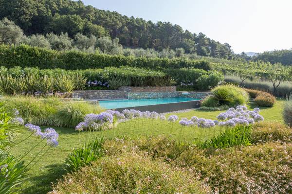
READ: Contemporary Italian Garden Offers Renewed Inspiration. Photo credit: Andrea Simonetti and Giuseppe Lunardini
Full Project Credits For Caulfield Campus Green:
Recommended Reading: Sustainable Urbanism: Urban Design With Nature. Click Here!
- Becoming an Urban Planner: A Guide to Careers in Planning and Urban Design by Michael Bayer
- Sustainable Urbanism: Urban Design With Nature by Douglas Farrs
Article by Elisa A.M.Varetti
Is The Haven Lakeside Residences The Best of Both Worlds?
Article by Elisa A.M. Varetti The Haven Lakeside Residences, by Malik Lip & Associates Sdn Bhd, in Malaysia Have you ever stopped to wonder about living in close contact with nature? Everyone loves to dream about quitting everything, going away, and living on a deserted island or, more simply, far from the daily routine. But we all know most of us will never leave our comfortable houses and the modern conveniences we are used to. Deserted places are not so attractive, after all, and there are always trips and holidays to help us keep our bond with the natural world. But some of us can have the best of both worlds, as this project in Malaysia shows.
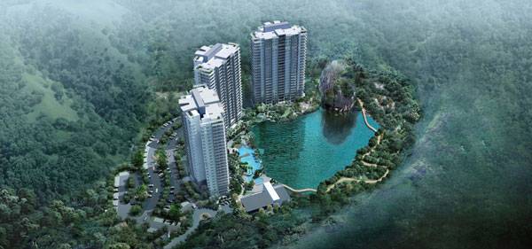
The Haven Lakeside Residences, by Malik Lip & Associates Sdn Bhd
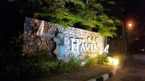
The Haven Lakeside Residences
The Haven is an urban development of almost 13.6 acres, including a natural, four-acre lake, located near the Lost World of Tambun Water Theme Park and the Banjaran Hotsprings Retreat in Tambun. Its clever position near the main road system makes it easily accessible. And it’s within a stone’s throw of the area’s main facilities, including a giant supermarket (2 km), the highway (5 km), the hospital (6 km), and the airport (11 km).
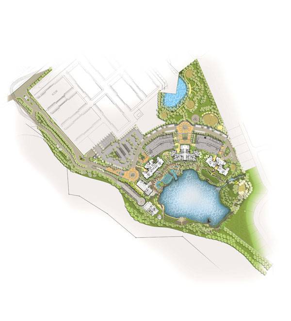
The Haven Landscap Masterplan. Image courtesy of Malik Lip & Associates Sdn Bhd
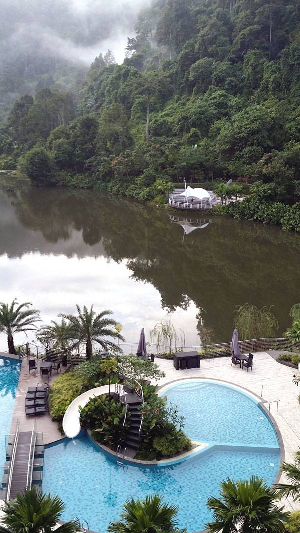
The Haven Lakeside Residences. Image courtesy of Malik Lip & Associates Sdn Bhd.
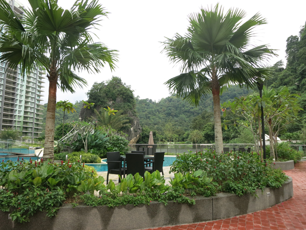
The Haven Lakeside Residences. Image courtesy of Malik Lip & Associates Sdn Bhd.
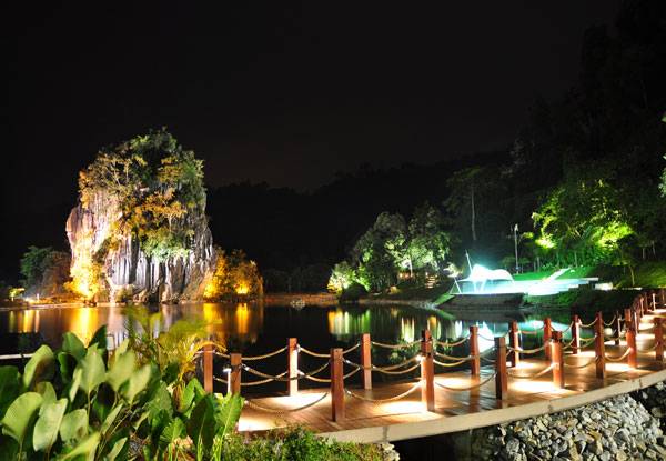
The Haven Lakeside Residences. Image courtesy of Malik Lip & Associates Sdn Bhd.
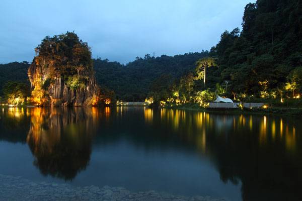
The Haven Lakeside Residences. Image courtesy of Malik Lip & Associates Sdn Bhd.
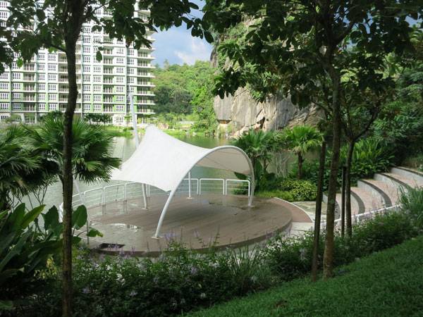
The Haven Lakeside Residences. Image courtesy of Malik Lip & Associates Sdn Bhd.
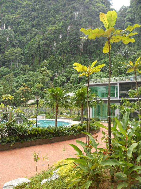
The Haven Lakeside Residences. Image courtesy of Malik Lip & Associates Sdn Bhd.
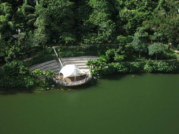
The Haven Lakeside Residences. Image courtesy of Malik Lip & Associates Sdn Bhd.
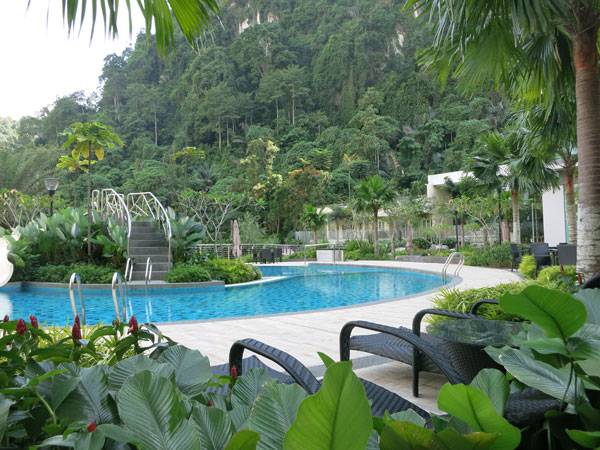
The Haven Lakeside Residences. Image courtesy of Malik Lip & Associates Sdn Bhd.
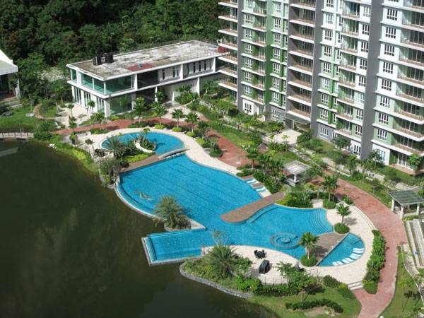
The Haven Lakeside Residences. Image courtesy of Malik Lip & Associates Sdn Bhd.
Full Project Credits For The Haven Lakeside Residences:
Project Name: The Haven Lakeside Residences Location: Tambun Ipoh, Perak Darul Ridzuan, Malaysia Team: Malik Lip & Associates Sdn Bhd Area: 13.6 acres Recommended Reading:
- Becoming an Urban Planner: A Guide to Careers in Planning and Urban Design by Michael Bayer
- Sustainable Urbanism: Urban Design With Nature by Douglas Farrs
Article by Elisa A.M. Varetti
How to Create an Urban Oasis Inside This Big, Noisy City
Article by Elisa A.M. Varetti Adria, by ONG&ONG, in Singapore, Republic of Singapore, Asia. When it comes to Singapore, we often think of a huge metropolis filled with tall buildings, without any space left for parks and gardens. But over the last few years, Singapore has started to change its urban image, thanks to a series of landscape interventions that clearly look out for the health and comfort of both its citizens and our planet. Let’s think about the creation of green areas such as Bishan Park, of which you can read more in our writer Win Phyo’s article, “How Bishan Park Became ‘The Central Park’ of Singapore” or another intervention such as the one that former LAN writer Tom De Blaser refers to in his article, “How Capitol Singapore is Bringing Luxury Design to the Public”. Singapore has also started to build new resorts capable of reducing the gap between citizens and nature. That’s the case with The Coast, which our writer Taylor Stapleton talks about in the article “Luxury and Tranquility are Expensive at The Coast”.
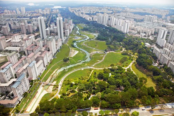
Bishan Park. Photo courtesy of Atelier Dreiseitl.
Adria, by ONG&ONG
Here’s another project: Adria, by ONG&ONG (among the top 10 architecture firms in Singapore for Focus Singapore). In Adria, architecture and landscape architecture combine to create an urban oasis inside this big and noisy metropolis.

Adria. Photo courtesy of ONG&ONG
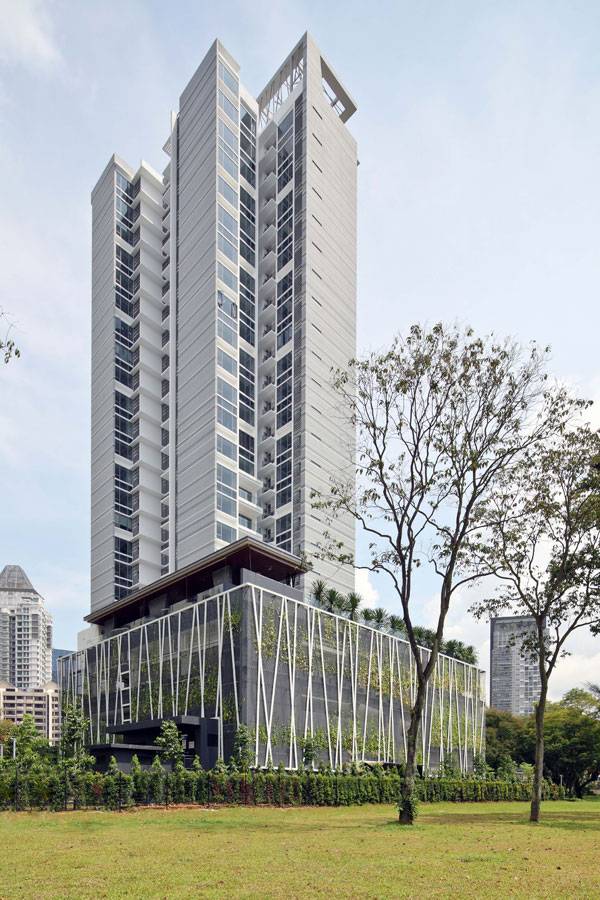
Adria. Photo courtesy of ONG&ONG
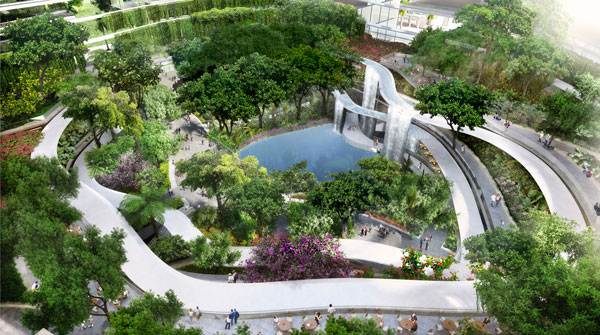
Visualisation of Marina one. Image courtesy of Gustafon Porter
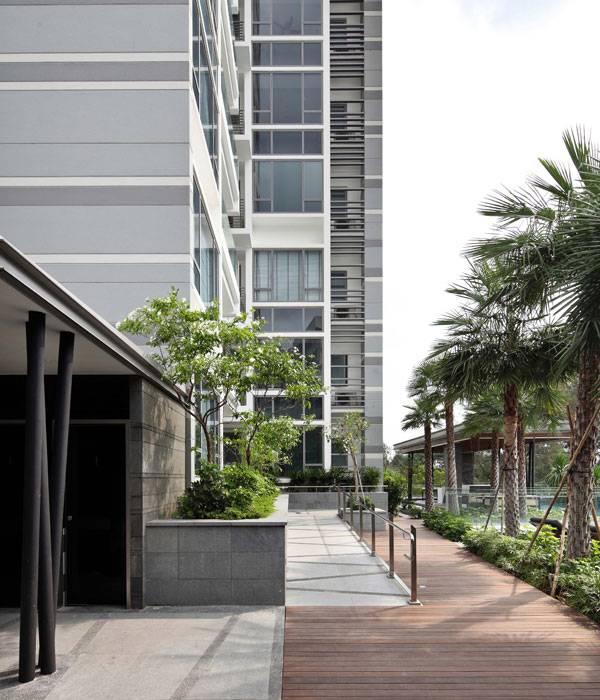
Adria. Photo courtesy of ONG&ONG

Adria. Photo courtesy of ONG&ONG
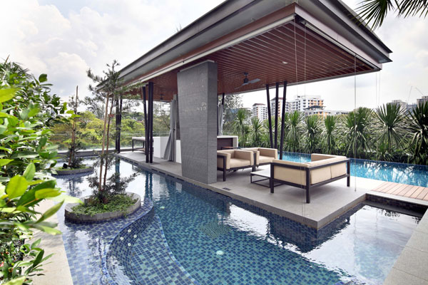
Adria. Photo courtesy of ONG&ONG
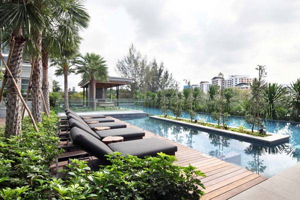
Adria. Photo courtesy of ONG&ONG
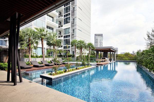
Adria. Photo courtesy of ONG&ONG
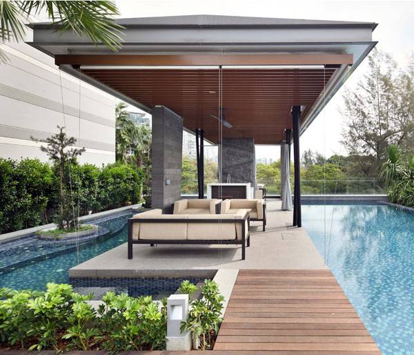
Adria. Photo courtesy of ONG&ONG
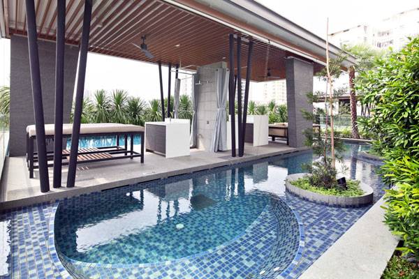
Adria. Photo courtesy of ONG&ONG
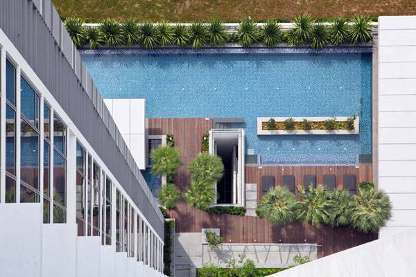
Adria. Photo courtesy of ONG&ONG
Full Project Credits For the Adria:
Project Name: Adria Location: Singapore Completion: 2013 Architecture, Landscape, Interior: ONG&ONG Pte Ltd Architecture Director: Andrew Lee Landscape Director: Lena Quek Photography: ONG&ONG Learn more about ONG&ONG: Website: www.ong-ong.com Facebook: www.facebook.com/ongong360 Twitter: www.twitter.com/ongong360 Recommended Reading:
- Becoming an Urban Planner: A Guide to Careers in Planning and Urban Design by Michael Bayer
- Sustainable Urbanism: Urban Design With Nature by Douglas Farrs
Article by Elisa A.M. Varetti
How to Design a Child-Size Science Park Like a Playground
Article by Elisa A.M.Varetti Mary’s Garden, Children’s Museum of Sonoma County, by BASE Landscape Architecture, Santa Rosa, California, United States of America. Being a landscape architect can be extremely funny sometimes, especially when you are asked to design a child-oriented outdoor museum. Be careful; it doesn’t mean it’ll be an easy task, not at all. There are indeed different things to take care of, as our writer Velislava Valcheva reminds us in her article, 11 Things to Remember When Designing for Children.
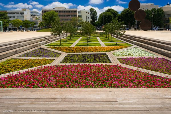
From the hit article 11 Things to Remember When Designing for Children. Sunken garden view. Photography Credits Go To Eran Karu
Children’s Museum of Sonoma County
The Children’s Museum of Sonoma County by BASE Landscape, in Santa Rosa, California, is a rare example of a child-oriented design process in which kids satisfy their thirst for knowledge by having real fun. Thanks to a grant of $1.8 million given by the state of California’s Office of Grants and Local Services, it has progressed from being a “Museum-On-The-Go” into a proper museum. Its oudoor area, titled Mary’s Garden, has been the first phase of the project to be realized.
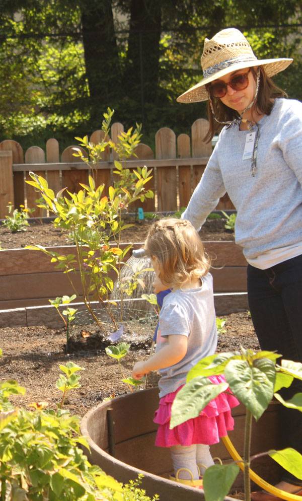
Children’s Museum of Sonoma County. Photo credit: Patricia Algara
The Concept: Kids + Nature + Creativity
This outdoor area, designed to become a children’s garden of learning and play, has been the first part of the whole museum to be developed because “It was essential to the Museum’s long-term success and mission”, says Collette Michaud, CEO of the Children’s Museum of Sonoma County. The concept of Mary’s Garden was to reunite children with nature by creating an interactive area with a tantalizing design capable of stimulating childrens’ imagination. With this thought in mind, Andreas Stavropouloud and Patricia Algara of BASE Landscape Architecture managed to design a plan capable of inspiring children’s creativity and satisfying their curiosity to discover the world; “It gives a lot of room for creativity”, they say.
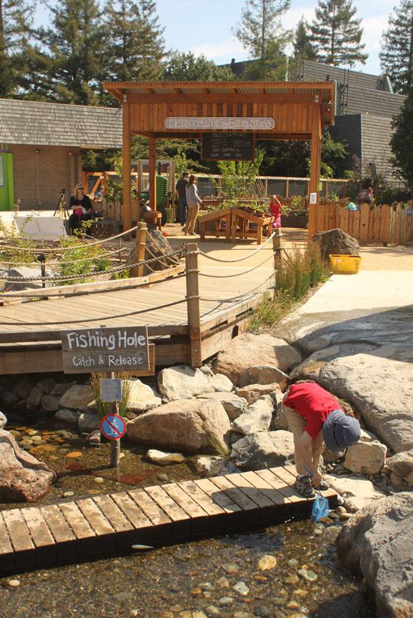
Children’s Museum of Sonoma County. Photo credit: Patricia Algara
A Place That Reflects the Surrounding Landscape
The whole design has been inspired by a transect of the environments of Sonoma County. By studying them, BASE Landscape developed a place where it is possible to pass, in a short walking distance, from inland agricultural valleys all the way to the Pacific Ocean. This became a main feature of the project because it was important to connect children with their local territory and make them aware of their surrounding landscapes.
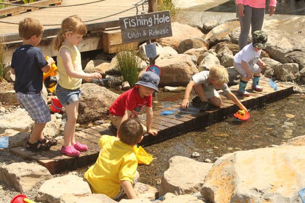
Children’s Museum of Sonoma County. Photo credit: Patricia Algara
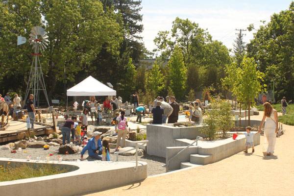
Children’s Museum of Sonoma County. Photo credit: Patricia Algara
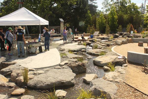
https://land8.com/exceptional-ecological-park-reconnects-children-nature/
The Educational Side of the Outdoor Museum
Mary’s Garden has several different educational aims:
- Making kids reflect upon pollinators and metamorphosis through a garden with pollinator plants
- Teaching the different ways in which water is used, thanks to an interactive water play area
- Getting kids to understand their local environment by representing its main elements
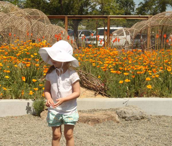
Children’s Museum of Sonoma County. Photo credit: Patricia Algara

Children’s Museum of Sonoma County. Photo credit: Patricia Algara
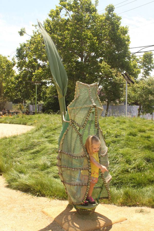
Children’s Museum of Sonoma County. Photo credit: Patricia Algara
Mary’s Garden: the Life Cycle of a Butterfly
One of the educational sides of the garden is getting kids to learn about pollinators and their importance for our planet. The title of the area, Mary’s Garden, is a tribute to those beautiful insects, as “Mary” comes from Mariposa (in Spanish; butterfly) and the moniker refers to the birth and life of a swallowtail butterfly whose name is Mary. Here kids will also understand the mysteries of metamorphosis thanks to a series of different but amazing elements representing bright eggs to climb and to hide in, and caterpillars in steel armature covered by netting and flowering vines to walk on, and also kinetic butterflies that flap their wings when kids crank the handle. Children will also discover large-scale solar and wind-powered butterflies placed throughout the garden.
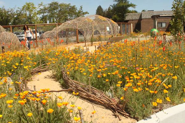
Children’s Museum of Sonoma County. Photo credit: Patricia Algara
Getting to Know About the Power of Water
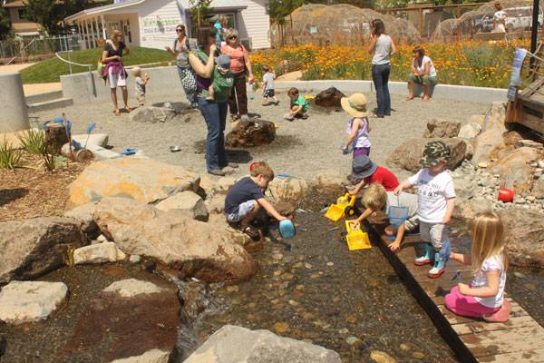
Apart from its design that relates to the Russian River, the garden also develops educational aims around the issue of water. Here, in what it is called the mechanical water play area, kids can learn how human beings use water in many different ways. They learn how water gets pumped, stored, and diverted; they discover how Archimedes’ screws and dams move water through agricultural areas and generate hydropower. They also can experiment with using hand pumps.
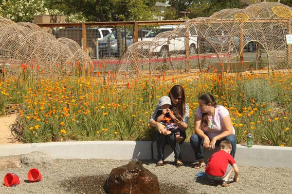
Children’s Museum of Sonoma County. Photo credit: Patricia Algara
Children’s Museum of Sonoma County. Photo credit: Patricia Algara
A Naturally Filtered Waterplay Area
One of the most interesting parts of Mary’s Garden is, of course, is its water play area which represents the first naturally filtered children’s water play area in Northern California. As the designers say; “Water is first cleansed via vegetative material and a gravel filter in a living wetland, then passes through a UV filter before being recirculated.” The Sonoma County Department of Health Services Director itself approved the permit for the natural filtration system.
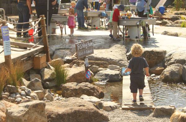
Children’s Museum of Sonoma County. Photo credit: Patricia Algara
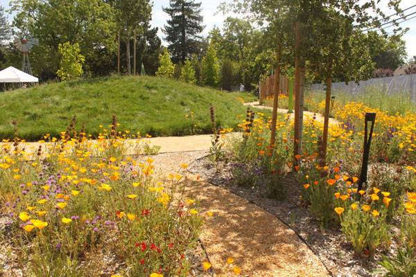
Children’s Museum of Sonoma County. Photo credit: Patricia Algara
The Importance of Child-Oriented Design
Everyone knows that nowadays most of the children aren’t aware of where our food comes from or even what some animals look like. It’s not their fault, of course, but living in a metropolis, far from the countryside, doesn’t help in keeping contact with the natural world. That is why it is so important that when it comes to designing something for children we must remember that kids represent the future, as Erin Tharp clearly states in her article Why Designing for Children is Vital to The Future of Landscape Architecture.
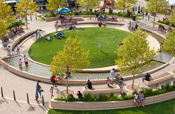
Featured in our article Why Designing for Children is Vital to The Future of Landscape Architecture. Uptown Normal. Photo Credit Scott Shigley – Hoerr Schaudt.
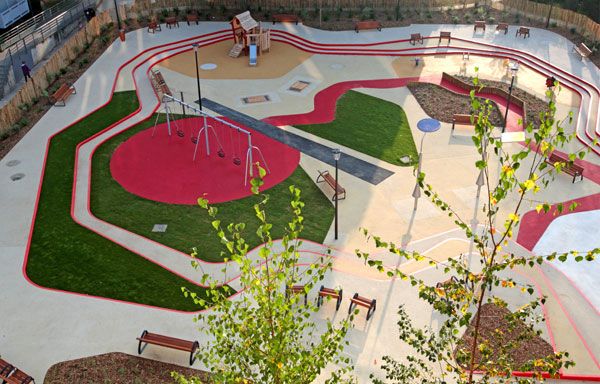
Featured in our article The 10 Best Playgrounds of the World. A Toddlers Playground. Photo courtesy of Espace Libre
Full Project Credits For Mary’s Garden, Children’s Museum of Sonoma County
Project: Mary’s Garden at the Children’s Museum of Sonoma County Location: Santa Rosa, California, USA Construction Date: 2013 Area: 1 acre Budget: $1.8M Client: Children’s Museum of Sonoma County Design Firm: BASE Landscape Architecture Consultants: Scientific Art Studios; Aquascapes Photographer: Patricia Algara Team: BASE Landscape Architecture (design firm), Scientific Art Studios (Ron Holthuysen), Aquascapes BASE Landscape Team: Andreas Stavropouloud (PLA), Patricia Algara (ASLA) Awards: Merit Award, Design Category, ASLA 2015 Awards; Special Award, Business Journal’s 10th Annual Top Projects in the North Bay Award Get Social with BASE Landscape Architecture: Website: www.baselandscape.com Facebook: www.facebook.com/baselandscape Flickr: www.flickr.com/photos/base_landscape LinkedIN: www.linkedin.com/company/base-landscape-architecture Recommended Reading:
- Becoming an Urban Planner: A Guide to Careers in Planning and Urban Design by Michael Bayer
- Sustainable Urbanism: Urban Design With Nature by Douglas Farrs
Article by Elisa A.M.Varetti Return to Homepage


