


Author: Land8: Landscape Architects Network

10 Reasons Why Cities Should Daylight Rivers
We explore the reasons why cities should daylight rivers. Every city in the world has hidden secrets which lie beneath its tarmac, concrete or buildings. In many cities, these secrets come in one powerful form: underground rivers and streams. Some cities have recognised the potential to lift the lid off these watercourses and “Daylight” them. The results have been astonishing and have benefitted the natural, urban as well as the social environments. With this in mind, we thought we would highlight 10 reasons why more cities should do the same.
Daylight Rivers
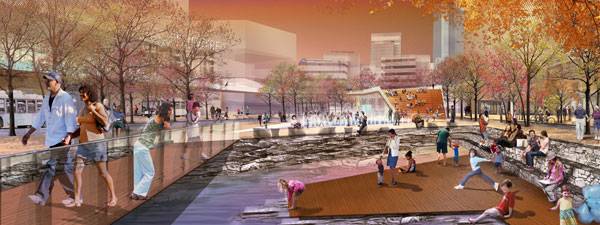
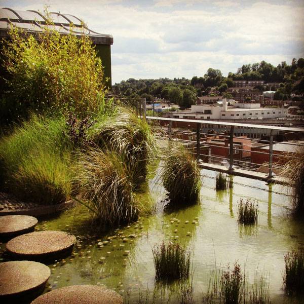
1. Reduce Flooding Many streams and rivers in cities have been forced to go underground in an attempt to remove stormwater as quickly as possible from the urban environment. This, however, often results in a flash flood during heavy rains as the underground systems become overloaded. By daylighting, the course of water can be retained, slowed down, and diverted, while at the same time reducing the risk of blockages at choke points.
Thornton Creek, Seattle where a large paved parking lot with an underground pipe was restored to an open channel with four chambers that accommodate flood and filters sediment. Image courtesy of Peggy Gaynor, GAYNOR, Inc.
3. Boost Ecology By depriving the water of sunlight, buried watercourses become ecological deserts, devoid of any natural life. Exposing rivers or streams to daylight allows for the re-establishment of plant and animal life. See More River Related Articles:
- Extraordinary Development Re-connects City With The River Bank
- The Amazing Zhangjiagang Town River Reconstruction
- Turenscape Design Outstanding River Park
The Saw Mill River in Yonkers, New York, saw the transformation of a buried river into a natural river bed. This new green urban park is now home to 8 species of fish and numerous birds. Image courtesy of Donna Davis/Ms. Davis Photography.
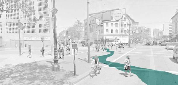
5. Create Green Corridors Daylighting rivers has the potential to unlock natural beauty in the heart of the city. Areas which were once hardened and lifeless can be transformed by unveiling the water beneath and re-introducing vegetation to create a green urban corridor. 6. Reduce Urban Heat Island Effect The Urban Heat Island Effect is the condition where extreme temperatures occur in the city due to radiation from hardened surfaces. Daylighting rivers and streams in cities has the ability to dramatically moderate temperatures. Cheonggyecheon River, Seoul by SeoAhn Total Landscape transformed a six-lane highway into a green urban waterway. This transformation has not only created an active urban park but has reduced temperatures along the stream by up to 6 degree Celsius.
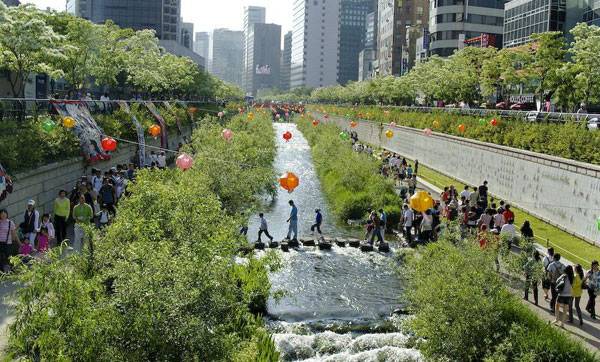
“Korea-Seoul-Cheonggyecheon-2008-01” by stari4ek – originally posted to Flickr as fest2-01. Licensed under CC BY-SA 2.0 via Commons
In 2013 SCAPE landscape architects won a competition to design a master plan to daylight the Town Branch Creek in Lexington. Their proposal was called “Reveal, Clean, Carve, Connect” and sought to create site-specific interactions which would transform the inner city. Image courtesy of SCAPE / LANDSCAPE ARCHITECTURE.
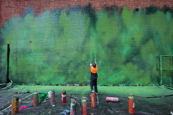
In San Francisco a project called Ghost Arroyos has begun to draw on the history of the hidden streams. While the streams haven’t yet been daylighted, their presence has been highlighted through an art installation where the watercourse has been painted onto the urban surfaces. Image courtesy of Emily Schlickman and Kristina Loring.
Recommended Reading:
- Drawing and Designing with Confidence: A Step-by-Step Guide by Mike W. Lin
- Landscape Perspective Drawing by Nicholas T. Dines
Article by Rose Buchanan Return to Homepage

Top 10 Most Influential Landscape Architects of All Time
We take a trip down memory lane and honor some of the most influential landscape architects in the history of the profession. Gone, but not forgotten: This is the legacy of 10 influential landscape architects, who have made their mark on history both physically (in their lasting designs) and spiritually (in their influence on the profession). Listed in chronological order, behold LAN’s top 10 most influential Landscape Architects of all time.
1. André Le Nôtre (1613-1700)
As the son and grandson of gardeners of the French court, André Le Nôtre learned about art and architecture from his early childhood on. He grew up to become gardener to the king’s brother and other French lords, and his first gardens sowed the seeds of his unique and thorough landscape architecture perspective. His work caught the eye of King Louis XIV, who appointed him to design the king’s garden and restore the gardens of Versailles. While the number of Le Nôtre’s creations can’t be counted on the fingers of two hands, those he did design remain iconic, including his masterpieces — the Garden of Vaux-le-Vicomte and the gardens of Versailles. Recommended Reading: André Le Nôtre in Perspective (Editions Hazan) by Patricia Bouchenot-Déchin
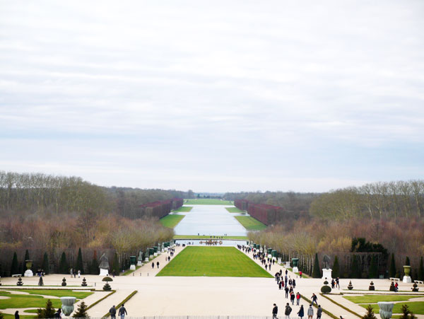
Garden of Versailles, France. Photo credit: Alexandra Wilmet
2. Lancelot “Capability” Brown (1716-1783)
Lancelot Brown was an English landscape architect who was often known by his nickname, Capability. He earned the moniker because he used to tell his customers that their sites had good “capability” for landscaping. Brown followed in the footsteps of William Kent (1685-1748), advocating a more naturalistic style using large expanses of undulating grass, water bodies with irregular shapes, and shelterbelts. This earned him criticism during his time, but his style became a key innovation in the history of landscape architecture, giving birth to the modern English garden. Many of his 170 gardens remain today, including Kew Gardens, Blenheim Palace, and Chatsworth House. Did you know that the Blenheim Palace park has been regularly used in films? You will look more carefully at “Harry Potter and the Order of the Phoenix” next time! Recommended Reading: Lancelot ‘Capability’ Brown: The Omnipotent Magician, 1716-1783 by Jane Brown
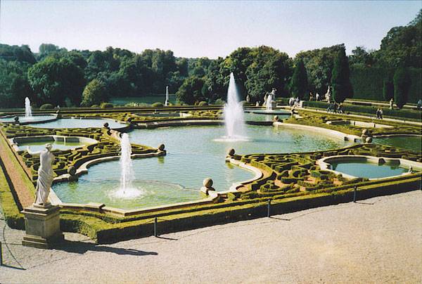
This is on the west side of the palace. The gardens follow French style of Le Notre with knotwork of low box hedges and shaped fountains. © Copyright Colin Smith and licensed for reuse under this Creative Commons Licence
3. Peter Joseph Lenné (1789-1866)
This Prussian landscaper was born into a family of castle gardeners. He learned the profession from big names in early 19th century landscape architecture and became a fine connoisseur of plants. Lenné created one of the first public parks in Germany — Park Klosterberge in Magdeburg. But his major works were the redesign of the park at Sanssouci in Potsdam and the Tiergarten in Berlin. Lenné’s success lies with his ability to mix utility and beauty, combined with his extensive botanical knowledge. Lenné remains a source of inspiration for many artists and landscape architects.
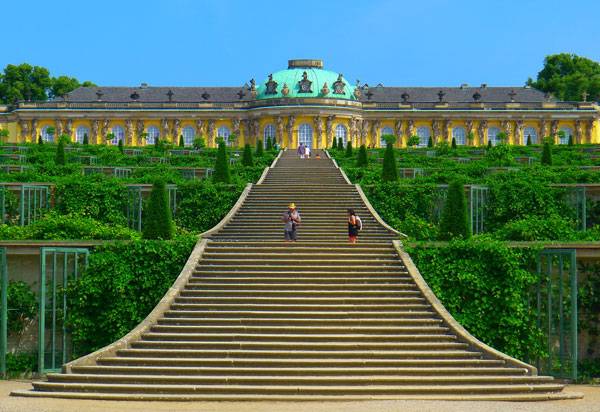
“P1190390 Potsdam sans souci rwk” by Mbzt – Own work. Licensed under CC BY-SA 3.0 via Commons
4. Frederick Law Olmsted (1822-1903)
Most of us think of New York City’s Central Park when we think of Olmsted. But this iconic American landscape architect was a man of many passions. He studied engineering, agronomy, and journalism, and traveled widely through Europe and the United States. He was passionate about nature and its preservation. Olmsted played an important role in the protection of nature, including the creation of the Niagara Reservation in association with Calvert Vaux (1824-1895). In additional to Central Park, Olmsted left his imprint on many urban projects and parks, including several university campuses and the grounds of the U.S. Capitol. Recommended Reading: Frederick Law Olmsted: Plans and Views of Public Parks (The Papers of Frederick Law Olmsted) by Frederick Law Olmsted
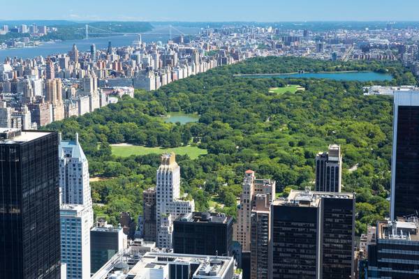
Central Park, designed by one of the earliest known landscape architects Fredrick Law Olmstead. Photo credit: shutterstock.com
5. Gertrude Jekyll (1843-1932)
English landscaper Gertrude Jekyll was one of the first famous women in the profession. Her contribution resides mainly in the publication of many books and articles focused on her research into landscape compositions. Influenced by the Arts and Crafts movement, her creations showed the importance of proportion and color balance, as well as the use of textures and fragrances in plantations, such as mix-borders. She created about 400 gardens in England, and some in Europe and America, but few have been preserved. Others have been restored and can be visited. Jekyll was also passionate about creepers and roses — Rosa Gertrude Jekyll has been named in her honor. Recommended Reading: Gertrude Jekyll and the Country House Garden: From the Archives of Country Life by Judith B. Tankard
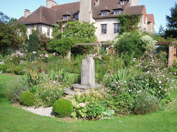
“Jekyll Garden Moutiers. The sundial garden” by Amanda Slater. Licensed under CC BY-SA 2.0 via Flickr.
6. Geoffrey Jellicoe (1900-1996)
The English landscape architect and theoretician had a vast knowledge of landscape history, writing several books, including “Italian Gardens of the Renaissance”, with the help of J.C. Shepherd (1896-1979). In 1948, he became the founding president of the International Federation of Landscape Architects (IFLA). Several of his projects, including the Kennedy Memorial at Runnymede and the garden of Sutton Place in Surrey, are significant works of landscape architecture. See More History Inspired Articles:
- Going Vertical: The History of Green Walls
- How Winter Bay Culture Park Merged History and Revitalization
- 15 Great Examples of Historical Landscape Architecture
Recommended Reading: Landscape of Civilisation – Moody Gardens by Geoffrey Jellicoe
House of Fraser roof garden. Photo credit available upon request.
7. Thomas Church (1902-1978)
This American landscaper was known for developing the modern movement in landscape architecture. He mixed innovative principles of modern style, such as the use of abstract forms, with the following four design principles:
- He thought of the garden and the house as a whole — a set to design. The garden is an extra living room.
- He focused on the function of the site, while still respecting the beauty of the place.
- He advocated the simplicity of a project for aesthetic reasons.
- He connected the place with the surrounding context.
During his career, he designed many projects, often at universities and private residences. Probably the best known is Donnell Gardens, an icon of modern style. But above all, Church is the father of a whole generation of American landscape architects who have made their mark on the American landscape. Recommended Reading: Gardens Are For People, Third edition by Thomas D. Church
“Donnell garden” by morisius cosmonaut. Licensed under CC BY-SA 2.0 via Flickr.
8. Pechère René (1908-2002)
This Belgian landscape architect participated in the design of the outdoor facilities for the Universal Exhibition of 1958. The gardens of the Congo and the Four Seasons that he made for the event provided him with international fame. Pechère designed nearly 900 public and private gardens in Belgium, France, the Netherlands, and Germany. His philosophy was to design the garden as a space that contributes to the joy of living. His work also highlighted the importance of the knowledge of many notions of art (sculpture, drawing, history, etc.). His designs used plants as well as architectural elements, taking into account shadows, sunlight, and colors. Renowned for Botany Park — or the Mont des Arts — in Brussels, Pechère is also known to have collected countless books in the field of garden art. His books are now gathered at the René Pechère Library, where you can view all kinds of documents on landscape architecture, onsite or via their website.
“Le jardin multicolore” by Stephane Mignon. Licensed under CC BY-SA 2.0 via Flickr.
9. Roberto Burle Marx (1909-1994)
Back to the other side of the Atlantic Ocean, more specifically, Brazil: Burle Marx has been widely recognized for his gardens and parks, but he was also an artist, ecologist, naturalist, musician, and painter. He studied the fine arts long before creating his first garden at a private residence. Passionate about botany, he studied the tropical plants of Brazilian forests along with other botanists and researchers. He created a collection of plants that is kept in Guaratiba, now owned by the state and considered a national monument, with its 3,500 species of plants (Sitio Roberto Burle Marx). Several plants also bear his name, including Calathea “Burle Marx”. Recommended Reading: Roberto Burle Marx: Brazilian Modernist by Jens Hoffmann
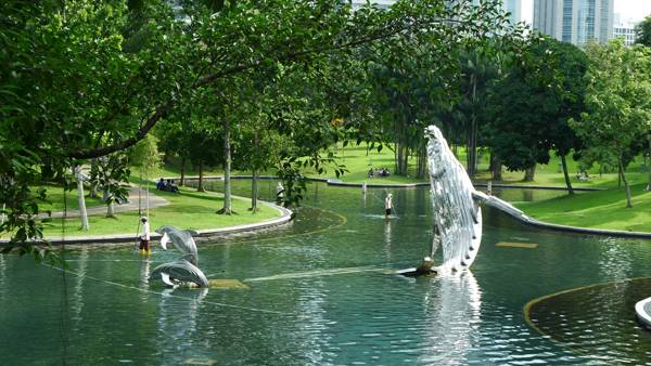
The Central Park of the Kuala Lumpur City Centre (KLCC) shortly before he died. Photo credit: Dr. Francis Ng,
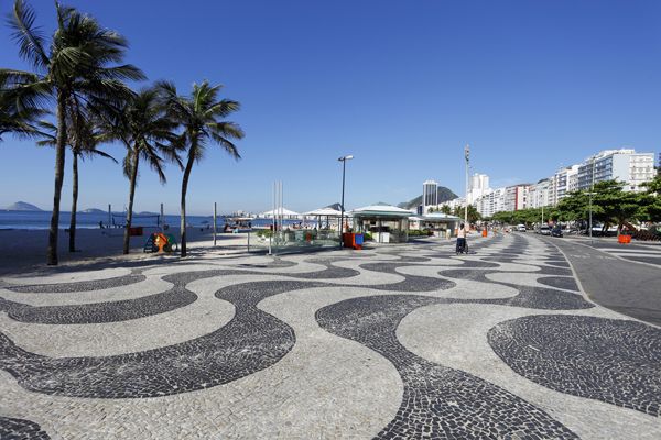
Copacabana Beach; credit: Shutterstock.com
10. Corajoud Michel (1937-2014)
The French landscape architect and professor contributed to a new vision of landscape design, especially in urban areas. Corajoud believed that the work of an urban landscape designer should take into account the architecture surrounding it, providing a continuity with the buildings. His work also focused on people in the landscape project, giving special attention to their expectations and happiness. His projects’ success was measured by the attendance rate of the public. This way of thinking has earned him several awards.
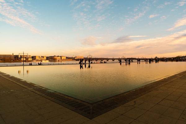
“Bordeaux miroir 01” by Oliwan – Own work. Licensed under CC BY-SA 3.0 via Wikimedia Commons
Recommended Reading:
- Drawing and Designing with Confidence: A Step-by-Step Guide by Mike W. Lin
- Landscape Perspective Drawing by Nicholas T. Dines
Article by Alexandra Wilmet Return to Homepage


Top 10 Sketchy Saturday – Edition|042
This week’s Sketchy Saturday Top 10. Sketchy Saturday brings with it another whirlwind of talent and styles as we get set to announce this week’s top 10. Covering the globe, over a range of skill levels, it truly is a hard job to determine who gets that coveted top spot. But low and behold someone always manages to elevate to the top spot, sometimes our choice is obvious, sometimes it is debatable. Have a look at our choice for number spot this week and let us know if you think we got it right.
Enjoy this week’s Sketchy Saturday top 10!
10. by Susan Isawi
By Susan Isawi
By Viviana López Argüello
By Susan Isawi
By Kerri Chuaquico
By Sebastian Varela
By Kodsart Denaro
By Kapil Natawadkar
By NG SHENG JIE
By Prachpasit Krab
By Walter Bone
- Sketching from the Imagination: An Insight into Creative Drawing by 3DTotal
- Architectural Drawing Course by Mo Zell
Article by Scott D. Renwick Return to Homepage
7 Deadly Sins New Landscape Architects Commit
We take a look at how the 7 deadly sins can be applied to new landscape architects. “There is a charm about the forbidden that makes it unspeakably desirable,” – if you are familiar with that famous saying by Mark Twain, perhaps you have also heard about the classification of vices concerning humans’ weakness to sin. That’s right, what we’re talking about is the seven cardinal, mortal, deadly sins. From Dante’s medieval epic poem the Divine Comedy to David Fincher’s sensational 1995 movie entitled Seven (SE7EN), the theme of the seven deadly sins has been a great source of inspiration to artists and writers all over the world and throughout the course of time. Landscape architects, too, are authors and artists. But most primarily, they are humans as well. How do the 7 deadly sins look from young landscape architects’ point of view? What are the sins new professionals commit? And which are the antidotes fighting those vices? Satisfy your curiosity by reading the intriguing lines below.
1. Lust
The first mortal sin, lust, is associated with an overwhelming, uncontrolled desire. According to Oxford Learner’s Dictionaries, lust is defined as “very strong desire for something or enjoyment of something.” That interpretation can include an intense desire for power, money, or fame, for example. So what does lust look like in the eyes of a recent landscape architecture graduate? Imagine yourself at the finish line of university. Only your graduation work stands in your way to the beginning of a meteoric career. You are eager, enthusiastic, and determined about your future. The problem, however, occurs when expectations and reality collide. Your extreme desire to find a brilliant job may meet a long, exhausting, discouraging period of search for that job. Sometimes it just takes more time than you expected. Of course, you may find a decent job quickly, but will your requirements match the conditions you’re given?

“Lujuria Lust Pecado Original (3969921829)” by Gabriel S. Delgado C. from Puerto Ordaz, Venezuela – Lujuria / Lust: Pecado OriginalUploaded by Fæ. Licensed under CC BY 2.0 via Wikimedia Commons
.jpg#/media/File:Lujuria_Lust_Pecado_Original_(3969921829).jpg)
2. Gluttony
The second deadly sin, gluttony, stands for “habitual greed or excess in eating” after Oxford dictionaries’ definition. Gluttony also refers to overindulgence and selfishness.

“Gluttony” by Hannah Farsi. Licensed under CC BY 2.0 via Flickr
3. Greed
The third place in the list of sins is saved for greed, the “intense and selfish desire for something, especially wealth, power, or food,” as Oxford Dictionaries explain. Greed is mainly related to excessive pursuit of material possessions or the desire to possess more than you need. How does greed apply to new landscape architects? It was already mentioned that green professionals are often tempted to chase higher incomes, more clients, power and reputation. And although it’s good to be ambitious, being greedy is a completely different story. Damage to your reputation is the least harm greed can do. Good deals and loyal clients come in time, gradually but steadily. So don’t walk into greed’s trap. You don’t want to step into the world of professionals in a wrong way – be loyal to colleagues, to clients, and to yourself. As Will Rogers has said, “You never get a second chance to make a first impression”; so don’t waste it!

“Greed” by Liz West. Licensed under CC BY 2.0 via Flick
4. Sloth
Right in the middle of the sinful roll call, we find sloth. “Reluctance to work or make an effort; laziness,” is how Oxford Dictionaries define sloth’s meaning. When we talk about young professionals, sloth may be quite a dangerous trespass. Leaving the university’s secure capsule may be exceptionally stressful to young people. The change is really huge when you realize that you have spent five years with the set purpose of graduating, and in the next moment – you’re out of college’s world. Most students take a period of rest after graduating which, if underestimated, may last longer than needed. If it’s accompanied by fear of the unknown, there is a great chance you will find yourself in a vicious circle of apathy, inertness, and indolence. So be careful and don’t underrate that transitional period. Set your new aims, mobilize and find the satisfaction of diligence again, in the next stage of your life.
5. Wrath
The fifth mortal sin is presented by wrath, the “extreme anger” as Oxford Dictionaries suggest. Anger, rage, fury, annoyance and indignation are some of the synonyms related to that sin. Wrath can also take the shape of impatience and self-destructiveness. In which cases do young landscape architecture professionals feel wrath? Finding a job that doesn’t satisfy your criteria or seeing that some of your colleagues are stimulated better than you at work without any particular reason are just some of the possible situations. Doing your best to impress your boss but not receiving any attention, or one of the worst scenarios – not even getting a chance to start working where you wished – are two more reasons for wrath to creep into your mind.

Licensed under CC BY 0.0 via Pixabay
6. Envy
Getting closer to the end of our list, we reach envy. The definition given by Oxford is “a feeling of discontented or resentful longing aroused by someone else’s possessions, qualities, or luck.” Envy is often relevant to jealousy as well, as they’re both characterized by discontent towards someone’s status, awards, abilities or traits. How is envy embodied through the eyes of a young landscape architect? New professionals are frequently quite dazed and disoriented at the starting point of their career. They are impatient and are often in a hurry to succeed. And honestly, some get luckier than others in finding their dream job. One more precondition for envious emotions is when some of your colleagues achieve more than you at work. Last but not least, some of the green landscape architects may jump into envy’s trap by trying to copycat some more experienced designers. Plenty of opportunities can make you envy’s prisoner, but the way to escape that prison is only one. Focus on yourself, work for your own achievements, and seek a kind attitude. Kindness is the nostrum.
7. Pride
The last deadly sin, which is also believed to be the greatest and the origin of all the other sins, is pride. According to Oxford Dictionaries, pride is ”a feeling of deep pleasure or satisfaction derived from one’s own achievements, the achievements of one’s close associates, or from qualities or possessions that are widely admired.” For young specialists, pride is a good quality to possess, as long as it doesn’t reach unlimited dimensions. But assuming for even one second that you are a finished landscape architect who doesn’t have an Achilles’ heel is the turning point of pride prevailing over you. It’s awesome to be proud of yourself after graduating such a vast, complex discipline as landscape architecture, but truth be told, it’s almost impossible to conquer the world armed only with a diploma.

“PikiWiki Israel 32767 Proud peacock” by שמוליק שחר – shmuel shahar via the PikiWiki – Israel free image collection project. Licensed under Public Domain via Wikimedia Commons
- Urban Design by Alex Krieger
- The Urban Design Handbook: Techniques and Working Methods (Second Edition) by Urban Design Associates
Article by Velislava Valcheva Return to Homepage


12 Things You Believed as a Student That are NOT True
We look at some of the common misconceptions students tend to hold, which turn out to be complete rubbish. Student days, aren’t they the best time of our youth? Full of new emotions, new happenings, and new experiences aren’t those years exciting and full of expectations; wild but educative simultaneously? Although we usually don’t realize it at the time, the period of our studies is one of the most momentous stages of life within which our personality, character, and attitude take shape. That shape is far from simple and explicit when we graduate, but its base is already deeply engraved. If that basic shape is bad, it will be almost impossible to transform or delete it. If it’s good, on the other hand, it can be improved and cleared up with ease and willingness. However, the four or five years at a university are varied enough for students to go through different phases. And though they last long enough to give you time to decide what you wish to do with your life, these years can also pass you by before you can say “I want to become a landscape architect.” So what are the things landscape architecture students believe in? And why are so many of them deceitful? What should you bear in mind that can help you make the most of your studentship? See the naked truth in the following lines. The 4 Deadly Sins Landscape Architecture Students Commit To assimilate the information readily, we will group twelve venial beliefs into four sections; Pride, Sloth, Gluttony, and Wrath. Each segment will display the relationship between the sin and the misbelief. PRIDE

Staring at a blank sheet won’t help. Photo licensed under CC0

From the article 9 Ways to Milk Your Professors for Everything They’re Worth!. Question everything! Photo credit: Duncan Hull, CC 2.0. Modification by SDR

From the article 5 Common Habits of Successful Landscape Architecture Students. Always have your pocket sized sketch pad at the ready. Photo credit: jurie/shutterstock

From the article 7 Things You Must Know to Succeed as a Student That Your Lecturer Can’t Teach You!. Real life experience makes all the difference; image credit: Andy Dean Photography / shutterstock.com
From the article Bad Landscape Architecture Students, Can They Improve?. “Bag End” by Rob Chandler (Rob & Jules) – Flickr. Licensed under CC BY-SA 2.0 via Commons

From the article 10 Tips to Help You Be a Top Landscape Architecture Student. 72 Hours Urban Action is an international rapid architecture event. Photo credit: Mor Arkadir

From the article 10 Mistakes Every Landscape Architecture Student Makes and How to Avoid Them. Know that your teacher hasn’t got all of the answers; image credit: Sergey Nivens / shutterstock.com
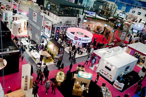
Image from 10 Easy Ways for Landscape Architecture Students to Network with Professionals. Visitors walk past stands at the Ideal Home Show 2013 in London on March 15, 2013; Image credit: pcruciatti / Shutterstock.com
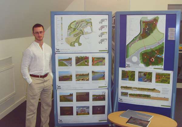
Image from 10 Things You Must Know If You Want to Study Landscape Architecture. Image credit: Scott Renwick | end of year presentations University of Gloucestershire

Image from 9 Productivity Killers in the Studio and How to Avoid Them. Listen to music improves performance
Credit: Listed under CC, source

Stop focusing on your over-achieving classmate and start focusing on yourself. Image from the article 8 Reasons Why You’re Going to Drop out of College and How to Avoid Them. Image credit: License: CC0 Public Domain / FAQ
- Urban Design by Alex Krieger
- The Urban Design Handbook: Techniques and Working Methods (Second Edition) by Urban Design Associates
Article by Velislava Valcheva Return to Homepage
Preparing Your AutoCAD File for SketchUp: The Essential Guide
An AutoCAD tutorial on how to prepare your AutoCAD file for SketchUp in just a few seconds from our resident AutoCAD expert UrbanLISP. As Kevin J. Pfeiffer has explained previously, AutoCAD drawings of your projects are good bases to build 3d models in SketchUp. Every CAD program has its benefits but sure enough also its downsides. In addition to Kevin’s article “How to Make Quick 3D Models From AutoCAD to SketchUp”, let’s have a closer look at those downsides and more importantly how to prepare your AutoCAD drawing for SketchUp.
Linear Entities
The drawing Kevin imported in his article is a simple plaza design made up only of linear entities. If that’s the level of drawing you want to import you might want to consider setting it up in SketchUp from the start. It’s more likely, however, that your AutoCAD drawing is developed a bit further. But let’s start with a drawing with only linear entities like Kevin’s. In the image below you see a screen shot of SketchUp. There are two similar shapes, both created in AutoCAD. The lower shape is a closed polyline. The upper shape consists of two arcs and two lines; the polyline after exploding it. See these AutoCAD tutorials:
- 4 AutoCAD Commands to Draw Paving Patterns on Curving Paths
- How to Show Topography in your Plan Drawing in AutoCAD
- How to Place Large Quantities of Trees in a Master Plan Instantly with AutoCAD
Let’s assume we have SketchUp Pro available, as only the Pro version will import files from AutoCAD. Since going out for dinner to a proper restaurant is often already too expensive for students, licensed software may not be in your budget if you are one. If you or your boss, do have a budget available for SketchUp Pro, you should realize the price of SketchUp Pro is only a fraction of any AutoCAD version, so the assumption of having SketchUp Pro available isn’t a long shot. When we import our CAD file into SketchUp Pro, we’ll see it’s still only linear. This tells us it doesn’t matter how we import the shape in SketchUp, we still need to make it into a surface. We do this for both shapes in our example and then extrude them with the push/pull function. Now this is where we see something odd happening.
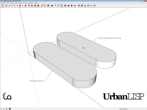
Extruding with SketchUp. Printscreen via Rob Koningen
Chewing Gum
Working in SketchUp might be considered to be like working with chewing gum. Let’s say we import an AutoCAD drawing that is a bit further developed than Kevin’s plaza design into SketchUp. In this imaginary urban plan the plots are an important feature of our plan. In AutoCAD the plots are closed polylines and define areas. They are drawn on a designated layer. SketchUp fortunately also allows us to work with layers, very important as explained in the article “10 Must do’s to Become a Professional AutoCAD User”. When we check the layers in SketchUp we see that it adopted the layers we created in AutoCAD. Phew, that saved us some time! Now let’s turn off all layers except our plot layer. Huh? Where did our plots go? We can see some of it, but where’s the rest? As we can read at point 8 in Kevin’s “Top 10 Hints & Tips For SketchUp” we can select every connected entity by clicking an entity three times. When we do this we see a lot more than our remaining plots highlighted.
The plots in AutoCAD. Printscreen via Rob Koningen
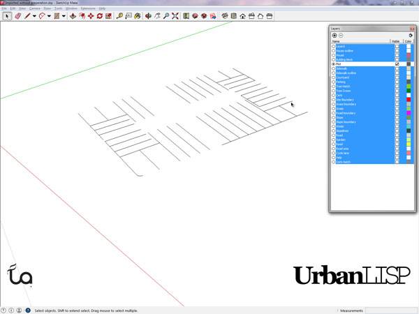
The plots in SketchUp. Printscreen via Rob Koningen
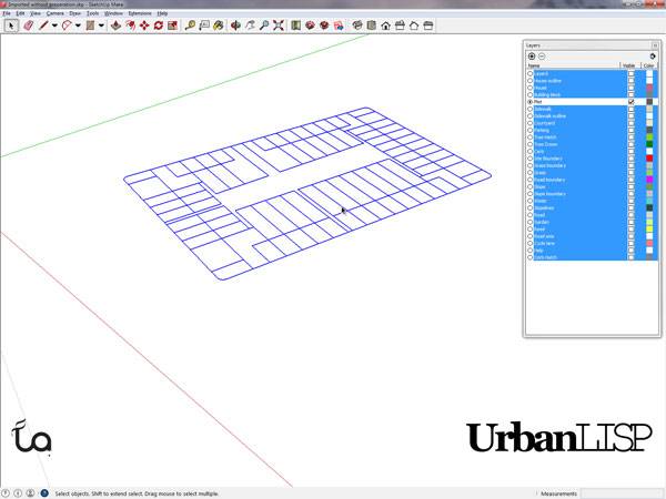
After clicking the plots three times. Printscreen via Rob Koningen
Isn’t something missing?
When we have another look at our imported drawing we see layers created and used for hatches in AutoCAD. But where did those hatches go? Well, they’re gone, as are your External References, by the way. The conclusion here – we don’t need those hatch layers so we can throw them out. Another additional action we have to do in addition to exploding our polylines and importing our layers one by one. Is there any time left for doing the actual design part? Probably not when you realize you also need to clear your blocks of useless hatches. Argh! Can you hear them too – those CAD opponents gearing up to bash the usage of CAD software? With all these issues you might consider joining them. Well, wait just a moment.
A Solution
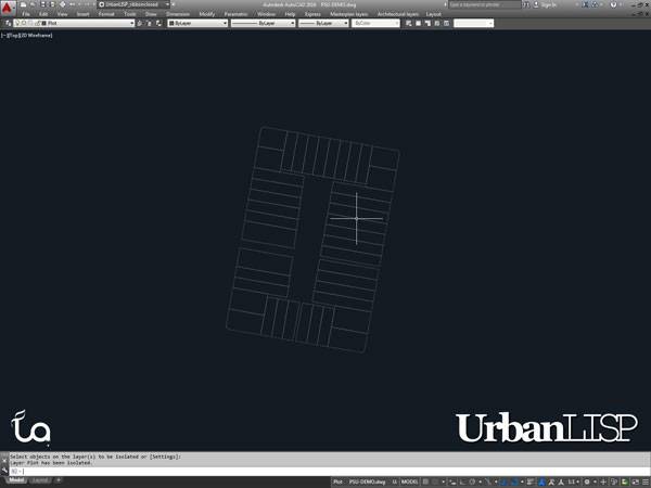
The list of issues above was created over years of developing multi-layered masterplans and importing them into Sketch Up, working with models designed by colleagues that didn’t consider these issues and resulting in many frustrating hours of cleaning up the file. Of course our CAD programs are packed with useful tools but sometimes seem to lack the essential ones. As mentioned in the article “10 Must do’s to Become a Professional AutoCAD User” the usage of apps is essential to become a professional. Help the software you use help you. In this case you might want to check out the UrbanLISP command “Prepare for SketchUp”. Once you’ve loaded it into AutoCAD, all you have to do is type P-S-U and confirm you in fact want to do this. Please remember to save your AutoCAD file as a file to be imported and leave your original CAD drawing untouched; you don’t want to lose that information. Depending on the size of your drawing the command will run for up to ten seconds. It will give you time to take a sip of your coffee or look outside for a moment. Meanwhile, the command will do the following:
- It erases all layouts, you don’t need them in SketchUp anyway and they might contain layers or blocks that are not in the model space, that part that actually is imported into SketchUp.
- It detaches all xrefs, they will not be imported anyway.
- Same story for the hatches, they’re kicked out.
- Also any hatches are removed from your blocks.
- It explodes all polylines.
- It places all entities on the same layer in a block. Both AutoCAD and SketchUp work with groups but AutoCAD groups unfortunately aren’t considered as such by SketchUp. Blocks work in both programs, however. The new block will be a part of its own layer. Existing blocks will be excluded; they are already blocks.
- It purges the drawing; with the removal of all the useless entities listed above, you are bound to have some empty layers or blocks that aren’t used.
- It performs a regen as a conclusion. When the command is done, save the file and import it into SketchUp. The drawing will have strictly separated layers, beautiful round curves and you will have a clean file with only the layers that are in use.
The plots in SketchUp. Printscreen via Rob Koningen
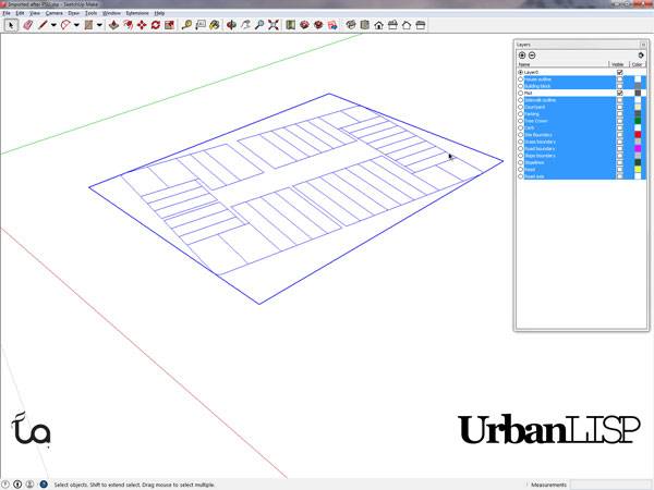
The plots are complete in SketchUp due to the ‘Prepare for SketchUp’ command. Printscreen via Rob Koningen
Recommended Reading:
- Digital Drawing for Landscape Architecture by Bradley Cantrell
- Detail in Contemporary Landscape Architecture by Virginia McLeod
Article by Rob Koningen
You can see more of Rob’s work at UrbanLISP

10 Highlights From Expo Milano 2015 For Landscape Architects
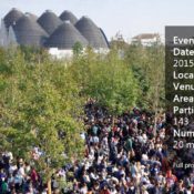
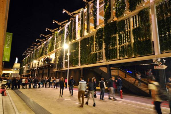
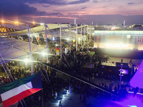
LAN’s Brett Lezon and Win Phyo went to Expo Milano 2015 and compiled a list of 10 Highlights that stand out for Landscape Architects. Dating back to 1851, in London, the Universal Exhibition has served as the stage for showcasing the world’s successes. From the phonograph (1878 Paris World Expo) to electricity (1904 St. Louis World’s Fair), endless inventions have made their first appearance at World Expos. Based in Milan, the economic and cultural capital of Italy, Expo Milano 2015 took place from May 1 to Oct. 31 and featured pavilions from 143 participating countries, representing 93 percent of the global population. Open and inclusive, beautiful and ambitious: Bringing the world to Milan for six months was certainly an impressive challenge, and the organizers succeeded — more than 20 million people visited the Expo. Titled “Feeding the Planet, Energy for Life”, the Expo observed traditional food production, shared cultural values, and explored the implementation of new technologies. We had the opportunity to attend in mid-October and witnessed a number of concepts that landscape architects could employ on many different scales. Whether your next project aspires to be quirky, productive, or simply experiential, take a look at our Top 10 takeaways for Landscape Architects.
Brazillian Pavilion. Photo credit: Win Phyo
Highlights From Expo Milano
1. Large-Scale Event Master Planning
Designed by Stefano Boeri, Richard Burdett, Mark Rylander, Jacques Herzog, and William McDonough, the site covered an area of 290 hectares (490 acres) and was readily accessible by several modes of transportation. Interestingly enough, the site was harmonically organized by two wide avenues: “Decumanus” and “Cardo”. Decumanus stretched for 1 kilometer (0.62 miles) along the east-west axis and was dedicated to participating countries who presented their riches in terms of food and production. WATCH: Expo Milan 2015 The “Cardo” extended along the north-south axis and was assigned to Italy and its regions. This grid-system planning style was popularized by the ancient Romans to transport massive crowds. The master plan was not just a collection of large buildings, but a complex landscape — the impressive exposition garden included more than 12,000 trees, stunning water features, and a canal.
2. Details Matter
Even at a gigantic scale, the little details were not neglected. The repurposed wood sourced from the original Coney Island boardwalk in Brooklyn at the United States pavilion and the 17,000-piece, carefully assembled Japanese pavilion that allowed sunlight to pass through were just a few of the many crafty designs…. WATCH: Biodynamic cement for the Italian Pavilion at Expo 2015 – Press Conference …Not to mention the intricate latticework of the air-cleaning façade at the Italian pavilion, which was made from bespoke smog-purifying concrete by material manufacturer Italcementi. Is this perhaps the technology of the future?
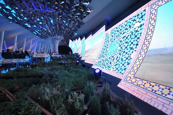
Intricate Latticework of the Iran Pavilion. Photo credit: Win Phyo
3. Porous Solutions
The United Arab Emirates pavilion, designed by Foster + Partners, creatively mimicked the narrow streets of an early desert city through the use of resin-bound surfacing — mostly locally sourced in Italy. The result was a porous, unified surface that delivered an undulating, sandscape feel.
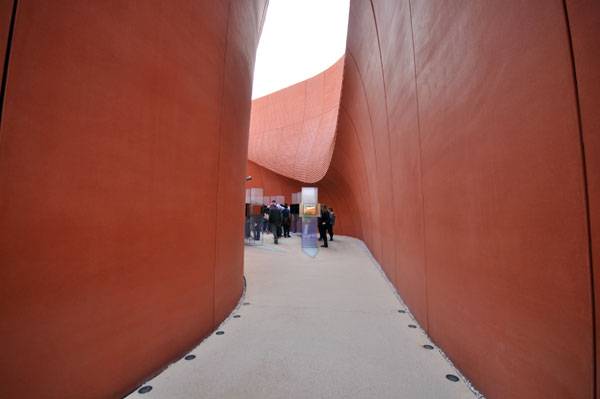
The Striking Simplicity of the Surfacing at the UAE Pavilion. Photo credit: Win Phyo
4. Innovative Mapping Conventions
At 290 hectares (490 acres), it was rather easy to become overwhelmed while traversing the Expo. However, a sleek mapping style dramatically simplified the way-finding process.
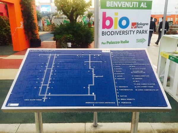
Expo Milano 2015 Sectional Map. Photo credit: Brett Lezon
5. Whimsical Seating Elements
Seating should never be repetitive at the World’s Fair, and Lithuania’s teeter-totter benches and Estonia’s kinetic energy swings were the most adventurous we encountered. The kinetic energy swings gave users a sense of how much energy is required for basic tasks such as charging a phone. We strolled past a group of wildly spinning children having fun on the British designer Thomas Heatherwick’s infamous Spun armchair. WATCH: Expo 2015: Estonian Pavilion The seats were arranged in the Lake Arena setting, where the most important installation of the exhibition — the “Tree of Life” — stands. Who would have thought this creation would be shown iconically in the most-visited and prestigious location of the Milan Expo 2015?
6. Out of the Box Uniqueness
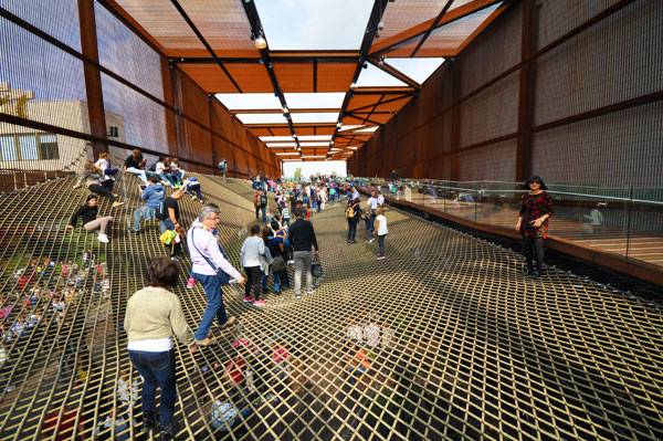
The Brazilian pavilion had to be the quirkiest representation of a plaza or an outdoor space. Redefining the given space and created as a light and open structure that supports nothing but a huge trampoline net, the Brazilian pavilion is a plaza that welcomes people into its unique area. We clambered our way through and tried to keep our balance! Seriously speaking, the project shows how a space built with very few resources can provide such a memorable interaction.

Brazillian Pavilion. Photo credit: Win Phyo
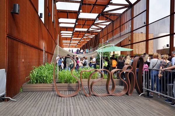
The Trampoline Awaits at the Brazilian Pavilion. Photo credit: Win Phyo
7. Biodiversity Park Was a Plant Lover’s Dream
Consisting of 0.85 hectares (2.10 acres), Biodiversity Park raised awareness of Italy’s environmental, agricultural, and food production qualities. We strolled the sweeping landscapes to observe different examples of organic farming styles from the major eco-regions of Italy. See More Cool Projects From Italy:
- Mediterranean Terrace Provides Inspired Living in Italy
- Historical Square Gets a Shocking Makeover!
- 15 Great Examples of Historical Landscape Architecture
The park had a strong narrative power: We discovered the riches of the Italian natural environment and its biodiversity. Boasting more than 300 species of plants, Biodiversity Park proved that the Italian organic farming methods serve as a global model. WATCH: Welcome to the Biodiversity Park in Expo Milano 2015
8. Lighting Counts
Proper lighting can add another dimension to any setting, and this was most certainly true for the Italian, United Kingdom, and Kuwait pavilions. While impressive by day, these pavilions were stunning at night. The cuboid lattice form known as the “hive”, which was the centerpiece of the UK pavilion, was designed by Wolfgang Buttress. It glowed based on activity from a real beehive.
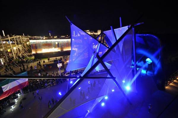
Stunning Lighting Display at the Kuwait Pavilion. Photo credit: Win Phyo
9. Design for the Experience
What’s a World’s Fair void of an enjoyable experience? The luna park-like festival grounds of the Holland pavilion was one of the most unique of all. It was furnished with a greenhouse, the world’s only Ferris wheel restaurant, nine food trucks, and Dutch DJs spinning the hottest dance tracks. What’s not to love about this incredible ambience? WATCH: Expo 2015: The Netherlands Pavilion
10. Vertical Farming
In the next 35 years, the world’s population is expected to grow from about 7 billion to 9 billion people. Many experts believe that vertical farming presents a solution to growing plants when maintaining a large tract of land is unattainable. We were impressed with the 860-square-meter (9,250-square-foot) automated vertical farm at the United States pavilion, which featured ZipGrow towers that are scalable, maximizing output in limited space.
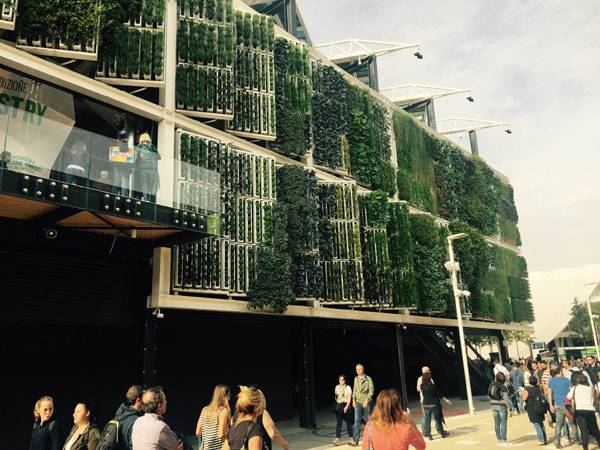
Automated Vertical Farm at the USA Pavilion. Photo credit: Brett Lezon
Nighttime Capture of the Automated Vertical Farm at the USA Pavilion. Photo credit: Win Phyo
Expo Milano 2015. Photo credit: Brett Lezon


Top Plantsman Roy Diblik Explains Keys to Successful Low-Maintenance Planting
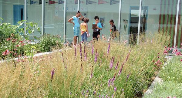
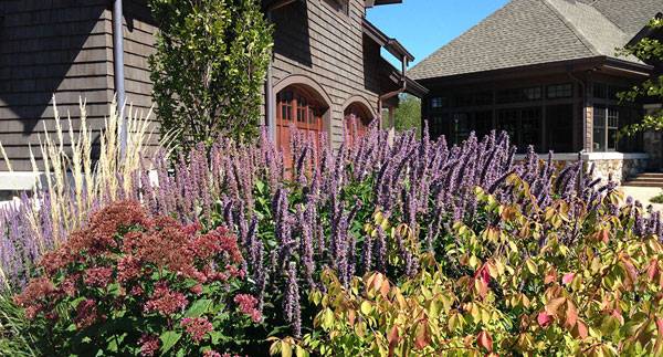
In a conversation with writer Nicholas Bueskingkeys, top plantsman, Roy Diblik explains the keys to successful low-maintenance planting. Over the past decade, Roy Diblik has become a prominent name in Midwestern perennials. He runs Northwind Perennial Farm in southern Wisconsin, which supplies some of the largest perennial wholesale companies in the area. He has never received formal education in horticulture. Nevertheless, today Chicago is sprinkled with prominent displays of his work: Lurie Garden, Shedd Aquarium, and the Gary Comer Youth Center, among others. He has become a leading advocate for a paradigm shift in the planting industry, alongside other notable plantsmen including Piet Oudolf and Adam Woodruff.
Gary Comer Center. Photo credit: Northwind Perennial Farm

Front cover of The Know Maintenance Perennial Garden, by Roy Diblik. Pick up your copy here!
The gardens at the Art Institute in Chicago demonstrate the concept of creating herbaceous coverage in order to push out weeds. Bulbs such as the tulips sprinkled throughout the foreground and background help provide early season interest and coverage while other perennials are getting started. Image credit: Northwind Perennial Farm
What Makes a Good Man-Made Prairie
To achieve these communities in the Midwest, Diblik frequently turns to the prairie. Discussing what makes a good man-made prairie, Diblik hedges a bit. The quality of a “good” outcome can vary, he says, likening it to cuisine. Some people are satisfied with a big, juicy burger. Others would prefer to dine at a five-star French restaurant. Yes, a prairie with low species diversity is still a prairie, but it will not compare to the biodiversity and ecological benefit of a truly healthy prairie. Early in our conversation, Diblik commented that he was interested to see how the recent work on Grant Park had taken shape. He had some early involvement in the project but had eventually moved on. The concerns he had then were still there; the planting beds were much too small for seeding.
A community-based planting at a Wisconsin residence illustrates the exuberance that can be created through the mixture of color and texture in a small area. Image credit: Northwind Perennial Farm
How to Make Sure Seeding Works
Seeding works best in large areas in which a large diversity can be achieved through the seed mixes. Gradually, the species will eventually establish themselves where they are happiest. In small-scale plantings, the same range of species cannot be achieved. For plantings in residential beds, civic spaces, and parkways—where plugs and containerized plantings are more appropriate—Diblik recommends multi-stage planting, for maintenance and budgetary reasons. Diblik starts with plants that will eliminate work. These are plants that clump together to become the substrate of his planting matrices. In this phase, grasses and sedges predominate. Their density reduces the need for weeding down the line. In a second stage, he adds plants that add color and form to the landscape.
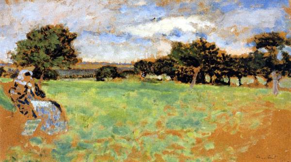
Madame Hessel Sitting in a Meadow in Normandy, by Edouard Vuillard. 1905.
Never Expect Instant Results
Once the project has been installed, the work is not yet complete. Developing a healthy prairie takes more than a single burst of planting. Too often, the client, the developer, or even the designer expects instant results, an irony in a field inherently reliant on time. When seeding, it takes years of continual analysis and reseeding to get a prairie that is balanced and can sustain itself. Without continuous seeding, a few species such as Echinacea, Aster, and Solidago—the “thugs” as Diblik calls them—dominate and greatly reduce the biodiversity and aesthetic complexity of the planting. The process is not fast. Diblik says that the tweaking process could last up to 18 years from initial installation, although often it is much shorter. Diblik says he finds a certain elegance in the extended effort, calling it the “beauty of time and patience to get it right.”
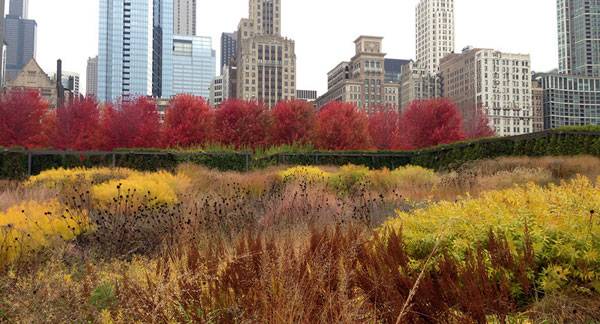
Per Gustafson Guthrie Nichol’s concept, Lurie Garden, makes use of dramatic swaths of color throughout the seasons. Image credit: Northwind Perennial Farm
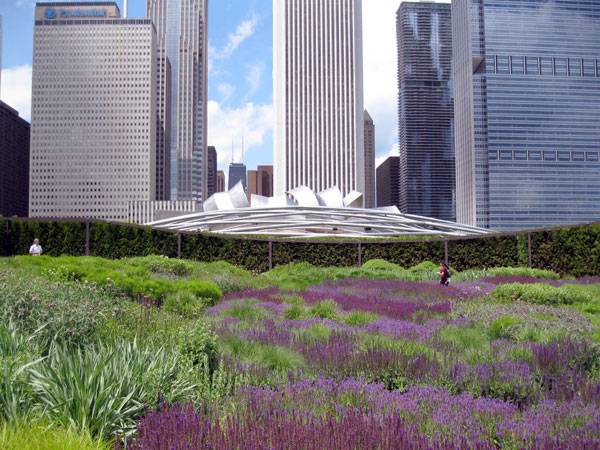
“Lurie Garden in sun” by Ruhrfisch (talk) – Photographed it myself. Licensed under GFDL via Wikimedia Commons
Roy Diblik at the Lurie Garden. Image credit: Northwind Perennial Farm
- The Well-Tended Perennial Garden, by Tracy DiSabato-Aust
- Manual of Woody Landscape Plants, by Michael Dirr
- The Know Maintenance Perennial Garden, by Roy Diblik
Article by Nicholas Buesking Return to Homepage

Rethinking the Urban Space with the ASLA Headquarters
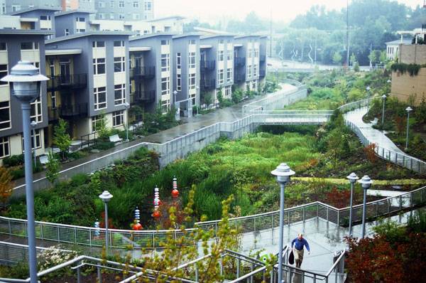
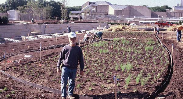
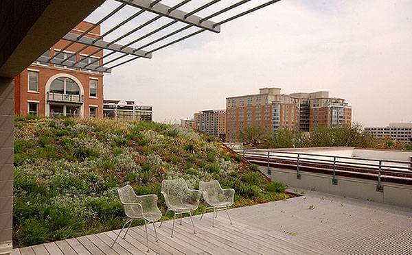
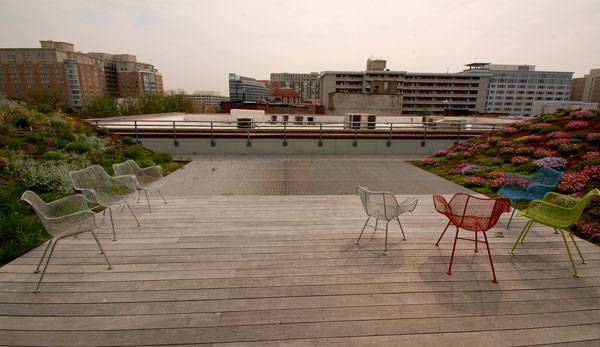
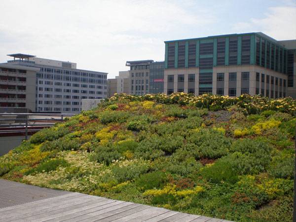
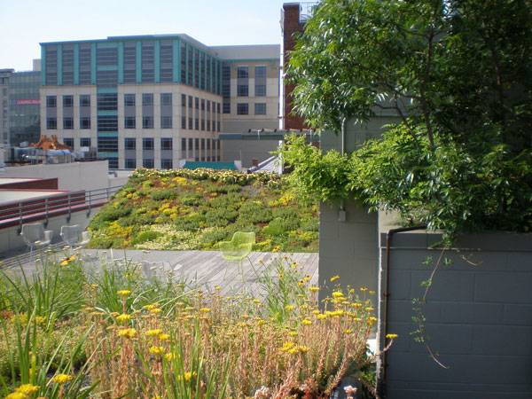
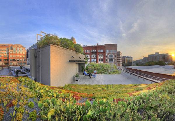
ASLA headquarters, by Michael Van Valkenburgh Associates, Inc. and Conservation Design Forum, in Washington, D.C. The ASLA (American Society of Landscape Architects) green roof project seeks to demonstrate the environmental benefits of green roofs, as well as to showcase what landscape architects contribute to this type of project. Located on the rooftop of the headquarters of the American Society of Landscape Architects in the heart of Washington D.C., the ASLA Green Roof project transformed an existing 3,000 square foot roof into an expressive display of green roof technology that supports an active social space.

ASLA Green Roof. Image courtesy of ASLA
Some Benefits of Green Roofs Worth Mentioning
Green roofs help to cool cities, clean the air, build habitat and manage storm water. The plants and their growing medium filter rainwater and some of its pollutants. The plants produce oxygen that improves air quality. A green roof reduces a building’s heating and cooling costs, acting as a form of insulation. And they lessen the heat island effect, in which buildings warm up so much that they heat their surroundings. See More Articles on Green Roofs:
- How The Chicago City Hall Green Roof is Greening the Concrete Jungle
- Extensive Green Roofs: The Essential Guide
- WARNING: Why You’re Losing Money By Not Using a Green Roof
On the ASLA green roof, Styrofoam forms the base for each 25 foot (7.6 m) long ‘wave’ of plantings, which minimizes the weight of the structure. It features many different soil depths, ranging from 3 inches (75mm) on the flat portion to 21 inches (525mm) on the elevator shaft, to accommodate the roof’s varying strength in different areas while also showing different types of green roof designs.
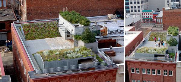
ASLA Green Roof. Images courtesy of ASLA
“…reduced building energy costs by hundreds of dollars a month…”
ASLA set up an extensive monitoring system to measure air temperature, water runoff, and building energy use. A comprehensive report found that the green roof retained thousands of gallons of storm water, reduced building energy costs by hundreds of dollars a month, and significantly lowered outdoor air temperature.
ASLA Green Roof. Image courtesy of ASLA
Creating New Views
With the barrel-shaped mounds at the north and south ends of the roof, the designers have created new horizons for visitors, clearing the immediate urban foreground and focusing views on the more distant Washington skyline. The plants on the north wave include native perennials such as purple love grass (Eragrostis spectabilis), butterfly milkweed (Asclepias tuberosa), and black-eyed Susan (Rudbeckia hirta).
Right Plant, Right Place
The overall plantings include many “experimental” plants which are not typical green roof plants. This is done in an attempt to find plants that can withstand the harsh environment on a green roof.
ASLA Green Roof. Image courtesy of ASLA
A Balance of Nature and Function
Balancing social use and ecological benefit, a unique element to the design is the aluminum grate that has Sedum growing below it. By using the aluminum grate, significantly more roof space is made accessible for visitors while providing a greater growing area.

ASLA Green Roof. Image courtesy of ASLA
ASLA Green Roof. Image courtesy of ASLA
ASLA Green Roof. Image courtesy of ASLA
ASLA Green Roof. Image courtesy of ASLA
Full Project Credits For The ASLA Headquarters
Project: ASLA headquarters Location: Washington, D.C. Build: 2006 Size: 3000 sq. ft. Prime Consultant/Landscape Architect: Michael Van Valkenburgh Associates, Inc. Website: www.mvvainc.com Green Roof Consultant: Conservation Design Forum Website: www.cdfinc.com Client: American Society of Landscape Architects Project Team: Conservation Design Forum, Michael Van Valkenburgh Associates, DMJM, Robert Sillman Associates, Forrester Construction Completion: 2006 Publications: Landscape Architecture Magazine, 2006, Metropolis Magazine, 2006 Recommended Reading:
- Urban Design by Alex Krieger
- The Urban Design Handbook: Techniques and Working Methods (Second Edition) by Urban Design Associates
Article by Agmarie Calderon Alonso Return to Homepage Feature image courtesy of ASLA


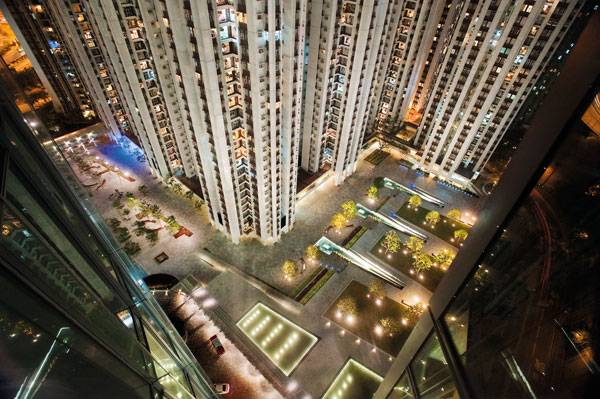
One Island East Becomes an Exciting Urban Plaza for the People of Hong Kong
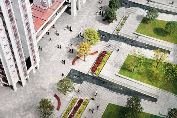
One Island East, by Hargreaves Associates, in Taikoo Place, Hong Kong, China. According to the common business terminology, a corporate design or a corporate identity is the specific combination of designs, colors, and words that a firm uses to present a visual statement about itself and its business philosophy. The corporate identity is the integral image a company shows to investors, customers, and the public. It is very often vital for the future development of the business. Corporate landscape is another notion, referring to the use of landscape architecture as a creative tool to underline and maintain a certain corporate identity. How can a landscape project reflect and correspond to the design and corporate identity of a specific office campus located in Hong Kong? How has it managed to complement the exquisite appearance of a 298.1-meter-high (978-foot) office tower, which is a landmark on its own? Find out the answers to these questions — and see how more of them pop up — while exploring one of the most exciting directions of landscape architecture, the corporate landscape design.
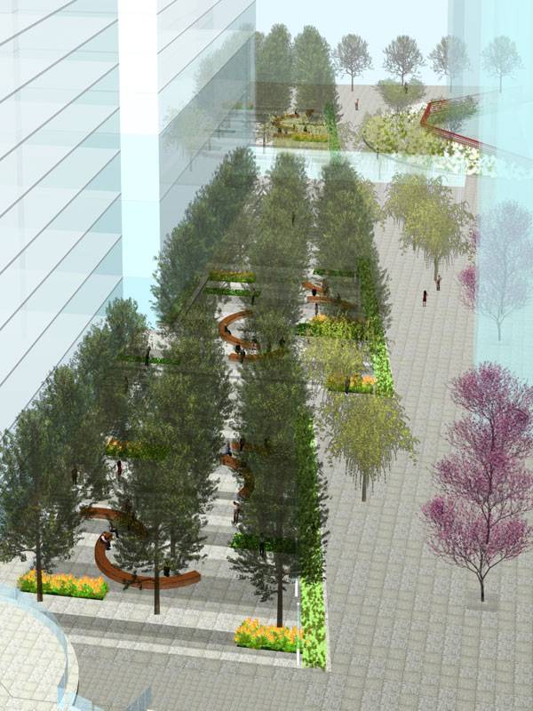
Visualisation for One Island East. Image courtesy of Hargreaves Associates
One Island East
As the latest office development at Taikoo Place, One Island East marks the center of the campus with a signature tower and open space that will serve the entire district. Comprised of 59 office floors occupied by 30,000 employees, the large-scale, commercial office tower poses a problem for landscape architects: how to incorporate the building with the surrounding environment without undervaluing its distinctiveness. How can designers connect the adjacent residential structures and another 50,000 residents to the corporate nature of the business hub?
One Island East. Image courtesy of Hargreaves Associates
A Landscape Echoing the Architecture
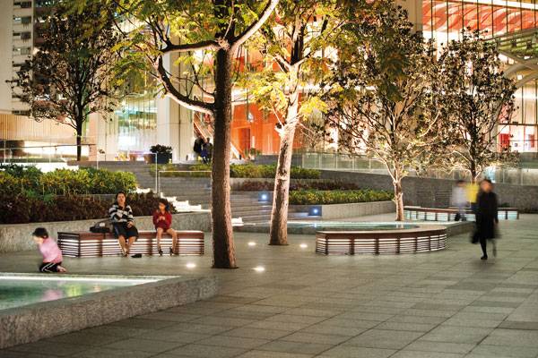
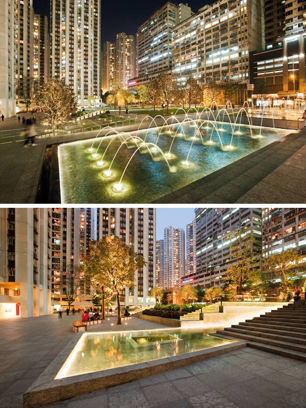
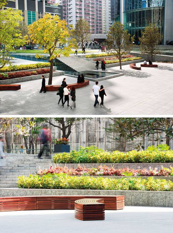
The team of landscape architects from Hargreaves Associates has come up with a deliberate, yet polished design solution. “The four-hectare plaza exemplifies the design objective of elegant simplicity held by Swire Properties Limited for the 30,000 office users and adjacent residents,” they explain on their website. The concept design for the plaza takes queues from the One Island East building and uses the topography of the site to create different zones of paving, landscape and water. THE RHOMBOID SHAPE of the tower in plan and elevation creates a floating effect that is further reinforced by the lighting, and is the inspiration for the plaza design and pattern, which translates the modern shapes of the building to the landscape.
One Island East. Image courtesy of Hargreaves Associates
Elegantly Graded
Providing a forecourt to the building, the plaza creates a graceful transition from the massive presence of the surrounding high-rises by means of three flat, green platforms that step down from the tower podium via water stairs, vegetated terraces with native tropical plants, and shimmering water basins and thus the landscape provides human scale and softness to the predominately hard and massive surroundings. More Related Articles:
- How Cumberland Park Became a Riverfront Adventure Park
- 30 Landscape Architecture Firms To Keep Your Eye On!
- Top 10 Names In Landscape Architecture Today
One Island East. Image courtesy of Hargreaves Associates
One Island East. Image courtesy of Hargreaves Associates
Connecting People or Tying Together the Urban Scape?
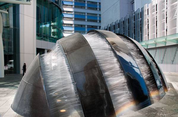
The alternation of linear and staggered tree arrangement, together with the rhythm of colors in the plantings, makes for a unique and pleasing asymmetrical composition. Two fountains are complementary enriching elements. The first one is located at the entrance to the tower and is an artesian interactive fountain using a combination of water and light effects to present a picturesque performance. The second fountain emerges from the podium in the shape of an egg, with black granite slabs and whitewater streams forming a striped shell.
One Island East. Image courtesy of Hargreaves Associates
One Island East. Image courtesy of Hargreaves Associates
The Potential of One Island East
Finally, emphasis should be placed upon the possibility for programs and choreographies that the elements of the podium offer. “The result is an expressive mix of performance art that signifies the sophistication and forward look of One Island East,” the design team says.
One Island East. Image courtesy of Hargreaves Associates
One Island East. Image courtesy of Hargreaves Associates
One Island East. Image courtesy of Hargreaves Associates
Full Project Credits For One Island East
Project Name: One Island East Project Type: Urban Plaza Scope: Design Concept through Construction Observation Location: Taikoo Place, Hong Kong, China Landscape Architects: Hargreaves Associates Size: 5 acres Design: 2007 Construction Date: 2008 Client: Swire Properties Ltd, Hong Kong, China Total Value: $2 billion (total project cost, public realm cost not separated) Website: www.hargreaves.com Recommended Reading:
- Urban Design by Alex Krieger
- The Urban Design Handbook: Techniques and Working Methods (Second Edition) by Urban Design Associates
Article by Velislava Valcheva Return to Homepage

How to Turn a Derelict Urban Space into a People Magnet
A’beckett Urban Square, by Peter Elliott Pty Ltd Architecture + Urban Design and Taylor Cullity Lethlean Landscape Architecture, in RMIT at Melbourne, Victoria in Australia. Conceived as a piece of urban theater carved out of the surrounding of the city, A’Beckett Urban Square is framed by new residential towers, multi-level car parks, and RMIT academic buildings. This urban landscaping pop-up has transformed a vacant site into a vibrant sports and recreational hub for RMIT. Transforming a vacant space into a useful one by using artwork, platforms for sports, and vegetation, and by creating space between spaces, the park adapts its surroundings into a collaboration of ideas, developing creative concepts.

A’beckett Urban Square. Above: Before image, courtesy of Peter Elliott Pty Ltd Architecture + Urban Design. Below: After image (Not at the same angle as above image) Photo credit: 2 John Gollings
A’beckett Urban Square
A’beckett urban square is a temporary zone which converges different activities into one location. It is accessible not just to RMIT students and staff, but also to the greater Melbourne community, turning this underutilized and derelict space into a publically-accessible 2,800 square meter ‘pop-up’ park. “It’s really meant for active ball games, because there’s really almost nowhere in the city you can do that, apart from what RMIT already has in its campus on Bowen Street.” -Peter Elliott-
A’beckett Urban Square. Photo credit: John Gollings
- 10 Great Projects Showing why Australia are Leaders in Landscape Architecture
- Australia to Lead the World in Green Infrastructure for a Healthier Nation
- The Australian Garden That Everyone’s Talking About!
A’beckett Urban Square. Photo credit: Ash Keating
Making a Vacant Space Into a Dynamic and Functional One
Design and creativity meet with simple and clear ideas, making a vacant space into a dynamic and functional one. Putting perspective onto a blank slate allows RMIT University to have an outdoor section that is also pragmatic. Though impermanent, the project managed an outgoing use of the space; people visited and interacted with the setting, making clear that it served its purpose. Turning derelict wasteland into an urban playground, these projects are transforming the way Melburnians engage with their city – however temporarily.
A’beckett Urban Square. Photo credit: John Gollings
The Impact of a Pop-up Park
This ‘pop-up’ park brought light and contrast to the area, incorporating colors and textures onto the plane; it played well with the buildings giving a burst of fun and playfulness to its surroundings. This piece of living art, at least for me, was simply amazing – bringing people together into one cohesive square, giving them many options to choose from and allowing for contemplation of each zone without overshadowing the others. This park lets the scenery speak for itself, providing a place for having fun while the commotion of the city continued on.
The Result of a Great Collaboration
Making a piece (space) like this was well thought out. Putting the concept together, a gathering of minds connected many ideas into a single one. In the end, they created a continuous surrounding that the people (community) could actually enjoy. That is what I consider a great collaboration between the architect, Peter Elliott, and the RMIT project manager, Liz Davies.
Understanding The Needs of The Users
Taking time to really understand the needs of the city and the people that live there is very important when working on a project, whether it is long term or just temporary. Nevertheless, it is necessary to have an open mind about what works in the area in which the project is going to be built; every detail counts.
A’beckett Urban Square. Photo credit: John Gollings
A’beckett Urban Square. Tony Owczarek
A’beckett Urban Square. Tony Owczarek
Full Project Credits For A’beckett Urban Square
Project: A’beckett Urban Square in RMIT Location: RMIT at Melbourne, Victoria in Australia Architect: Peter Elliott Architecture + Urban Design RMIT Project Manager: Liz Davies Services Engineer: Arup Build: June of 2014 Size: 2,800sqm Client: RMIT University Principal Architect: Peter Elliott Project Architect: Catherine Duggan Project Team: Sean van der Velden, Daniel Bennetts, Juliet Maxsted Structural & Civil Engineer: Arup Building Surveyor: BSGM Landscape Architect: Taylor Cullity Lethlean Quantity Surveyor: DCWC Town Planning Consultant: Nicholson Planning + Development Project Manager: Savills Artist: Ash Keating Graphic Designer: Univers Graphics Photographers: John Gollings, Tony Owczarek, Ash Keating Project Value: $1.2million Designed: September 2013 Completion Date: May 2014 Head Contractor: ADCO Website: www.peterelliott.com.au Recommended Reading:
- Sun-Drenched Gardens: The Mediterranean Style by Jan Smithen
- Designing and Creating a Mediterranean Garden by Freda Cox
Article by Agmarie Calderón Alonso Return to Homepage


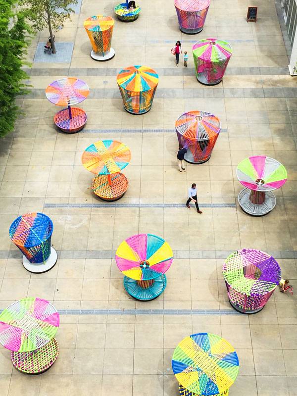
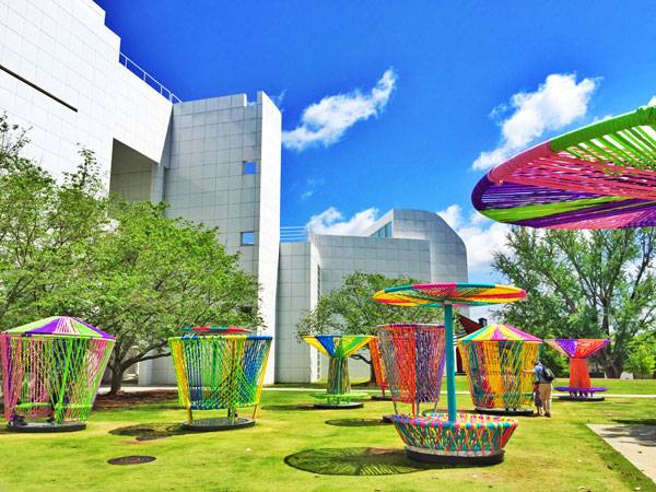
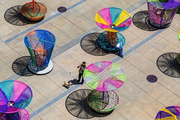
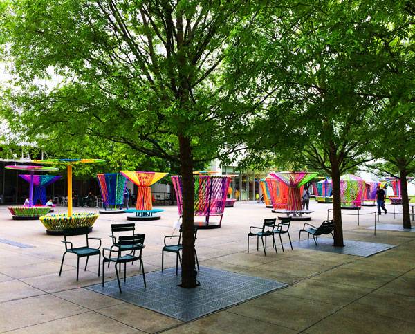
The 3 Benefits of Play Design Seen in the Spinning Tops of Los Trompos
Los Trompos, by Héctor Esrawe & Ignacio Cadena, High Museum Atlanta, Atlanta, Georgia. “Should we take the ‘ground’ out of ‘playground?’” That is the question posed by scientist and landscape historian Paige Johnson, so that the idea of play can be extended throughout the city and we can have play opportunities throughout the space we move through. The desire to broaden the playground to include more locations and ages can be seen in the increased focus of museums and public spaces on play. One such space is in Carroll Slater Piazza inside the High Museum of Art in Atlanta, where Los Trompos has been housed since April 2015. Designed by Esrawe and Cadena — two of the leading designers in Mexico today — the “Spinning Tops” are the second-stage project after Mi Casa Su Casa – the red hammock houses. This work is part of a multi-year initiative to activate the outdoor space by engaging visitors. And as you will see in this article, this happened within the idea of play design.
Los Trompos. Photo credit: Esrawe+Cadena
General Context and Inspiration Source
Besides the fact that Los Trompos is a response to the desire to extend the playground to different ages and locations, we ask ourselves about a deeper meaning of the idea of play design. In a globalized world where speedy travel, mass communication, and information influx among countries are taken for granted, traditions and cultural inheritances are becoming anchor points and key elements in maintaining the whole globalization-machine.
Los Trompos. Photo credit: Esrawe+Cadena
- 10 Top Examples of Land Art From Around the World
- Can Art Revive a Dead Urban Space?
- Mind Blowing Snow Art – A New Way to Think of Snow
Los Trompos. Photo credit: Jonathan Hillyer
1. Tradition – “We love our country, our people, and our roots”
The design concept of Los Trompos rests upon a popular toy for children around the globe and on Mexican cultural inheritances. Spinning tops have existed since antiquity, and they are toys designed to be spun rapidly on the ground. The “larger-than-life” spinning tops designed by Esrawe and Cadena are also reminiscent of Mexican tradition and the skills of local craftsmen: the weavers. Within their colorful expression and way of construction, they remind the visitors of the Mexican potpourri in clothing and flavor.
Los Trompos. Photo credit: Jonathan Hillyer

Los Trompos. Photo credit: Abel Klainbaum
2. Openness – “What we aim for the most is to translate this inheritance into new languages”
The cultural inheritance represented as an anchor point on a global level has nevertheless to be opened. It has to be understandable for others who aren’t local. In order to understand a cultural inheritance, locals have to translate meanings, shapes, and values. That means having the openness to share with other people.
Los Trompos. Photo credit: Abel Klainbaum
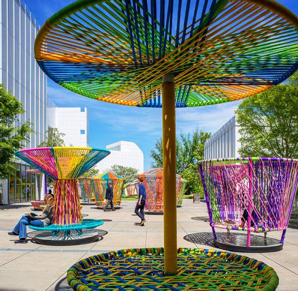
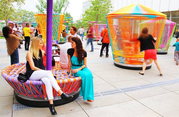
3. Interaction – “Share with different cultures and different individuals”
The translated Mexican cultural inheritances through Los Trompos are fostering an interaction among people from around the world who are visiting the High Museum of Art in Atlanta, as well as between the people and the designed structures. It’s not only about enjoying recreation, but also about social interaction. The tops will only spin when at least two people cooperate, fostering an engaging connection. In these carousels, visitors can work together to spin. By interacting with the spinning tops, visitors can understand the Mexican culture better and also become part of it.

Los Trompos. Photo credit: Abel Klainbaum
Los Trompos. Photo credit: Esrawe+Cadena

Los Trompos. Photo credit: Esrawe+Cadena
Full Project Credits For Los Trompos
Project: Los Trompos Location: Atlanta, Georgia Completion: 2015 Concept & Creative Direction: Héctor Esrawe & Ignacio Cadena Design Team: Esrawe + Cadena ® Project Management: Javier García-rivera, Ricardo Bideau Operational Coordination: Alberto López Monzón Production Steel Structure: Mario Alberto Gómez – Magsa Woven: Israel Castañeda Becerril – Cbi, Rogelio Castañeda Becerril. Prototype: Gerardo Domínguez. Esrawe + Cadena ® Team. Alberto López Monzón, Alejandro Flores, Arturo Bonilla, David Flores,Javier García-rivera De La Plaza, Jorge Castruita, Moises Gonzálezl, Ricardo Bideau, Sofía Centeno Photography: Abel Klainbaum, Esrawe + Cadena, Jaime Navarro, Jonathan Hillyer Website: www.esrawe.com High Museum Of Art Team Curators: Sarah Schleuning, Curator Of Decorative Arts And Design. Virginia Shearer, Eleanor Mcdonald Storza Director Of Education Project Manager: Elizabeth Riccardi, Coordinator Of Collections And Exhibitions Installation Team: Brian Kelly, Chief Preparator. Gene Clifton, Senior Preparator. Ed Hill, Preparator. Caroline Prinzivalli, Preparator. Tommy Sapp, Preparator. Jim Waters, Senior Exhibition Designer Assistants: America Salomon, Education Department Assistant. Melissa Maichele, Research Assistant, Decorative Arts And Design Recommended Reading:
- Urban Design by Alex Krieger
- The Urban Design Handbook: Techniques and Working Methods (Second Edition) by Urban Design Associates
Article by Ruth Coman Return to Homepage