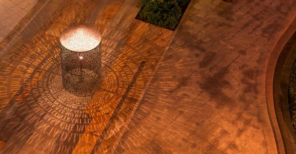
Author: Erik Schofield
10 Things Wrong with Landscape Architecture Today
Article by Win Phyo – In this article, we take a closer look at landscape architecture today and investigate just what is wrong with this profession. In current times, we cannot deny that landscape architecture is indeed a growing profession. In 2011, the National Endowment for the Arts, NEC, predicted future job prospects for several artistic occupations through to 2018 within the U.S. and landscape architecture came out with one of the highest projected growth rates of 20%. Since 1863, when Fredrick Law Olmsted adopted the title “landscape architect,” the profession has digressed into several areas of expertise from landscape planning, to management, to design, which can be further divided into areas of conservation, science, the arts, and many other applications. So much so that landscape architects have coined themselves as “Stewards of the Land”. The accumulated development of the profession has also made landscape architecture vulnerable, for example, to the influence of popular trends and culture. It has never been a better time to now pause, take a step back, and look at the profession with a critical eye.
Landscape Architecture Today
10. Our Professional Organizations are not Doing Enough to Promote the Profession
It is time to get over the fact that landscape architecture is a relatively new or young profession. It has been about 150 years since the profession has been recognized (if you recall the mid-nineteenth century establishment of its identity).  There are now so many professional organizations that represent landscape architects nationally and worldwide, from ASLA in the U.S, LI in the U.K., AILA in Australia to IFLA Europe and IFLA World. Yet I still find myself explaining that we do not just do garden design. Sustainable and resilient modes of thinking demand that landscape architects lead the way but as landscape “stewards,” are we having much of an impact? Frankly, I am concerned that our respective professional organizations are not doing an effective job at getting the word out about who we are and what we do. The vigorous and sensitive nature of our work means landscape architects are capable of being the most adaptable and least appreciated. We need a public relations campaign.
9. Landscape Architects Fail to Pursue Bigger Decision-making Roles
There may be a general inferiority complex within the profession. As Mark Hough has rightly stated in his article, landscape architects “have had a tougher time finding seats at the table alongside planners and architects when broader planning decisions are being made.” ASLA has also questioned this statement back in 2012. Landscape architects need to assert themselves as designers of all public infrastructures. Working as a planner is a decision-making position but land uses can be better regulated and revived using the spatial design knowledge and skills we fundamentally possess.
8. Students are not Taught to Understand the Real Practice of the Profession
Last July, I finished four years of design education where I emerged with a B.A. and M.A. in Landscape Architecture. Yet with my diploma in hand, I am still pondering about what it means to practice as a landscape architect. Design school is all about selling your idea, no matter how bad it would be in reality.  Why do students in design school create marketable but unrealistic proposals when our job is to design places that ought to be built one day? Design studio culture shuts students inside and away from intermingling with people unlike themselves. If we spent time, from much earlier stages, delving into interpreting ecological or social patterns and learned to place importance on feasibility and actual implementation of a project, we would be much better equipped to grapple the ropes of good practice.
7. Office Culture Needs to Start Reflecting the Work we do
Historically, from the likes of the French landscape architect André Le Nôtre, who designed the park of the Palace of Versailles, our industry has been about the aesthetics of projects. It then evolved to include showing sensitivity to environments and is now touching on resiliency and the effects of personal well-being. We are, at times, building projects for the wrong reasons; focused on “building” landscapes rather than building up people and relationships. Office culture can certainly do better to start this discussion.  Facebook, the social media giant, is leading discussions of the digital world and they have a unique office culture to match what they are preaching. If Facebook can do things differently, why can’t landscape architectural firms evolve and do things differently? After all, our mindsets influence our designs, which in turn translates to our projects and are reflected on the product users.
6. Young Professionals Lack the Necessary Horticultural Knowledge
What clearly differentiates landscape architects from fellow professionals in artistic occupations is our ability to specify planting species for different purposes . However, young professionals today often have little background knowledge on plants. The school system should also be encouraging horticultural studies as a strong basis of the learning component if one wants to practice as a landscape architect. The implications of specifying wrong species can have a huge impact in the built environment. An example is to know the right species of trees to specify in urban landscapes. James Urban, an American landscape architect, has even written the ASLA award-winning book “Up by Roots” to help the professionals specify the right trees in the built environment.
5. The Profession Needs to Stress the Importance of Maintenance
The value of maintenance is vital in the profession since we only see the fruits of our work over a long period of time and what happens during this time, after the ground works have been completed, will determine the success of the project.  Of course, it all comes down to cost in the end; however, time constraints and lack of manpower in maintaining completed sites can ruin the initial hard work. Some maintenance contractors can often fail to recognize their role and landscape architects don’t always have the scope to help with the longevity of the project. All in all, large sites with big budgets may do fine but it is the everyday public spaces which need the most attention.
4. There is Robotic Geometry Overload Within the Profession
Landscape architects will need to overcome the need for perfection; countless designs today have more focus on creating the perfect geometry than on spending quality time studying the big picture. Place-making and the creation of ecologically healthy spaces requires much more from the profession than geometry being a driver for design.  Books such as “From Concept to Form in Landscape Design” do not help with the issue where designed spaces can become completely unfit for their surroundings. Isn’t it time we accepted that there can be no given systematic approach and that creating the perfect curve in AutoCAD is incomparable to the real issues we ought to deal with?
3. We Fall into the Trap of Valuing Flashy Innovation for its Own Sake
Another idea landscape architecture students have become prey to, like their professional counterparts, is that innovation for its own sake is a good thing. Take green walls for example; from the likes of Patrick Blanc’s work, where corporate clients use them in both the literal and figurative sense to project a rich and green image.  What happens when the irrigation system stops working? Is it really worth the consumption of high volumes of energy? Designing spaces based on flashy innovation means they are vulnerable, like fashion trends, to become outdated and to lack any real substance. Flashy lighting is another example in which the space becomes merely a tool for a lighting show. No doubt, the public loves the design flair, but the innovative beauty must be complimented by robust depth, function and intention for when the innovation becomes redundant.
2. The Profession has the Wrong Idea of a “Concept”
A large part of the profession is concerned with storytelling. The problem is that then our idea of the concept also falls prey to abstraction. What is your concept? This is the question that all students and professionals ask themselves and each other, yet our idea of the concept in landscape design is lacking clarification. Concept may very well be seen as the artistic component of design but concept-driven process should be analyzed and the profession must work in more relational and flexible ways. We have to consider the ecological, geological, political, social and cultural processes and forces, which indeed can be the make-up of what we view currently to be a single “concept”.
1. There is not Enough Post-Occupancy Evaluation (POE)
Post-occupancy evaluation still remains elusive within the profession; its importance is often undermined as part of the design practice. The Landscape Architecture Foundation’s (LAF) Case Study Information (CSI) program is one of the few examples that seek to investigate landscape performance. As ASLA points out , the value of such qualitative and quantitative research with robust data helps in communicating the importance of the profession to those without landscape design expertise. Yet the problem lies in the lack of research and participants. As we find out the user satisfaction with our most impactful projects like the New York’s High Line, we can better prepare our cities for the next century. Hence, POE needs to be better integrated into the profession, especially once a project has been completed. – The 10 things we have mentioned above are not only food for thought but also food for action. By making ourselves aware of the current nature of our profession, we all have a responsibility to remedy the cracks in the system. In most cases, it is not the case of conscious acts of bad practice but of not being conscious enough. Artistic occupations are most often exposed to the subjective eyes of the public and we must not only acknowledge this aspect but also look ahead and become Stewards of the Profession that is constantly dynamic and interpenetrating. You now know our Top Ten, we would love to hear your views and points. What are the things that are wrong with landscape architecture today, based from your own experiences?
Recommended Reading:
- Becoming an Urban Planner: A Guide to Careers in Planning and Urban Design by Michael Bayer
- Sustainable Urbanism: Urban Design With Nature by Douglas Farrs
- eBooks by Landscape Architects Network
Featured image credit: Alexander Pidgeon, via Unsplash
Przelomy Centre for Dialogue | From Painful War Scars to Success Story
Article by Win Phy0 – A review of Przelomy Centre for Dialogue, by KWK Promes, in Szczecin, Poland. Imagine a place that is deeply rooted in a painful history, a place that hasn’t caught a break in the years since. The potential for reviving that space and making a 360-degree turnaround might seem highly unlikely. For years, a section of Szczecin, Poland, suffered this sorry state. The once vibrant urban quarter was first destroyed by aerial bombings during World War II, then neglected under Soviet regimes. There were times when the people tried to take back the site’s identity, but it wasn’t until the turn of a new century that real progress began to be made.
Przelomy Centre for Dialogue
Today, the city has taken back this space, now home to the Przelomy Centre for Dialogue. The turnaround is a result of good planning and design decisions that focus less on a complete re-invention and more on acknowledging and rebuilding much of the history that was involuntarily ignored. WATCH >>> World Building of the Year 2016 is part building, part topography says architect Robert Konieczny
The Scars Behind the Square
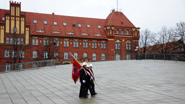
In 1907, the site was a densely populated quarter of the city, vibrant with urban activity. The advent of World War II brought with it destruction, with bombings literally leaving a physical hole. After the war, Soviet occupation led to ill treatment of the neighborhood. New motorways were built alongside crude concrete blocks, while the city’s empty spaces – including the square that is now home to the Centre for Dialogue — were neglected.
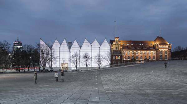
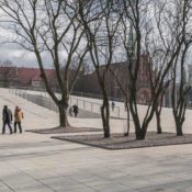
Przelomy Centre for Dialogue. Photo credit: Juliusz Sokolowski

Przelomy Centre for Dialogue. Photo credit: Juliusz Sokolowski
Reconciling the Past Through Good Design
The Solidarity square was used for the odd commemorative event, but for the most part was still empty of life and everyday use. This was not helped by the indistinguishable boundaries of the square, which was bordered by a main road that was highly congested. A decision was made to change the use of the square. But filling the physical and memorial holes within the site was not going to be an easy task. How do you begin to decide what happens in a space that already has a lot of stories to tell? Will it turn into new development or an open space?
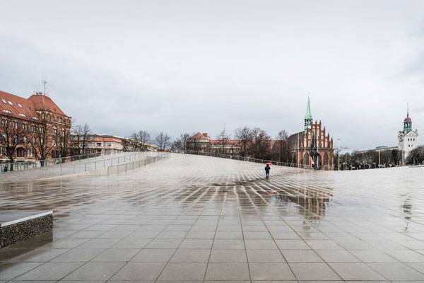
Przelomy Centre for Dialogue. Photo credit: Juliusz Sokolowski
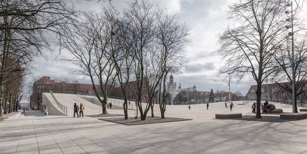
Przelomy Centre for Dialogue. Photo credit: Juliusz Sokolowski
Przelomy Centre for Dialogue.
The Prewar Urban Quarter and the Postwar Square
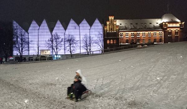
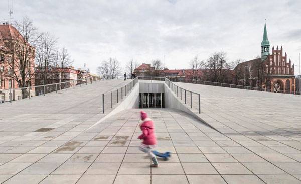
From the beginning, there was a clear and clever intention to integrate the previous site’s uses. The language of the proposal derived from the 1907 urban quarter development and the 2009 square, which popped up after the war. Respecting these pieces of history has led to the success of the site. What came out of this intention was an urban hybrid reflected physically in both forms of the quarter and the square.
Przelomy Centre for Dialogue. Photo credit: KWK Promes
Przelomy Centre for Dialogue. Photo credit: Juliusz Sokolowski
Przelomy Centre for Dialogue. Photo credit: Juliusz Sokolowski
How Are the Interior and Exterior Spaces Enhanced?
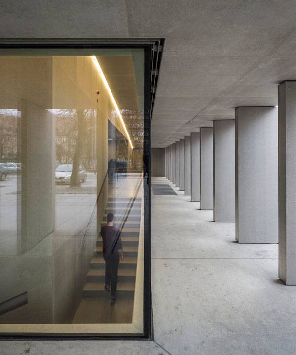
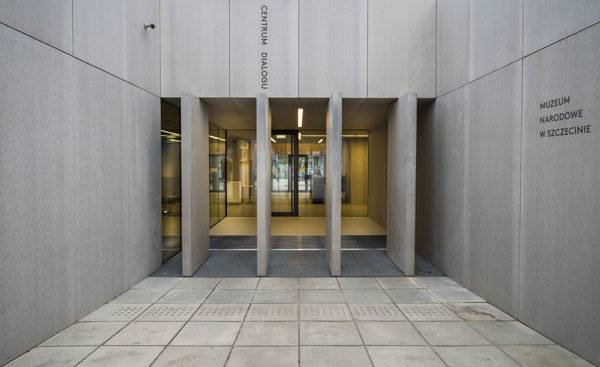
The designers involved in creating the public realm collaborated with the interior designers. They decided to use concrete as the only material, achieving a monolithic character for the whole design. As you step down into the underground museum, the interior made up of black floors, walls, and ceiling reflects the dark history. From the outside, panels of rotating walls show glimpses of the inside, letting light through to the underground floor.
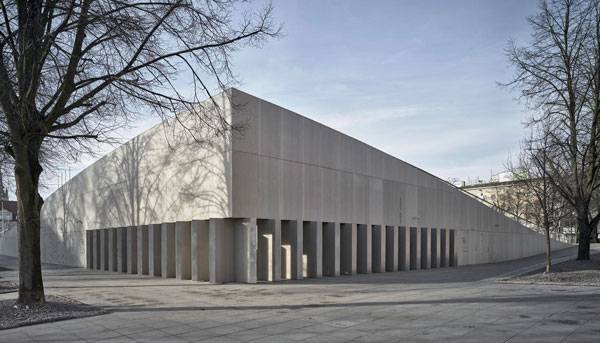
Przelomy Centre for Dialogue. Photo credit: Jakub Certowicz
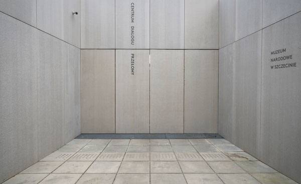
Przelomy Centre for Dialogue. Photo credit: Juliusz Sokolowski
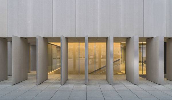
Przelomy Centre for Dialogue. Photo credit: Juliusz Sokolowski
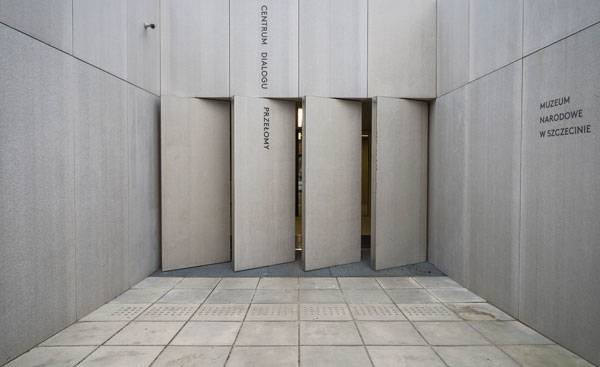
Przelomy Centre for Dialogue. Photo credit: Juliusz Sokolowski
Przelomy Centre for Dialogue. Photo credit: Juliusz Sokolowski
Full Project Credits For the Przelomy Centre for Dialogue:
Name of Project: Przelomy Centre for Dialogue Location: Szczecin, Poland Site Area: 9,577 square meters Competition: 2009 Project Design Duration: 2010-2011 Construction: January 2012-February 2016 Designers: KWK Promes, architects Robert Konieczny, Michał Lisiński, Dorota Żurek, Katarzyna Furgalińska Collaboration: Architects Aleksandra Stolecka, Piotr Tokarski, Adam Radzimski, Joanna Biedna, Magdalena Adamczak General Contractor: Skanska Investor: National Museum in Szczecin Awards: World Building of the Year 2016 Recommended Reading:
- Becoming an Urban Planner: A Guide to Careers in Planning and Urban Design by Michael Bayer
- Sustainable Urbanism: Urban Design With Nature by Douglas Farrs
- eBooks by Landscape Architects Network
Article by Win Phyo
Top 10 Influential Urban Designers
Article by Win Phyo – We explore 10 influential urban designers that have shaped the world as we know it and inspired countless others to follow in their footsteps. Urban design is complex. Before I introduce the influencers that have made a huge difference to the way people live and interact (some still are making that difference), let’s answer this question: what is the definition of urban design? According to urbandesign.org, urban design is “the art of creating and shaping cities and towns”. The following ten people – some of whose names you may recognize – were (and are) visionary urban designers and they have contributed to the process of giving shape, form and character to whole neighbourhoods, including built and social elements that make up the colourful vibrant places we move and dwell in.
Influential Urban Designers
10. Rem Koolhaas
Rem Koolhaas, a controversial Dutch architect, theorist and urbanist, has shaken up the world of urban design over the decades. He founded OMA (Office for Metropolitan Architecture) and his urban work has a unifying theme of the visionary metropolis as a world of extremes which is open to every kind of human experience. Thriving on change, uncertainty and infinite possibilities, Rem Koolhaas describes new urbanism as “the manipulation of infrastructure for endless intensifications and diversifications, shortcuts and redistributions – the reinvention of psychological space”. WATCH >>> Rem Koolhaas – The Future Of The Way We Live, Love And Work
9. Gordon Cullen
Gordon Cullen, English architect and urban designer, was a big motivator and developer of British urban design in the post-war period. He was a promoter of the Townscape movement, which aimed to produce a methodology for urban design, questioning Modernist and garden-city planning in the New Towns built post-war in England. He is also highly commended for his beautiful visual drawings that were his own representations of the urban environment, complimenting his influential career as an urban theorist. WATCH >>> Townscape analysis (final), Oxford 2013
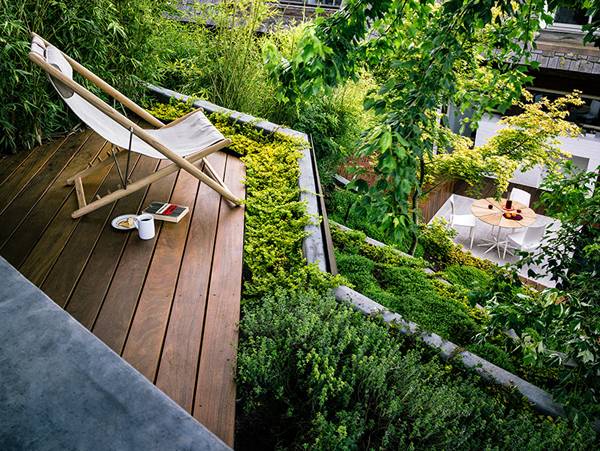
8. Camillo Sitte Camillo Sitte was a 19th century Austrian visual city planner, painter and architect. His influence was on the development of urban construction planning and regulation in Europe, drawn from his travels around European towns to identify aspects that made places feel warm and welcoming. His book “City Planning According to Artistic Principles” turned away from the hygienic planning procedures of the time in the late 1880s. Instead, he emphasized the creation of irregular urban spaces made up of spacious plazas and complimentary monuments and other aesthetic features. 7. James Corner The landscape architect and urban designer who has brought us the High Line and Fresh Kills Park in New York City, James Corner has been a more recent prominent figure of changing cities in the 21st century. His work stems from the principle that a vibrant and dynamic public realm is achieved by the interaction between people and nature. He sums up urban design in three words: infrastructure, ecology and urbanism. Take the High Line – this elevated park was a former railway (infrastructure) that combines the use of native species (ecology), igniting developments and becoming a magnet for tourists and residents alike (urbanism).
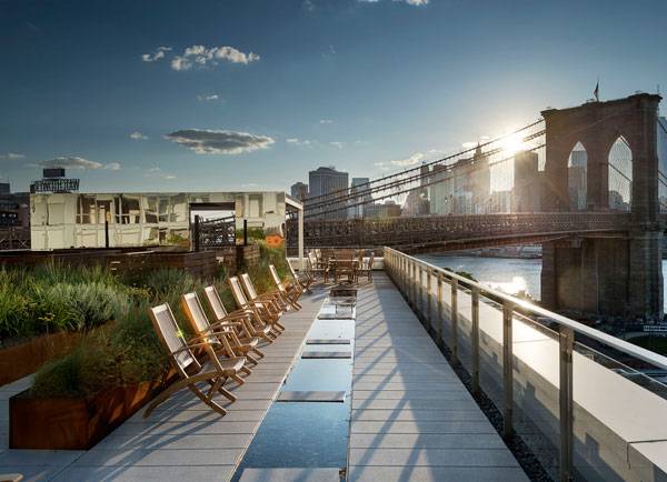
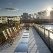
Dock Street Roof Terrace, by James Corner Field Operations
5. Andres Duany Another more recent influencer of the 21st Century, Andres Duany, American architect and planner, founded the Congress for New Urbanism, a non-profit organisation with a mission to reform growth patterns to provide people with diverse choices for how they live, work and get around. The organisation, operating at a political level, is pushing for policy reforms and has been named by the New York Times as “the most important collective architectural movement in the United States in the past fifty years.” WATCH >>> Andres Duany | The Urban Design View of the Neighborhood
4. Frederick Law Olmsted Considered the father of American landscape architecture, Frederick Law Olmsted is most known for designing New York City’s Central Park. He had the vision to create vast recreational and cultural achievements in the hearts of American cities, believing that the perfect cure to the stress and artificialness of urban life was a good stroll through a park. His work mission brought the landscape close to the urban population, as much as was possible.

Philadelphia Navy Yards – Central Green. Credit: © Halkin Mason Photography
2. Jan Gehl Jan Gehl, a Danish architect and urban designer, is an advocate of creating “Cities for People” and has focused his career on improving the quality of urban pedestrian life. The prominence of his work has affected cities across the globe, including London, New York, Auckland and Copenhagen, where his architecture and urban design company is based. We only need to take a look at the people-friendly metropolis of Copenhagen to see how his principles and work has made a difference in shaping the successful City. WATCH >>> In Search of the Human Scale | Jan Gehl | TEDxKEA
1. Le Corbusier This intriguing man, amongst many of his other professions, was a well-known Swiss architect and city planner. As an architect his refined yet functional style using concrete has progressed the development of his star material. To do this he invented the “Modulor” – a human silhouette used to design the structure and size of housing units. He applied his principles to an entire city – Chandigarh, in India, a city that has the least congestion in the country to date. WATCH >>> Le Corbusier’s model city of Chandigarh | FT Life
As Donald Watson (the animal rights advocate who popularized veganism) remarks, urban design is a “gift of its designers and makers to the future.” The urban designers are as colorful as the places they bring to life and the plausible efforts of those in the list are why we now have a vibrant urban lifestyle. Their legacies are passed down to successive generations to beautifully blend architecture, landscape architecture, and planning and in some ways to transcend policies to bring distinct places that our future generation can be proud of. So the next time you walk around your city, your mind might wander from the communal likes of Jane Jacobs and Jan Gehl to the utopian perspectives of Rem Koolhaas and Le Corbusier and many more.
Recommended Reading:
- Becoming an Urban Planner: A Guide to Careers in Planning and Urban Design by Michael Bayer
- Sustainable Urbanism: Urban Design With Nature by Douglas Farrs
- eBooks by Landscape Architects Network
Article by Win Phyo
10 Best Tutorials for Drawing Landscapes
Article by Win Phyo – Today we dive in YouTube and find 10 brilliant tutorials that will help you drawing landscapes better and improve your overall skills. Drawing is a discipline that we ought to develop constantly within the profession, especially if it is not our strongest asset. Sketching out our ideas is ultimately the first fruition of our designs before we stare into our computer screens to portray the perfection of our ideas. As Pablo Picasso once said: “Inspiration exists, but it must find you working.” Drawing is one of those things that requires skill, which is ultimately developed through spending hours and hours improving on the craft. Since the categories of elements contained within landscapes can stretch far and wide, studying it through drawing can reveal many facets you have not otherwise discovered or noticed before. This can be a joyful experience. With this in mind, here are the best tutorials for drawing landscapes to inspire your inner artist and get you working on this timeless craft.
Drawing Landscapes Like a Pro
10. The Graphite Powder Technique
WATCH >>> How to Draw Landscapes, The Graphite Powder Technique.
This simple video demonstrates repetitive techniques for drawing landscapes using graphite powder. The highlights of the technique include creating the initial background with graphite before sculpting the tree trunks with an eraser and creating details with lead pencils. The beautiful result is a drawing full of tone, texture, and atmosphere that transports the viewer to the setting.
9. Oil Pastel Landscape Demonstration
WATCH >>> Oil Pastel Landscape Demonstration
Oil pastels can be another challenging medium to work with. This quality tutorial is quick, but demonstrates a clear way of drawing in this medium and creating a success story out of it. The artist also highlights the importance of drawing landscapes as an illusion of an atmosphere you want to create, rather than producing an exact replica of the scenery.
8. Charcoal Pencil Landscape Sketching
WATCH >>> How to Draw with Charcoal Pencils – Landscape Sketching
Using charcoal can be a daunting experience at first because of its dark, unforgiving tones, which can also easily create a mess. This is a very detailed tutorial that shows a rewarding experience of drawing with charcoal, guiding us to study the light and textural details that come with drawing the landscape.
7. Chalk Pastel Drawings
WATCH >>> GREAT RUSSIAN 19th century artist chalk pastels drawing sandpaper мелки пастель Шишкин Лесные дали
Containing no spoken explanation but using a great video angle, the artist shows us how to draw a mountainside landscape using chalk and sandpaper. Sandpaper is a perfect companion for chalk, and we can see the ease that comes with blending colors using this medium.
6. Greytone Picture with 5 Pastel Pencils
WATCH >>> How to Draw a Greytone Picture with 5 Pastel Pencils
Artist Colin Bradley uses five grey tones of pastel pencils to create a rural landscape drawing. We love his videos so much, two of his videos have been chosen in this feature! He articulates the consideration of light when drawing and the best places to use darker and lighter tones. This video will definitely fill your mind with new drawing knowledge.
5. How to Draw a Waterfall Using Charcoal
WATCH >>> How to draw a Waterfall / charcoal / landscapes #20
This is an inspiring tutorial showing how expressive you can be drawing a waterfall landscape with two contrasting charcoal colors of white and black on colored paper. Although charcoal is not good for creating a lot of details, it can be useful for producing bold drawings and conveying movement and atmosphere extremely well. The end result is beautiful and, more importantly, teaches the viewer that drawing can also be a quick process.
4. How to Draw a Landscape Using Pastel Pencils
WATCH >>> How To Draw a Landscape – Part 1 – Pastel Pencils
By using pastel pencils, Colin Bradley teaches us how to draw a harbor landscape through simple coloring techniques. His video demonstrates how to thoughtfully choose the colors that the pastel palette provides, creating a contrast between the soft water waves and the textural built landscape. The techniques are also easily applicable for drawing both rural and urban landscapes.
3. How to Draw a Winter Landscape
WATCH >>> Pen & Ink Drawing Tutorials | How to draw a winter landscape
It may be a snowy winter for several of you during this time of the year. As cold as it may be, after watching this tutorial, you may be tempted to capture the winter landscape scene of your area through a sketch. Alphonso Dunn gives a great tip about building up a mental library of scenes before using a creative process of cutting and knitting several elements together to create your own unique drawing using pen and ink.
2. How to Draw an Old City Landscape
WATCH >>> Pen & Ink Drawing Tutorial | How to Draw an Old City Landscape
A lot of the tutorials we have seen are based on a rural landscape. However, an urban landscape scene can challenge us with heightened activities and features. This tutorial is a gentle but beautiful guide to creating a simple capture of an urban landscape using pen, ink, and simple mark-making techniques in an almost cartoon-like manner.
1. Landscape Painting with Pastels
WATCH >>> Landscape Painting with Pastels
This is a tutorial worth watching. Not only is the video quality clear, but the artist also clearly communicates the process in a close-up manner that shows the details of his techniques. Pastels can be a challenging medium, but this tutorial shows how it can be a brilliant tool that can be used to bring more vibrancy into our drawings. – A lot of knowledge can be gained from watching these videos. After all, they are the best tutorials for drawing landscapes! Jokes aside, the featured artists have shown how they draw landscapes using their techniques and the different mediums they work with. They also tell a collective message to us about some of the important factors in drawing landscapes. As mentioned in the beginning, the fundamental part of the process lies in using our creative tendencies to filter out the relevant and irrelevant parts of the landscape for the purpose of the drawing. The drawing may be done using a reference picture or straight from the scene, but since you are the artist, don’t forget that the essence of the drawing comes from using your own imagination instead of creating a rigid replica of the scene. We hope you enjoyed watching the videos and gained an immense amount of insight. Now it is down to you to refine your craft. Happy drawing!
Recommended Reading:
- Drawing for the Absolute Beginner: A Clear & Easy Guide to Successful Drawing (Art for the Absolute Beginner) by Mark Willenbrink
- You Can Draw in 30 Days: The Fun, Easy Way to Learn to Draw in One Month or Less by Mark Kistler
Article by Win Phyo
Top 10 Landscape Architecture Projects 2016
The official Landscape Architects Network choices are here for our top 10 landscape architecture projects 2016. Covering a range of varied projects that are sure to keep you inspired going into 2017. 2016 has been an exciting time for landscape architects. It’s been a year of expanding creative innovation, receiving recognition, and setting standards for future development. We have, once again, arrived at the time of year where Landscape Architects Network presents you with the best projects completed during the year. Our criteria: Projects that pushed the boundaries of our profession. From a playscape that draws its design roots from mining heritage to a complicated exploration of mathematical patterns in nature, revealing a perfectly precise garden, to a landscape that welcomes the public while protecting a radiation research facility at the same time, let us reveal the most impactful projects of the past year.

The Park, Las Vegas, Nevada, by !melk. Photo credit: Hanns Joosten
Landscape Architecture Projects 2016
10. Vanke Cloud City Phase 2, Guangzhou, China, by Lab D+H, completed May 2016
How do you direct a design toward a trendy population? By uniquely targeting young newcomers to the city, who, although working, cannot afford housing at high-end prices. Lab D+H helped to design an affordable, mixed-used development comprised of small apartments and commercial uses. The cost-saving design was based on a modular grid system used for softscape, paving, and furniture that also reduced labor and allows for easy replacement.
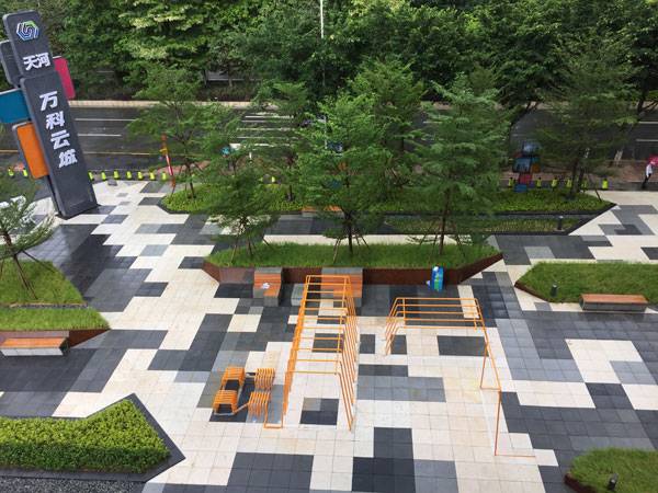
Vanke Cloud City Phase 2, Guangzhou, China, by Lab D+H. Photo credit: James Cheng
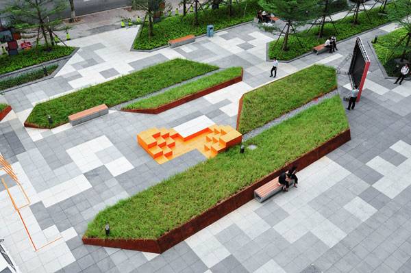
Vanke Cloud City Phase 2, Guangzhou, China, by Lab D+H. Photo credit: James Cheng
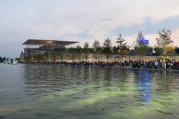
9. Stavros Niarchos Foundation Cultural Centre, Athens, Greece, by Renzo Piano Building Workshop, completed in 2016
Designed by one of the green architects of our time, this project is a testament to designing in a strikingly harmonious nature with buildings. A leftover car parking area of the 2004 Olympic Games will now be a focal attraction point in Athens.
View from the canal building – Opening Event 23-26.06.2016 © SNFCC – ph. Yiorgis Yerolymbos
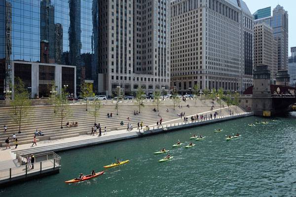
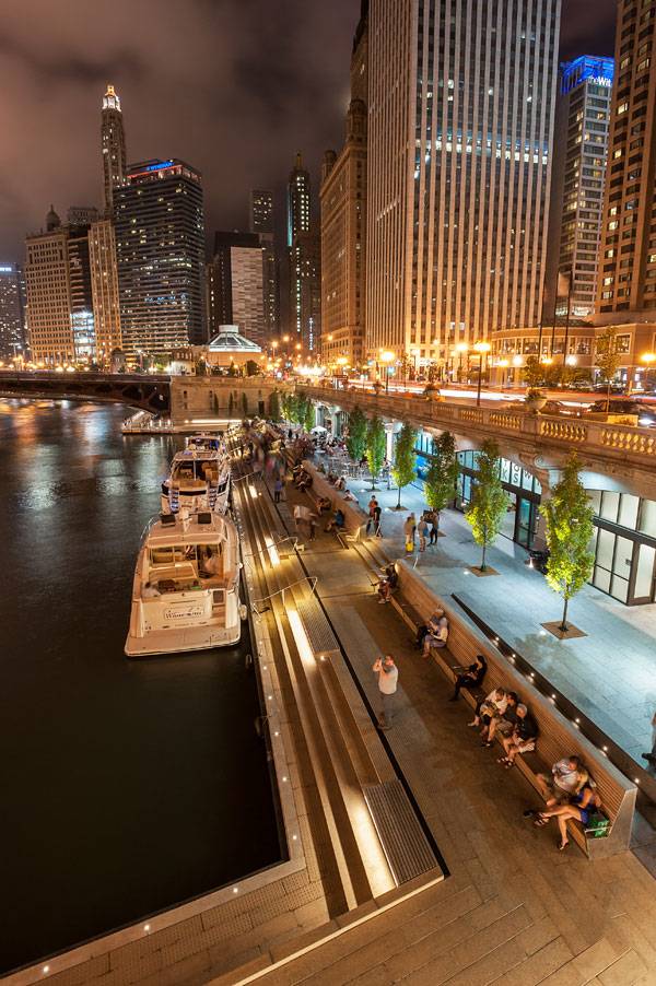
8. Chicago Riverwalk expansion, Chicago, Illinois, by Sasaki and Ross Barney Architects, completed October 2016
Many cities have turned their backs on their rivers. Chicago was no different. But the last decade has shown that such mistakes can be undone with great design. Following the plans of architect and urban planner Daniel Burnham, whose vision sought to change the relationship of the city with the river through a series of riverside promenades, Sasaki and Ross has further developed this key city space with new interventions as part of the Chicago Riverwalk Expansion.
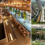
Chicago Riverwalk. Photo credit: ©Kate Joyce
Landscape Architecture Projects 2016
7. The Park, Las Vegas, Nevada, by !melk, completed April 2016
When the private owners along Las Vegas Boulevard came to the realization that positive investment in outdoor public space pays out, what manifested was “The Park”– the first ever park along the Las Vegas Strip. No pressure, but it seeks to mitigate several regional conditions of the area, from heat to drought and dust storms, through a series of iconic shade elements, water features, desert plantings with drought-resistant trees, and sculpture — all capturing the essence of the popular tourist destination. Contrasting with the artificial attractions to date, “The Park” signifies the first potential of transforming Las Vegas back to an oasis within the desert. WATCH >>> The Park Las Vegas Strip – MGM Resorts International
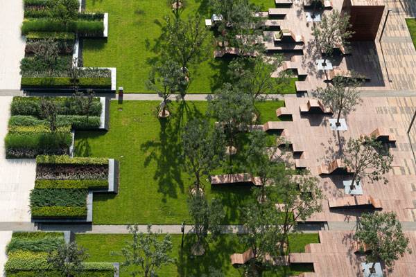
6. Beiqijia Technology Business District, Beijing, China, by Martha Schwartz Partners, completed in 2016
As a LEED Gold Project candidate, the mixed-used development of Beiqijia Technology Business District comprises a strip landscape with clear distinctions between the different types of development. The strips then become the beginnings for bespoke site furniture, paving, plantings, and bold gateways.
Beiqijia Technology Business District, Beijing, China, by Martha Schwartz Partners. Copyright Martha Schwartz Partners
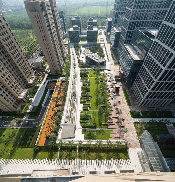
Beiqijia Technology Business District, Beijing, China, by Martha Schwartz Partners. Copyright Martha Schwartz Partners
5. The Hills, Governors Island, New York City, by West 8, completed July 2016
The Hills accommodates Governors Island on New York City’s harbor to complete the transformation of a former military base into a public park. This is an example of a carefully considered design that accounts for the acute visitors’ experiences, which landscape architects can understand. As such, West 8 has sculpted the topography to create winding paths and trees to “conceal and reveal vistas”, choreographing the whole experience of the park with these planted hills, defining the character and creating a sense of anticipation throughout. The resulting planting strategy is a complex answer to challenging issues of microclimate and slope degree variations, making it one of the toughest projects from the list to give the ultimate visitors’ experience. WATCH >>> The Hills
4. The Winton Beauty of Mathematics Garden, RHS Chelsea Flower Show 2016, United Kingdom, by Nick Bailey, completed May 2016 This show garden really pushes the boundaries of creative thinking. The whole design is based on the mathematical patterns that appear in nature — for example, the Golden Ratio — which are then communicated through the garden’s structure and layout. The garden designer Nick Bailey has implemented bands of copper elements and a staggering amount of mathematical algorithm-driven plantings from around the world to create a special kind of place one would only dare to dream of in animated movies.
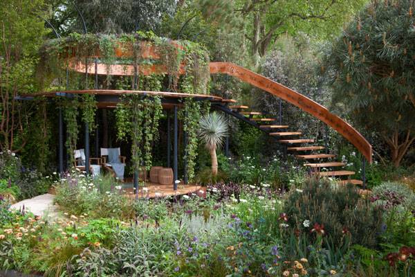
The Winton Beauty of Mathematics Garden. Copyright Nick Bailey
2. Max IV Radiation Center, Lund, Sweden, by Snøhetta, completed June 2016
The landscape design at Max IV Radiation Center has set new standards for research facilities’ outdoor areas worldwide. In efforts to transform the northeast of Lund from agricultural land into Science City, the extroverted, outward-facing, 19-hectare public park welcomes people into its space.
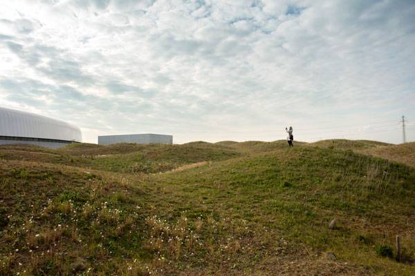
Max IV Radiation Center, Lund, Sweden, by Snøhetta. Copyright holder Mikal Schlosser
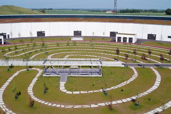
Max IV Radiation Center, Lund, Sweden, by Snøhetta. Copyright holder Mikal Schlosser
1. Play Landscape be-MINE, Beringen, Belgium, by CARVE, OMGEVING and Krinkels, completed September 2016
A former coal-mining site with its 60-meter-high landmark mountain of rubble has been transformed into an adventurous playscape. With many references to its history, the design — the “Pole Forest,” “Coal Square,” and prismatic playsurface — allows young and old alike to experience the industrial heritage in a playful way. Highly respected by Landscape Architects Network, the project definitely pushes the boundaries of safety in play and user experience in contextual ways that we had not yet seen in the profession. WATCH >>> Playlandscape Be-Mine Beringen
Landscape Architecture Projects 2016
With the scope to be creative, the listed landscape architects have played a huge role in bringing our profession to the forefront of design, thrilling the public, enhancing everyday lives, and benefiting our environment. One at a time, projects such as The Park in Las Vegas and Max IV Radiation Center in Lund have also shown us the increased recognition of the social and monetary benefits of investing in our outdoor spaces. We can also see how computer technology has allowed us to create more complex designs befitting functional requirements. As technology gets more advanced and other global issues fill our everyday news, let us anticipate an equally exciting response from more landscape architects in 2017.
Recommended Reading:
- Becoming an Urban Planner: A Guide to Careers in Planning and Urban Design by Michael Bayer
- Sustainable Urbanism: Urban Design With Nature by Douglas Farrs
- eBooks by Landscape Architects Network
The top 10 landscape architecture projects 2016 was composed by Win Phyo
10 Questions for Pok Kobkongsanti , Lead Designer and Founder of TROP
While the vast majority of our content is FREE, this interview composed by Win Phyo is exclusive content for Landscape Architects Network’s VIP Subscribers only – Pok Kobkongsanti, founder and lead designer of T.R.O.P. terrains + open space answers some question for Landscape Architects Network. Pok Kobkongsanti is the founder and lead designer of T.R.O.P, a company from Thailand that is slowly making its mark. The “Tropster” graduated with a Masters of Landscape Architecture in Urban Design from Harvard University, Graduate School of Design, before venturing onwards to work with two of the legends of landscape architecture; George Hargreaves and Bill Bensley. He has been in search of “New Ground” in landscape architecture since his departure from these experiences. His search has not been in vain, as the value of T.R.O.P’s projects have been acknowledged by the likes of the American Society of Landscape Architects, (ASLA), the TED organisation and many others. Pok’s motivated, vibrant and influential character is transparent in his interviews. Today, he speaks to Landscape Architects Network VIP Members about the influence of working with some of the greatest landscape architects of our time, the motivations behind T.R.O.P’s signature designs, and he shares with us some of his greatest inspirations.
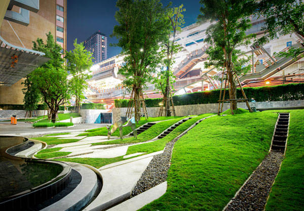
The Forest and Pool at Pyne, TROP Terrains + Open Space
Question Time With Pok Kobkongsanti
1. In order for our readers to get to know you better, please summarize yourself in three words and tell us how you discovered landscape architecture? –
Be Water (that’s my design principal, which is inspired by my idol, Bruce Lee)
2. You have worked with some of the greatest landscape legends of our time. What led you to found your own company, TROP, in Thailand, after working with these folks, and have they influenced the way you work at TROP? – I am a very lucky landscape architect because I had trained with two of the Masters of our time, George Hargreaves and Bill Bensley. Both of them are very influential to our profession; George for public waterfront and brownfield projects and Bill for resort and hospitality design. Working with them gave me a great perspective about how to be a professional. However, deep in my heart, I felt like I need to do something of my own, even though I did not know at the time what it would be. That was why I decided to leave and started my own practice.
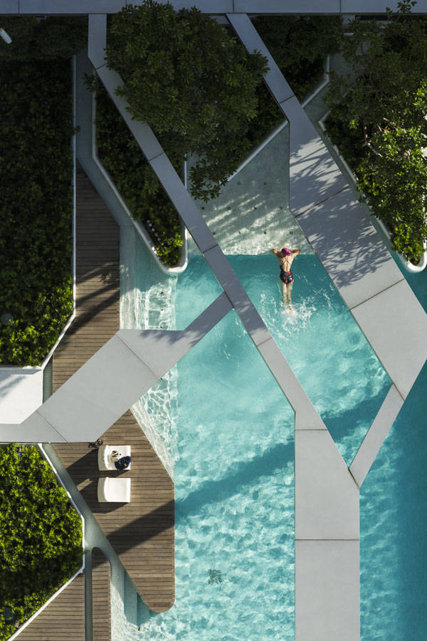
The Forest and Pool at Pyne, TROP Terrains + Open Space
“we have no choice but to do our best, one project at a time“
5. What are some of the common mistakes and challenges you have seen or faced in the profession and to counteract, please give some of your best advice for young landscape architects? – For the young landscape architects, I would recommend that you don’t have to worry about mistakes. There is no way to avoid them. Sooner or later, every one makes mistakes, including me (still making some more at the moment). However, you have to learn from those mistakes and try your best not to repeat them.
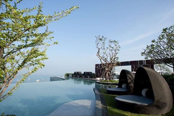
The Garden of Hilton Pattaya by T.R.O.P. Terrains + Open Space, in Chonburi, Thailand.
“..we let our design process tell us what kind of geometry we need to compliment each of our sites”.
7. The design process, or the “journey” to the destination of the final design, is a big part of TROP. What is the design process journey that you take through your projects and how does it impact your final designs? – We have never forced our design on any site without our design process. Normally our projects are built in problematic sites. The design process helps determine which design solution we need in order to solve each problem. Most of the time, there is more than one problem in each site, so we layer each design solution on top of one another. At the end, we compose those solutions together in order to achieve our final design. So before we complete the design process, we would have no idea what our landscape would look like.
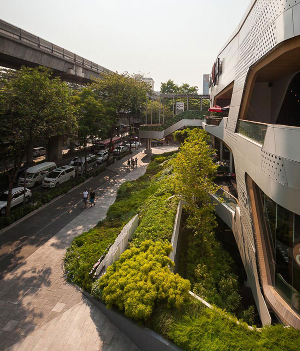
Walk of the Town. Photo courtesy of T.R.O.P: terrains+open space
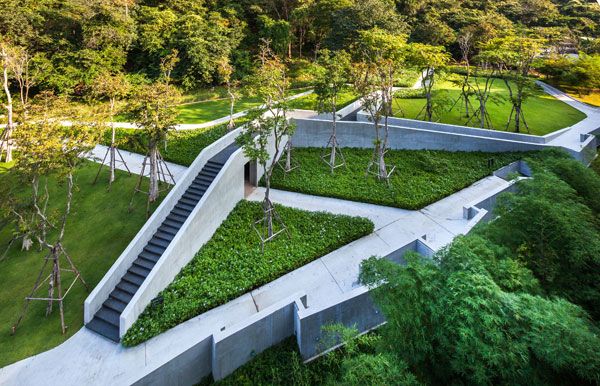
Botanica Khao Yai. Photography credit: Spaceshift Studio Pirak Anurakyawachon, Aranyarat Prathomrat
Pok Kobkongsanti
Landscape Architects Network is certainly anticipating TROP’s growth in the coming years. It has been interesting to gain an insight into the workings of the “Tropsters” and the journey Pok has taken to reach this stage. Could it be luck or fate that he stumbled upon the profession? The watery landscape architect continues to inspire others with a take on landscape architecture using Bruce Lee’s philosophy on life. We would like to thank Pok Kobkongsanti for sharing his insights at Landscape Architects Network. Within that being said, have you watched any of the landscape lecture series by Isabella Stewart Gardner Museum? Do you agree with Pok that global warming is currently the most pressing issue in our world?
Recommended Reading:
- Becoming an Urban Planner: A Guide to Careers in Planning and Urban Design by Michael Bayer
- Sustainable Urbanism: Urban Design With Nature by Douglas Farrs
- eBooks by Landscape Architects Network
Article by Win Phyo
Guldbergs Plads : A Thrilling Urban “Forest” That Will Make You Look Twice
Article by Win Phyo – Guldbergs Plads , by 1:1 landskab in Copenhagen, Denmark Have you ever thought about (or been interested in) how simple features can be used in multiple ways? Flexibility in landscape design is a wonderful thing, and Guldbergs Plads, a neighborhood park in Copenhagen, does the job of demonstrating this. Upon first glance, this project doesn’t look very conventional, and you may even doubt whether it works as Upon first glance, this project doesn’t look very conventional, and you may even doubt whether it works as a space. However, the three elements that have been implemented teach us the value of creating unity with the existing features and coherence to the overall design.
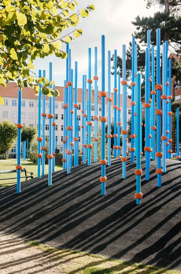
Guldbergs Plads. Photo courtesy of `1:1 landskab
What Does it Mean When We Say a Landscape Design is Flexible?
As landscape designers or clients, we normally have a set of multiple site requirements that needs to be met. It can get overwhelming to sort out the high input of information. However, the principle of a good design need not be complicated; it can be practical, people friendly, and — here is the last point that most of us can forget — fun. A design language that meets these criteria and ultimately creates this flexibility within a landscape design concentrates its utmost importance on this one question: How can we create multiple functions from one or two elements? In this instance, for 1:1 Landskab, it is about picking three bold elements and actually sticking to them.
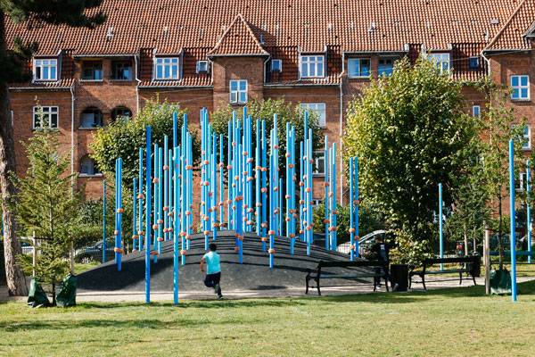
Guldbergs Plads. Photo courtesy of `1:1 landskab
An Urban Forest in the Hub of a Cultural City
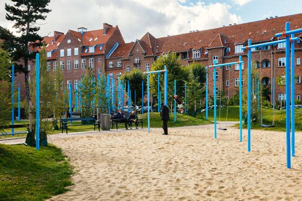
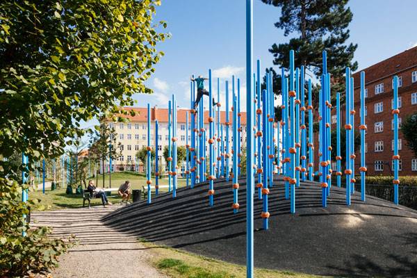
Guldbergs Plads resides in Nørrebro, a trendy and cultural neighborhood that is also home to the famous Superkilen project. Fittingly, the design creates a surreal “urban forest” using 75 Larch trees and 200 blue poles, making up two out of the three elements that shape the overall design. In the busy cityscape, away from nature, the change from the conifers reconnects the urbanites to the natural cycle of the seasons. Leaves change from green in spring to yellow in autumn, then drop from the trees to expose long skeletal silhouettes in winter.
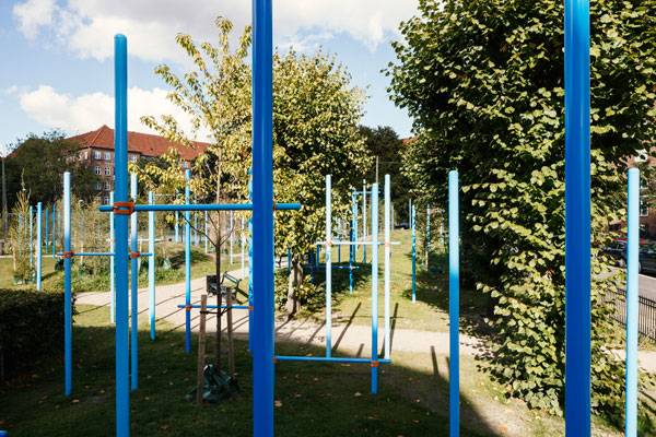
Guldbergs Plads. Photo courtesy of `1:1 landskab
Why Here, Why Now?
The area was pedestrianized in 2010 and, together with the surrounding buildings, creates a safe urban space that acts as a town square, public playground, and schoolyard. With these three functions in mind came a much-needed facelift to revitalize the area as an activity park — a meeting place that focuses on exercise in the cityscape. The designers sought input from the people, working with local residents to identify the sporting equipment needs. This also allowed those new to exercise to give their input in the first phase of the design development and to explore for themselves what could be implemented to improve their lifestyle. The result? Guldbergs Plads is a space fit for both the young and the old.
Guldbergs Plads. Photo courtesy of `1:1 landskab
Re-capturing Natural Landscapes
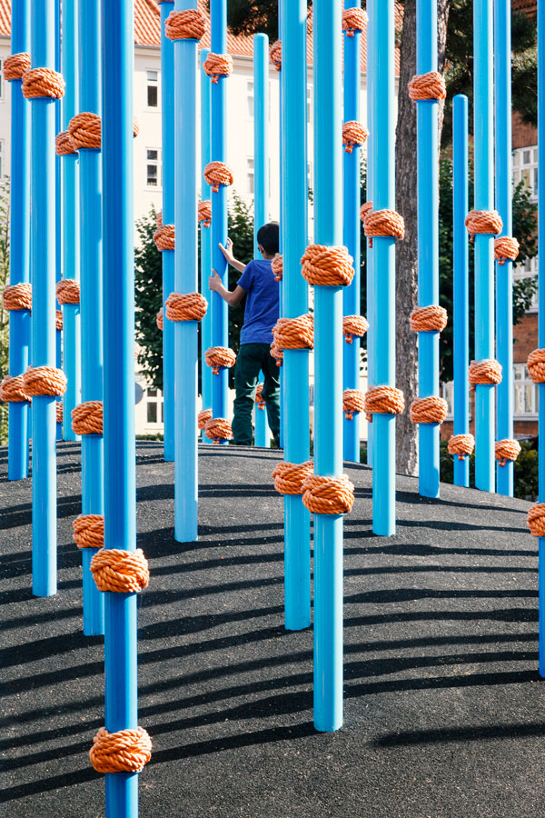
The last design element that has been repeated throughout the site is the 10 hills, which are reminiscent of mountainous landscapes. Some are made out of the rubbery play surface upon which the blue poles are scattered, while others are covered with meadow plantings. This is another aesthetic layer that can reconnect users back to nature. The mixture of the horizontal rolling hills and the vertical blue poles creates a modern urban forest that befits the trendy neighborhood.
Guldbergs Plads. Photo courtesy of `1:1 landskab
Which Element Offers the Most Fundamental Functional Framework?
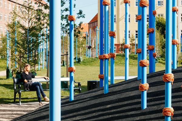
The previously mentioned three design elements include the blue poles, the hills, and the conifers. The hills provide a protective play area and a sense of adventure. The Larch trees add to the realistic concept of the forest with its natural seasonal change. But it is the poles that provide the framework for the functionality and future flexibility of this space. The use of the complementary blue poles and tied orange knots really gives people a sense of entering a unique space. The designers’ confidence in using this bold approach works.
Guldbergs Plads. Photo courtesy of `1:1 landskab
Guldbergs Plads. Photo courtesy of `1:1 landskab
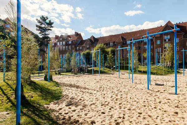
Guldbergs Plads. Photo courtesy of `1:1 landskab
Full Project Credits For Guldbergs Plads :
Project Name: Guldbergs Plads Location: Copenhagen, Denmark Landscape Architects: 1:1 Landskab Client: Municipality of Copenhagen Team: Keingart (Architects), Sloth-Møller (Engineers) Area: 4,500 square meters Status: Competition 2013, Completed 2015 Recommended Reading:
- Becoming an Urban Planner: A Guide to Careers in Planning and Urban Design by Michael Bayer
- Sustainable Urbanism: Urban Design With Nature by Douglas Farrs
- eBooks by Landscape Architects Network
Article by Win Phyo
Company Profile: ASPECT Studios
Landscape Architects Network features a company profile for ASPECT Studios. ASPECT Studios is a multidisciplinary firm solving a range of services within the public realm, which can be seen making headlines in the landscape architecture profession. The company is made up of studios across Australia (Adelaide, Sydney, and Melbourne) and in Shanghai, China. Chris Razzell, who is one of the nine directors, founded ASPECT Studios in 1993 in Melbourne, then expanded to Sydney and Shanghai. The range of services provided are a reflection of the arts, sciences, and technology, working for an array of clients from the local, regional, and international markets, including many levels of government and the private sector. They delve into landscape architecture, urbanism, living architecture/green infrastructure, digital media, environmental graphics, and integrated playspaces. This specificity and variety in services, including the clientele, speaks volumes about ASPECT Studios as a constantly evolving company.
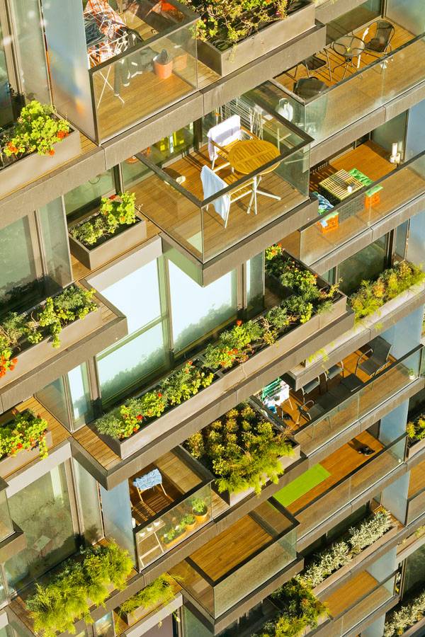
One Central Park, by ASPECT | OCULUS. Photo credit: Simon Wood
Creating a Community Beyond the 9 to 5
Beyond the 9 to 5, the “community” of studio members gets involved in guerrilla gardening or working in their own communities. This proud lifestyle choice that ASPECT Studios preaches makes them authentic designers dedicated to living their vision of always learning, collaborating, and debating. Some of their community-oriented projects include Hart’s Mill , a colorful playscape that gave life to an abandoned area, and Pirrama Park. Pirrama Park is a refreshing attraction for local people, as described by Velislava Valcheva in our article “How Pirrama Park saved Sydney’s Harbor from Residential Development”.
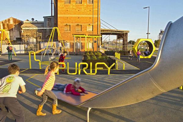
Harts Mill Surrounds. Don Brice
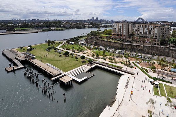
Pirrama Park. Photo credit: Adrian Boddy
Design Approach
Design quality is the ultimate goal of every project undertaken by the company. Its distinct designs take on a contemporary approach, which integrates technology into testing ideas. Totality in all aspects is a major component of the landscape design, looking at social, economic, and ecological considerations in order to achieve quality and ethical responsibility. While being design-driven, the directors say that project management is the key to their success. Their perspective of management is fitting, always changing in objective and processes. For example, the entire project life cycle is considered, extending beyond physical design and project delivery to presently ongoing curated events that increase “vitality interest, civic pride, and social interaction,” as stated in the company profile.
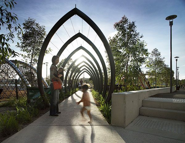
Pirrama Park. Photo credit: Florian Groehn
Working with Game Engine Technology to Communicate Projects
The teams spend a great deal of time researching new techniques around the world. This research has led them to a conclusion that the future of design lies in the digital realm, which extends beyond 3D renders. The Goods Line, for example, is a project involving a former railway line that has a “microsite”developed for interested parties and the public. They focus their efforts on virtual reality/real-time 3D solutions, which can also benefit in communicating complex projects of the urban design and planning industries to stakeholders.
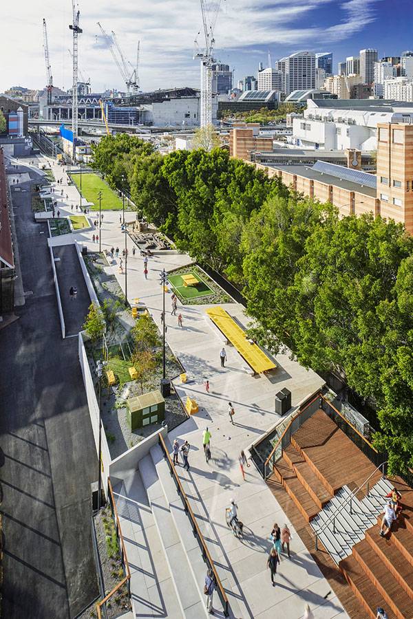
The Goods Line. Photo credit: Florian Groehn
Being a Landscape Architect at ASPECT Studios
Challenges are resolved through interaction with various professionals in a culturally aware studio environment by discussing ideas, research, design, and technical expertise. If you are a designer who is not afraid to constantly evolve and adapt, have a strong interest in how technology can aid design, and have an interest in working on projects that are culturally and communally diverse, this is the perfect company to join. With an array of awards that were achieved within the last couple of years, it seems like ASPECT Studios’ rise in recognition and reputation would catch the eye of any ambitious, forward-thinking designers.
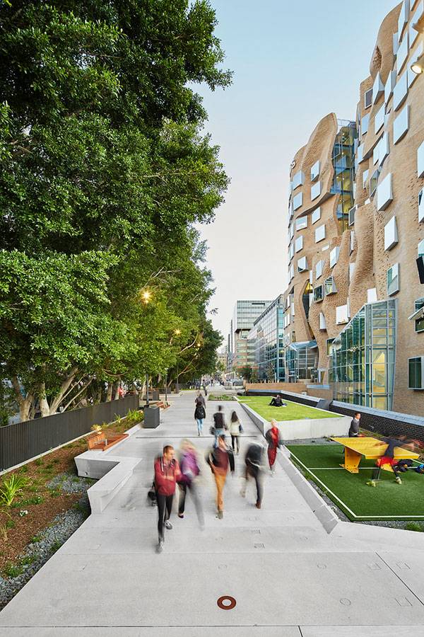
The Goods Line. Photo credit: Florian Groehn
Driven by Constant Change
With more than 23 years of experience, ASPECT Studios has proven its competency and innovation within the industry with a stunning portfolio of successful projects and deeply embedded (and serious) values. Through their ways of working by practicing what they preach and striving to deliver quality responses to each project, they have begun to gain recognition worldwide, particularly in Australia and China. In a constantly changing world where complex communal and global problems frequently arise, ASPECT Studios is an exemplary company with the potential of solving major challenges. It is an exciting waiting game to anticipate future developments from this company.
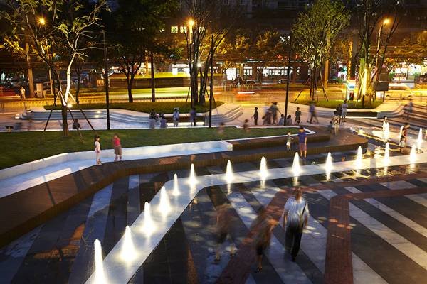
Vanke Chongqing Xijiu PlazaCredit: ASPECT Studios
Direct Information for ASPECT Studios :
Office Name: ASPECT Studios Founder: Chris Razzell Year of Foundation and Location: 1993, Australia and China Address: Offices can be found in the following locations in Australia: Adelaide, Brisbane, Melbourne, Sydney. Also in Shanghai, China Website: https://www.aspect.net.au E-mail contacts: adelaide@aspect.net.au, brisbane@aspect.net.au, melbourne@aspect.net.au, sydney@aspect.net.au, shanghai@aspect.net.au Social networks: Facebook, Twitter, LinkedIN, Instagram
More ASPECT Studios projects:
- The Goods Line
- Chongqing Xijiu Plaza
- Hart’s Mil
- St. James Park
- Metcalfe Park (Pop-Up Park)
- One Central Park
- Pirrama Park
Related Articles Featuring ASPECT Studios:
- 10 Projects showing why Australia are Leaders in Landscape Architecture
- Design Like You Care: 10 of the Best People-Orientated Designs
- 10 of the Best Tourist Spots for Landscape Architecture in Australia
- Australians do it better- Instructions for the Perfect Waterfront
If you would like to get your landscape architecture office profiled on Landscape Architects Network, contact us at office@landarchs.com Profile composed by Win Phyo
Is Glenelg Foreshore Playspace Everything Children Want?
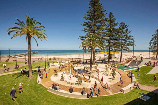
Article by Win Phyo – A full review of Glenelg Foreshore Playspace , by WAX Design, in Glenelg, South Australia. Playgrounds have the potential to be magical and exciting places for children. In fact, earlier this year, we featured some of the best playgrounds in the world, which shows that the standards of play for children have evolved over the 21st century and continue to do so. Nobody quite knows what the perfect formula is but we are getting closer. Glenelg Foreshore Playspace, in our opinion, has got it right. You see, research is revealing that risk in play has proven to be a beneficial thing as children get to learn about their own competence. Hence natural play has been getting popular amongst parents. However, to develop this concept further, one has to think about other factors such as inclusiveness or an imaginative concept. Furthermore, what about sourcing renewable materials for the play equipment… or community engagement? With all these things in mind and more, Glenelg Foreshore Playspace is very iconic – read on to find out why it would be hard to top this level of design integrity.
Glenelg Foreshore Playspace
Glenelg Foreshore Playspace . Photo credit: Sweet Lime Photo
Coastal Concepts
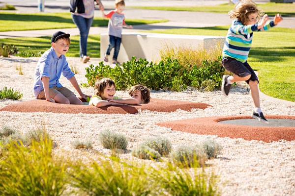
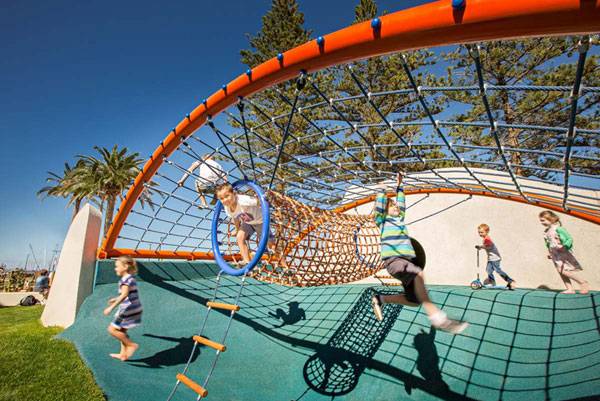
From a tunnel that becomes a giant sandcastle for children to explore, to the brightly coloured dome net which is an abstracted form of a draping beach towel, there are no shortage of imaginative fixtures in this project. It is quite clear that WAX Design has thought long and hard about the concept. The design takes inspiration from the surrounding landscape, elements of a beach setting, and the history and culture of Glenelg Foreshore.
Glenelg Foreshore Playspace . Photo credit: Sweet Lime Photo

Glenelg Foreshore Playspace . Photo credit: Sweet Lime Photo
Healthy Measure of Risk and Inclusiveness
The beach is their adventure and a place for children to call theirs; Glenelg Foreshore Playspace wants them to know that. The design promotes principles of natural play and risk-benefit opportunities for children of all abilities, which means they include spaces for children with physical, cognitive, sensory, and intellectual disabilities.

Glenelg Foreshore Playspace . Photo credit: Sweet Lime Photo
The Sustainable Way
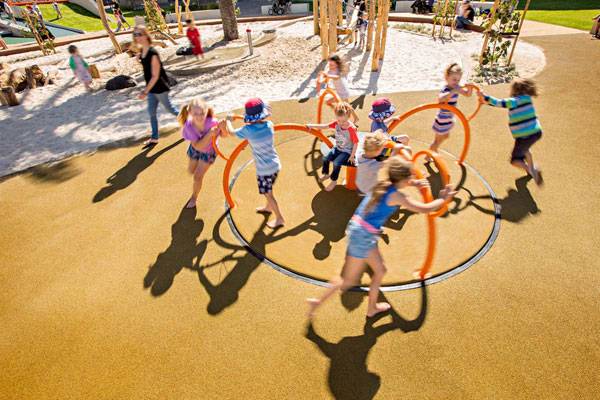
They did not forget the fundamental long-term goals of sustainable design either. The softscape strategy is particularly valid. All the existing trees were retained and additional ones were planted to provide even more shade for children. Native plants were also used to increase the biodiversity within the area. What’s more, for the first time in South Australia, “Living Soft-Fall Turf” has been prototyped. This invention ensures a higher standard of wear and compaction in playgrounds and the provision of a safe falling surface. Play elements are featured with renewable materials. Timber and rope has been prioritized over steel and plastic and a high proportion of equipment is custom-designed between WAX and local makers. This results in authentic and unique play equipment.
Glenelg Foreshore Playspace . Photo credit: Sweet Lime Photo
Involving Community Right from the Start
One of the most successful aspects of this project is its constant engagement process with the community. WAX has consulted with the children in particular and has allowed their ideas to influence the design decisions. Consultations were executed in “Family Fun Day” format by using cognitive mapping and a voting system to distinguish popular ideas and aspirations. They also involved the Council to give further feedback, which strengthened the whole project. The inclusiveness translated in this way allows people of all backgrounds to respect the space as a place of congregation, regardless of social and economic factors.
Glenelg Foreshore Playspace . Photo credit: Sweet Lime Photo
A Success Story
Obviously, when the children are happy, the adults are too! Hence, the playspace has become a valuable asset – making it a play destination in South Australia, boosting the surrounding commercial areas, and increasing tourism. The success can also be measured by numbers of two-hundred-plus children and adults who constantly visit, since the opening in January 2016. Do you have any playground projects in mind that can top this project?
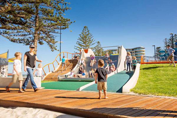
Glenelg Foreshore Playspace . Photo credit: Sweet Lime Photo
Full Project Credits For Glenelg Foreshore Playspace :
Project Name: Glenelg Foreshore Playspace Location: Moseley Square, Glenelg SA 5048, Australia Client: City of Holdfast Bay Design Firm: WAX Design Cost: $1.3million Date of completion: December 2015 Award: Good Design Award 2016 Contractors: LCS Landscapes, Ric McConaghy Playspaces, PT Design Suppliers: Bullseye Creative, Kaebel Leisure, Timber Creations, Playrope Recommended Reading:
- Becoming an Urban Planner: A Guide to Careers in Planning and Urban Design by Michael Bayer
- Sustainable Urbanism: Urban Design With Nature by Douglas Farrs
Article by Win Phyo
Landscape Architecture 2-Day Road Trip in the Land of Queen Elizabeth II
Article by Win Phyo. We explore for the concept for going on a landscape architecture inspired road trip, this time in the land of Queen Elizabeth II in England. Since we are nearing the end of summer, what better way to make the most of it by squeezing in a road trip before autumn approaches? If you find yourself answering yes to the following questions, you should head down to England and venture on our two-day road trip; you will not be disappointed! Are you interested in the grandeur of English gardens? Do you want to experience how traditional British gardening has evolved into modern and sophisticated landscape architecture? From a castle grounds to a beach, with an array of Grade I listed buildings, historic gardens, and Sites of Scientific Interest (SSSI), the amount of diversity on this trip highlights some of the very best landscapes in England throughout history.
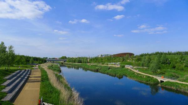
Olympic Park, London, United Kingdom. Photo credit: Alvin Leong via Flickr, licensed under CC 2.0
The Land of Queen Elizabeth II
Stop 1 Queen Elizabeth Olympic Park, London
Start your trip in East London at the infamous Queen Elizabeth Olympic Park, home to the London 2012 Olympic and Paralympic Games. LDA-Design and Hargreaves Associates were the leading landscape firms to realise the masterplan.
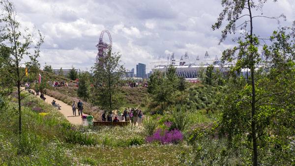
Olympic Park. Photo credit: Ed Webster,via Flickr. Licensed under CC 2.0
Tip: Stop for a refreshing drink and meal at Counter Coffee, an independent bohemian canal-side café. Next Stop: Great Dixter House and Gardens (61.3 miles; 1hr 58mins drive)
Stop 2 Great Dixter House and Gardens
Located in East Sussex, Great Dixter is the family home of gardener and gardening writer Christopher Lloyd. The house itself is an interesting compilation of the original mid-15th century housing with 16th- and 20th-century additions.
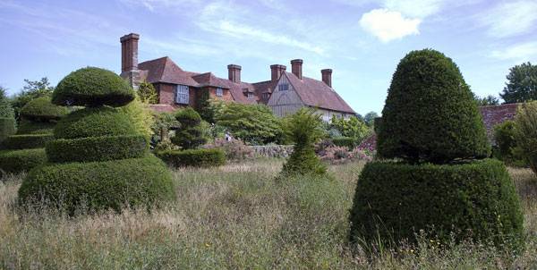
Great Dixter. CC0 Public Domain
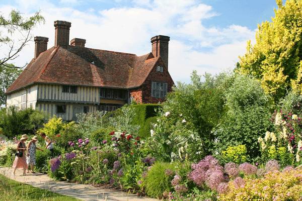
Great Dixter. Photo credit: Malcolm Manners, via Flickr. Licensed under CC 2.0
Overnight Stay Escape from the hustle and bustle of the city and continue enjoying the scenic atmosphere at the many traditional bed and breakfasts around the area, before heading down on a shorter drive to your next stop. Next Stop: (Sissinghurst, 15.1 miles, 30mins drive)
Stop 3 Sissinghurst Castle Garden
A visit to Sissinghurst Castle Garden in Kent can be like something out of a fairy tale. The grounds consist of “garden rooms” inspired by the romantic and intimate poems and writings of the owner Vita Sackville-West, who also worked as an artist-gardener. Each garden will bring you tons of inspiration for colour and concepts. WATCH >>> Walk through the White Garden of Sissinghurst Castle
Tip: Don’t miss the beautiful White Garden, inspired by white gardens around the world and enjoy panoramic views from the top of the Tower. Next Stop: (Dungeness, 27.4 miles, 50-minutes drive)
Stop 4 Dungeness: Prospect Cottage by Derek Jarman
You can end your trip here in Dungeness, a headland on the coast of Kent, and a Site of Scientific Interest (SSSI). It is one of the few areas in lowland Britain where natural plant communities have been little modified by man’s management. The shingle beaches and associated brackish and freshwater pools are of importance both for their physiography and for their flora and fauna. It is here that you will find Prospect Cottage’s famous garden by Derek Jarman, an English film director, on the shingle shore near Dungeness nuclear power station.
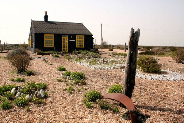
Prospect Cottage, Dungeness. Photo credit: Jon’s pics, via Flickr, licensed under CC 2.0
Stop 5 Cambridge Botanical Garden
If you still haven’t had enough of the tour of British landscapes, perhaps you can have your final stop at Cambridge Botanical Garden to round up the trip. John Hounslow, Charles Darwin’s tutor, founded it in 1846. Originally, the garden was growing herbaceous plants to teach medical students at the University and now the garden displays 8,000 different plants. WATCH >>> Cambridge University Botanic Garden: from the air
Tip: Explore the infamous Cambridge afterwards and stay there overnight! This comes to the end of our virtual tour, however, we suggest you grab a friend or two, fill up your car with petrol and head down to an airport or motorway and come see these sites for yourself. They are rich in history and quality you would be glad to step foot into them to experience their timeless beauty. Have you visited any of the sites mentioned above? Have they inspired you to go on your own landscape architecture road trip?
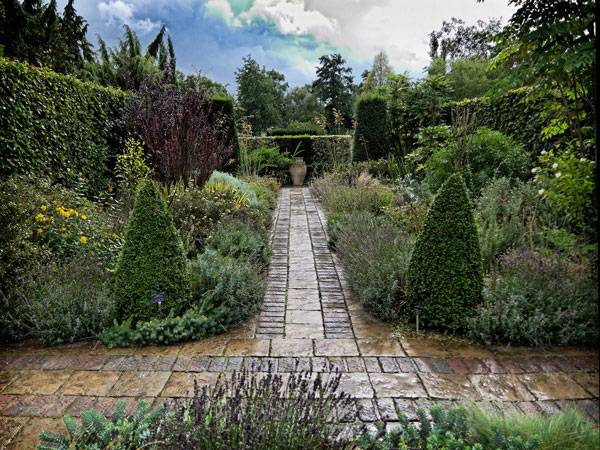
Dry Garden, after rain at Cambridge Botanical Garden. Photo credit: Alex Brown, Flickr. Licensed under CC 2.0
- Becoming an Urban Planner: A Guide to Careers in Planning and Urban Design by Michael Bayer
- Sustainable Urbanism: Urban Design With Nature by Douglas Farrs
Article by Win Phyo
Why Every School Should Consider Having an Elegant Landscape Design
Article by Win Phyo A review of the elegant landscape design at Grõnnegaarden Herning High School by Schønherr, in Herning, Denmark There are some landscapes that can be considered purely as land art, such as the glorious mounds in Northala Fields Park or the magical green carpet of Green Varnish , which provide beautiful and engaging spaces for recreation and contemplation. However, there are other landscape designs around the world that are not necessarily created as land art, but have artistic resonance that really adds to the value of the overall space. The recreational area of Herning High School in Denmark is one such example. It was created as a multifunctional space, but the elegance and artistry in the design surpass the spatial standards that we have experienced or seen in other high schools.

Grõnnegaarden Herning High School. Photo credit: Jens Lindhe
Elegant Landscape Design
Suggestive Multi-functionality Both the layout and the choice of material used are very suggestive. The space lends itself to several activities, which can vary from studying, sitting, running, sliding, relaxing, and gathering, as well as for festive and special occasions. Grõnnegaarden teaches all of us that the busy atmosphere of a space can come from the people occupying the space. Without doing much to the design, landscape architects Schønherr have created a multifunctional landscape that is “just right”.

Grõnnegaarden Herning High School. Photo credit: Jens Lindhe

Grõnnegaarden Herning High School. Photo credit: Jens Lindhe

Grõnnegaarden Herning High School. Photo credit: Jens Lindhe

Grõnnegaarden Herning High School. Photo credit: Jens Lindhe

Grõnnegaarden Herning High School. Photo credit: Jens Lindhe

Grõnnegaarden Herning High School. Photo credit: Martin Schubert
Full Project Credits For Grõnnegaarden Herning High School :
Project Name: Grõnnegaarden Herning High School Location: Herning, Denmark Client: Herning Gymnasium Building Architect: CUBO Architects Engineer: CC Contractor Other Collaborators: HJ Lauritzen Landscape Architects: Schønherr Contractor: CC Contractor Prize: Herning City Council Building Award 2015 Status: Realized 2014 Area: 2,500 square meters Cost of Construction for Landscape: 600,000 euros Recommended Reading:
- Becoming an Urban Planner: A Guide to Careers in Planning and Urban Design by Michael Bayer
- Sustainable Urbanism: Urban Design With Nature by Douglas Farrs
Article by Win Phyo
10 Projects That Show the Power of Detail in Design
Article by Win Phyo Good design is in the details – We take a look at 10 landscape architecture projects that show the power of detail in design. It is often the little things that count and a combination of little things usually end up amounting to something worthy, touching and extraordinary. This applies to nearly everything in life but guess what? It also applies to landscape designs too! As designers working for many kinds of clients, our job is to paint an exciting big picture. However, what happens when your design gets implemented? In the end, it is the visitors and users of your site that count. It is they who will gush over a tiny detail in design, remember how they felt, what they heard and the small personal interactions they had with your design. This is exactly why, in this article, we are going to be celebrating many types of details in landscape designs and show you how they matter.
The Power of Detail in Design
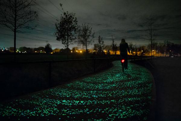
10. Starry Bicycle Path Nestled within the hometown of Vincent Van Gogh is a one-kilometre-long, energy-efficient bicycle path that glows in the dark. Inspired by Van Gogh’ painting “Starry Night” and embedded within this bike lane are 50,000 stones coated in phosphorescent paint and solar-powered LEDs to imitate the beauty of the painting in real life. During the day, it is an ordinary bike lane but the special paint gathers energy to create a magical, unique experience for cyclists commuting during the night. If all bicycle pathways were like this, perhaps people would be inclined to cycle more. Nevertheless, this is what happens when practicality, energy-consciousness and beauty is combined in a simple but powerful detail in design.
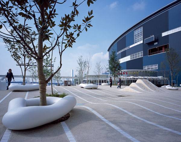
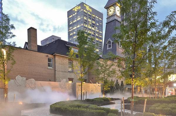
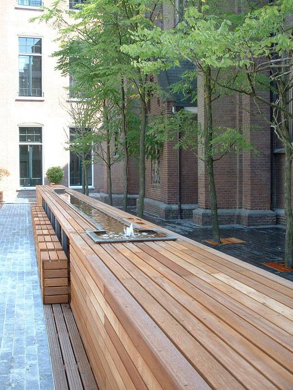
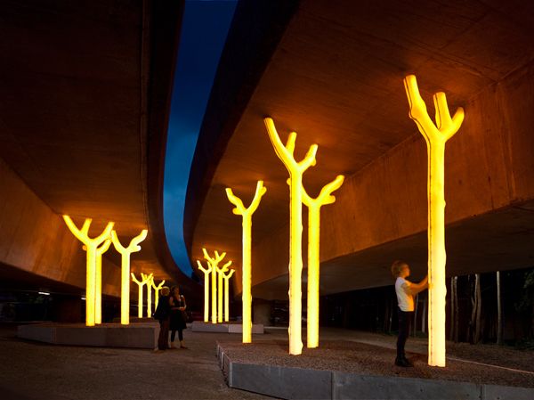
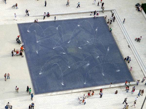
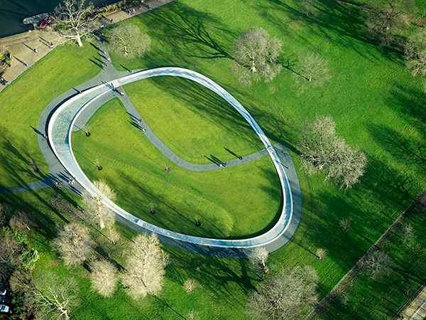
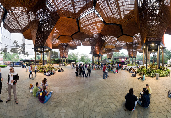
9. LaLaport Toyosu There are many great things that can be said about this site in Tokyo. In comparison to our first example, this is a complete contrast. What happened to subtlety? Well, this project shows how details in repetition that follow a particular theme can create a fun experience. The former dock and port site has followed an oceanic theme. Take a look at how the paving follows the waves of the ocean and how in certain places, it raises up to create a play feature. Have you seen the benches, made to look like a clump of coral, that are pure white, and how the trees poke through, like sticks in shallow water? 8. The Four Seasons Hotel and Residences Here, we take it up a notch to reveal detail in design created on a bigger scale. The landscape is set between a 21st century skyscraper and a 19th century Victorian home. This may not be everyone’s cup of tea, however, this project is a true example of a conceptual design executed in a bold manner. Sitting in front of the hotel entrance to welcome guests is a pixelated, rose-patterned “urban carpet” paving with a grand, cast iron fountain four stories high. Adjacent to this is a rose-shaped garden to compliment the patterns. This creates a branding image for the famous hotel – its bold, startling details are sure to stay in everyone’s minds! 7. Choorstraat Papenhulst The clean execution of the furniture detailing in this project is awe-inspiring. Within this courtyard, all of the furniture is made out of the same wood, including the lattice work of the paving upon which these features sit. There is some seating shaped like blocks and modern benches; however, the star attraction is the long picnic-bench-like table with a water fountain that doubles as a wine cooler. Elegantly placed in the courtyard, the residents of this site will be made to feel like characters in Da Vinci’s Last Supper. 6. Aspire Public Art Lighting Project This community-focused public art work lies in an underpass and allows residents from the nearby suburbs to feel safe walking through it at night. The figures are shaped like trees which glows during night time and are made to look like structures holding up the highway. They are made out of high density polyethylene, a popular plastic commonly used for packaging. It is a subtle yet striking detail in design, fitting into its surrounding context and during the night, it transforms the space into something more meaningful. 5. Hilgard Garden Within this garden is a material palette that consists of cedar wood, used as bench-planters, concrete used for a retaining wall/ planter feature, granite paving, and COR-TEN steel fence and retaining panels. These materials are used in a purposeful manner to differentiate the function of the small spaces within the garden and to create a strong visual axis. The end result is truly breath-taking. The project is an example of how a hardscape material palette can create a strong textural detail, which strengthens the overall shape and form. 4. Place Lazare Goujon There are many good thigs that can be said about this project. However, we want you to focus on only one thing for this site and that is the fountains. Yes, they are grand and fit in very well to the existing buildings which surround the public square. However, if you walk a few steps in to take a closer look at these giants, you will see tiny pieces of blue and gold paste pieces with words on them. These look fun and at the same time, elegant, against the blue background of the basin. The designer has worked alongside an artist to create this and we can imagine this detail shimmering from a distance. 3. Diana Memorial Fountain This circular water fountain was made as a memorial, representing the inclusive and loveable personality of Princess Diana. The fountain feature has textural details that influence the sound and character of the water as it flows in a circular motion around the fountain. This is made from computer-machined pieces of granite connected at intervals. In some areas, the water flows freely and calmly and in others, its speed quickens, splashing or gurgling, accompanied by the soft and loud sounds of its journey. 2. Orquideorama This 50-foot high canopy is made out of steel and wood and takes inspiration from honeycombs. The steel structure allows the canopy to expand far and wide and the latticework of the wood creates interlocking shadows. Each structure funnels rainwater downwards and the overall shape and form connects the built and the natural together in this Columbian botanical garden. The beauty of this project is in turning a simple concept into a highly technical and well-detailed design. 1. North Bethesda Market This project is a true demonstration of the “importance of the little things” we have mentioned in the beginning of this article. It is set amongst a luxurious shopping facility and apartments and the different spaces within reflect a place for people of all ages. Our favourite detail in this project is the use of locally-sourced granite in different colours and shapes, used in many features ranging from steps to waterfalls to paving. What tops this project off is the implementation of perforated copper waterjet-cut texts, mounted in sculptures that edge the steps. One particular piece named “Alluvium” has lighting inside which illuminates the words and creates shadows beneath the floor!Appreciating Detail in Design
By now, we realise we have taken you on a whirlwind journey of details today. From elegant subtlety to striking boldness, they vary by form, material, and themes but one thing is for sure- the details compliment the context in which the site is set. Whether through strong visual images, a collection of simple features, or the deliberate use of certain materials, we can say that none of these projects have simply taken the standard way out of detailing. They show us that it is important and worthwhile to take the time to consider the impact of the little things and design them artfully. Which project has made the deepest impression on you? Let us know in the comment section below!
Recommended Reading:
- Becoming an Urban Planner: A Guide to Careers in Planning and Urban Design by Michael Bayer
- Sustainable Urbanism: Urban Design With Nature by Douglas Farrs
Article by Win Phyo


